


Creating my paintings allows me to share my personal interactions with nature in a manner that will make the viewer feel a part of what I have experienced. My goal is to simulate the feeling of actually being present in the painting. I was fortunate to spend my childhood along the banks of the Credit River in Southern Ontario, Canada. This beautiful creek has probably had the most influence in the subject matter I have chosen to pursue in my painting career. The desire to be able to replicate the feeling of standing in water has always been overwhelming.
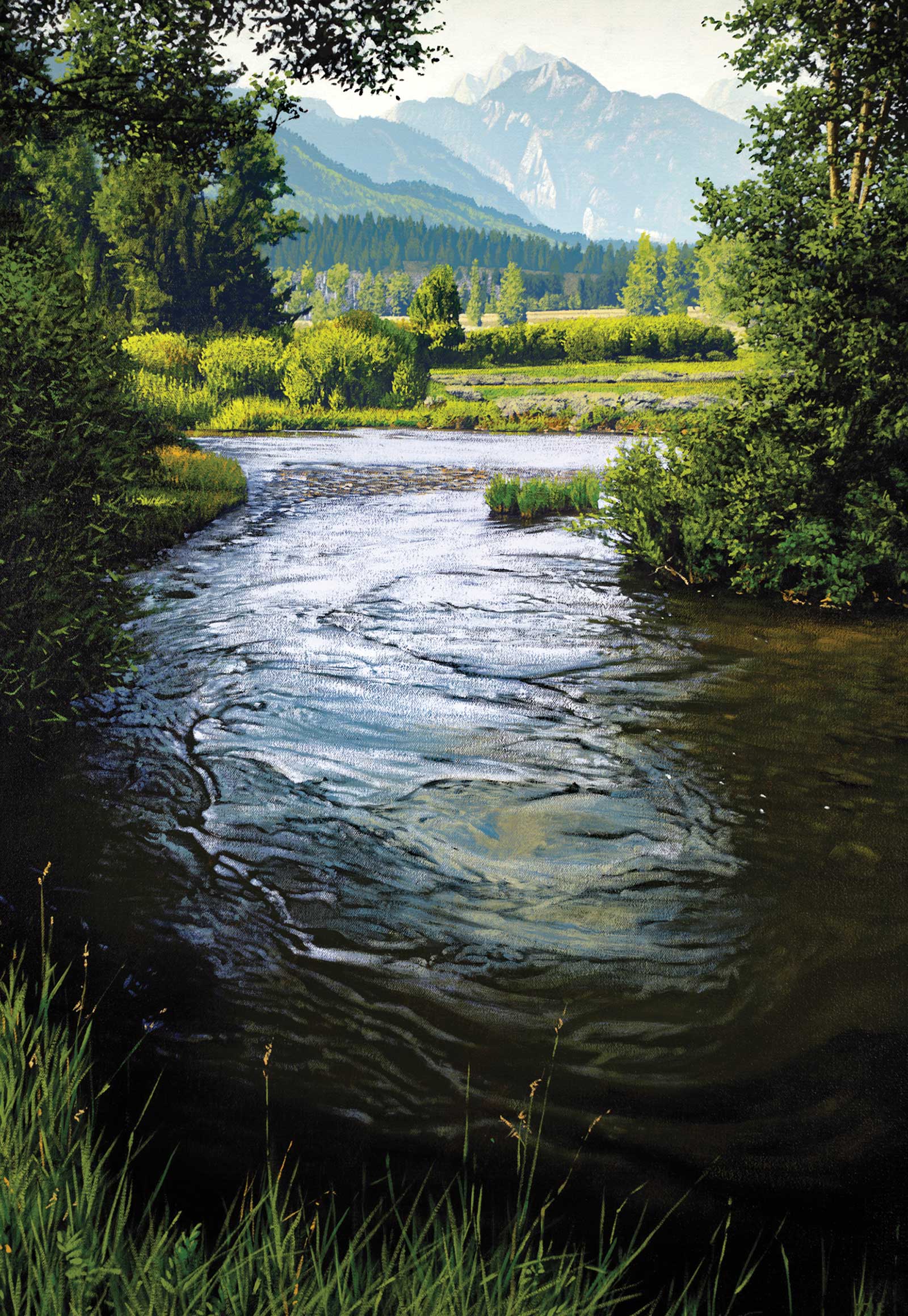
Bend in the Snake, acrylic on canvas, 36 x 24" (91 x 60 cm) This painting is of the Snake River in Grand Teton National Park in Wyoming. I came across this scene while gathering reference material in the park a number of years ago. The deep swell of the current as it rounded this corner caught my attention and became a challenge to paint. I found it interesting to capture the different depths of the river.
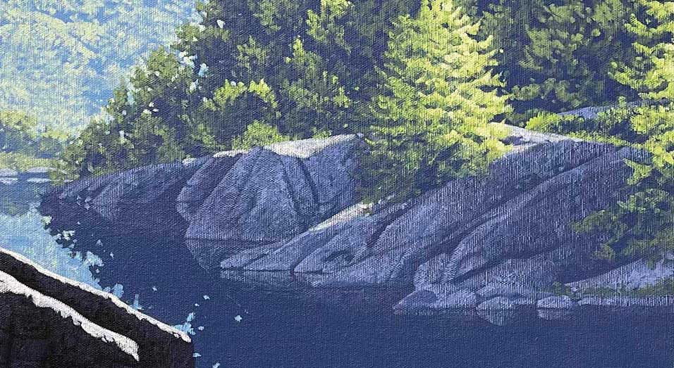
My paintings are value based. Understanding the importance of value in realistic painting is crucial to its success. Value is the quality of light and dark. In my paintings there is no gradual blending of values from light to dark. The separate planes that I divide my composition into are each assigned a value of their own. They are clear separations, and that requires the eye to almost jump from foreground to background or vice versa. This seems to create a dramatic volume and atmosphere in the painting. As a value is assigned to a plane, it represents the darkest part of that landscape. Any color or detail added after that must maintain the same value or it will result in a reversal. As objects move back into the distance they become less distinct in detail and cooler in temperature. As they move closer to the foreground the details become more evident and the hues tend to be warmer.
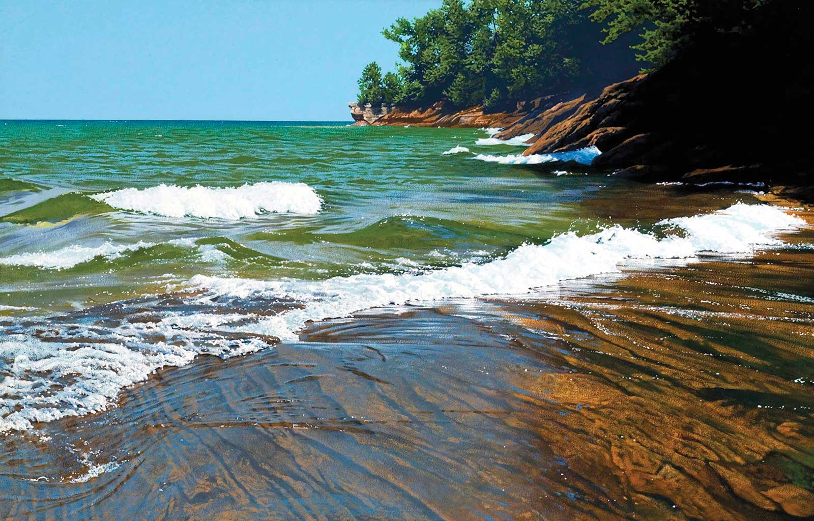
South Shore Superior, acrylic on canvas, 24 x 36" (60 x 91 cm) I had the opportunity to spend a July afternoon along the Superior shore in Michigan. I was amazed at the variety of color in the water. The big challenge in this piece was to capture the skim of water gliding over the rocks as it came ashore.
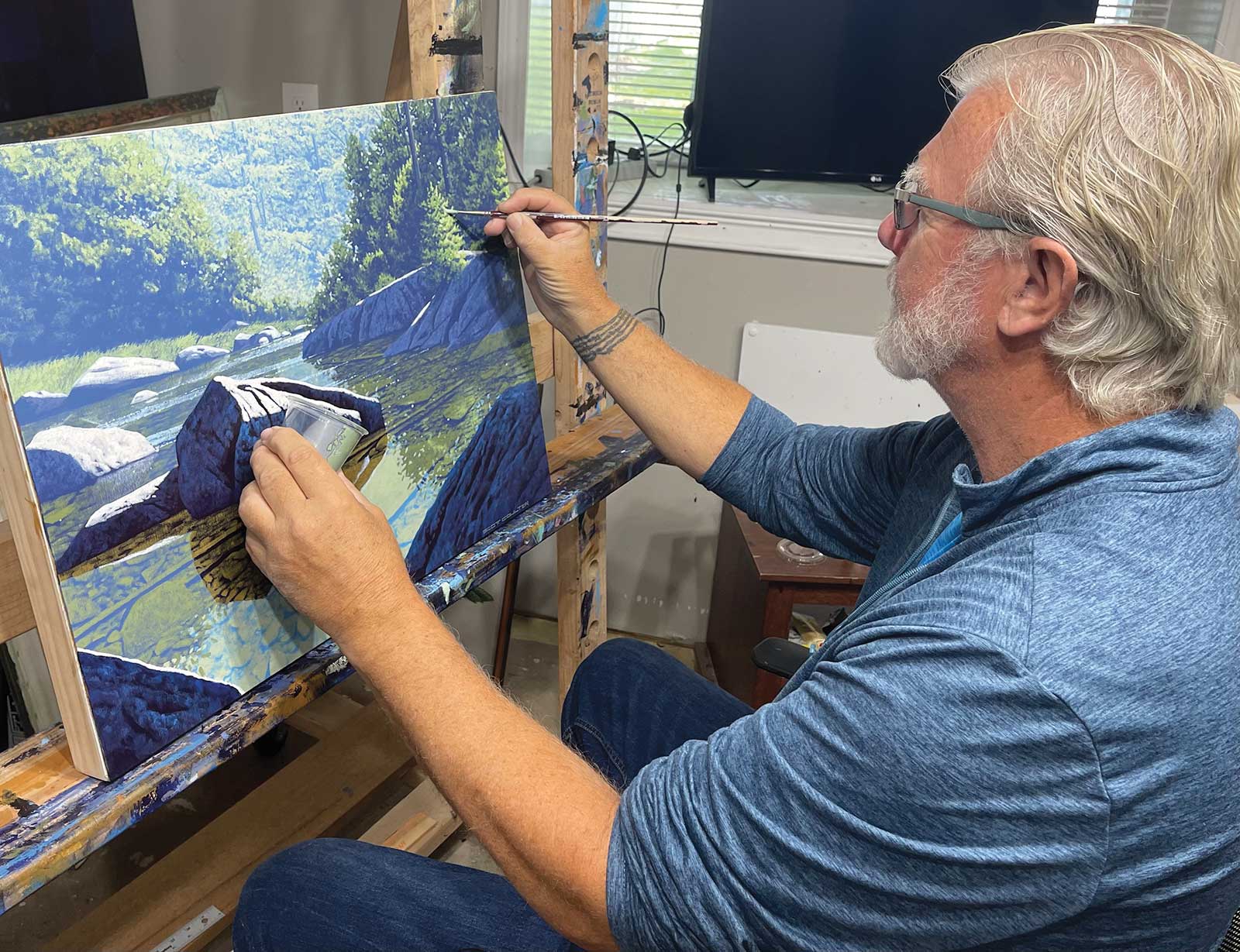
I paint in acrylics and I paint very flat. There are really no impasto brushstrokes. The paint consistency is directly from the tube and mixed with a palette knife on a disposable palette. This allows me to overpaint and make any changes necessary at any point in the completion of the painting. I have been painting landscapes for 46 years. I switched from oil paints to acrylics after about six years. The main reason for that was speed. I paint in layers, and the drying time of the acrylics made that an easy decision.
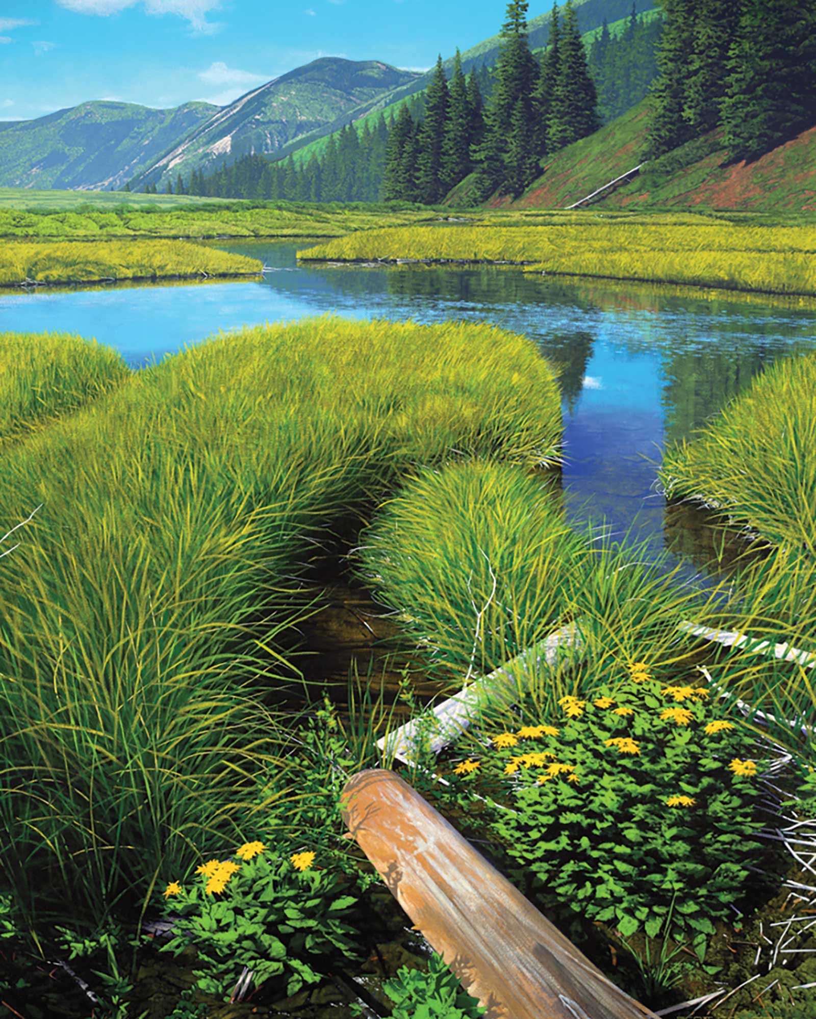
Castle Creek, acrylic on canvas, 60 x 48" (152 x 121 cm) The location of this painting is near Aspen, Colorado. The shallow winding ponds created by beaver dams always catch my attention. This piece is more about the composition . The soft shapes of the clumped grasses broken up by the hard diagonal edges of the fallen tree trunks are a great lead into the painting.
Of course, most of my paintings incorporate water as a subject matter. The best advice I could give to anyone attempting to paint clear water is to train yourself to paint what you see. If you let your mind convince you that what you are looking at is the color “clear” you will fail. It is simply learning how to see. If you see a color or detail or shade, reproduce that exactly on your canvas. Do not let your mind convince you it is something other than that. There is no magical wash that you can paint over a water scene that will make it look transparent.
My Art in the Making Clear as Water
 Stage 1
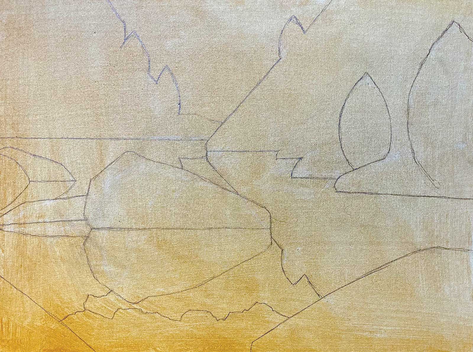
Stage 1 Drawing on Tinted Canvas
This painting is entirely from my imagination so there is no reference material used at all. A simple line drawing on a tinted canvas will map out the distant trees, foreground rocks and the river shoreline.
 Stage 2
Stage 2 Focusing on Values
Distinct areas of value are painted in to be the darkest part of each plane, receding from dark purple in the foreground to a blue/gray background.
 Stage 3
Stage 3 Distant Trees
Cadmium yellow light and white are added to the background color to create trees in the distant forest. The other trees’ outlines are formed by cutting in the edges with the value behind them.
 Stage 4
Stage 4 Blocking in Additional Foliage
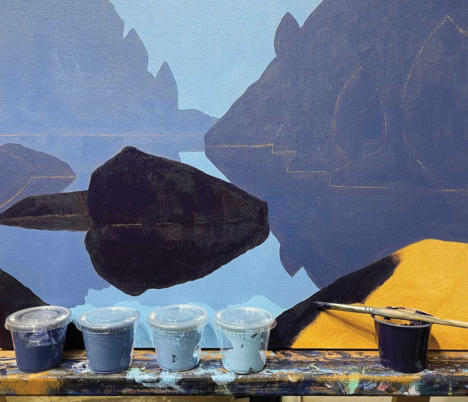
Two more treed areas are blocked in. These are acrylics, so enough paint for all these colors are mixed and stored in airtight plastic cups to use as the painting progresses.
 Stage 5
Stage 5 Establishing a Light Source
Details of the rocks are starting to be added. At this point a light source needs to be established. In this case, it will be from the upper right side of the painting.
 Stage 6
Stage 6 Details
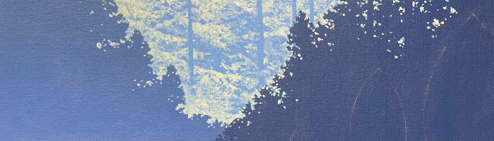
Further details of the trees and rocks are added. The colors are becoming brighter as work moves towards the foreground of the painting. Final adjustments will be made later.
 Stage 7
Stage 7 Rocks and Water
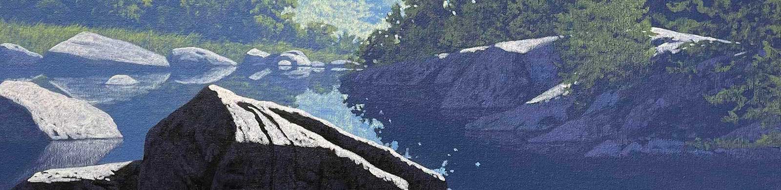
Work begins on the rocks and water under the surface. A pattern of sticks and stones is indicated by painting or dry brushing a single color (raw sienna mixed with hookers green and white).
 Stage 8
Stage 8 Matching Values
Each area of stones under the water must match the value of the landscape directly above it. The darkest shadow from under a stone should match the deepest shadow in the trees above it.
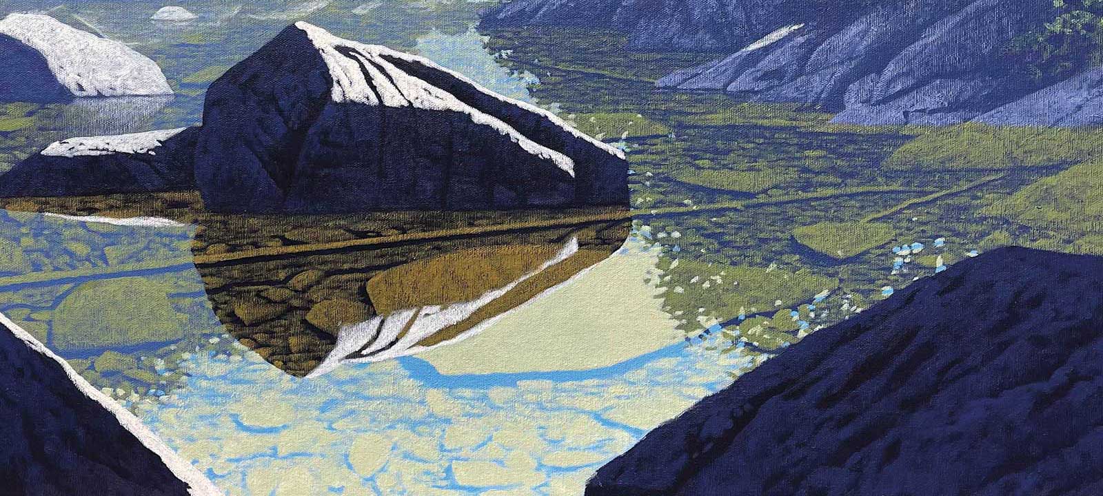 Stage 9
Stage 9 Underwater Patterns
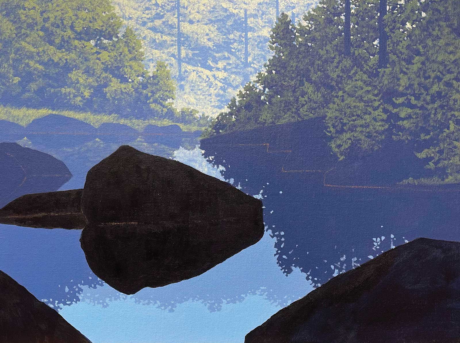
The underwater patterns of stones are completed. A single rock under the water could be painted using multiple values determined by the reflection above it. When connected, the water will appear transparent.
 Stage 10
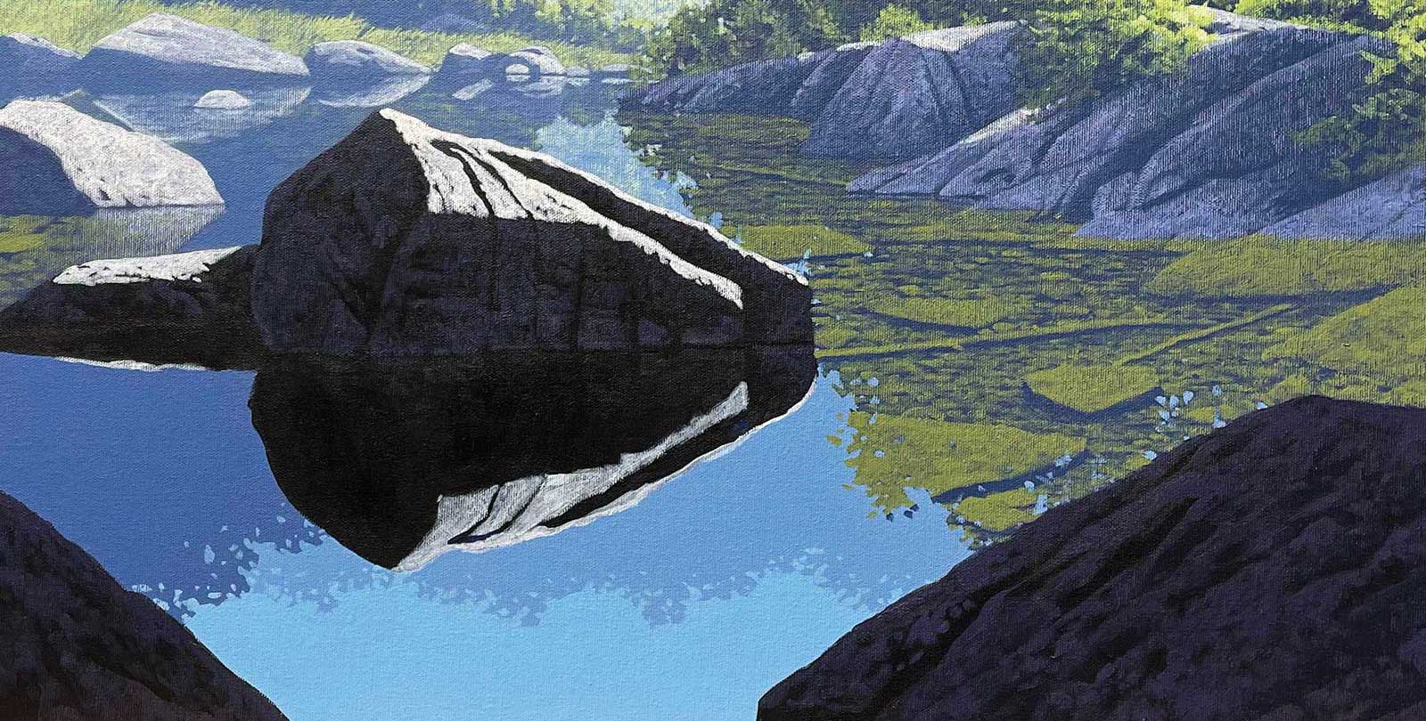
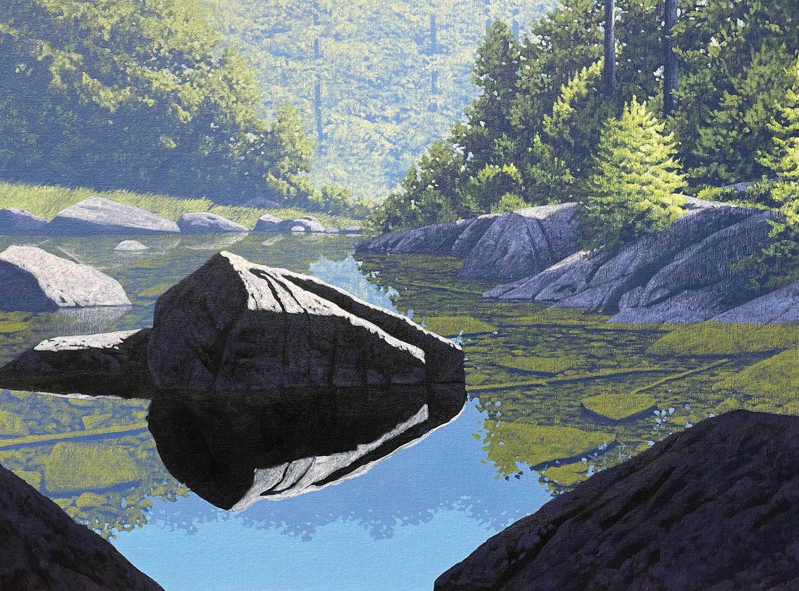
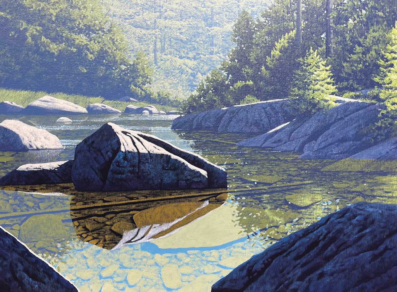
Stage 10 Finished Artwork
Clear as Water, acrylic on canvas, 18 x 24" (45 x 60 cm)
Surface ripples, underwater shadows and rock details were all added in this final step.
About the artist
 Scott Coulter
Canadian artist Scott Coulter was originally from the Credit River Valley of Southern Ontario in Canada. He is a self taught painter of the landscape. He lived and painted for six years in Alberta, Canada, before moving to the United states. He then spent 22 years painting in the Finger Lakes Region of New York. He currently resides and works from studios in Sarasota, Florida, and Chisago City, Minnesota.
He has earned many accolades for his work including the Grumbacher gold medal at the Cooperstown National and the American Artists Professional League Grand National in New York. He has participated in many national and regional art shows and accumulated many awards along the way. Coulter primarily shows his work at outdoor art shows all over the country. He is widely collected in private and corporate collections in Canada, the United States and Europe.
Contact at
rs.coulter@gmail.com
www.scottcoulter.net