


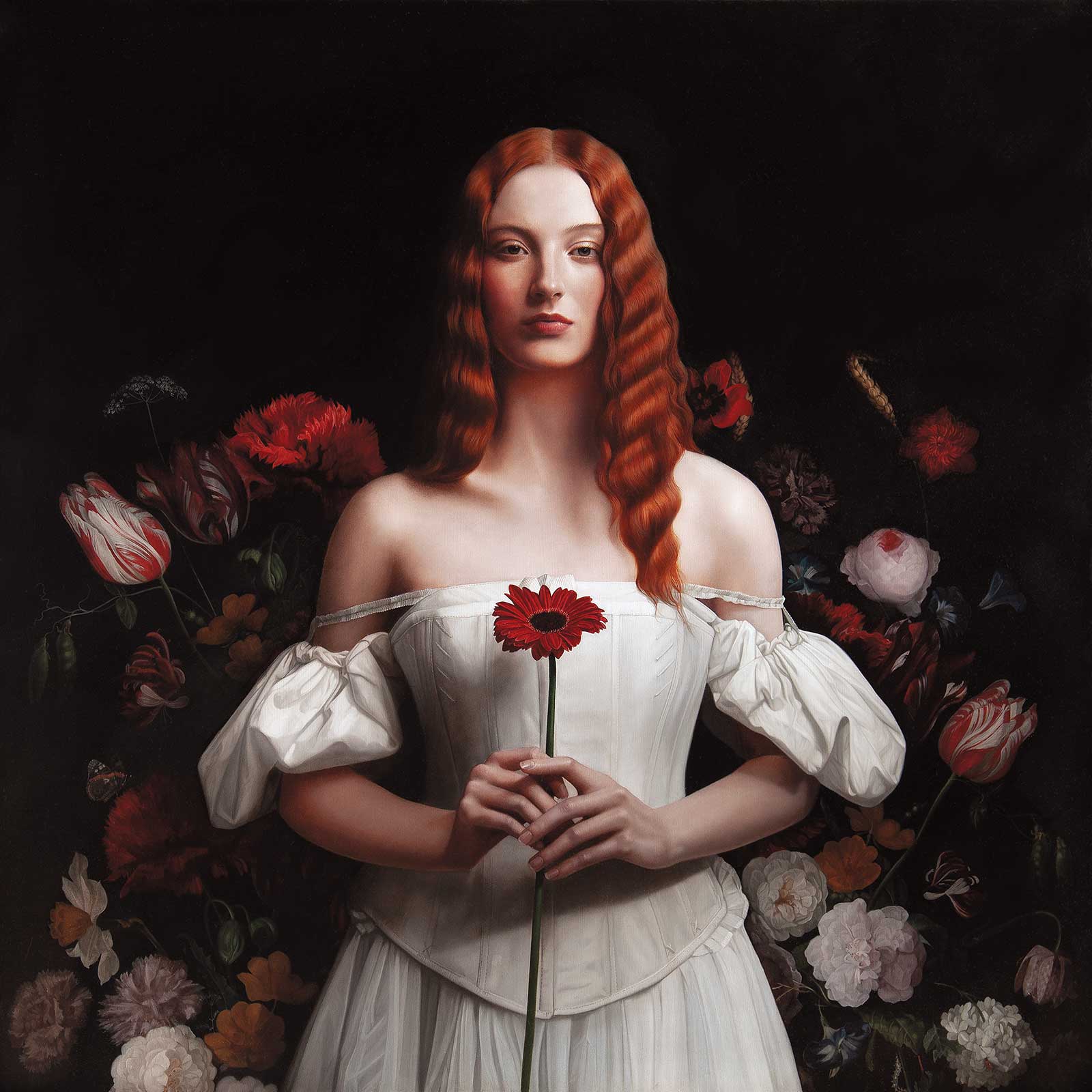
The piece Naissance V continues a series of paintings paying homage to some of my very favorite works of art. I began the series referencing Botticelli’s Birth Of Venus with its mysterious ode to the divinity of physical and intellectual love. As someone who spent 26 years living in Brighton next to the sea, I feel its pull everyday and I am fascinated by it as a vehicle for creation, how just to be near it can fire the imagination. And so my series continues here by looking at the Victorian painter John Bulloch Souter’s The birth of Venus. As he references Botticelli, so do I, and it feels like a conversation continued.
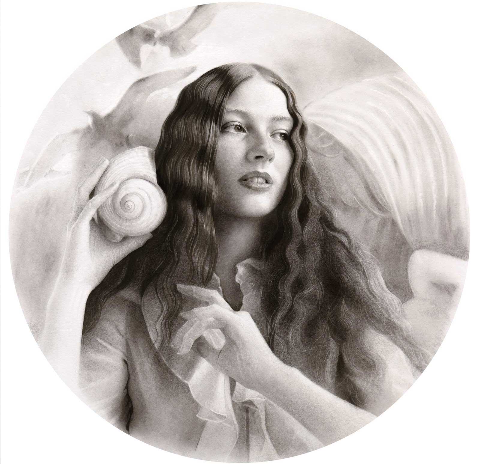
Asterales, oil on aluminum, 30 x 30" (76 x 76 cm) Asterales continues my ongoing homage to the exquisite floral paintings of the Dutch Masters. It is one of those paintings that appears to come to me fully formed—I had only to bring it to life. It takes its name from the daisy-like flower my model holds. This genus of star-shaped flowers gives this piece an appropriately otherworldly double meaning.
I’ve already made studies of the composition, working up the final drawing in graphite and liquid charcoal on paper, which I’ve transferred to my aluminum panel. Typically I prime my panels with an acrylic primer in a neutral gray around a value 3, but I’ve recently been introduced to Michael Harding’s new non-absorbent acrylic primer range, and as I love and use their paints I am intrigued and decided to use this demonstration to test out its potential. It comes in a range of colors plus white, and I decided to try the gray value 5. It suggests two coats but I find a slightly less strong bond with the panel after two, so I apply a couple more and let all dry thoroughly in between.
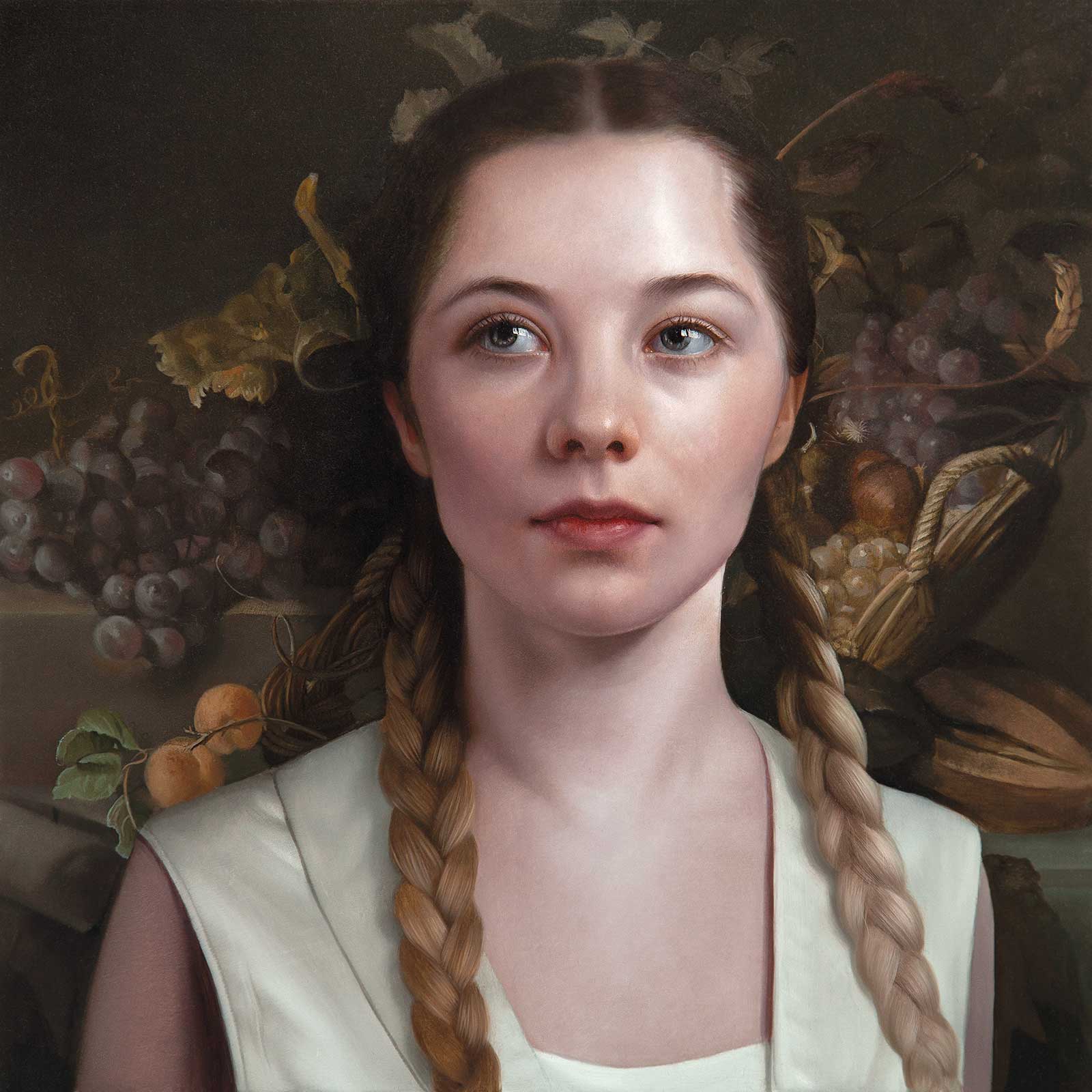
Vinifera, oil on aluminum, 12 x 12" (30 x 30 cm) Vinifera—the title is a reference to fruits of the vine, so beautifully described in the painting by Jacob van Walscapelle. These exquisite still life paintings captured my fascination from early visits to the Rijksmuseum as a very young painter. Full of symbolism, their layers of meaning sparked my imagination for the potential of subtle narratives even at such a small scale, something I am still enjoying exploring well over 30 years later!
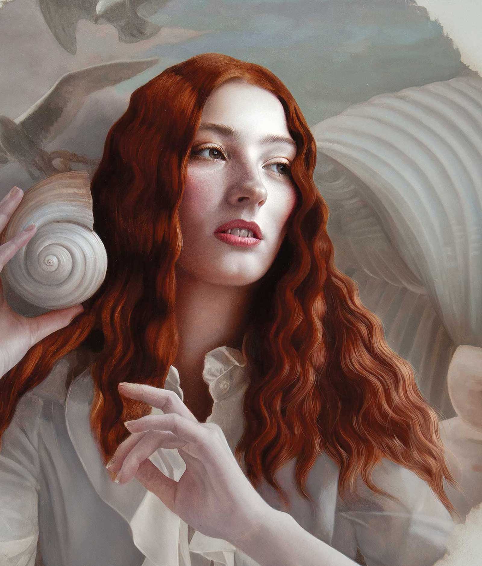
Using a gray primer is perfect for the palette I’ve selected for this piece. I’m looking to desaturate the colors slightly to create an overall harmony and accentuate the pastel hues of Souter’s painting. I also want to call to mind in the viewer the iridescent shades of mother of pearl in the shell my model holds and in the painting behind, so I’ll also echo these hues in my model’s skin tones and clothing. My palette is principally made up of earth tones, which can have a tendency to sink in, so this will be a test for the primer.
I like to select from a range of techniques to start a painting, sometimes using a grisaille or an ébauche or a wipe out method. Since the primer is quite a dark gray already, and all of those methods would only darken the initial layers further, I decide to test how it will take full-bodied paint; tentatively at first as I feel my way around the facial features. It’s slower going this way, but I’m enjoying the feel under the brush so far.
Taking Souter’s warm tones in the sky area as my cue, I continue to lay in paint. As this is a relatively large area of flattish colors I select a wide one stroke synthetic flat, working quickly and softening the edges slightly with a soft synthetic fan brush before the paint sets up too much. I’m using a very simple medium of gamsol mixed 50/50 with linseed stand oil, which allows the paint to set up enough to hold its place on the panel but stand up to being gently brushed over. I soften for two reasons: firstly to optically knock back any details in that area and stop them jumping forward, and also because just as I love a smooth surface to paint on, I love the surface of my painting to be enamel smooth, letting the eye flow over it in close inspection.
In the following demonstration, I will continue to describe my process in further detail.
My Art in the Making Naissance V
Stage 1
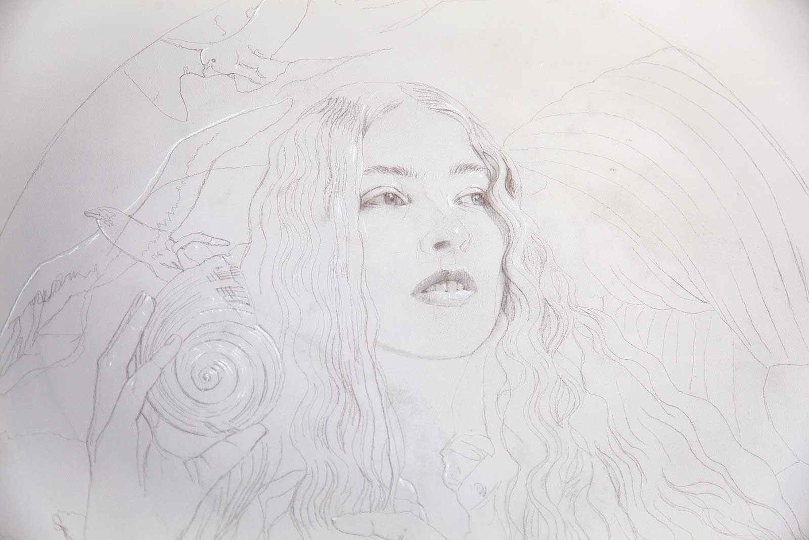
Stage 1 Drawing Study
Working in a combination of charcoal and graphite on a 300gsm cartridge paper, I work out the composition and balance of my idea.
WHAT THE ARTIST USED
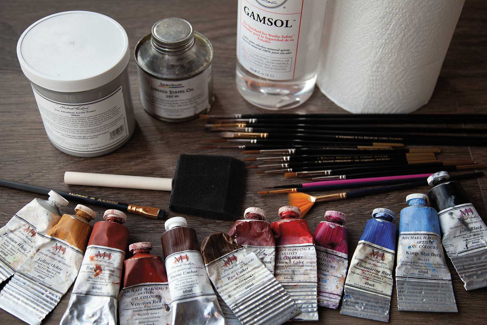
Michael Harding Oils
Titanium white, Yellow ochre, Burnt sienna, Burnt umber, Raw umber, Indian red, Crimson lake, Magenta, Ultramarine blue, Ivory black, Kings blue deep
Mediums
Gamsol, Linseed stand oil
Brushes
Synthetic fan brush, Various sizes of worn synthetic rounds, Long handled pointed rounds, #5, Long handled long filbert, Synthetic rounds, #s3/0 0, 1, 2, 4, Synthetic riggers, #0, 3,Flat one-stroke, 1/8", 3/16", Foam brush, 2½"
Stage 2
Stage 2 Transferring the Drawing
Once I’ve established my drawing I transfer it to my primed aluminum panel, working lightly in graphite. I also lay in some highlight areas as additional guide marks.
Stage 3
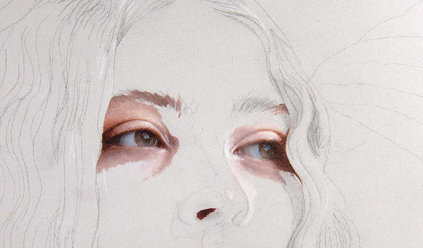
Stage 3 Beginning the Painting
Feeling my way with this new primer I decide to see how much detail I can lay with full-bodied paint, working carefully around the eyes to find the focus of the piece. I don’t always start this way but am curious to see how well it takes the paint.
My Design and Composition Tactics
Composition
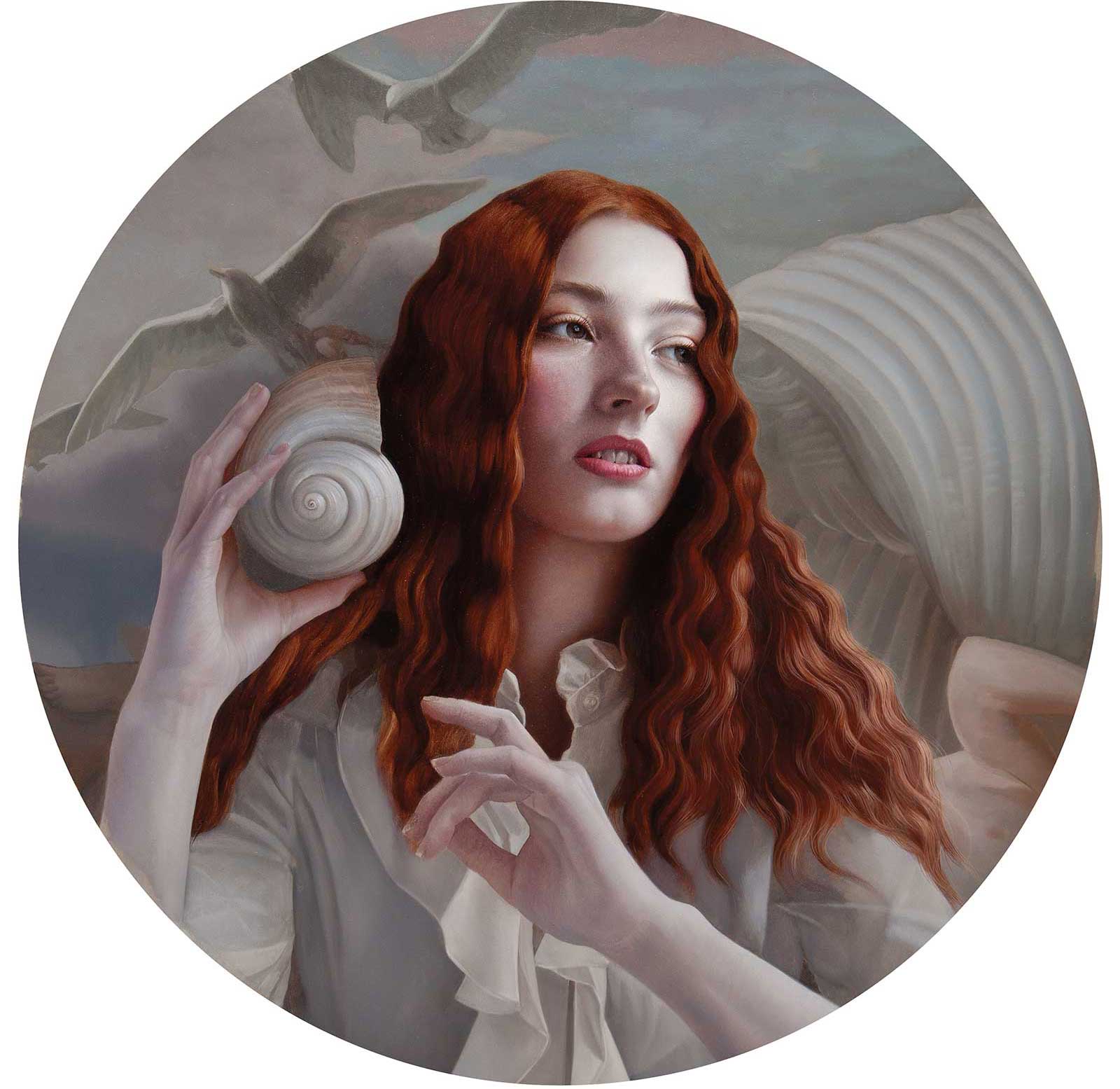
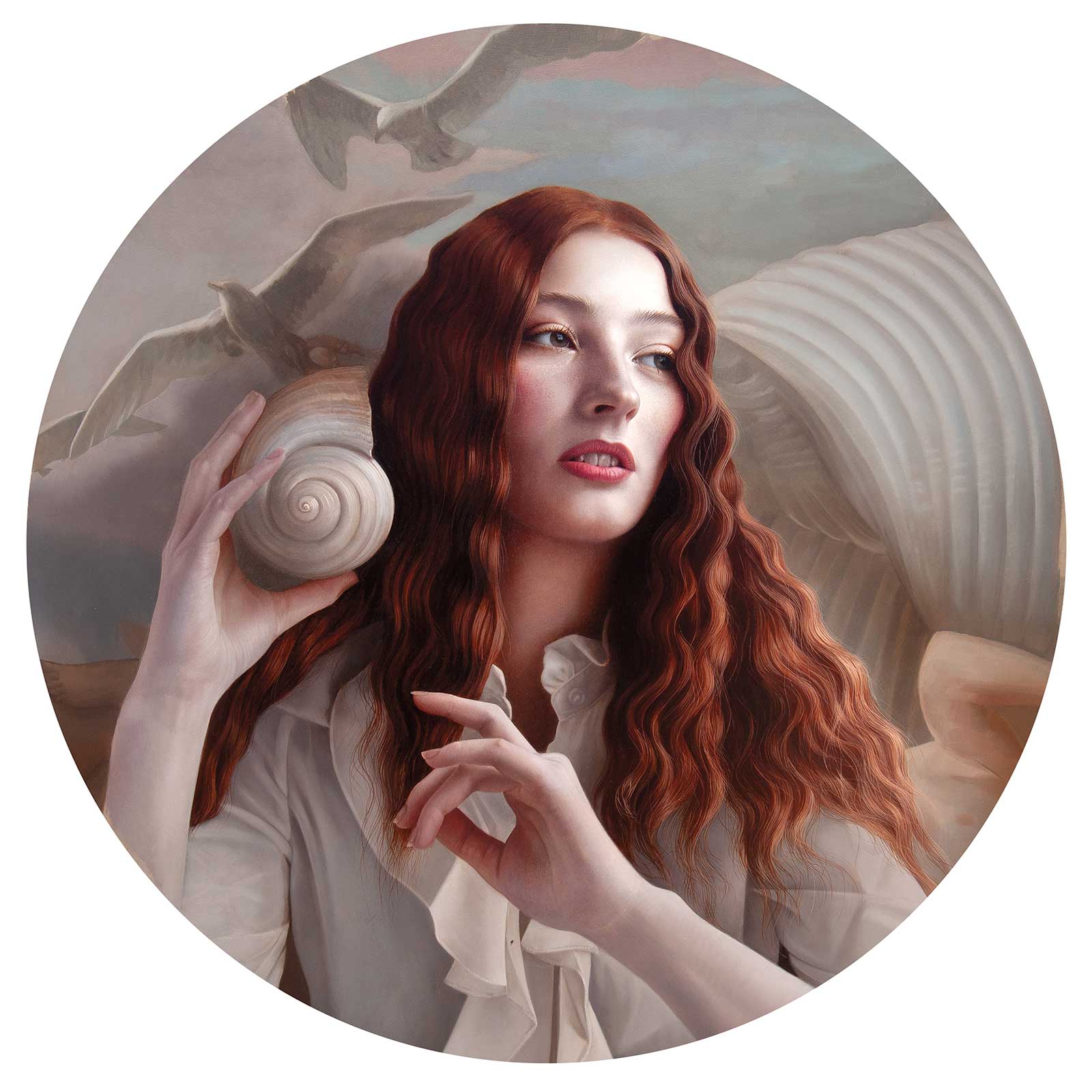
I very often use a close central focus and balance in my compositions to draw the viewer into the sitter in an intimate way, focusing on their inner thoughts. Then I like to create flow around the painting by drawing your eye from background to foreground, using areas of light and shadow and repeating shapes to highlight a symbolic element or design.
Palette
The color palette I choose for a piece is another important way of reinforcing an idea. For example in the demo, I chose a muted palette to echo the pastel hues of the Rococo sky, which in turn refers to the iridescent shades of the inside of the shell she’s holding, then I brought those shades into the skin tones to accentuate her alabaster coloring.
Narrative
The genesis of ideas for me so often starts while I’m reading, as both fiction and non-fiction inspires me. So often the ideas for paintings simply start out as a few lines of text, a series of thoughts or multiple sides of an idea. Later, those ideas morph into images in my mind, some fully realized, others to be found as I work with my models in the studio.
Props and Costumes
Over the years I have collected dozens of props and costumes, seeking out the items I need from places as diverse as the costume department of the Royal Shakespeare Company (as in the breast plate featured in Fortitude) to online auctions, antique markets or simply found or made items. They become a library of symbols that I can draw upon that evolve over time.
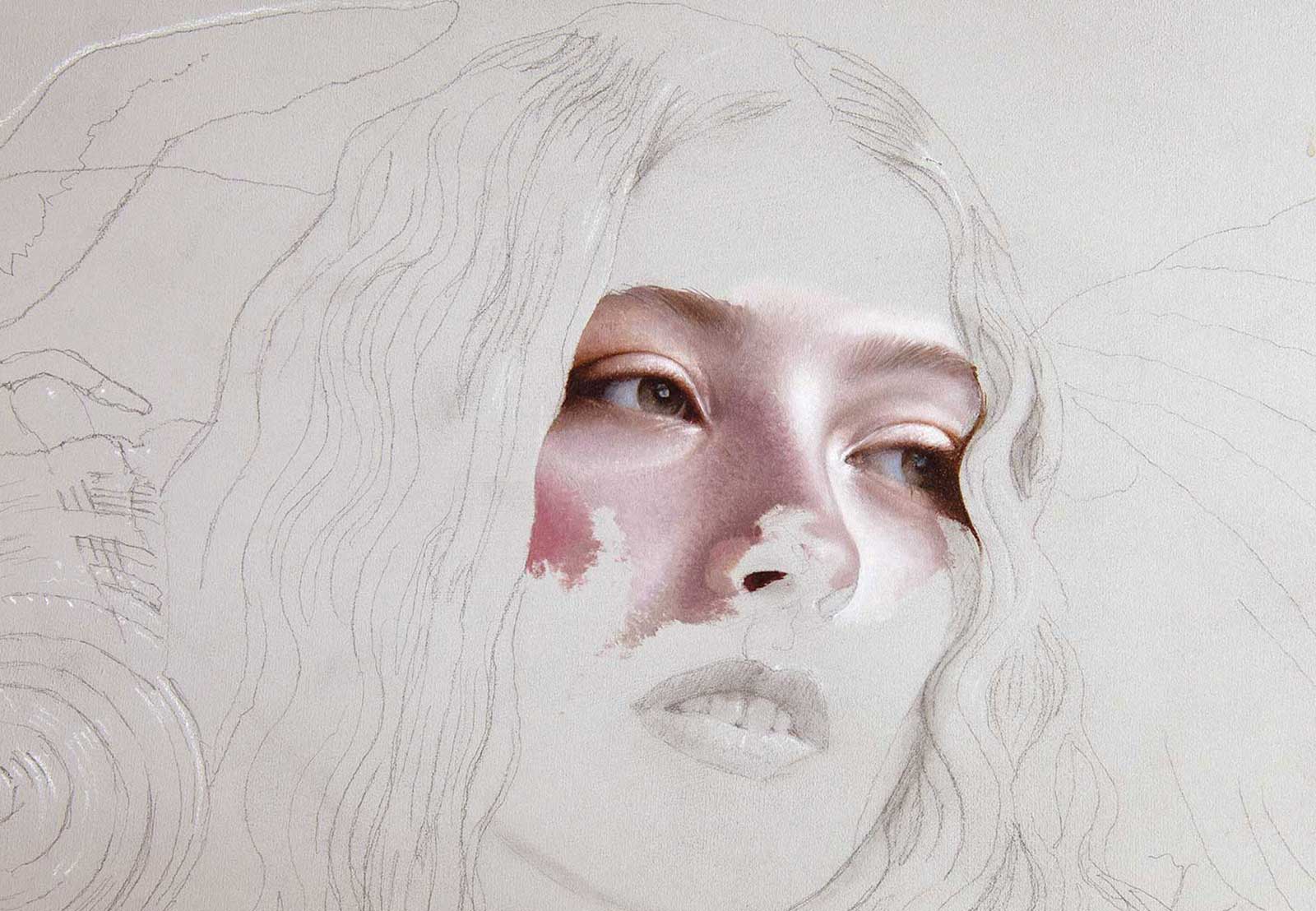
Stage 4
Stage 4 Feeling My Way
It proves to be a slower start than usual. The ground despite its name is more absorbent than I am used to so I take my time over a day or two establishing the features.
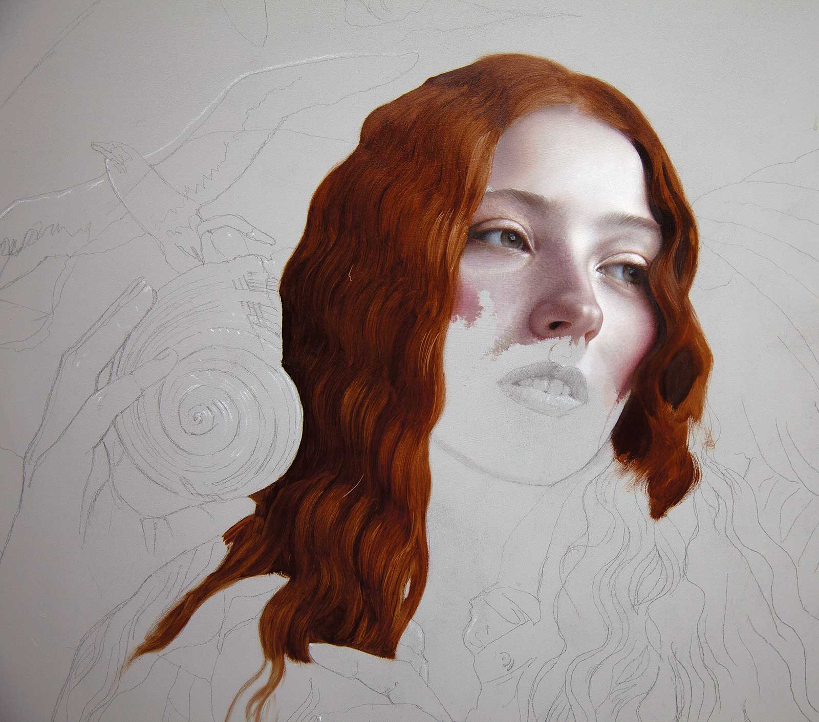
Stage 5
Stage 5 Laying in the Hair
Using a combination of burnt umber, crimson lake and ivory black, I start to create the structure of the hair, lifting out a little paint here and there with a dry brush to create the impression of hair strands.
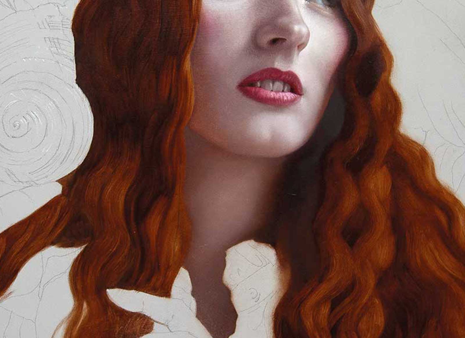
Stage 6
Stage 6 Establishing the Mouth
As John Singer Sargent supposedly said, a portrait is a painting with something a little off around the mouth, and an open mouth holds pitfalls for many a painter. So, I take my time. I’m also beginning to establish an area of darkest dark in the shadows around the neck.
Stage 7
Stage 7 Knocking Back the Gray
I’m finding the darker gray value too neutralizing so I decide to warm it up for the background area. This is also useful as Souter’s painting utilizes a warm underpainting, which he allows to show through his paint layers—warming the blues in his sky.
Stage 8
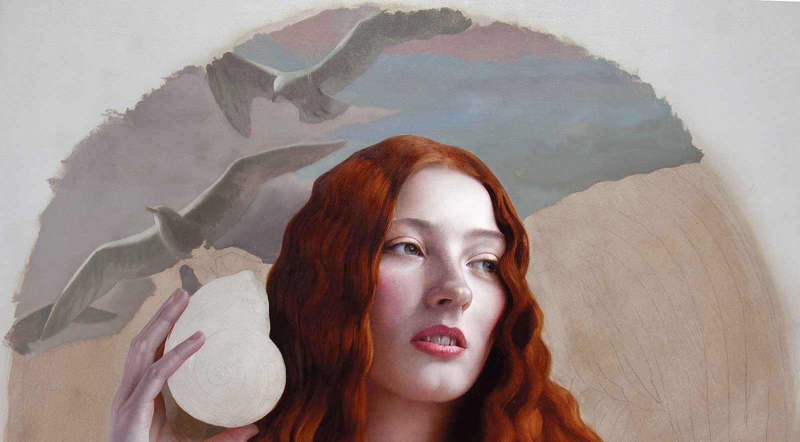
Stage 8 Laying in the Sky
Using the warm tones in the sky area, I lay in full-bodied paint with wide one stroke, synthetic flats softening the edges slightly with a soft synthetic fan brush. This serves to optically knock back any details in that area and stop them jumping forward.
Stage 9
Stage 9 Working on the Shell
Using the wider one-stroke synthetic brush, I draw in the structure and lines of the shell. I’m not looking to model too much at this stage, as I know I will be making at least another two or three passes in increasingly finer detail over this and almost every area of the painting in the days to come.
Stage 10
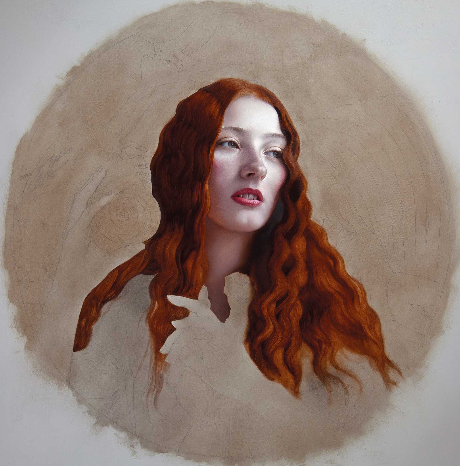
Stage 10 Second Pass on the Hair
I begin to work into the hair, testing out some new Prolene Proarte riggers. They are tempting me to get a little too detailed with the hair but are impressively controllable. I typically use soft synthetics, which I cut down to just a few strands to add final detail in the hair. I will continue to test out which method I prefer here.
Stage 11
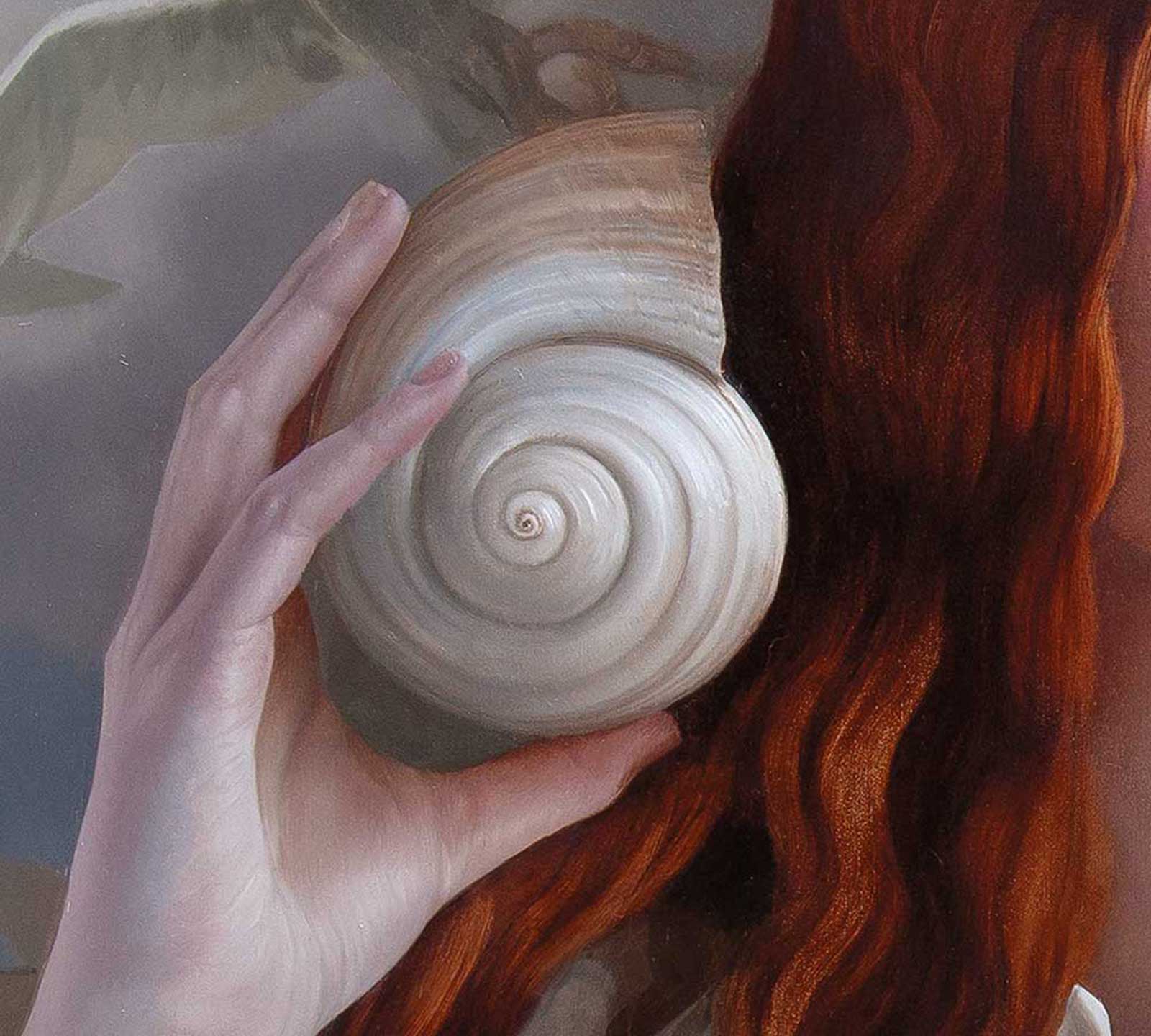
Stage 11 Beginning to Balance
With the whole of the piece now blocked in I can begin to revisit areas. I start to glaze the shell in the background with a very thin layer of burnt umber and ivory black, modeling it and warming its color as its form turns.
Stage 12
Stage 12 Final Details
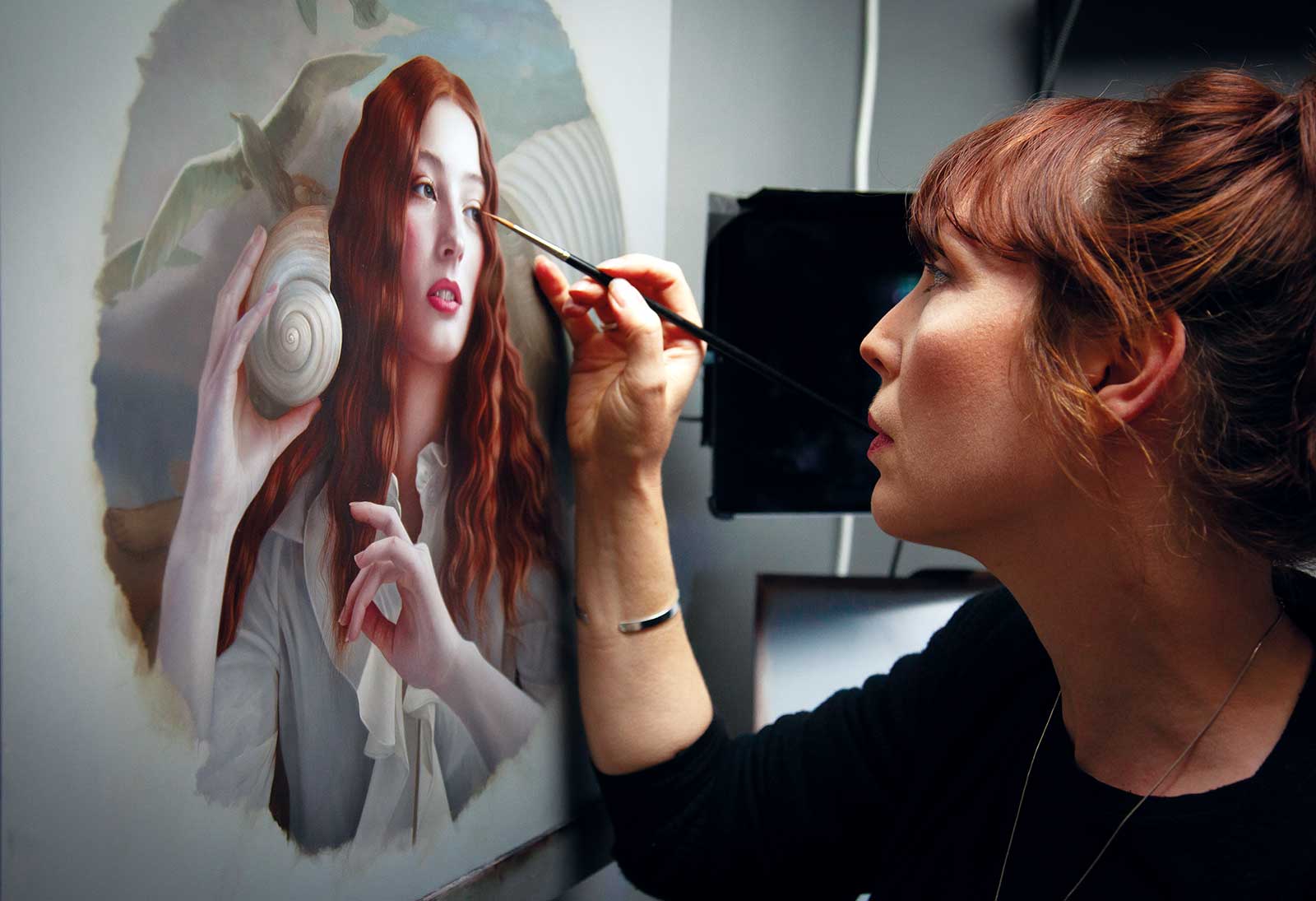
Naissance V, oil on aluminum panel, 18½" (46 cm)
Typically a painting will take me many dozens of hours and be made up of anywhere between two to six layers of paint. Using a combination of glazes and full-bodied paint, I like to build up a surface quality that is both tactile and enamel smooth. In my final layers I’m also harmonizing the design of light and shadow across the painting, subtly shifting hues and values where needed until I reach the effect I’m after.
About the artist
 Mary Jane Ansell
Originally studying illustration, Mary Jane Ansell quickly discovered her real passion resides in portraiture and painting the human form. She creates narratives layered with symbolism described in intricate, painterly attention to detail.
She recently moved from her Brighton studio with her musician partner of 30 years, to North Wales, close to the mountains of Snowdonia. Her works feature on the covers of numerous books and magazines and in collections worldwide including the National Portrait Gallery in London, Brighton Museum, Joe Lewis Foundation and The Bennett Art Collection. A member of the Contemporary British Portrait Painters Exhibition, she has been selected four times for the prestigious BP National Portrait Award as well as the Royal Society of Portrait Painters and Threadneedle Prize.
She recently gave her first painting workshop in Tuscany this October 2 to 8. (www.artescapeitaly.com).
Represented by
Arcadia Contemporary, New York, USA, www.arcadiacontemporary.com
Fairfax Gallery, United Kingdom, www.fairfaxgallery.com