



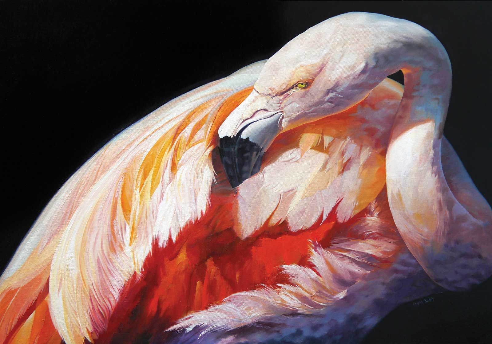
 Keeping Up Appearances, oil on canvas, 21.6 x 31.4" (55 x 80 cm)
Grand Prize
Grand Prize is a four-page editorial feature in American Art Collector magazine
Emma Swift—Somerset, UK
Colorful and Inquisitive
Full of curiosity and bright shocks of color, Emma Swift’s artwork seems to leap off the page. Her wildlife art has a sense of solid structure and form, grounded in realism, and yet delightfully painterly. “I love exploring brushstrokes, textures and color. I enjoy researching my subject and being accurate with details, however, my work is not traditionally photorealistic. Color just seems to work its way into unexpected places,” says Swift, who resides in England.
The artist finds endless inspiration in the natural world, and over the past several years has become involved with a number of conservation charities through her artwork. “This is incredibly rewarding, and I am very happy that my work is focused in this direction,” she says. “There are many talented wildlife artists out there who inspire me, however I also look toward a broad range of art—abstract, landscape, portrait—and I often see styles, colors and techniques that excite me, and I work to translate some of that feeling into my wildlife paintings.”
Swift explains that her winning piece, Keeping Up Appearances, needed a more classic feel due to the dramatic lighting. “However,” she adds, “I love unexpected color—a shocking pink or a bright dash of yellow, colors that maybe ‘shouldn’t be there’ but somehow work. I often use an oversized brush, a palette knife, and sometimes I cut out stencils to bring an unexpected effect to the canvas. Wildlife is inextricably linked to its environment and other species, so I don’t view the subject and background as separate entities. In my paintings, there is an element of connecting them together through color.”
She continues, “I feel like my painting is always developing. There’s constantly an element of experimenting and not standing still as I explore new ways of creating imagery to reflect my love of the natural world.”
My Inspiration
While photographing birds on a visit to a local Wildfowl and Wetlands Trust site in the UK, I observed a flock of flamingos relaxing. They had wandered into their inside shelter, so the lighting was dark, and I was taking shots through a cloudy window. Despite the less-than-ideal conditions, there was a shaft of light cutting through the darkness, spotlighting the birds. This provided a moment of high contrast, which brought to mind the effect of “chiaroscuro.” It was just begging to be painted.
My Design Strategy
Out of this mass of pink plumage, big bodies, twiggy legs and long necks, I wanted to isolate one individual from the flock. The close crop helps to focus in on this immense and distinctive beak performing the incredibly delicate process of preening. Much time is spent maintaining feathers —removing dust and pests, realigning each barb, applying oil for waterproofing—and I wanted to capture this one behavior. The complexity of feather-layers on any bird is incredible, but, on this flamingo, this moment reveals the layers of color from white to pale pink, from vibrant orange-red to black.
My Working Process
I darkened the background of the original image in Photoshop and increased the contrast to make the flamingo “pop” more. Despite feeling confident about how I wanted the final painting to look, I used loose canvas taped to a board which gave me a little flexibility to change the crop of the final piece if needed. I have 25 years experience as a graphic designer, so playing with composition is all part of the process.
Although I used a grid to transfer the image onto the canvas, I don’t paint square by square. I “attack” the whole surface with paint and, although it appears detailed, there are areas where the color alone does most of the work. On closer inspection, the bright orange-red area is loosely painted. Using a brush, just a little too large, or the drag of a palette knife across the canvas can result in exciting strokes and textures which I like to leave in.
Contact Details
Email: emma@idopictures.co.uk
Website: www.idopictures.co.uk
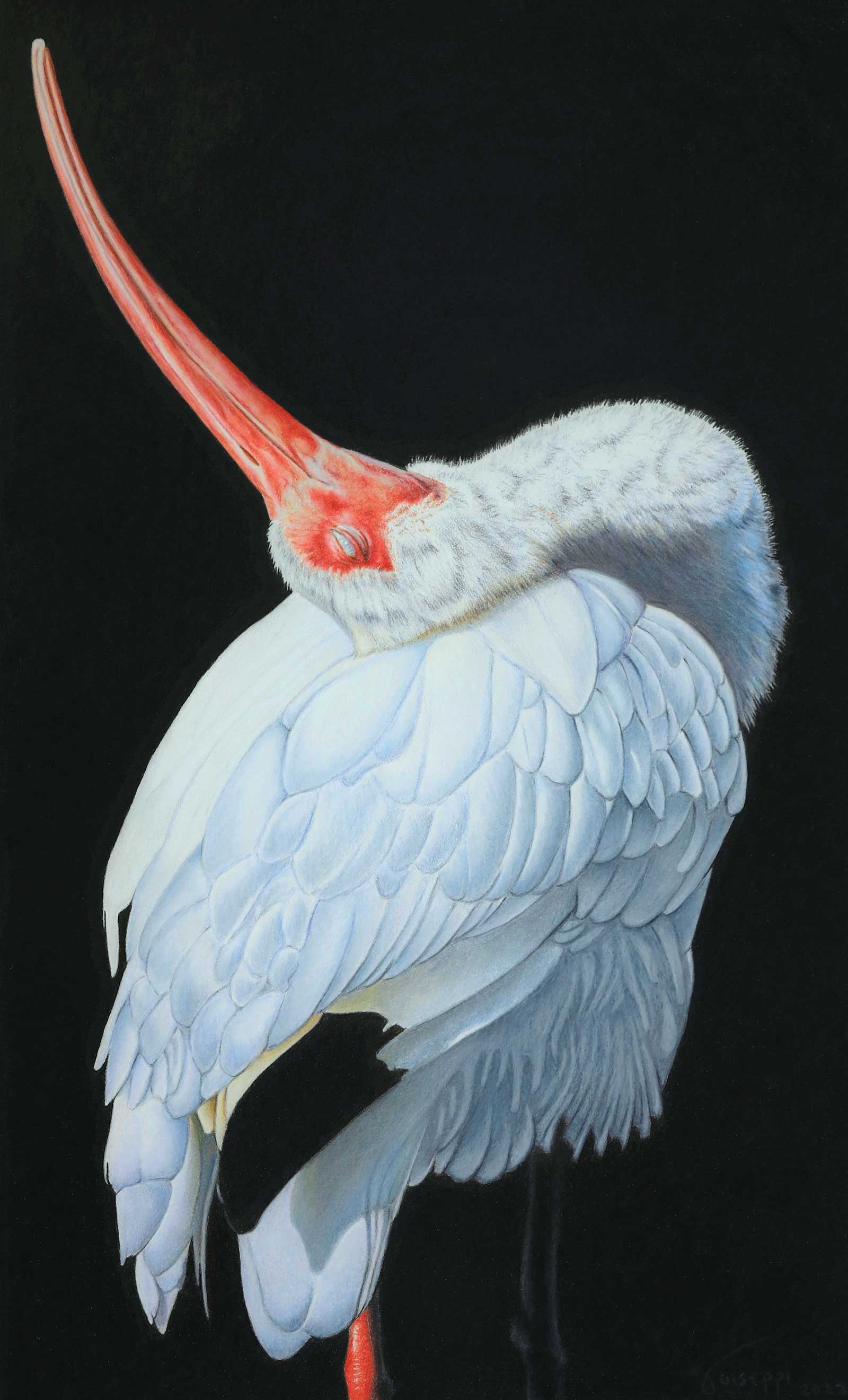 Strike A Pose - American White Ibis, Prismacolor and Polychromos colored pencils, 18 x 11" (45 x 27 cm)
Second Prize
Second Prize is a two-page editorial feature in American Art Collector magazine
John Guiseppi—Florida, USA
My Inspiration
Adult white ibis are mostly white with black-tipped wings, a reddish colored face and legs, and a very distinctive down-curved, pink bill which is used to probe the ground for food while foraging. It was that beautiful and distinctive coral colored bill that caught my attention for this piece. The upward turned bill and this magical pose during preening, it reminded me of a model striking a pose during a photoshoot. I knew from the first time that I saw my reference photos, it was the moment frozen in time that I wanted to capture.
My Design Strategy
As in most of my art, I strive to simplify the process of line, shape, color and composition. In this piece, the beautiful coral bill suggests a starting point and immediately leads you down to the main subject—with all of the intricacies of the feathers, direction and color. I wanted them to all mesh, not drawing you to any one specific area and becoming stuck. If you look closely, the bill, feathers and body shape all have a flow. The back leg—barely visible and without much color—provides balance, but it doesn’t take away from that flow.
My Working Process
I use my photography as reference to capture the moment that others miss, don’t see or notice. Once I have the reference photos, the drawing process begins. I’ll produce a line drawing, making tweaks and adjustments along the way for a strong composition. I like dark backgrounds, and use Faber-Castell black Polychromos for the solid blacks. For the rest of the drawing I primarily use Prismacolor Premier pencils. I pay close attention to lightfastness ratings of the pencils that I use. You don’t want to spend 50 to 100 hours on a drawing and have it fade away.
Contact Details
Email: j.guiseppi@yahoo.com
Website: www.johnguiseppi.com
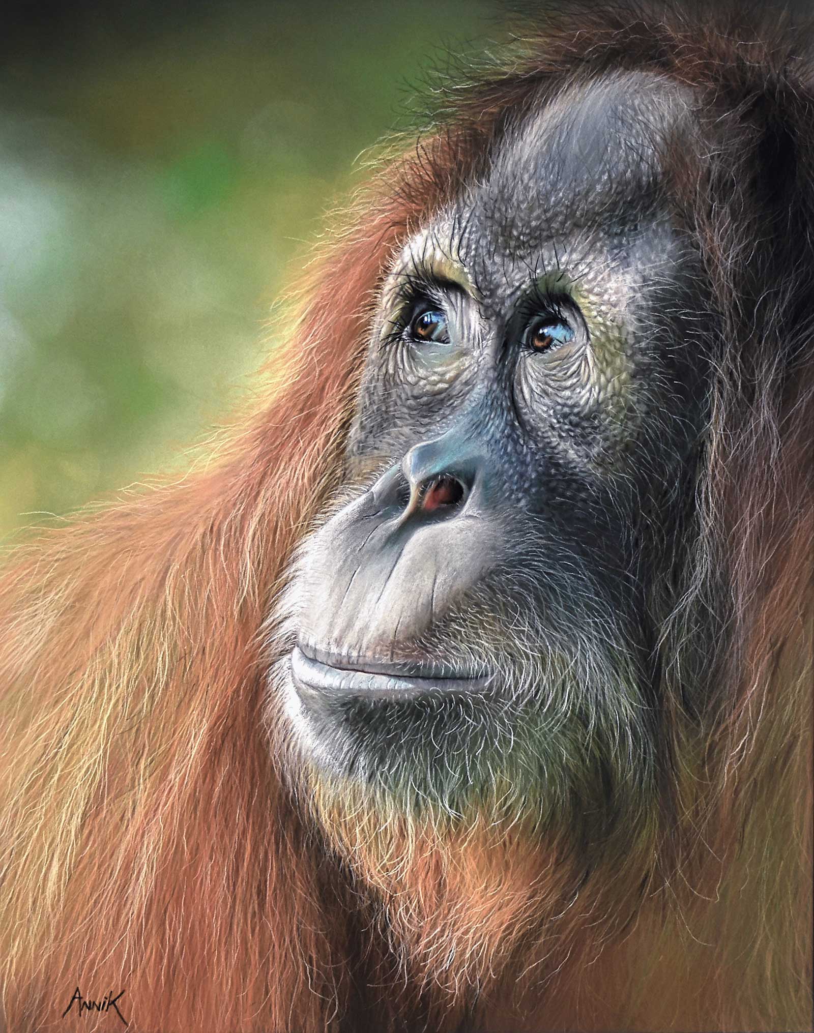 Dreaming, PanPastel and pastel pencils on Pastelmat paper, 20 x 16" (50 x 40 cm)
Third Prize
Third Prize is a one-page editorial feature in American Art Collector magazine
Annik Janssens—East Flanders, Belgium
My Inspiration
All my life I have had a huge passion for animals and everything that has to do with nature.
I strive to convert my passion for animals into realistic portraits where I try to approach the character of the animal as much as possible. I often draw endangered species and want to include a message. A message of awareness of the threats that hang over many of these species.
I work photorealistic to be able to portray the character of the animal as well as possible. Images say so much more than words. The viewer has to want to touch the animal, to feel it.
My Design Strategy
As reference I use either my own photos or photos by photographers I have the authorization to use. These photos must touch me, they must have feeling and passion, and often it is the look in the eyes that does it! With Dreaming, I want to give a positive message. Orangutans are critically endangered because of poaching and deforestation. Fortunately, more and more people are aware of this and action is being taken. This guy is dreaming of a better future.
My Working Process
Starting a painting I take great care to ensure that the proportions are perfect. I always start drawing the eyes. I think the eyes are the most important part in a portrait by the way, whether it is a dog or an elephant, the eyes are the mirror of the soul. I work in several layers, from dark to light, in order to be able to show the structure of the fur or feathers as well as possible. For the lower layers I use soft pastel or PanPastel. Afterwards I work with pencils of different brands and hardness for further detailing.
Contact Details
Email: annik.j@skynet.be
Website: www.annikanimalart.com
Finalists
Each receives an Award Certificate and a one-year subscription to International Artist magazine PLUS having their work seen worldwide by international galleries looking for new talent.
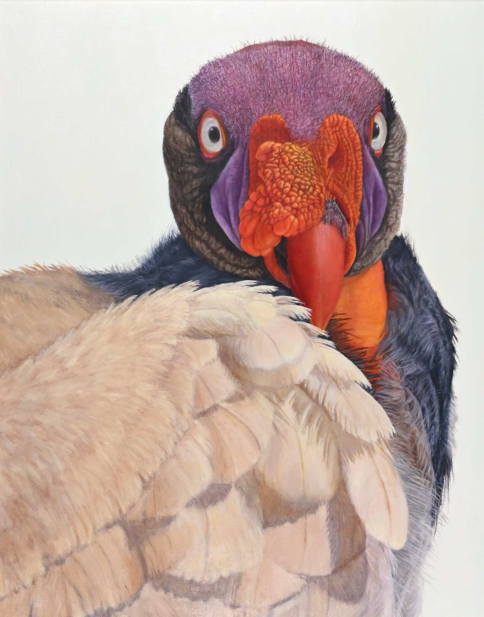 The Ferryman, oil on linen, 20 x 16" (50 x 40 cm)
 Mary Cornish—Virginia, USA
My Inspiration
I’ve always been intrigued by birds, especially those not considered beautiful, including vultures and condors. It’s fun to speculate that they are the modern dinosaurs that live among us. This bird, the king vulture, is found in Mexico and Central America. They were revered by the Maya as messengers between this world and the underworld. When selecting the title, The Ferryman, I saw a connection between Virgil’s Charon (the ferryman) and the Mayas’ messenger.
My Design Strategy
My design strategy begins with seeing the actual animal, their appearance and demeanor. I do take photos for reference, but don’t rely on them completely, since it can create problems with the final painting. I challenged myself by painting a “full face portrait.” I turned his neck slightly to give him a regal appearance. I strive to paint realistically in order to engage the viewer to take a second look at these amazing birds.
My Working Process
A preliminary drawing allows me to resolve most problems before painting. I use the indirect method, starting with a dead layer, drawing on the support with oil, followed by a color block-in, sometimes in complementary colors. Doing this creates a visual vibration of color mixing as the layers are built up. The third and following layers concentrate on form, light, texture, and color value. My final layer adds the finishing touches.
Contact Details
Email: cornishgraphics@comcast.net
Website: www.marycornish.com
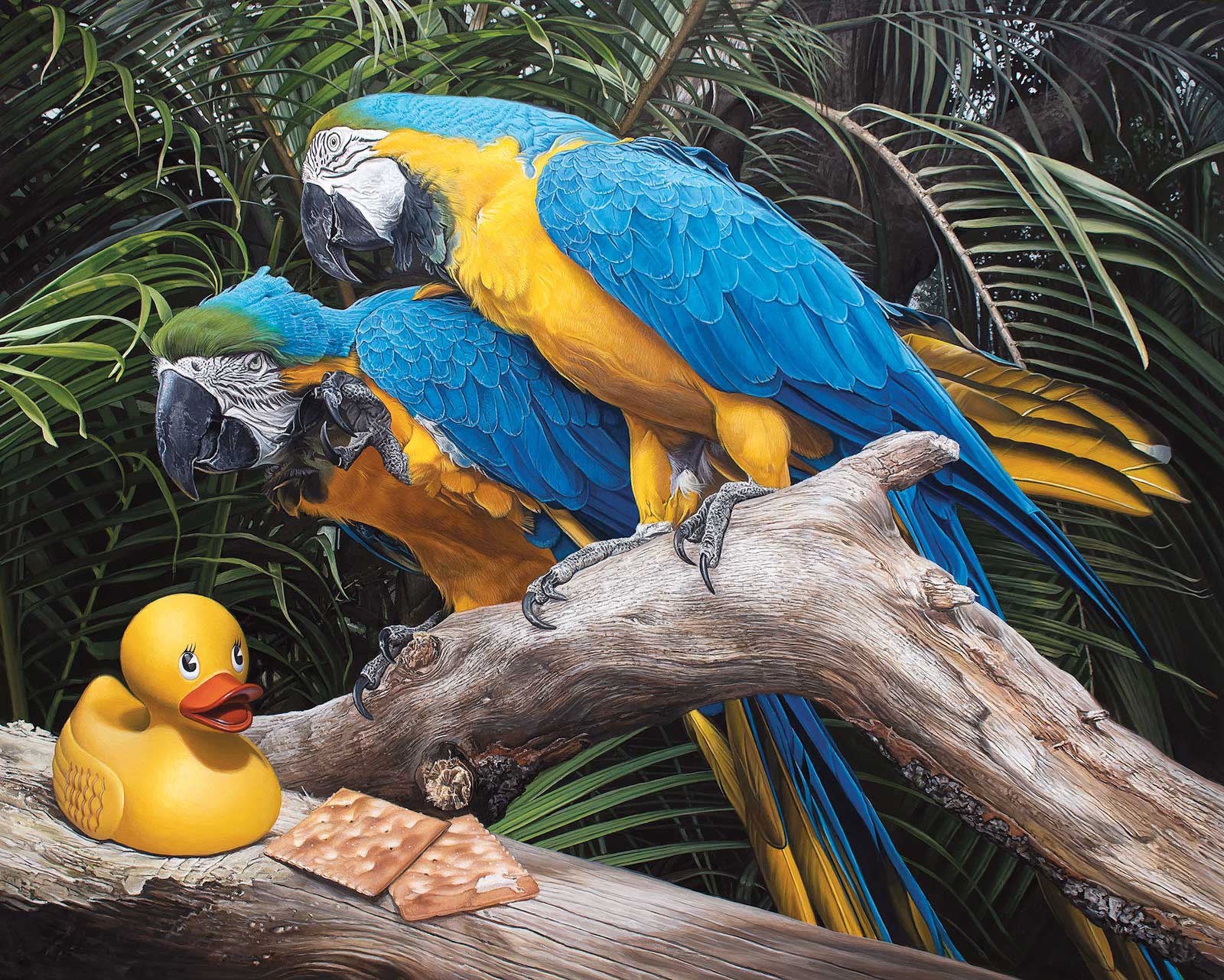 Polly Wanna Quacker, acrylic on an aluminum panel, 16 x 20" (40 x 50 cm)
Kevin Grass—Florida, USA
My Inspiration
Polly Wanna Quacker is part of a series called Lame Ducks, which features rubber ducks in a variety of narratives inspired by idioms or phrases that include the words duck, quack, fowl, bird or their homonyms. These visual puns are often worthy of inciting groans, hence the inclusion of the word “lame” in the title for the series. The idea for this painting came from Nabisco’s slogan for its saltine cracker: “Polly wants a cracker?”
My Design Strategy
Photographic references were my best option because I was working with landscape and live animals. I decided to use a photograph that my wife took of two macaws at one of Florida’s theme parks because I really liked the interaction between the two parrots. The background is based upon photographs of areca palms in my backyard. The images were combined in Photoshop to create the final design.
My Working Process
I began with a careful full-color block-in so that significant corrections would not need to be made in later stages. The depth and richness of the colors were heightened by increasing the translucency of each successive layer of acrylic paint. A final glossy varnish was added several weeks after the painting was finished to protect the surface and to improve contrast, color intensity and luminosity.
Contact Details
Email: fineartfan@hotmail.com
Website: www.kevingrass.art
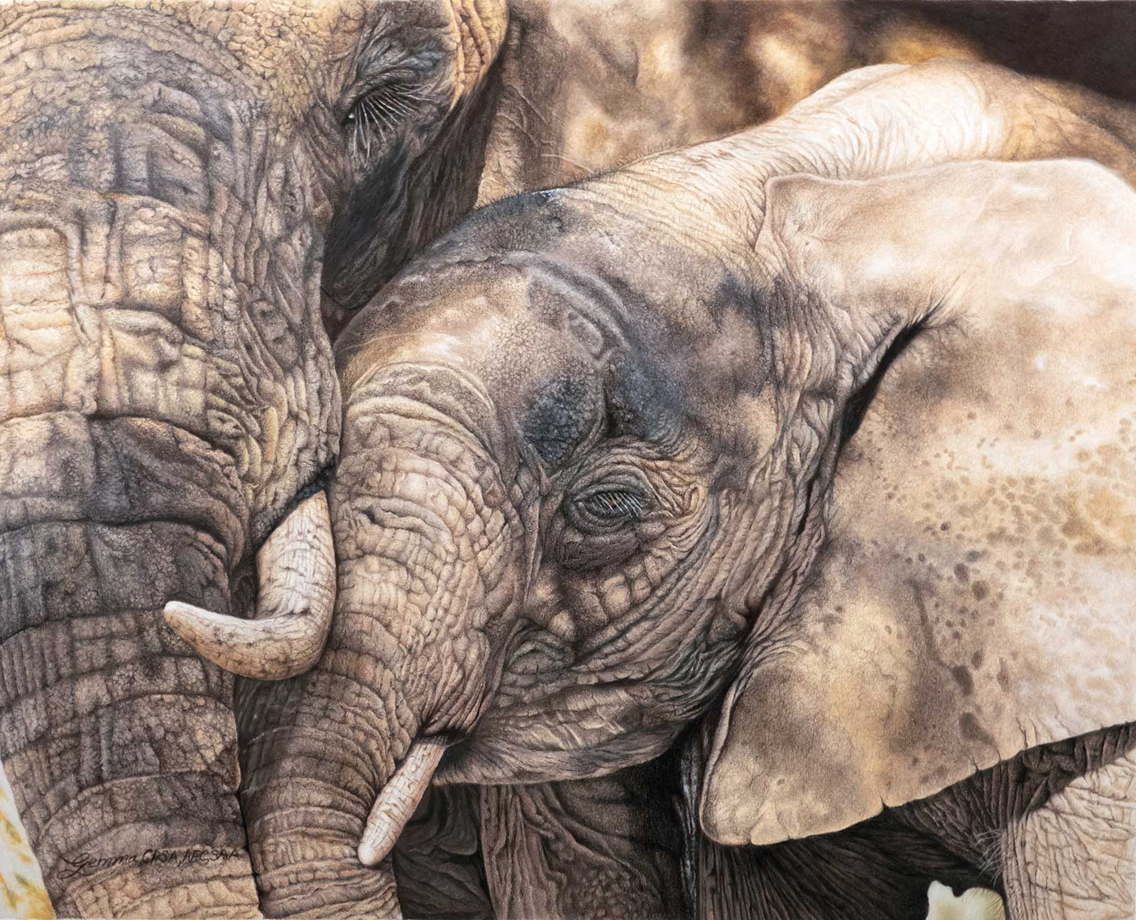 They Love, They Play, They Mourn - Save Them, colored pencil on Bristol vellum, 16 x 20" (40 x 50 cm)
Gemma Gylling—California, USA
My Inspiration
The experience of being up close and personal with these creatures will be something I will never forget. Every morning the herds of elephants would come to drink, bath and interact with one another. It was so much fun to see how they care for their young and how the young would play with each other. The trumpeting and noises were incredible. The whole experience was so inspiring!
My Design Strategy
A hint of light coming through the leaves, causing the beautiful warmth and shadows on their faces, is one of the things I look for in my design decisions. That very special moment is what I try to capture and then, to pass on to the viewer, the emotion I felt when I laid my eyes on that moment in time. I decided to do a closeup of the two elephants, so the viewer could explore the emotion and understand what these magnificent beings have been through.
My Working Process
After taking numerous photos, I go through them, to find the image I like best. Sometimes I will combine several photos but, in this case, the one image was what I wanted. I then use that photo to create a contour drawing, using a grid system. Once my contour drawing is done, I then transfer that contour to the Bristol vellum. I start in the upper left-hand corner by layering several layers of colored pencil and continue to work from left to right and top down.
Contact Details
Email: gemma@glassgems.net
Website: www.glassgems.net
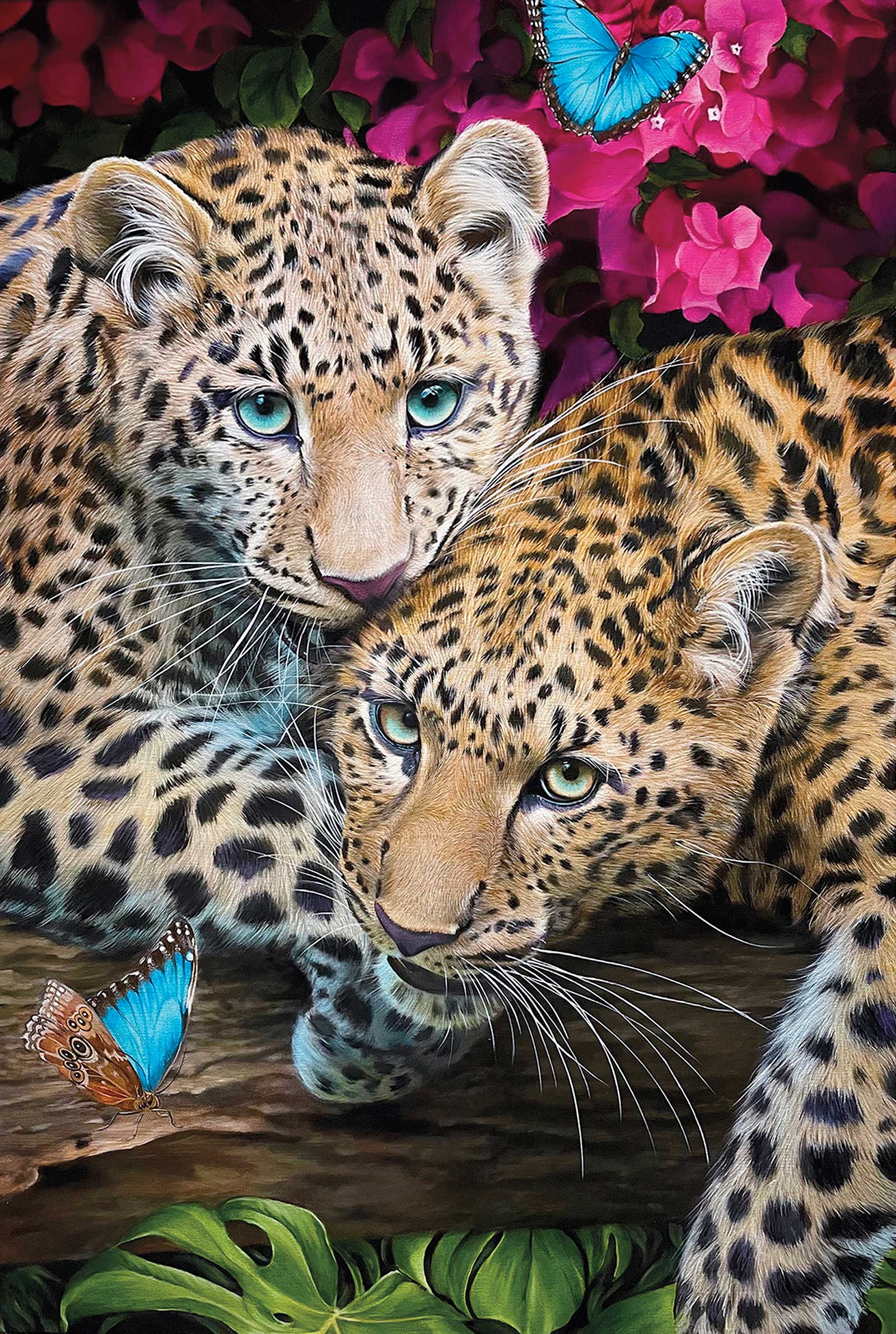 Love Bite, oil on canvas, 36 x 24" (91 x 60 cm)
Kelley Sutphin—California, USA
My Inspiration
Animals have always been a sort of muse to me. They embody aspects within ourselves that have been worn away due to modern life. I see them as having a divine quality like sacred beings that reflect back to us our own nature. The way humans are affecting the planet is very concerning to me, and when I am not working on commissions for pet portraits and illustrations I try to incorporate endangered species into my fine art pieces whenever possible.
My Design Strategy
When I paint wildlife, my go-to for images is a handful of photographers I follow on instagram that sell licensing for artistic use of their images. I found this particular image of a mother African leopard and her cub to be very eye-catching. The dynamic criss-cross of their bodies created a perfect way to draw the eye in and let it wander amidst the spots and soft fur. I’m a color enthusiast and adding the magenta azaleas into the background created a beautiful mix of pinks and golden fur. I needed to add another species that was facing habitat loss and decreasing populations so I chose the blue morpho butterfly that is suffering from over collection due to its rare beauty. The iridescent blue sheen of the wings complemented the blue green color of the leopard’s eyes beautifully.
My Working Process
For this painting, I used a gallery wrapped canvas with two layers of gesso, sanded between the layers. To keep the saturation in the flowers as strong as possible I used pure pigment glazes of quinacridone magenta over an untoned canvas with only some final glazes of ivory black over the areas I wanted to push back. To get the depth and fine quality of the fur I used a sword liner brush and started with a dark base, getting progressively lighter as I reached the top layers where light would hit it.
Contact Details
Email: kellyduda1984@gmail.com
Website: www.instagram.com/kelleypaints
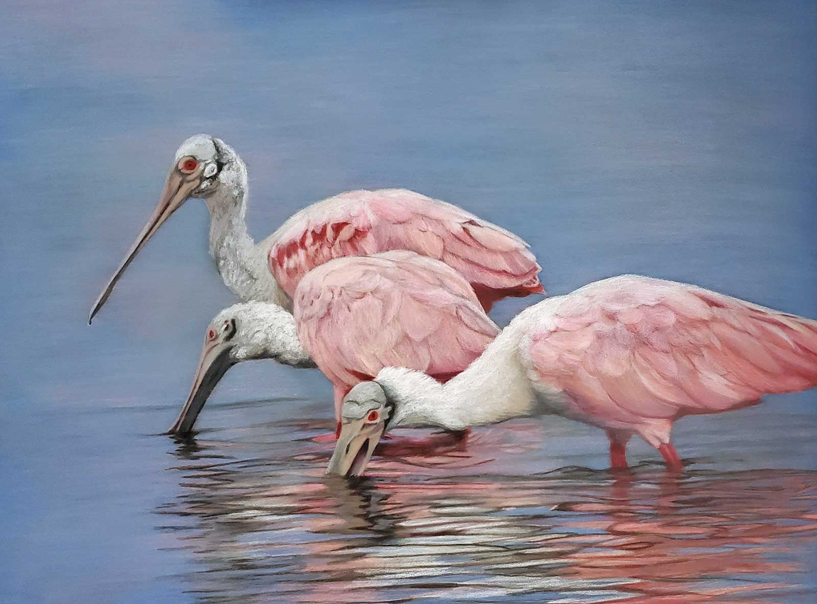 Just a Spoonful, watercolor pencil on Ampersand Pastelbord, 18 x 24" (45 x 60 cm)
Patsy Lindamood—Texas, USA
My Inspiration
Originally, I began drawing birds on a dare. A business friend of mine who saw some of my early wildlife sketches insisted I should try my hand at birds. I did. From those early efforts I developed not only a passion for drawing birds, but for birding and the conservation of the bird population. Finding a sought-after specimen in favorable photographing conditions is a thrill outstripped only by creating a compelling art based on my resulting photography.
My Design Strategy
My process begins with finding a strong reference photo. When birding, I attempt to take photos with a painting composition in mind. For Just a Spoonful, I sought a shot with an odd numbered grouping in varying positions of feeding, preferably with a preeminent reflection. The spoonbill on the far right is partially outside the frame to enhance a sense of the birds moving into and through the frame.
My Working Process
Watercolor pencil on Ampersand Pastelbord requires significant layering to achieve strong color and dimensionality. First, I lay in the darkest darks, next the lightest lights, then work between the two to control the values of the piece. In similar fashion, I work between foreground and background to control the hues and values as well as to control edges. Viewing work in progress photos on a large monitor through the process helps to reveal problematic areas that are not otherwise obvious.
Contact Details
Email: lindamood@lindamoodart.com
Website: www.lindamoodart.com