


As a professional artist since the age of 13, my favorite subject has always been people. As an educator since 1986, the one question I get from students repeatedly is how to draw and paint a likeness. People are difficult only in that we are extremely objective about likeness, proportions, emotional connection, etc. Empathy is one of our greatest assets as artists and as teachers. So, in these exercises and demonstrations, I chose a subject that I am very familiar with—my face. I set up some light sources in my studio, one being natural north light, as this is a traditional approach to creating cool highlights and contrasting warm shadows. The other portrait was set up using a warm incandescent light with a soft diffuser. In both cases I wanted to create the look of an Old Masters painting.
In order to get a good likeness, I have developed a simple approach that is based on the alignment of the facial features, e.g. eyes, nose, mouth, ears and tilt of the head, as well as proportions. Using the head height as my unit of measurement, I break down the proportions of the major facial features, and using “artistic license” I adjust for vanity. I will then use these sketches to transfer the likeness to my painting surface, in this case a Raymar C15DP 11-by-14-inch panel. I like painting the human head smaller than life size.
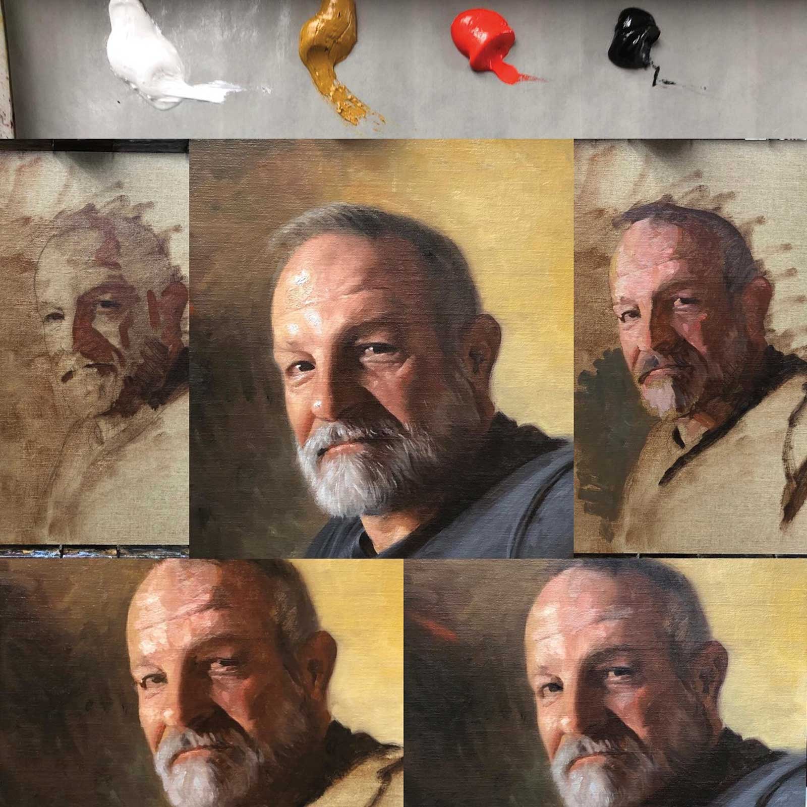 Portrait One
Portrait One
Here, I have transferred the image to canvas (by applying charcoal to the back of the image and then tracing the image using a hard pen or pencil). In this case the panel had been pre-primed with a thinned neutral wash of oil, which had been allowed to dry. I keep several pre-primed panels around the studio. Color is one of the hardest disciplines to master for students, so I’ve learned to keep it simple. Harmony is created by simply limiting the number of colors to paint with. Here I am using the well-known Zorn Palette of white, yellow ochre, cadmium red light and ivory black. This is a great palette for painting skin tones from light skin to medium and dark-skinned tones as well. Working in the alla prima method, I quickly establish the shadow patterns, painting from dark to medium values with a thin and translucent application and consciously keeping the tones warm. I then move to the halftones, where the color is most intense and then build the highlights. It’s at this turning into the light that my paint purposely gets thicker and more opaque. Remember, yellow ochre has a lighter value, so I use it to lighten the value before adding white. Note: If you add white or black it has an effect of cooling the color temperature, so I resist the urge to add white too soon. Before I paint in my lightest lights, I establish the background values. Here I employ the famous Chiaroscuro technique as a way to bring the face forward and create interest. Notice the dark cool color of the background recedes as the warm tones of the face come forward, and the shadow side of the face is kept vague, so as not to garner too much attention and then contrasting with the lighter yellow of the background. The highlights were then added, and it is at this point that the painting started slowing down. Making micro decisions about the eye height, subtle smile, edges of the hair and shadow transitions. The face and expression of the model is the focal point, so I consciously reduce the importance of details or hard edges that might detract. I like to bring up the finish of the painting evenly. I don’t want to have any one part of the painting finished. Remember, harmony is what we are working toward—every part working together to make a greater whole. All in all, this painting was completed in one sitting from start to finish in a six-hour window.
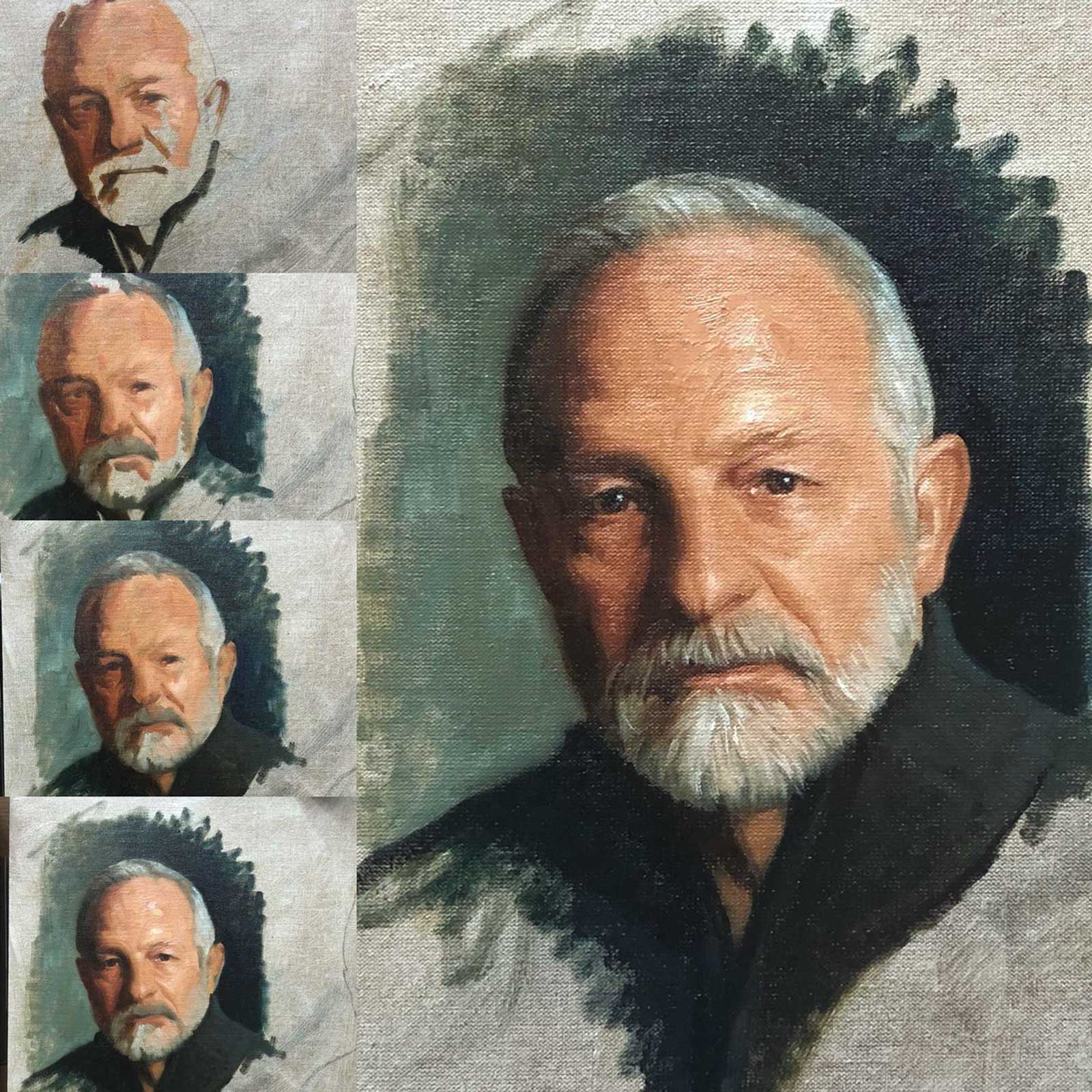 Portrait Two
Portrait Two
Using the same sketch approach to get a likeness that I discussed at the beginning, I transferred my sketch to a pre-primed Jack Richeson oil-primed panel. In this approach I wanted to limit my color choices to a complimentary palette of titanium/zink white, yellow ochre, transparent oxide red and Prussian blue. This is a variation of the often used blue/orange palette of burnt sienna and ultramarine blue. Ultramarine plays well with other colors, and since it is already a warm blue it blends easily with the warm sienna color and produces a very neutral gray when mixed equally. In this color palette I wanted to stretch the color wheel a bit by utilizing Prussian blue, which is a cool blue and adding a neutral yellow ochre. When mixed with the transparent red oxide, I can get a more chromatic orange and when mixed with Prussian blue can achieve a nice range from a cool turquoise to warm blue.
Working the same way as before, I quickly block in the warm shadow shapes. Working the whole painting together, I lay in warm blues for the sweater and right-side background, while transitioning towards a cool turquoise on the left side of the background and right side of the sweater. I establish the chromatic warms in the halftones of the face and build towards more opaque yellows and finally cool white for the highlight. I let the grays of the hair and beard act as a transition area. Also note the cool-to-warm transitions bouncing between green, gray and yellow. This painting was done in the alla prima method and was completed to this stage within a three to four-hour period.
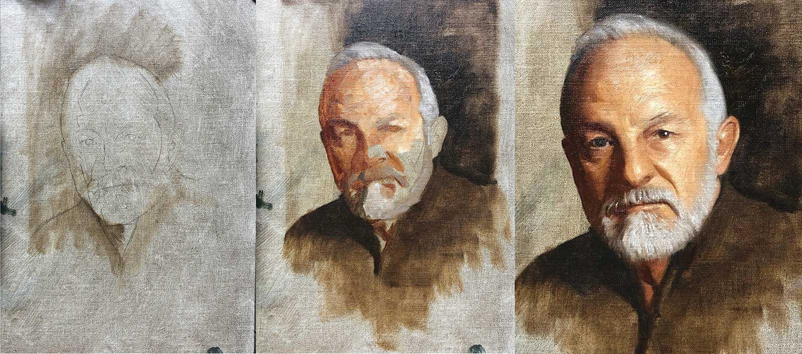 Portrait Three
Portrait Three
This was the same pose as the last portrait, but I wanted to simplify the color choices even more. This is an analogous limited palette of titanium zinc white, underpainting white for the body, yellow ochre, transparent oxide red and raw umber. As you can see all of the colors fall within the yellow and orange spectrum of the color wheel. This is a great approach for an underpainting for a full spectrum color palette. Staining the darks with a thin mixture of raw umber and transparent oxide red and then building up the halftones with a chromatic mixture of transparent oxide red and yellow ochre, transitioning into a thicker yellow ochre and white. In a slightly different approach, I used Winsor & Newton underpainting white, which dries quickly for body and thickness in the highlights. This is a nice effect that gives real dimension to the painting. It’s been said that you can pick up a Rembrandt portrait by the nose, because of the thick paint build-up in the highlights. This approach allows for an easy impasto build up that dries quickly.
Mike Wimmer is an award-winning artist living in Georgia with an international reputation. Wimmer currently serves as professor of illustration at Savannah College of Art and Design in Savannah, Georgia. He maintains his portrait studio in Savannah, where he takes commissions from all over the United States. To see more of his work, visit www.mikewimmerportraits.com, www.mikewimmer.com and www.wimmerswoods.com as well as his Instagram @wimmerartist.—