


Floral painting has such a rich and varied past, it’s something that’s been present throughout art history from the Renaissance painters to the impressionists. I often get asked what it is that draws me to paint flowers, and my answer is always the same: I don’t know exactly, but I do know it’s a lot of things all together. What is it about this subject that attracts me and so many others to paint it? Is it the beautiful color, the texture, the subtleties in values? Maybe it’s the challenge, of which there are many when it comes to painting this difficult subject. Having explored many subjects in my time as a professional oil painter, the joy of setting up a still life or painting a selection of garden roses in bright sunlight is pretty hard to match, both in terms of the satisfaction it brings to see the flowers come together and the challenge that flowers present when painting them.
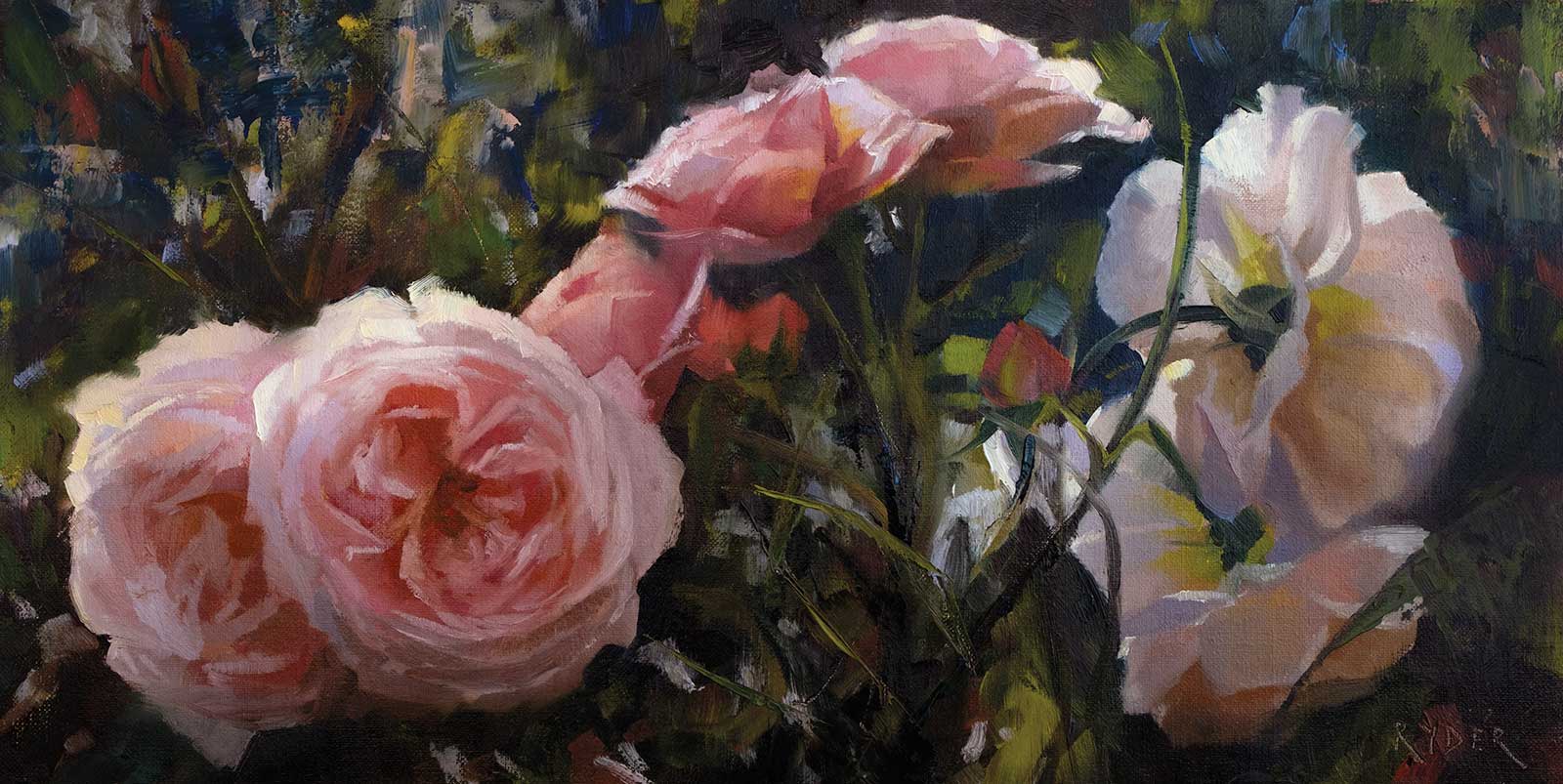
Ascension, oil on linen, 10 x 20" (25 x 50 cm) I really enjoy the panoramic format for floral paintings, this one in particular works well as there is a soft transition of color flowing through the painting giving it movement and rhythm
It gives me an opportunity to truly explore and push color, even changing my palette over time, adding in violets, pinks and cadmiums to focus more on the vibrancy that florals offer. The compositional possibilities are endless as are the textural elements that can be brought into a still life. It’s a subject that can be painted for a lifetime with every painting offering something new. I paint from life and also from photos. Both have their advantages and disadvantages, and I have to say these days I enjoy painting both equally.
When I paint, I am always trying to push myself to bring something new to my work. This means a lot of experimentation and a lot of failed paintings. I welcome the ones that don’t work as much as the ones that do, as they always offer up a lesson that can be put into the next painting, something that has helped to evolve my work to what it is today. I pay particular attention to expressive brushwork in my florals, painting predominantly wet into wet (except for much larger paintings). This allows me to retain freshness in the brushwork and also manipulate edges much more easily.
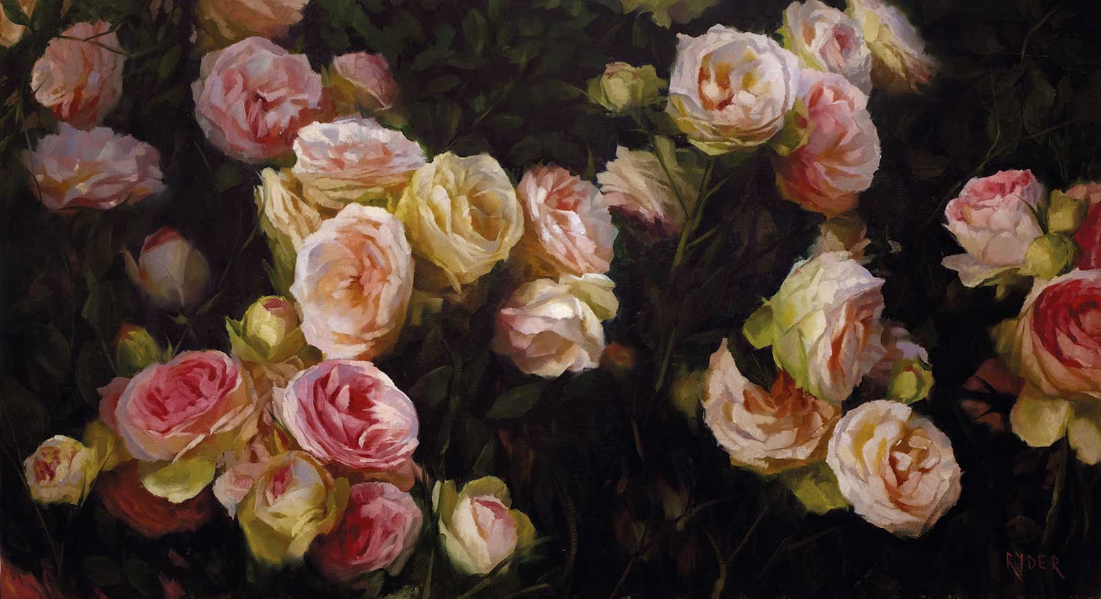
Crossroad, oil on linen, 24 x 43" (60 x 109 cm) This is one of my largest floral compositions and certainly the one with the most roses in it! I really enjoyed focusing on creating color harmony throughout this piece. It was a challenge to be consistent with color and value throughout but certainly worth it in the end.
For me, a successful painting will have both abstract elements and areas of tighter realism, but the true success as I see it is in the color. If I can pack in bright vibrant color and exaggerate what’s really there, while still retaining the authenticity of the subject and have it feel like what I’m looking at, then I’m a happy painter. This of course is a challenge in itself, and only by painting the subject over and over can you begin to grasp what can be pushed and what needs to be left alone.
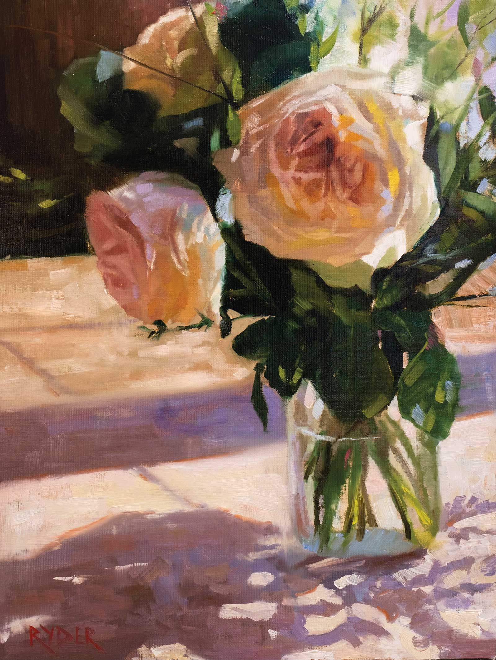
Last of the O’Hara’s, oil on linen, 24 x 18" (60 x 45 cm) I had a handful of surviving O’Hara roses left after teaching a multi-day workshop and decided I’d set them up to do one last painting of them. I really enjoyed painting the bright sunlight and trying to make them look transparent. I played a lot with color on this painting and even tried out a new composition, it was a lot of fun.
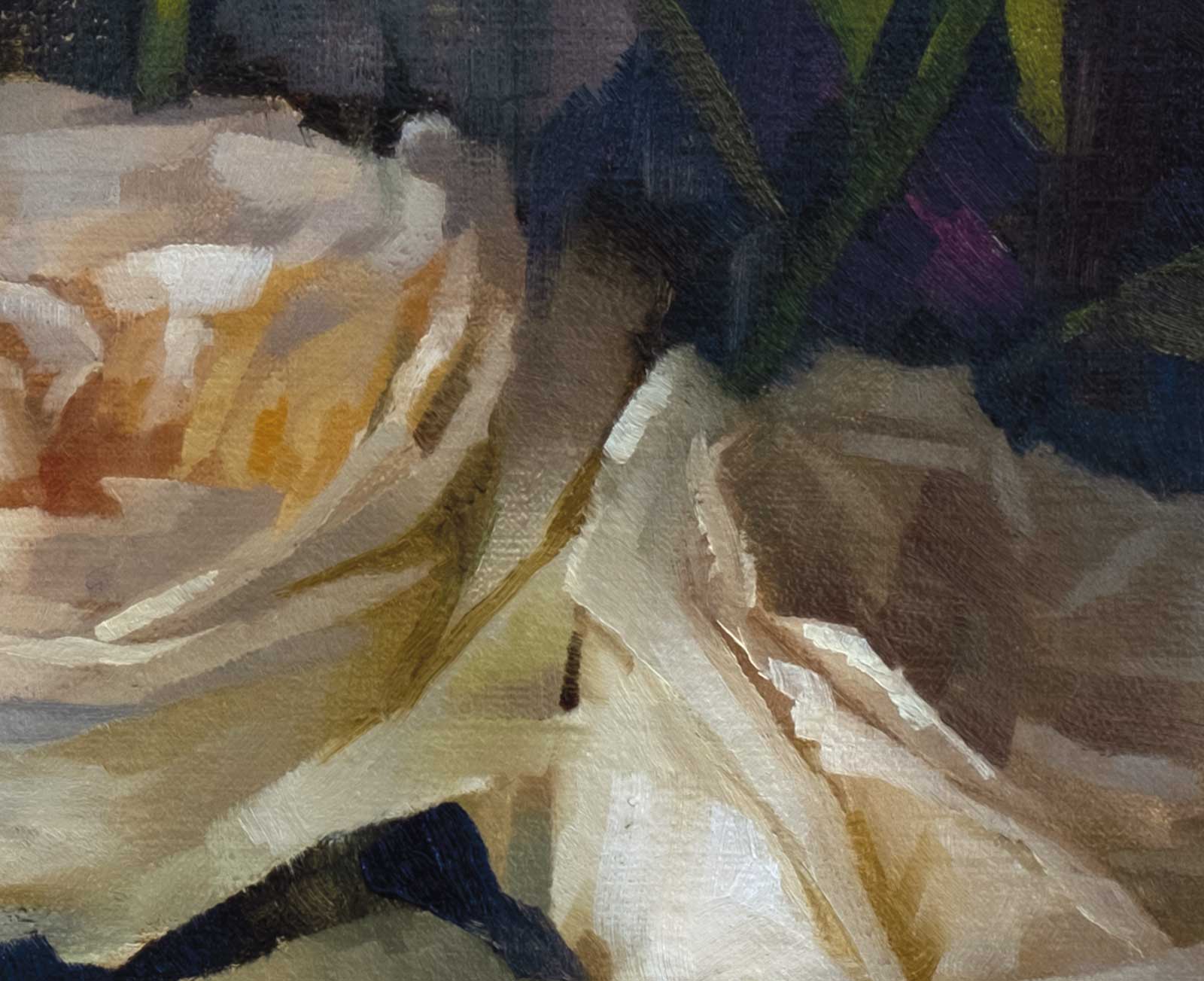
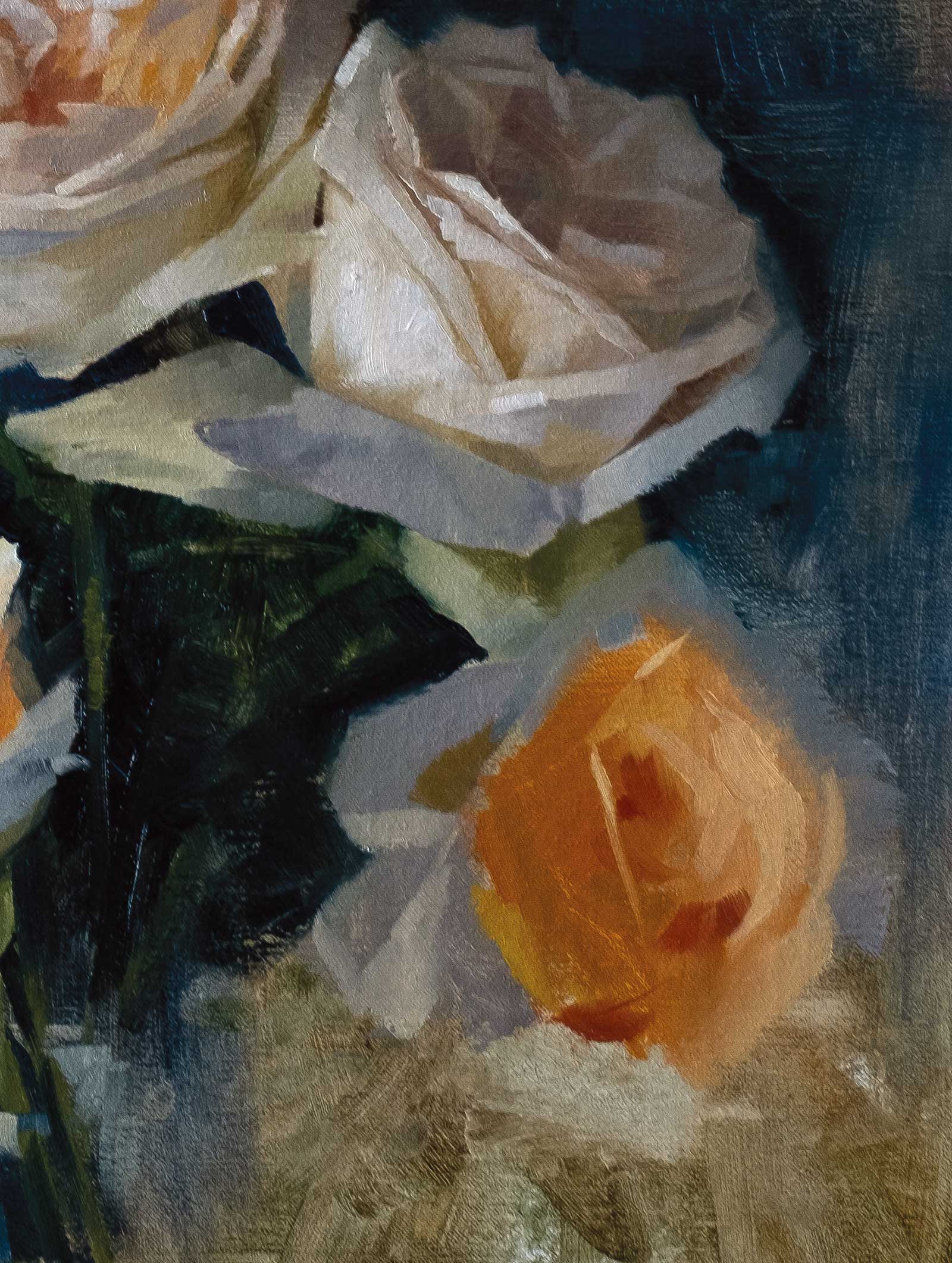
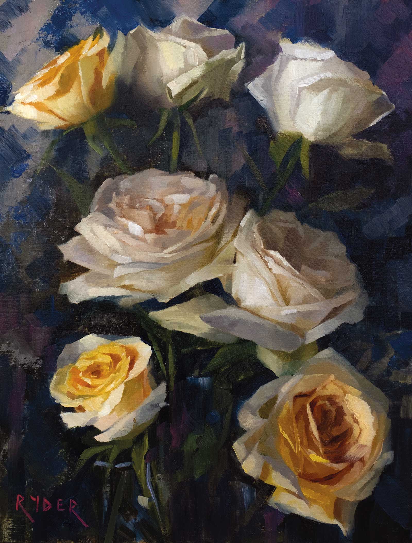
My favorite flowers to paint are roses, and I generally pursue lighter colors. Whites, yellows and pinks are my favorites, and for good reason. With the lighter roses there is so much more fun to be had with color, reflected light, temperature and transparency. All you need to do is to teach yourself to see nuances of value and color and the overall bigger picture, all at the same time—no small feat. The other thing I love about painting roses is they’re beautiful from any angle. I’d be just as happy to paint the wonderful shapes at the back or side of a rose as I see in the center, as this can help with making an interesting composition too.
So, as you may have guessed by now, I’m mildly obsessed with painting flowers. It’s truly a lifetime pursuit to capture light and color in this fascinating subject.
My Art in the Making Violet, blue and roses
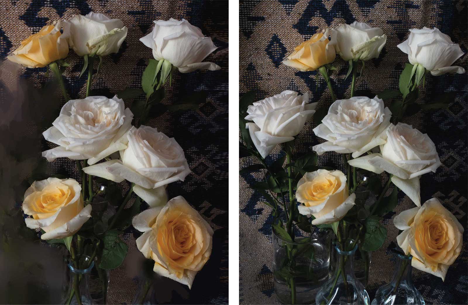 Photo references
I photographed a still life set-up in my studio but decided later that it would be a stronger composition to remove the flower on the left and raise up the bottom right yellow rose. I did this in Photoshop using very basic editing techniques; it’s a rough edit but it will work. You can see here the differences in the two images. I set up the still life next to an open window and positioned a rug behind the flowers for some interesting texture and patterns.
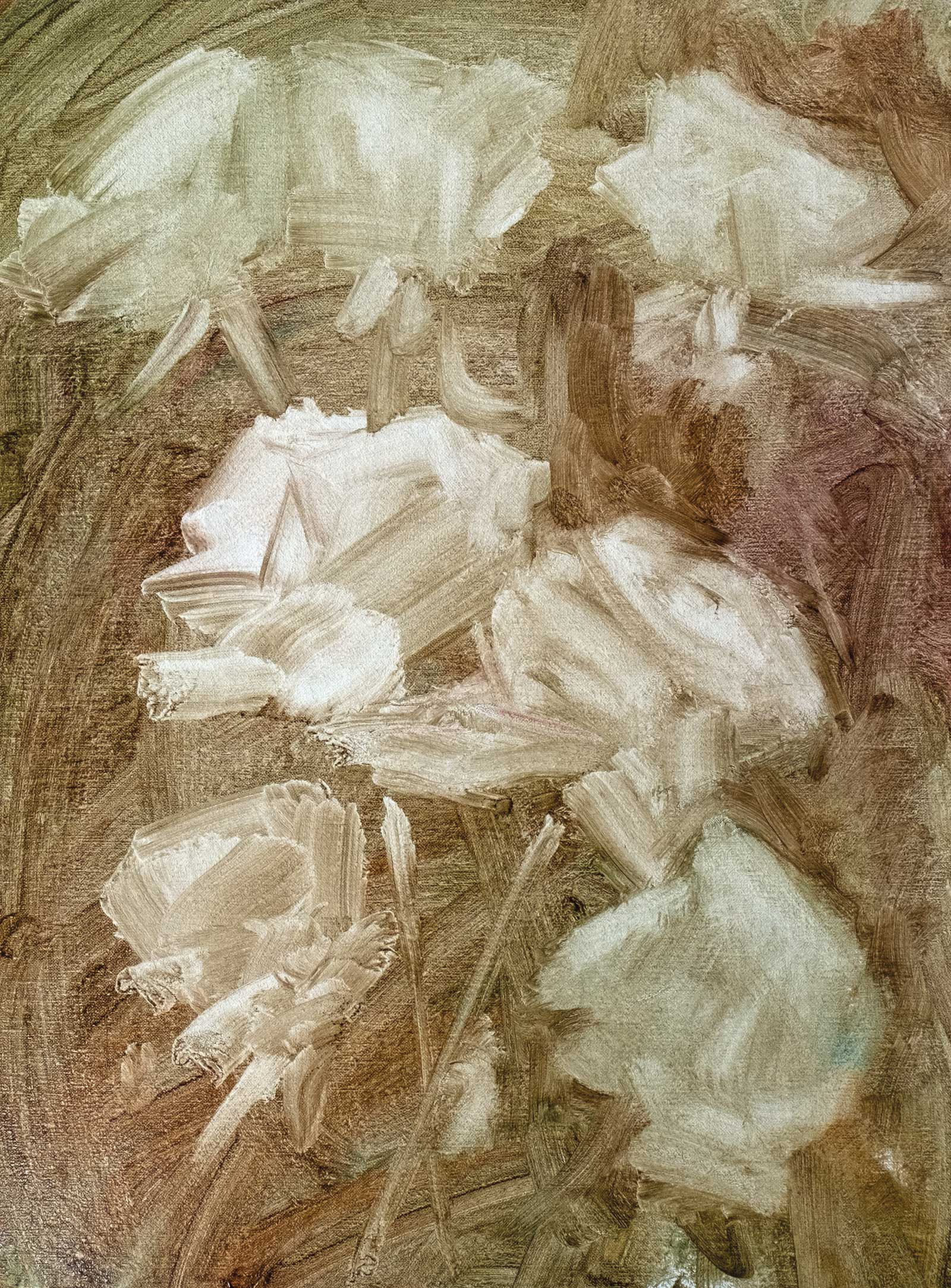
Stage 1
Stage 1 Toning the Panel
I tone the panel with a thin wash of viridian and transparent red oxide and then rub out the approximate layout for the flowers with a paper towel. This is an approximation of the flowers’ positioning, and it may be adjusted slightly later in the process.
WHAT THE ARTIST USED
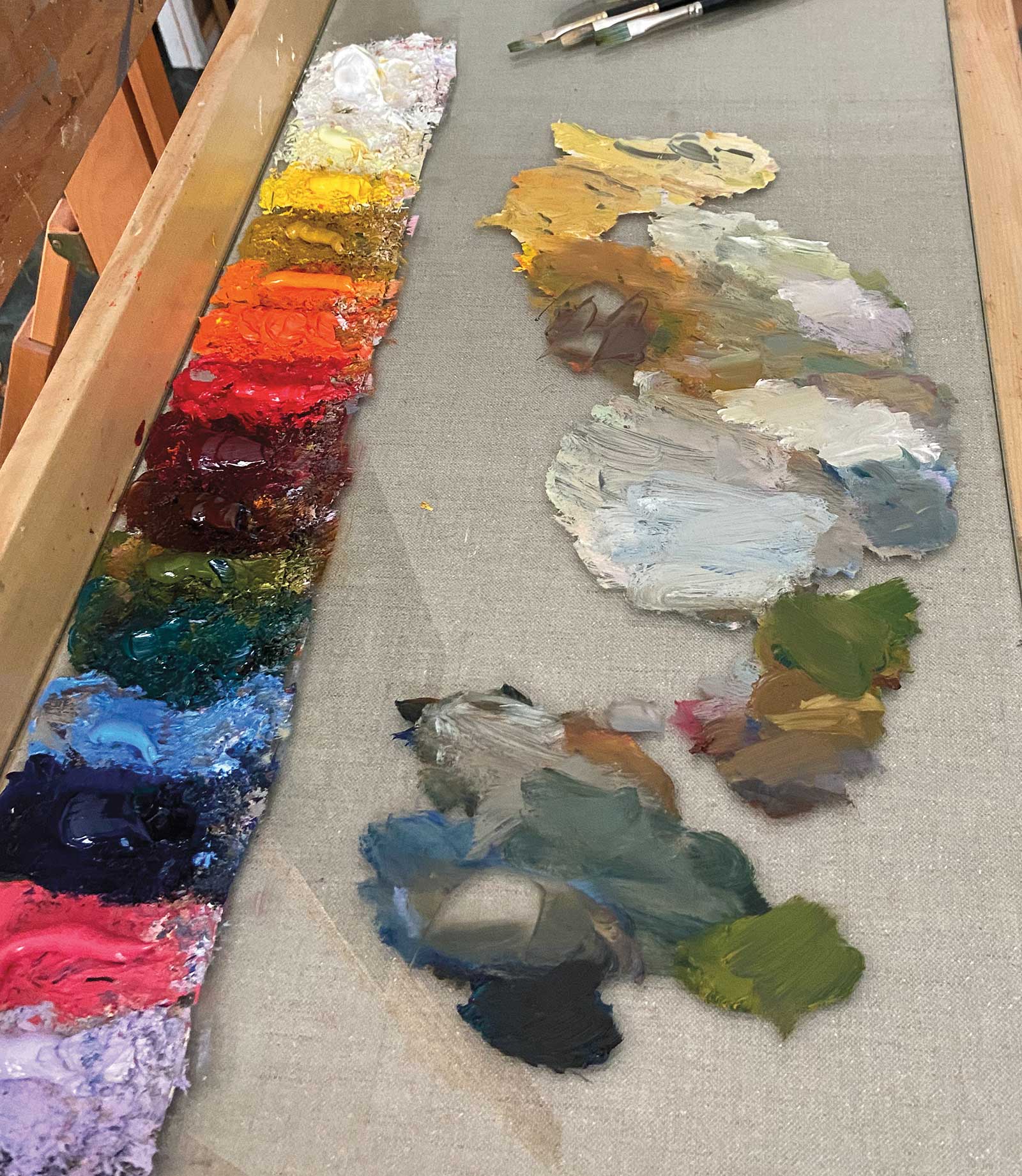
Oils
Titanium white, Lemon yellow, Cadmium yellow medium, Yellow ochre, Cadmium orange, Vermillion, Cadmium red medium, Terra rosa, Transparent red oxide, Permanent madder deep, Transparent yellow green, Viridian, Kings blue, Ultramarine blue, Brilliant pink, Radiant violet
Brushes
Rosemary and Co. Eclipse long flats, combers and flat ivory’s
Surface
Raymar panels, C13dp linen
Additional Supplies
Gamsol (medium), Palette knife, Paper towels
Stage 2
Stage 2 Blocking In Basic Shapes
I start blocking in what I feel is the most important flower of the composition. I pay close attention to warms and cools at this stage and establish my mid values and basic shapes.
Stage 3
Stage 3 Details and Background
I work more detail into the first flower and add some of the background value to help better see if my lights and darks are strong enough. I begin the same process on the second flower, making sure I don’t go too light as this flower is turned away from the window.
My Design and Composition Tactics
Composition
When thinking about a composition I am always looking for interesting ways to lead the eye around the painting. I use shape, color, texture and contrast to achieve this.
Color
I set out to push color and vibrancy in my paintings while remaining as true to the source as possible. I will always look for areas that I can use my strongest, straight-from-the-tube colors. These are usually in the center of the flowers, where petals meet and overlap and often in the background.
Shape
This goes hand in hand with composition, but I will use elements of the background to shape and calve the flowers. This way when painting the rose I can focus on value and color, and then worry about the shape and edges later.
Subject
I’m drawn to light, color and strong composition; the subject itself is secondary
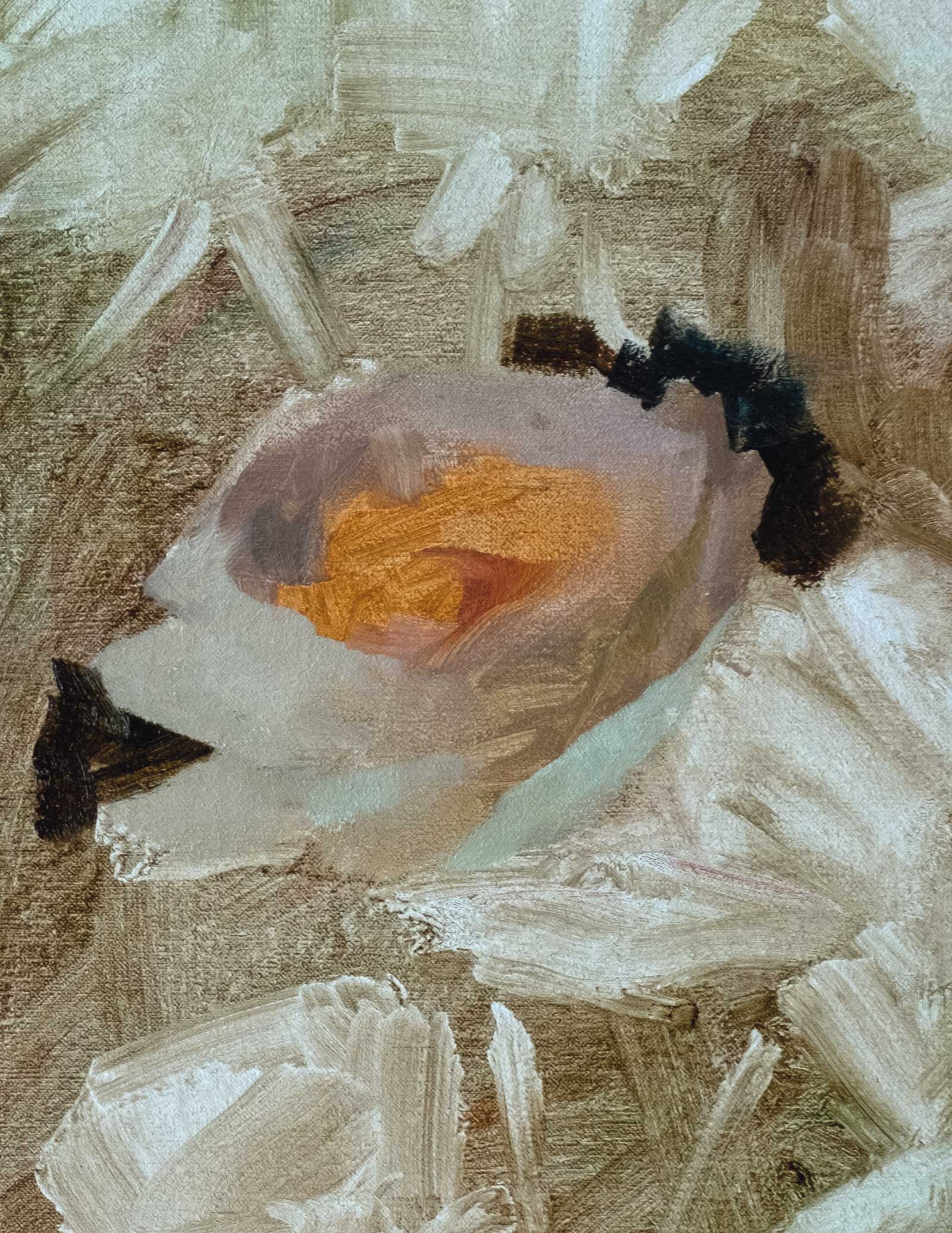
Stage 4
Stage 4 Edges
I pay close attention to the edges and where the values are very close together. I will often soften those two edges together, keeping my hardest edges for high contrast areas.
Stage 5
Stage 5 Determining Accurate Colors
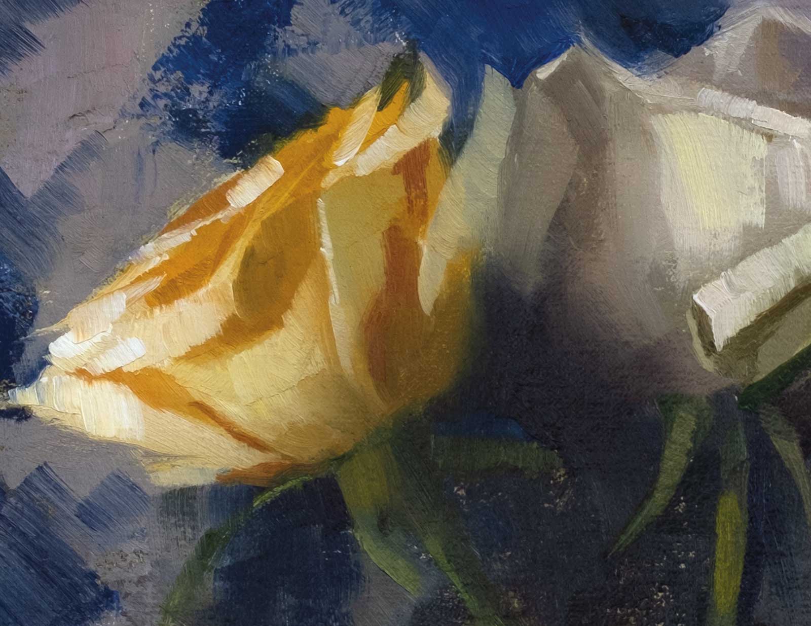
Yellow roses can be tricky as it feels like everything is warm, so you must pay close attention to color temperature shifts. I try to get the color accurately without mixing too many colors. This gives better vibrancy and avoids graying down the flowers.
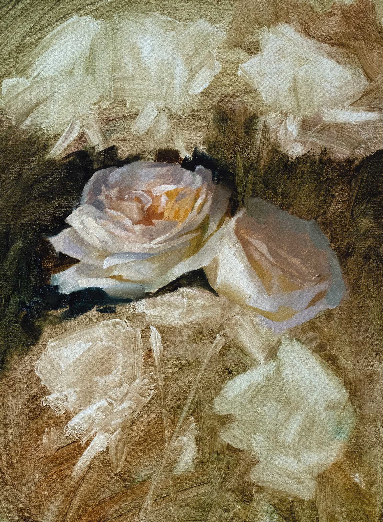
Stage 6
Stage 6 Surrounding Elements
When I start a flower, I will often overshoot the edges as this allows me to calve back into the petals to establish shapes using surrounding elements and the background.
Stage 7
Stage 7 Additional Details and Playing with Texture
The top roses are simplified as much as I can get away with, and I have some fun with the edges. I’m starting to establish some color and texture in the background, keeping it loose and using the palette knife to play with texture.
Stage 8
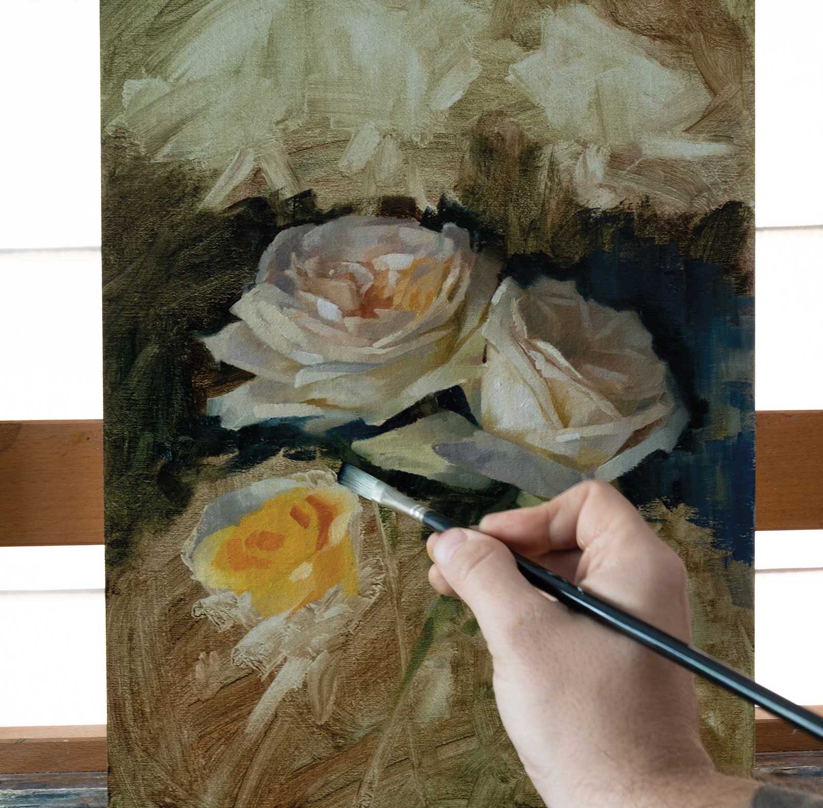
Stage 8 Finished Artwork
Violet, blue and roses, oil on linen, 16 x 12" (40 x 30 cm)
I had some fun with the background color and texture, and I introduce some stronger blues which work well with the yellow roses. I also use some pinks and violets that work as a great complement with the greens in the painting.
About the artist
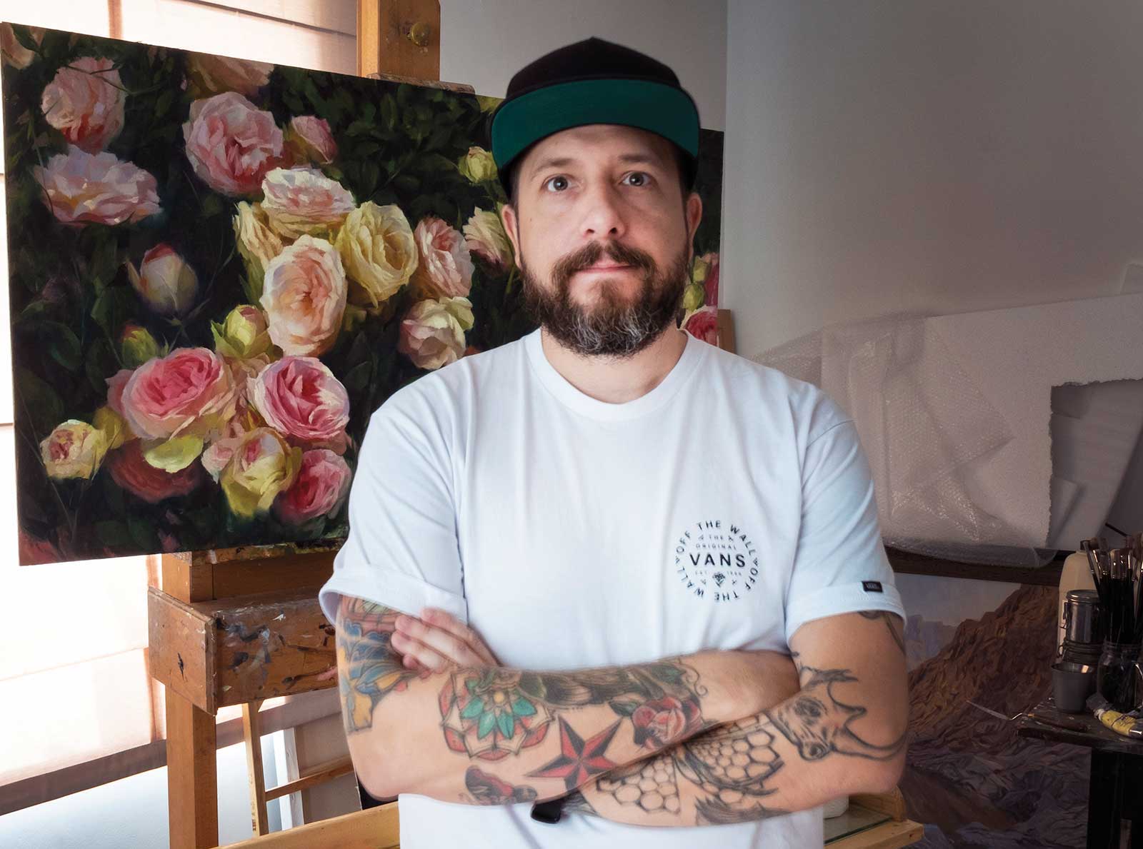 Matt Ryder
Matt Ryder is an award-winning British artist currently living and working in Dubai, United Arab Emirates. He is a lifelong painter inspired by the natural world and the beauty of nature. After taking the leap to professional artist, Ryder quickly established himself and gained critical acclaim for his florals and landscapes both locally and internationally. His work has been featured in multiple publications, including International Artist, and has also featured on several art podcasts. Being predominantly self-taught has enabled Ryder to develop a technique that is very unique to him with a particular emphasis on bringing the feel of natural light into his work.
He has taught and exhibited in the UAE, USA and Ireland and is represented by Mark Sublette Medicine Man Gallery in Tucson, Arizona.
Represented by
Mark Sublette Medicine Man Gallery, Arizona, USA, www.medicinemangallery.com
Contact at
info@ryderscanvas.com | www.ryderscanvas.com