


I still remember vividly the wonderful smells wafting through my mother’s kitchen during the summer holidays. The perfume of ripe blackberries, which my father had picked during his walks, the bright red, tart redcurrant juice in the big juicer, the pink blush on the soft orange apricots or the sweetness of the giant strawberries we bought from a classmate’s father. All the smells and tastes of summer were collected in jam jars and put into storage for the winter months to come.
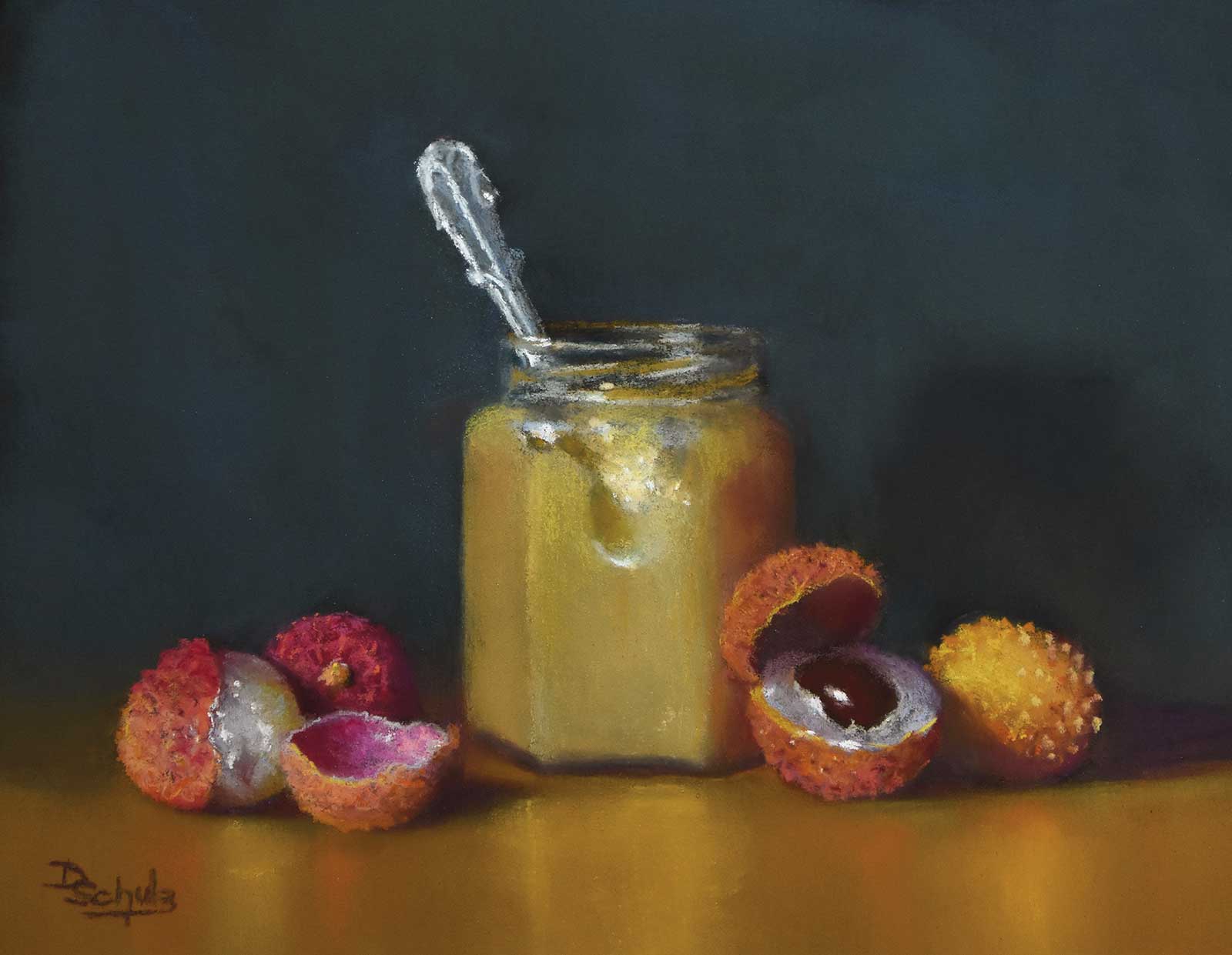
Merry lychee, soft pastel and pastel pencils on black ArtSpectrum Colourfix paper, 9 x 12" (22 x 30 cm) Lychee peel has amazingly beautiful shimmering colors on the inside and an attractive spiky outside. It was an enjoyable challenge to paint the different textures. The light yellow homemade lychee jam adds a quiet counterpoint. I chose complementary blue for the background to add more interest.
When I painted my first jam still life in 2014, I just wanted to capture these childhood memories of simple sweet pleasures and bright colors. I had no idea that this painting would become the first in a series that would grow to more than 20 and would accompany me on my artistic journey ever since. Since my move to Belgium in 1996, I had come to love the opulent still life paintings of the Dutch masters at the Royal Museum in Brussels. Ten years later, during my 4-year drawing course at the local art school, I had learned how helpful setting up a still life can be for an artist who wanted to learn about composition. And although I started my pastel journey in 2011 with teachers who were all landscape artists, I soon realized that what I really wanted to paint were still lifes.
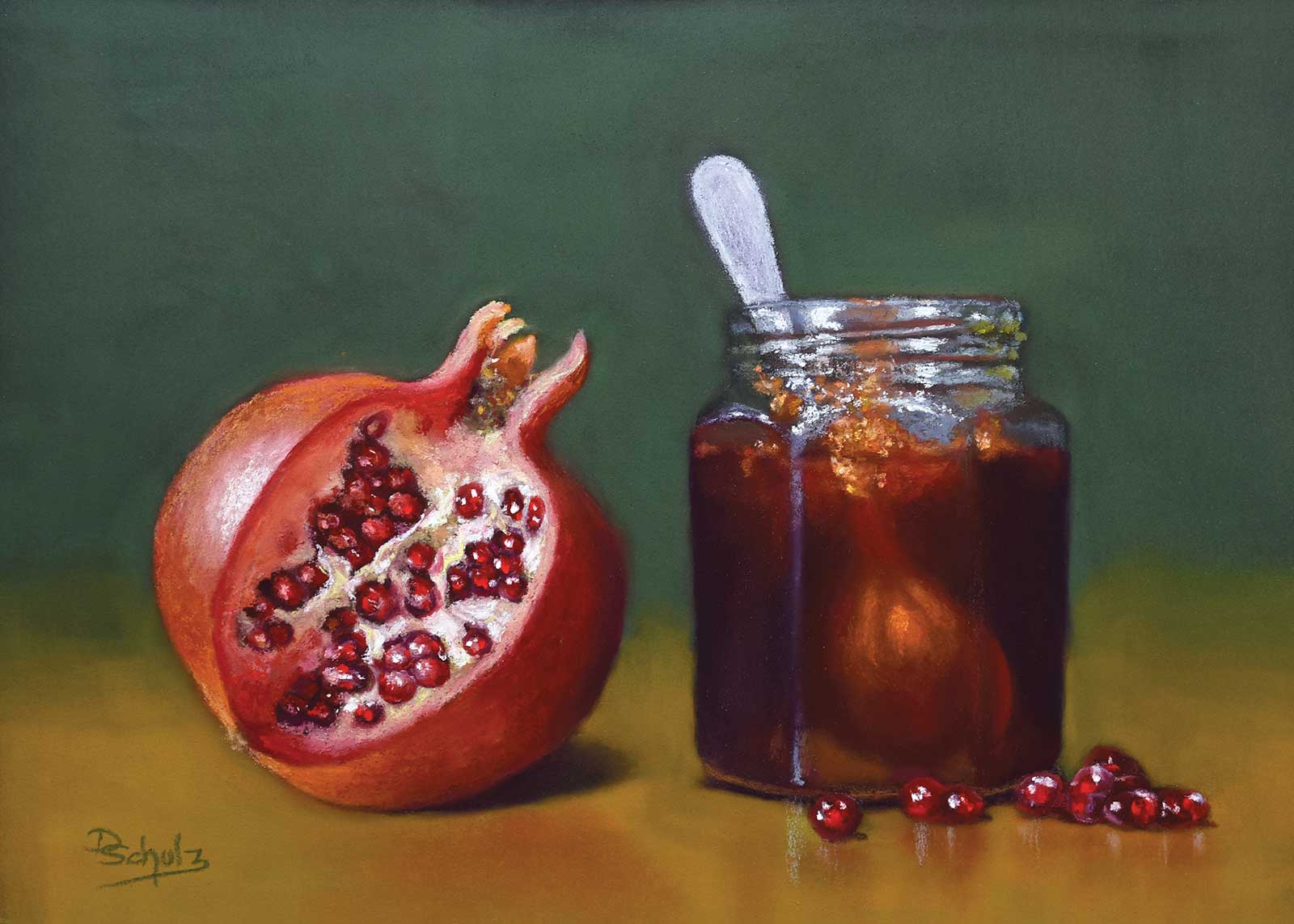
Merry pomegranate, soft pastel and pastel pencils on black ArtSpectrum Colourfix paper, 9 x 12" (22 x 30 cm) Another painting from my Jar and spoon series, this pomegranate still life shows why pastels are my favorite medium. Made from pure pigments with only a tiny amount of binder, they are unsurpassed in vibrancy, and their crystalline nature adds a wonderful sparkle.
I wanted to depict simplicity over opulence; my goal was not the open depiction of wealth and conspicuous consumption which governed many of the baroque still life paintings, but to show the hidden beauty of humble everyday things. With my Jar and spoon series I strived to do just that. A glass jar with jam, a spoon and some fruits were all the design elements I needed. And pastel, with its sticks made from pure pigments, was a perfect medium for the depiction of vibrant fruit and sparkling glass.
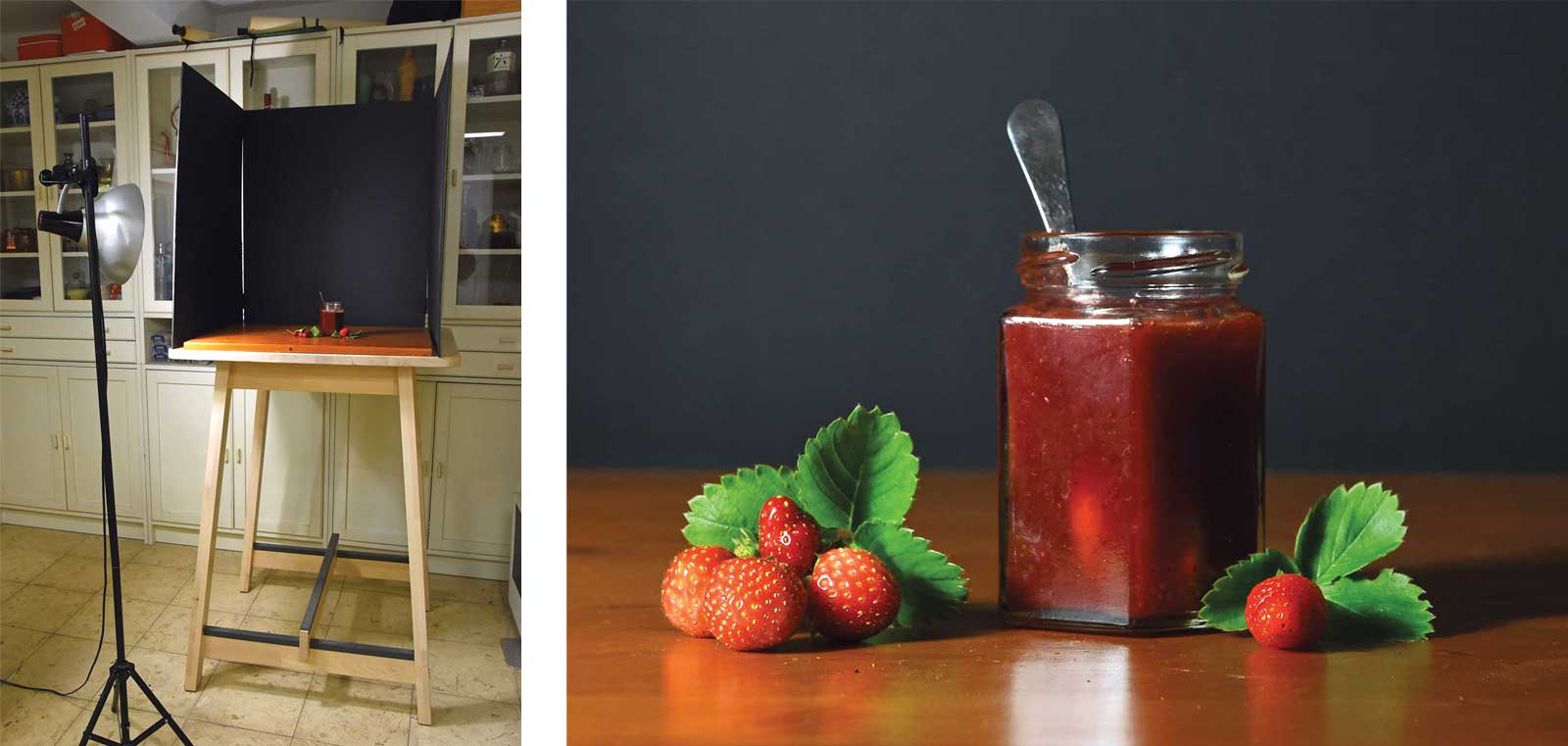
I quickly discovered the usefulness of setting up my composition in a shadow box, either a carton box painted black on the inside, or a screen made of three black foam core panels. All my still life compositions are set up this way. For illumination I use a daylight spot to make sure that the light comes from one direction only. By moving it around, I can change the way my set-up is lit and look for a pleasing distribution of light and shadow. A simple wooden board acts as a tabletop. Its varnished surface adds subtle reflections to my composition.
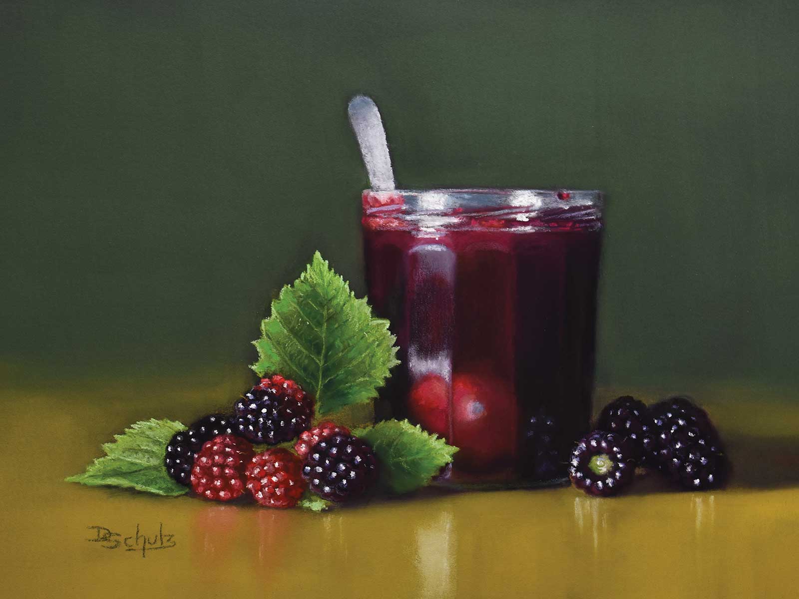
Merry blackberry, soft pastel and pastel pencils on black ArtSpectrum Colourfix paper, 9 x 12" (22 x 30 cm) Whenever possible, I try to find fruit with the leaves still attached to get a more natural look. Luckily there is a fruit grower in the vicinity who lets me cut fruit still on the branch. This is particularly nice with small fruit like berries. The rich dark purples are Terry Ludwig pastels.
The use of black pastel paper is a logical choice for a set-up in a shadow box. The Australian Art Spectrum paper I paint on has a nice tooth and accepts many layers of pastel; it also enhances the colors and lets even the dark values pop. It is easy to add some background color to my painting, either in a harmonious or complementary color scheme. PanPastel lets me add a smooth layer that doesn’t distract from my main subjects: the jam jar and the fruit.
Although my choice of paper allows wet underpaintings, I prefer to block in my composition with a layer of soft pastel, which I rub into the paper with my fingers. This dry underpainting in the local colors but in a relatively dark value is my starting point. It contains all the essential information about the big shapes and the color relationships. Changes to the composition are still possible at this stage. From here I work from dark to light like most pastel painters, moving from one object to the other, always mindful of the composition.
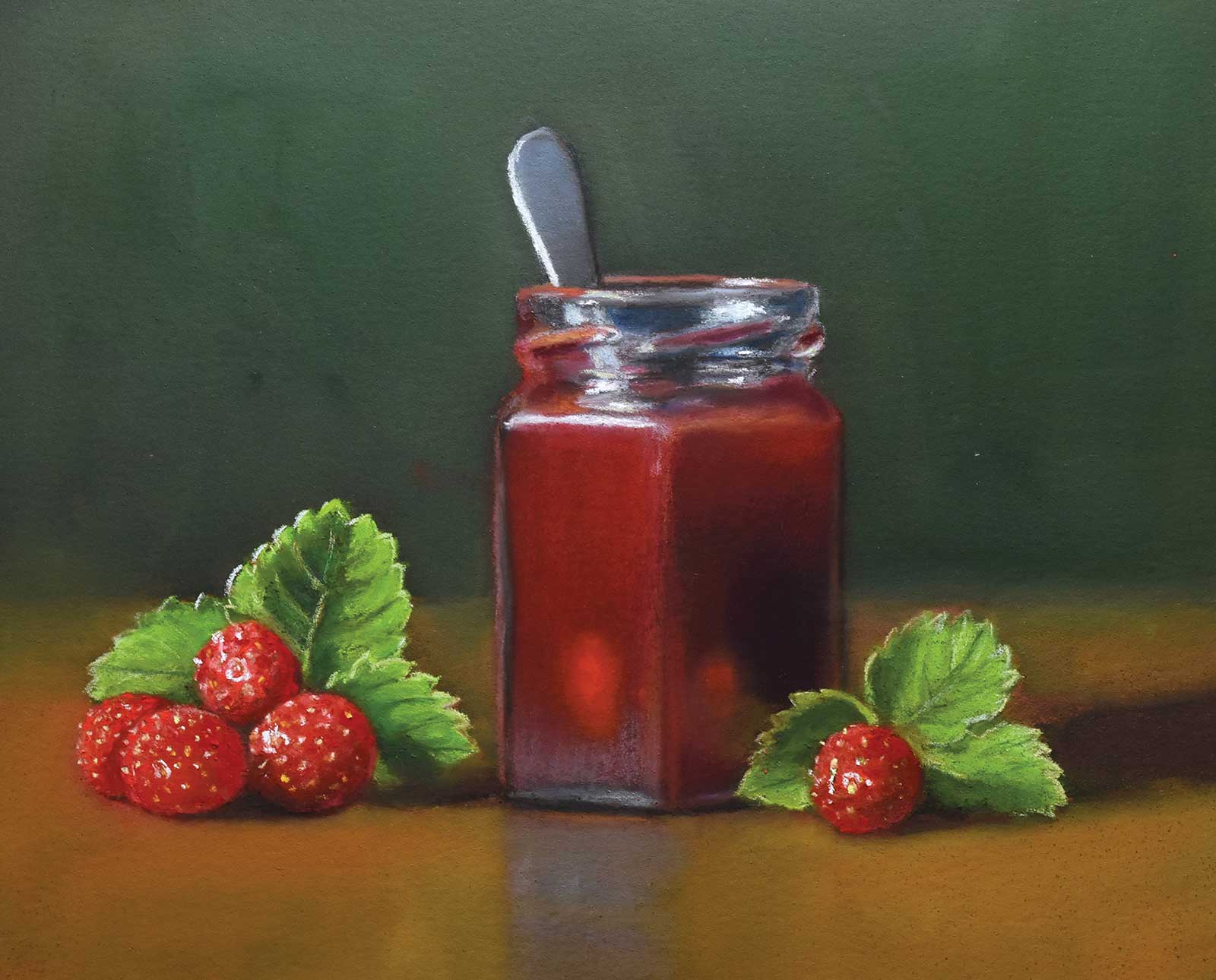
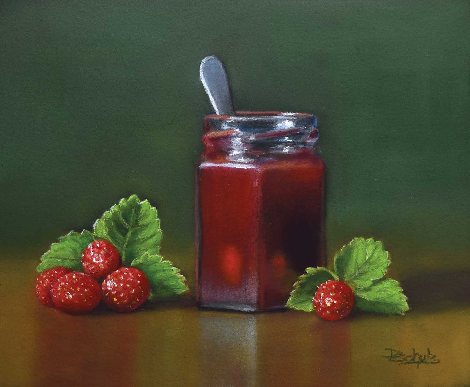
My Art in the Making Merry strawberry 2
Stage 1
Stage 1 Set-Up and Composition
When painting a jam still life, the first thing I choose is the fruit, then I look for a matching pot. I have assembled quite a collection of empty glass jars in different sizes and shapes. My homegrown strawberries are tiny, so I choose a small pot. I fill it with strawberry jam, stick in a spoon and start arranging the jar and fruit in my shadow box. I move the daylight spot around to see how the glass jar catches the light. I normally go through 20 or 30 slightly different arrangements and take a photo of each. Then I check these photos on my computer. They make it easier to choose the best composition and crop. I save the photo of my chosen set-up, because I work with perishable props. That lets me continue my work the next day.
WHAT THE ARTIST USED
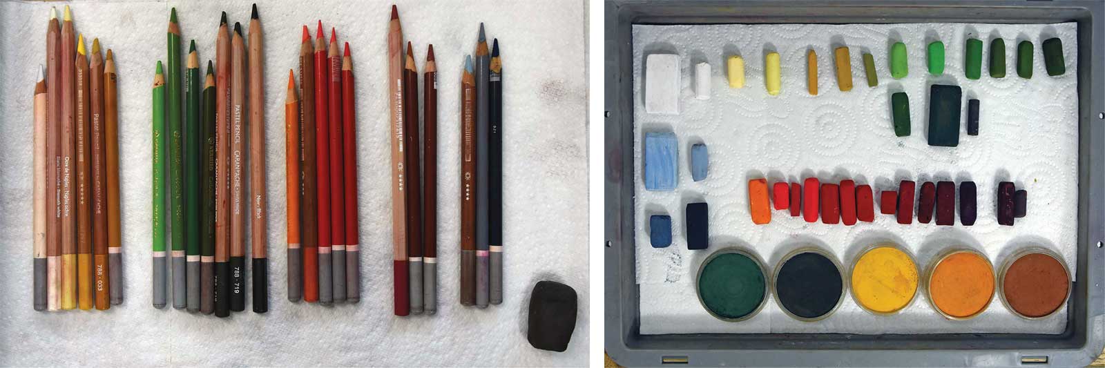
Pastel Sticks
Yellow and ochre, Red, Green, Blue-gray, White
PanPastels
Dark green, Ochre, Sienna
Pastel Pencils
In the previously mentioned colors in multiple values
Paper
ArtSpectrum Colourfix paper in black
Additional Materials
Tracing paper and graphite pencil for the sketch
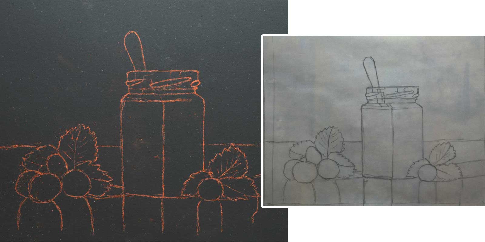
Stage 2
Stage 2 Sketching and Tracing
I sketch my composition on tracing paper, not directly onto my pastel paper. Mistakes can be easily corrected and grid lines erased. I transfer the finished design to my support by applying a layer of pastel on the back of the sketch and tracing it. I use a pastel pencil in a matching color to reinforce the faint lines.
Stage 3
Stage 3 Dry Underpainting
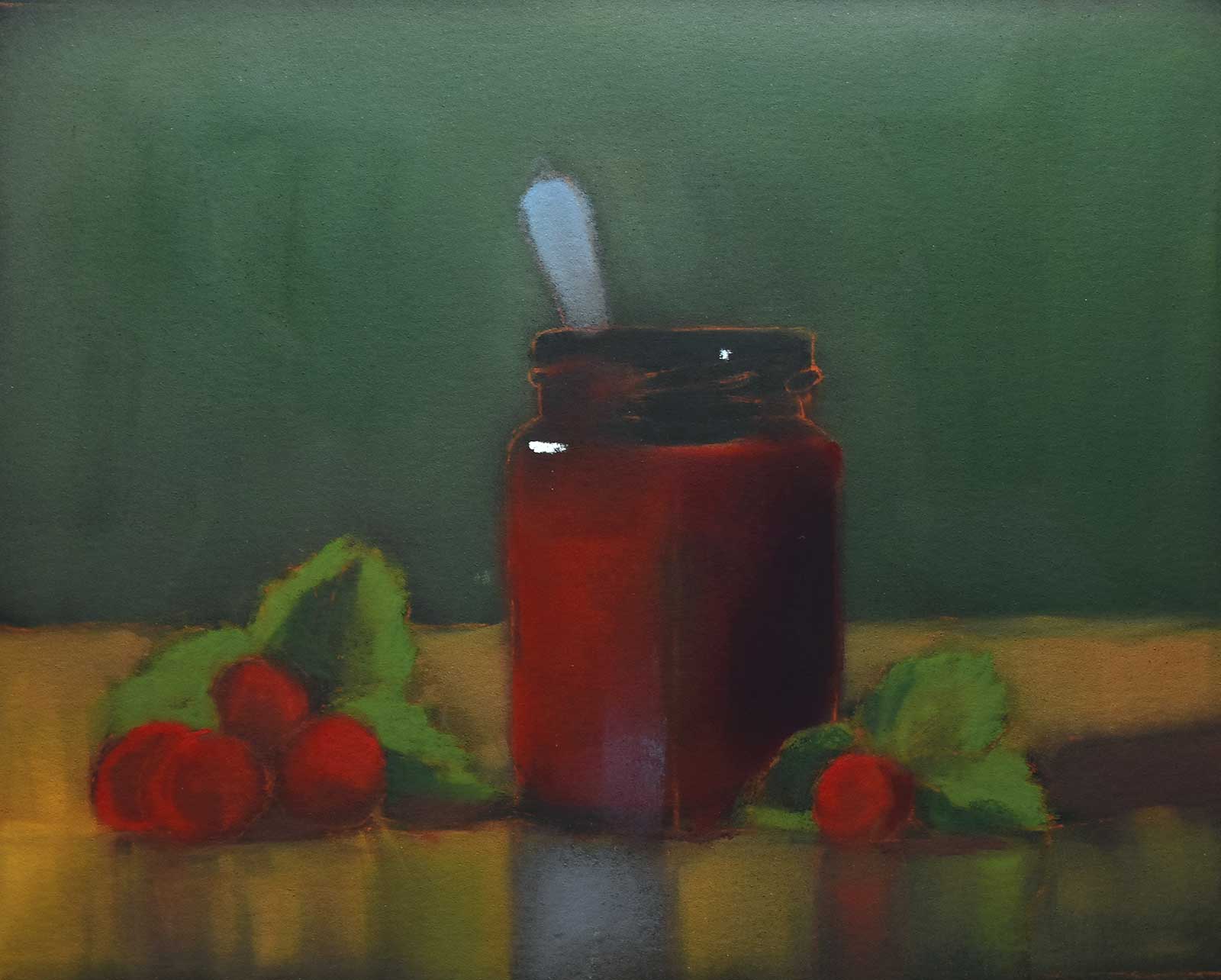
I use PanPastel and soft pastels to create a dry underpainting. I choose a basic color palette by holding the sticks next to my objects and squinting. If both seem to merge, then the colors and values are right. For my underpainting, I use the local colors, but in a darker tonal value. Then I indicate the lightest light and the darkest dark; that will give me my value road map.
Stage 4
Stage 4 Color Tests
In the next step, I move back and forth from one object to the other and test colors. Here, I first work on a strawberry and a leaf and add pastel sticks to my basic palette as needed.
Stage 5
Stage 5 Colors and Tones of Glass
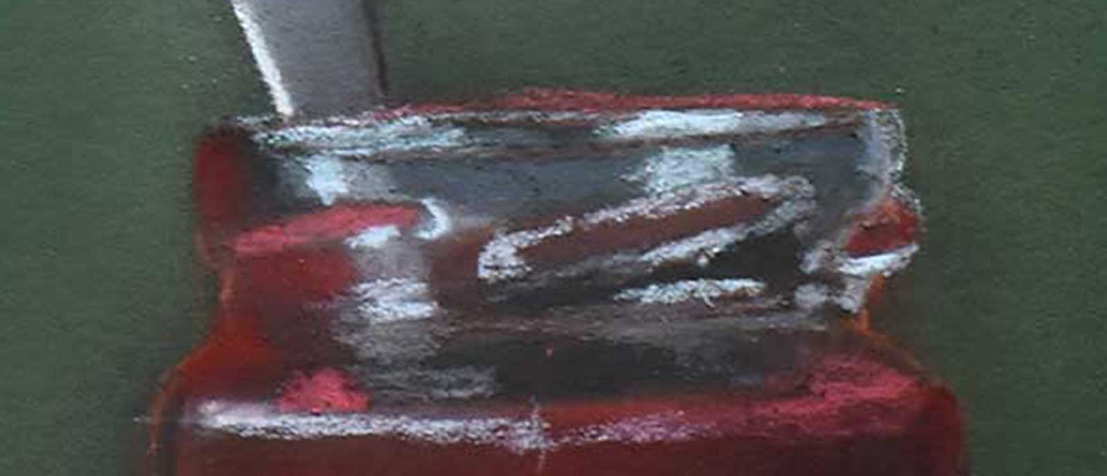
Then I turn to the jam jar; the colors and the tonal values of the different elements are always to be seen in the overall context, never in isolation. For the “naked” glass I use gray-blue pastels and pastel pencils in different tonal values.
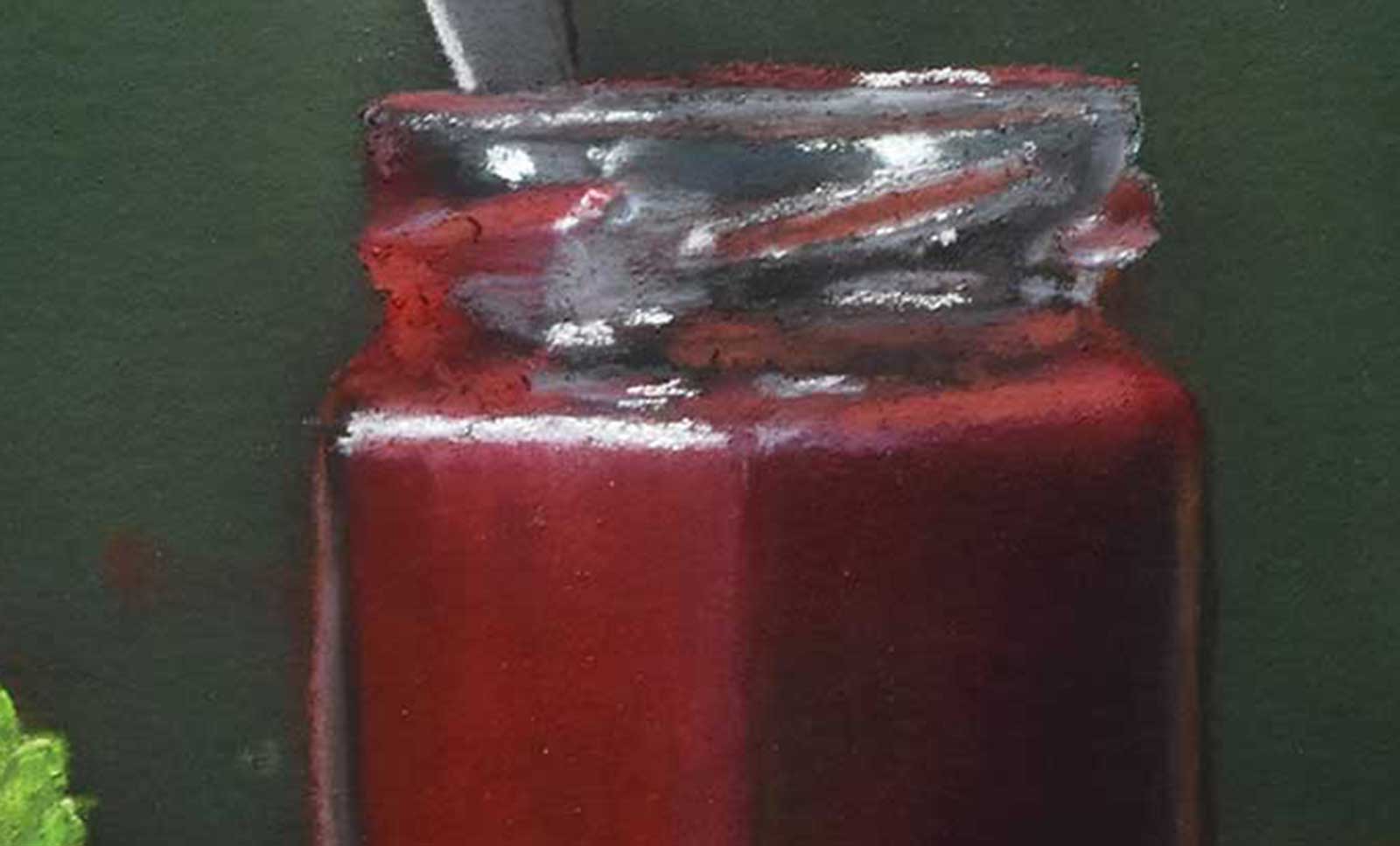
Stage 6
Stage 6 Additional Details in Jar
Again and again, I look at the abstract shapes and patterns in the glass which are created by reflections and the shimmering spoon. I paint them by adding thin translucent layers with a pastel pencil or by dabbing pastel with my finger onto the surface. I add the highlights with a white Schmincke pastel.
Stage 7
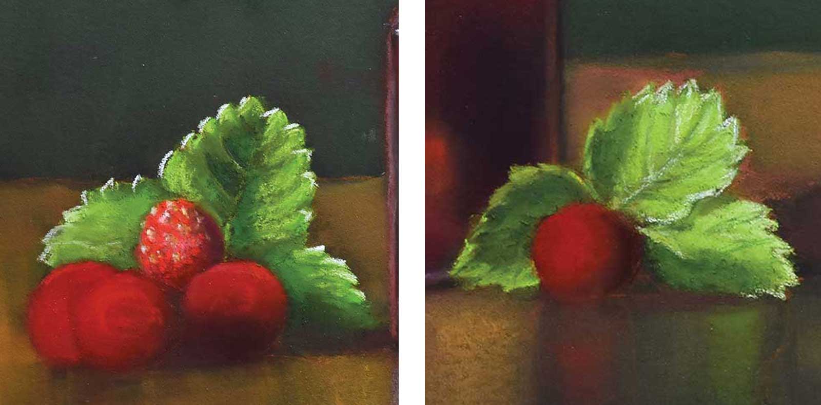
Stage 7 Leaves
In the next step I start to paint the leaves. I switch back and forth between soft pastels, which I apply in thin layers and blend, and pastel pencils for finer details. I create the illusion of light by using brighter tonal values and warmer colors.
Stage 8
Stage 8 Strawberries
Now I paint the strawberries. For the red areas in the light, I do not use tints because they can look too chalky, but instead I move in the color wheel towards orange. With an ochre and a white pastel pencil, I add dots for the small seeds and the highlights.
Stage 9
Stage 9 Thin Layer of Ochre
The table surface, which has become slightly dirty during the painting process from floating pastel dust, receives another thin layer of ochre PanPastel. This is gently applied with a special sponge.
Stage 10
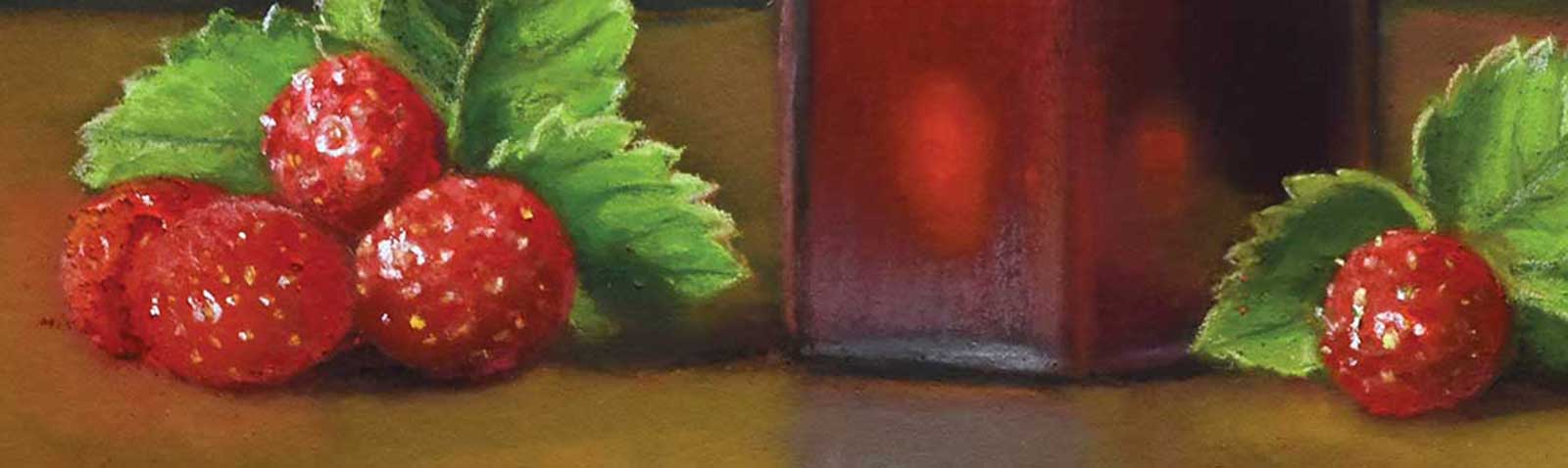
Stage 10 Reflections
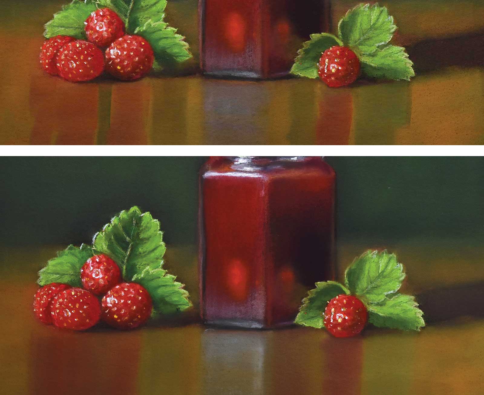
For the reflections on the table, I now stroke with my finger over soft pastel sticks in red, green and blue and apply this thin layer of pigment from top to bottom under glass, fruits and leaves. I blend the transitions with my finger and apply a final translucent horizontal layer of ochre. The reflections should be discreet and support the main motif, not distract from it.
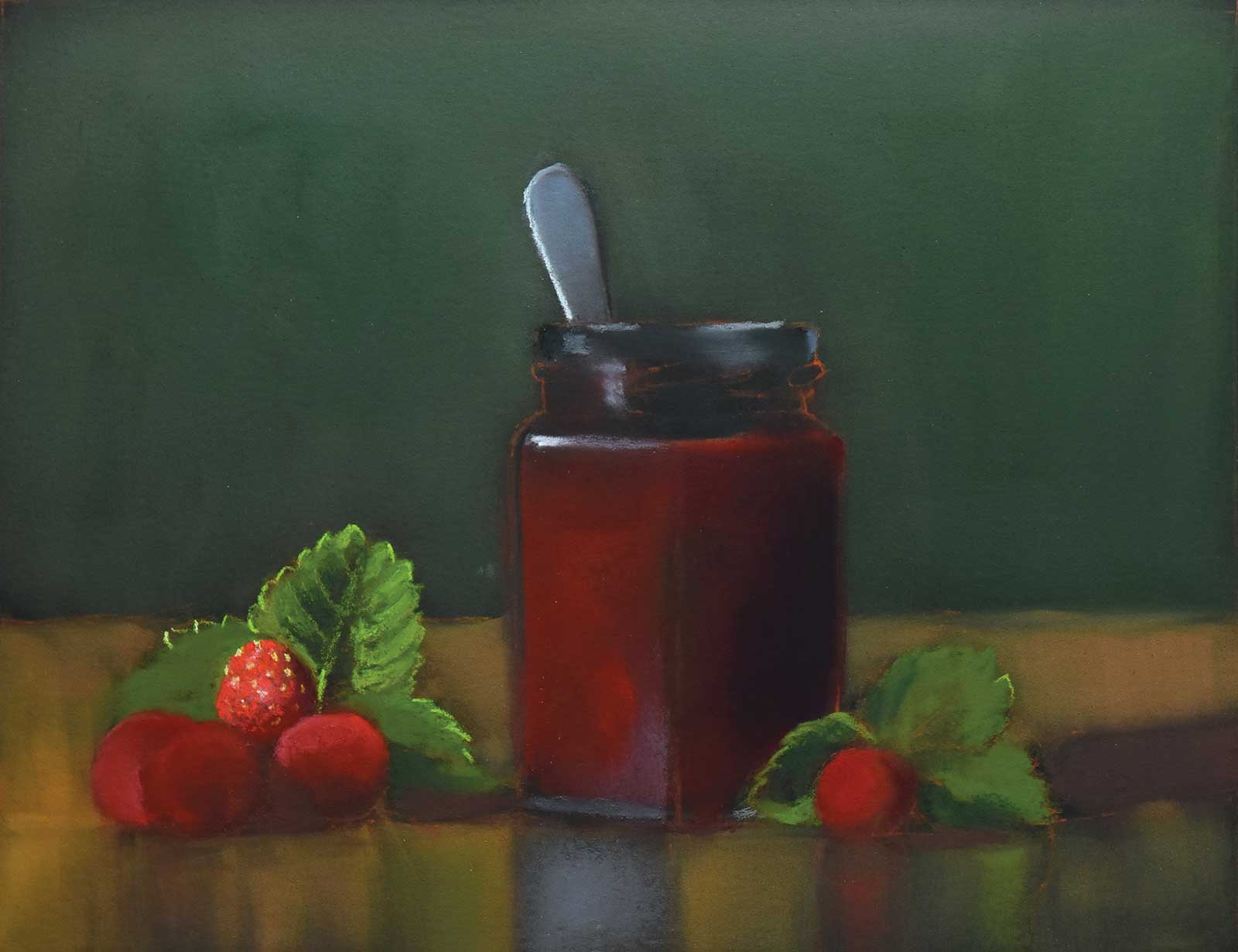
Stage 11
Stage 11 Finished Artwork
Merry strawberry 2, soft pastels, PanPastel and pastel pencils on black ArtSpectrum Colourfix paper, 9 x 11½" (22 x 29 cm)
In the final step, I remove smudges, blend the transition from table to background and make final corrections. Time for my signature!
About the artist
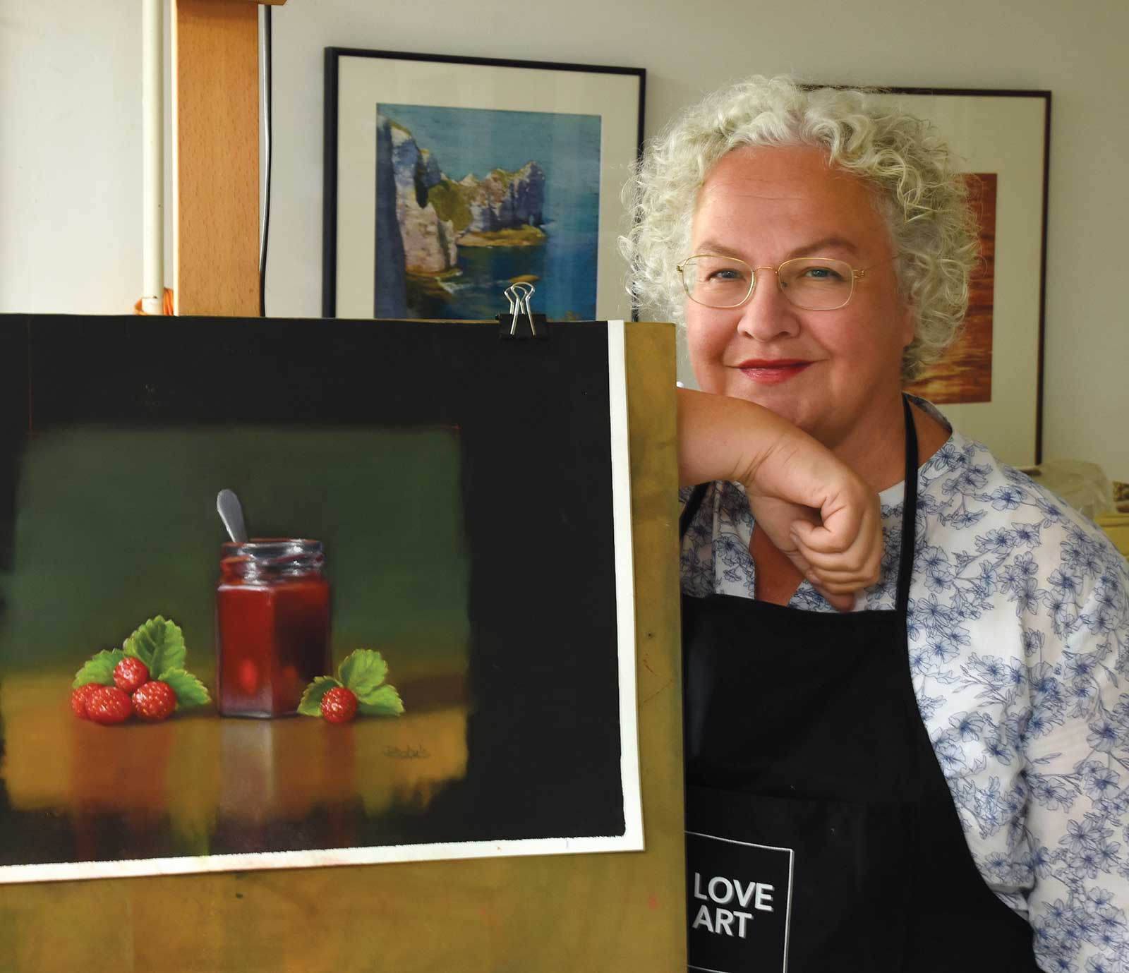 Dorothea Schulz
Dorothea Schulz is a German pastel artist who lives in Belgium. She has been drawing and painting since her childhood and started using pastel in her teens. From 2007 to 2011, Schulz studied drawing at the local art school where she rediscovered pastel as an artist medium. She signed up for pastel workshops in Europe and the United States and has studied with several eminent American pastel artists, among them Terri Ford, Sally Strand, Karen Margulis, Cuong Nguyen and Alain Picard.
Since 2013 Schulz has had five solo exhibitions in and around Brussels. She has participated in numerous international pastel exhibitions in Europe, China, Canada and the US. Schulz has been a member of the PastelGuild of Europe since 2011 and has become their president in 2015. She is a member of several European pastel societies and an associate member of the Pastel Society of America.
Contact at
www.dorotheaschulzpastelart.com