


Recently, I’ve enjoyed creating a series of paintings using black-and-white vintage photos as reference and inventing the color from imagination. I was going through a chapter of feeling stuck and “blocked” as an artist. Working with these images freed me up, giving me a more carefree attitude without a personal attachment to the subject like I do when painting someone close to me like a family member, friend or portrait client. These former eras of film, ballet and theater have a classic aesthetic that I love. I use the initial emotional impact I get from the photo, and I use that to guide the palette. I love working from vintage photographs for that reason-it exercises the interpretive muscle!
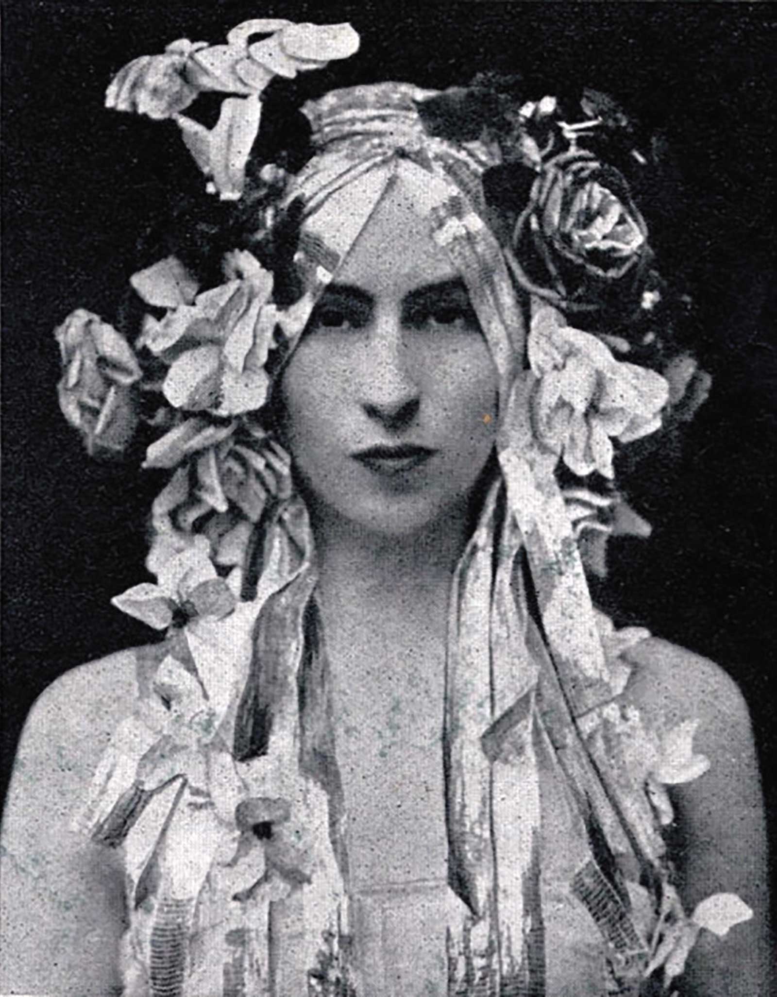 Reference Photo
Reference Photo
My reference here was a black-and-white photo of the dancer Margaret Morris, circa 1910. My intuition guided me to this Easter egg-inspired palette. I use a very extensive chromatic palette, but some key colors in this painting are: lead tin yellow light by Michael Harding, and Sennelier paints in Chinese orange, baryte green, permanent green, cobalt violet and king’s blue.
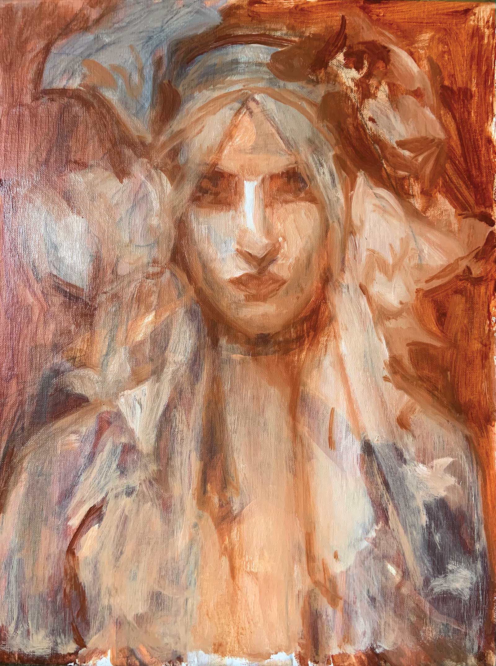 Step 1
Stage 1: I work from general to specific, creating a rough block-in using titanium white and Michael Harding’s transparent red oxide. I don’t spend much time on a detailed or accurate drawing. I just mass in the general shadow shapes and light shapes, correcting drawing and proportions as I go. I mix Windsor & Newton’s Liquin into my paint for this stage to speed the dry time so I can start adding color on top without a long wait.
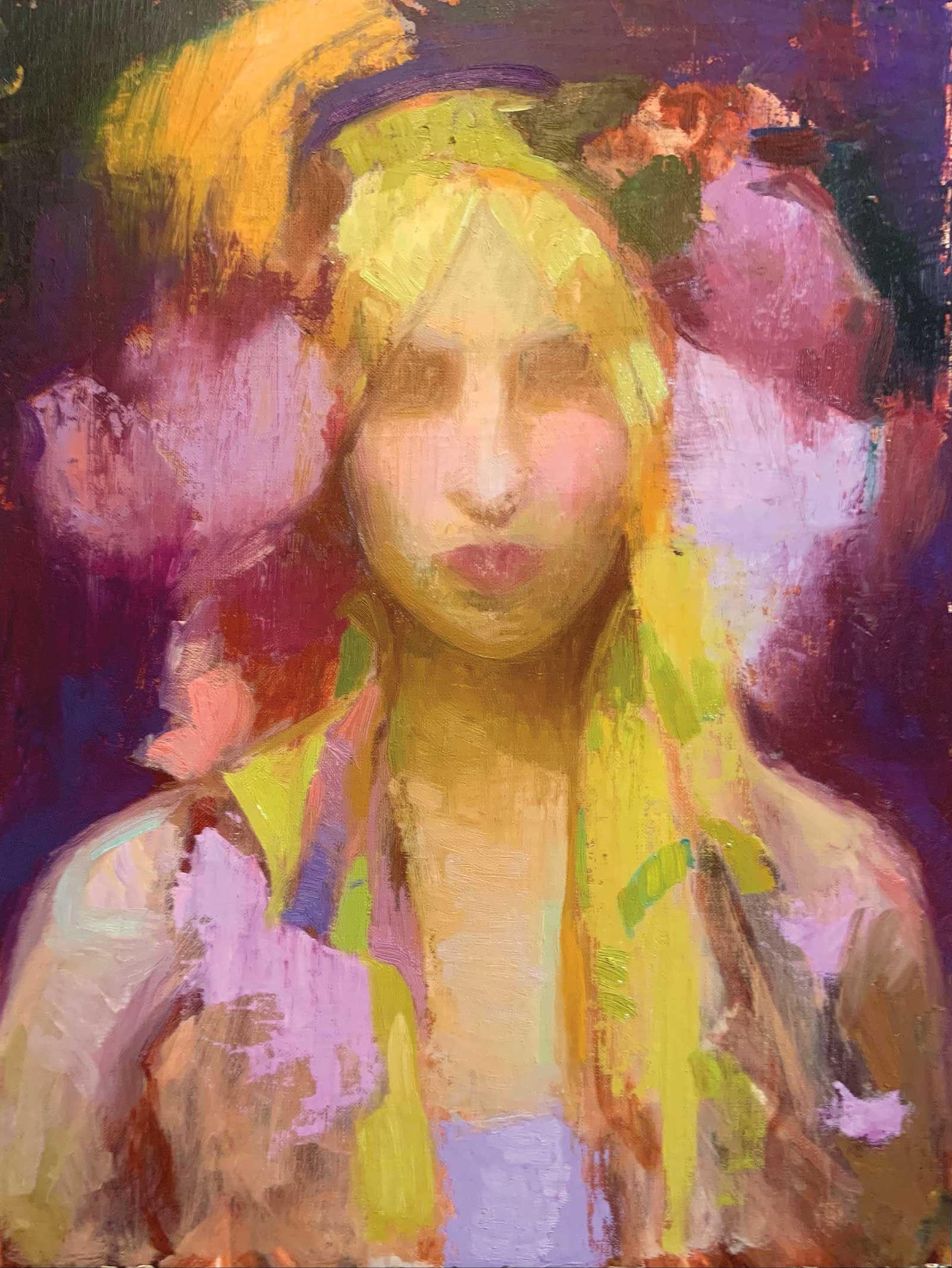 Step 2
Stage 2: Using a palette knife, I aggressively apply bold colors to build up texture and establish the palette and overall color harmony of the painting. This helps to start the painting confidently and establish its direction. I am not jumping to my lightest lights or darkest darks yet but mostly establishing the mid-tone.
 Step 3
Stage 3: I begin building the lights on top of the mid-tone and glazing the darks on. By glazing, I mean using a small amount of linseed oil with my paint to create a transparent paint layer. I do all of this after the previous layer is dry.
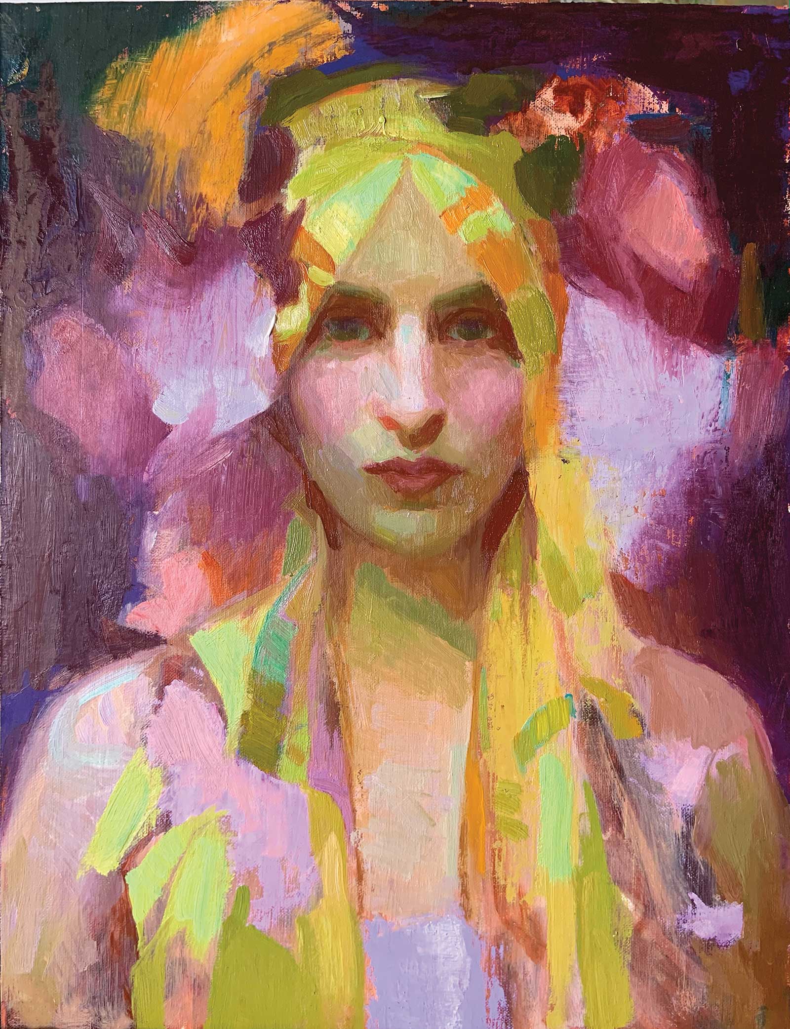
 Step 4
Stage 4: Like a tile mosaic, I gradually add more and more “tiles” of specific tones and colors to turn the form and build volume. This takes away the harshness of the stark value contrast and begins to soften the portrait and give it a more human look.
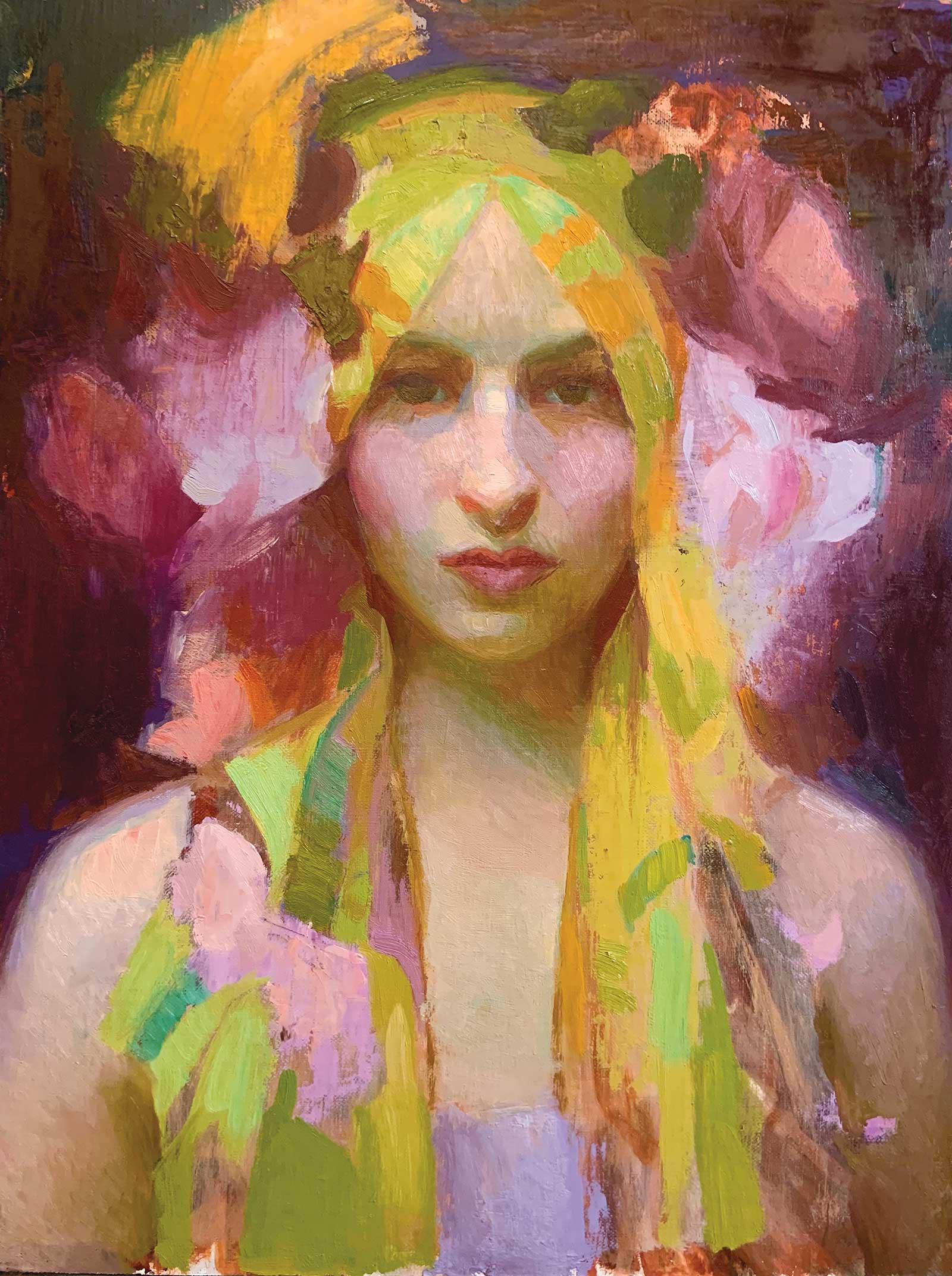
 Step 5
Stage 5: Adding lights and darks to petals, I begin to call forth the flowers, adding depth and dimension by gradually building shadow and light.
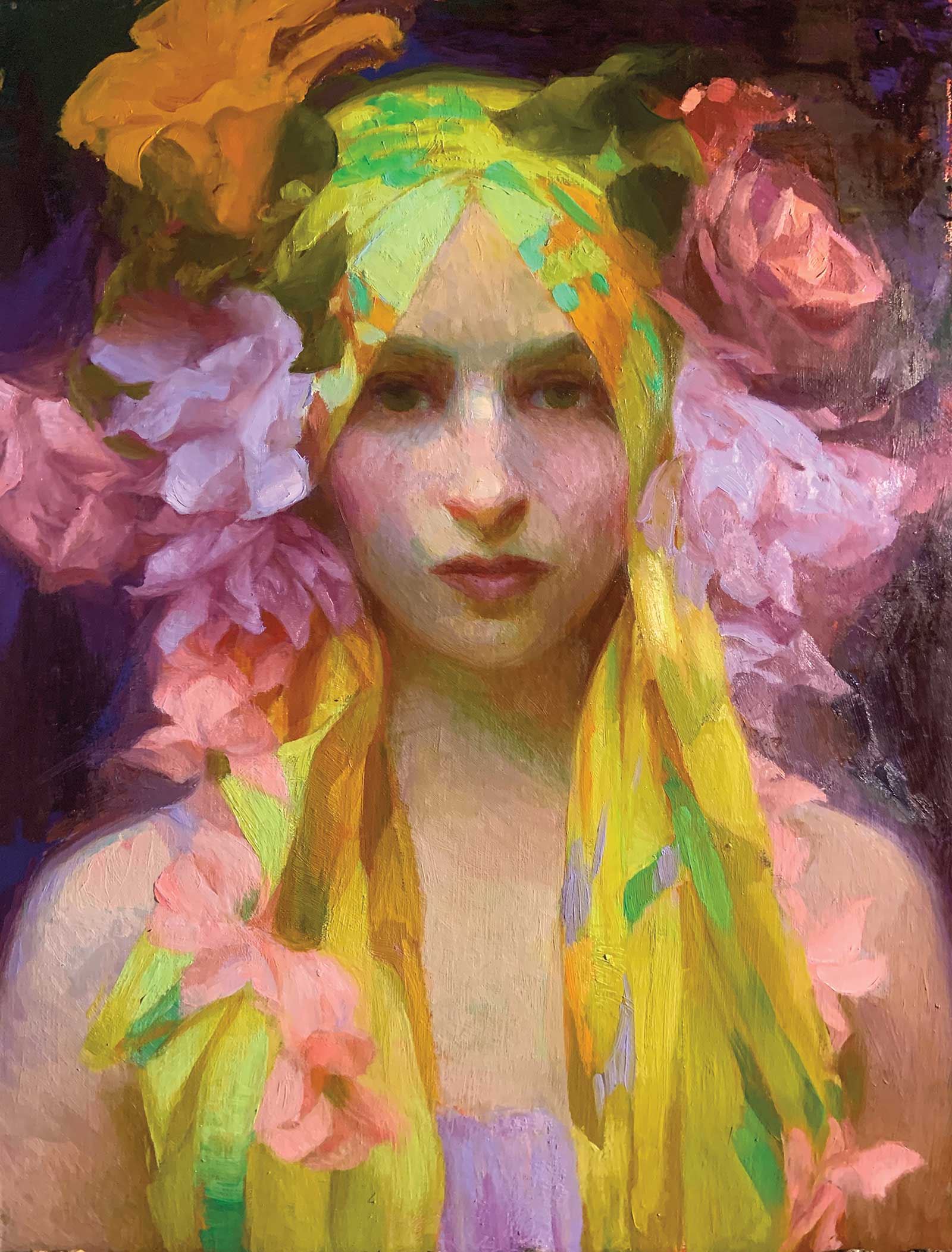
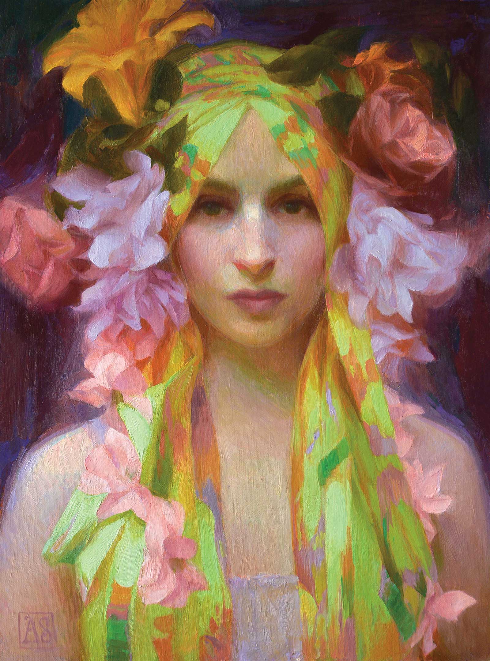 Step 6
Stage 6: The final touches involve softening some edges and leaving other edges hard. I also check to see that the colors harmonize and if there are any areas that need to blend glazed “down” to darken or scumbled with light to lighten. When I feel the spirit of the subject shining through, the painting is finished.
Adrienne Stein is an award-winning American artist living and working in Pennsylvania and Colorado. She holds an MFA from Boston University and a BFA Magna Cum Laude from Laguna College of Art and Design. Stein studied under many gifted and influential instructors throughout the United States, France and Italy.—