


A rose is a rose is a rose. Or maybe not if you’re a frustrated painter trying to paint one. Flowers are fascinating, and I use them often in oil compositions. Their delicacy, intricacy and subtle colors are irresistible, but these qualities make them challenging to paint. So, how do you approach such a rewarding yet tricky subject?
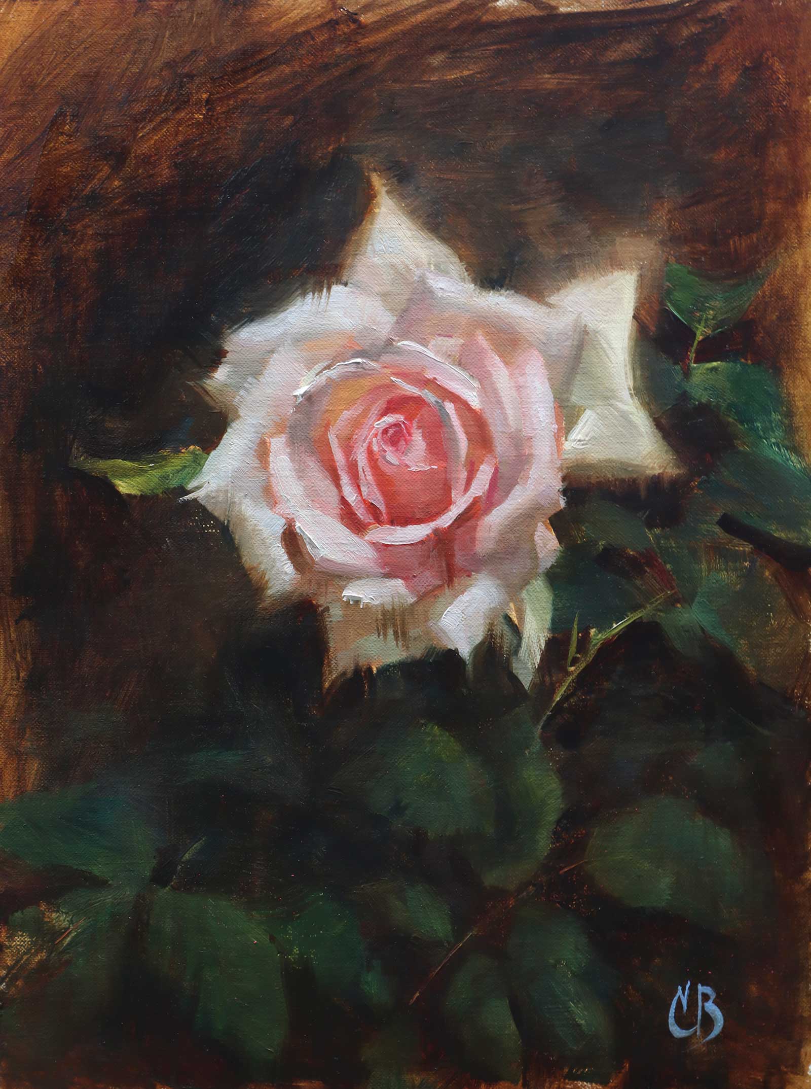
A Cosmos, oil on linen, 12 x 9" (30 x 22 cm) Studying flowers outdoors is a very important part of my process. Garden roses are more varied, more complex, and have more interesting stems and foliage compared to commercially grown flowers. I studied and photographed this rose at a local botanical garden and then finished the painting at home.
I bring formal figure drawing experience to my flower paintings. The same concepts used in portraiture can be applied to flowers: squint to see major shapes, edit excess information, focus on creating and organizing simple value masses. Whether your ambition is to paint a single rose or an elaborate floral arrangement, mastering these three concepts can get you there.
Novice painters get unnerved by the intricacy of flowers. They see a confounding forest, but no trees, and they are not alone. Skilled artists can get flustered when faced with a dainty flower, often resorting to tracing a reference. This eliminates the hassle of drawing all those petals, and it can result in a nice technical painting where all that’s lacking is any spark of life. But it doesn’t have to be so complicated. By simplifying shapes and values, you allow yourself to design a composition where technique is in service to the painting, rather than the other way around.
Designing is the early heavy lifting part of the painting process that allows you to concentrate on the fun, more nuanced stuff later in the process such as capturing subtle hues, temperature shifts and the finishing touches. In my flower painting, I use three strategies to make designing less complicated: squinting, organizing value relationships and limited shape language.
Squinting is a ridiculously simple yet underused skill. It helps prioritize what’s important without getting mired in irrelevant details and brings forward what is necessary (and eliminates what is not). So, squint. Often. Your painting depends on it.
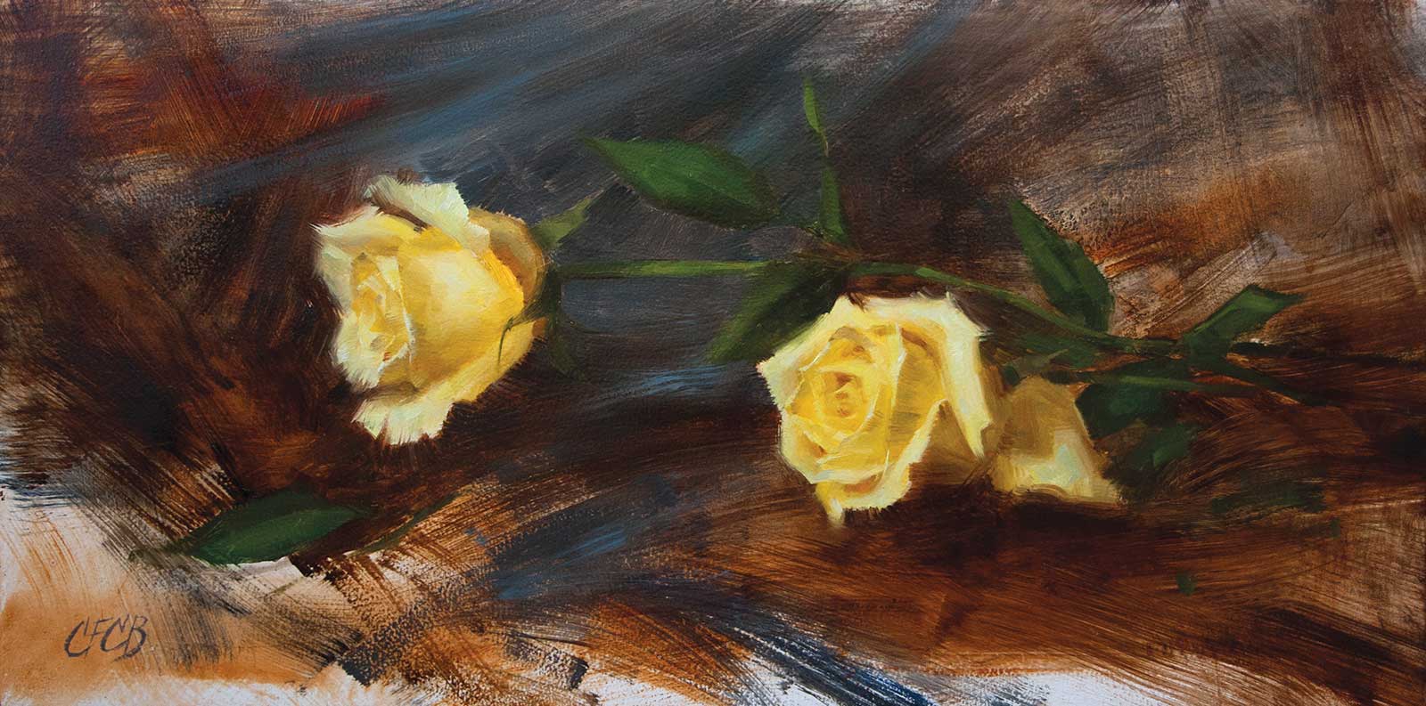
Two Roses, oil on panel, 10 x 20" (25 x 50 cm) Roses are demanding subjects to paint from life! I do not always like to present flowers in a vase, but it is necessary for them to have a water supply. Here, I used flower tubes filled with water to keep the roses fresh. Laying roses on their sides can squish the bloom, so I supported the stems with wooden blocks to preserve their shape but edited out the blocks in the painting.
Organizing values, or tones, takes a good deal more patience to master than squinting, but it keeps me honest while composing and painting. With flowers, the painter is faced with a nightmarish puzzle of values to sort through, so a blueprint for tackling them is essential. My strategy is to limit paintings to five values (black, white, and three even gray values in between). That’s it. When first composing, I hold my scale to the subject—say a yellow flower in a dark blue vase on a white cloth—and squint. No matter how many tones I think I see, I reduce them until they correspond to the scale’s five values. Your subject will almost always have more than five values, but this limitation allows you to simplify and organize what you see.
“Shape language” is a design term used in animation, but it has applications to fine art. When I’m painting a flower (or anything) my goal is not to render every observable thorn, leaf and petal. That works for nature but not for painting. Painting is about deciding what to put in and what to leave out. In addition to limiting values and palette colors, you can gain control and vastly improve your compositions by limiting shapes.
Many students exaggerate and overstate the contours of their subject using a random hodgepodge of strokes, lines and curves because they are not minding their mark making. What they’re missing is an appreciation for the game-changing beauty of making marks with intent. Limited shape language helps. For flower paintings, I use precisely two shapes: straight lines and C-curves. At first, it can feel counterintuitive or mechanical, but employing limited shape language will strengthen your paintings.
Finally, a word about color. In painting, value is critical to color. If your value organization is off, your colors will be off, and another tube of paint won’t help. To get good at color, limit your values. To edit out white noise in your composition, squint. Then, use shape language to bring it all together.
My Art in the Making The Garden Rose
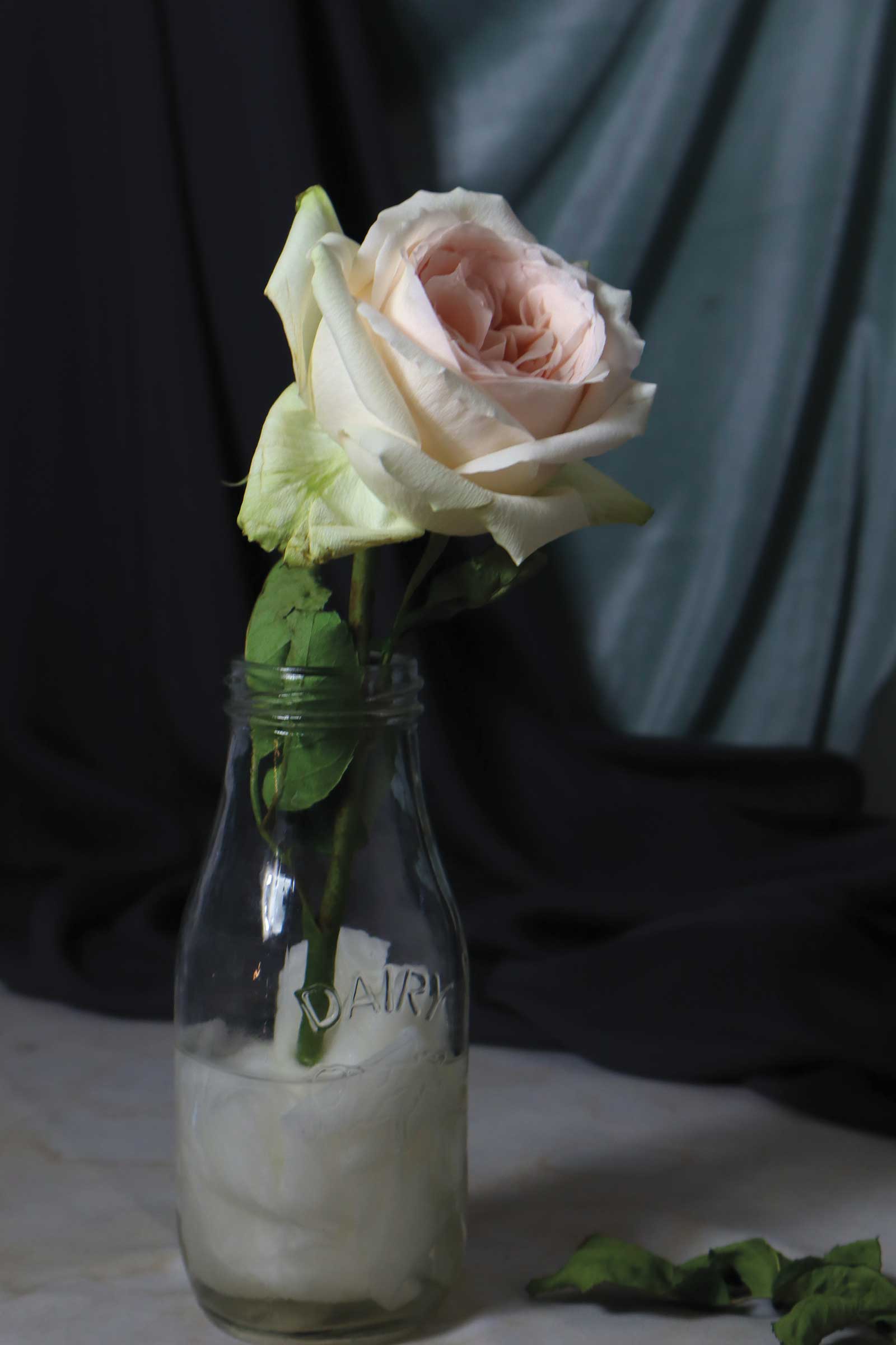
Reference Photo
I love to make charcoal studies before starting an oil painting. Charcoal is great because it is a painterly medium that creates soft, gauzy edges like oil paint, and it forces me to think in simple terms of shape and value before getting caught up in color. The drawing and the photo were taken several days apart. Though they are of the same rose, the flower wilted by the time I was ready to paint it. Just one of the many challenges of painting flowers from life, though I often prefer the shape of a flower that is several days old to one that is fresh.
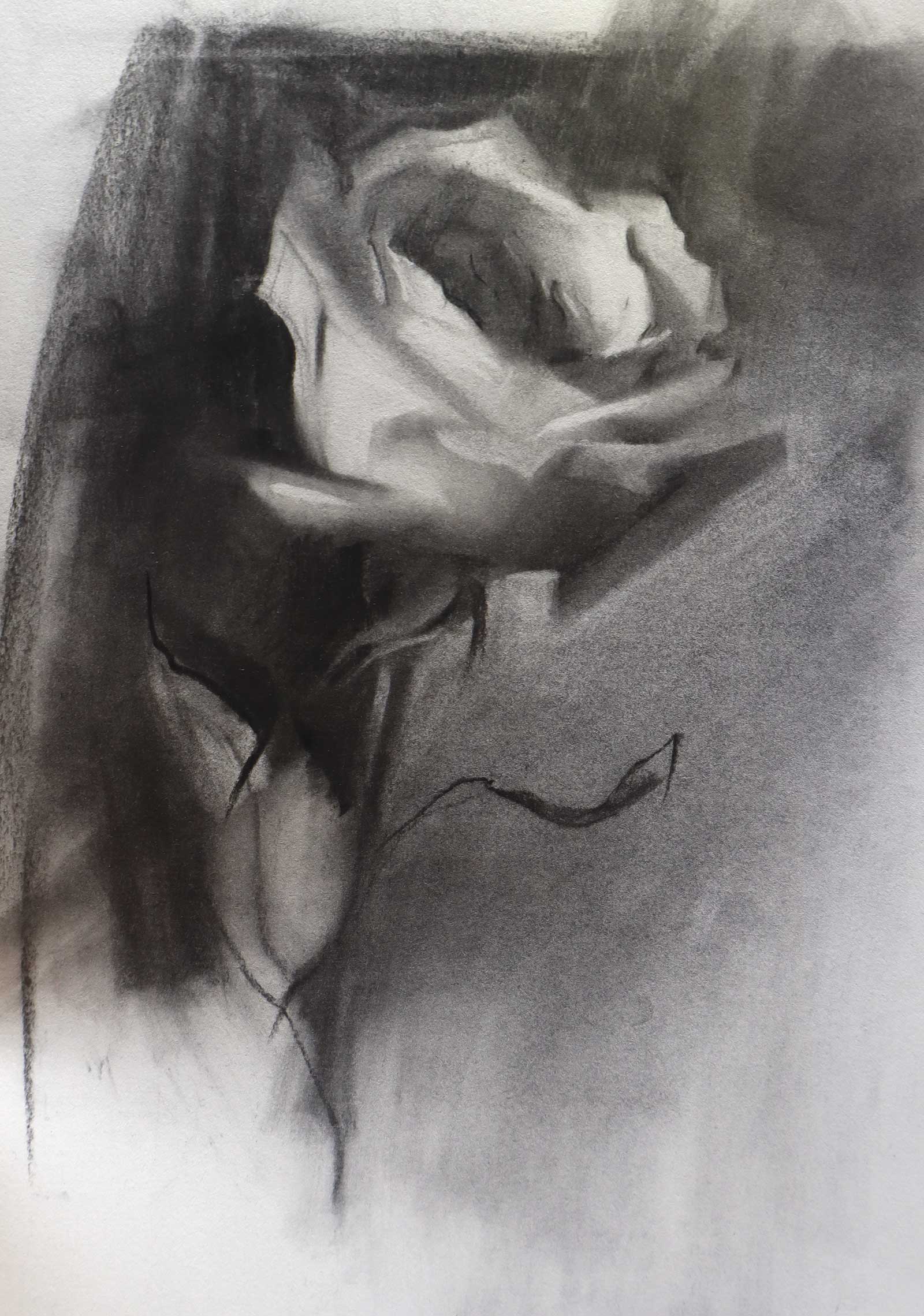 Stage 1
Stage 1 Charcoal Study
Charcoal studies help me keep my values organized and simplify the subject. While the study is valuable, the problems of the painting are not solved yet. There is plenty of time to change the composition.
 Stage 2
Stage 2 Underpainting
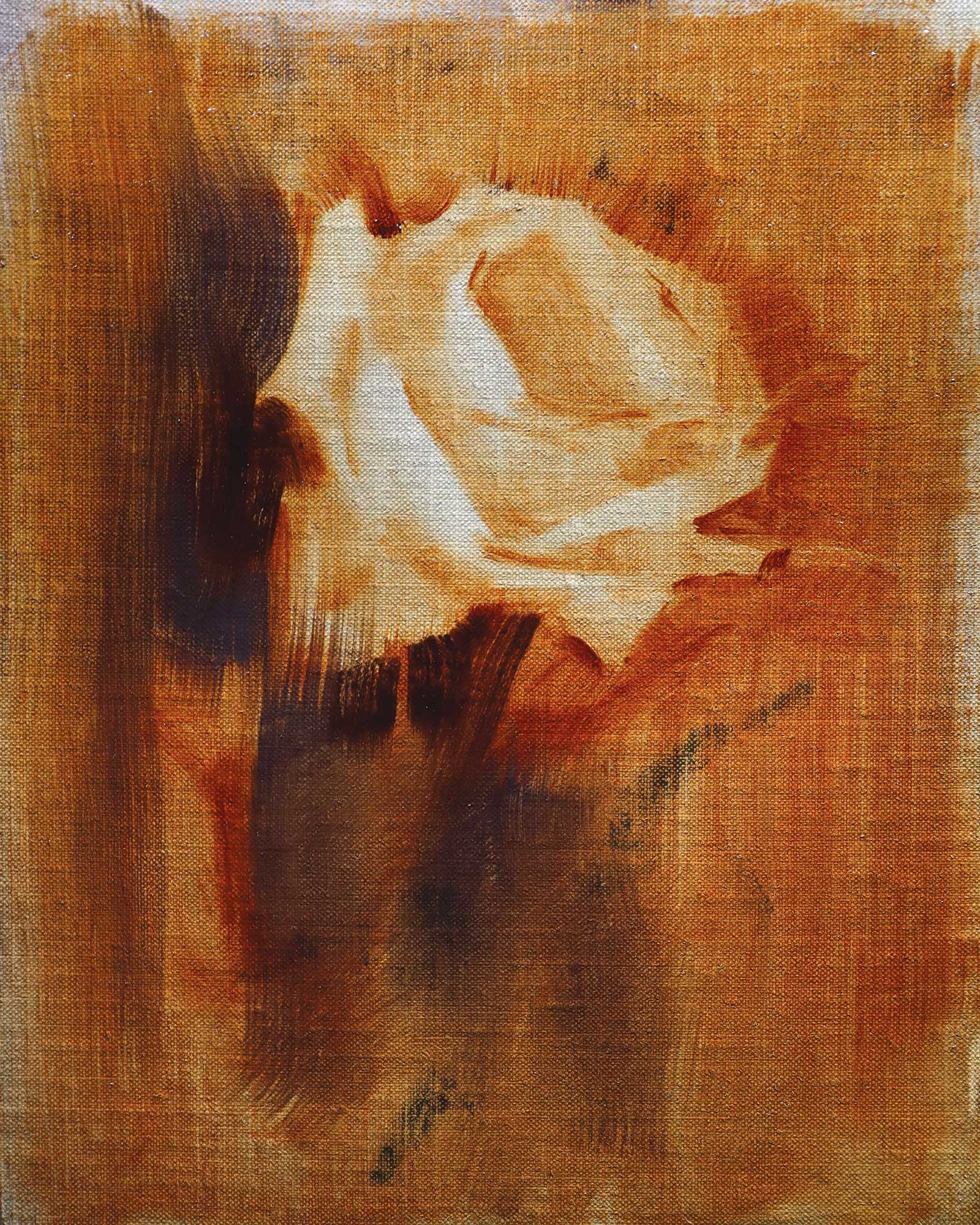
First, I stain the whole surface with a mixture of transparent red oxide and ultramarine blue. I like to “draw” my subject by wiping away the paint, which helps to keep the drawing simple.
 Stage 3
Stage 3 Blocking In Shadows
I squint to see the shadow shapes and block them in with color, checking the value against my scale. If they appear too dark, I lighten the value with cremnitz white or lead tin yellow.
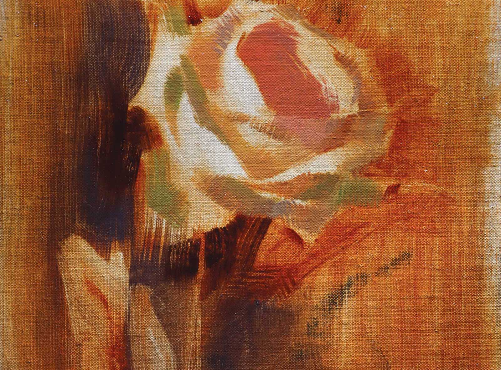
 Stage 4
Stage 4 Light and Leaves
I begin the light side of the flower with clear, simple marks. The dark background and shadow help me judge the accuracy of this value. The stem and leaves were painted with a palette knife.
 Stage 5
Stage 5 Developing Light and Value
The shadow values have not changed, however, they look more “settled” now. Value is relative, so it is hard to judge the accuracy until more of the surface is covered. A value scale really helps!
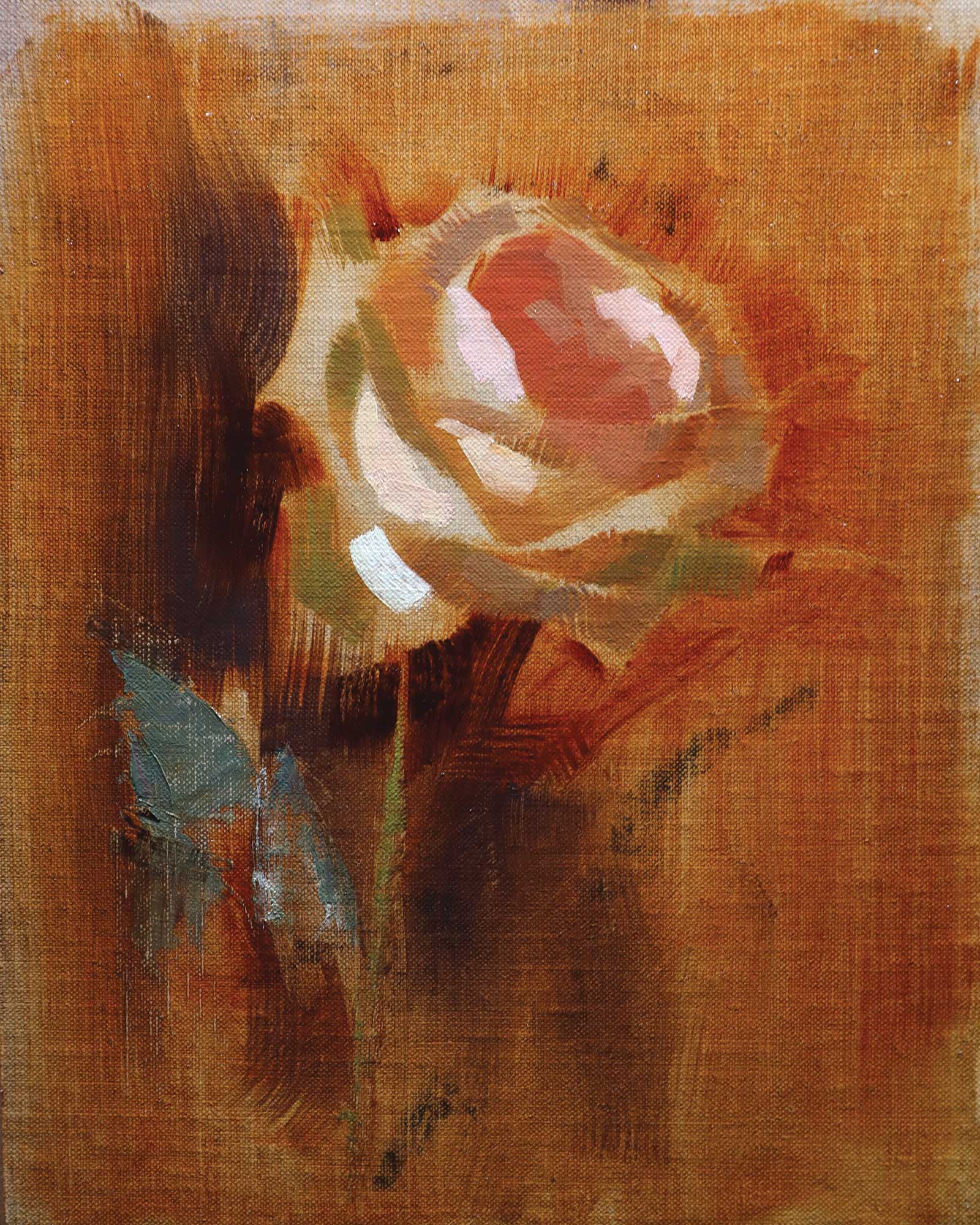
 Stage 6
Stage 6 Color Mixing
I use mixtures of permanent rose, titanium white and yellow ochre for blush-colored flowers. Yellow ochre is wonderful for painting flowers. Stronger yellows, like cadmium, are often too saturated and high tinting for delicate colors.
 Stage 7
Stage 7 Let it Dry
At this point I let the painting dry. When I returned to it, I had fresh eyes and new ideas for how to resolve it. I oiled out the surface lightly before painting again.
 Stage 8
Stage 8 Background Values
The background values are very important to the composition. I like to keep the highest contrast with the background on the side where the flower is brightest, and less contrast on the shadow side.
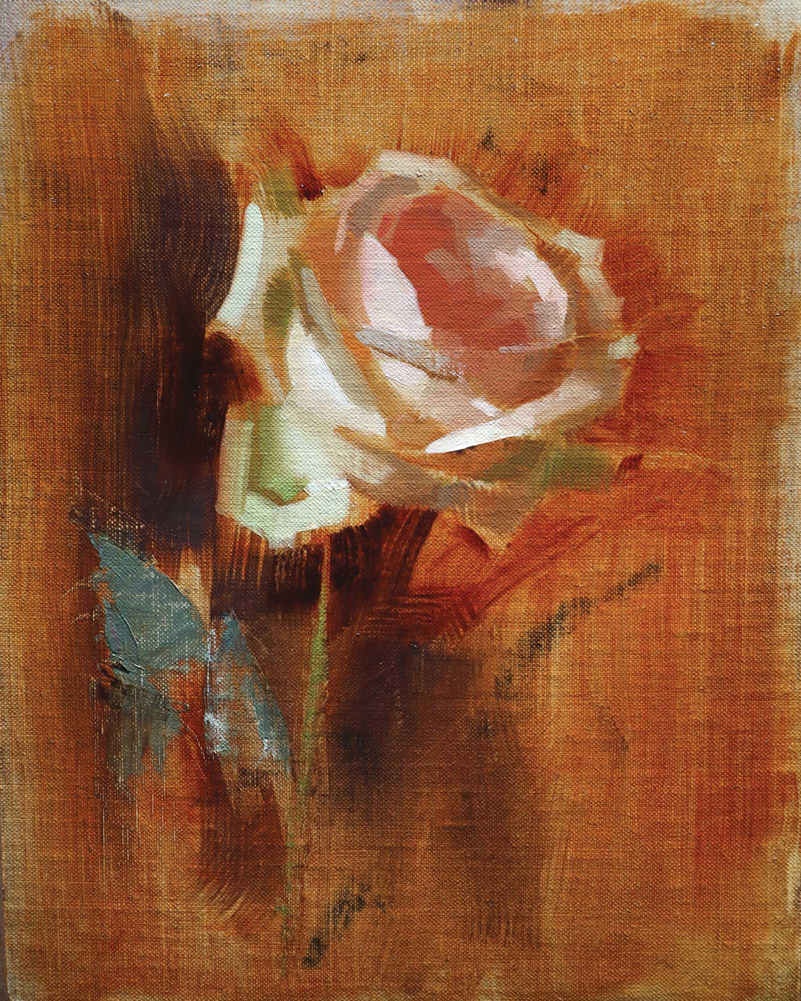
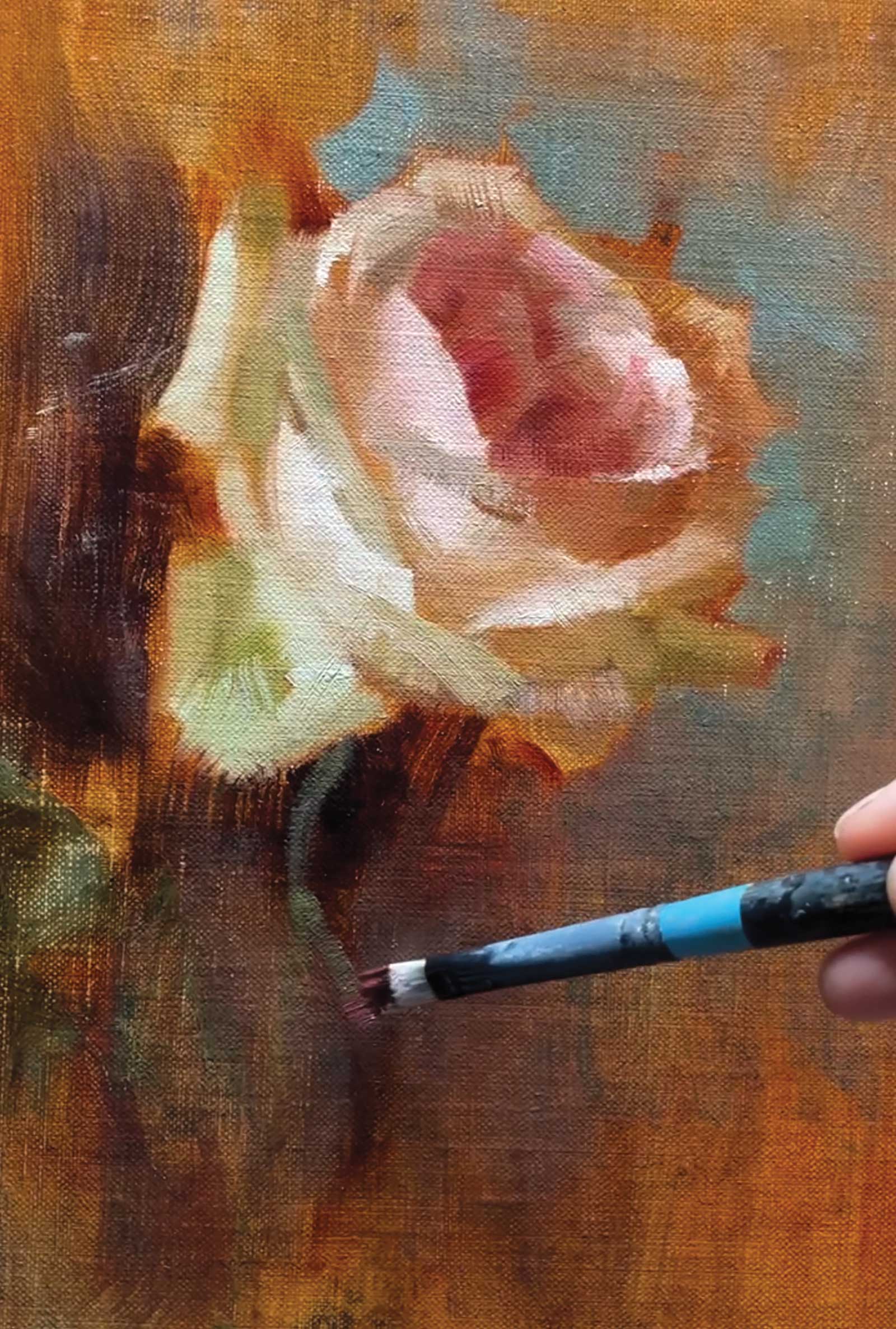
 Stage 9
Stage 9 Changes to Stem and Leaves
After studying some roses at a botanical garden, I decided to change the stem and leaves in my painting. Garden roses usually have more interesting shapes in their stems and leaves than commercially grown flowers.
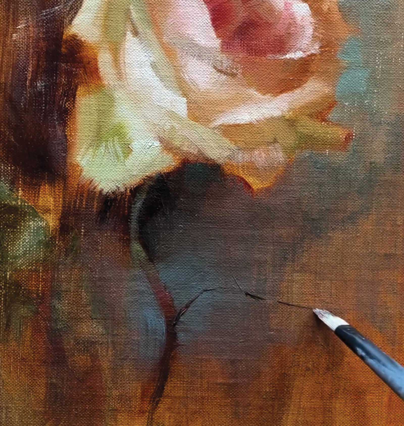
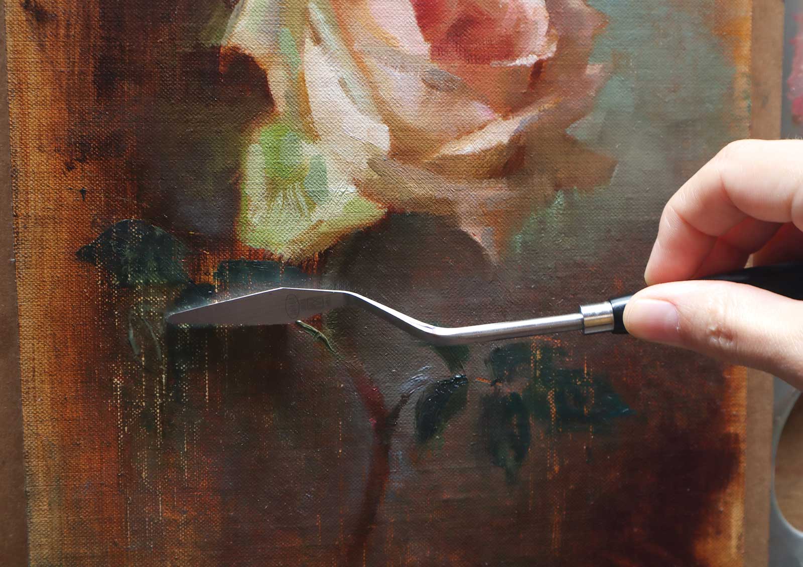 Stage 10
Stage 10 Scrape Out Leaves
I painted in some dark green leaves and then quickly scraped them back out with a palette knife. This is the improvisational nature of painting. I don’t want the leaves to demand too much attention.
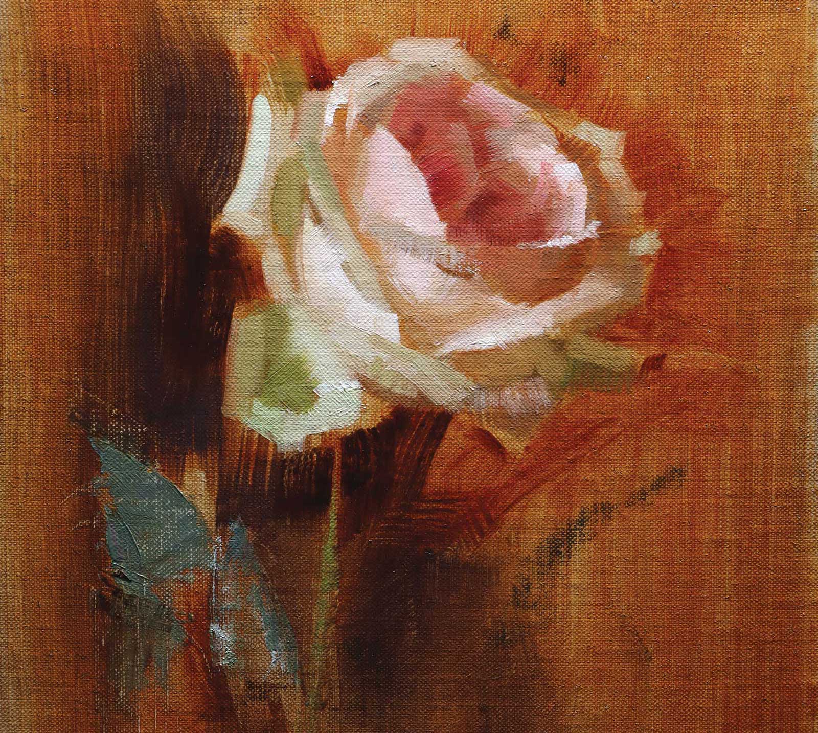
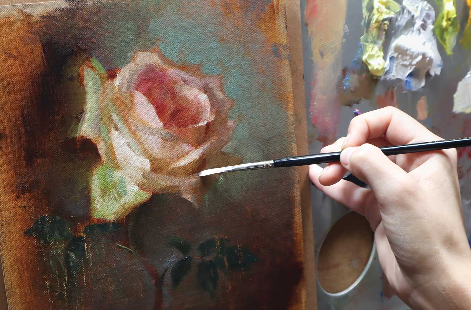 Stage 11
Stage 11 Adjusting Temperatures
It is easier to resolve the painting when the drawing and value structure are already planned. Instead of blending, I prefer to mix and paint minute value steps in between the shadow and light shapes.
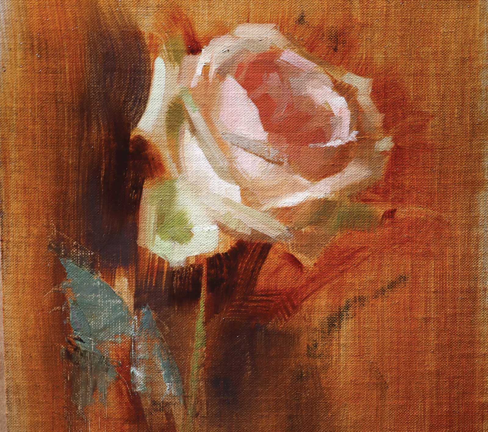
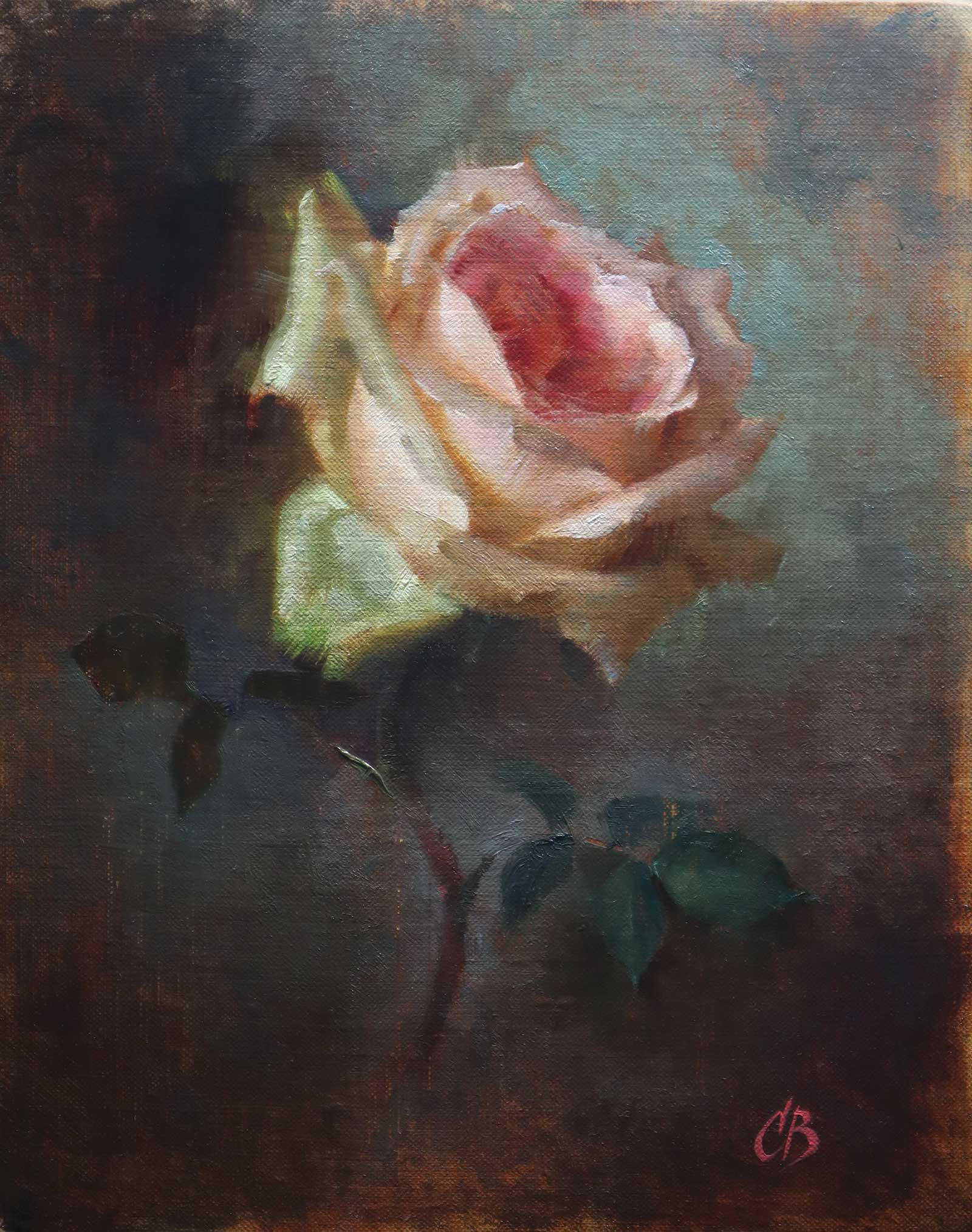 Stage 12
Stage 12 Finished Artwork
The Garden Rose, oil, 10 x 8" (25 x 20 cm)
I resolved the background and the leaves. Impasto highlights create a greater sense of dimension. The simple value statement allows me to experiment with color and texture without the painting getting too out of control.
About the Artist
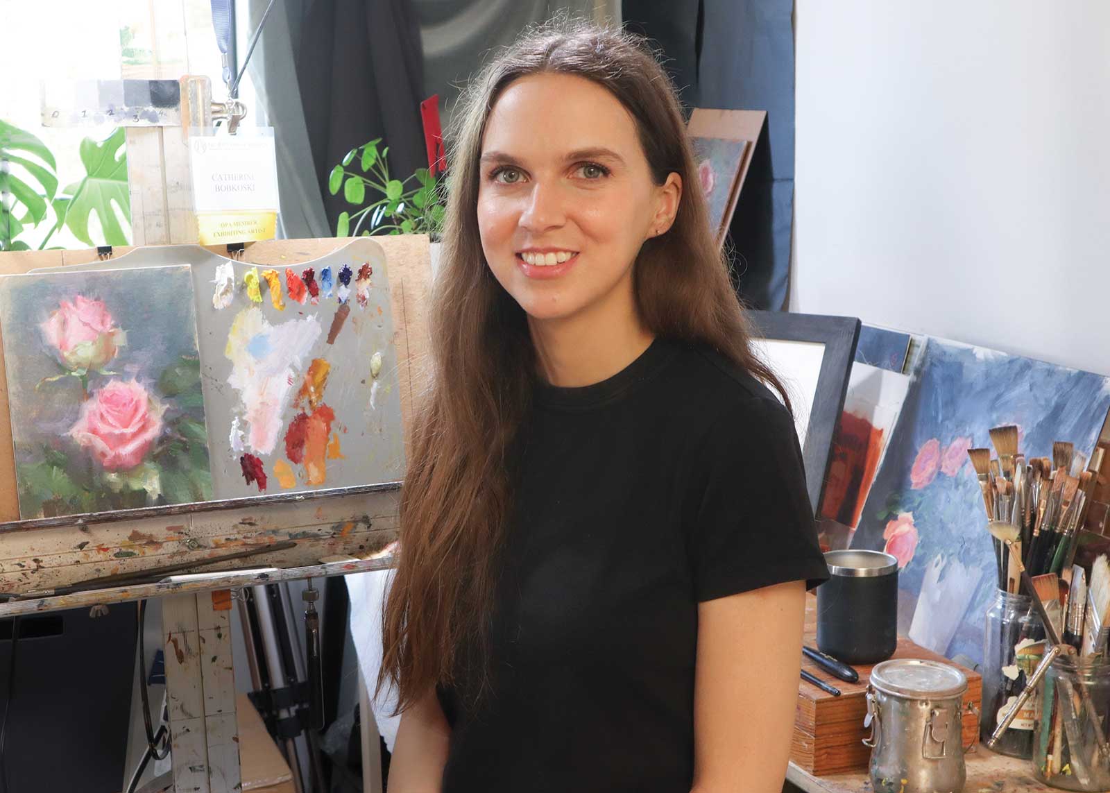 Catherine Bobkoski
Catherine Bobkoski is a still life and figurative artist whose work celebrates the quiet beauty of ordinary things. Her delicate paintings of flowers and still life scenes are exhibited nationally, including at the Oil Painters of America 2021 National Juried Exhibition. She began studying drawing and painting at The Watts Atelier in Encinitas, California, and later at Grand Central Academy and New York University in New York City.
Bobkoski enjoys sharing her knowledge and love of painting with others. She is a sought-after painting instructor and teaches private classes and workshops online and at many art schools throughout Southern California, including Creative Arts Group in Sierra Madre, California, and The Art Studio in Westminster, California. She teaches online to students around the world, most notably with New Masters Academy. Students describe Bobkoski’s teaching style as generous, thorough and joyful. She especially loves teaching painting and drawing basics to students in a clear, concise way that is easy to understand.