



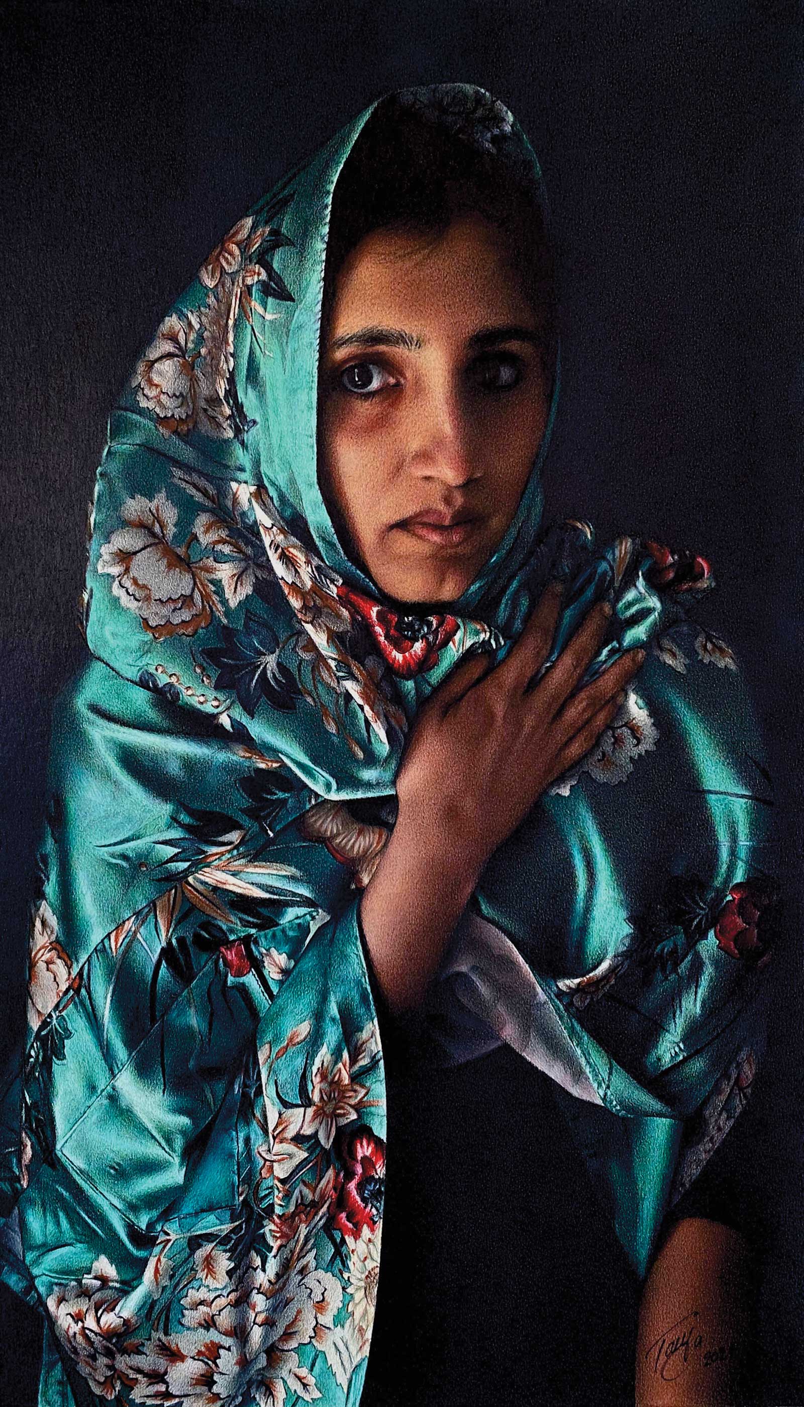
 Jade, colored pencil, 28 x 16" (71 x 40 cm)
Grand Prize
Grand Prize is a four-page editorial feature in American Art Collector magazine
Tanja Gant Texas, USA
Personal Connection
People provide the main inspiration for Texas-based artist Tanja Gant, although the artist says she finds little gems and potential subjects in everything she sees. “I take photographs of everything and anything, keeping in mind that those little gems might make it into a drawing eventually. Sometimes it’s a word or a lyric or a sentence from a book that helps me get an idea and solidify a composition. Other times it’s my personal experiences or experiences of my models, who are mostly my family and friends. Even though I’ve drawn some models multiple times, the underlying theme of my work is the human experience.”
Working in colored pencil, Gant’s artwork lives in the realm of contemporary realism. “Colored pencil as a medium lends itself to very detailed work but for the sake of composition, time and sanity, in all honesty, I try to keep the whole process as simple as possible. It’s a very tedious, unforgiving and time consuming medium that requires an incredible amount of patience,” she says.
Gant strives to capture the person she’s drawing in a way that honors who they are and tells their story. Often, she’ll tell her own personal stories through the models because they can “say” it better than her through their poses and acting ability.
“It’s all about the attitude/personality but only after you master the drawing part. A good work of art is more than technical proficiency…One of the most rewarding things about successfully completing a drawing is the emotions, interpretations and awe they inspire in the viewers. When people connect to an artist’s work, which is sometimes deeply personal, it is one of the most satisfying feelings in the whole creative process.”
Gant’s most recent colored pencil drawing Good Shepherd can be seen in the Colored Pencil Society of America’s 30th annual traveling International Exhibition.
My Inspiration
People have been and continue to be an inspiration for me. When I first started drawing portraits, near the end of elementary school, I was mainly focusing on getting the likeness of the subjects all the while being intrigued by highly contrasted values and simple compositions. After moving to America in 1999, and having access to colored pencils, I decided to add a new element to my graphite drawings by introducing color. As a self-taught artist I went through a lot of trial and error trying to master that new medium, but I was determined to take every new drawing, whether graphite, charcoal or colored pencil, a step further. Jade is a more recent result of all those trials (and errors). For me it’s not enough to just “get it right” anymore. Now I see people as infinitely complex and fascinating, regardless of age, size or shape. After I took reference photos for Jade I knew immediately that I had something special. The one I chose to draw had all the elements that inspire me to create, from dramatic contrast to vibrant colors and different textures.
My Design Strategy
Since I’m mostly portraying individuals, I try to keep the composition and “background noise” to a minimum. I believe that in a lot of cases less is more. I choose to include the elements that enhance the composition, say something about the model and add to the mystery. I purposefully get rid of everything that distracts, even the background when necessary. In Jade the beautiful model and stunning fabric that’s framing her face was all the drawing needed so I made them the focus. The delicate hand and the busy pattern of the fabric both lead the eye to the flawless, enigmatic face, while the dark background brings them forward.
My Working Process
Once I choose the reference photo to draw from I use a grid system to transfer the image onto the paper. I then select the colors I will be using from several different brands of colored pencils. Each brand has a unique consistency, and I find that that’s what makes them work so well together. I draw the initial outline very lightly with a mechanical pencil. I apply colors in light layers working from light to dark, increasing the pressure on the pencil in the darker areas. I try to keep the number of colors I use to a minimum, because less is more. It’s very easy to get carried away and lose the tooth of the paper, which is what makes colored pencil pigments brighter.
Contact Info
Email: tanjagantart@gmail.com
Website: www.tanjagant.com
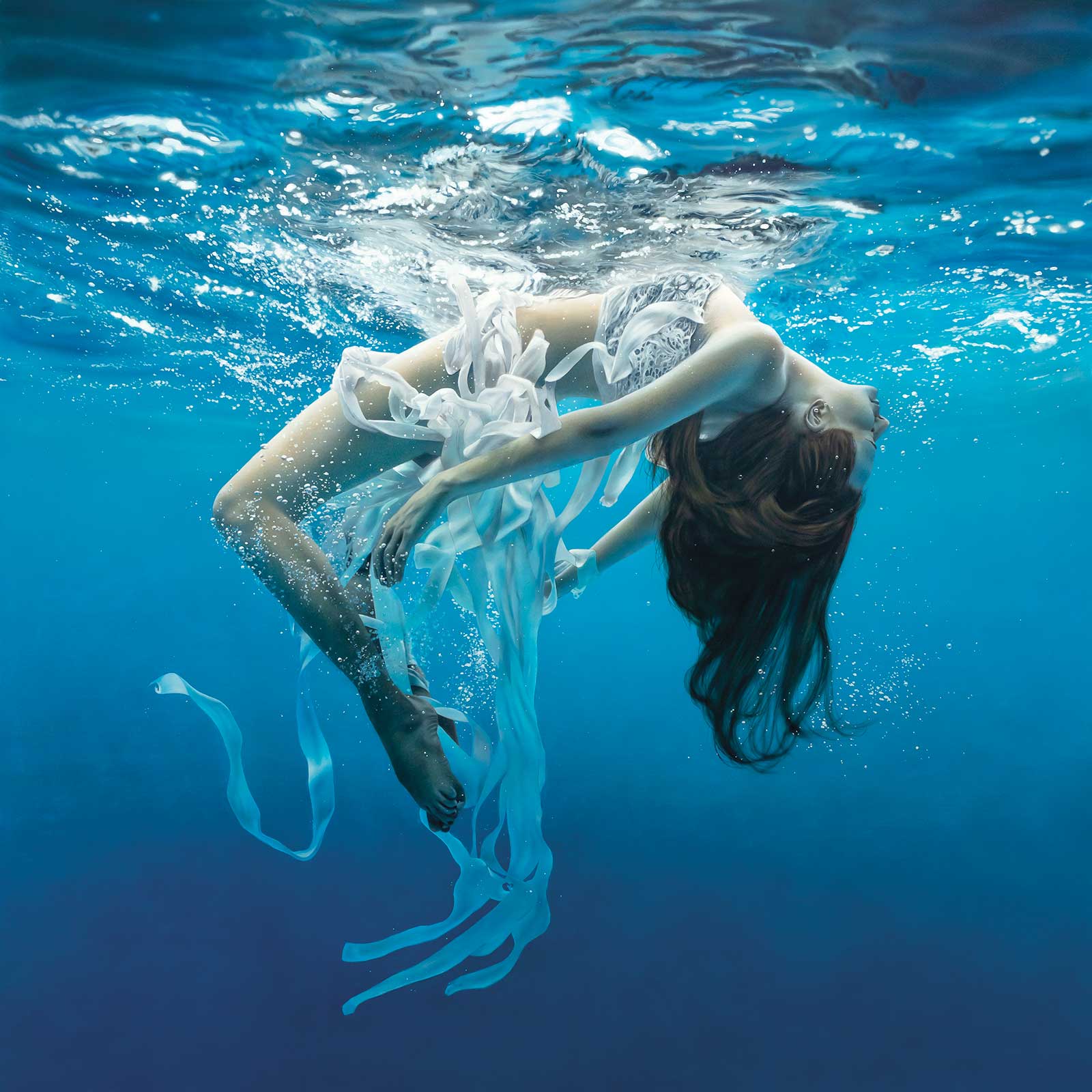 Weightless, acrylic, 33 x 33" (83 x 83 cm)
Second Prize
Second Prize is a two-page editorial feature in American Art Collector magazine
Johannes Wessmark Värmland, Sweden
My Inspiration
I normally take all my reference photos myself. This is one of the very few paintings I have made from someone else’s photo. I wanted to make an underwater scene, which is quite difficult if you don’t have the right equipment and knowledge, so I was looking for underwater photographers and came across a fantastic photo of Dmitry Laudin. It was stunning and different, so that was enough inspiration to make a painting.
My Design Strategy
As this isn’t painted from my own photo, I cannot say much about the design strategy. I can add though that it is quite difficult to take photos like this. I have a small watertight camera and have tried it. Since you can hardly communicate with the model underwater, you have to take lots of photos, and then see what you came up with and if any are usable.
My Working Process
My working process is in short like this: I decide how big I want the final painting and print the reference photos in small pieces that together make up the whole image in full size. I make the sketch on a light table to make sure everything is in its correct position. The background and other bigger areas are airbrushed with acrylic paint, which dries immediately. Smaller details are painted with tiny brushes and oil, which dries slowly. This gives me more time to work with the most delicate details before they dry.
Contact Info
Email: brev@johanneswessmark.se
Website: www.johanneswessmark.se
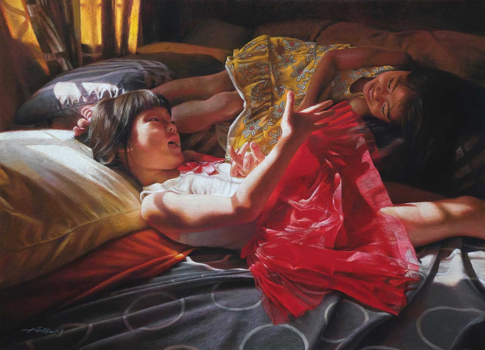 Sunny Conversation, pastel on sanded paper, 15½ x 21½" (39 x 54 cm)
Third Prize
Third Prize is a one-page editorial feature in American Art Collector magazine
TaiMeng Lim Selangor, Malaysia
My Inspiration
Staying at home became the new normal during the pandemic, and I have had to rediscover aspects of the home that have otherwise been ignored. Rooms have been cleaned, documents organized and old photographs revisited with the newfound time. Revisiting old photographs always gives me a new reward as it rekindles memories that may have gone dormant over time. I literally stumbled on some photographs that I only had a vague recollection of capturing, especially the one I captured during the first day of our Chinese New Year back in 2014. It was such a precious moment, seeing both of my nieces have a wonderful time, and enjoy chit chatting and laughing in the bedroom. So, I decided to paint it in the hope that seeing this image allows me to travel back in time, one memory at a time.
My Design Strategy
Painting from photographs, I always make sure the photograph comes with a good variety of values (shading and depth). For this piece, I wanted to capture the details of this scene with a great mood and atmosphere. I worked around with my photographs until I found exactly what I wanted, then I proceeded to the painting process, which included the pleasing composition, natural expressions, focal point and color temperature.
My Working Process
First, I started with a detailed drawing on sanded pastel paper. Then I did a complete monotone underpainting by using burnt umber acrylic paint to establish the value relationship early on. With the combination of hard and soft pastels, I applied the first layer of color working thinly, then adding layers of color working more and more opaquely, and finally the details and highlights. I constantly adjust the form and shape until I am satisfied. This process allows me to take time to appreciate the beauty of each element in my piece, and I hope it can draw the viewers in to elicit an emotional response and rekindle some happy memories of their life.
Contact Info
Email: info@taimenglim.com
Website: www.taimenglim.com
Finalists
Each receives an Award Certificate and a one-year subscription to International Artist magazine PLUS having their work seen worldwide by international galleries looking for new talent.
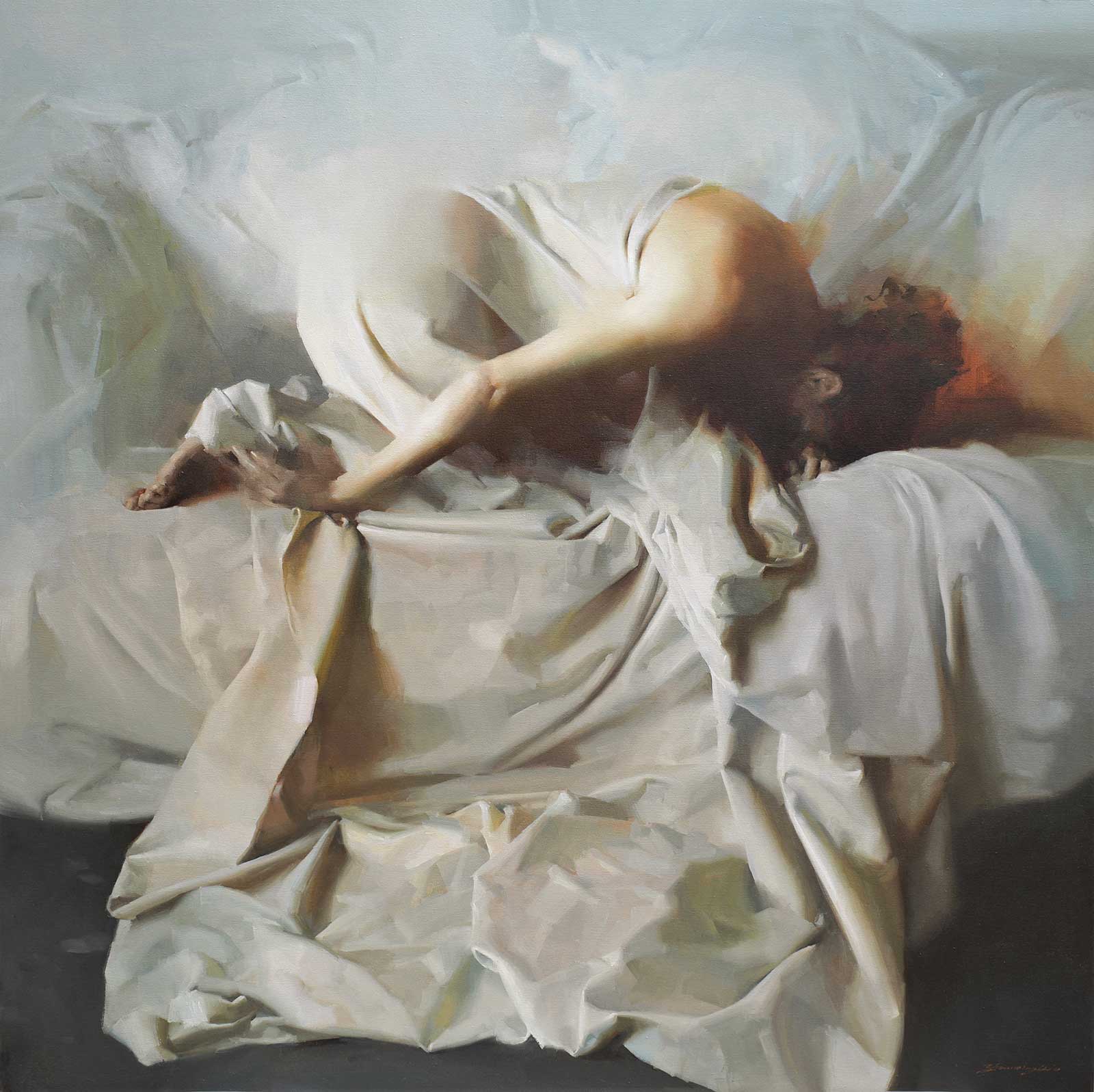 Pale Age, oil, 48 x 48" (121 x 121 cm)
Zhaoming Wu California, USA
My Inspiration
A few years ago, I had the opportunity to ask a young female model to pose for me to take the reference photos for my painting. I set the model in front of a white wall in natural light and wrapped her with large pieces of light gray fabric. There is a serene tension created by her bent movement, and the entire tonal setting is reminiscent of a marble sculpture.
My Design Strategy
I was planning to create a larger piece using the inspiration from this reference photo, so I ordered a stretched 48-by-48-inch canvas at the art supplies store. I also used photoshop to crop the reference photos for composition and toning adjustment to complete the preparation before the canvas.
My Working Process
On the canvas, I first use the raw umber color to outline the shape of the character in the predetermined composition. Since I wanted to create a marble-like vision in the painting, I decided to use only three colors: raw umber, cadmium yellow and ultramarine blue to complete this work.
Contact Info
Email: zhaomingw@hotmail.com
Website: www.zhaomingwu.com
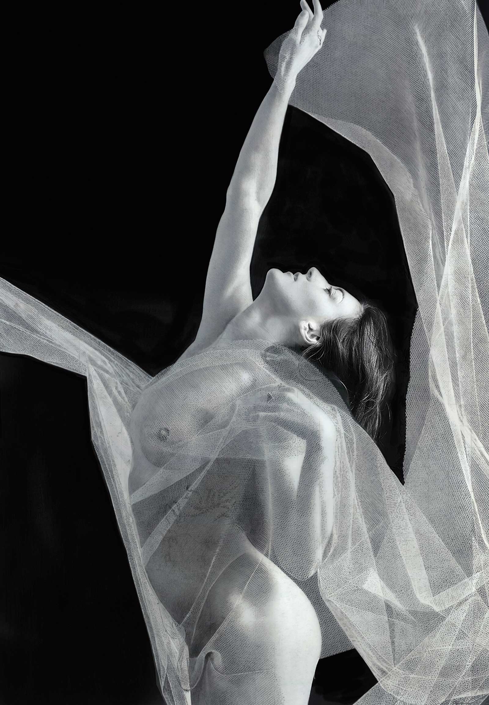 Corralling a Lightning Bolt, colored pencil, 40 x 30" (101 x 76 cm)
Tracy Frein Illinois, USA
My Inspiration
My inspiration is drawn solely from my subjects and their hidden emotional truths.
Each subject is a compelling visual portrayal of the human spirit, determination and courage. I strive to show the viewer that while at first glance my subjects show a sense of inner fragility, they also have strength and their own visual voice. Capturing this inner fragility is what has moved me forward documenting my subjects and their dealing with mental illness, addictions and social stigmas.
My Design Strategy
Corralling a Lightning Bolt is the celebration of resisting the polarizing tides of fear that sweep us off our feet and keep us from seeing the truth. There is no controlling life. Instead of letting it all in, the only way to overcome it is to rise, let go and shoot for a higher ground. In the choice to let go of your known way of being, the whole world is revealed to your new eyes.
My Working Process
My process Drawing by Subtraction® is a trademarked black-and-white colored pencil process, where I strip away colored pencil pigment from the surface of Grafix® Drafting film. Working in the Old Masters’ technique, Chiaroscuro, I create a sense of opposition and tension between different elements as I create a complete range of tonal values-eventually adding detail while expanding and readjusting my value structure.
Contact Info
Email: tracyfrein@gmail.com
Website: www.tfrein.artspan.com
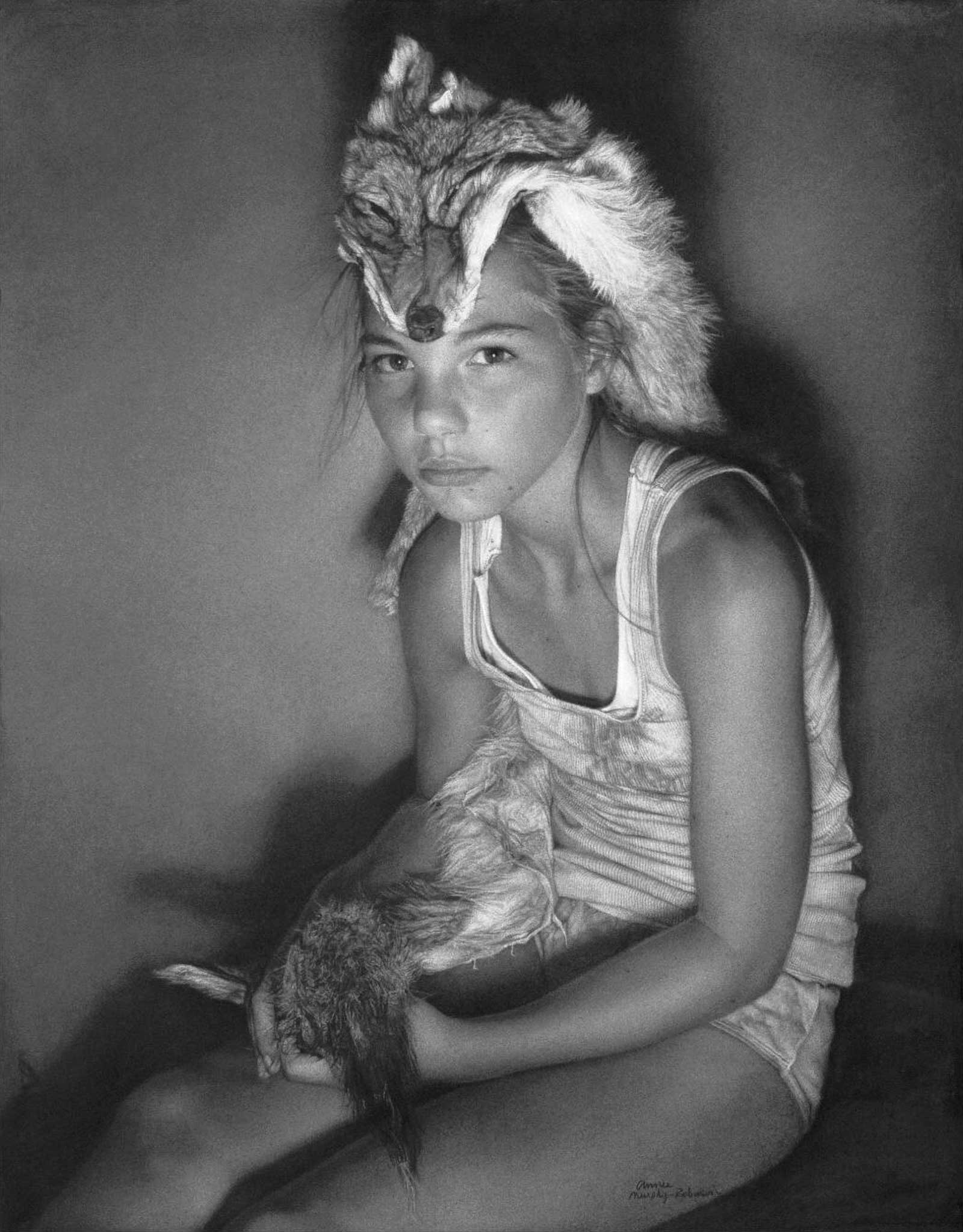 Casey and the Coyote “Animus”, charcoal, 42 x 35" (106 x 88 cm)
Annie Murphy-Robinson California, USA
My Inspiration
This piece is a drawing of my daughter that is actually a self-portrait. As a child we lived on 80 acres in Montana and I was obsessed with animals, especially wolves and coyotes. The title “Animus” is meant to imbue her with masculinity, offering her more protection in a world that is wild and unforgiving. This artwork also implies pack mentality. The idea of family, and in the larger sense community and hierarchies within that construct, is also alluded to.
My Design Strategy
My design strategy always starts with curating the photo session. I take a lot of photos to get the perfect “look” which includes everything from composition to clarity.
My Working Process
I sand charcoal into heavy (300 gsm) printmaking paper. The sandpaper is a tool that allows both an additive and reductive process to occur. Using this process, I am able to achieve a more complex value scale.
Contact Info
Email: artfamily@sbcglobal.net
Website: www.anniemurphyrobinson.com
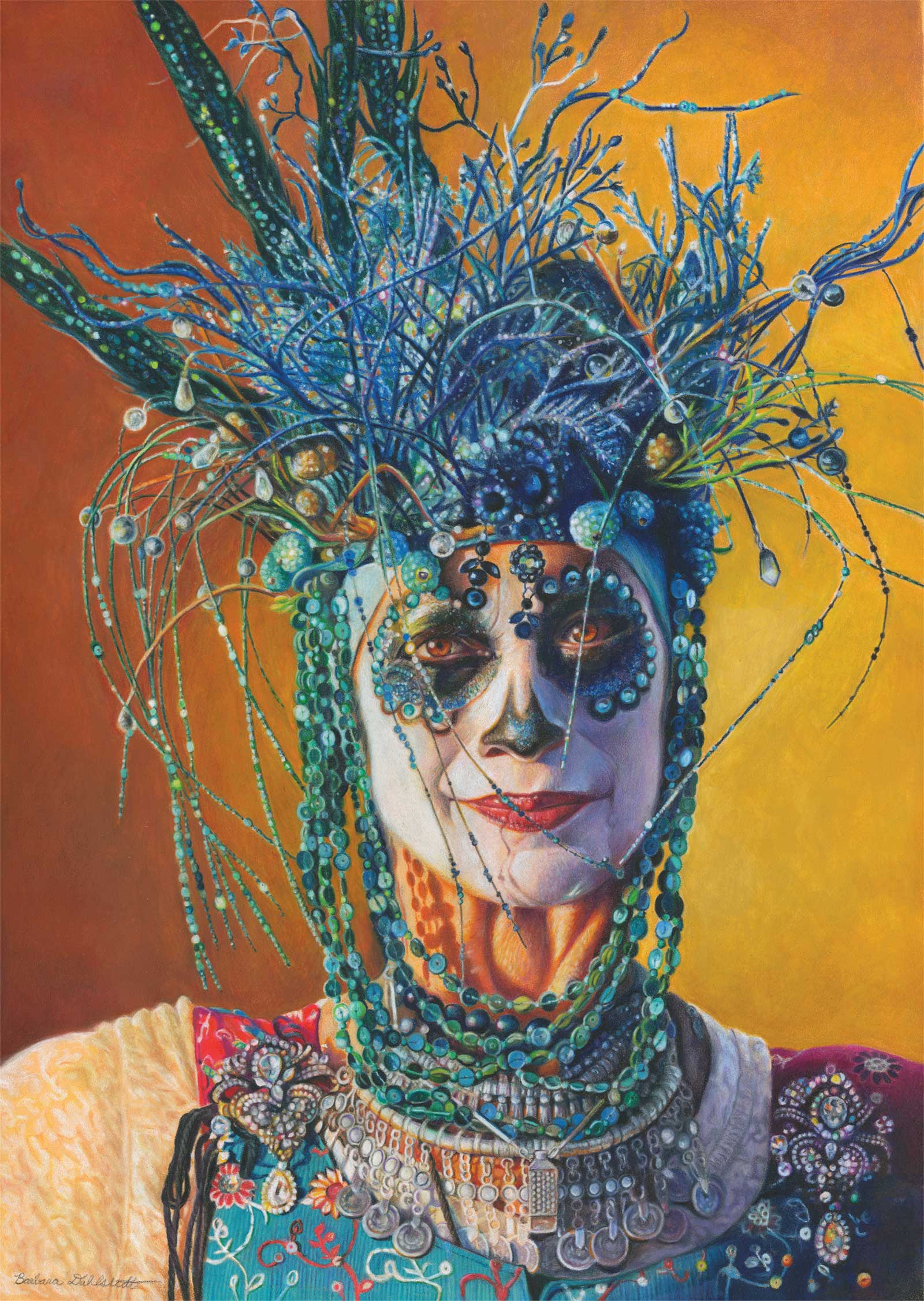 Lifting Spirits, colored pencil, 26 x 18" (66 x 45 cm)
Barbara Dahlstedt Arizona, USA
My Inspiration
Lifting Spirits was inspired by a woman dressed up for the “Old Souls Parade” in Tucson, Arizona. She stepped out into the light of the setting sun and caught my attention with her stunning costume and graceful stature. The Hispanic culture traditionally honors the dead with a holiday called Día de Los Muertos. It is a joyful celebration where deceased family members are remembered and colorful skulls are painted on faces.
My Design Strategy
My composition was developed by eliminating nonessential elements. I omitted the crowd behind my model and focused on capturing the light illuminating one side of her face. I chose maize colored Pastelmat because the bright peach color was perfect for showing through the white makeup on her face. I decided on a gradation of gold and rust for the background to contrast the turquoise colored costume and symbolize the colors of the Southwest.
My Working Process
I began this drawing by tracing the major shapes onto the paper for general placement. Then, I used the grisaille technique of developing the values before adding the local color. I used archival colored pencils and ArtStix with the highest lightfast ratings to create each section of the drawing. Solvent and heat were used to blend colors. Fine detail was achieved by viewing my reference photo on a large computer screen.
Contact Info
Email: barbara@dahlstedtart.com
Website: www.dahlstedtart.com
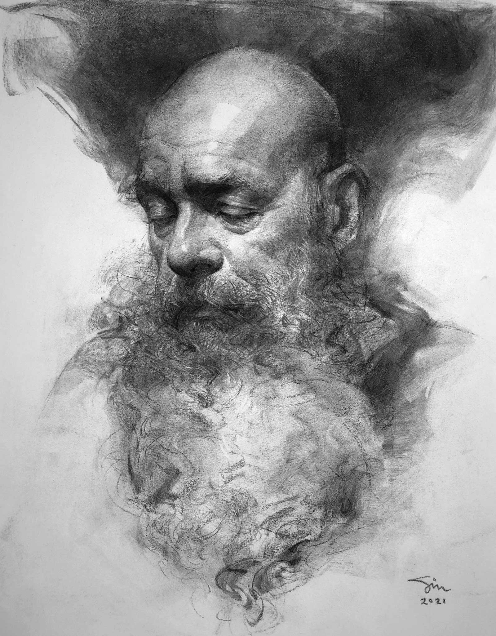 John Carrasco, charcoal, 17 x 14" (43 x 35 cm)
Oliver Sin California, USA
My Inspiration
This is a vine charcoal portrait drawing of John Carrasco, the model who has been my greatest muse for over 10 years. My inspiration comes from a desire to create a soulful portrait drawing that looks effortless to the viewers. I never just copy what I see but interpret it with my emotions instead. My subject and I are merged into one and are presented in a deeply personal expression. My subject provides visual information, but my mind and body capture it on paper, seasoned by all those years of drawing. Drawing portraits brings me joy and satisfaction, plus one extra bonus: the elevation of my soul.
My Design Strategy
I have always considered drawing to be one of the greatest vessels to study paintings. I used drawing to help me develop my aesthetic for paintings, leading my drawings to look a great deal like paintings with countless layers of vine charcoal. The point of a drawing is to capture a feeling of some kind. For me, I love capturing some sense of someone being there, in some way emotive. My goal is to capture a person’s spirit, expression, likeness, personality, mood and soul. Each artwork reflects the unique perspective of the artist, no matter the style or subject. This is the element of a good drawing that only comes from within the artist.
My Working Process
I start with the structure of the human head by eliminating details and breaking them down into a few basic shapes and planes. Working from live models is important, not only to develop drawing skills but also to gain a better understanding of the subject’s character and personality. When there is interaction, the artist and subject develop some level of connection and share a humanistic moment, and the quality of the portrait benefits from this. It is easy to become absorbed in the technical aspects of drawing and miss the purpose. Technique without spirit is meaningless, but the feeling cannot be conveyed without technique-the two must be united.
Contact Info
Email: oliversin@gmail.com