


Painting a realistic seascape isn’t easy. There are many aspects to think of before it will turn into a spectacular and fresh painting. Of course, I’ve observed many waves and have spent a lot of time on my favorite beaches in Denmark or in the United States to get a feeling for the right look. Mostly, I paint seascapes by reference photo because the circumstances like the current, the wind direction or the light change every second during a live painting, so that I would never get it right on paper. The photo will remind me exactly of that specific, fascinating moment with gray sky and rough sea, or a bright hot day on the beach.
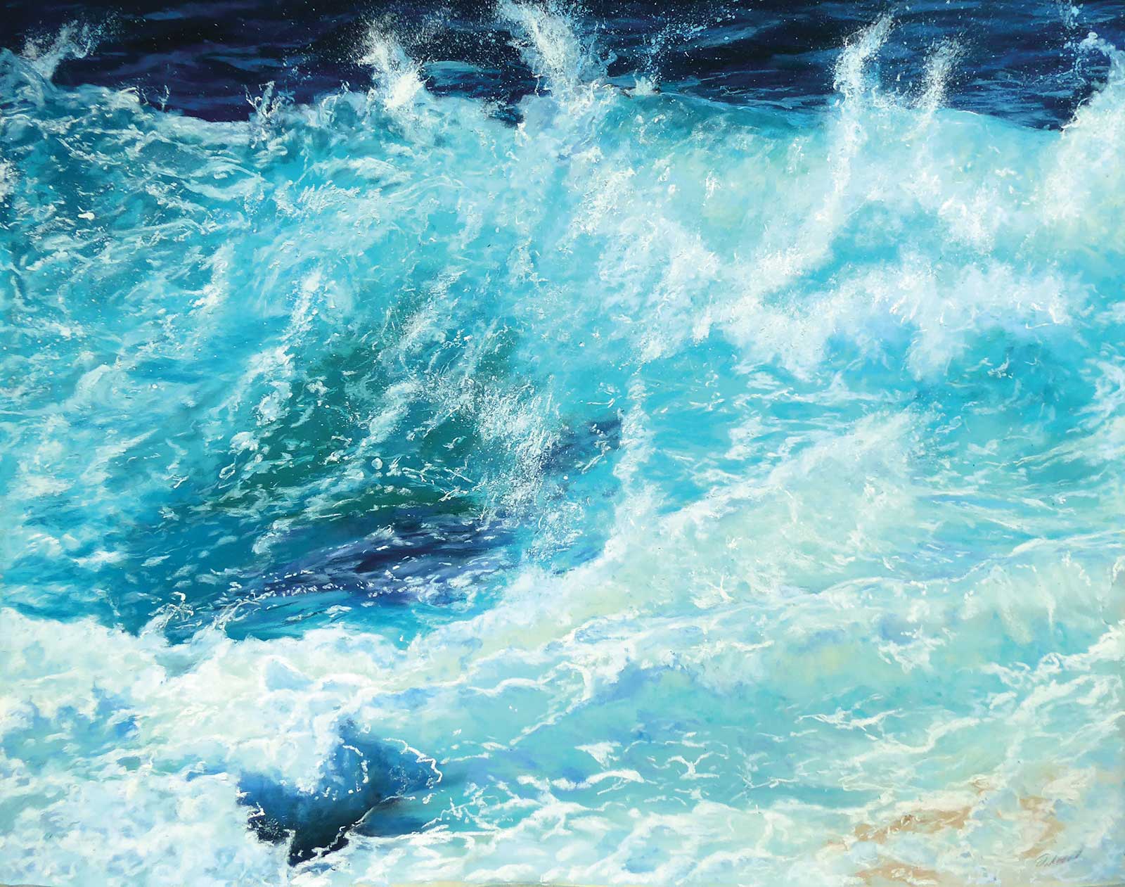
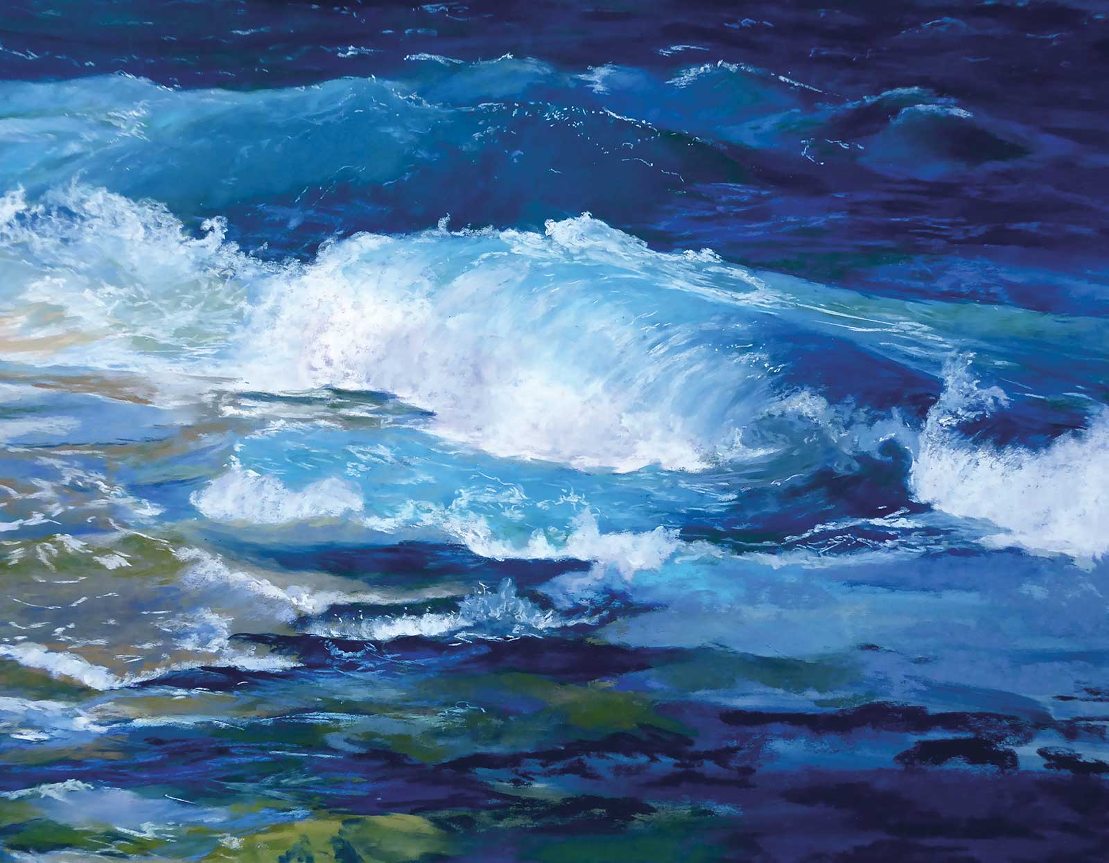
Refreshing, pastel, 12 x 15½" (30 x 40 cm) This February I won the Best of Show 2022 award in the Left Coast Pastel Painters Society show Pastels in Paradise. Refreshing is a real eye catcher, and the judge couldn’t take his eyes off this pastel. I’m very honored and happy!
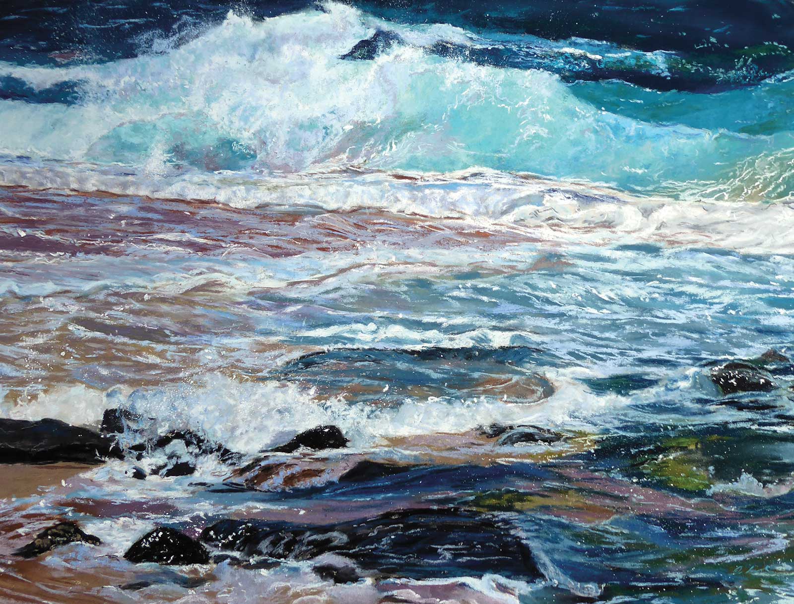
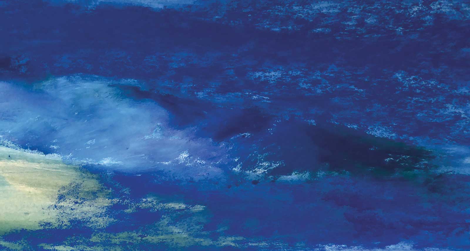
I’ve searched through the photo folders on my computer looking for a special wave and an interesting foreground. For this demonstration, I found this picture taken on vacation on Maui, Hawaii, in 2018. The spectacular turquoise colors and the rough ground where the water flows over the sharp edges of the lava in a horizontal slope was an interesting composition. The breeze came from the side and the current let the waves roll laterally. It was late morning and a wonderful day with only a few people on the beach. What’s more beautiful than sitting on the beach, letting the waves take our thoughts away, tumble and roll them, wash them, and bring them back to us, all washed and fresh?
Tumble and roll, pastel, 15½ x 19½" (40 x 50 cm) Many of my recent finished works are from our favorite beaches on the north shore of Maui, Hawaii. They show the fantastic turquoise colors of the Pacific in this area, which are unbelievable when it’s your first time on these beaches. I remember on my first day of summer 2014, I stood there looking at the water speechless, and my husband said, “I see a lot of new, beautiful paintings in your eyes.”
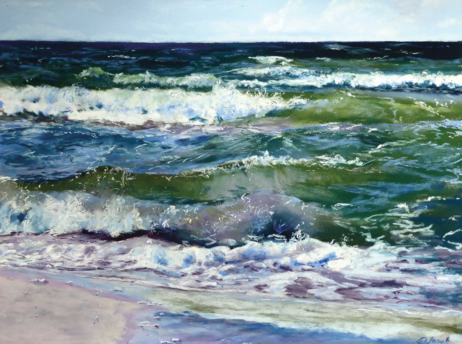
Again and again, pastel, 9 x 12" (22 x 30 cm) I’ve painted in plein air “again and again” during our holidays on Denmark’s Baltic Sea coast. The waves are not spectacular there, but the nice green colors fascinated me. And when I was looking at the reference, I saw some shiny violet parts there too. These parts of the waves make them glassy. So, many thin layers are necessary for me, for volume, transparency and movement.
As I would like to recreate the movement of the wave, I must add many thin layers in different colors. In the following article, I will show you how to do it, and why it is necessary. Using a high-quality pastel paper is very important to achieve the best results. I’ve tested many kinds of pastel paper and fell in love with the UART sanded pastel paper. The sharp-edged grain is consistently applied on the paper or board, and it is available in seven different grades and two colors. It’s acid free, ph-neutral, allows wet underpainting, and you don’t need a fixative, which would otherwise darken your colors. This surface allows me to apply up to 25 different thin layers, and thus create the necessary depth of the painting. If you use a different kind of pastel paper, be sure it’s suitable for applying a wet underpainting.
I usually use gloves while painting to protect my skin when I’m blending the pastel strokes, but that’s not necessary in this painting. Now that all preparation has been done, let’s start painting!
My Art in the Making Hawaiían Memories
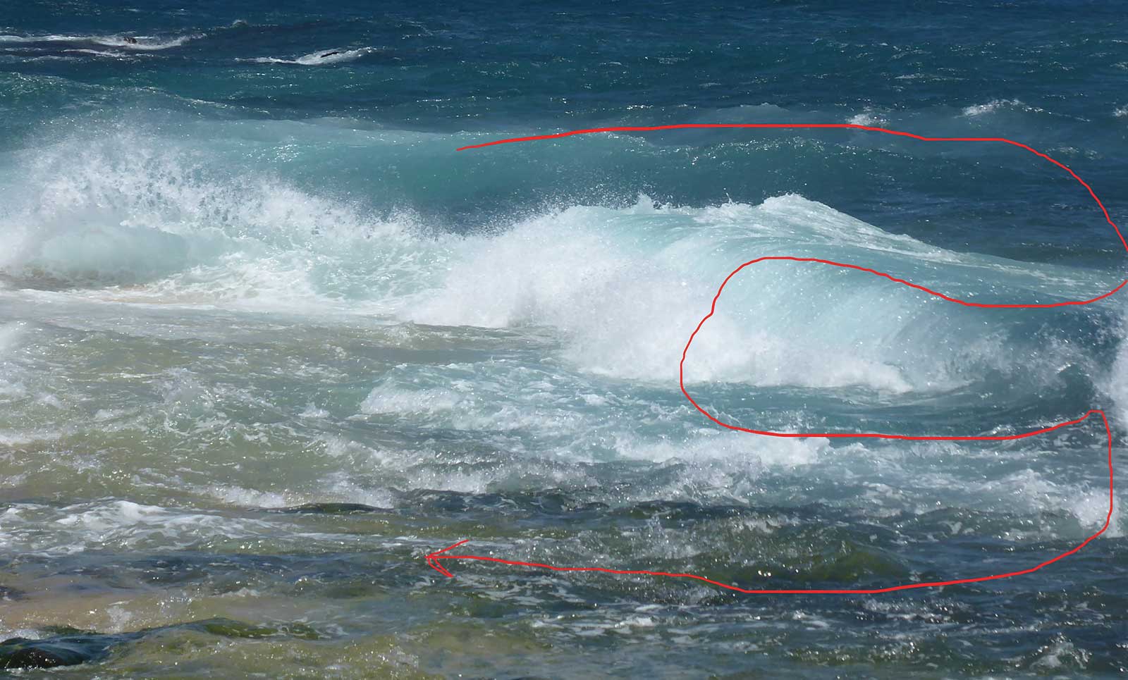 Photo Reference
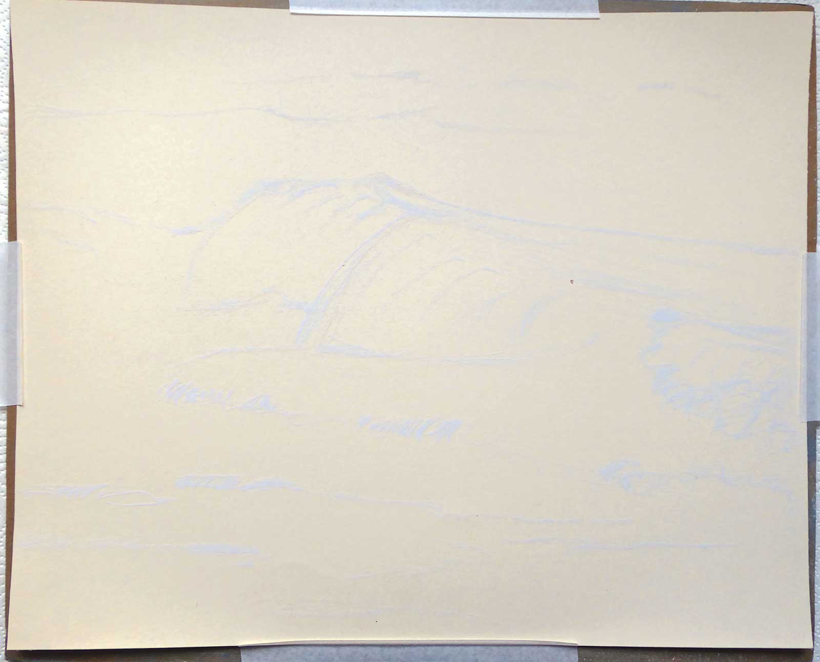 Stage 1
Stage 1 Sketch with Light Gray Pastel
First, I cut the paper into a sheet at 40 by 50 centimeters (which is a standard size in Europe) with scissors, and use the rest of the paper for color tests. I tape the sheet to my painting board with artist tape and start sketching with a light gray pastel pencil afterwards. The composition was set by nature!
WHAT THE ARTIST USED
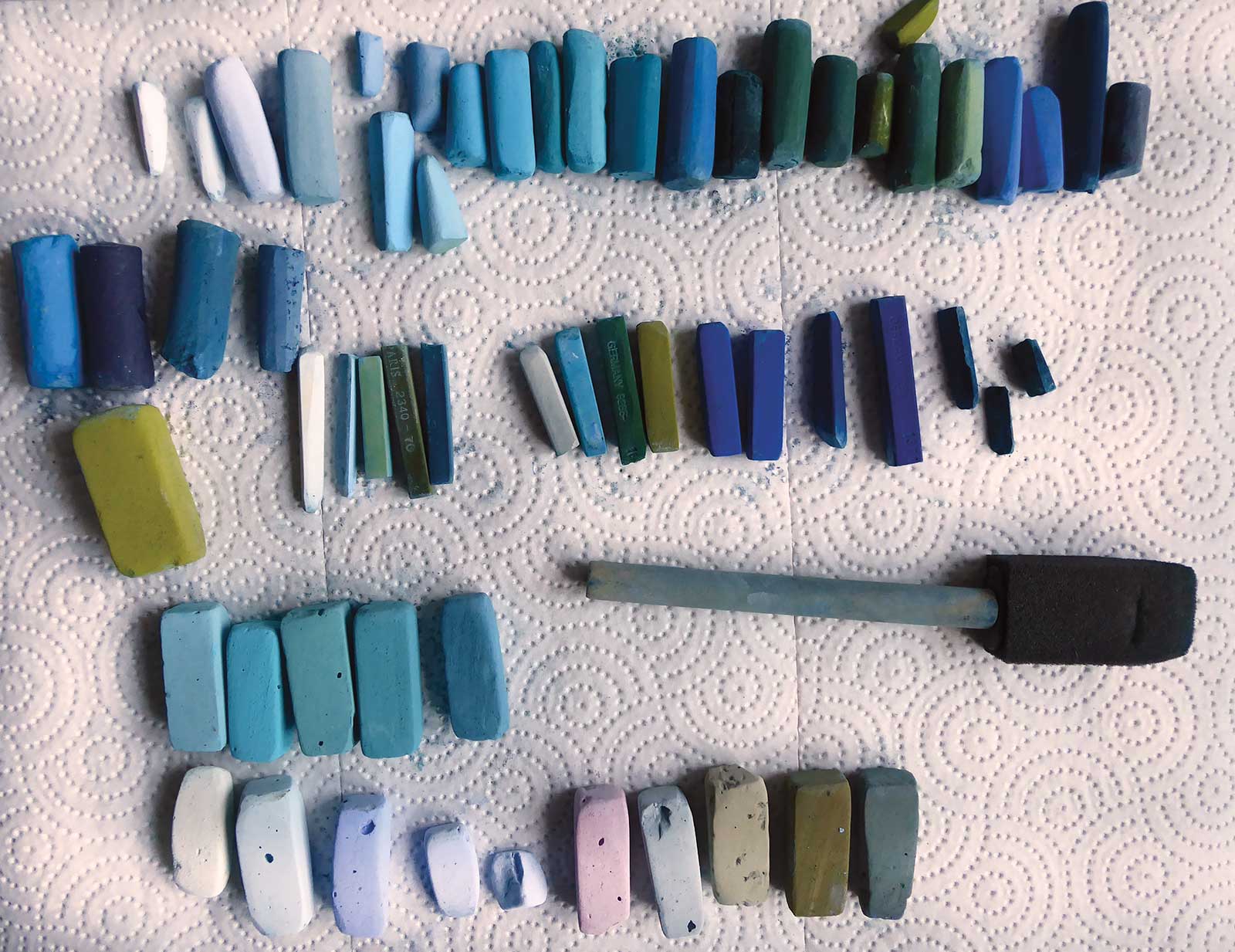
Faber Castell Polychromos (Hard Pastels)
Helio turquoise, Permanent green, Light gray, Cobalt blue, Violet, Indigo blue, Blue violet
Conté (Hard Pastels)
White, Light green, Prussian blue, Emerald green, Sky blue, Olive green
Terry Ludwig (Soft Pastels)
Turquoise set: T060, T300, T180, T330, Best Loved Basics: neutrals
Unison (Soft Pastels)
0B12, 0B6; BG3, BG11, DG6; green 34; A1, light 13, BV 1
Sennelier (Soft Pastels)
740, 501, 466, 188, 724, 734, 965
Gordan Becin (Soft Pastels)
Neutral warm green/brown
Additional Supplies
Small crumbs of self-made soft pastels from an artist friend, UART sanded pastel paper grade 400, beige, 30 x 40 cm, Board (to tape pastel paper on), Isopropyl alcohol, 70%, Flat, synthetic brush, 2 cm wide, Foam brush, Artist’s tape, Paper towels, Small plate, Old toothbrush, Gloves
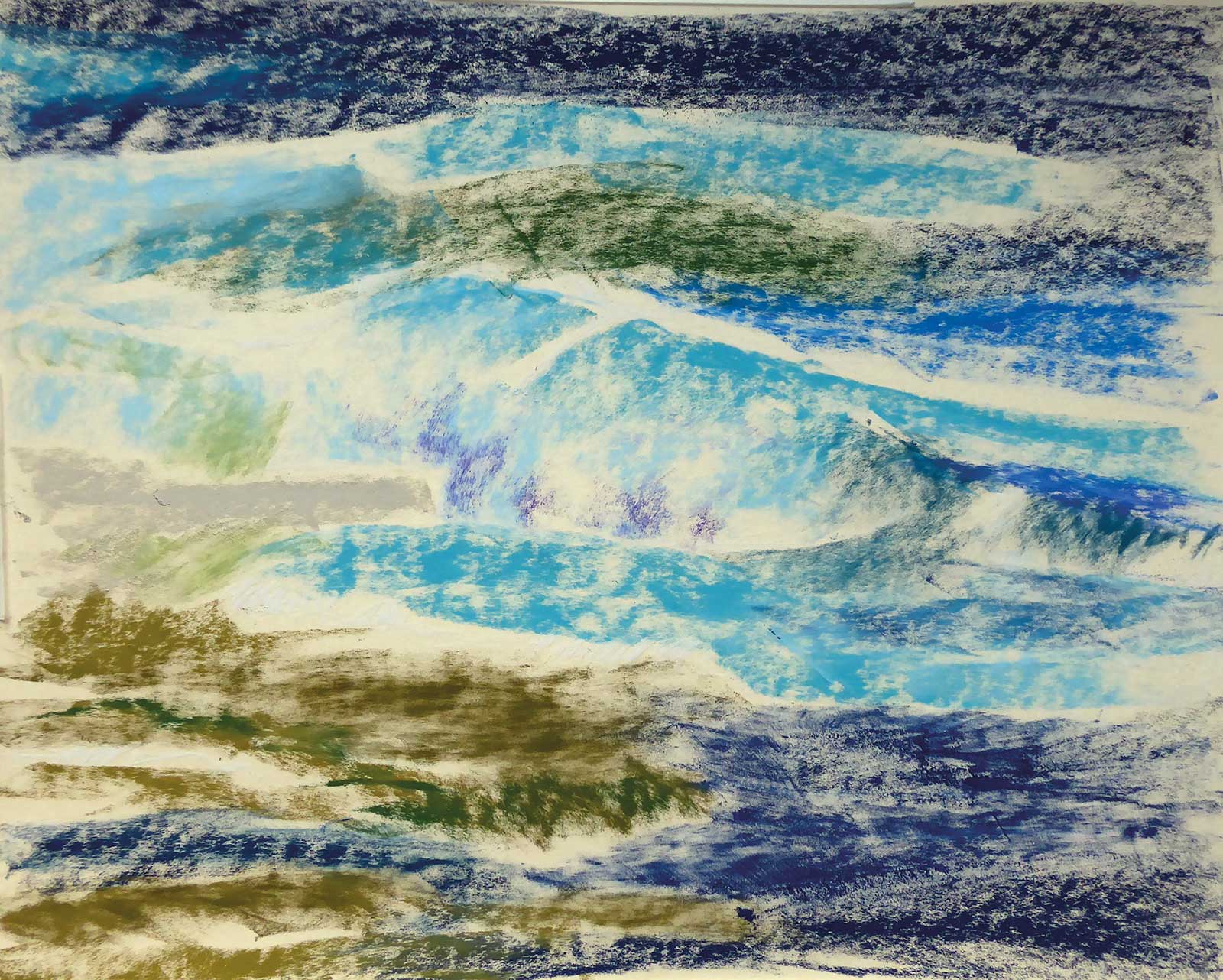 Stage 2
Stage 2 Underpainting with Hard Pastels
I choose no more than six colors of the hard pastels at once, and I always pull the sticks over the paper with their long sides in a horizontal movement, using light pressure. My reference picture shows that only the main wave has got a curvy direction. Next, I dip a simple synthetic brush into a glass filled with a small amount of isopropyl alcohol and stroke over the colors with quick movements.
 Stage 3
Stage 3 Wet Underpainting with Alcohol
As soon as the underpainting has dried, I renew the taping that holds my paper to the board because the alcohol has dissolved the glue and the paper will come off if I just continue painting. Sometimes, I use clamps to keep the paper in place as well.
 Stage 4
Stage 4 Background Layers
I start with the background of the painting where the water is deeper, more of a warm green and dark blue color, making horizontal strokes with the hard pastels. The throes of the waves I paint with strokes in lighter blue and blue violet. The back of the waves is darker than the front where the morning light is falling on. Always keep the daytime, the weather, the light and the wind in mind while painting! Then, I add some sparkles and a foam mist to create the direction of the moving wave, using midtones in blue and blue gray. Some tones of white show the sunlight being reflected in the water drops.
 Stage 5
Stage 5 Building the Middleground
For the main wave, I use different turquoise soft pastels and midtone blues to create the beautiful color of the Pacific Ocean surrounding the Hawaiian Islands. Don’t forget the dark shadow under the wave where it’s curling! The backside of the wave is darker than the curling water because there the light is falling on it and shining through.
 Stage 6
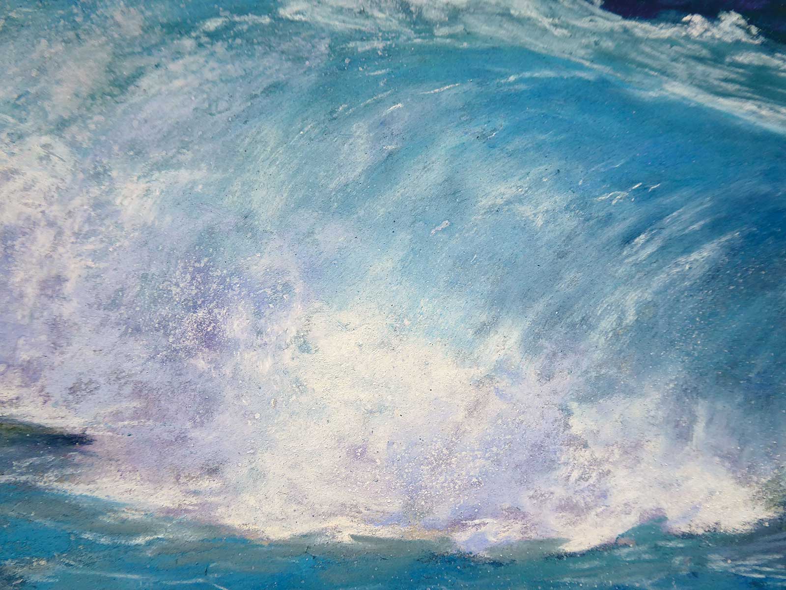
Stage 6 Detailing the Foam
Whenever there is too much pastel dust on my painting, I lift the board up, knock on its back and let the loose pastel dust fall on a slightly wet paper towel, which I then throw in the trash. To protect your lungs, be sure never to blow the dust away. Next, I create the foam of the wave with soft strokes of light blue, light violet and warm white strokes. The different colors make the foam look three-dimensional, so you should never use white only.
 Stage 7
Stage 7 Neutrals and Violets
Using neutrals and some violets, I create the wet sand in the foreground. Dark blue and black perfectly show the areas where the lava is covered in water.
 Stage 8
Stage 8 Foreground
I add some warm greens, too, showing the algae underwater, as well as the very slippery ones on the lava. Some horizontal slopes show the moving foam on the water surface.2
 Stage 9
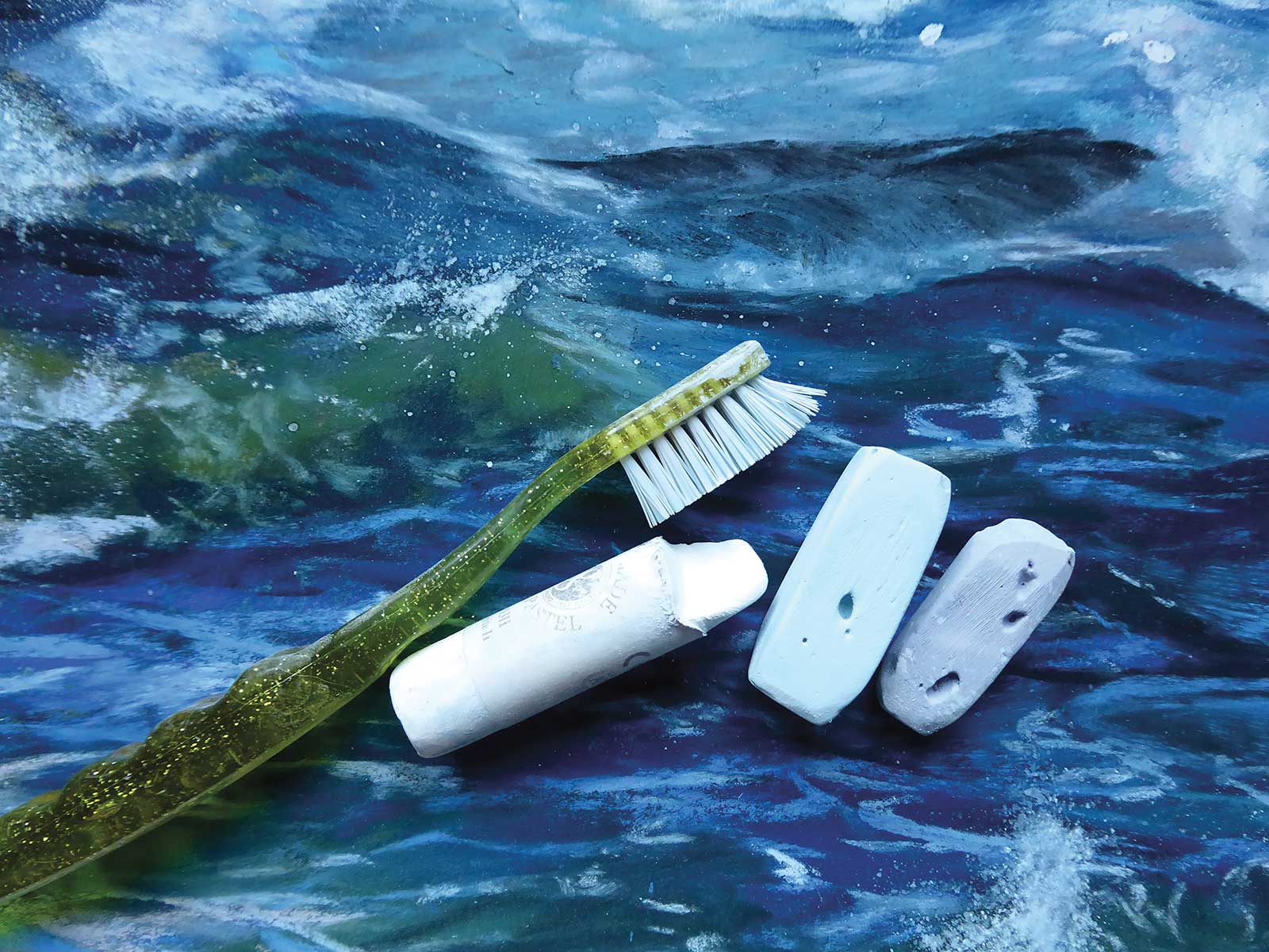
Stage 9 Splash and Foam with Toothbrush
When I’m happy with the overall painting, it’s time to add splashes and fine drops in the air. There is a simple trick to create them. I just use an old toothbrush, a warm white, a light violet and a light blue soft pastel. Then, I fill one teaspoon of isopropyl alcohol onto a flat small plate and wet the toothbrush in it. Then, I stroke the wet brush over the pastel stick. As soon as there’s a little paste on the brush it’s time to splash it on the painting with the forefinger. Be careful when striking the toothbrush, maybe even try out on another paper first how strong your strokes have to be, in what direction you have to do them and how far the splashes should go to achieve the effect you want. Be aware that if the paste is too thin, the splashing will produce big unreal drops on your painting!
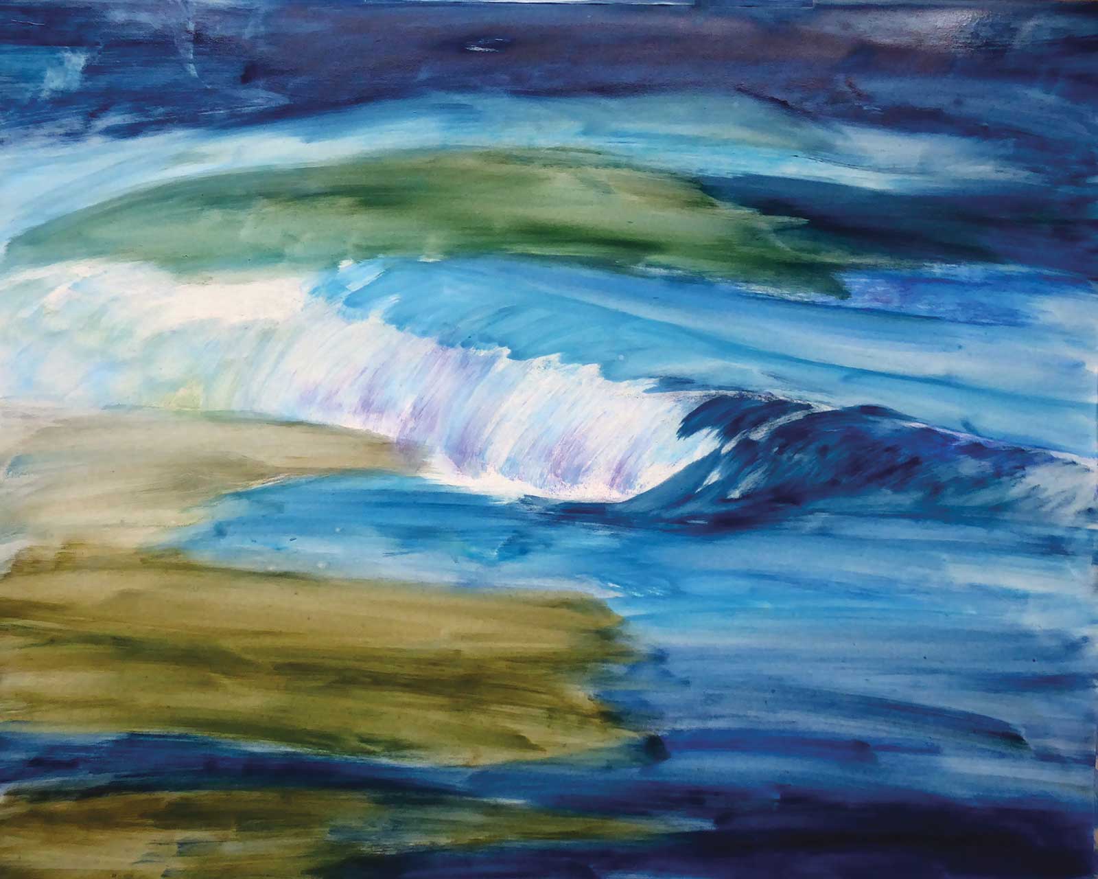
 Stage 10
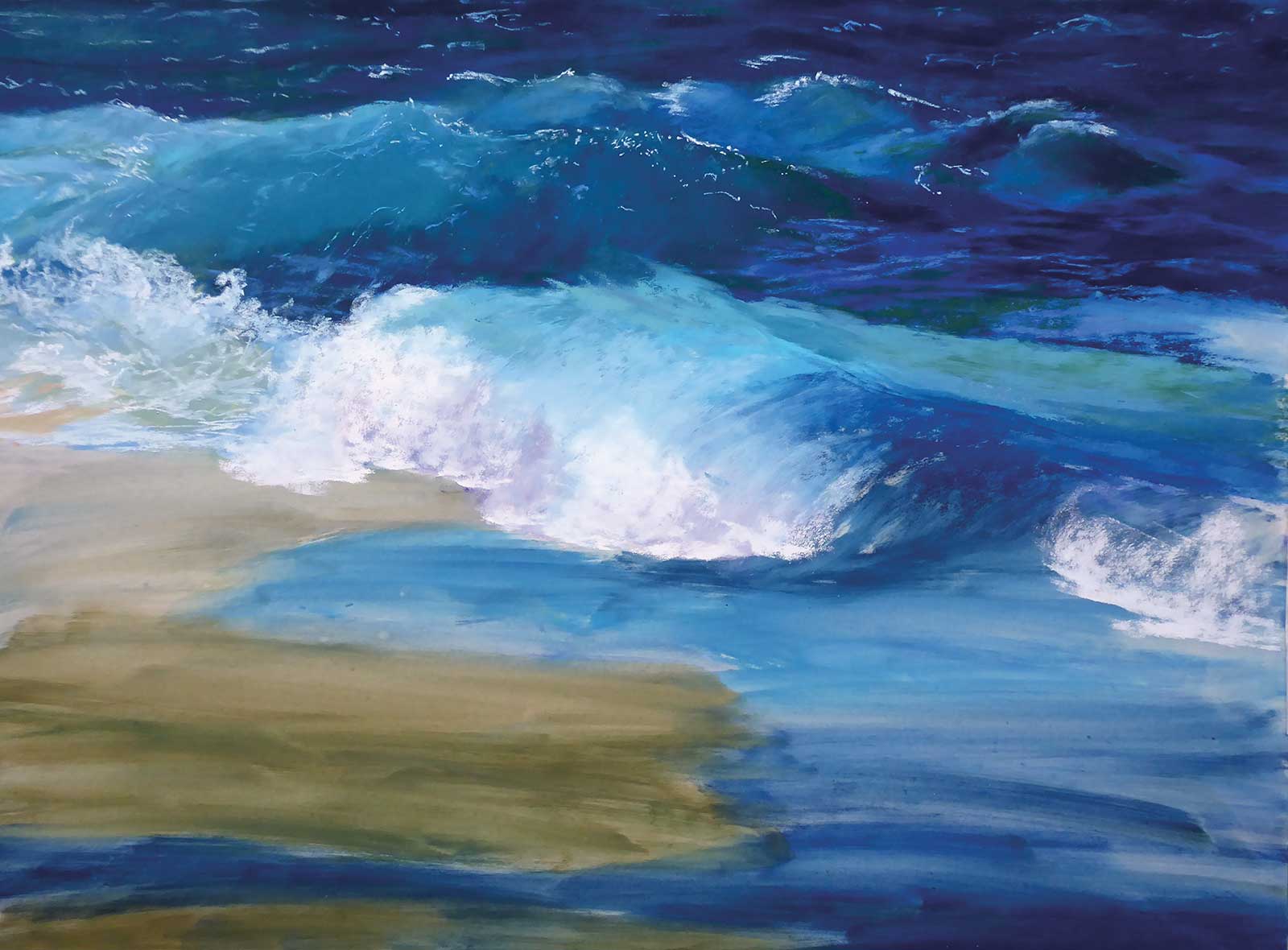
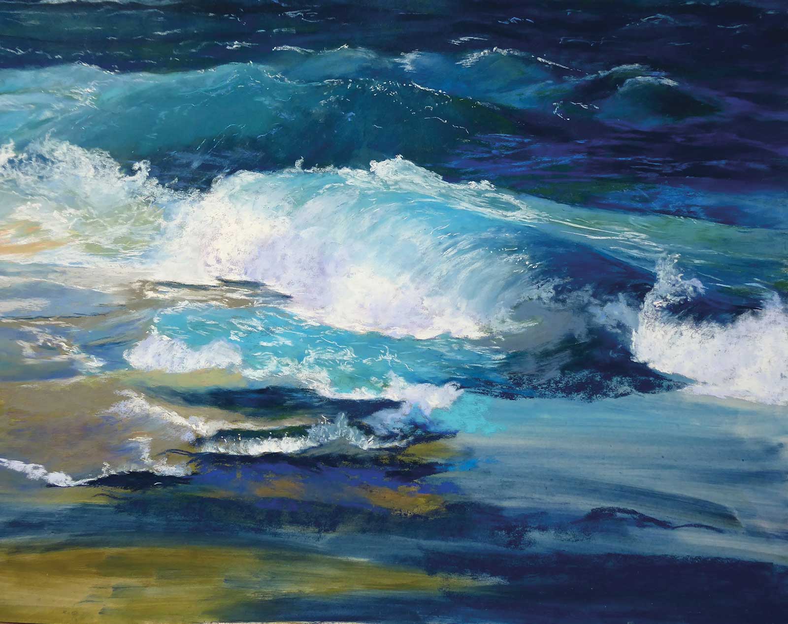
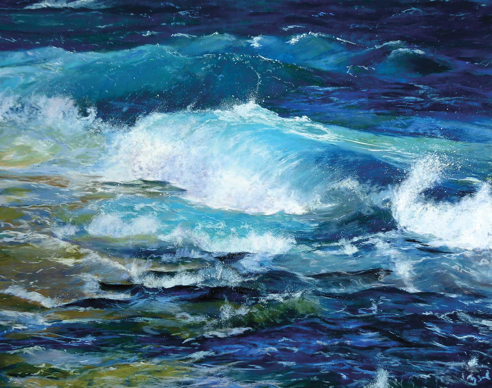
Stage 10 Finished Artwork
Hawaiían Memories, pastel, 15½ x 19½" (40 x 50 cm)
When you’re satisfied with the result, let the painting dry. Now, Hawaiían Memories is finished and can be framed under glass.
About the Artist
 Dolores Saul
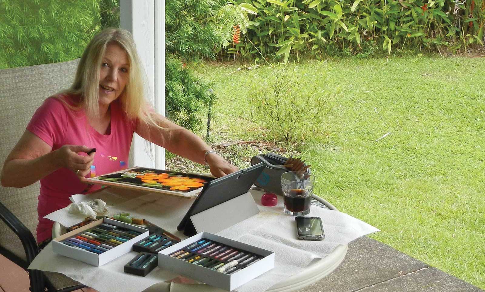
Dolores Saul is a contemporary German award-winning pastel artist. She was born in Frankfurt, Germany, in 1959. She has a daughter and lives in a small village in the Taunus region near Frankfurt with her husband. In 2003, Saul began studying and experimenting as an artist, and during a workshop with a well known German pastel artist in Northern Germany, she first properly understood how to use balanced tonal values. After that, she began painting exclusively in pastel, gaining knowledge and insights from other master pastellists. Then, in 2009, she exhibited her pastels for the first time. Since then, Saul has participated in numerous group exhibitions and has had several solo shows. Her paintings have sold in Europe and in the United States, and in 2012, she won a Creative Award for a pastel on bark piece in Wiesbaden, Germany.
Saul sometimes works as a freelance illustrator for children’s books and poetry volumes. She also teaches beginners in pastel art. She gives pastel painting demonstrations in Germany and abroad during art fairs and at art supply stores. Saul is on the board of the Arthouse Hochtaunus e.V. She is also a member of the Pastel Society of America and a member of the Pastel Guild of Europe PGE, where she became a Signature Member in August 2017. This February, she was awarded Best of Show in the Pastels in Paradise exhibition hosted by the Left Coast Pastel Painters Society for her piece Refreshing.
Contact at
www.dolores-saul.de