


My paintings, no matter the subject matter, are about color and the path of light. Most people know me for my backlit animal paintings. My grandfather was a cattle rancher, and I grew up in a small town surrounded by dairy farms. Both had a big influence on my life and my artwork. No matter the subject matter, I try to find the path of light, to lead the viewer into my paintings and into my world. I believe the artist’s job is to simplify the subject matter so the viewer can see what we are experiencing and perhaps bring their own experience into the painting.
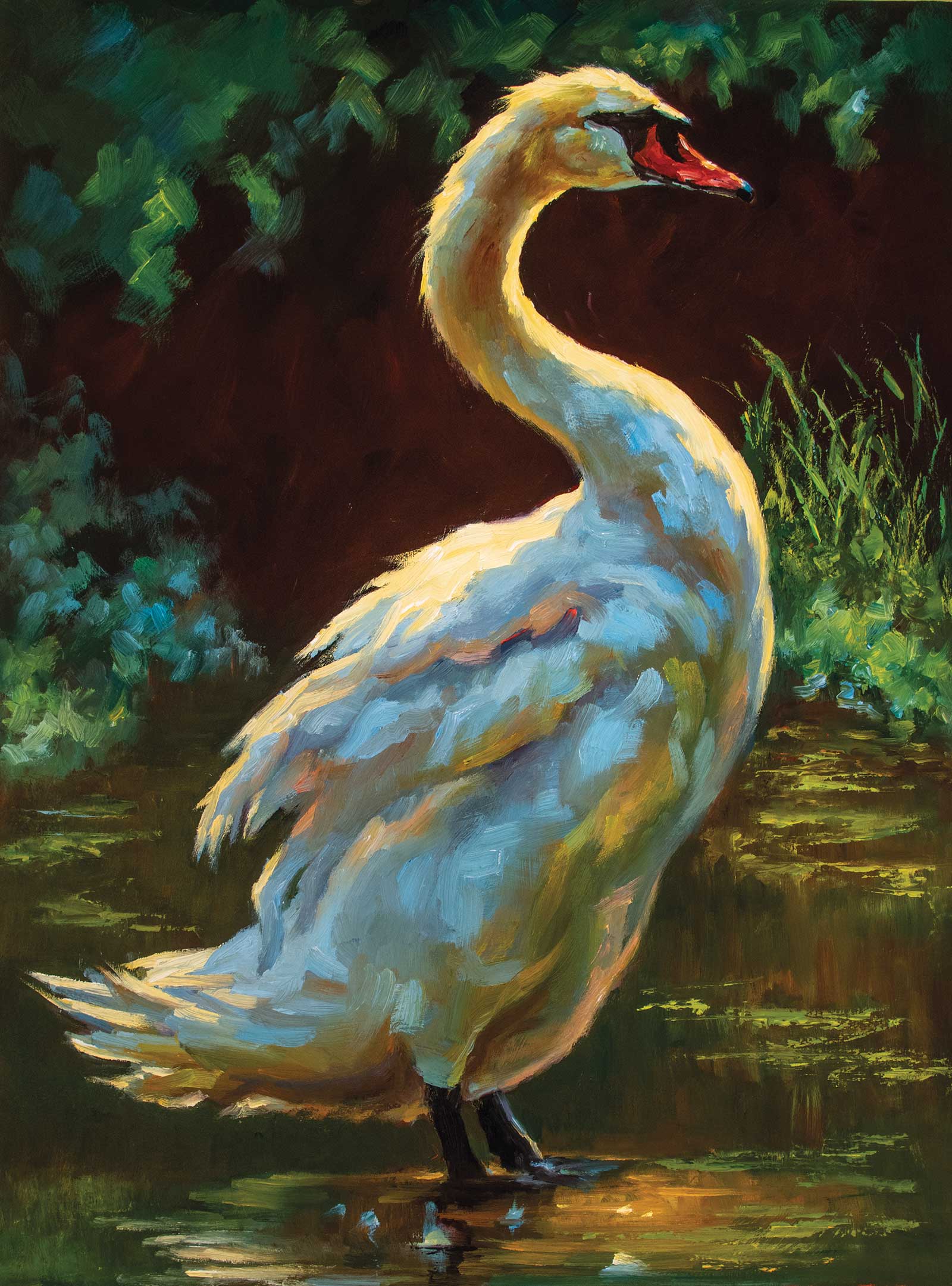
Graceful Elegance, oil on board, 24 x 18" (60 x 45 cm) Graceful Elegance was inspired by a friend’s photo of a swan. It is painted both in brush and palette knife. I’ve used the brush for the swan and a palette knife and brush for the water. I did some dry brush dragging in the water too, to help it read. I used the grass to the right to lead your eye into the swan and the path of light. My eye goes up its neck to the head, which is the focal point. Then the eye travels down the swan to the water and back around. I’ve used the elements of the light and reflection on the water to keep the viewers’ attention in the painting.
The play of warm and cool colors on the form excites me. I want the viewer to be dazzled by this. Not only seeing the path of light, but having it play against the warm and cool colors in the shadows too. I like to create the drama of the painting with the shadows, having more shadow than light. That way when I place the path of light on the form, it dances across it, leading you in. Some artists overlook shadows, or they see them as gray, when there really is a lot of color happening there. I don’t want to miss it!
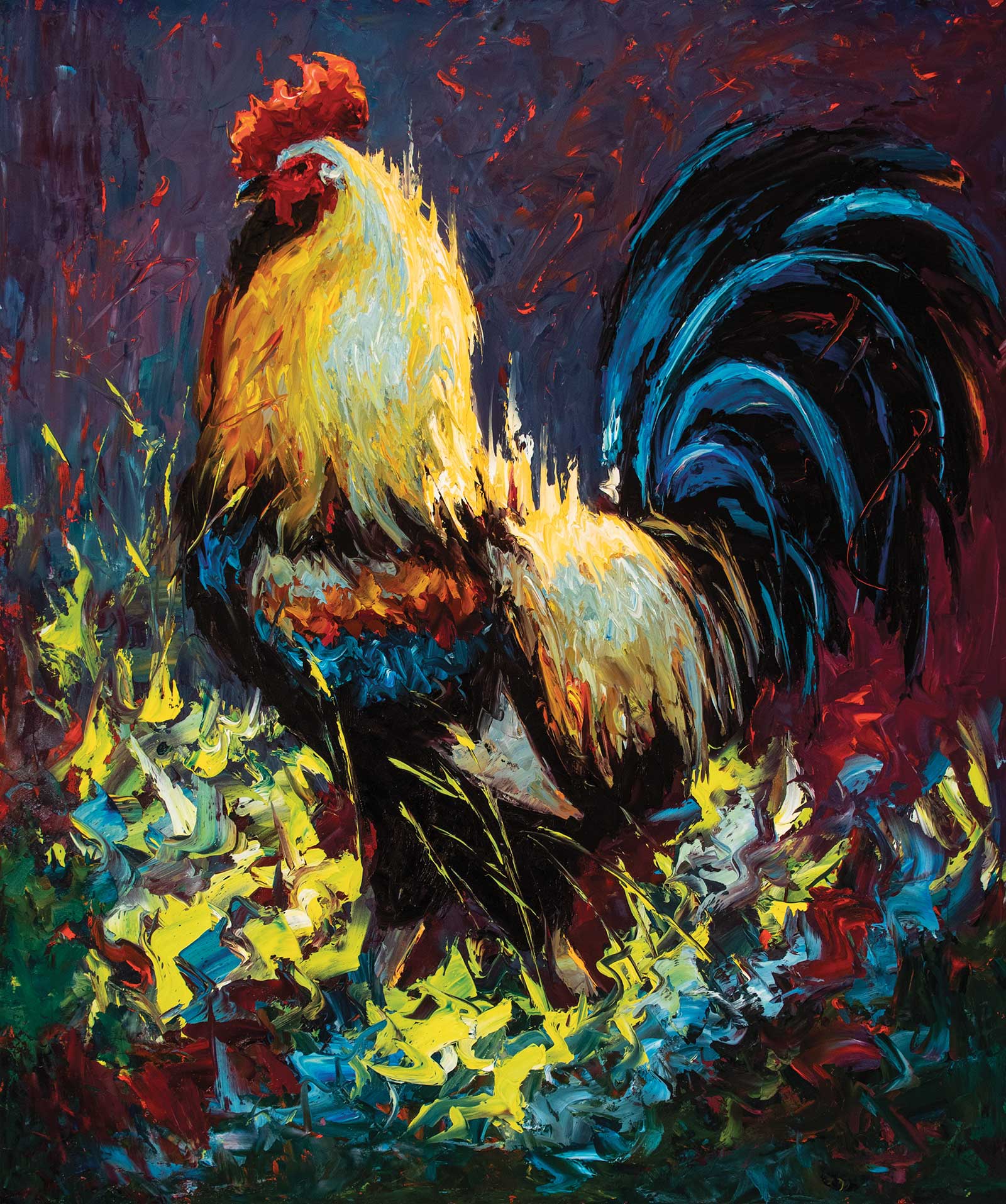
Caught by the Light, oil on board, 24 x 20" (60 x 50 cm) My inspiration for Caught in the Light is a rooster I photographed backlit in the grass. I love painting roosters with a palette knife. I believe it adds to the motion of the bird. Roosters are always moving, and the palette knife works effectively to capture this. I’ve played with edges here too. Dragging the lights up into the background. I’ve added some calligraphy too at the end using cad red light to break things up and add more energy to the painting.
To achieve this in my paintings I concentrate on value and the color relationships in my subject matter. What is the value of the color, on a black and white scale? Is it my darkest shadow or a middle shadow or lightest shadow? When you are comparing for color, what local color is it closest to—red, green, blue, purple, yellow, orange or a mix? Is it a warm or cool color? Is the color intense or grayed out? It’s all about color relationships. I’m doing this with every stroke I place, comparing it to what is already on my canvas. If I make a change, it’s not really a mistake but part of the process. You must put something down before you can refine it. In order to simplify this process, after my rough sketch, I start the painting with the shadow shapes. That way I’m only focusing on that part of the painting and making sure everything falls into my shadow value range. Once I have this completed and refined, I can start on the light areas of the painting. When I say lights, I mean everywhere the sun hits or whatever your light source is. I go through the same steps as with the shadow shapes. What is the value, the local color, the temperature of the color and the intensity of the color?
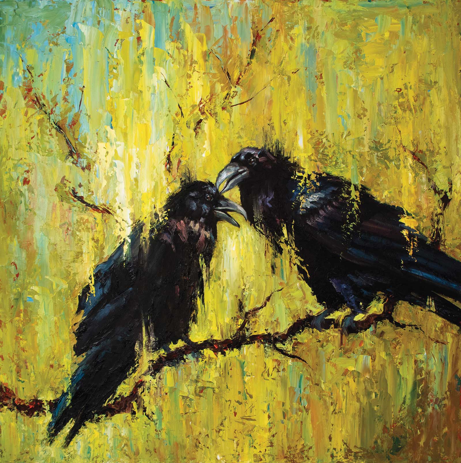
Odin’s Messengers, oil on board, 30 x 30" (76 x 76 cm) The inspiration for this painting came from a trip to London I took years ago to The Tower of London. In Norse mythology a pair of ravens fly all over the world and bring information to the god Odin. Because of the mythology associated with the ravens, I wanted this painting to be more mystical. The ravens being black don’t reflect light the same way white does. I used the background to bring the light in; losing edges and having the ravens immersed in the light helped make this painting a little more expressionist. To create this painting, I used a brush on the ravens and a palette knife everywhere else. I loved using layers and layers of paint to create depth and texture.
After I have all my big shapes refined, I’ll stand back and make sure nothing pops out of the shadows and into the light or vice versa. If I’m satisfied, I’ll move on to modeling the form. When modeling the form, I like to do as little modeling as possible. Less is more for me. I like the viewer to take part in the painting, letting their eyes fill in whatever is left out. My style is to use big brushstrokes or a palette knife, leaving it on there without a lot of blending. I want the viewer to see that what they’re looking at is a painting. I want them to see the texture and to step up close and wonder how this painting came into being. How when up close, it’s just brushstrokes or spots of paint, but when you step back it becomes a painting. I accomplish this by stepping back a lot when I’m painting, making sure that what I’m doing up close reads when you step back. It’s a little dance.
At the end of the painting, I’ll put dark accents on and highlights, and then if it needs any more, I’ll add calligraphy to pull it together. Usually that’s done with dark accents or occasionally I’ll add little flecks of cadmium red light. This works well with the Venetian red gesso that I let show through at times.
My Art in the Making Duck Gangs II
© Streamline Publishing, Inc.
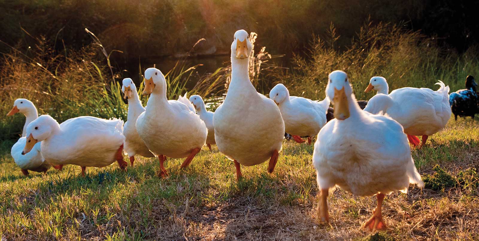
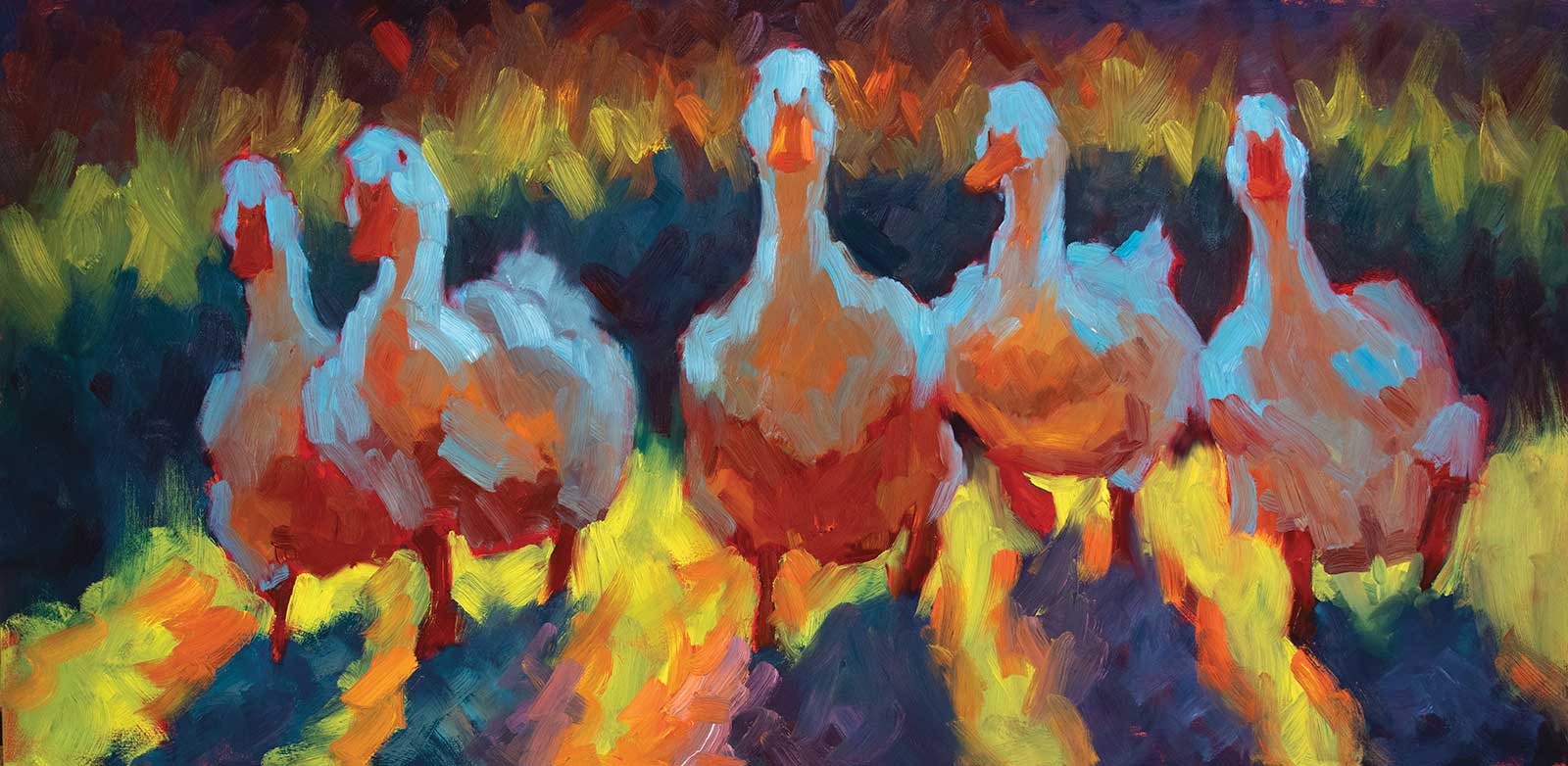
Reference Photo: I used the main duck from the top photo along with the two on the left. Then I used the far right duck on the bottom photo along with the duck to the left of it behind the bigger duck.
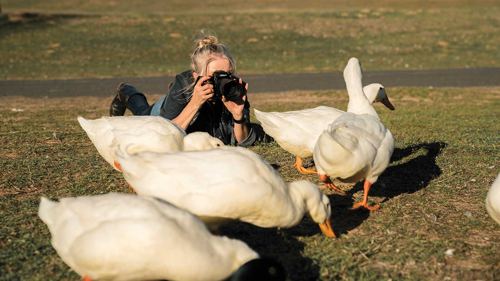
I mainly do my own photography because I believe this brings me closer to my subject matter. I like to photograph on the same level as my subject matter. You might see me lying in the grass surrounded by ducks to get the kind of shot I want. I’ve kind of trained some of them to run at me for treats!
In this demonstration I will be showing you how to do a larger in-studio oil painting from your own photographs—from layout and composition to value and the use of warm and cool colors to create form. I will be using hog bristle brushes for this painting because I want my brushstrokes to be seen. A limited palette will help keep the painting harmonious and swimming in the same color tones. And it forces you to learn how to mix colors. So let’s get started!
 Stage 1
Stage 1 Rough Compositional Sketch
After I’ve chosen my reference photos, I’ll do a rough sketch on board. I use the Ampersand gessobord primed with a Venetian red gesso. I’m using alizarin permanent to do the rough sketch. I keep it rough because I will lose the drawing as I go forward, so it’s really for the layout and composition. Regarding composition—in a group painting like this I like to think of it like a movie. You have your main actor—for me it’s the middle duck—best supporting actor goes to the duck on the far right, and the others are extras. That way the duck to the far right brings your eye into the painting towards the main character, then onto the other ducks. My eye stops at the lead duck, but the extras will bring your eye back around. I picture this painting on a wall at eye level, so it really pops at you. I love being at duck level and in their world!
 Stage 2
Stage 2 Blocking in Shadows with Warm and Cool Notes
When I’m blocking in the shadow shapes, I’m thinking about four things: value, color, intensity and temperature. Let’s take a closer look at the warm and cool notes on the ducks in shadow. I love painting white subjects because white in shadow reflects the colors around it, and this was a great opportunity to take advantage of that. The blue reflecting down from the sky and the warmth from the ground reflecting up at the ducks. It also helps give the ducks form without their values popping into light value territory.
I start with the area of color I can see clearest, the darker blue/green in the background. Then it turns more purple behind the ducks. Next, I see the cast shadow is purple/blue in some areas and more of a green/blue in other areas. The shadow on the ducks is lighter than the background shadows and the cast shadows. On the ducks, let’s start with the lower planes; it’s lighter, warmer and redder than the other shadows we’ve discussed. It gets lighter as it travels up the ducks. It’s still warm though, and I don’t add white to make it lighter. Instead I’ve used cadmium yellow deep, with cadmium red light and a touch of phthalo blue. When I need the yellow darker, I add yellow ochre
 Stage 3
Stage 3 Edges
I’ve kept the edges loose so I can decide at the end which edges to harden to bring the eye into my focus area. Paint outside the lines! Shadow areas are good areas to lose edges. I don’t like to have hard edges in the shadow areas because you can lose form if all your edges are hard edged, and it will look cut out. You need to remember you are painting light and shadow, not painting separate items. Keep your edges soft in the shadows. You can then use tighter edges between light and shadow at the end of the painting to help direct your viewer’s eye where you’d like to lead it.
 Stage 4
Stage 4 Blocking in the Lights
This stage is a lot like stage 2, but I’m comparing values in the lights. I’m going to compare the lights by value, color, intensity and temperature. As you can see the lights in the foreground are lighter and more intense than the lights in the background. Some areas are greener, and some areas are more yellow. Some areas are redder and some more towards orange. I’ve still left room to pop the lightest lights on the ducks towards the end, meaning I’m not at the top of the value scale.
 Stage 5
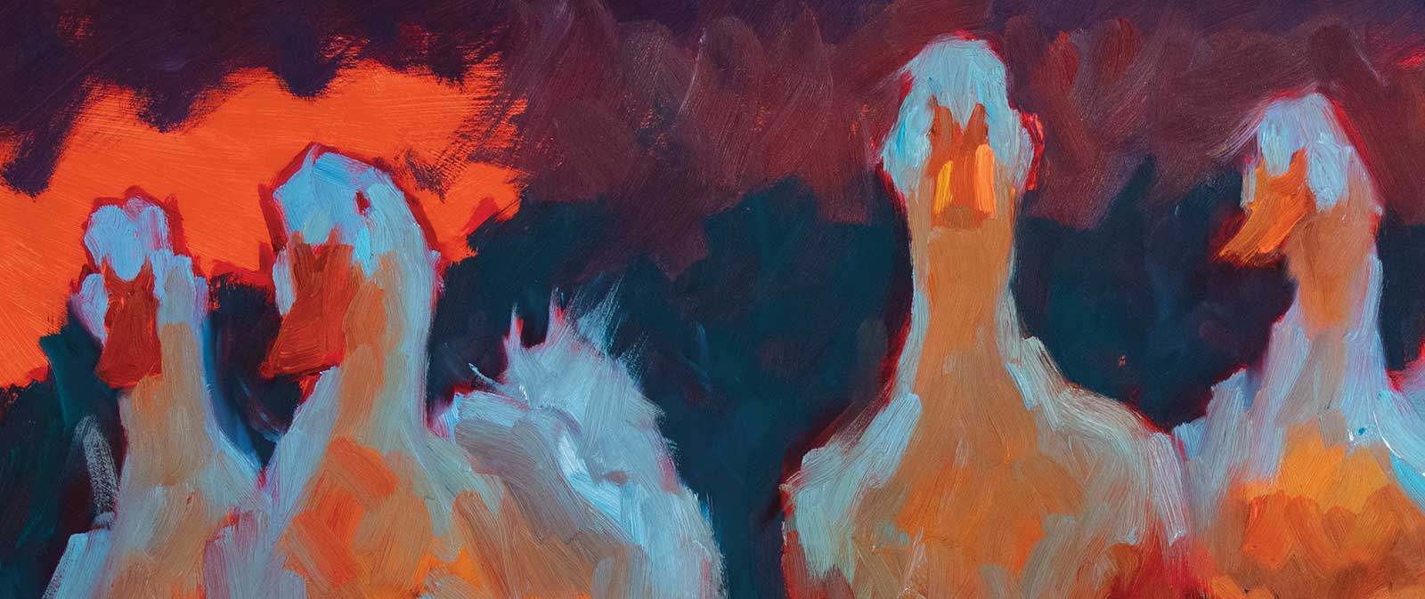
Stage 5 Modeling Form and Details
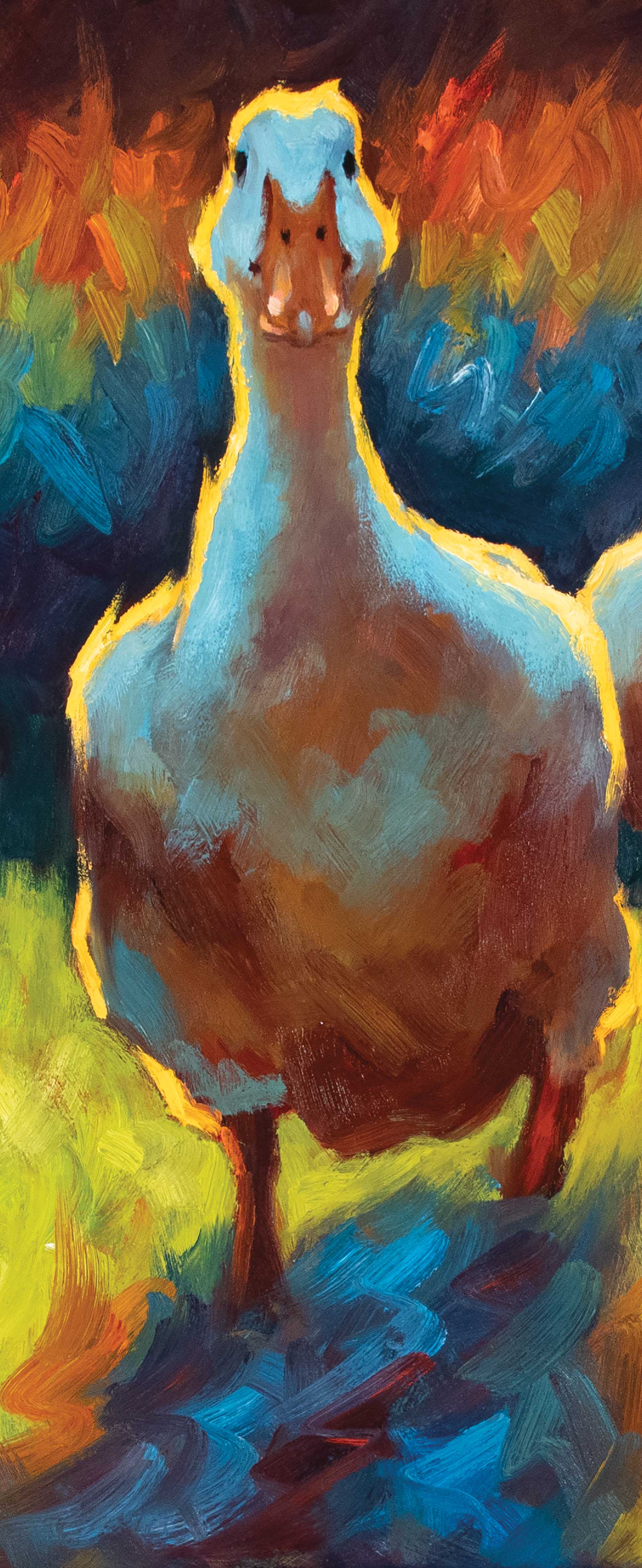
When modeling the form, you can model as little or as much as you’d like. I like to keep it simple and let the viewer fill in the spaces. In other words, you don’t have to tell everything. Here on the closeup you can see that I’ve indicated where the eyes are, making a slightly darker area to set the eye in, then adding the eye. I’ve also formed the duck’s bill using reflected light and dark accents.
 Stage 6
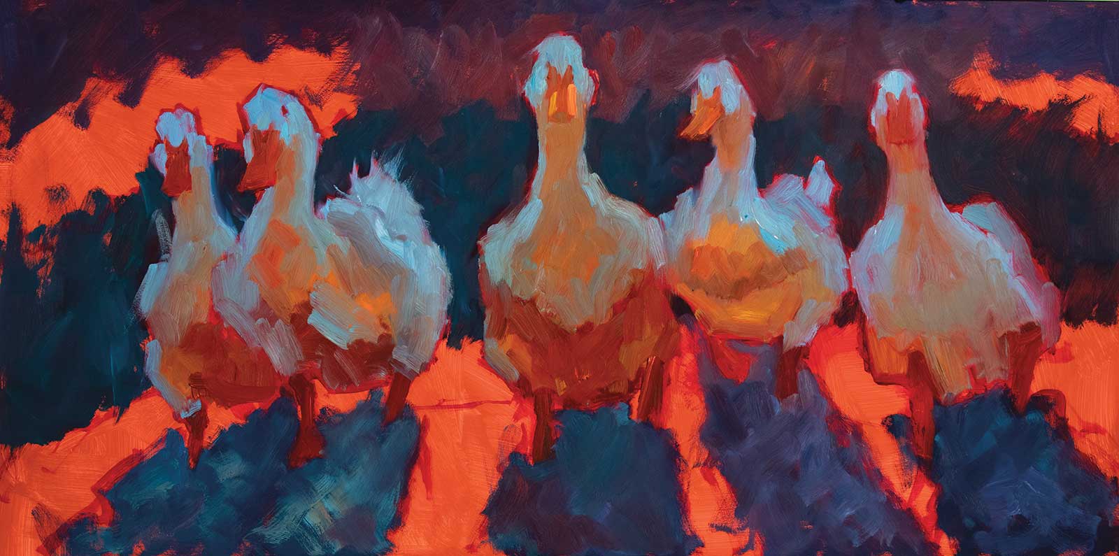
Stage 6 Lightest Lights and Dark Accents
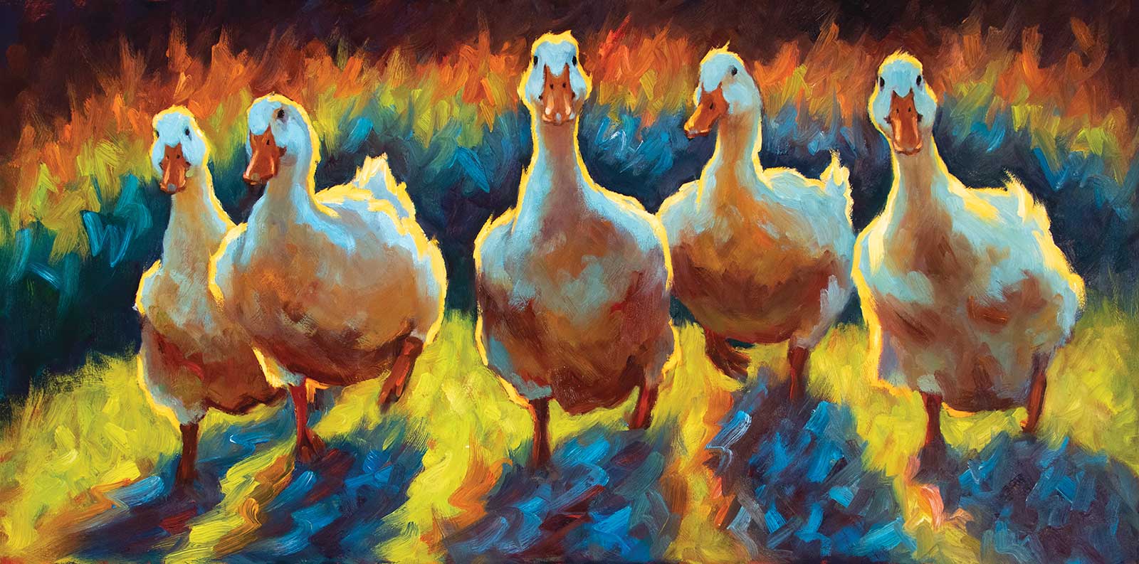
Duck Gangs II, oil, 18 x 36" (45 x 91 cm)
This stage is the lightest lights. You want to save the lightest lights/highlights and dark accents until the end. Here you can see how the ducks really pop out at you with the lightest lights added. My leading actor is taking center stage! I like it, it’s fun and not a viewpoint most people think of when they think of ducks. The dark accents around the legs and feet help ground them, and the other accents help define their features. I’m calling this one done!
About the Artist
 Cheri Christensen
Cheri Christensen grew up in Enumclaw, Washington, a small rural town of horse, dairy and cattle ranches at the foot of Mt. Rainier. Christensen’s grandfather was a cattle rancher there, and he was a big influence on her choice of subject matter today. She attended the University of North Carolina at Greensboro and graduated with a BA from the University of Washington. She studied oil painting and drawing intensely for three years with Ron Lukas, a protege of Sergei Bongart, who taught in the tradition of the Russian impressionists. Christensen concentrates on seeing and conveying the effects of color and light on form.
The first painting she submitted to a competition was included in a prestigious exhibition at the Charles Emma Frye Art Museum in Seattle, Washington, and the first painting to include farm animals received the Beatrice Jackson Memorial award for Best Traditional Landscape in the Allied Artists of America 1995 show.
Christensen has been featured in several magazines, including International Artist sister publications American Art Collector and Western Art Collector. Christensen is represented by McLarry Fine Art in New Mexico, InSight Gallery and Jack Meier Gallery in Texas, and Eisenhauer Gallery in Massachusetts. She has an upcoming exhibition at McLarry Fine Art, Keeping it Light, opening July 29. See her Liliedahl instructional videos at www.painttube.tv and search “Cheri Christensen.”
Contact at
cheri@cherichristensen.com
www.cherichristensen.com