


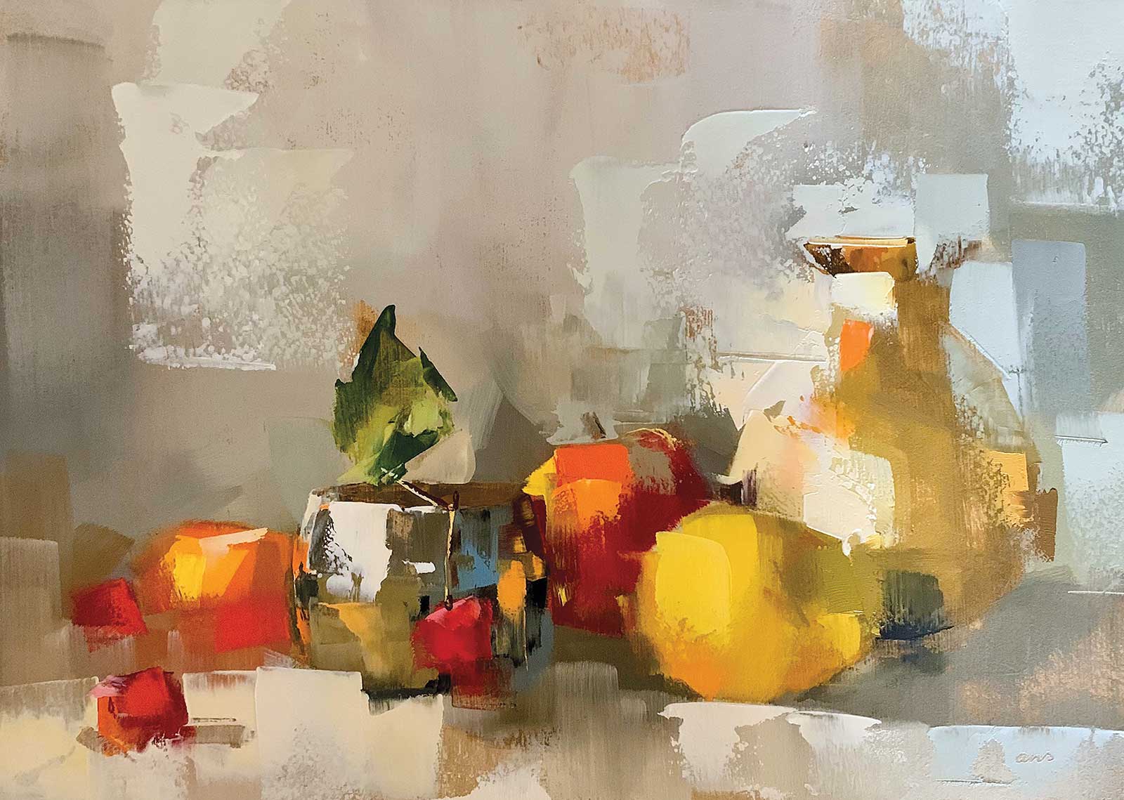
My aim in painting is to take things that we casually pass by every day, draw attention to them, and see that their beauty is recognized. Upgrading ordinary objects by using contrasting darks and lights to create shine is my way of emphasizing common, everyday items so they stand out.
Carefree, oil painted with blade, 8 x 11" (20 x 28 cm) Do not think, just do. Apply paint bravely—you can always move it or remove it.
I almost always work with still life as my subject matter. I spend a lot of time setting up and lighting a still life. The light falling on a still life or object helps me to see the shapes and the color values (dark and light) that are most important to express the objects in my painting. The values in a painting are extremely important to make the object stand out. I like to exaggerate that a bit. Especially with metal objects, very light colors are right next to dark colors.
I try to make an impression of the object with as few brushstrokes as possible. At the moment I only paint with oil paint on small sized MDF panels, up to 12 by 16 inches.
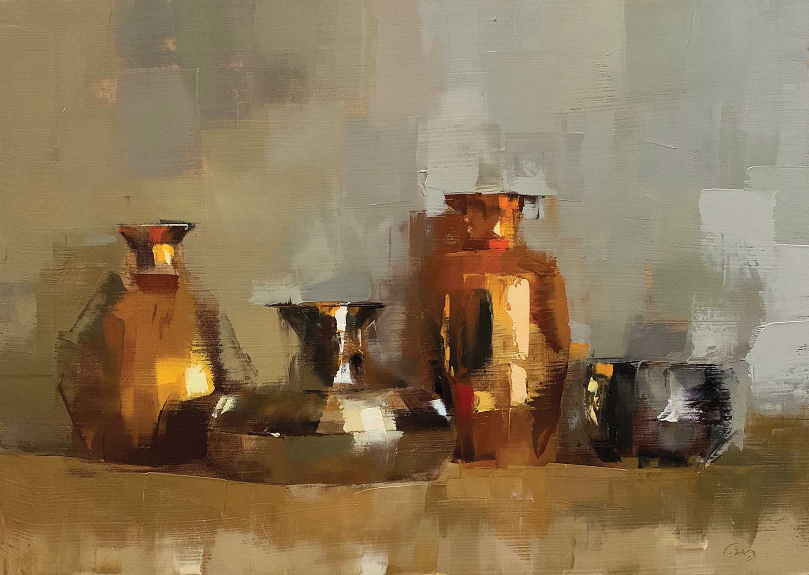
Metallic shine, oil painted with blade, 8 x 11" (20 x 28 cm) Four of my favorite vases, warm and sparkling. I created soft transitions between objects and background and sharp edges to emphasize the shape in some places.
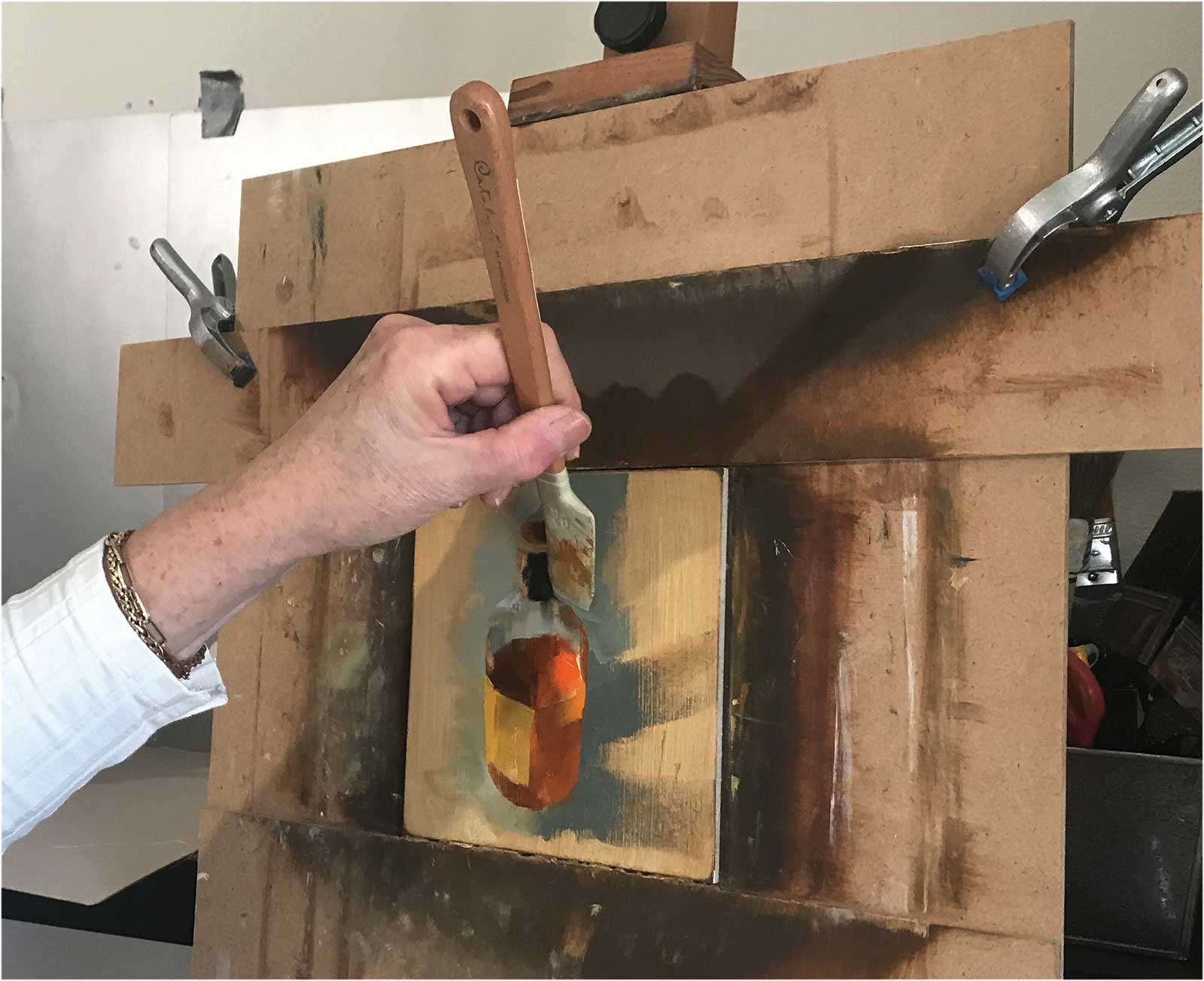
I prefer to work with wide flat brushes and silicone blades. That forces me not to work too precisely but to get the paint on the wooden panel with great freedom. That doesn’t mean I just accidentally throw the paint on it. Especially with coarser brushstrokes you have to consciously put the right color/value in the right place. For that, you have to have an eye for the essence and material expression of the object to be painted. Recognizable from a distance, roughly painted up close. By not working too detailed, I create varied edges. Sometimes sharp, sometimes completely gone. An object never needs a complete outline to be recognized. Your brain fills in the missing lines.
All my paintings are painted alla prima, wet in wet, in one session. I start by coloring my panel (treated with gesso) with diluted oil paint, usually with Rembrandt oil paint in asphalt or burnt umber. With the same paint (slightly less diluted) I draw the object or still life to be painted in a few lines. I then indicate for myself where the dark, middle and light tones come by making areas darker or by simply wiping away the underlayer.
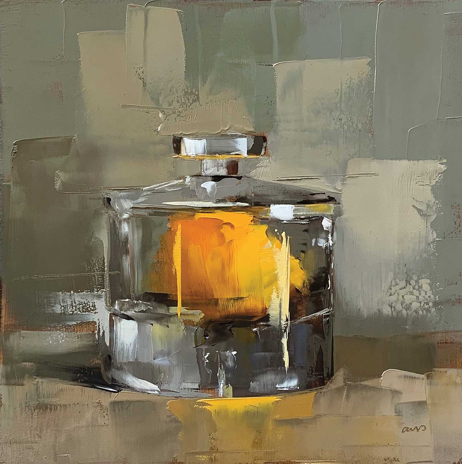
Something borrowed, oil painted with blade, 6 x 6" (15 x 15 cm) This painting features a bright yellow lemon as the centerpiece. Because it comes in a glass jar, I didn’t have to stick to the shape. Glass distorts and reflects; sharp edges fade behind glass. What remains is a yellow spot, vaguely shaped like a lemon.
When I’m satisfied with the sketch I apply colors to the object. Sometimes I add the dark (or most saturated) colors first, but often I’ll apply them in random order. I don’t mix all colors up front, as they are often created during the painting process. The color mixes that I use for the object I also use in the color of the background. A grayish background is always made up of a mix of many of the colors that are on my palette from that painting. As a result, object and background are connected.
My Art in the Making New Monkey
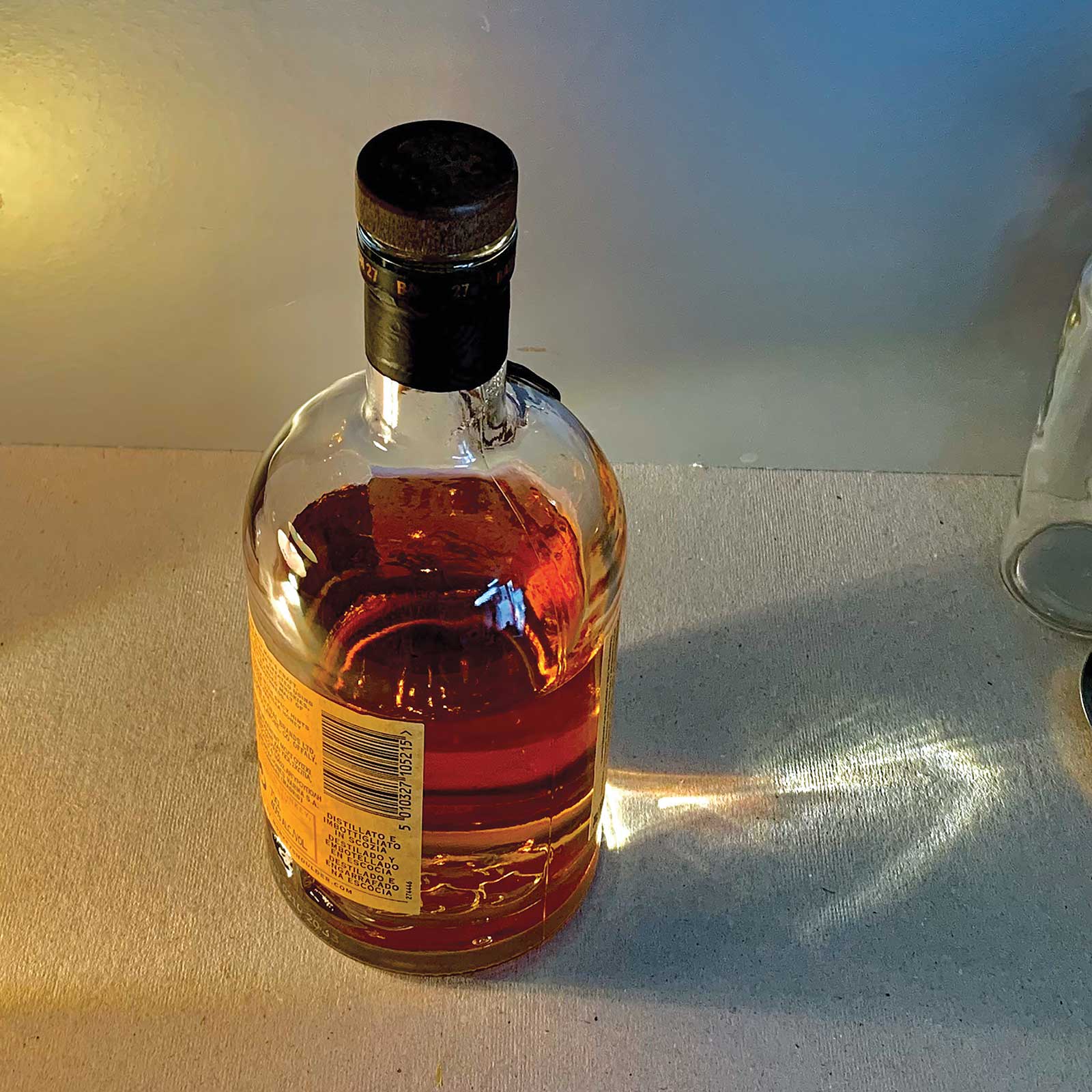
Reference Photo
 Stage 1
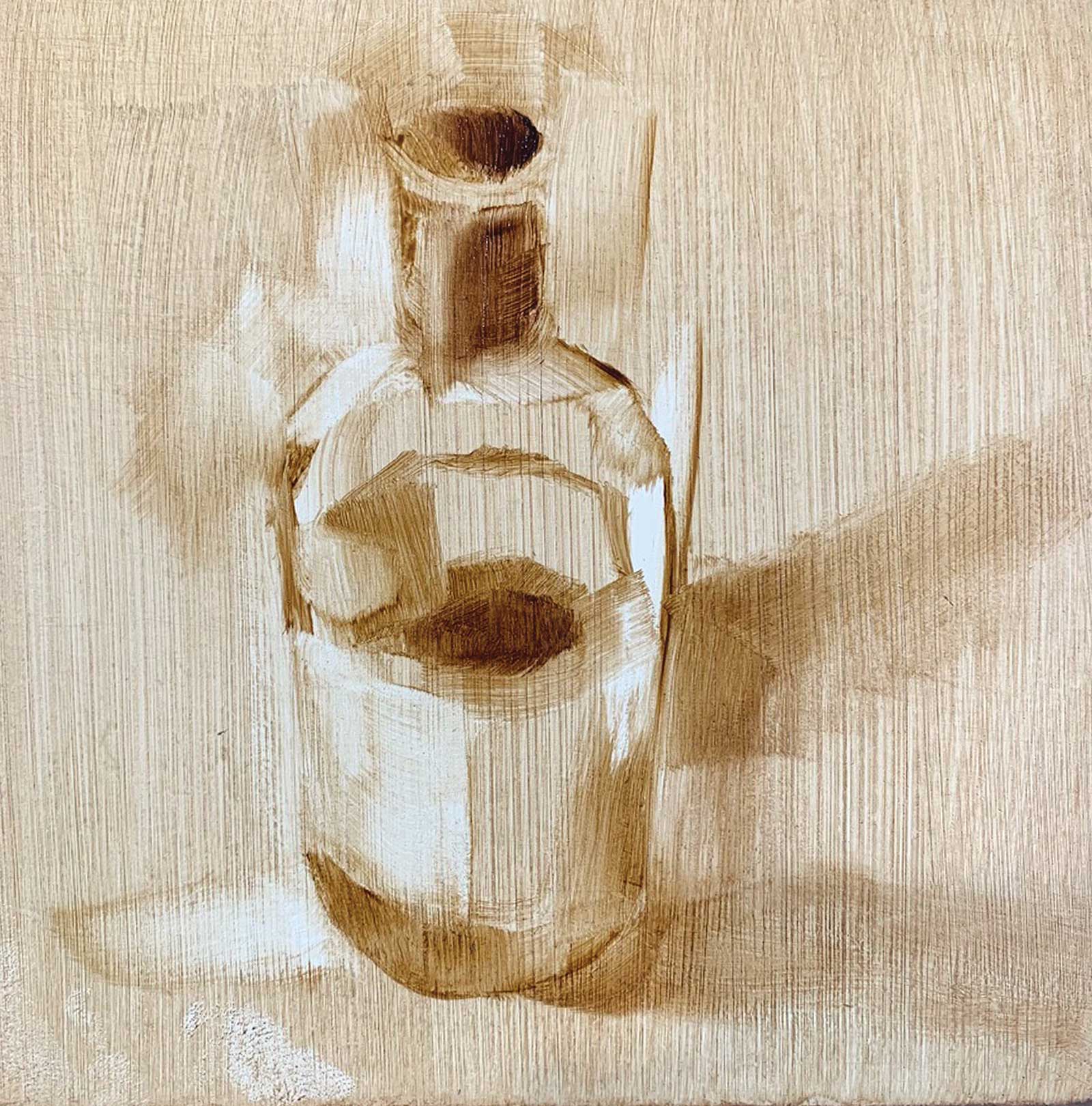
Stage 1 Underpainting
I use a brush with diluted oil paint in asphalt to draw the picture I want to paint, quickly indicating light and dark.
WHAT THE ARTIST USED
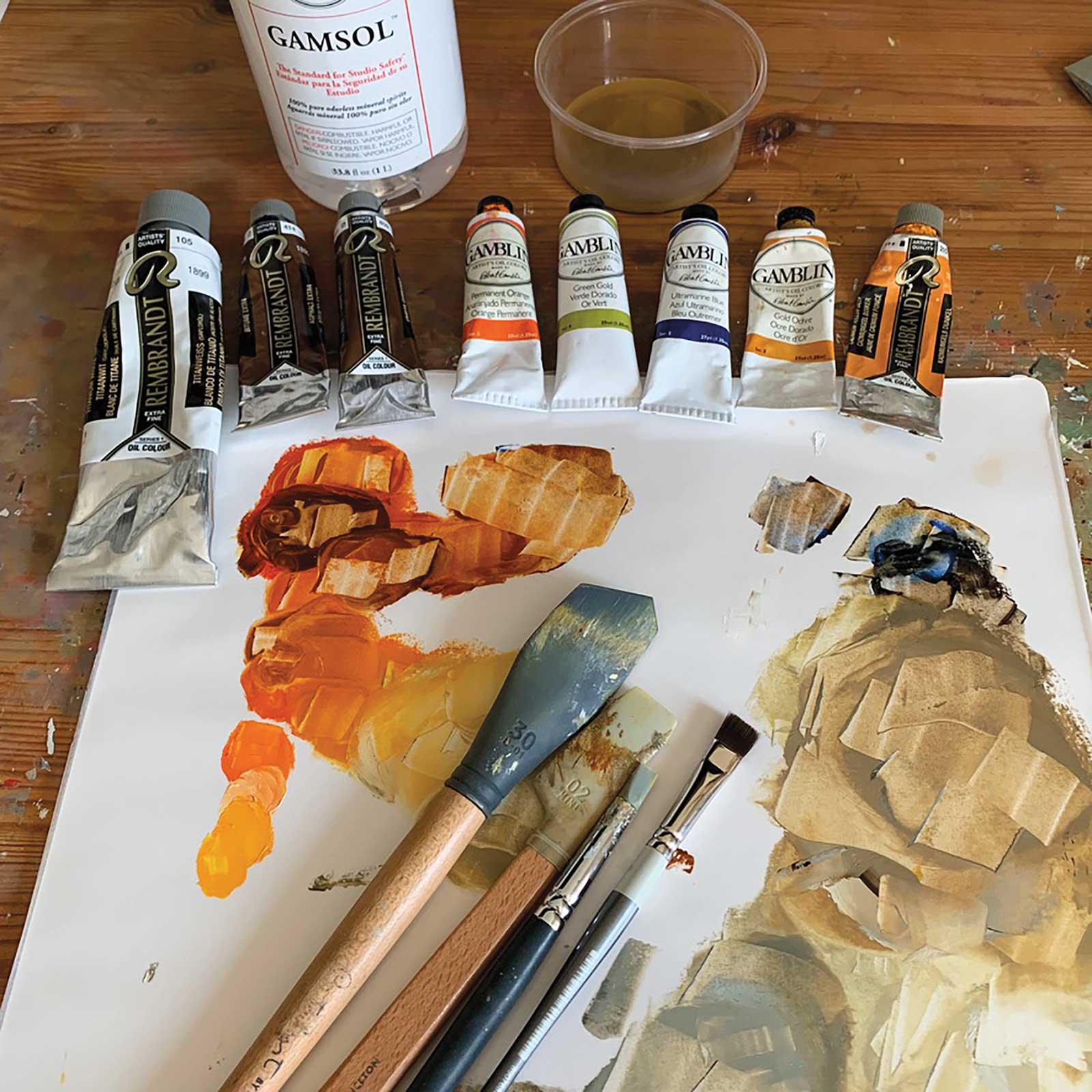
Rembrandt Oils
Asphalt, Burnt umber, Cadmium yellow deep, Titanium white
Gamblin Oils
Gold ochre, Green gold, Permanent orange, Ultramarine blue
Additional Supplies
Princeton Catalyst silicone blade, no. 1, 30 mm, Princeton Catalyst mini blade, no. 2, scraper, AMI color shaper, no. 6, PANART 4601 craft brush, Gamblin Gamsol odorless mineral spirit
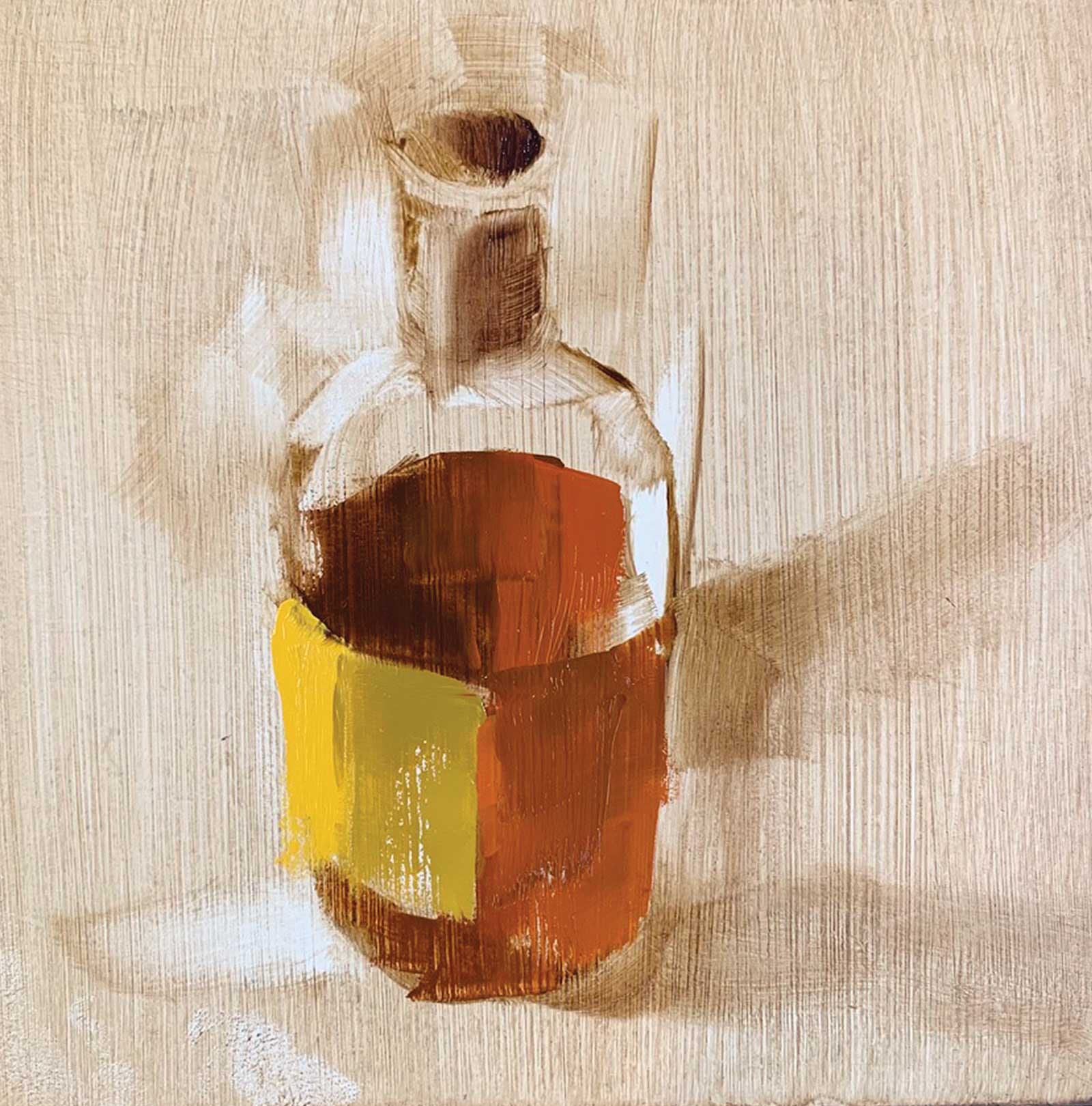 Stage 2
Stage 2 Major Colors
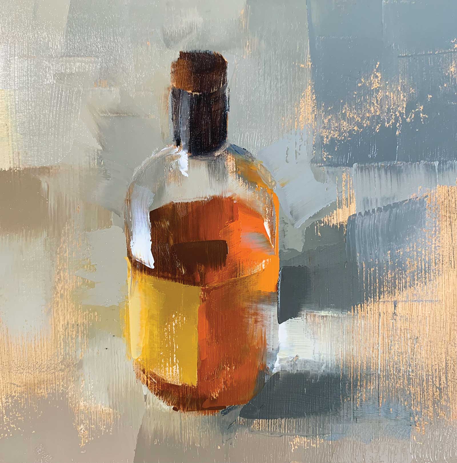
I then add a mix of permanent orange, green gold, asphalt, gold ochre and ultramarine blue. I apply the base colors to the bottle with a 3-centimeter-wide Catalyst blade. For the label, I use asphalt, gold ochre, cadmium yellow deep and titanium white.
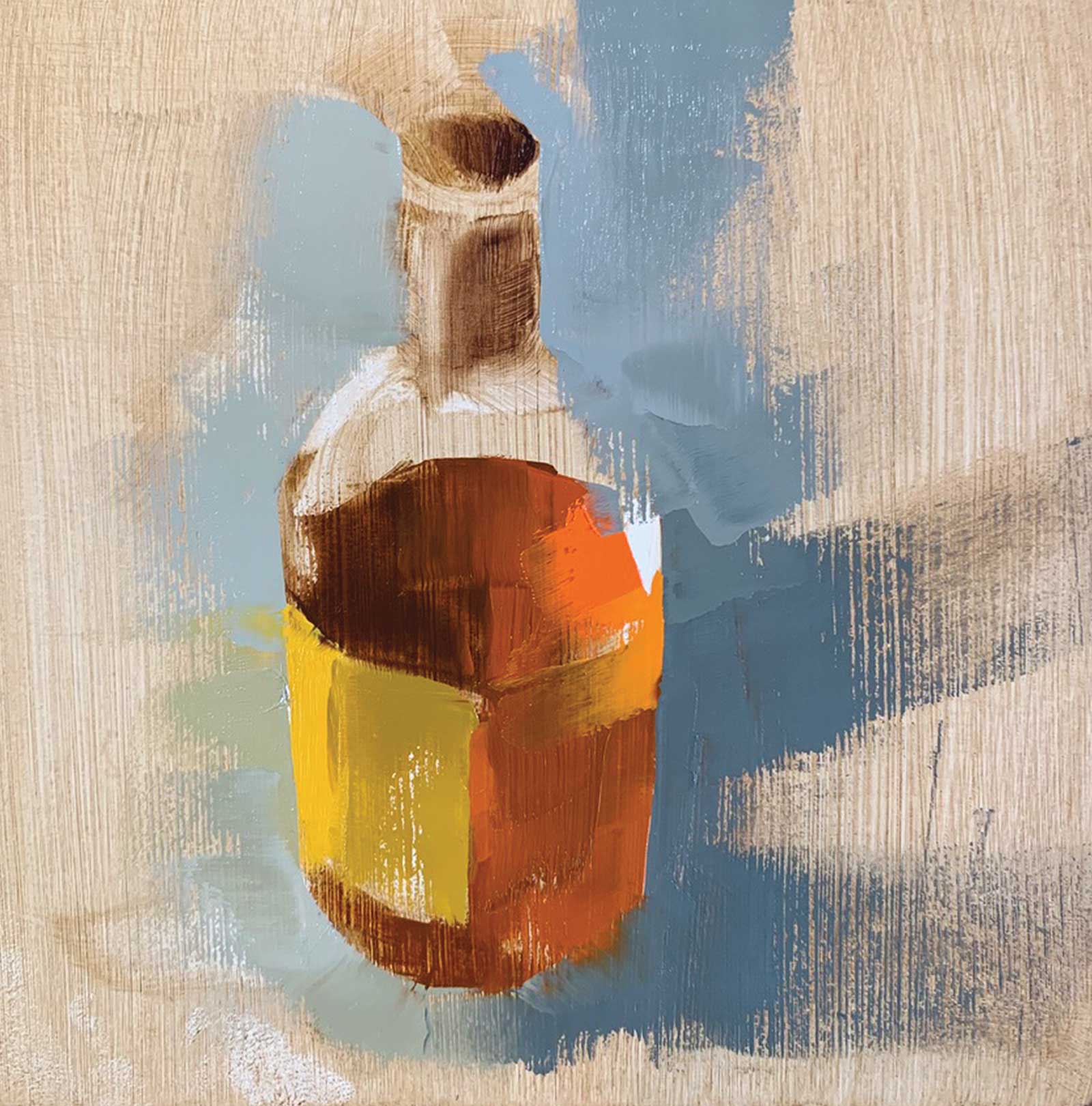 Stage 3
Stage 3 Introducing More Blues
Around the bottle I use the earlier mix with some more ultramarine blue and asphalt. The colors of the whiskey bottle are also mixed in the background color. Everything is applied with the blade.
 Stage 4
 Stage 4
Stage 4 Bottleneck
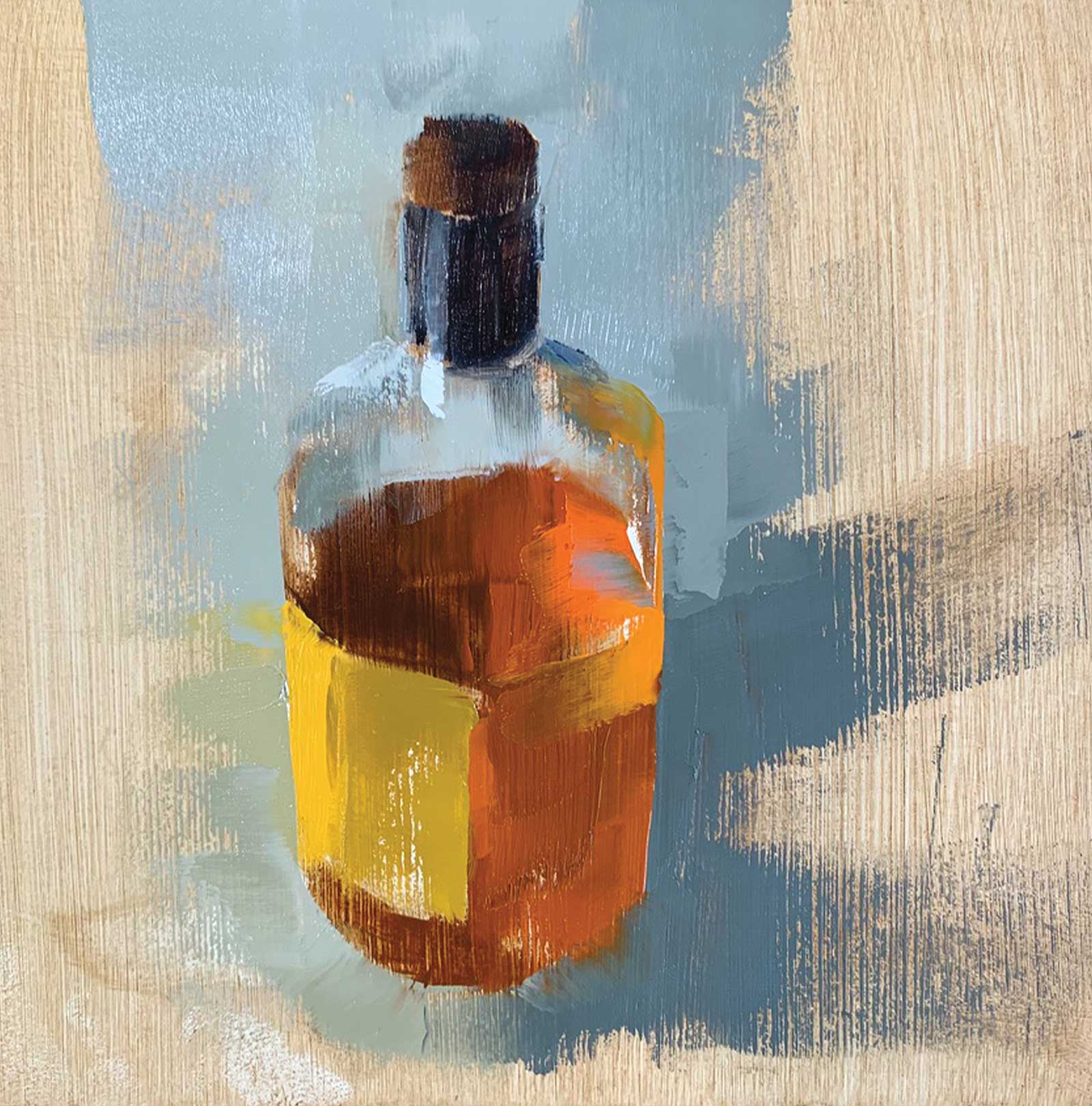
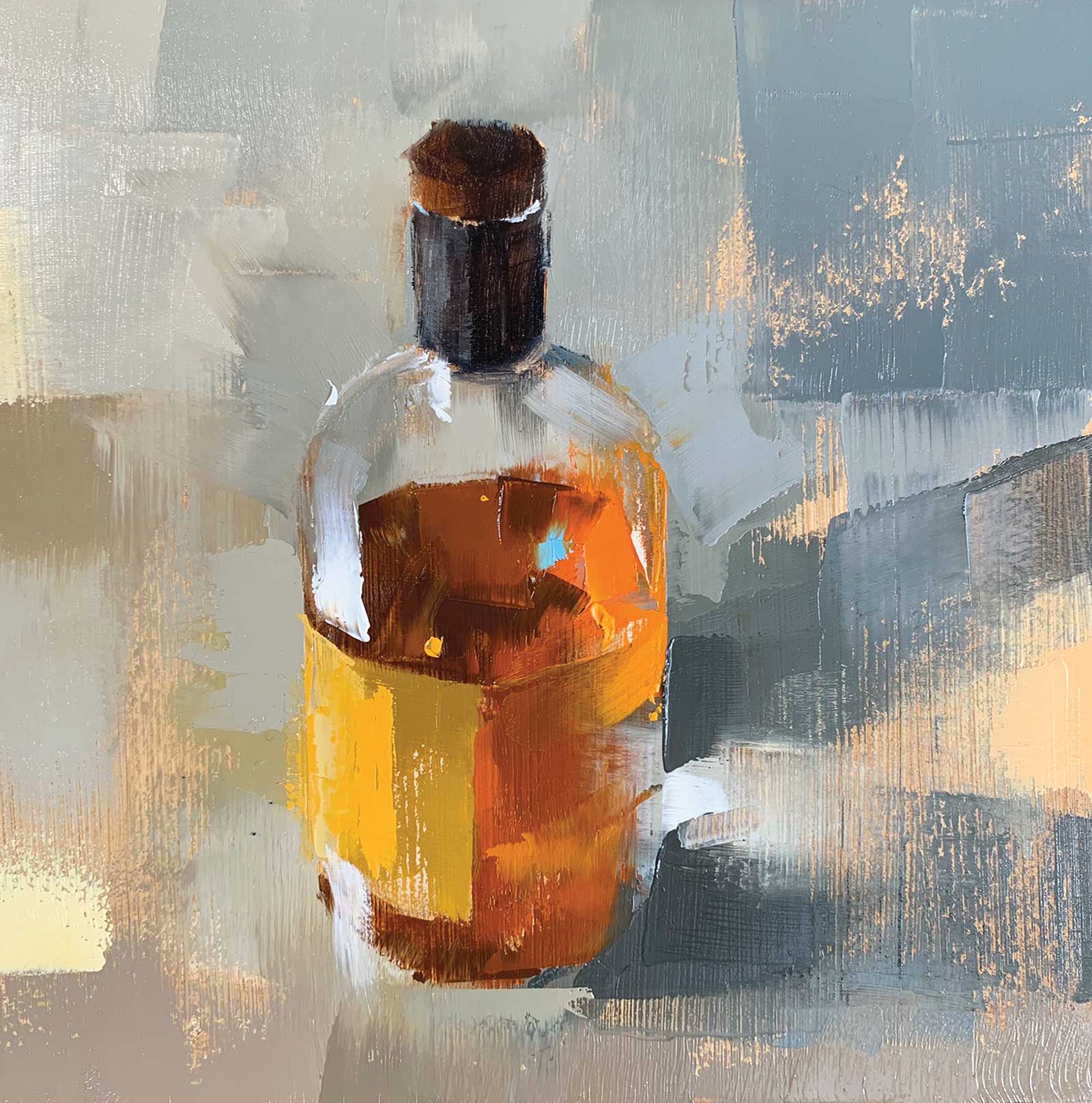
The background color shines through the bottle (above the surface of the whiskey). For the neck of the bottle and the cap I use a mix of burnt umber and ultramarine blue. Because the neck and cap are too small for the blade, I use a brush.
 Stage 5
Stage 5 White Highlight
I apply the white highlight on the left side of the bottle with a narrower blade. This is applied from the top of the label upwards.
 Stage 6
Stage 6 Blue Highlight
I then apply a blue highlight to the right side of the bottle and lighter yellow tones in the background where light hits the floor.
 Stage 7
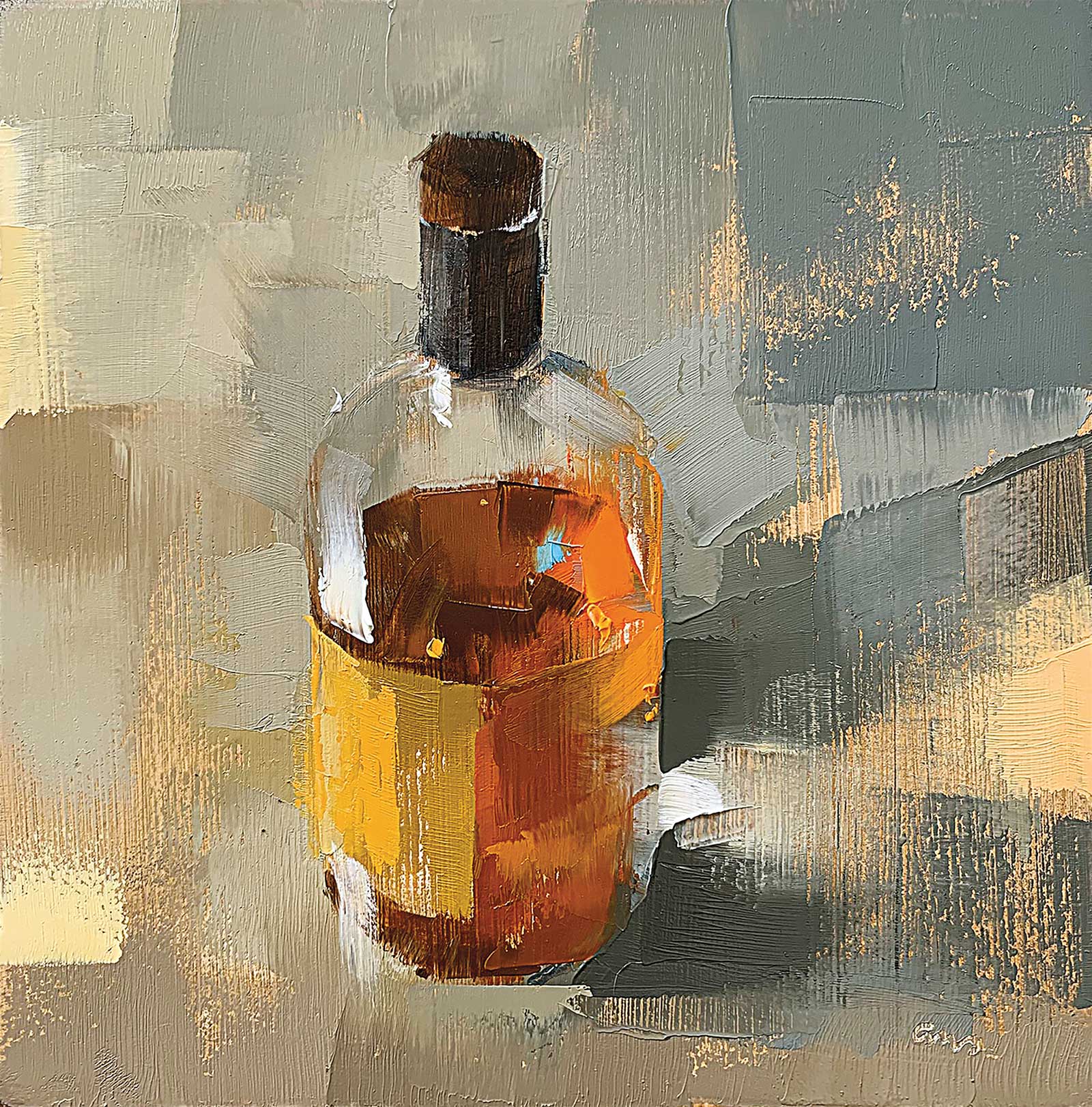
Stage 7 Finished Artwork
New Monkey, oil painted with blade, 6 x 6" (15 x 15 cm)
About the Artist
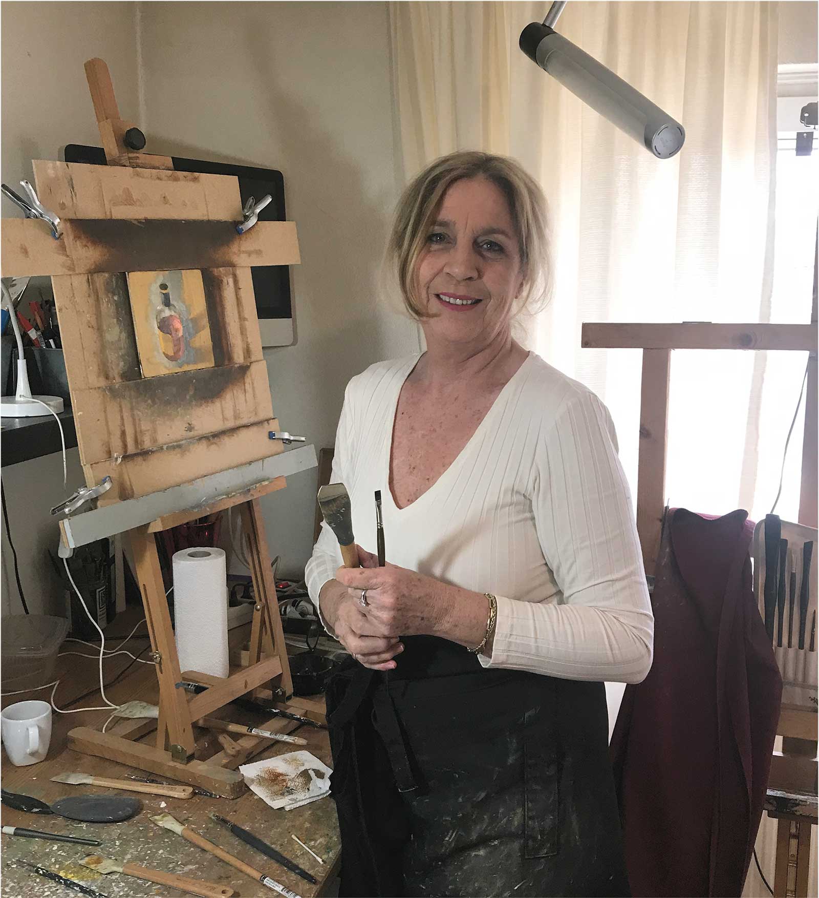 Ans Debije
Ans Debije was born and raised in The Netherlands, graduating from the Design Academy in Eindhoven as an interior and fashion fabric designer in 1984. Drawing and painting lessons were subjects that supported the design process and were not the most important elements in her growth as a painter. She taught herself skills in painting by observing art and trying out different techniques with mediums like watercolor, acrylic and printing techniques (etchings and monotypes) before she began working with oils. Although Debije has been painting all her life, she became a full-time artist in 2019 and has created oil paintings on a daily basis since then.
Contact at
www.ansdebije.nl/artwork