



After nearly four decades as a professional artist, I’ve developed a highly recognizable signature style, especially in regards to composition and creative content. My paintings are based on symbolism. I convey my thoughts about life through metaphors and symbolic meaning universally ascribed to my subject matter. This symbolic content is mostly a reminder to myself—a personal internal dialogue, if you will—which is intended to lead to personal growth, new narratives, and ultimately, new paintings.
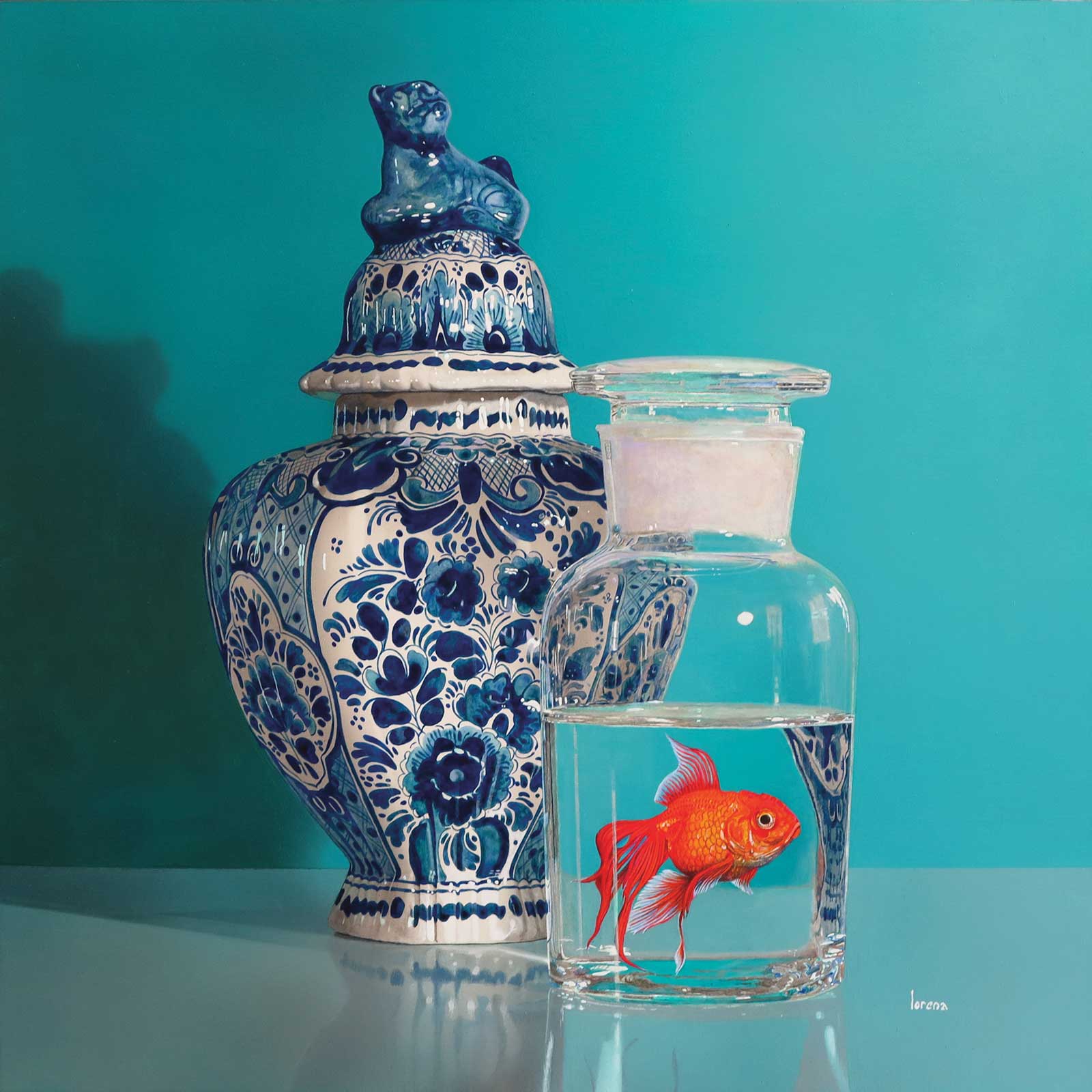
Tempus Memores IV, acrylic on panel, 15¾ x 15¾"(40 x 40 cm) This piece depicts an 18th-century Delft Blue jar with a lion finial next to a glass bottle with a goldfish. To be able to incorporate aquatic creatures into my still life, I added the element of glass holding water, with the additional benefit of transparency and interesting reflections. Of course, this composition is entirely based on imagination and artistic license, as I strongly disapprove of animals held in confined captivity.
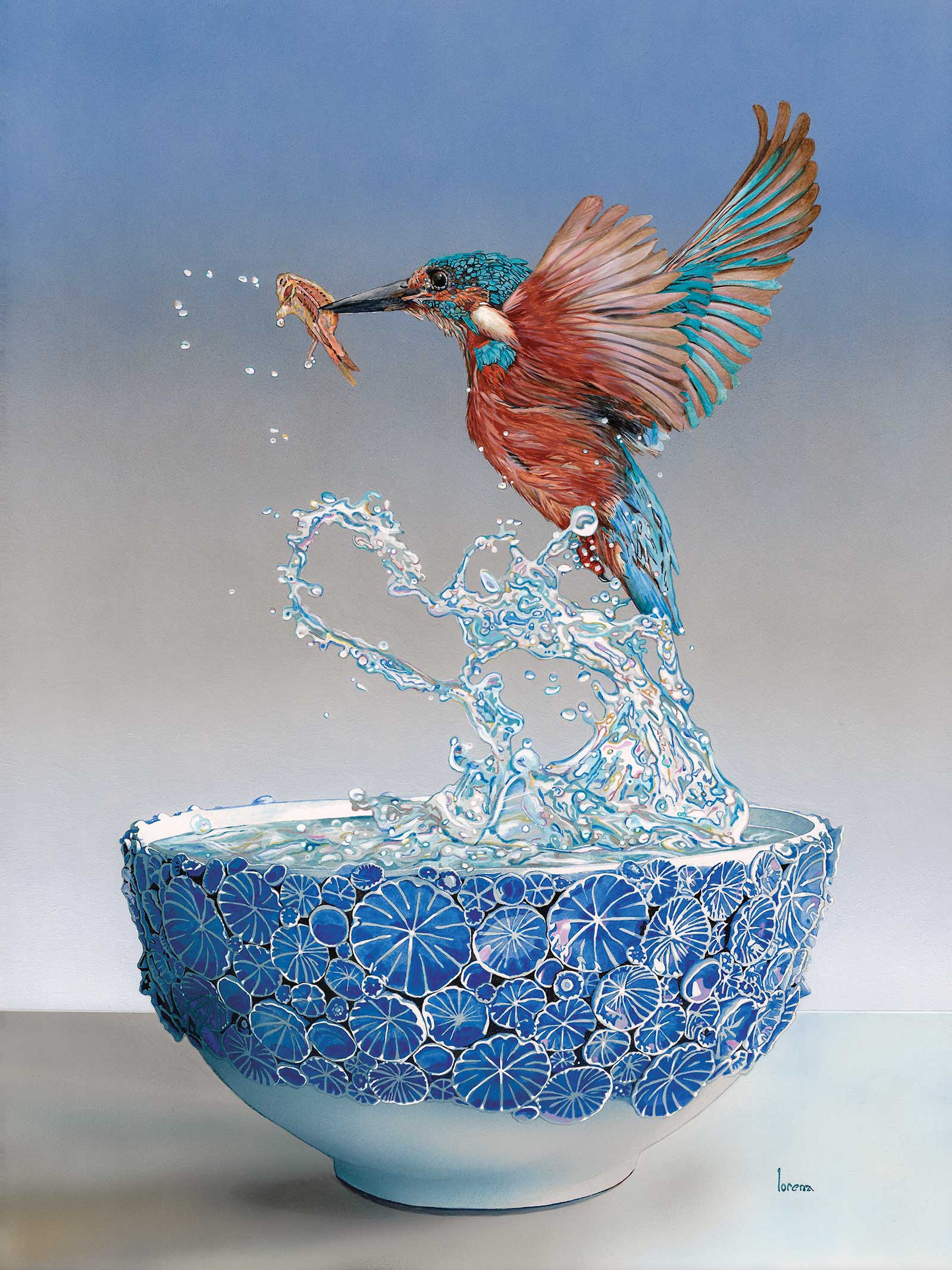
Recently, I have started a series called Virtus Aquae, meaning “the power of water” in Latin. I’ve coined these paintings “still lifes in motion” because they aren’t as static or motionless as still lifes tend to be. These paintings portray scenarios in which a kingfisher scoops its meal out of a bowl, dramatically trailing a sparkling splash of water. Water is my favorite element and a subject which allows a lot of freedom in its gloriously graceful abstraction. I’ve chosen Virtus Aquae III for the step-by-step section of this article because it includes so many interesting features.
My preferred medium, acrylic paint, is a huge change from the traditional use of oils. I switched to using acrylics in 2004 and since then I’ve developed techniques using ready-made blends or single pigments in transparent glazes, taking advantage of acrylics’ fast drying times to achieve a look and finish indistinguishable from oils. Transparent layering allows for optical mixing; instead of mixing paint on a palette and then applying it thickly, I prefer to apply multiple transparent layers to achieve the desired color intensity, values and nuance. Of course, it takes many, many layers to achieve the desired results that, in the end, pull the entire composition together.
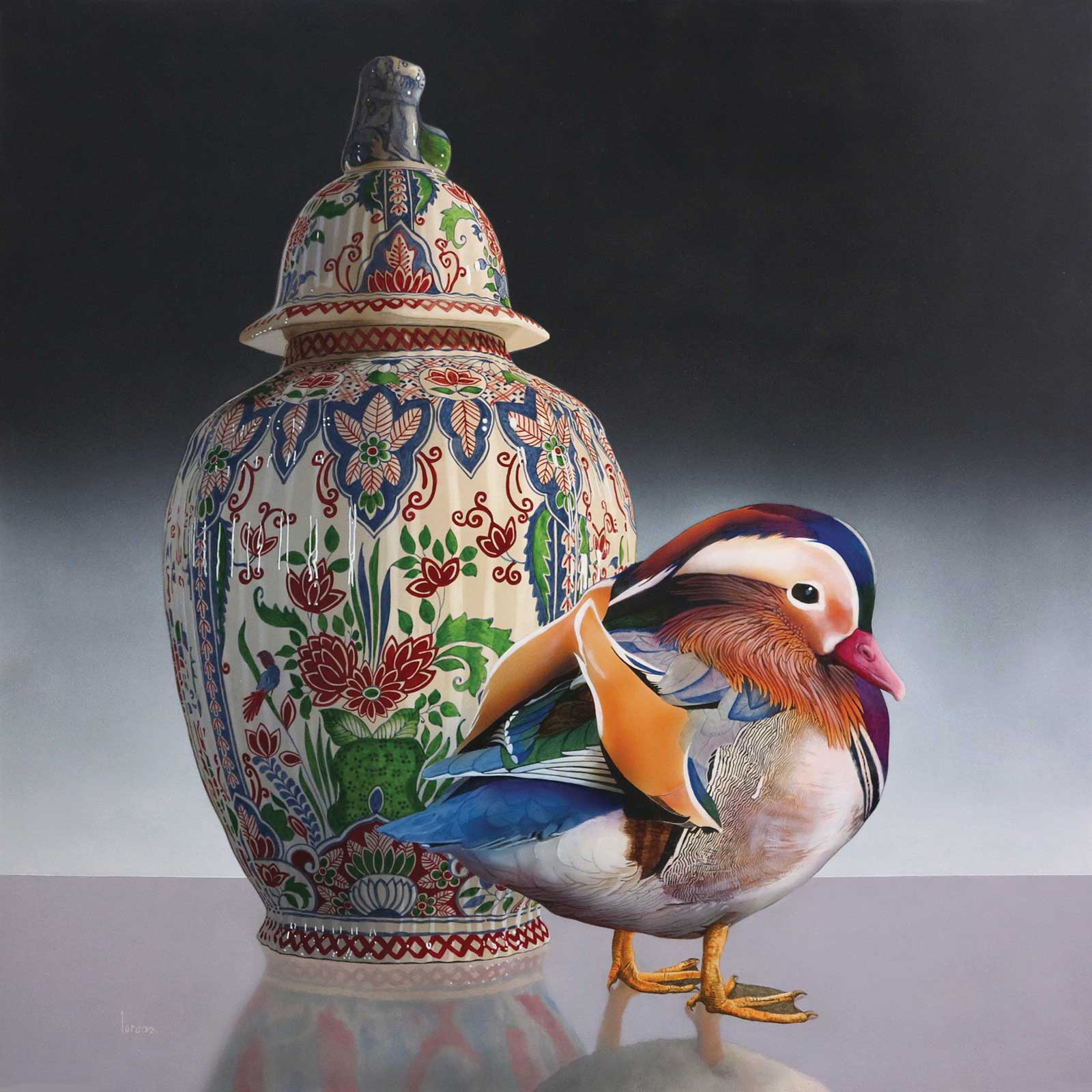
Tempus ad Requiem XLVI, acrylic on panel, 19½ x 19½" (49 x 49 cm) I always wanted to paint this polychrome lidded vase—a legacy from my Dutch grandparents—and finally found a perfect companion to echo its distinctive Frisian style color palette. Mandarin ducks are exotic looking birds; the adult male has a red bill and large white crescents around the eyes transitioning into auburn cheeks with “whiskers.” Purple, green, blue and russet patterns contrast starkly against black and white plumage. Most remarkable are its two orange “sail fins”—large feathers that stick up like boat sails.
In 2012 I added the airbrush to my toolbox, which I now use for areas with gradations, such as cast shadows, and for varnishing. However, without an airbrush one can achieve wonderful gradations by dry brushing. This technique requires a very small amount of paint on a clean, dry brush (preferably an old, worn one), and a lot of practice to get it right. The airbrush is also a wonderful tool to flawlessly apply the final coat of varnish. Other than that, I’d say about 90 percent of my paintings are done using traditional brushwork.
As a final note, I’d like to highlight the collaborative aspect of my work. As an artist, I work in solitude, behind closed doors. Yet the objects I paint—mostly from my personal collection or borrowed from friends—have been created by fellow artists, some alive, many long gone, some who signed their work, others nameless. A few reference photos of animals are bought through image licensing, but most are acquired from friendly photographers who graciously allow me the use of their work. I love this collaboration between different art genres; I create an image by combining exquisite handcrafted objects made by accomplished artisans and magnificent creatures captured by the deft eyes of wildlife photographers. Then I paint the imaginary composition seeking to make it look believable—a new reality born of many hands, hearts and minds.
My Art in the Making Virtus Aquae III
Reference Photo
Reference Photo
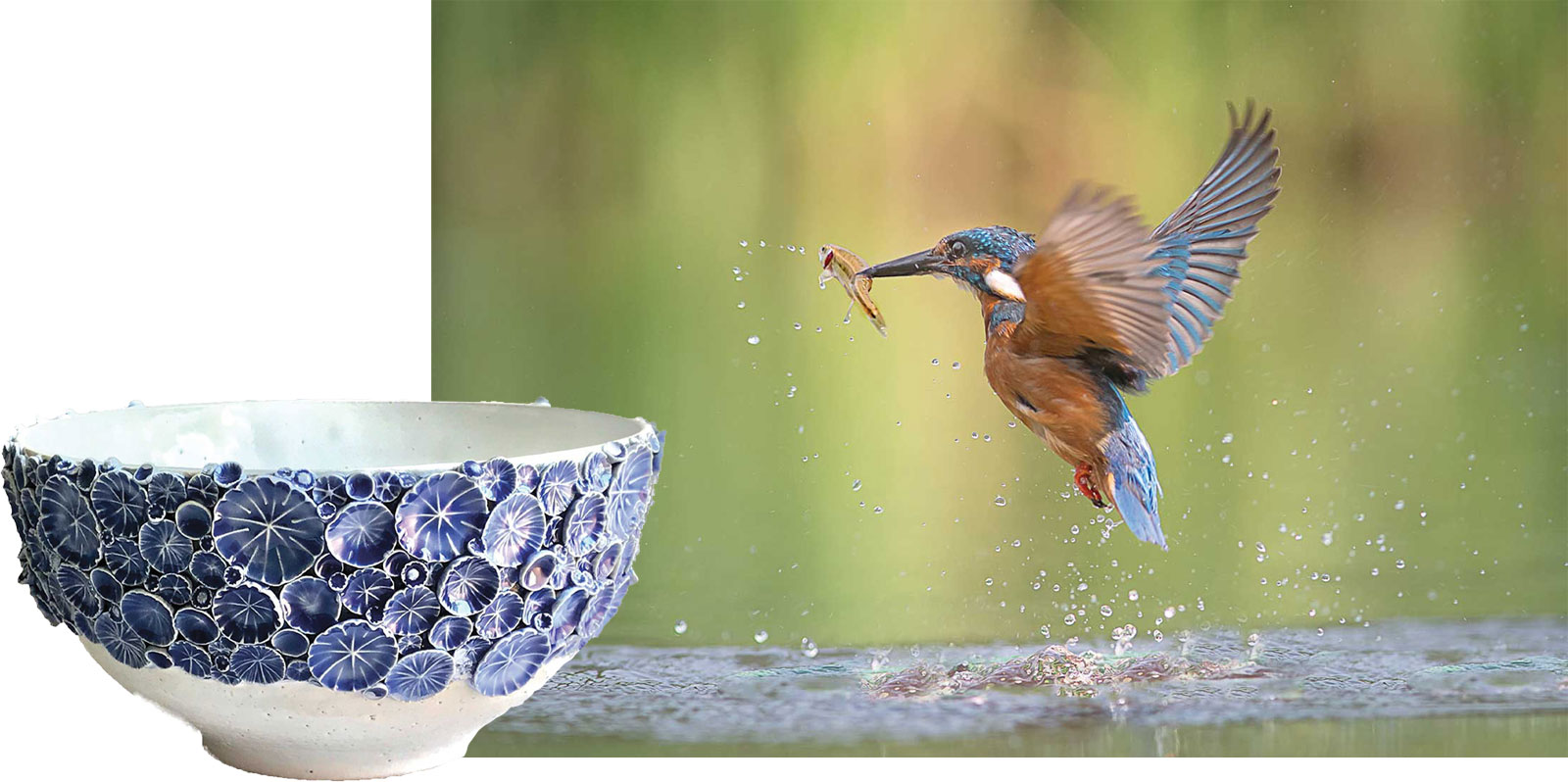
The reference photos of the bowl and the bird form the foundation of my painting. Part of the water, just below the bird, gives me an indication of how the water surface should “sit” inside the bowl. For my initial drawing I translate blurry areas, such as the bird’s wings, into well-defined lines. Note that realism depends more on achieving the correct value scale (lights and darks) than on color palette.
 Stage 1
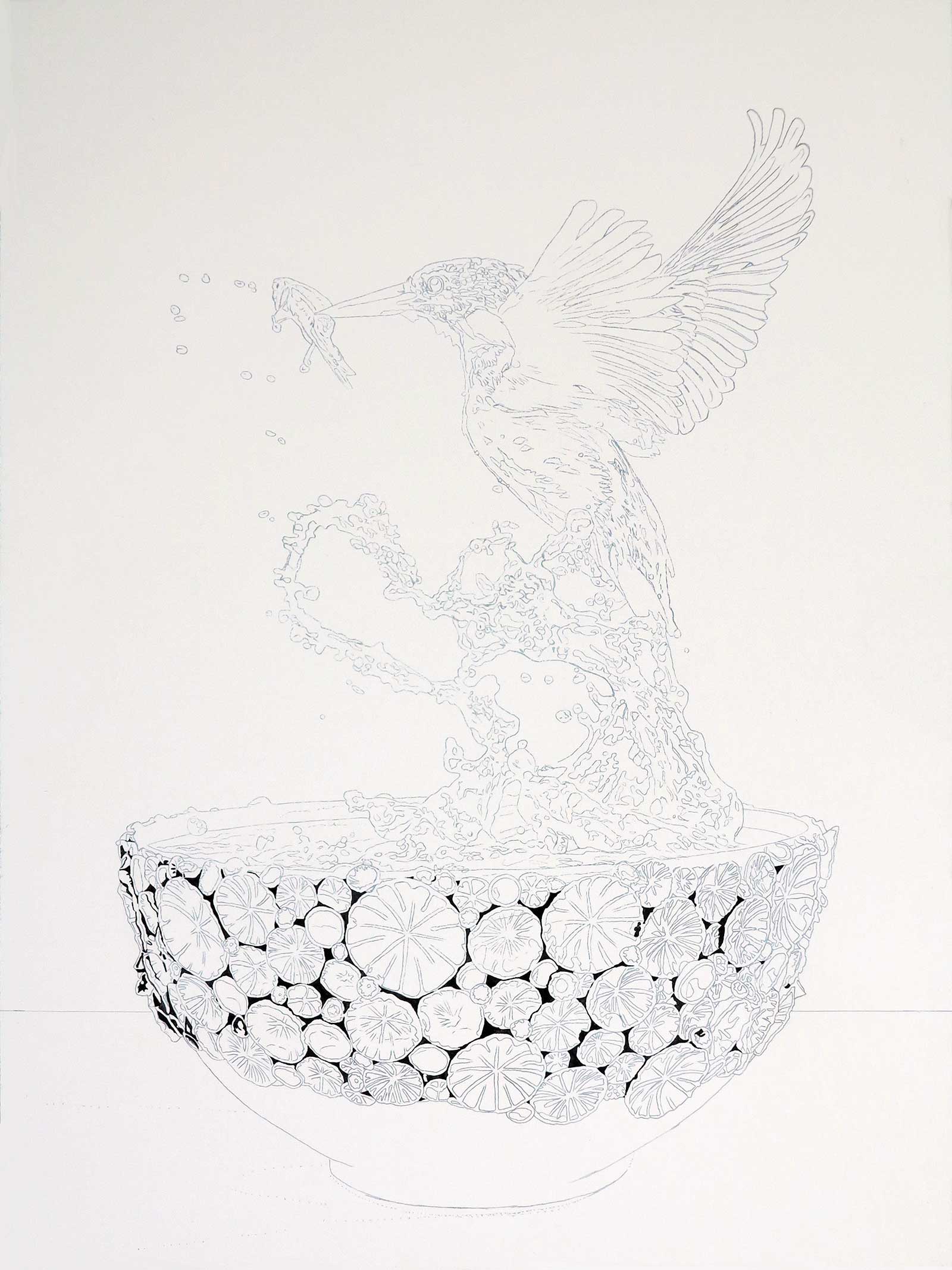
Stage 1 Transferring the Sketch
Using graphite paper and a mechanical pencil, I trace my composition onto the panel with as much detail as possible. Then I draw the imaginary splash of water between the bowl and the bird. To fixate the graphite and avoid smudges, I lightly apply a coat of highly water-diluted gesso (consistency of milk) to the entire panel with a broad synthetic brush. I start blocking in the darker areas of the bowl using Payne’s gray. Except for the background, I use the smallest brush, size 000.
WHAT THE ARTIST USED
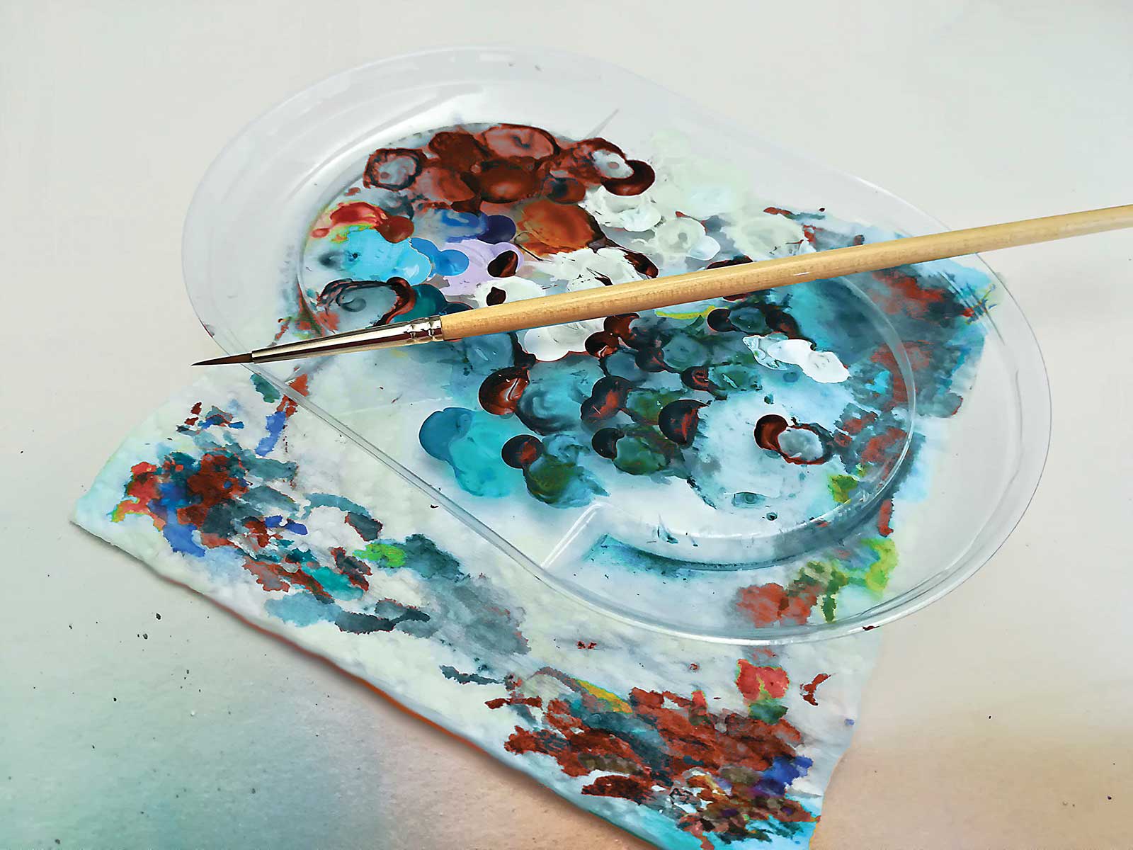
Fluid or Soft Body Acrylics
Bright aqua green, Burnt sienna, Burnt umber, Cadmium orange, Cobalt blue, Light violet, Neutral gray, Payne’s gray, Real teal, Sandalwood, Titanium white, Venetian rose
Brushes
Flat synthetic brush, 2" wide, Synthetic brush, #000, Short flat brush, #2, Well-worn, bone-dry filbert, #10 for dry brushing (or an airbrush), Old pointed round brush, #1 (soaked in warm soapy water to apply liquid frisket)
Additional Supplies
Panel, Mechanical pencil, eraser, graphite paper, and a print of my composition, White acrylic gesso, Water mixed with Flow-Improver (in a squirt bottle) to dilute paint, Gloss medium (transparent acrylic polymer) to strengthen paint integrity, Paper towels, Plastic lid or saucer, Q-tips, Liquid frisket, Masking tape, Acrylic satin UV varnish
 Stage 2
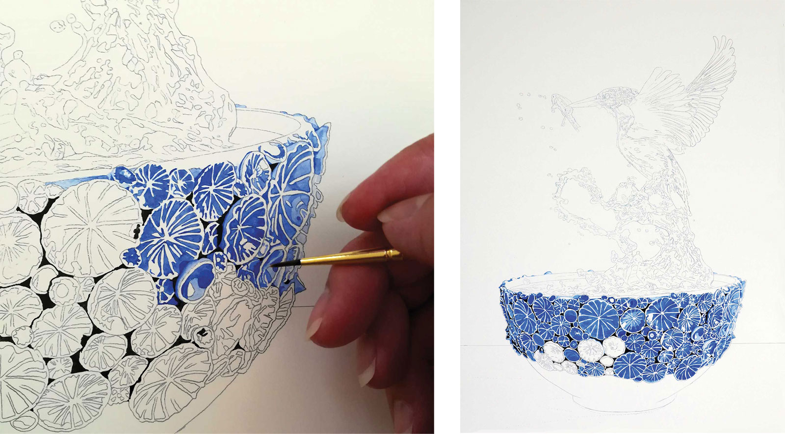
Stage 2 Flowers on Bowl
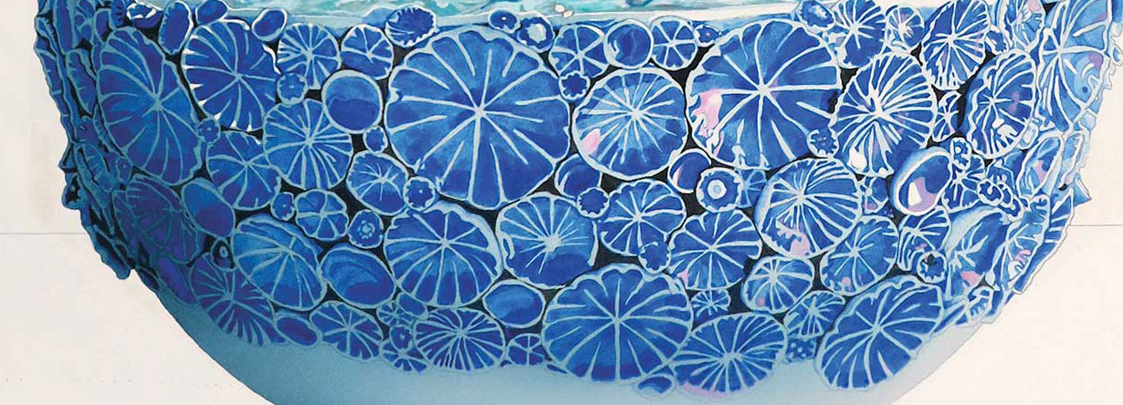
The acrylics I prefer are soft body or fluid acrylics, all of which I slightly dilute with a few drops of water premixed with flow improver and a few drops of gloss medium. The flow improver, true to its name, makes it easier to move the paint around, while the gloss medium (acrylic polymer without color pigments) helps maintain the integrity of the diluted paint pigments. Here, using cobalt blue, I build the flowers on the ceramic bowl, using less layers in lighter areas and more layers in darker areas.
 Stage 3
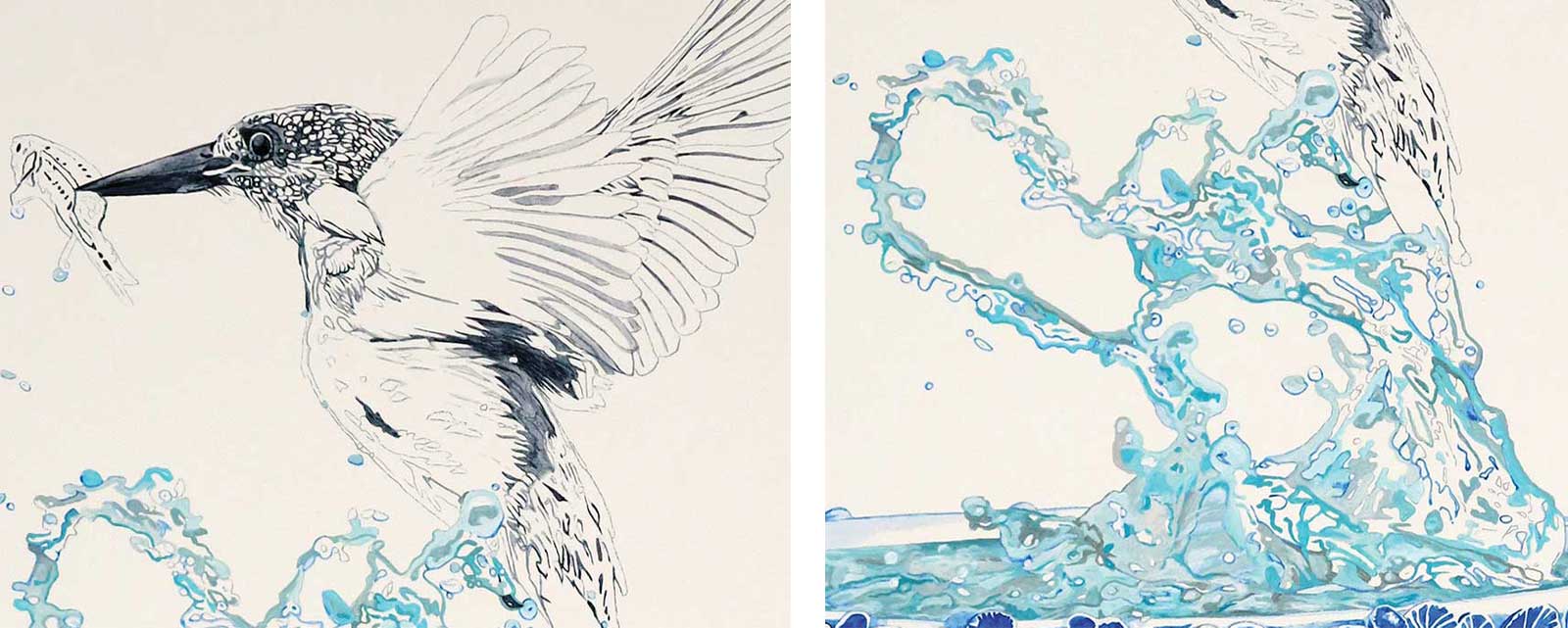
Stage 3 Defining Forms
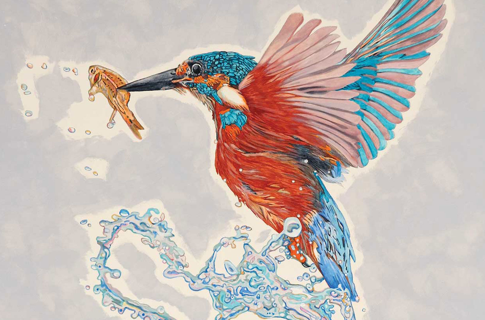
Applying Payne’s gray to the darkest areas of the bird helps bring out its shape. I also start forming the water using bright aqua green, titanium white and some Payne’s gray. The shape of the water is important, so I make sure to keep hard edges and slowly build up areas of darker and lighter values. The colors are chosen on a whim, so I’m not worried about following a prescriptive method because I can go back in to lighten, darken or change the colors entirely as often as I want. Note that hereafter, each time I use a new color, I add some of it to the splash to integrate it into the overall composition.
 Stage 4
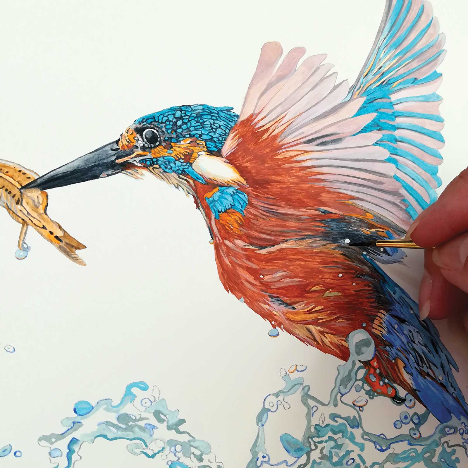
Stage 4 Coloring the Kingfisher
The kingfisher has a pronounced pattern of colors that need to be respected to make it recognizable. Real teal, burnt sienna, cadmium orange, cobalt blue and sandalwood are layered in the right places, including the little fish in the bird’s beak. Again, the intensity of the color is manipulated and reinforced through the number of layers of transparent glazes. Less layers result in pastel hues, more layers result in high chroma. Glazes, applied in shapes, define the breast feathers and suggest movement.
 Stage 5
Stage 5 Depth and Dimensionality
To mimic lustrous highlights, I apply light violet to some of the flowers on the bowl. Then the entire bowl is isolated from the rest of the painting using liquid frisket applied with an old #1 pointed round brush previously dipped in warm soapy water. Once dry, the frisket creates a rubbery barrier to make it easy to maintain edges and protect areas that need to remain clean. This next part can be either airbrushed or dry brushed using a transparent layer of cobalt blue and another layer of transparent Payne’s gray, delicately darkening the left side to achieve dimensionality. I use a damp Q-tip to wipe away paint in areas that I want to lighten. Once done, I carefully roll off the frisket with a clean fingertip, taking care I don’t leave smudges.
My Design Composition and Tactics
Laying the Groundwork
Once a visual idea becomes clear, I make a few thumbnail sketches and create several compositions on my computer, merging different elements using photo software. This is the most important phase as I develop my own ideas and shape the basis for the future painting.
Mapping the Painting
This painting is divided into four elements, and each has its own particular qualities: the background, the ceramic bowl, the water and the bird. During painting sessions, I move from one element to another and back again, continuously adjusting color and values by adding transparent layers. Time is not important; I paint until I can’t improve on it within my abilities. It is only then that I consider my painting finished.
Revisiting Colors
Using the same colors in all elements including the background helps to tie the entire composition together. Even just hints of reiterated color can make a huge difference in the overall atmosphere.
The Spirit
I love collaborating with fellow artists, especially those who work in other disciplines. For Virtus Aquae III the exquisite ceramic bowl was made by the Australian ceramicist Nicole Speakman of ClayPress Ceramics, and the captivating photograph of the kingfisher was made by UK wildlife photographer Alan Tunnicliffe.
To Thine Own Self Be True
Serious artists seek authenticity within their work. They take ownership of their artistic process and language. And they do not copy, rather, they seek to find their own voice. Their development and growth can be traced back through their previous work. There are no surprising leaps or free rides between being a novice and an artist of substance. The process of creative growth is a personal journey, and our artworks are, in some ways, self-portraits.
 Stage 6
Stage 6 Blocking In Background
Although I use most colors straight out of the tube, I prefer to mix specific background colors to suit the overall color scheme. In this case I made a blend using titanium white with a tiny bit of neutral gray, cobalt blue and burnt umber in a small lidded jar. The airtight jar keeps the acrylic paint fresh, so I don’t have to worry about matching the same color again later. I start blocking in the background using the short flat #2 brush, and use the smaller brush to paint around the edges. I also paint the baseline of the bowl using burnt umber. It takes many layers to achieve a flat uniform color.
 Stage 7
Stage 7 Beautiful Transitions
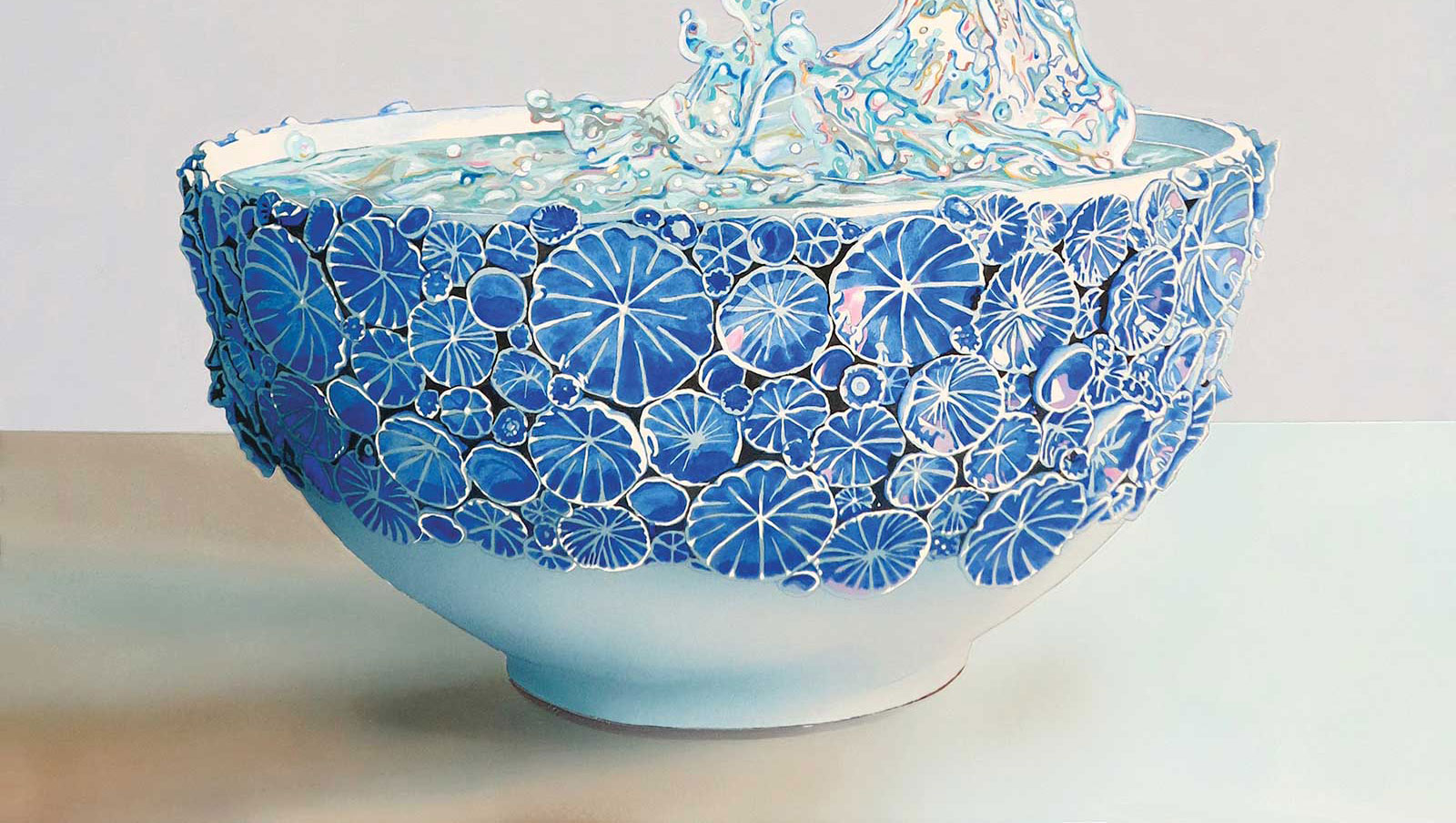
Using masking tape and liquid frisket for the edges (applied with an old pointed round brush #1 previously dipped in warm soapy water), I cover the entire painting except for the lower background area of the painting. Again, this part can be either airbrushed or dry brushed to achieve beautiful transitions between light and shadow areas. Here I used titanium white on the right-hand side of the table, and three separate single-color glazes (cobalt blue, Payne’s gray and burnt umber) on the left-hand side to convey depth and shadows, waiting for each layer to dry thoroughly before applying the next.
 Stage 8
Stage 8 Fine Tuning
After removing the tape and frisket, I sign the painting and evaluate it carefully. Taking digital photographs—both color and gray tone—is very helpful to assess the visual strength of the artwork on a smaller scale. Because the water needs more contrast, I decide to slightly darken the background, so I isolate the painting once again using masking tape and liquid frisket, covering everything except the background. Once more, this part can be either airbrushed or dry brushed; here I used a layer of Payne’s gray on top, then a layer of cobalt blue transitioning softly into a layer of sandalwood, leaving the original background color in the lowest area exposed.
 Stage 9
Stage 9 Finished Artwork
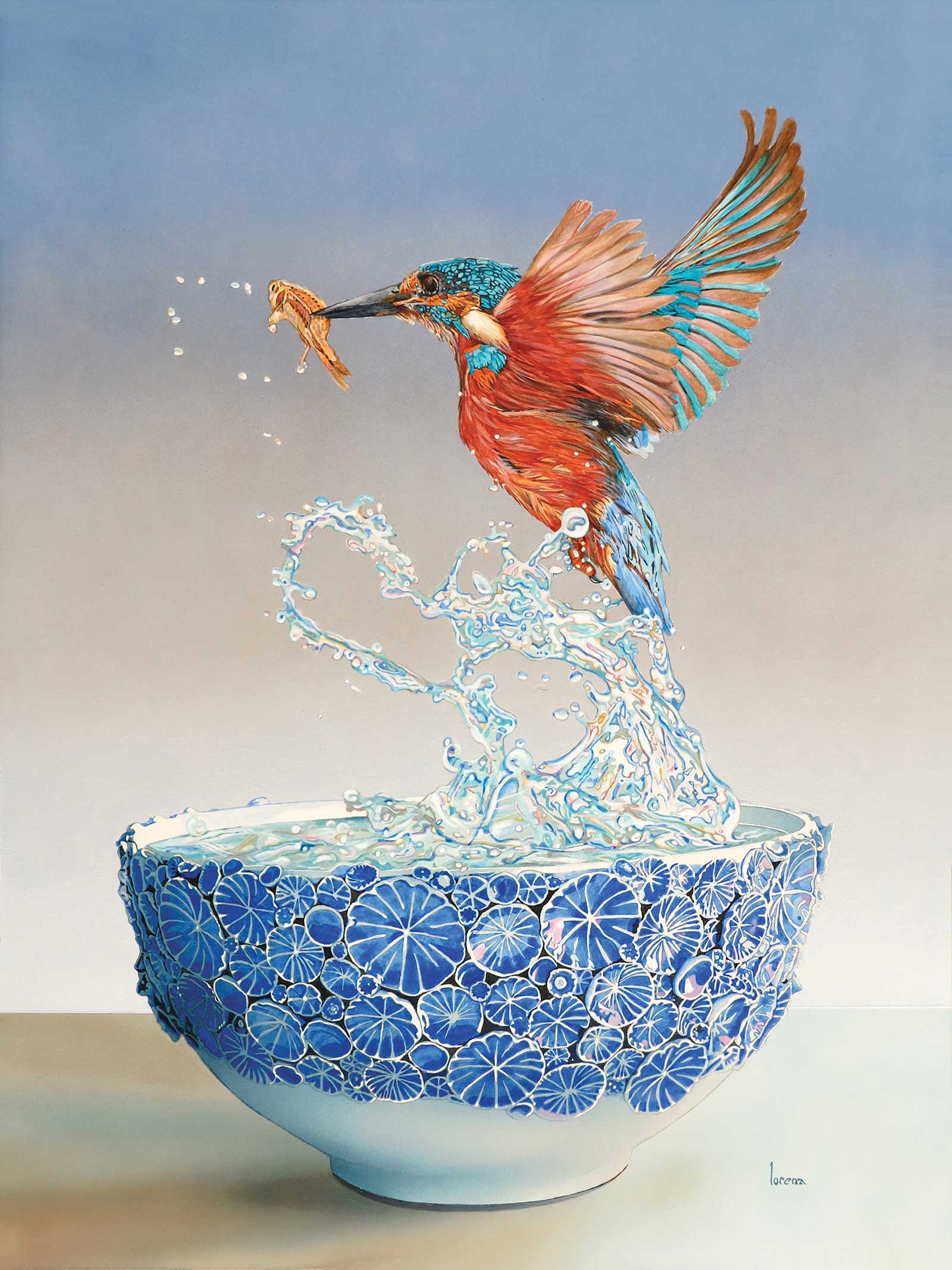
Virtus Aquae III, acrylic on panel, 15¾ x 12" (40 x 30 cm)
The final touches are meant to pull the now almost finished painting together. First, I give the entire painting a layer of gloss medium with a tiny hint of cobalt blue and Payne’s gray. This delicately yet dramatically darkens the entire painting. Once dry, I reinforce highlights using titanium white and any other color I think needs a lift. I call this the “push and pull” phase, adjusting lighter and darker values, taking the time I need to get the right amount of contrast and color intensity. Once satisfied, I apply a final isolation coat using gloss medium to the entire painting, and then after a few days a coat or two of varnish to protect it from airborne pollutants, UV damage and fading. Voilà, the finished Virtus Aquae III.
About the Artist
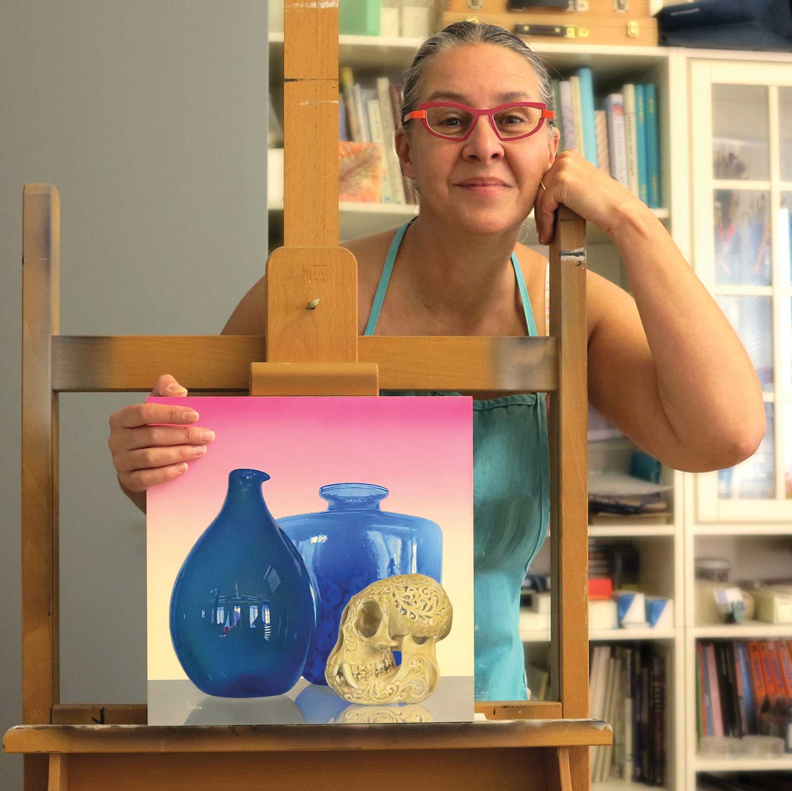 Lorena Kloosterboer
Dutch-Argentine artist Lorena Kloosterboer, born in the Netherlands, creates contemporary realist and hyperrealist still lifes, focusing on glass and ceramic pieces, often accompanied by flora and fauna. She seeks to capture the fascinating interactions between colors, light, shadows, textures and reflections, uniting them in visual poetry. During her 35-plus-year career, Kloosterboer’s artwork has been widely published and has been in over 150 gallery and museum exhibitions in 14 different countries.
Kloosterboer’s book Painting in Acrylics: The Indispensable Guide was first published worldwide in American English in 2014 and has since appeared in three additional languages under different titles and covers. Kloosterboer regularly writes essays about art and artists, as well as catalog introductions, and has engaged in several curatorial projects. Currently she publishes her essays on the website Medium and is living and working in Antwerp, Belgium.
Represented by
Simie Maryles Gallery, Massachusetts, USA, www.simiemaryles.com
Contact at
www.art-lorena.com