



Being passionate and aware of landscapes from a young age has created an internal need to explore the act of creating–to figure out how to paint, what to say and why it’s important to say it. This creative exploration and intense learning in a relatively short period of time has forced me to constantly assess my work and my voice. With a growing desire to pare down my paintings to the essential elements of shape, light, movement and depth, I am determined to capture the essence of a moment on canvas.
My work with acrylics has encouraged my style to have expressive brushwork as working with this medium begs for speed. Often, where paint is placed is where it stays, and working quickly leads to a more expressive and intuitive response to the paint and canvas. This ability to work freely and quickly has pushed my style as an artist beyond representational to a more contemporary interpretation while maintaining the integrity of the physical landscape. You’ll see more unblended brushwork and purposefully placed color overlaid on what would be a more traditional painted landscape.
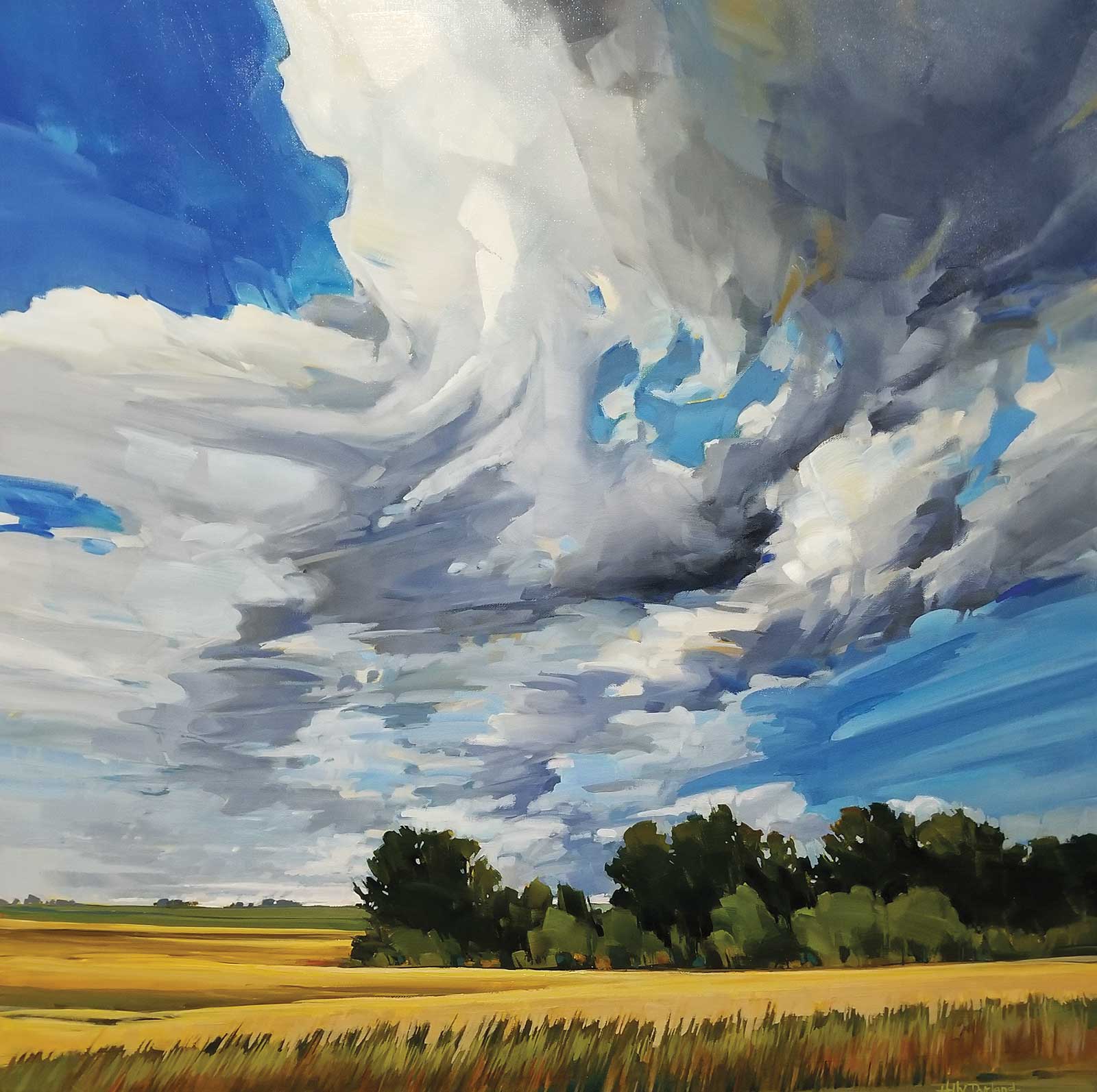
Thursday Afternoon, acrylic, 36 x 36" (91 x 91 cm) A classic rural Alberta summer scene, this painting was created to capture the feeling of our big skies. Billowing clouds overhead often overwhelm the landscape in the summer, so capturing the expression of movement and lift and giving it over to the majority of the canvas helped to capture the scale of the sky. Small patches of standing brush in the fields are typical in low spots, and they always give an interesting point and give light direction to the scene. Again, the field was suggested with larger brushstrokes to give its presence without over detailing, allowing the eye to be carried up into the sky.
My goal in painting is to capture a specific moment: a moment that took my breath away or made me pause. One that feels alive and exciting or peaceful and still; often a study of contrasts. I want to be able to draw the viewer into this place without overstating details, allowing them to recognize the place relative to their own lives and stories. This involves a beautiful play of push and pull with the paint: push the clouds back along the horizon line while pulling forward the upper clouds closer to the viewer. This depth is achieved with glazes to make something recede, and opaque heavier brushwork to pull portions of the painting closer. Building proper perspective with line and imagery (sketching and layout) work hand in hand with the glazes to create the illusion of space. This illusion of space and depth is very important to me as an artist as I want to create a painting that you can visually enter and be present in.
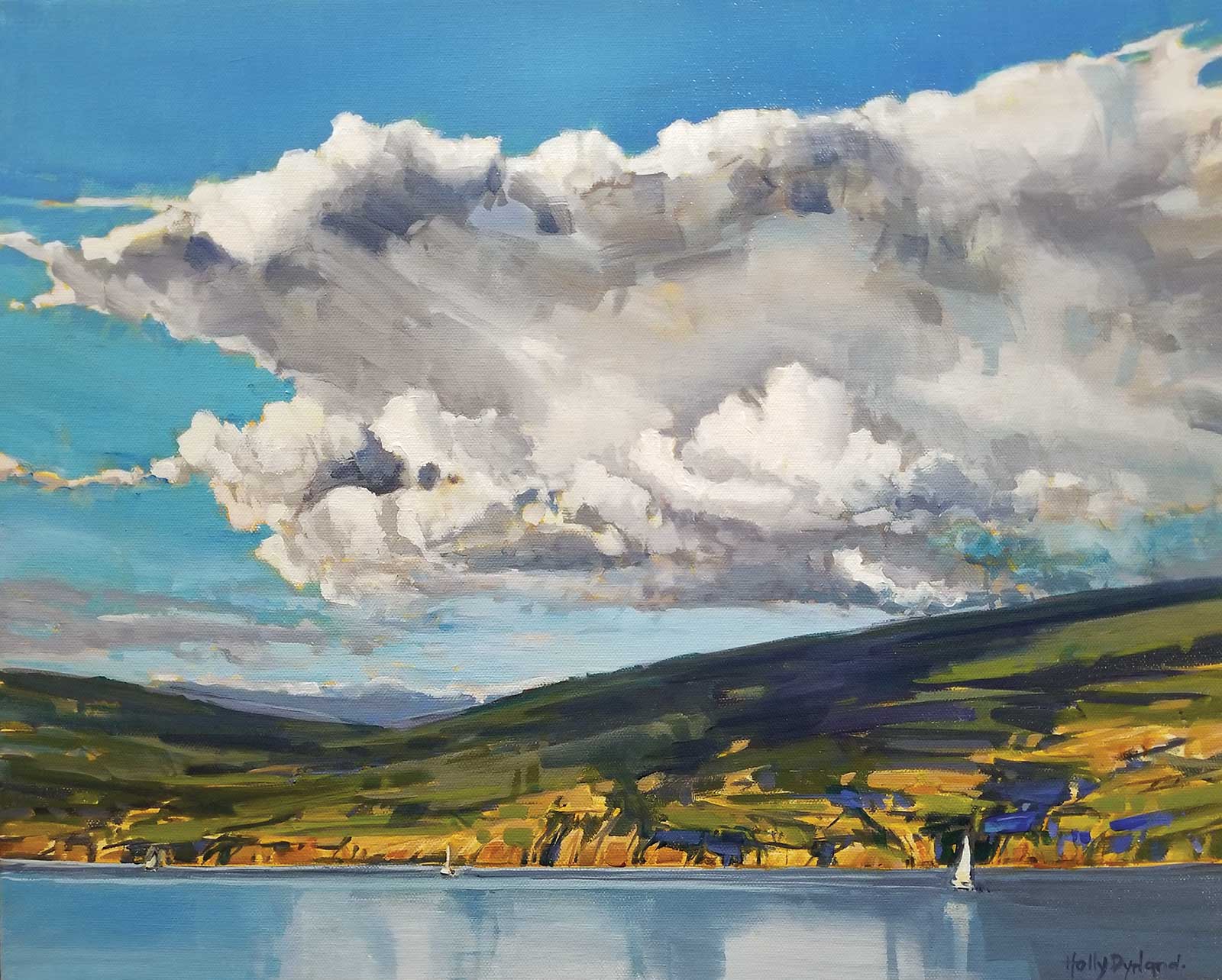
Afternoon Sail, acrylic, 16 x 20" (40 x 50 cm) What I wanted to capture here was the scale of the sky and the hills. This was achieved by cropping the water almost completely away, leaving just enough to paint the suggestion of the sailboat. The emphasis of the painting is placed on the sky with focus given to the shadow patterns on the mountains, giving a strong sense of light. Some of the focus is placed on developing the brushwork on the mountains to build bold strokes, which pulls that section of the painting forward. The focus of the detail is moved to the mountains and sky, with the water remaining smooth and calm. Another painting with a play of contrasts.
This push and pull is also a vital part of building movement within the painting as it adds to the illusion of depth. The movement is further developed with free expression of shape, simplifying the overall details to basic shapes, think ovals or expressive lines that lead the eye to support the movement. I am very careful to work out composition with focused cropping of reference material and thumbnail sketches, placing things where I want them in order to capture the moment that caught my eye in the first place. Simplifying what I see to overall shapes forces the composition to be seen and understood at its most basic form. From here I can create that initial capture of the moment without getting lost in the story.
Glazes are used once again to help capture light, as the luminosity that can be achieved by placing translucent colors over one another is brilliant. It is a delicate balance of thin layers building up to thicker layers, leaving the heaviest paint to be added last as a final flourish, often to draw your eye to the focal point or move you through the painting. Landscapes are alive, living moments, which is why light is so important. Painting light to make it read well involves having proper contrast, and finding the right amount to create the mood of the moment is achieved here once again with the application of glazes and heavier more opaque brushwork. Typically the higher the contrast the better as it really helps to create the focus for the painting; there is never any light without shadow.
I get this canvas and this moment to say something that I hope will create an emotional response, a breath, trigger a memory or take you to a place you can recognize or relate to. Art has an incredible power of bringing the subject to life and I love to create a slightly exaggerated visual description to emphasize it.
My Art in the Making Under Southern Skies
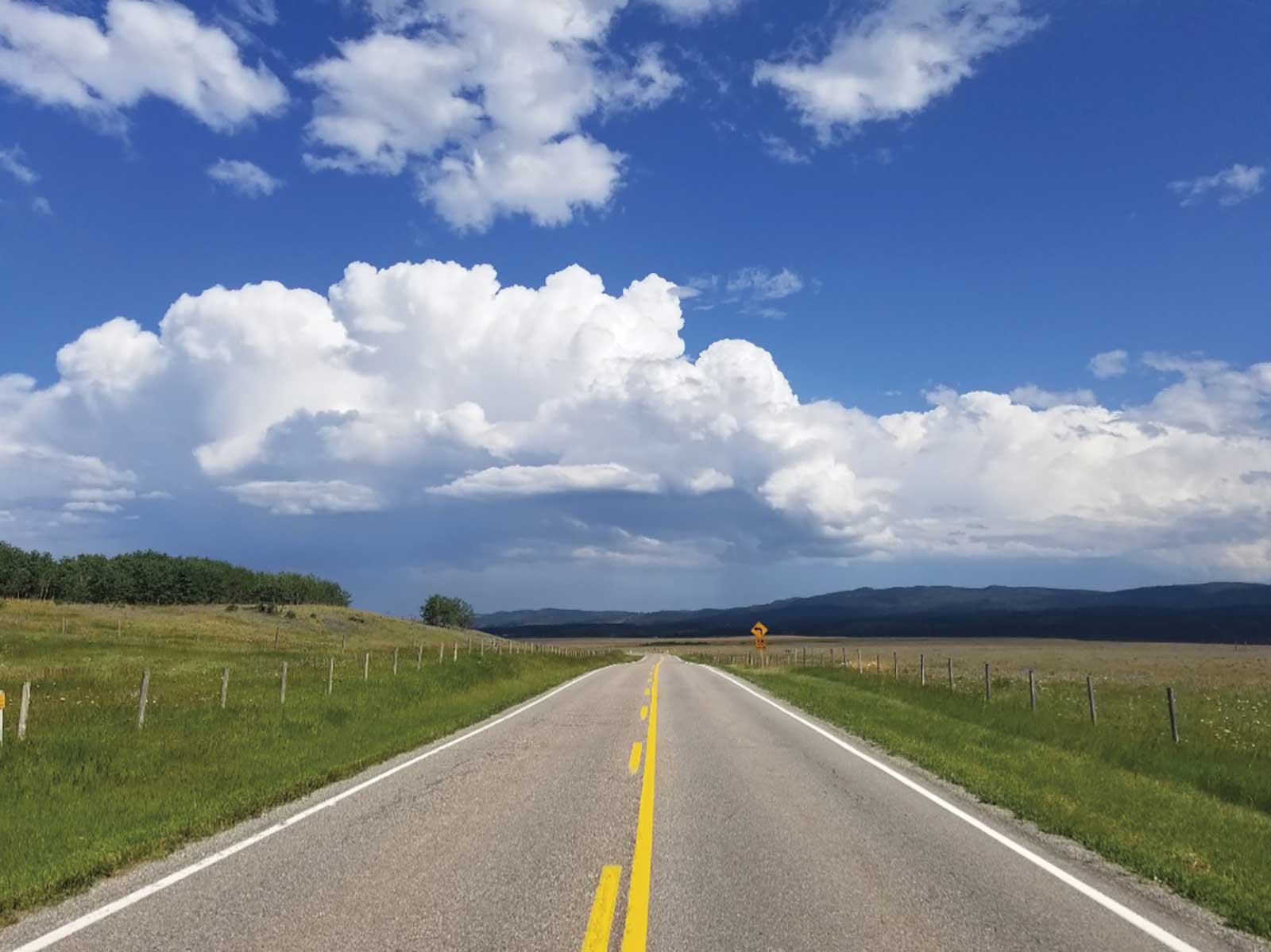 Reference photo
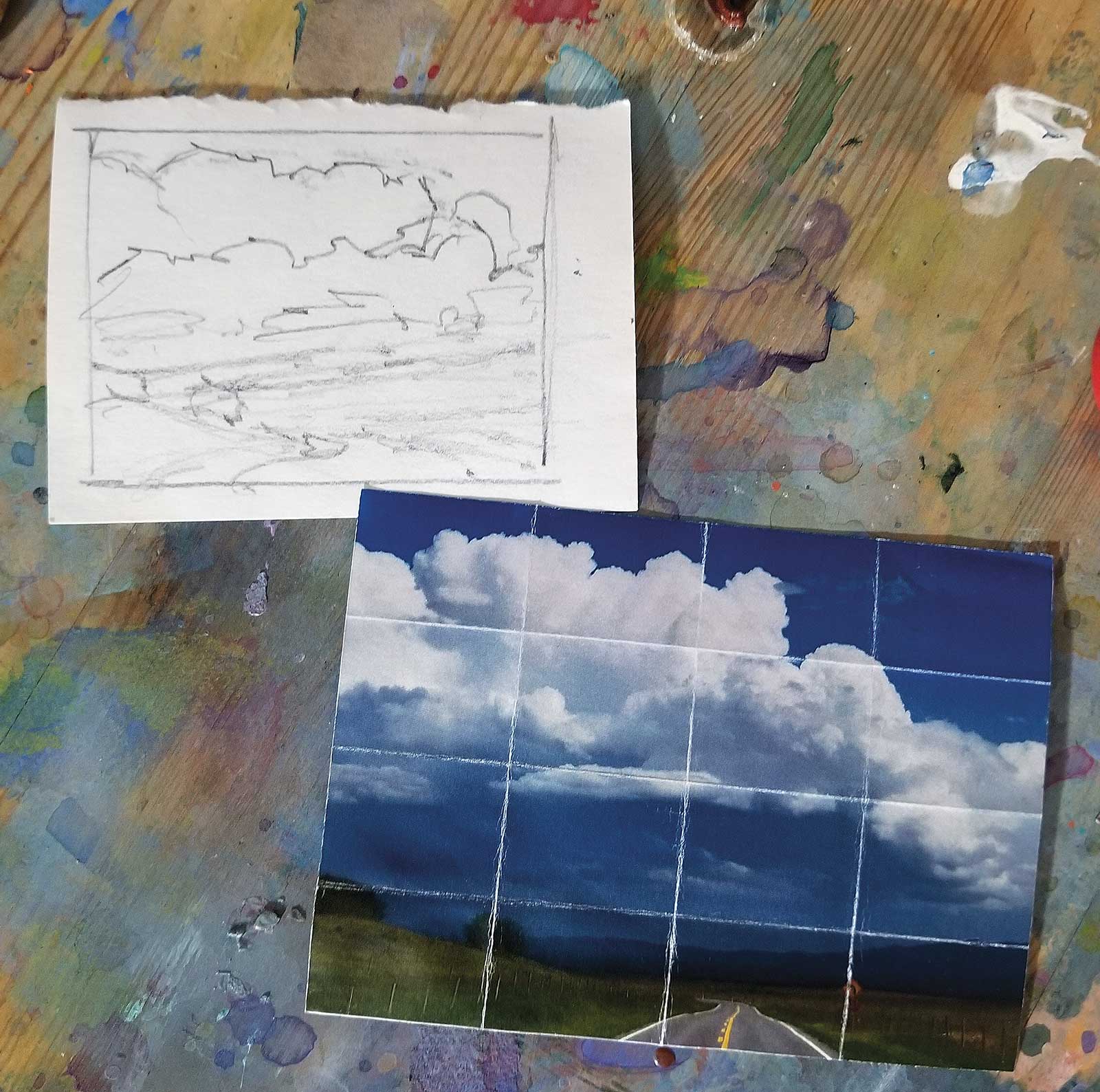 Stage 1
Stage 1 Gestural Thumbnail Sketch
This is the initial shape thumbnail sketch. I’m cropping down the original image to create a focused composition that communicates the reason behind the painting—capturing the feeling of that giant billowing sky in a simplified, gestural way.
WHAT THE ARTIST USED
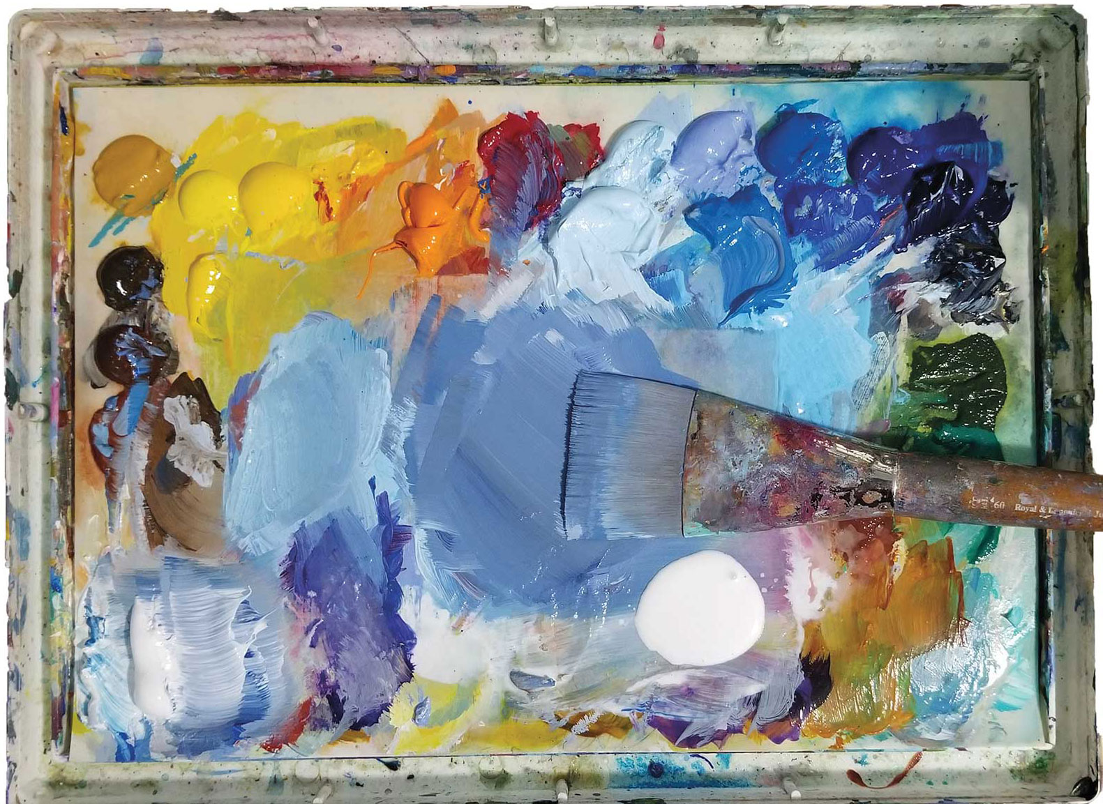
Acrylics
Quinacridone/nickel azo gold, Titanium white, Burnt sienna, Burnt umber, Raw umber, Yellow ochre, Cadmium yellow light, Cadmium yellow medium, Cadmium yellow dark, Cadmium orange,
Permanent rose, Phthalo blue light, Ultramarine light, Ultramarine blue, Phthalo blue, Manganese blue, Payne’s gray, Viridian green, Sap green
Brushes
Rosemary & Co ivory pointed round, #0; Princeton umbria, #10; Royal & Langnickel jumbo firm, #60
Additional Supplies
2b pencil, Sketch paper or book, Stay-wet palette, Spray water bottle, GAC 500, Blue shop cloth, Two water rinse bowls
 Stage 2
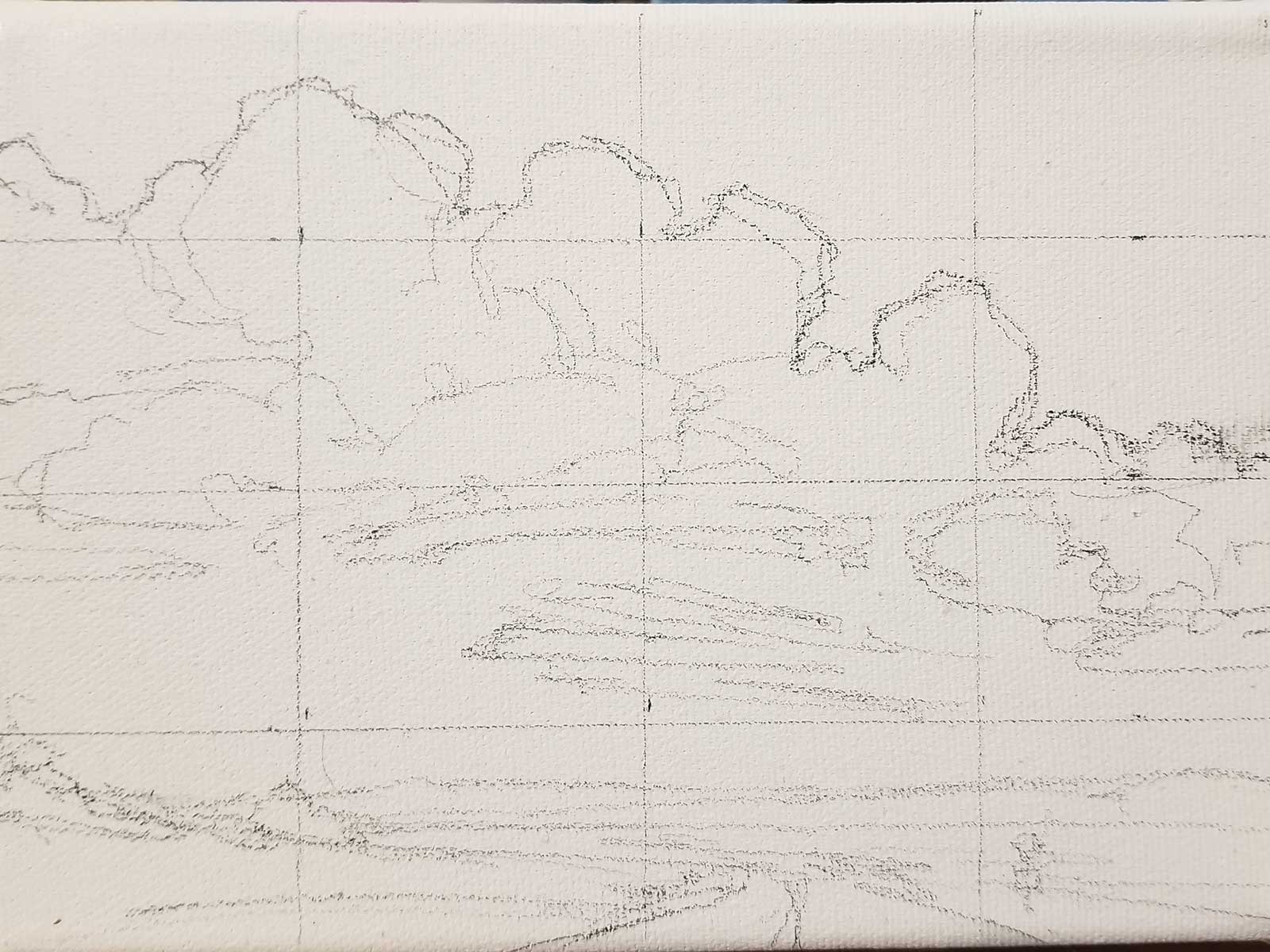
Stage 2 Sketching onto Canvas
Now, I’m creating a pencil sketch on canvas via gridwork from the printed reference photo, honoring the gestural thumbnail sketch.
 Stage 3
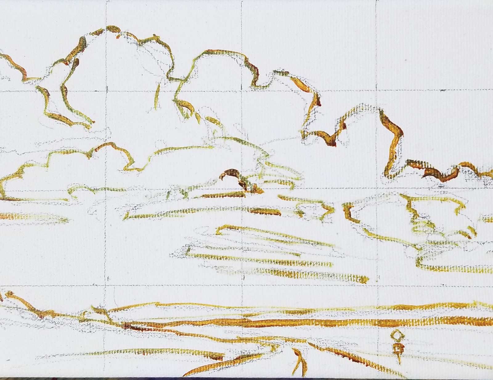
Stage 3 Outlining the Image
I then outline the overall sketch with a transparent liquid acrylic and GAC 500 mix. Basically, I’m hard lining my image so it doesn’t go anywhere. It’s another opportunity to focus on gestural linework.
 Stage 4
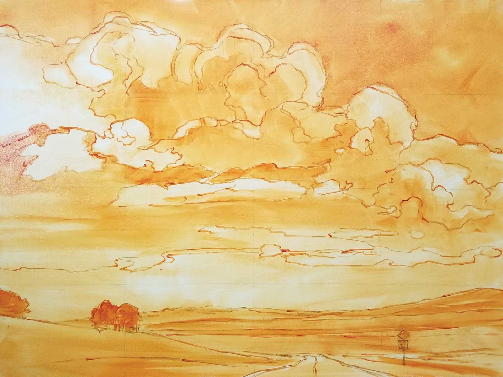
Stage 4 Value Study
An application of a ground color is applied to the whole canvas, essentially creating a value study. When wet, I use a blue paper towel/shop cloth to wipe away the lightest areas or receding areas.
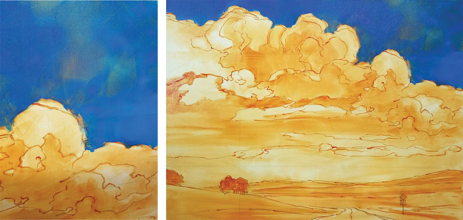 Stage 5
Stage 5 First Layer of Background Color
Working top down, I begin covering the background sky with a thin layer of color, being sure to allow the ground color to show through. This gives a sense of more depth in the finished work.
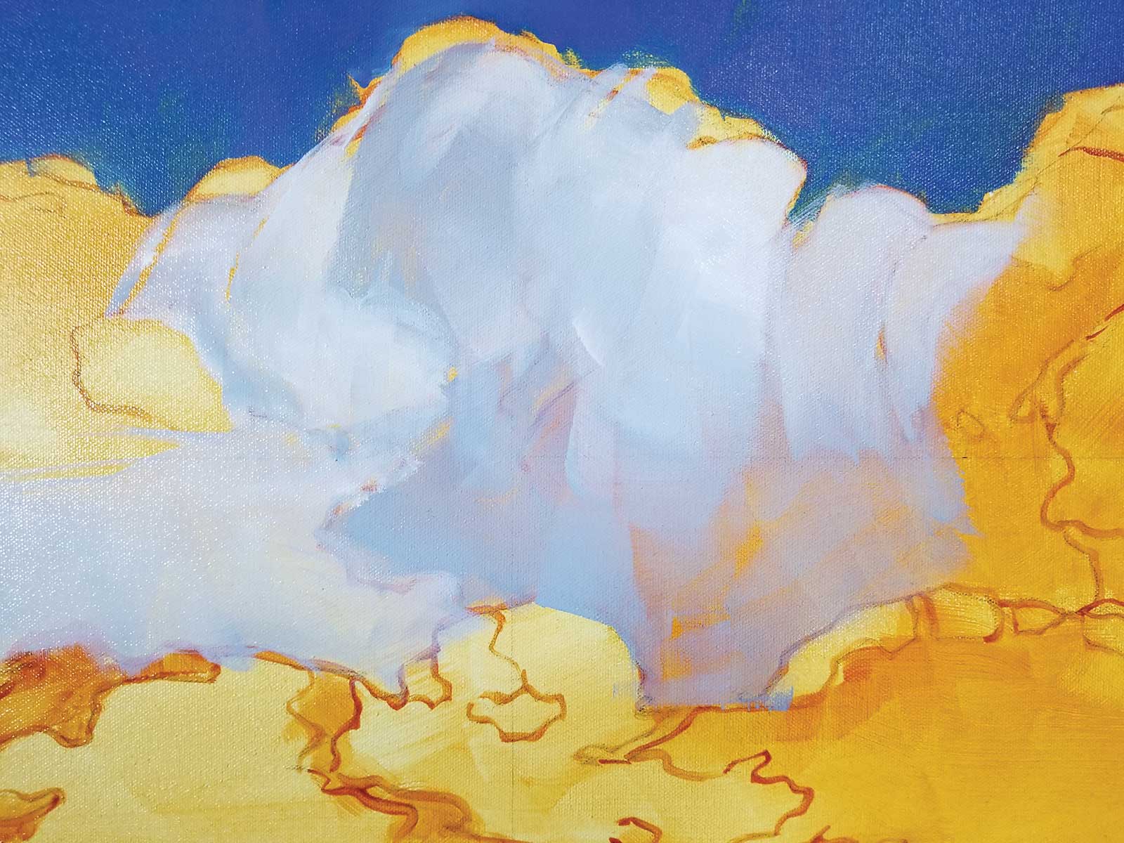 Stage 6
Stage 6 Clouds
The clouds are next and get a similar treatment of thin and light titanium white, burnt sienna and Payne’s gray, leaving the underpainting to show through and building up more opaque paint where it needs to read closer to the viewer.
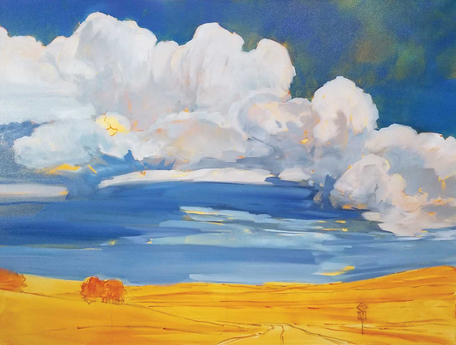 Stage 7
Stage 7 Establishing Distance
Here, I am layering in soft, more distant horizon colors. Value is key to creating distance, while brushwork is key to creating focus and movement, leading the eye into the furthest distance.
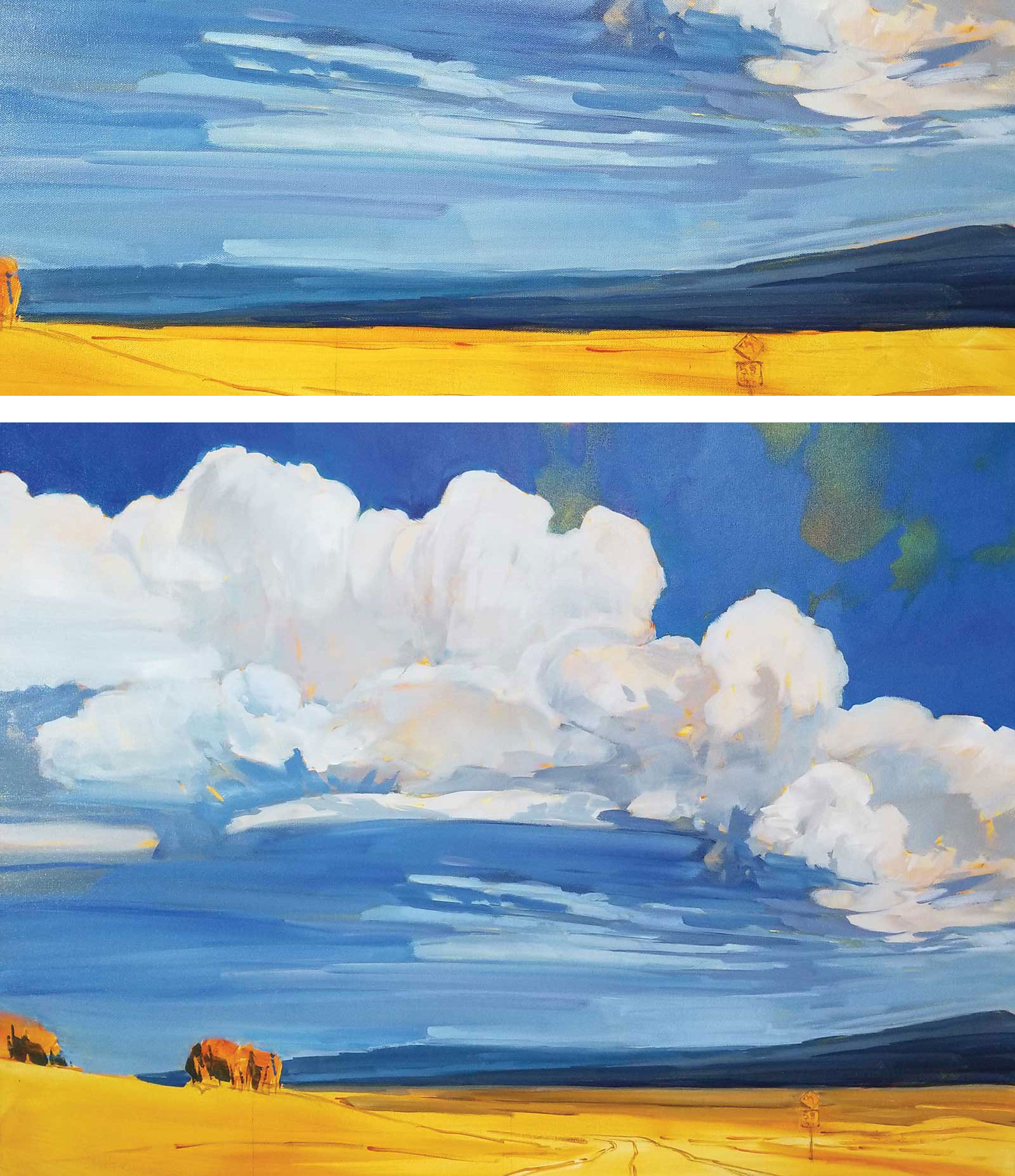 Stage 8
Stage 8 Building up the Background
I then move on to building the background colors, keeping them cooler and grayer so they sit down at the back (Payne’s gray, manganese blue and viridian green). I keep detail to a minimum and create more of a suggestion.
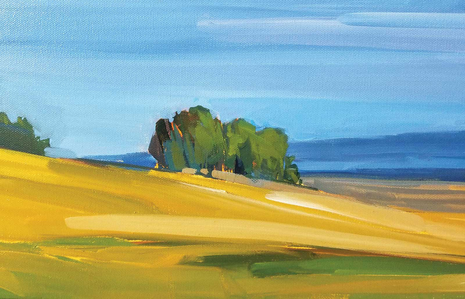 Stage 9
Stage 9 Focusing on Foreground
Building foreground with warmer colors and defined brushstrokes, I focus on showing motion and direction. More detail is layered in with solid brush marks that pull the eye forward and create further depth.
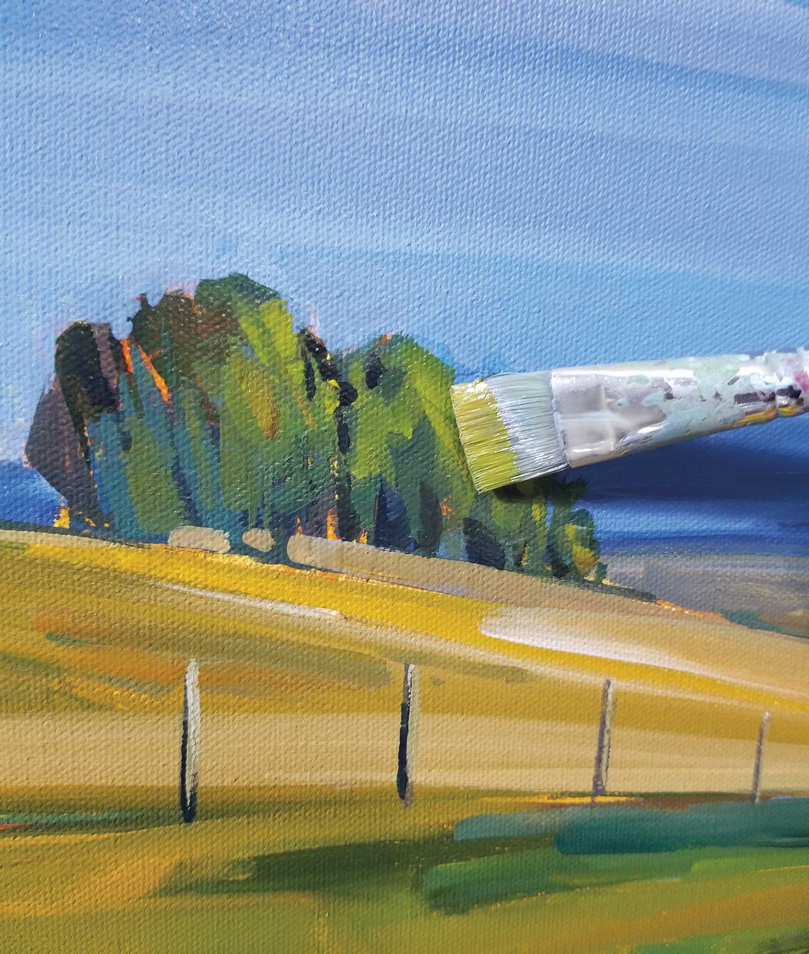 Stage 10
Stage 10 Basic Forms
Always simplify objects to their basic shape, leaving a loose interpretation of form. Working here with shadow and light to create form, I work with a 1-inch brush to leave the proper width of marks. Glazing of cool colors like phthalo blue (green shade) are beautiful for adding cool shadows.
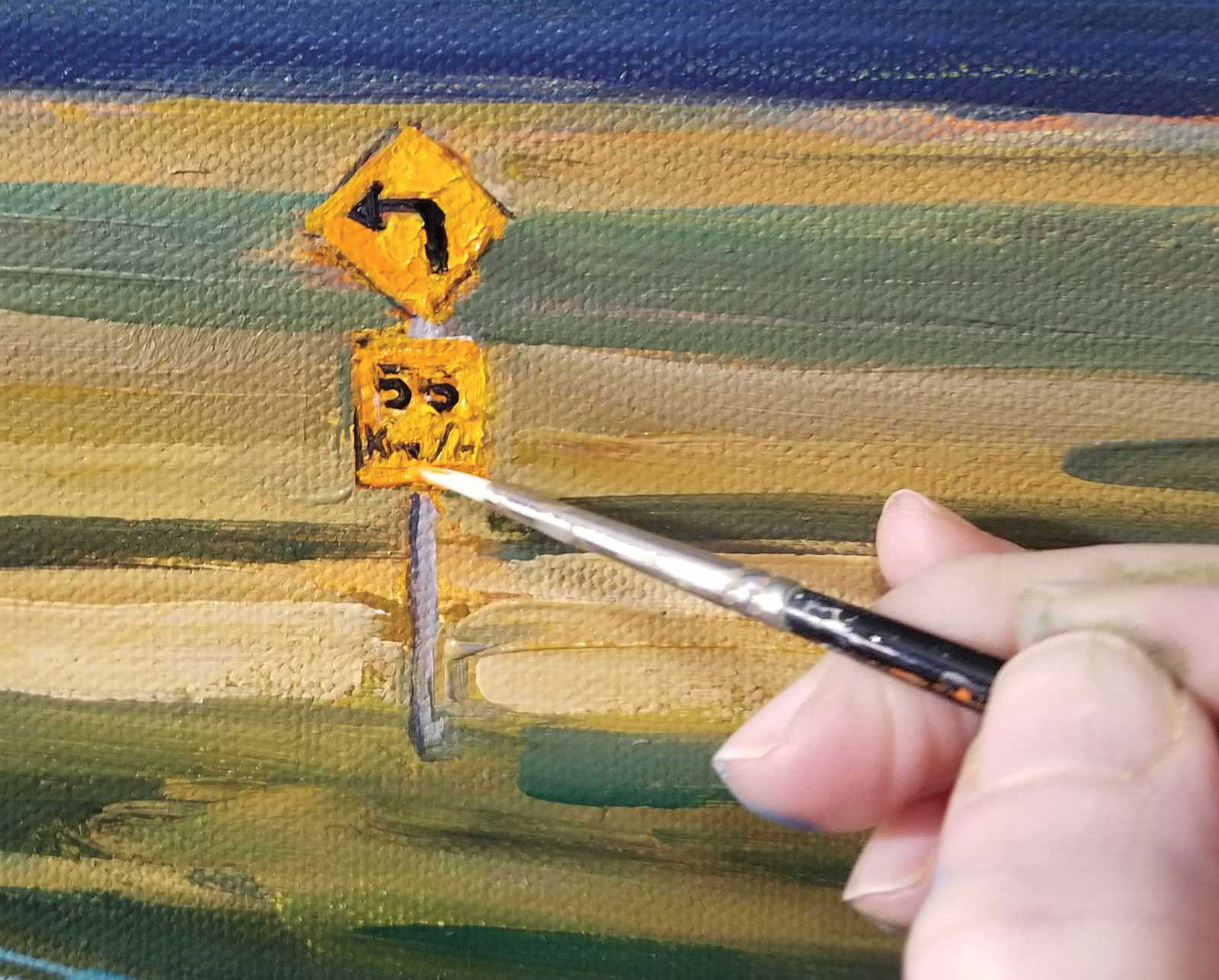 Stage 11
Stage 11 Sprucing up the Details
Focus on finessing details and making sure my focal point is clearly understood. I want my brights to read bright and the rest to fade away, with detail only where I want the eye to stay.
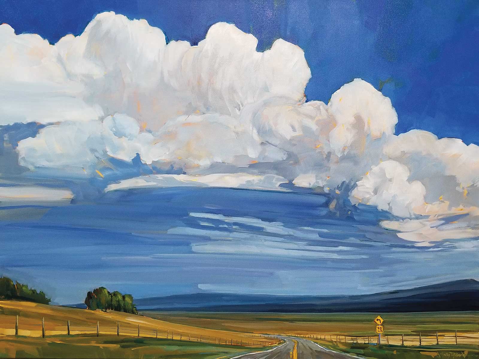 Stage 12
Stage 12 Finished Artwork
Under Southern Skies, acrylic, 30 x 40"
The finished piece! In all my work I want to make sure there’s a beautiful push and pull—pushing the distance back to create depth and pulling objects closer to the viewer. Heavier, opaque paint closer to the viewer and softer glazes to push back areas that I want to recede.
About the Artist
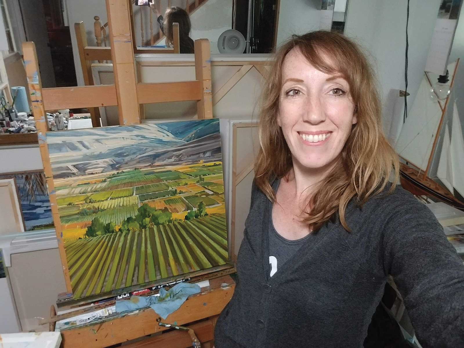 Holly Dyrland
Holly Dyrland has been pursuing art from a young age. Attaining a degree in interior design prior to painting gave her foundational drawing and composition skills as well as introducing her to watercolor, which opened the door for her to pursue her interest in acrylics.
She has studied with present day masters David Langevin, Doug Swinton and Mark Heine to further her skill with acrylics and art professionally. She desires to capture specific moments, using glazes and veils to add depth, light and translucency to her work, always adding a balance of subtle and bold strokes to define the subject. Her love for landscapes began early on the farm as she spent most of her spare time outdoors. She currently resides under magnificent skies in rural Alberta, Canada, with her husband and three teenage sons.
Dyrland’s work has won awards, has been juried into international shows, had media coverage (both television and online magazine coverage) and is included in private collections around the world. The artist has a solo show in Edmonton, Alberta, in the spring of 2023.
Represented by
Gibson Fine Art, Alberta, Canada, www.gibsonfineart.ca
The Lloyd Gallery, British Columbia, Canada, www.lloydgallery.com
Contact at
hillhousesd@gmail.com, www.hollydyrland.com