



It is always a challenge to balance careful, structured detail with loose, expressive suggestion. This is particularly so with watercolor, as once the contrast of clean, white paper and rich, strong darks is lost, the impact of the focal area disappears.
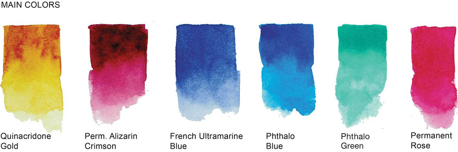
Apart from the glazes in the painting of the fishing boats, these are the colors used in all these paintings.
Planning is important here—working out where to place the focal area and retain white paper before picking up a brush avoids problems that can become impossible to solve later on.
The best way I have found to plan where the focal area and preserved white paper should be is with a quick, rough sketch. These sketches don’t need to be detailed, just a rough plan of where the major shapes will go. It is important to make the sketch in the same proportions as your finished painting. The size is not important, just the proportions.
Decide on your focal area, plan where the whites will be, then sketch some strong contrasting darks into the area. Once the focal area is established, manipulate the rest of the major shapes into an interesting composition. It is often helpful to shade in some of the major shapes to establish tonal values before starting to paint.
Once we start to paint and the focal area is established, all sorts of adjustments can be made to the surrounding areas. So long as the crisp, high contrast focal area is untouched, all sorts of overglazes and washes can be built up to simplify and redirect attention back to the focal area.
These examples show the initial rough plan and the various adjustments to regions outside the focal area to concentrate attention and reduce confusion.
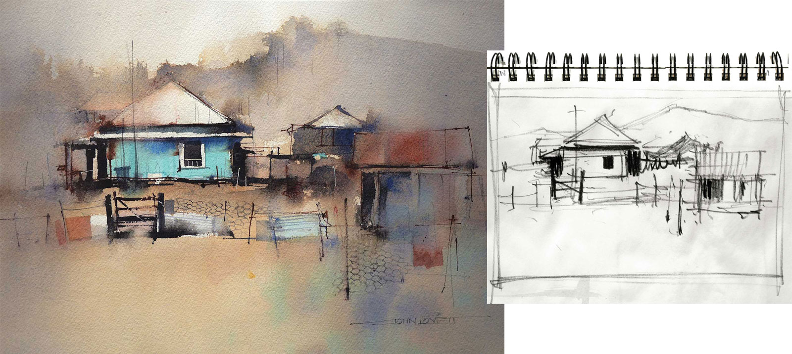
This subject has a complex arrangement of buildings, fences and scattered junk. What really appealed to me was the crazy blue/green color of the old farmhouse. I left white paper around the main window, along the veranda roof and in the triangle of the main roof. As the painting progressed the buildings on the right were starting to create confusion. A big brush full of blue/gray was scrubbed over this area, taking away detail, subduing the darks and covering any whites. This tightened up the composition, directing attention back to the focal area. As the painting neared completion, a few simple pen and charcoal pencil lines reintroduced a suggestion of detail. Finally a rigger brush was used to tie the focal area and subdued buildings with a detailed mesh fence.
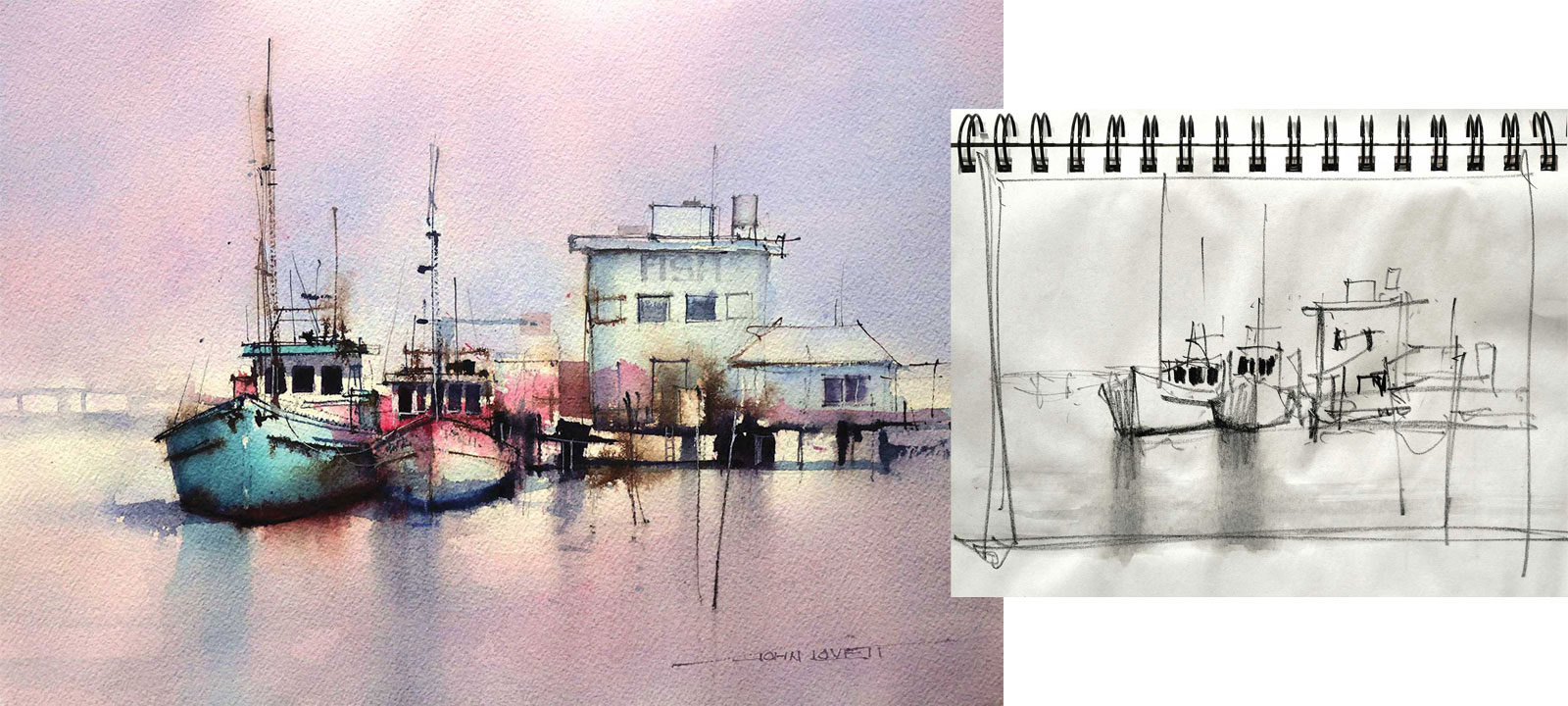
The interesting detail of weathered old fishing boats always seems to attract attention. I placed these two trawlers off center vertically and horizontally then balanced the detail with a simplified suggestion of the jetty and fish processing buildings. Dark shapes were added little by little to the region under the buildings until they supported the focal area without distracting from it. The water, sky and buildings in this painting were built up with layers of permanent rose, cobalt blue and aureolin.
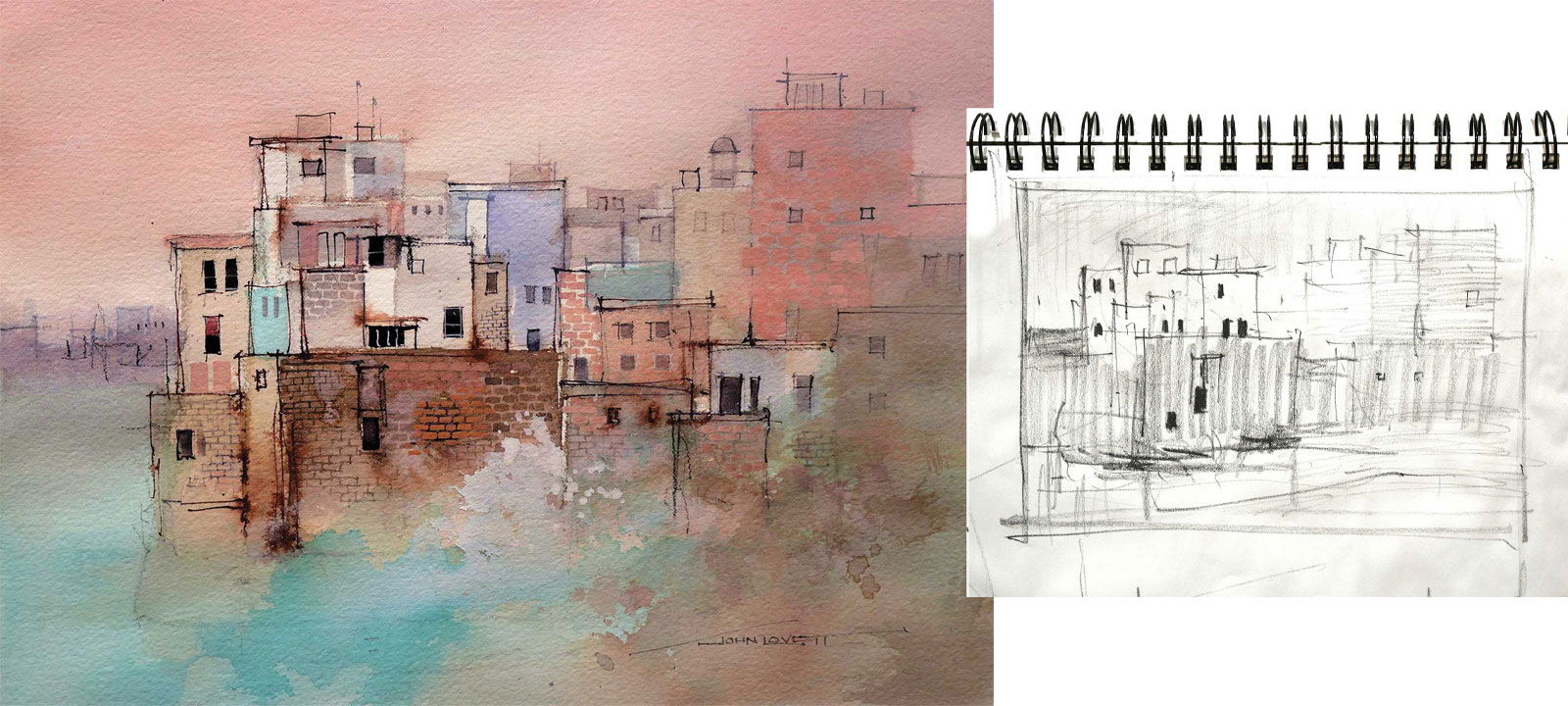
This village built on a cliff top in Southern Italy has a fantastic arrangement of subtly varying shapes and colors. Eliminating perspective and treating the buildings as a flat two-dimensional pattern emphasizes the random arrangement of the numerous structures. Retaining whites in the buildings on the left and contrasting them with dark, precise windows creates a focal area. This contrast in the focal area is reinforced by the intricate brick and stone textures that decrease in intensity as the eye moves away from the focal area. A loose warm wash was splashed over the right hand side to partially obliterate the buildings in that area, allowing the focal area to dominate.
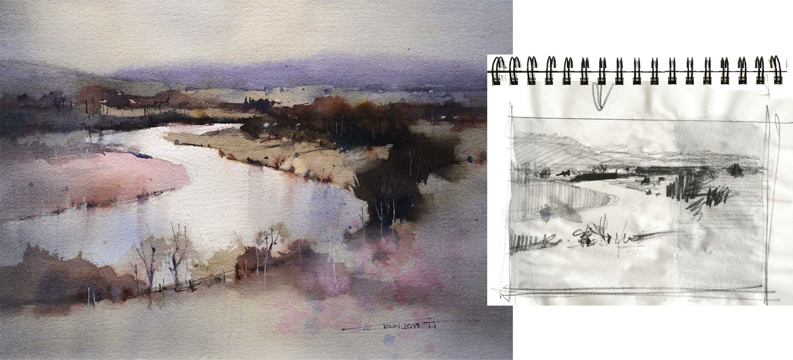
The shape of this meandering river draws the eye up to the focal area at the distant bend. In the sketch I planned to keep the distant river as white paper and use the far bank as a dark contrast. I also planned to grade a cool gray wash over either side of the painting. The idea being to concentrate tonal contrast in a vertical band through the focal area. While the gray wash on the right was still wet I splashed in some permanent rose to tie in with the sandy bank on the left.
It can feel like a risky move to paint these side washes over an almost finished painting, but they really do concentrate attention and add impact to the focal area. Allowing your painting to dry thoroughly before applying the side washes makes it a safe procedure provided you don’t overwork the washes.
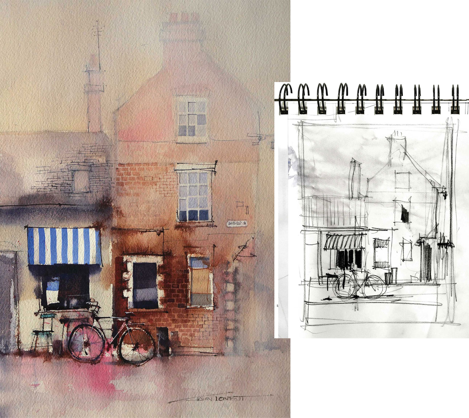
Contrasting colors and textures make this simple subject interesting. By ignoring perspective and treating the subject as a simple arrangement of geometric shapes, a strong formal structure is created. The loose application of paint, bleeding ink lines and scribbled marks of charcoal pencil relieve the subject’s formality and add a casual, chaotic atmosphere to the painting. A thin gradation of white gesso over the top of the painting encourages the eye down the buildings to the focal area of the striped awning and bicycle.
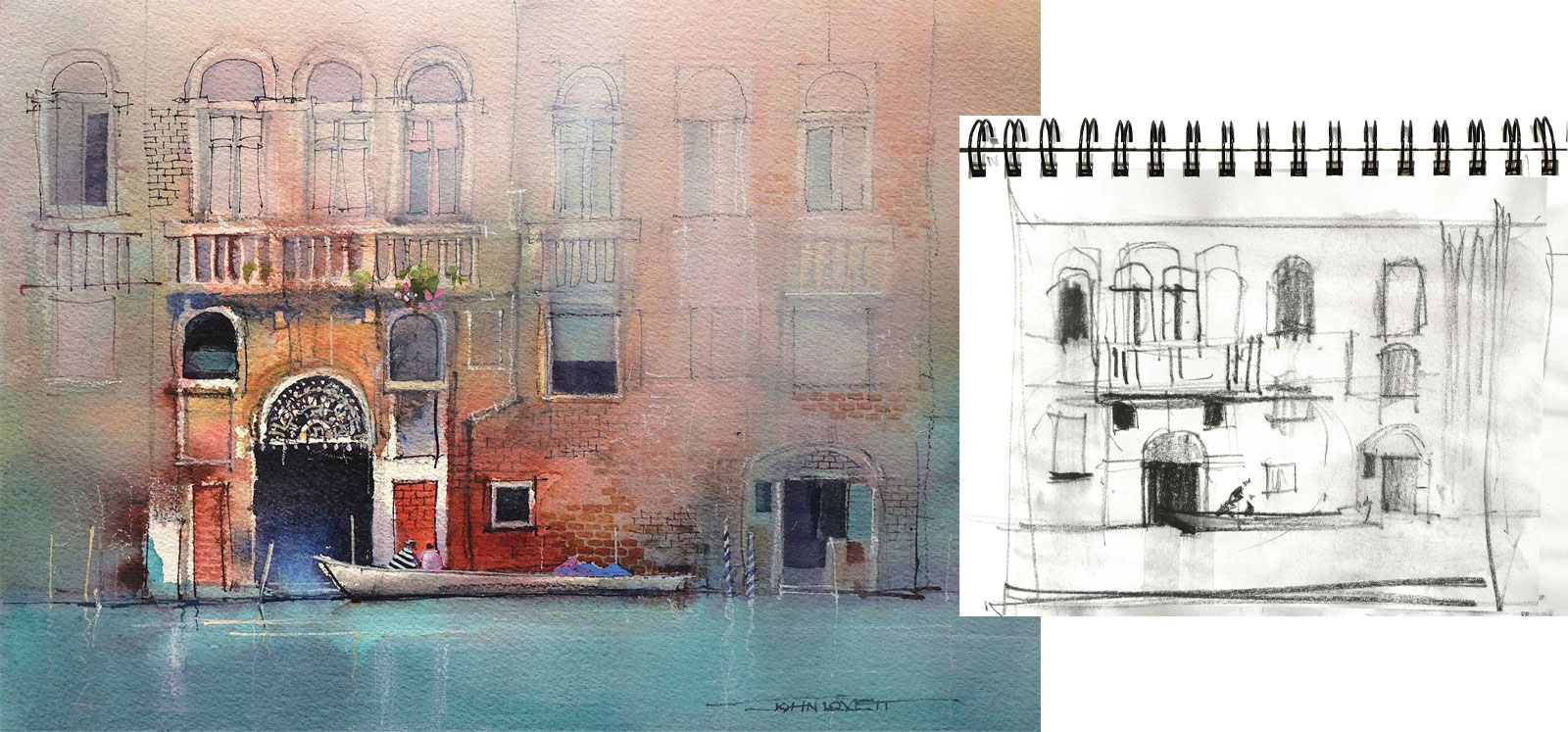
The boat, arched doorway and red bricks create a strong focal area in this painting. A mixture of phthalo blue and phthalo green was washed over the foreground water and up into the parts of the buildings surrounding the focal area. A thin wash of gesso was graded down from the top of the painting. These surrounding washes reduce detail and tonal contrast. Balancing the soft, subdued areas with the strong focal area was the next step. Some dark shapes, fine rigger and charcoal lines and the subtle suggestion of textures were gradually built up in the softer areas until a balance was achieved. Too little detail and contrast in these softer areas can make them appear unrelated to the rest of the painting. Too much detail and contrast can make the painting appear busy and confusing.
No matter what you choose to paint, a few minutes spent doing some quick, rough sketches will allow you to work out where to best place the focal area and preserve white paper, and where to understate and suggest things. If in any doubt, retain more areas of white paper than you need. It is easy to get rid of, but very hard to reinstate once it has gone. —
Contact at www.johnlovett.com