


Watercolor is a great medium to work in, not just because of its special translucent quality, but also its versatility. I paint botanical subjects, especially fruit, but in contrast to the soft, delicate renderings often characteristic of watercolors, I use value, color and texture to produce paintings that are realistic but also bold. I achieve this by building up the paint in layers with a dry brush technique. I begin with a search for something beautiful, followed by decisions about composition. I often paint much larger than life, as playing with scale gives a new perspective on a familiar thing.
I make a basic line drawing of my chosen subject, which needs to be precise and accurate. If it is something simple then I draw it straight onto my watercolor paper, but if it’s more complex I use basic paper so I can refine and erase where necessary. When I’m happy with the drawing, I trace and transfer it. This is because I want to avoid disturbing the surface of my super smooth watercolor paper. The final drawing should be very faint, as if it’s too heavy it can be hard to remove and can show through the paint.
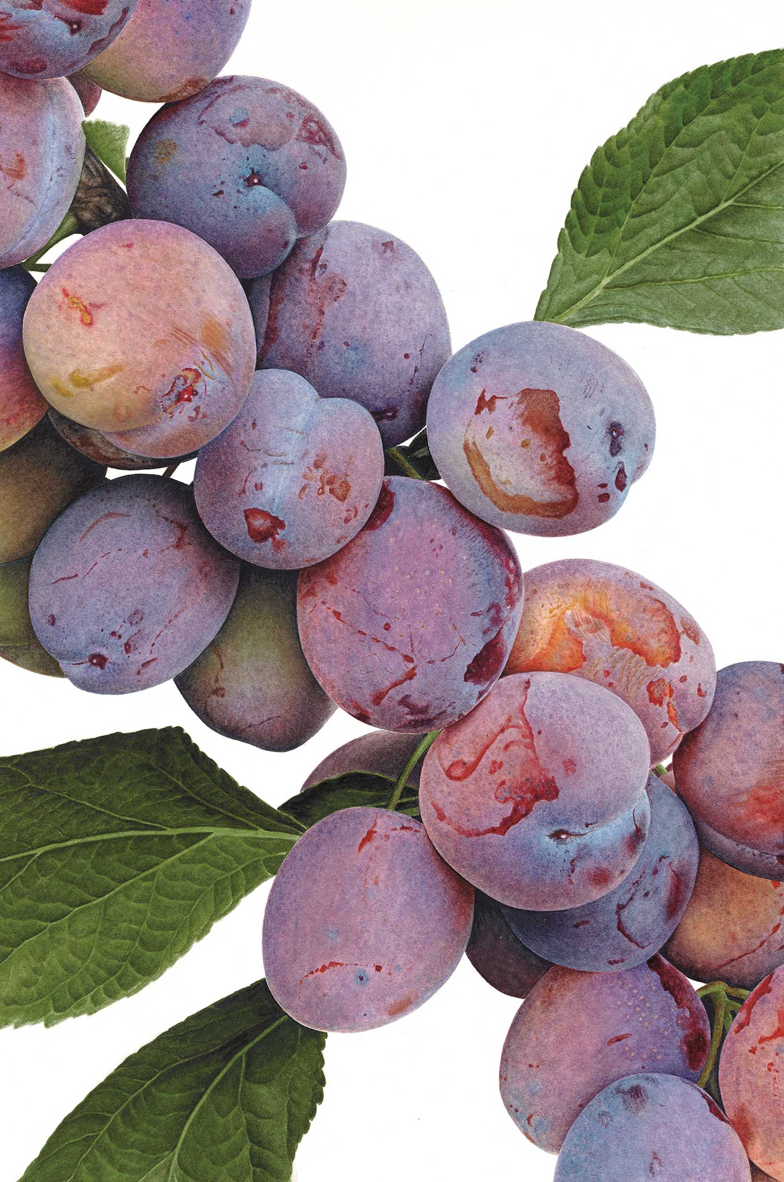
Plums Opal, watercolor on paper, 15 x 10" (38 x 25 cm) These were growing in a public garden that I often go to for inspiration. Their incredible colors and soft, powdery texture made me want to paint them. I chose to go really close to focus on this and also capture detail, such as little areas where the bloom had rubbed off, revealing the rich colors of the skin beneath. I used transparent colors so I could layer all the different hues I could see.
I then select which colors to use to perfectly match what I can see in the subject. I have a palette of about 12 colors, basically several of each primary color, and select the most suitable from these. I don’t use many colors for each painting because I find it easier to mix my own, something which comes through practice. Sometimes it works better to layer the colors separately rather than mix them. Working in layers also means I can adjust as I go.
Then, it’s time to put paint to paper. For the first application the paint mix is mainly water with a tiny bit of pigment, like a tea wash, and I use my biggest brush, which is a size 3. However this isn’t a wet wash, as I don’t have much of the watery paint on my brush and have a roll of kitchen paper to get rid of any excess. I use a motion as if I’m coloring in, so I need just enough paint on my brush for it to transfer smoothly. With this initial layer I’m essentially making sure everything’s in the right place, mapping out before starting to build up the strength of color. I gently remove any pencil lines I need to as I go.
A bit of forward planning is required because I’m working from light to dark, using the white of the paper for the lightest areas such as highlights and any reflected light (rather than white paint), so I need to make sure I leave them pale enough. As I’m not working wet it’s very easy to control where the paint goes and work around these lighter areas.
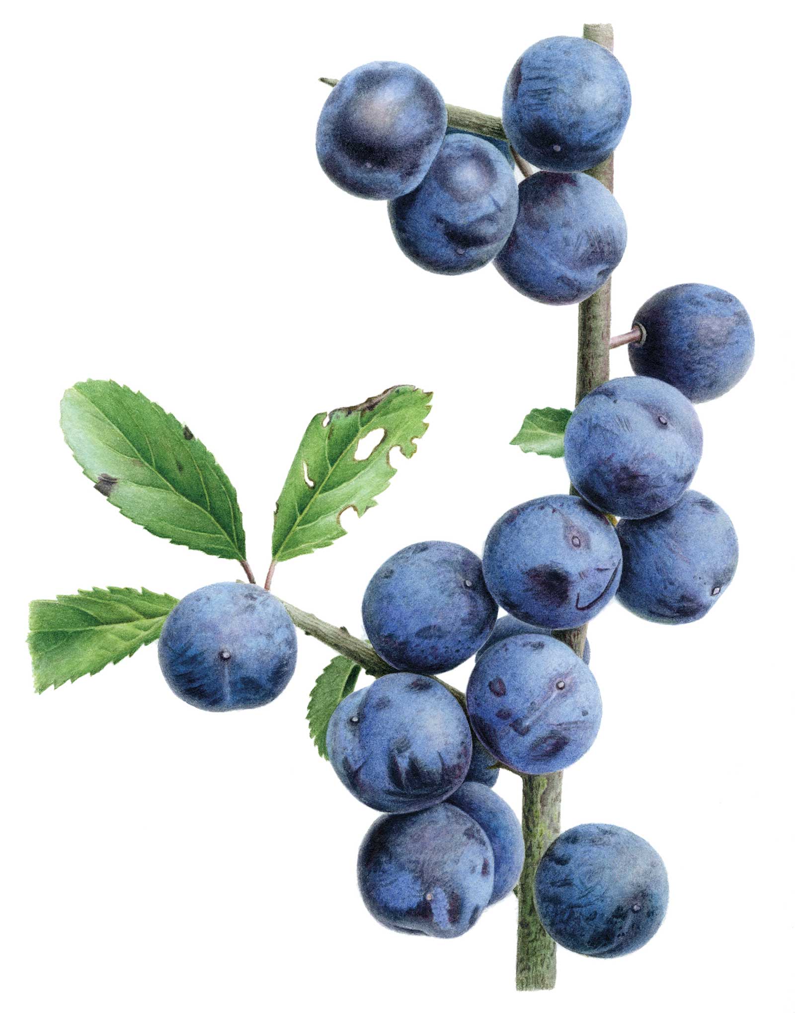
Blackthorn up Close, watercolor on paper, 11 x 9" (27 x 22 cm) This is one of four paintings of blackthorn completed in the last 18 months. It’s such a great subject! The weather erodes much of the bloom, giving a range of colors and textures on the skin. I worked with just three colors for this painting, one of each primary, using combinations of all three for every part of the painting.
I then begin building up the paint in layers, adding more pigment to the mix and working with a progressively drier brush. I move around the painting making sure that each layer is completely dry before painting over it. Watercolors are transparent, but if the paint is put on thickly it can lose its vibrancy and appear dull and heavy. Applying paint in multiple layers keeps a fresh, luminous appearance. I keep building the intensity of color and the darker value areas until the painting starts to look three-dimensional and realistic.
Once the painting starts to take shape I switch to a size one brush to begin refining. This allows me to work on the texture as I progress, smoothing out the surface where appropriate and “polishing” any shiny areas with an almost dry brush or working in a rougher, more matte texture with the brushstrokes I use.
The final stage is ensuring I have the right value for the very darkest shadow areas and adding the markings and imperfections on the surface, details that add to the realism. For this I make up a much thicker paint mix and apply it with my smallest brush, a size zero, using it as if it were a pencil. It is a slow but enjoyable way of working, and it gives me the control needed to achieve the realism and impact I’m looking for.
My Art in the Making Blueberries in Transition
 Stage 1
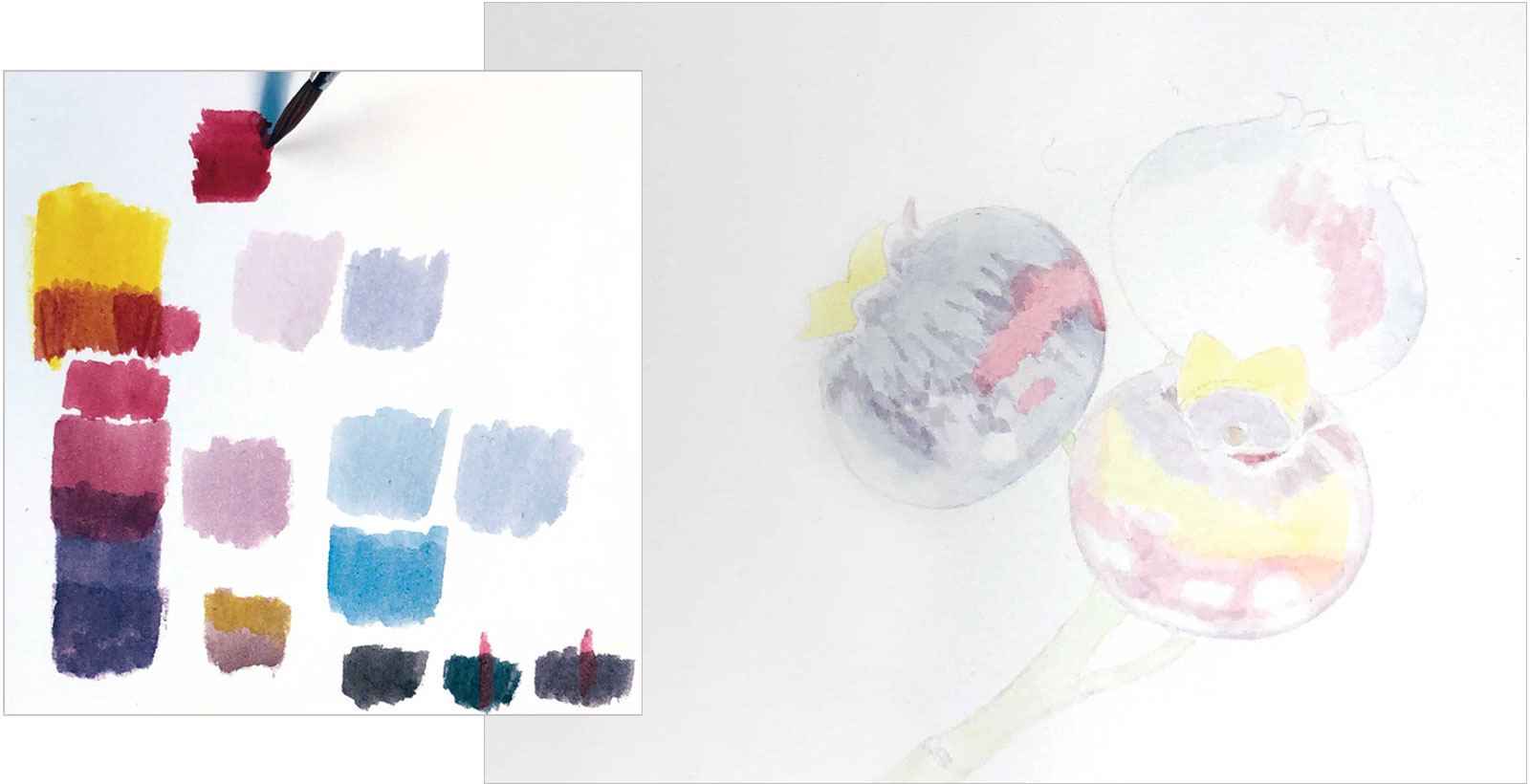
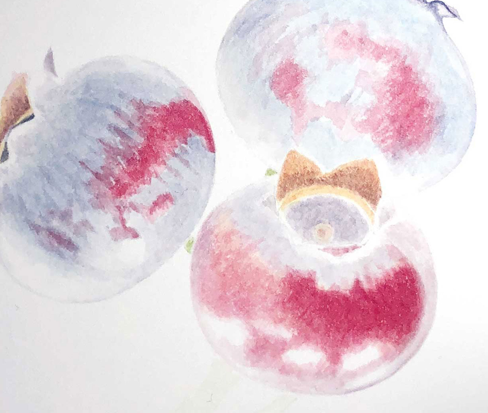
Stage 1 Setting Up
Using very diluted paint I am getting everything in the right position, leaving the highlights as white paper. I mix cerulean, alizarin crimson and transparent yellow in different ratios for my grays.
WHAT THE ARTIST USED
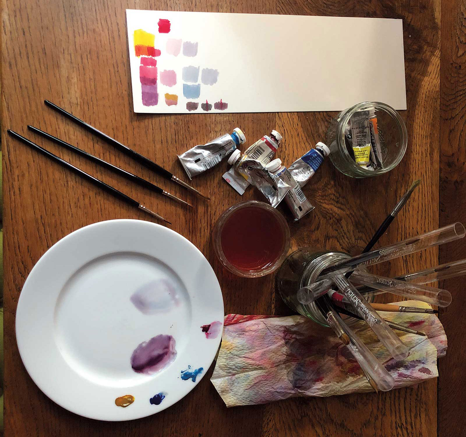
Watercolors
Cerulean, French ultramarine, Permanent alizarin crimson, Transparent yellow, Winsor blue
Brushes
Winsor and Newton series 7, #0, 1 and 3
Paper
Hot-pressed 140lb paper
Additional Supplies
Mechanical pencil with .3 lead, H, White ceramic plate, Kitchen roll, Tracing paper, Masking tape, Water jar, Eraser, Lamp with daylight bulb, Tabletop easel
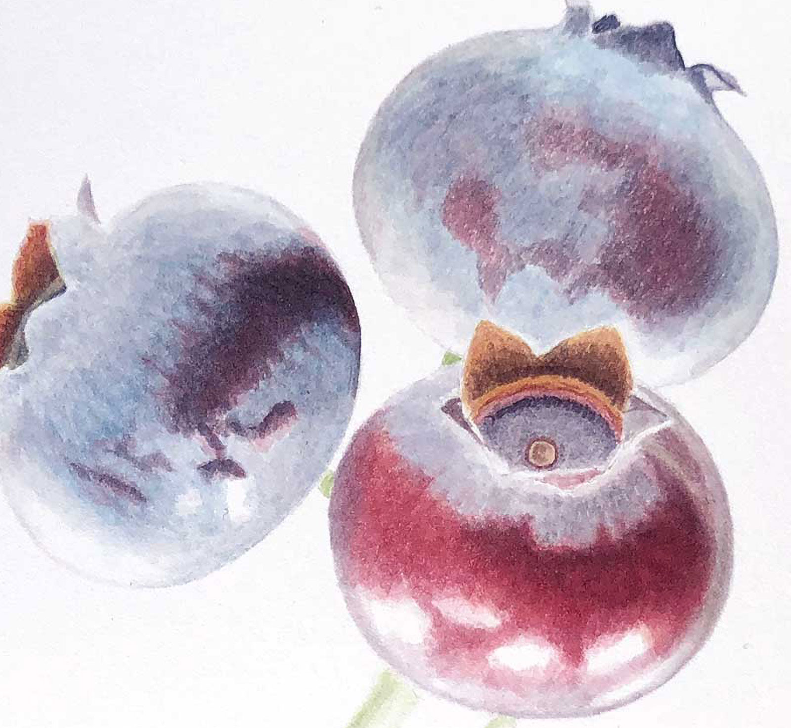
 Stage 2
Stage 2 Adding Reds and Browns
Over the yellow base I add reds and browns. The yellow underneath gives an extra richness to these areas. Similarly, the red I’ve placed in the darkest areas will show through the black I will add later.
 Stage 3
Stage 3 Color and Value
I’ve laid the groundwork so I now begin working on the color and value. For the dark areas on the berries I mix a black using French ultramarine, alizarin and yellow.
 Stage 4
Stage 4 Building Layers
I continue building up layers. I use cerulean for the two blue/gray berries with just a hint of alizarin and yellow mixed in to mute it a little.
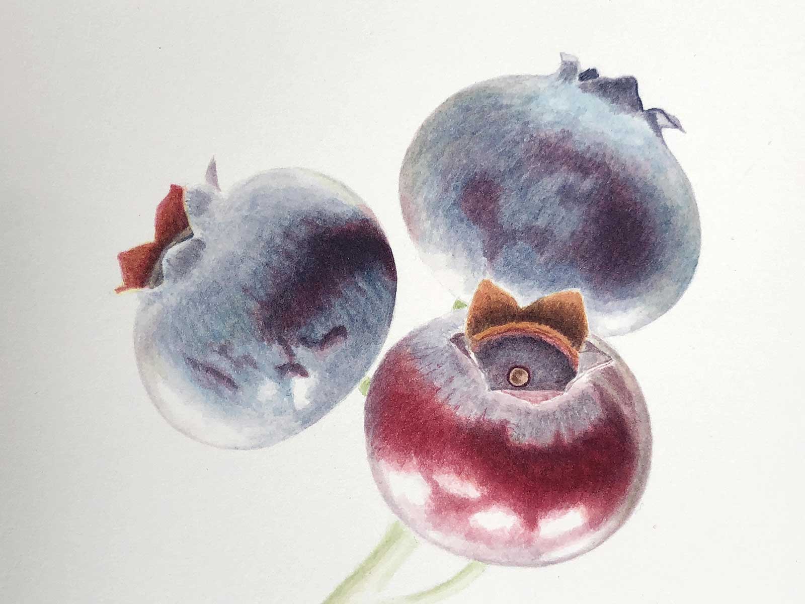
 Stage 5
Stage 5 Softening and Refining
I now switch to a smaller brush, size one, and begin refining the painting. I soften the area around the highlights with a damp brush.
 Stage 6
Stage 6 Concentrating on Darker Areas
I switch to my smallest brush, which is a size zero, to work on the very darkest areas around the sepals and add the smaller dark markings on the skin.
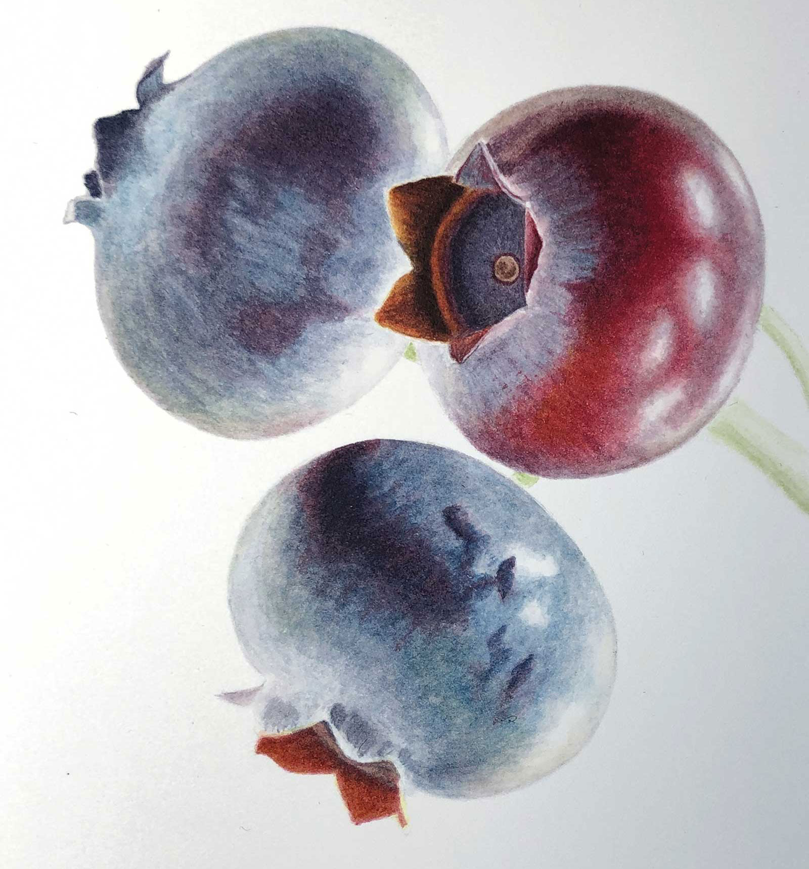
 Stage 7
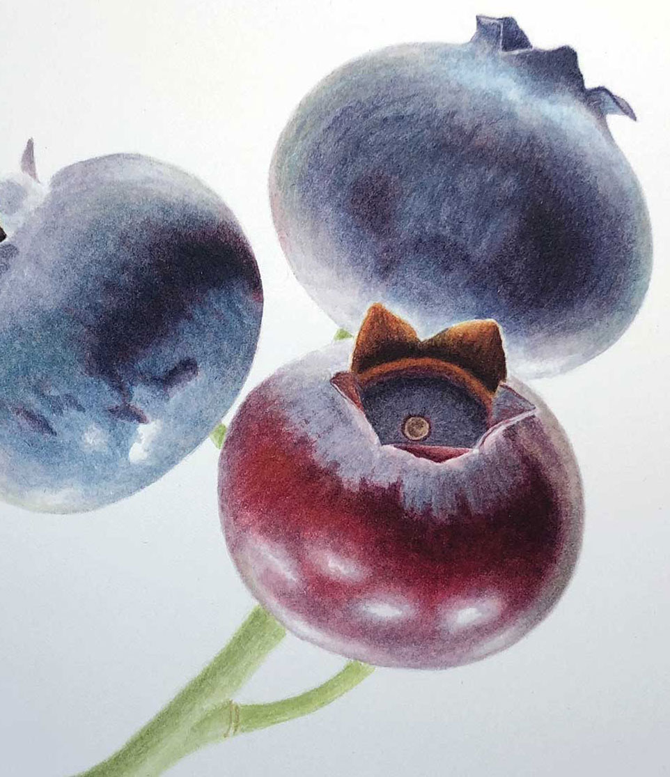
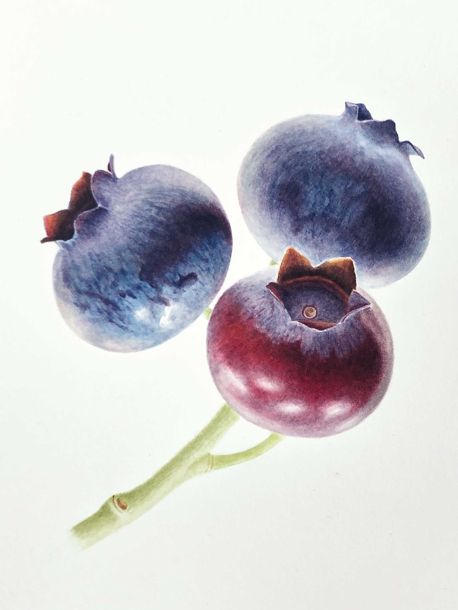
Stage 7 Finished Artwork
Blueberries in Transition, watercolor on hot-pressed paper, 7 x 7" (17 x 17 cm)
About the Artist
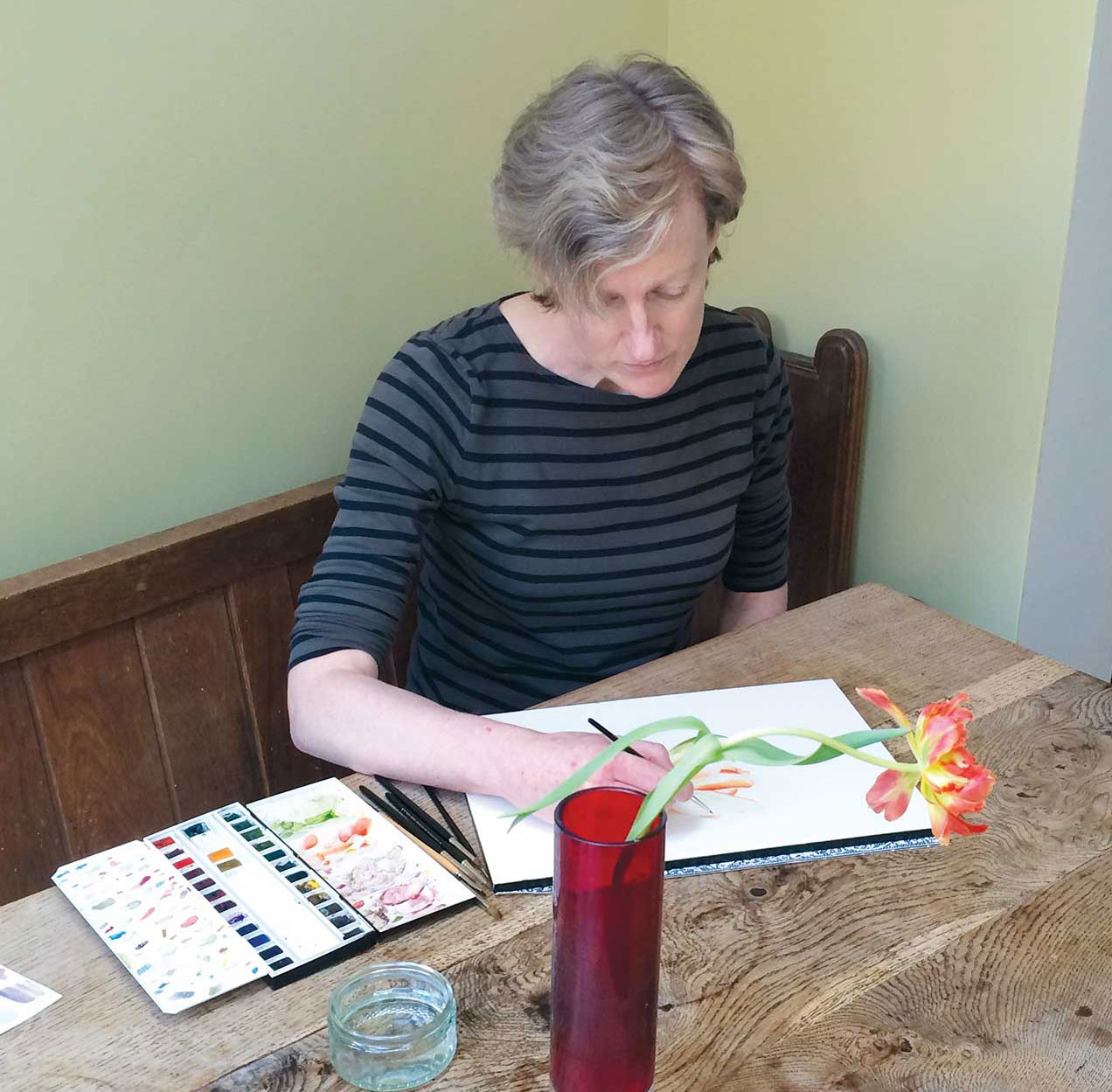 Liz Shippam
Liz Shippam has been a practicing botanical painter for 10 years and is largely self taught. Shippam is known for her detailed and realistic depictions of fruit and is particularly interested in the changes undergone by fruit as it ripens, aiming to capture its transient beauty at a specific moment in time. She is a member of the American Society of Botanical Artists (ASBA) and has exhibited at their Annual International Exhibition since 2015. In 2020 her painting Blackthorn was given the prestigious ASBA Eleanor Wunderlich Award. She is also a Fellow of the Society of Botanical Artists in London and a Royal Horticultural Society medal winner. Shippam exhibits regularly in London and South East England. In addition, Shippam works as a freelance illustrator, producing watercolor paintings of fruit for packaging.
Contact at
liz.shippam@me.com
www.lizshippam.com