


Obsession might be too strong a word, but it comes pretty close. It’s not just colored pencil that I’m constantly thinking about, it’s art in general. If I’m not occupied with creating it myself, I’m searching the internet, magazines and books—not only to see, but also to closely examine the works of other artists whose work I admire most. Whether I am sitting in a restaurant, driving down the road or walking through a market, all the while I’m wondering if someone or something I’m seeing would be a great subject for a painting. A sunset, a flower, or a rainy day, I see it all as art. For the better part of my life, I have been totally captivated.
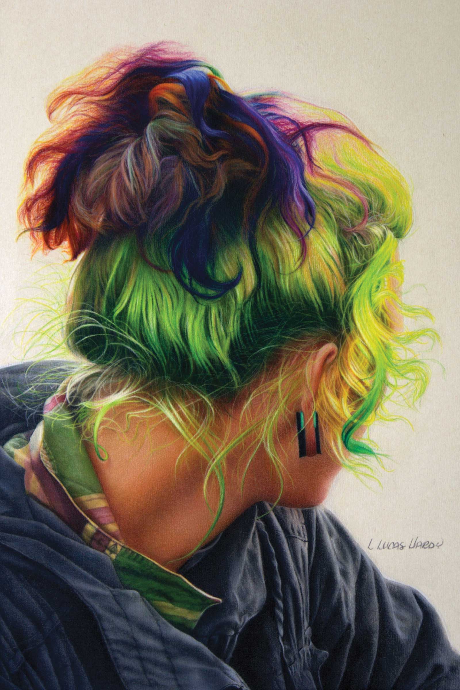
It Don’t Make Sense But it’s so Much Fun, colored pencil, 18 x 12" (45 x 30 cm) As a rule I don’t blend skin tones or shadows. I’ve learned through trial and error that color blends are unpredictable and can end up too dark and heavy. Plans, however, sometimes go awry. While blending a wisp of hair I accidentally brushed across a portion of skin on the neck. Because of the dramatic change of color, texture and the overall look, I had no choice but to blend everything. Surprisingly, it turned out fine.
Completing a project in colored pencil is a gradual process that takes gentle repetition of pencil applications. Colored pencil is not a medium that lends itself to quick results. Therefore, in order to be successful, it’s important to have patience. The most important things to remember are applying light pressure at the beginning, layering and keeping the pencil sharp at all times.
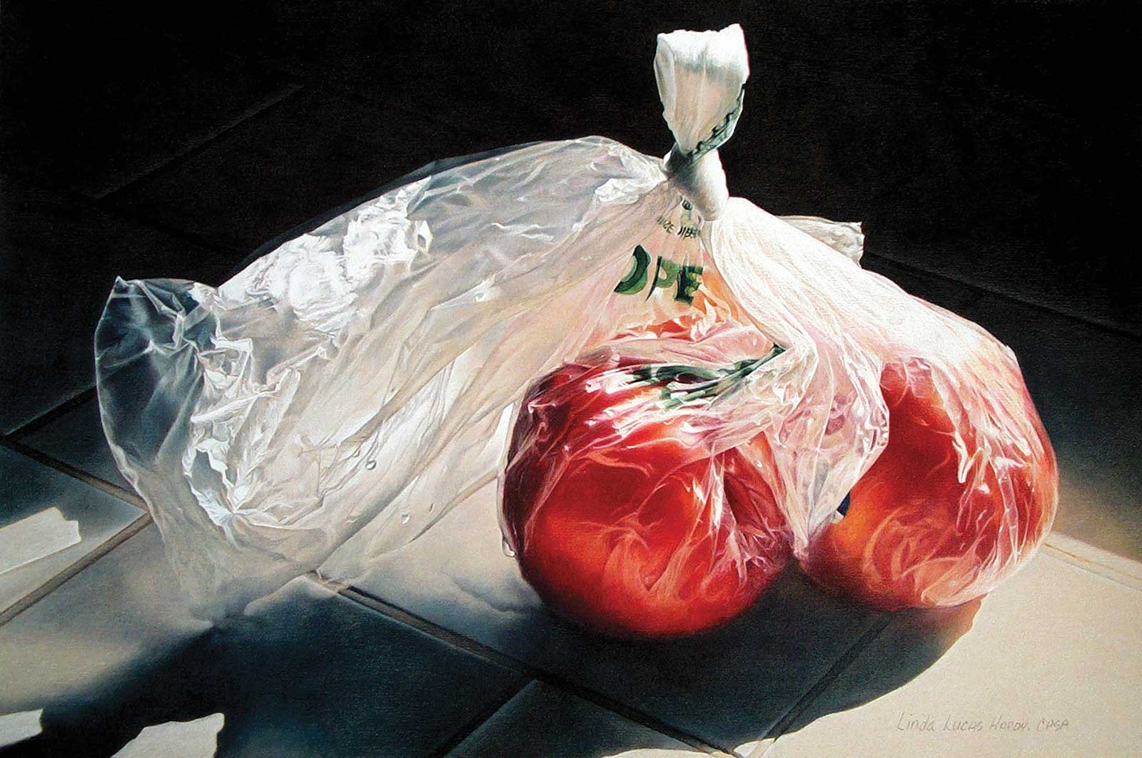
Pull to Open, colored pencil, 13 x 20" (33 x 50 cm) Pull to Open is the second in a series of paintings focusing on a plastic bag rather than the fruit inside. What initially attracted me to the photo and caused me to want to do this piece was the fact that the plastic bag was illuminated by light, as well as the movement and direction of the bag as it flowed from the knot, to the nectarines, and finally to the single drop of water.
Since I work on a sanded surface that has a grain, my objective for the first few layers is a smooth, even and consistent look which requires filling the tooth of the paper. To accomplish this, I use a sharpener that makes a long point, and I keep my pencils very sharp. Another thing that helps is that I slightly rotate my pencil as I work. Doing this ensures that my point will be sharp with every turn. If I do not rotate and/or sharpen my pencil often, a flat place develops. If the point is short, dull or develops a flat place, the pencil pigment will sit on the top of the tooth of the paper and will not fall into the valleys, ultimately causing the work to look grainy.
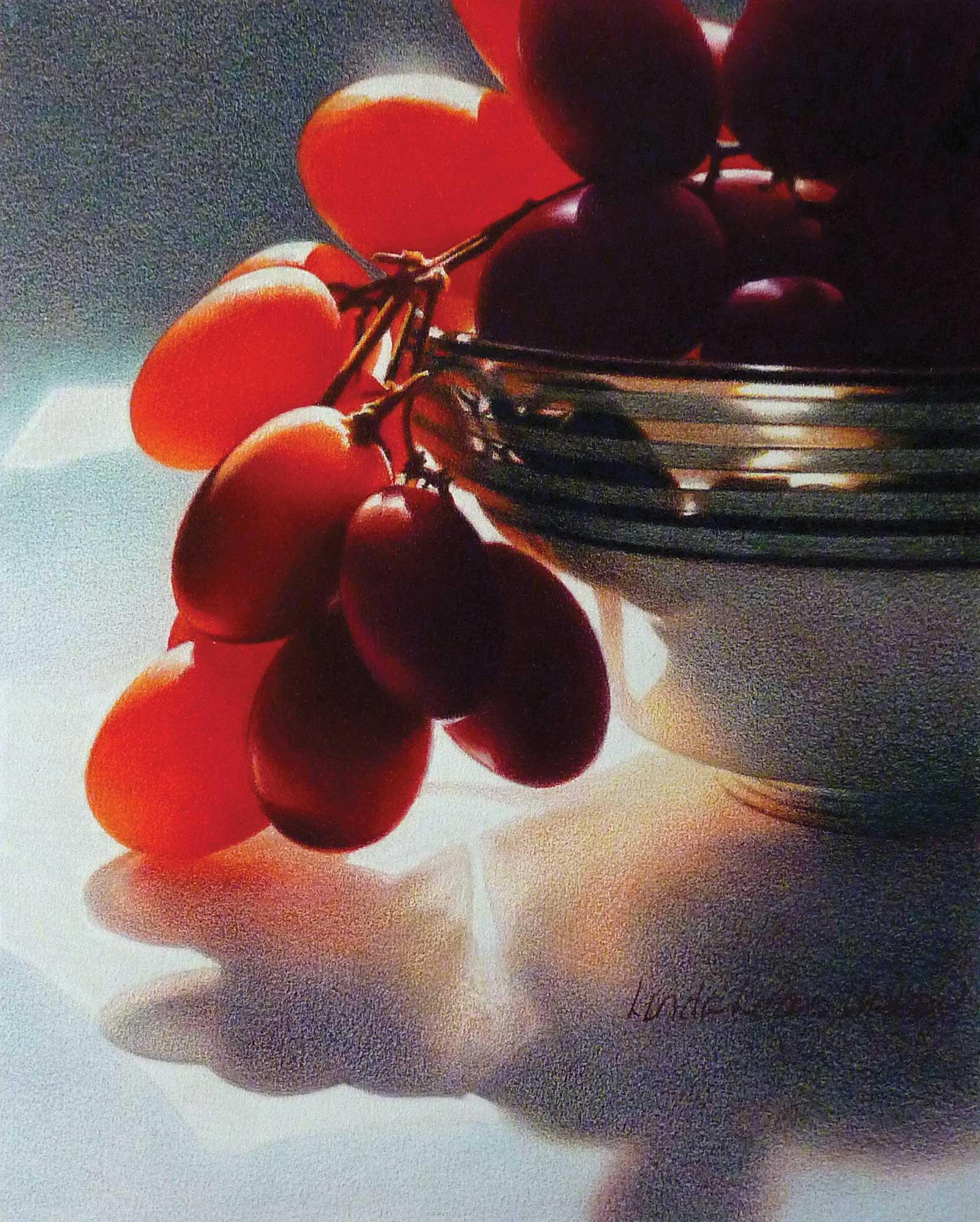
Sweet Seduction, colored pencil and graphite, 10 x 8” (25 x 20 cm) My approach to this piece had to be different for several reasons. One: it’s not just colored pencil. Two: the shadows were made up of a myriad of colors so blending was out of the question. Then I began to think, what if I leave the background grainy and in contrast make the grapes smooth by blending? Overcome by the excitement of incorporating contrasting textures I decided to override my nature and leave parts unrefined.
With all that in mind, understanding colored pencil requires slow and controlled applications, and I am meticulous when it comes to the first few layers. Since developing a gradated rendering is absolutely essential, with a very sharp pencil and working against the grain of the paper I begin lightly applying pigment. This is where I muster self-discipline because my beginning strokes are no longer than a quarter inch. Once the tooth of the paper is lightly filled, I change the direction of my strokes to a diagonal, then change to the opposite diagonal. I repeat these steps, across the grain and opposite diagonals, two to three times. If, by that time, the applications are smooth and even, the values are correct and the valleys of the paper adequately filled, I can comfortably increase the length of my strokes, my speed and pressure. Again, the objective is to get as much pigment into the valleys of the paper as possible with short, light strokes prior to increasing speed and pressure.
My Art in the Making Gorgeosity
 Reference Photo
Reference Photo
When taking photos for reference, I study the light and the way it falls on the subject. Sometimes I’m more interested in what’s happening around the object than I am in what’s happening to the object. If I’m photographing something transparent, I look for what I can see through the transparency. Sometimes I lose interest in the object altogether, so that it becomes merely a prop. For me it’s not really about the subject, it’s about extremes between light and dark which conjure up passion, mystery and emotion.
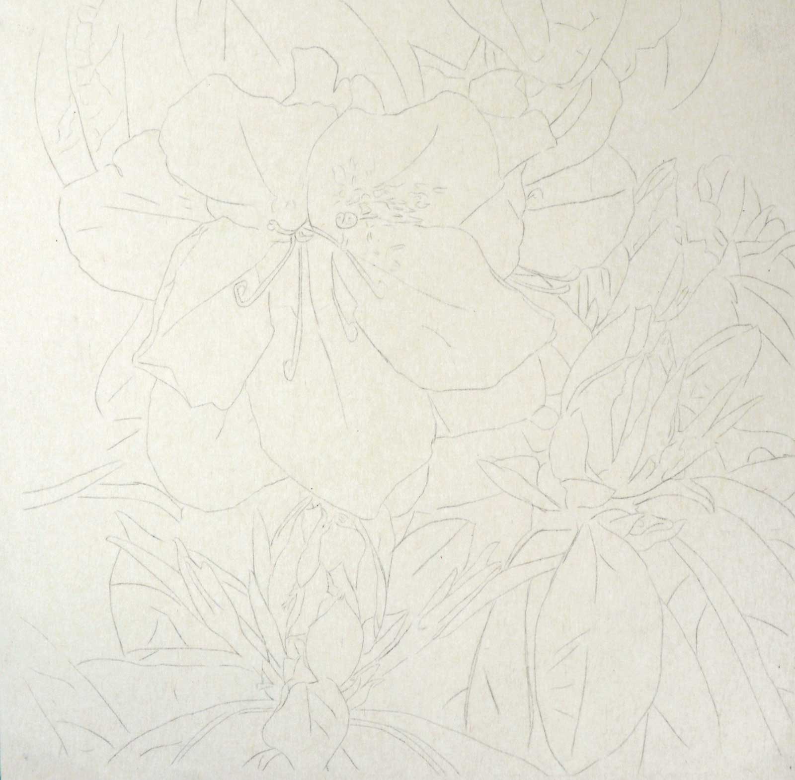 Stage 1
Stage 1 Line Drawing
The underdrawing is my road map, therefore I like to ensure accuracy. If time permits, I prefer to apply the image using a grid, if not, I use an enlargement and transfer the image.
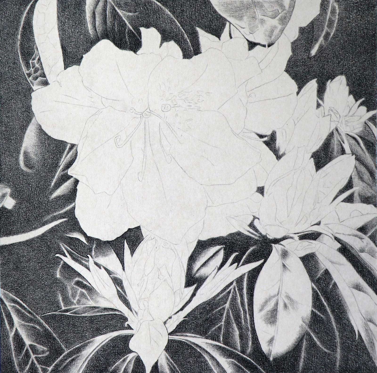 Stage 2
Stage 2 Creating a Grisaille to Build Background
My intention was to make the background dark green. However, the darkest green in my palette was not dark enough, so I began with black which enabled me to get the dark green I needed.
Stage 3 Adding Greens
To make sure the value was correct and the tooth of the paper evenly filled I added a few more light layers of black. Once completed I added a layer of dark green.
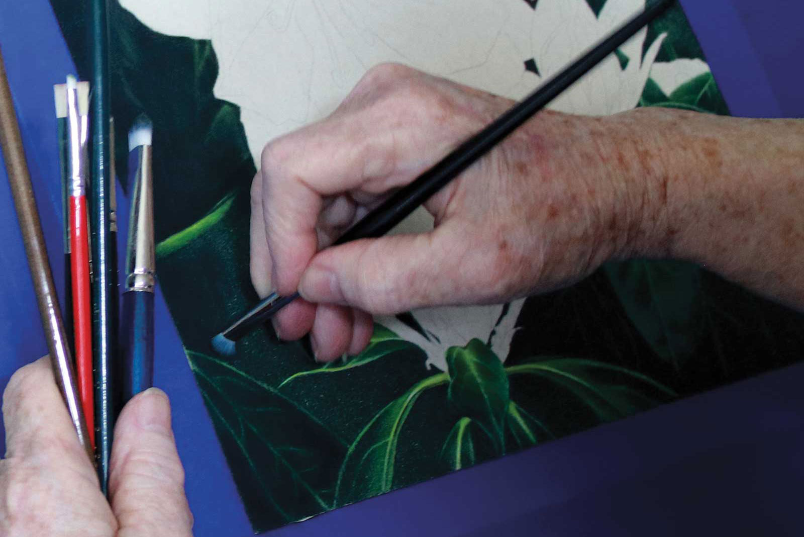
About Dry Brush Blending
In order to be successful with my method of dry brush blending I prefer to use a small, fairly stiff hog bristle brush and Prismacolor Premier colored pencils because they use wax as a binder. The brands of pencils that use oil as a binder tend to be harder and less blendable. I’ve also noticed that the oil-based pigments do not adhere as well when applied to sandpaper. Since dry brush blending is how I bring a piece to completion that creates a problem. The wax-based pigment will blend whereas the other pigments tend to sweep off the sandpaper.
With this method of blending, it’s important to get enough pigment on the paper or it will not work. In other words, the paper has to be fairly saturated. The brush can only pick up a little bit of color so it’s basically just smearing it around. I’m often asked if more color can be added after blending. In some cases, yes, but only if a limited palette is used. Since the colors flatten once they are blended, making one color, that color does not exist. It’s like mixing paint. If several colors are put together and mixed, they are no longer individual colors. Using a brush blends and intensifies the colors. Afterwards, the pigment mimics paint.
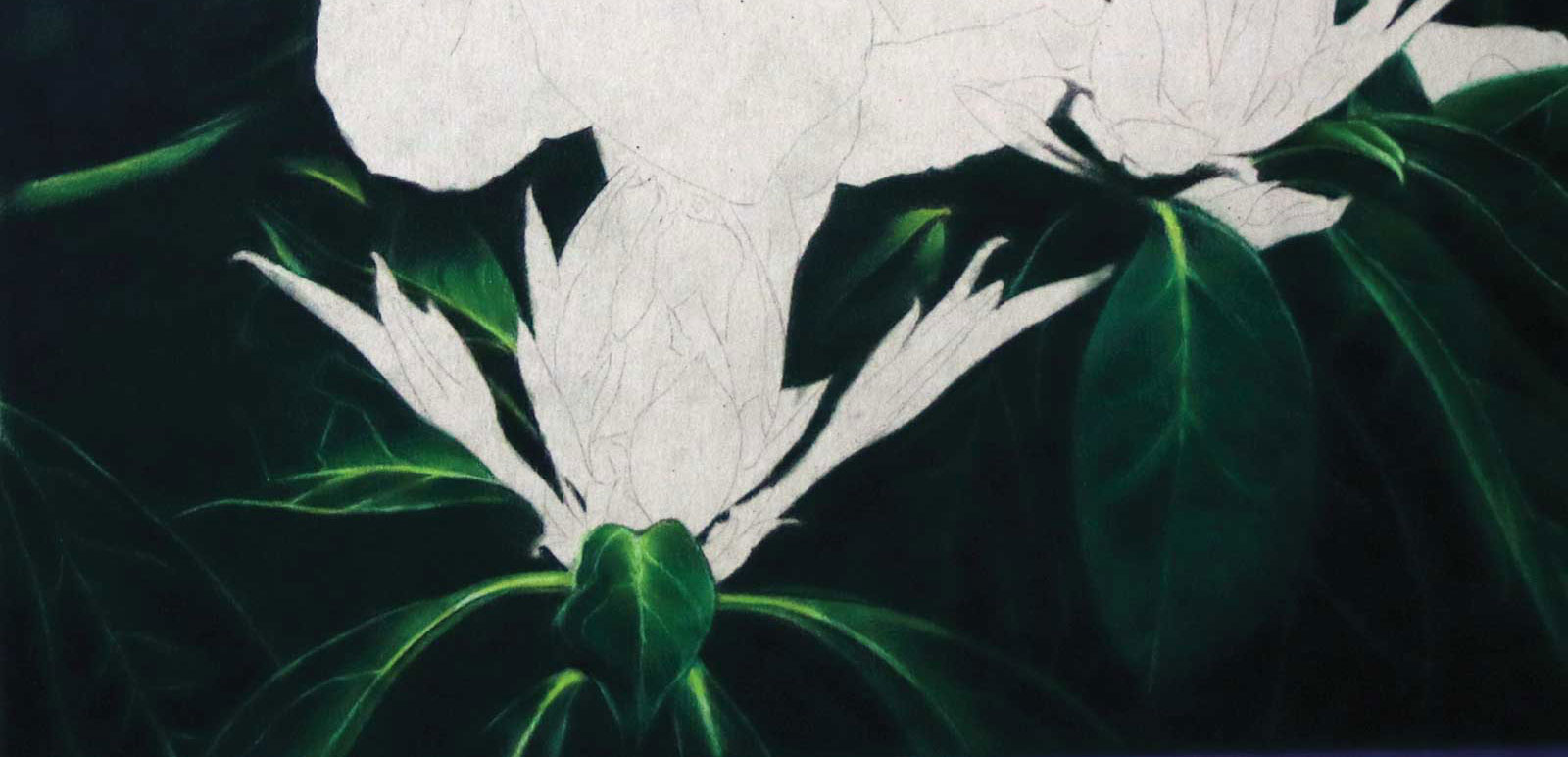
 Stage 4
Stage 4 Blending the Background
Assured my paper was approximately 90 percent saturated with pigment, I used several fairly stiff, dry brushes in various sizes to blend the colors, carefully avoiding any parts of the paper that had no pigment.
 Stage 5
Stage 5 Fully Blended
Since the brush is dry, it is only able to pick up and smear pigment, so the paper should be fairly saturated. When blended the tooth of the paper fills, causing the pigment to mimic paint.
 Stage 6
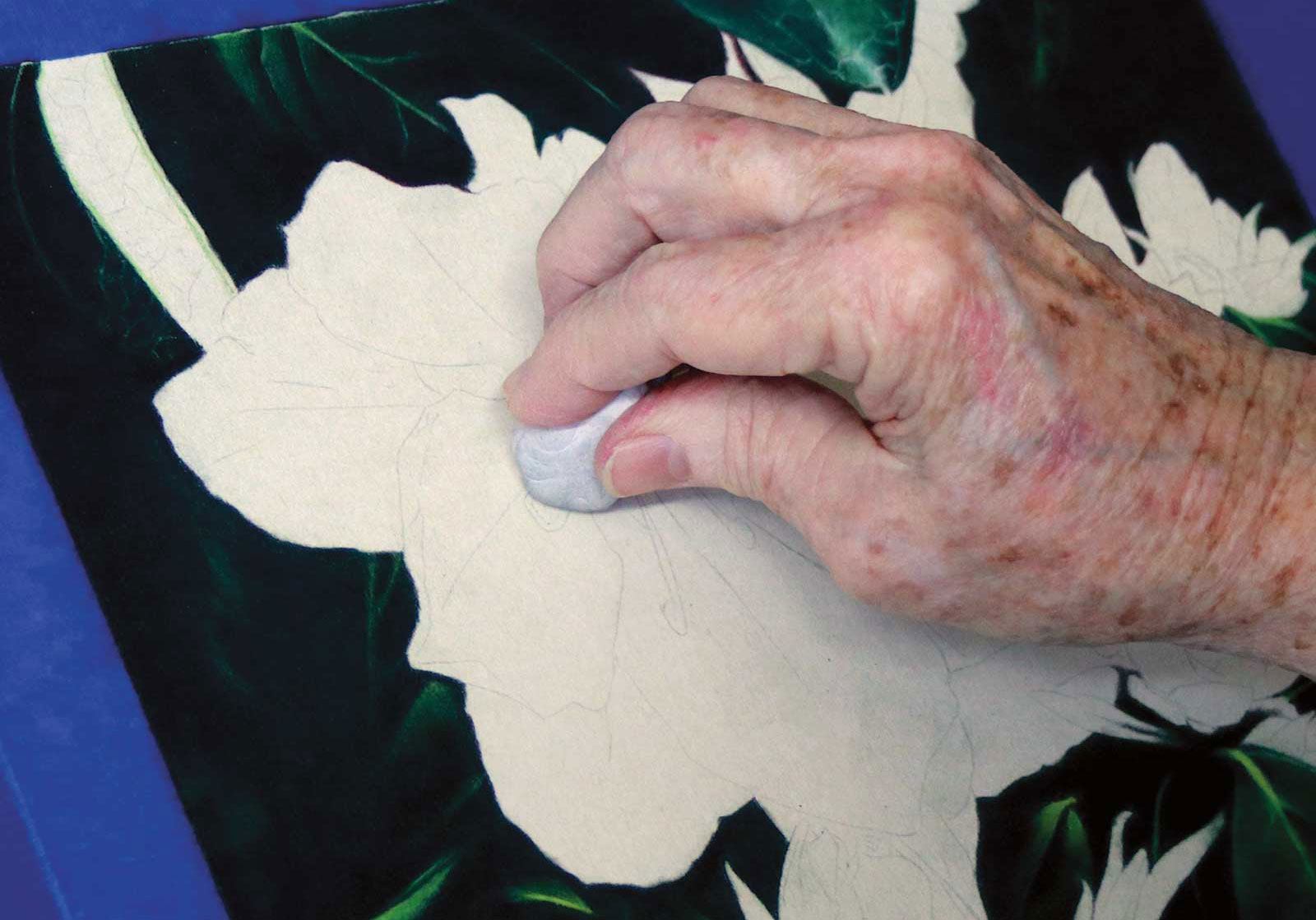
Stage 6 Cleaning the Paper with Tacky
While working, colored pencil pigment floats across the paper which makes it dirty, more so with sandpaper. Therefore it’s critical to constantly clean bare paper before adding any more colors, especially the light ones.
 Stage 7
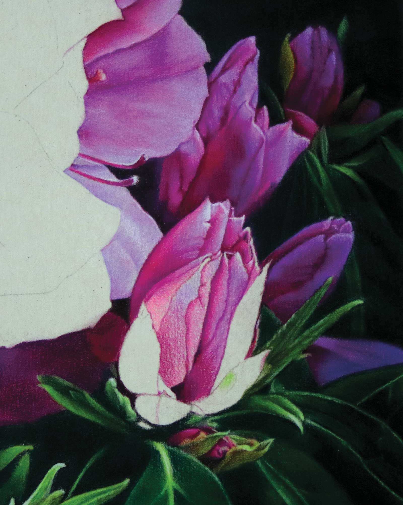
Stage 7 Adding Local Color
As with every stage I begin with light pressure, paying close attention to color and value. At this point the pigment looks grainy, however after several more layers I increased the pressure and the speed.
 Stage 8
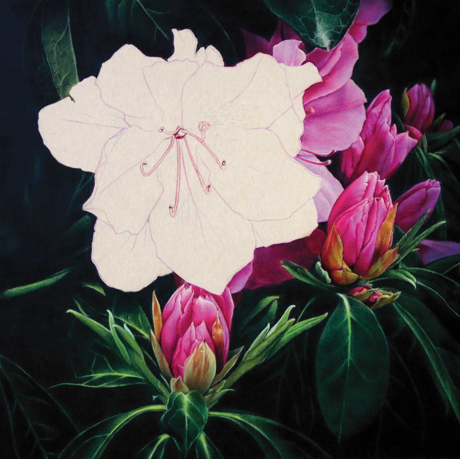
Stage 8 Reinforcing the Line Drawing
With constant cleaning my line drawing becomes weak. Since I know graphite shows through the translucent pigment it’s not an option, therefore, I lightly reinforced the lines with the colors I’d be using.
 Stage 9
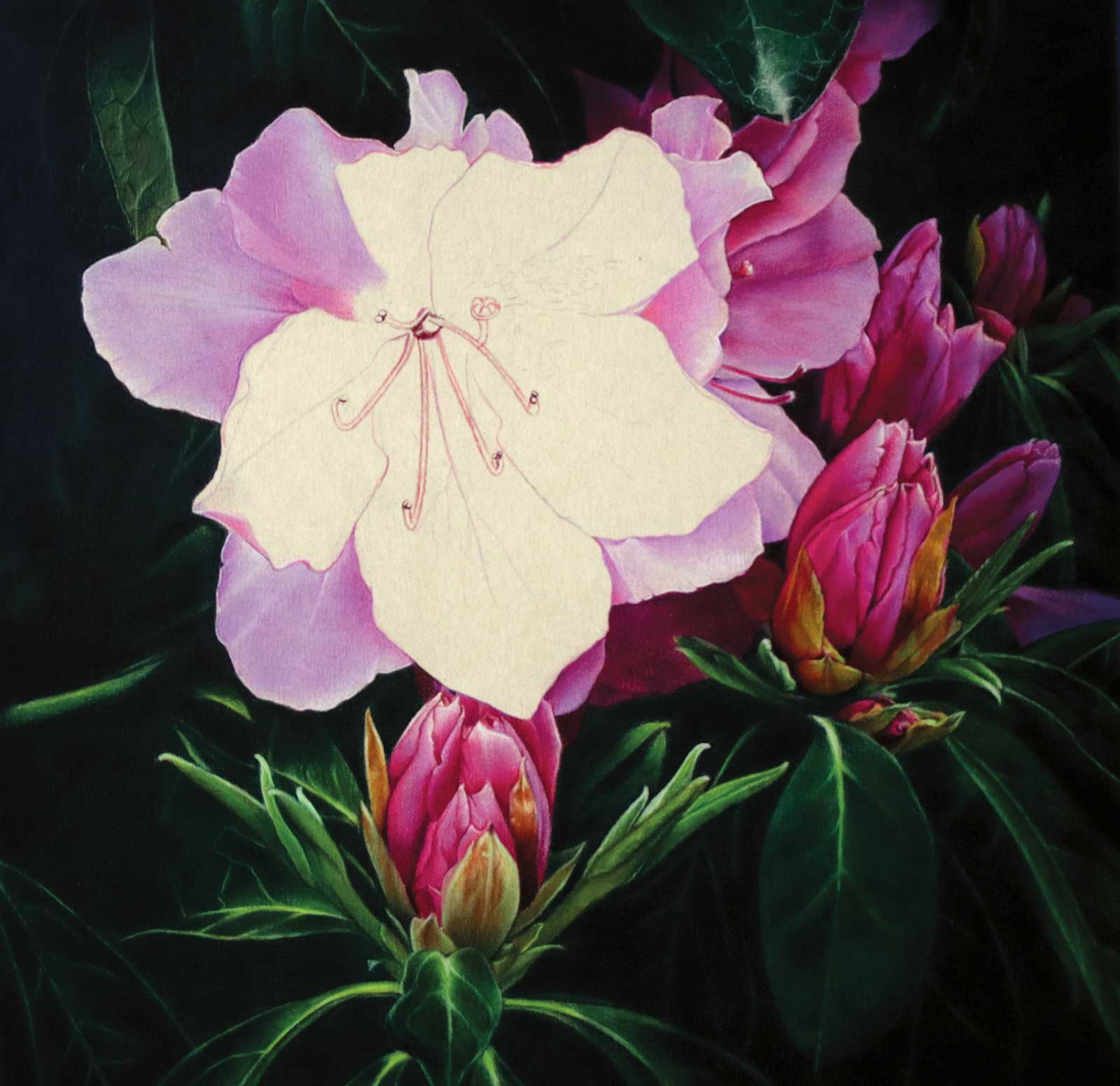
Stage 9 Working Back to Front
Because I use a dry brush to blend it’s imperative that I work on the lightest parts of the piece last. Starting at the back I work toward the front and intermittently clean with tacky.
 Stage 10
Stage 10 Pulling It All Together
Bringing the piece to completion requires blending, including areas that might have been missed. Afterwards, we both rest. Later, I can see if any changes need to be made. If so, it’s usually in value.
 Stage 11
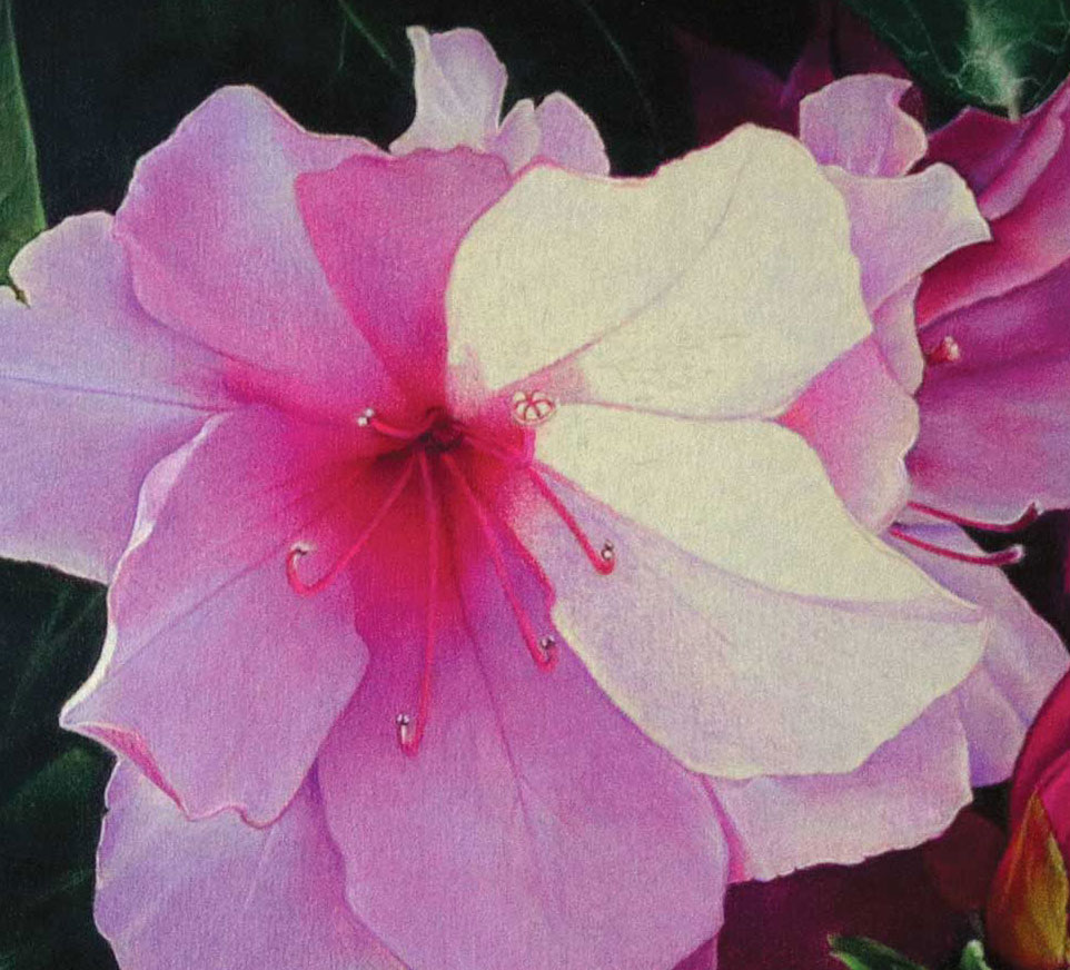
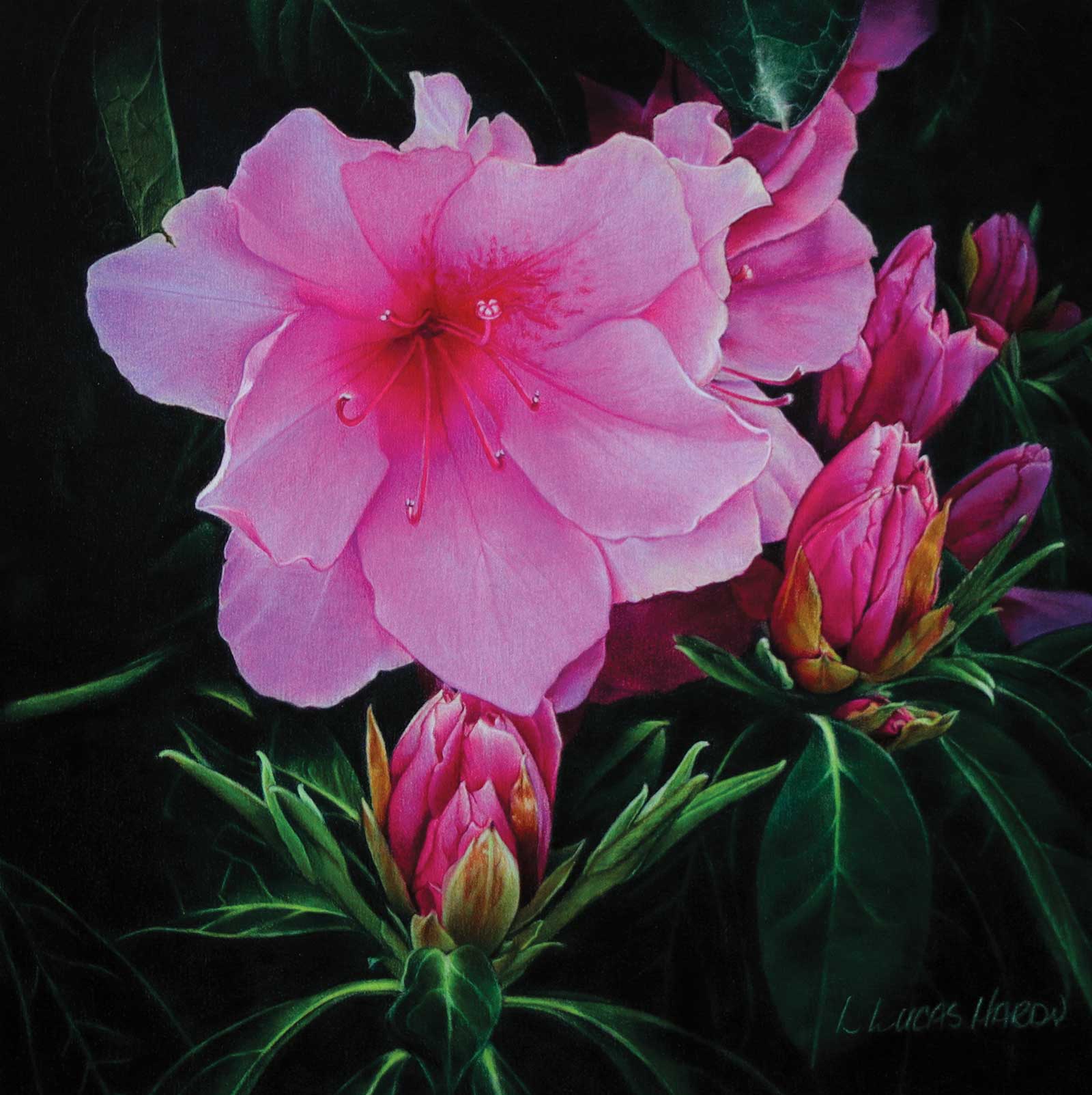
Stage 11 Finished Artwork
Gorgeosity, colored pencil on 800-grain sandpaper, 10 x 10" (25 x 25 cm)
The last thing I do is reinforce the lightest areas with heavy pressure then seal the piece with a UV spray. The spray protects the work, intensifies the colors and permanently eliminates wax bloom.
About the Artist
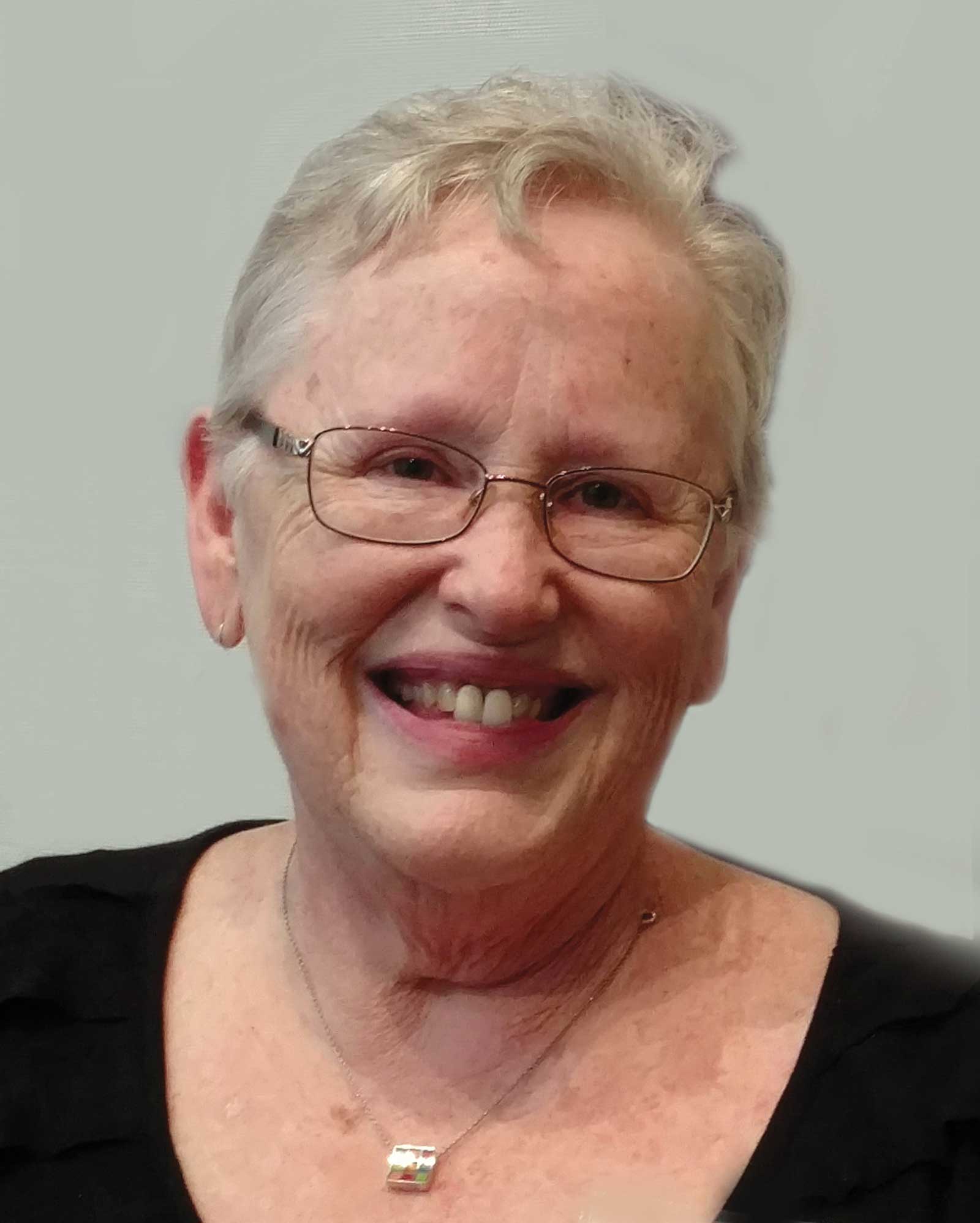 Linda Lucas Hardy
After raising her seven children, Linda Lucas Hardy, at 53, began living her dream. With an insatiable hunger and tenacity, she soon became renowned for her stunning paintings done in colored pencil. Over a 15-year period her art and/or articles have been published in two dozen magazines and 16 books. Her work has been juried into more than 80 national and international exhibitions, and she’s won an equal number of awards and honors, including a CIPPY and two EXPY Awards, both of which are Best of Show awards given by the Colored Pencil Society of America. And finally, after 20 years of entering, in 2021 she received her 15-year Merit Award from the Colored Pencil Society of America.
Represented by
Mainview Gallery, Arizona, USA, www.mainviewgallery.com
Southwest Gallery, Texas, USA, www.swgallery.com
Davis & Blevins Gallery, Texas, USA, www.sjmainstreetgallery.com