


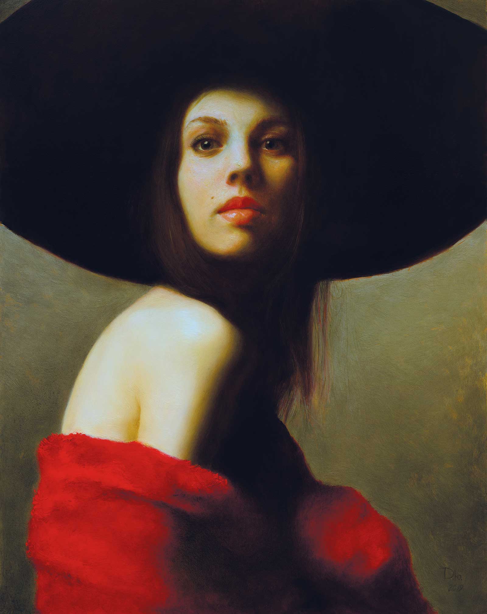
 Self-portrait in a wide hat, oil on wood, 19½ x 15" (49½ x 39 cm)
Grand Prize
Grand Prize is a four-page editorial feature in American Art Collector magazine
Darya Dolgareva, Saint Petersburg, Russia
Visions of Beauty
Inspired by the Dutch masters, Darya Dolgareva incorporates classical techniques into her contemporary portraiture and figurative art. And when it became difficult to find or purchase the necessary props to achieve her artistic vision, Dolgareva began creating her own costumes and accessories. “My creative work combines ideas of Old Masters and modern interpretations,” she says. “It takes me months to complete some works. The biggest of my projects contain not only the final painting, but also costumes, designed for particular effigies. These two elements contribute to rendering the general idea and transcend the traditional framework while retaining the historical flavor.”
Dolgareva’s process, a combination of layered painting techniques and elements of modernity, focuses on emphasizing beauty rather than hyperrealism. “I am attracted by beauty, and beauty for me presupposes the presence of something strange [and] extraordinary,” she says. “When I paint a portrait, I do not copy the external features, I interpret the character, underlining their twists. Instead of making an exact copy I look for idiosyncratic features and dramatize them. I am an interpreter, not a copyist. My portraits carry an imprint of individuality, but it is nature that I address when I seek truthfulness.” Brushwork is always important, she adds, explaining that it enables the artist to render various visual effects, like a glint in the eyes or sequins on fabric, imitating embossment or embroidery.
The artist especially enjoys working with color. “Golden yellow-orange, royal burgundy, deep blue, warm gray or grassy green, I adore them all. I like it when I can achieve a bright glow in the shadows of lower layers, choosing different styles for different faces.” She’ll often combine thin layers of paint on her portraits with thick rough strokes, used for painting textures, backgrounds and jewelry.
“I do not strive for photographic similarity—it is life I’m interested in. I follow nature, but let loose my imagination. Every object in the painting performs a certain function, be it aesthetic or conceptual, without breaking basic laws of nature. Rigid requirements do not rule out a creative approach to nature transformation, though. On the contrary, they contribute to intensifying the character’s expression, produced by imagination but rooted in reality.”
My Inspiration
The self-portrait is a study of asymmetry in the human face, which is intertwined with the psychology of the image at hand. I used a mirror throughout to reproduce my characteristic features and while studying the behavior of mirrors, I began to rethink and appreciate their value in painting more. Sometimes the hardest part is to achieve simplicity. I wanted to create a portrait that looks ordinary but thought out everything to the smallest detail. What was needed was a relaxed image, without any ornamentation but with a focus on the main subject—the portrait. If the painting appears to have been painted quickly, it is due to the careful adjustment of the pose, light and color scheme.
My Design Strategy
While mastering my profession I sacrificed endless hours and infinite efforts to gather and classify the pieces of knowledge which helped me to grow as a professional artist. Starting my work from a far-distance view, I keep the shadows intact. I do not like adding too many details to them as these areas start losing sharpness. Excessive details burden the painting and deprive it of airiness. I make all color dabs as bright and “hot” as possible because at the end of the painting process they are bound to “go down.”
My Working Process
At the very beginning I use only one color, and later three or four, elaborating the tone balance. Working on bona fide hues does not start until the middle of the process or, rather, its end. I do not make use of more than 10 tubes of oil, representing basic colors: the less room there is for choice of materials, the more food for thought and imagination. Out of four colors one can create 120 hues and achieve the utmost expression with minimal effort.
Contact Details
Email: dolgarevadarya@gmail.com
Website: www.dariamart.com
—————————————————————————
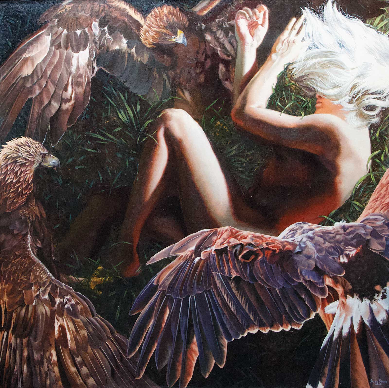 Guarded, oil on canvas, 36 x 36" (91 x 91 cm)
Second Prize
Second Prize is a two-page editorial feature in American Art Collector magazine
Renee Brown, New York, USA
My Inspiration
My inspiration often comes from nature and a love for wildlife, specifically birds. Growing up in a rural area, I found myself emotionally connected to my surroundings. I use it to reflect and clear my mind. My painting titled Guarded was created as a means for me to find peace, acceptance and tranquility. I’ve struggled with an eating disorder since childhood, and this painting is a way to accept my truth and be open about it.
My Design Strategy
I went into this painting knowing it needed to feel venerable and dramatic. It had to be a self-portrait but also anonymous. I didn’t want there to be any eye contact with the viewer or to look particularly like one person. It should also feel like the viewer is looking down into the scene. As the tall grass starts to swallow the figure, golden eagles are swooping in, surrounding the figure on all sides. Their gigantic wings create walls that shield me from the outside while also allowing me to hide.
My Working Process
I typically start with a preliminary sketch followed by a digital collage using my own references and some found photos. I break down all my colors for one specific area first and work very directly. First, I lay a very opaque base layer down and follow up with my fine details, and then highlights. Painting the pores and details is my favorite part. It can be both therapeutic and exhilarating. The form gets simplified so much that I must trust it will create the illusion once I take a step back.
Contact Details
Email: reneebrownart@gmail.com
Website: www.reneebrown.net
—————————————————————————
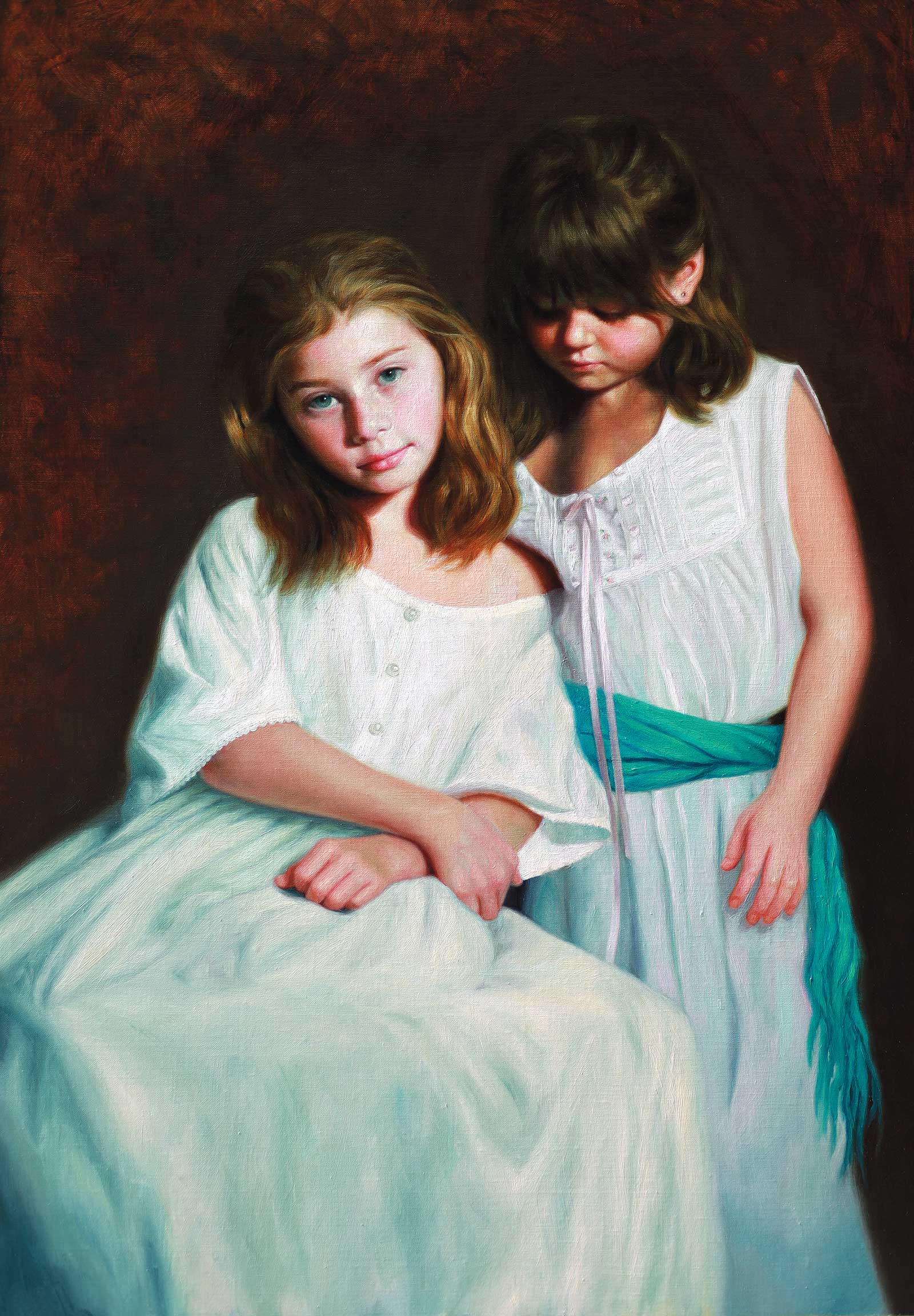 My Sister my friend, oil on linen, 32½ x 22" (83 x 59 cm)
Third Prize
Third Prize is a one-page editorial feature in American Art Collector magazine
Vicki Sullivan, Victoria, Australia
My Inspiration
Children are one of my favorite subjects to paint. During the pandemic, as we were in lockdown for so many months, I was unable to have live models in the studio. So, I began searching through all my older reference photos and I remembered a photo I had always loved of my two nieces. They enjoyed playing dress up, and I had taken some photos of them wearing white flowing muslin dresses. I decided this would make a beautiful subject for a painting. I was absolutely drawn to the look on my older niece’s face, a look of dreamy wisdom coming from such a young girl. It was that particular look and the close sisterly bond I wanted to capture in my painterly portrayal.
My Design Strategy
I am so grateful to have trained in Florence at the Angel Academy of Art under the tuition of Maestro Michael John Angel. I am always keeping in mind his lessons about composition and design. The S curves in this pose make for a more graceful flow, perfect for implementing Maestro’s design strategies. They keep the eye moving around the painting, leading back to the focal point, the older girls’ eyes. I used dramatic Chiaroscuro lighting to give the piece the Old Master feel and painted the dark background thinly to add to the atmosphere in the piece.
Before I placed the head, I worked out a simple armature to make sure the focal point was positioned to give the best impact.
My Working Process
I set up my models posing in a gesture which showed a close sisterly bond. I used the photo to work from, and I began with a raw umber drawing in pastel. When I was satisfied the drawing was working, I drew over that with a small round brush of raw umber oil paint and also filled in the shadow shapes and background with a raw umber underpainting. I waited for this to dry, then did a black and white grisaille painting over that. When that was dry, I began the first layer of color, slowly building up layers, refining with each pass. I was paying attention to edges and texture, keeping my background darks thin and building up my lights with thicker paint.
Contact Details
Email: vicki.sullivan42@gmail.com
Website: www.vickisullivan.com
—————————————————————————
Finalists
Each receives an Award Certificate and a one-year subscription to International Artist magazine PLUS having their work seen worldwide by international galleries looking for new talent.
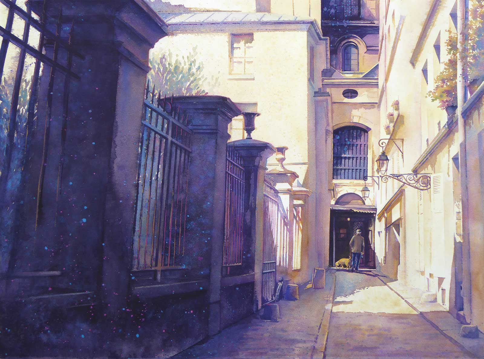 Afternoon Walk, watercolor on paper, 22 x 30" (55 x 76 cm)
Carla Gauthier, Texas, USA
My Inspiration
Architectural subjects always inspire me. Perspective, atmosphere, textures and layers are a challenge—to present this visual complexity without having the information overwhelm the piece. The play of light in this alley, as well as the shape and weight of the pillars on the left side, were the inspiration for this piece. I liked that it read like a story unfolding.
My Design Strategy
I started with a notan of the reference photo and was drawn to the breakdown of shapes. The pillars were enticing, but also a hurdle. Balancing the large, rectangular shapes that cut the painting in half diagonally could be a potential problem. In the end, understating the values in the sun-kissed areas while pushing the darker details in the column of windows was the solution, creating visual movement and the needed balance.
My Working Process
Completing a quick value sketch beforehand keeps me on track. I paint traditionally from light to dark, soft shapes to distinct edges, and kept a limited palette—yellow ochre, cobalt violet, cerulean and indanthrene blue. Darker colors were used to give the small doorway, the man and his dog visual contrast and to balance the pillars. Finally, a few splashes of spattered paint softened the overall feel of this painting.
Contact Details
Email: carla.gauthier@yahoo.com
Website: www.carlagauthier.com
—————————————————————————
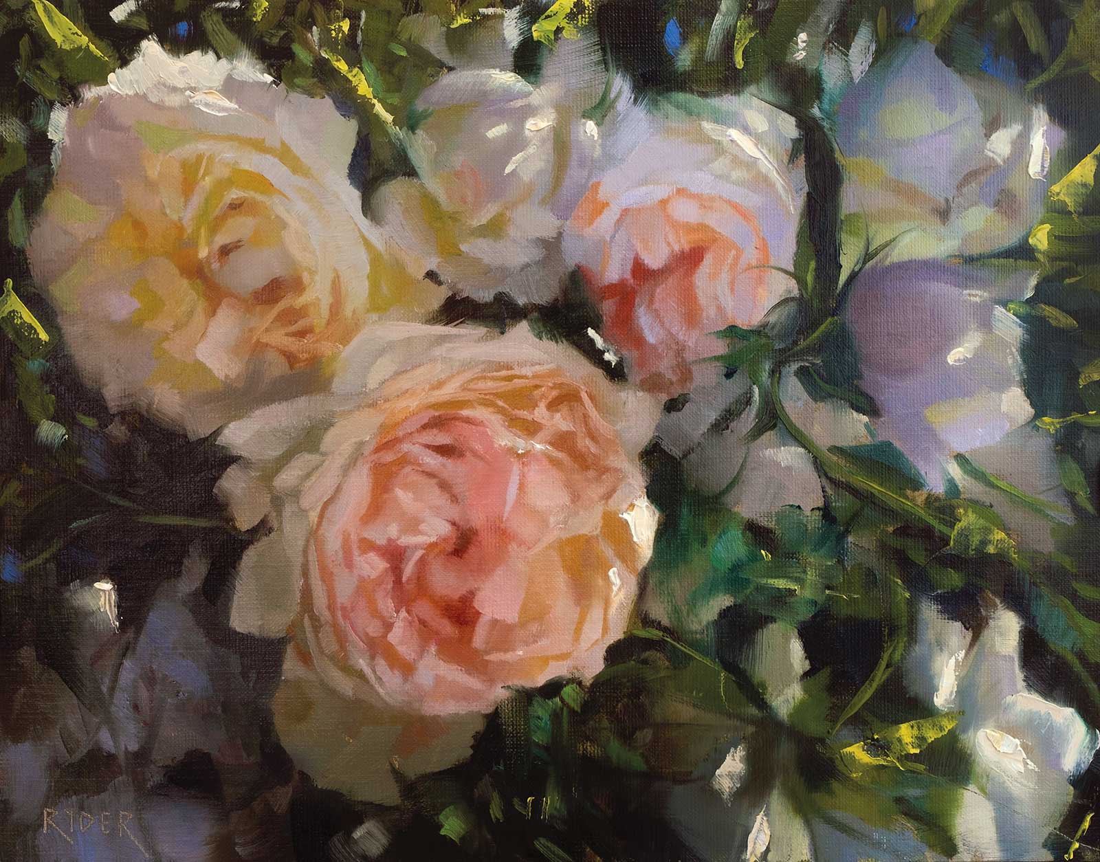 Dappled light roses, oil on linen, 11 x 14" (27 x 35 cm)
Matt Ryder, Dubai, United Arab Emirates
My Inspiration
Sometimes a subject is just calling out to be painted, and when I saw the dappled light falling over these beautiful roses I knew that it had to be captured. As a painter of the natural world, be it florals or landscapes, I will always try to search out strong light patterns and interesting shapes to help with composing my paintings. I find that the more I paint the more I am drawn to heavily sunlit subjects, and it’s now a lifelong pursuit to bring natural light and the feeling of being outside into my work.
My Design Strategy
With this particular painting I wanted to push the vibrancy of color and introduce strong textural elements to really give the feeling of bright sunlight. I knew to do this I would need areas of strong contrast and pure color in order to create the illusion that the viewer is right there in front of these flowers. In terms of composition I rearranged some of the roses in order to better lead the eye around the painting, something I will do with almost all of my work.
My Working Process
I started with a thin wash to tone the canvas of transparent red oxide and viridian, I then built up the roses starting with what I felt was the most important flower (closest flower) and worked towards abstraction the further back in the painting I went. I paid particular attention to color temperature and texture in this painting. I kept everything as loose as possible, focusing on brushwork and only introducing detail in areas that will help lead the way around the painting. I finished with some palette knife application for the brightest areas of the piece.
Contact Details
Email: ryderscanvas@gmail.com
Website: www.ryderscanvas.com
—————————————————————————
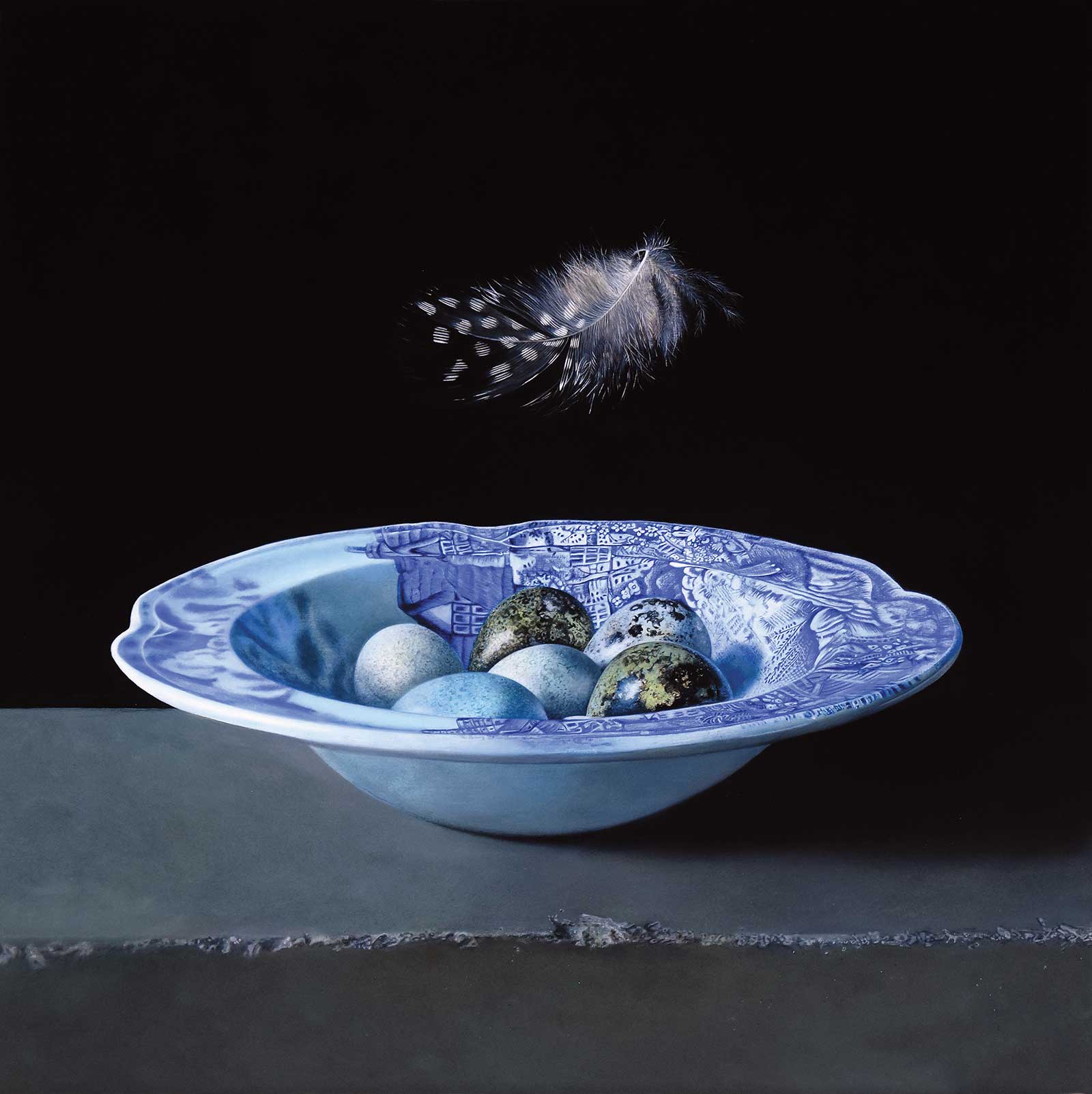 The Resurrection, oil on panel, 21½ x 21" (55 x 53 cm)
Ginny Page, Copenhagen, Denmark,
My Inspiration
Eggs have always fascinated me due to their simple but cleverly designed shapes. Though fragile and pretty, their shells are strong enough to encase and protect a tiny embryo, keeping it safe until a new life emerges and then the whole process continues. Many of my paintings have a hidden symbolism, which often refers to the transience of life in general. The meticulous craftsmanship of the still life masters from the 17th century continue to inspire me.
My Design Strategy
I created a circular composition symbolizing the circle of life. The bowl with its intricate blue speckled pattern complimented the freckled tints on the eggs. The damaged brick contrasted with the delicacy of the eggs and the lightly floating feather. Some of these eggs are from birds that I rescued and hatched! The feather was a reminder from my beloved one-legged pet pea hen to show my gratitude for the simple joy of nurturing.
My Working Process
On my smooth gessoed panel I measure out the golden section and draw out my motif accordingly. The largest areas are blocked out first. I paint an entire layer each day and then allow it to dry overnight. The pattern on the bowl is built up in multiple translucent layers using a limited palette. The feather is added last when the background is complete. A thin coat of retouching varnish is applied when dry.
Contact Details
Email: art@ginnypage.dk
Website: www.ginnypage.dk
—————————————————————————
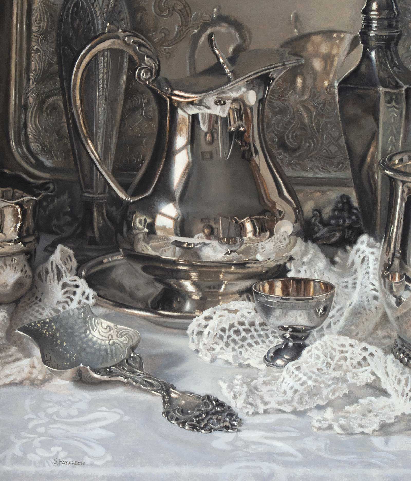 Studio Reflections, oil on panel, 16 x 13¾" (40 x 34 cm)
 Susan Paterson, Nova Scotia, Canada
My Inspiration
Studio Reflections was inspired by the reflective surfaces of silver and the almost monochromatic colors of silver pieces and white linens. I love how the reflections bring you into another “world” and are mini paintings within the painting. Working primarily with different tones of grays and browns allowed me to bring out the subtleties of color, the warms and cools, and to emphasize the textures of the various objects.
My Design Strategy
I designed this painting around the silver creamer, which was placed in the middle, surrounded by the other objects both in a two-dimensional and three-dimensional sense. You enter the painting in the foreground and move back to the pitcher with the reflections of my studio. I didn’t want these details to be obvious at first, rather a reward for taking the time to look a little closer.
My Working Process
I set up the objects in a box with light coming from only one source, in this case the window. I did a detailed pencil drawing from life, taking the time to make it as accurate as possible, then transferred it to my board. In the first paint layer I concentrated on the bigger shapes, with details gradually added in the second and third layers.
Contact Details
Email: susanpaterson14@gmail.com
Website: www.susanpaterson.ca
—————————————————————————
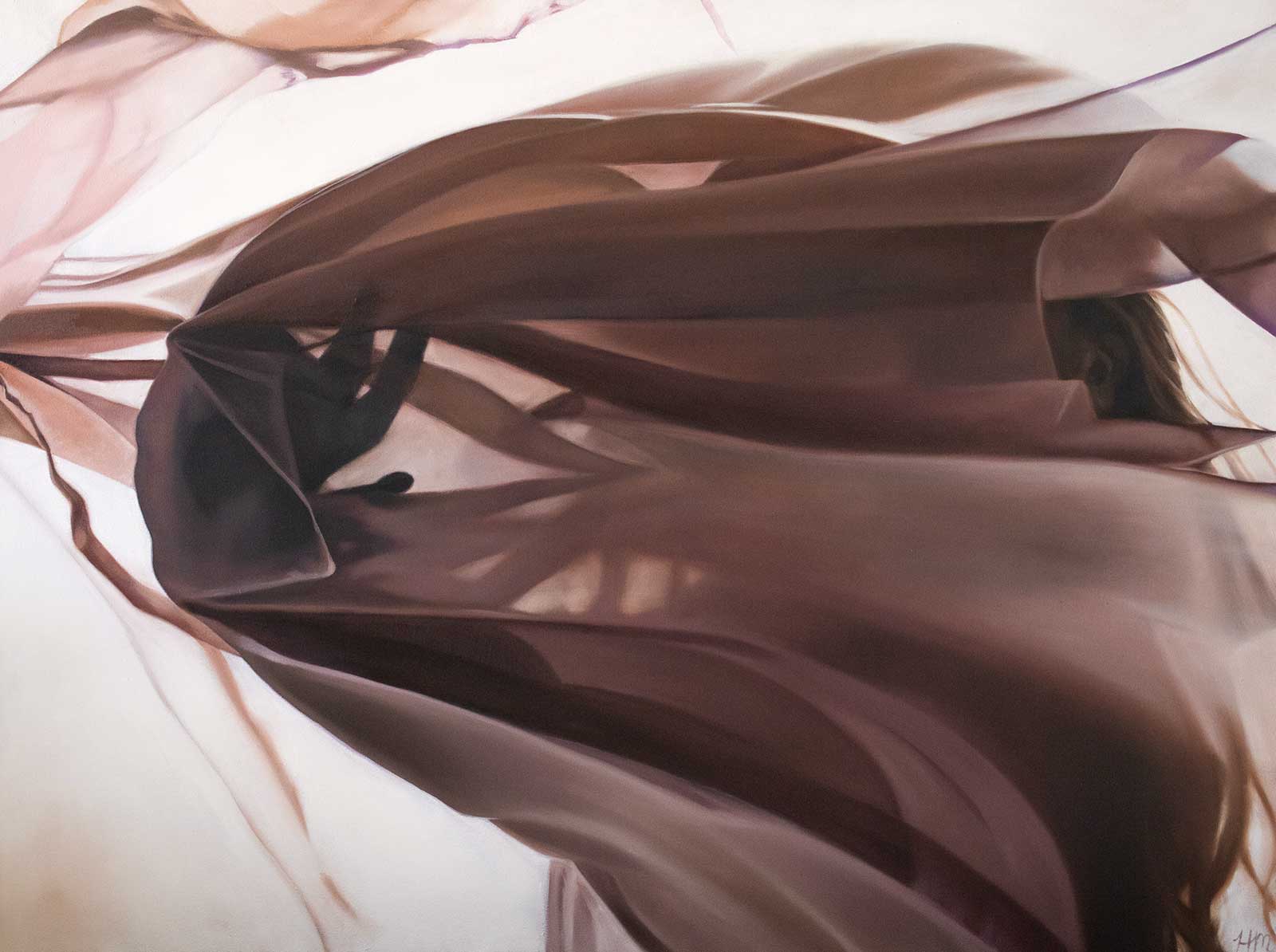 Resistance, oil on canvas, 36 x 48" (91 x 121 cm)
Heather Martindale, Idaho, USA
My Inspiration
I am inspired by the power of human emotions through light and movement. The different colors, sheens and weight of fabric is a great way to evoke emotions using dance and movement. Watching humans interact with the world around them inspires me to evoke the beauty of those inherent emotions. Objectively, I am equally inspired by light and its interaction with different fabrics.
My Design Strategy
I start out with an idea or emotion I want to portray in my work and build on that idea. The type of fabric or garment, the dancer, the environment and lighting are all considered when gathering my reference photos. The photoshoot is really where the magic happens. I am always in awe of what the camera captures all on its own that I rarely make any edits before translating to the canvas.
My Working Process
Starting with a burnt sienna wash provides a nice glow from behind the paint that oftentimes shows through the thinner layers of paint. I will then do a line drawing to map out each shape of shadow, highlight and fold. Occasionally starting with the most detailed portion or the darkest part of the composition, I bring each section to completion before moving to the next section, mixing each color as I go.
Contact Details
Email: creative-content@hmartindale.com
Website: www.hmartindale.com