


You could say that I’m obsessed with clouds and skies. Painting skies is something that I’ve thoroughly enjoyed most of my painting career. This obsession started long before becoming an artist. I grew up in Kansas on a farm where open space was common and looking up at the sky to consider the weather was an everyday occurrence. It is a thrill to capture the movement of clouds when I’m outside. I really get into the moment, feeling the direction of the wind, and watching clouds as they go by to find the most interesting shapes.
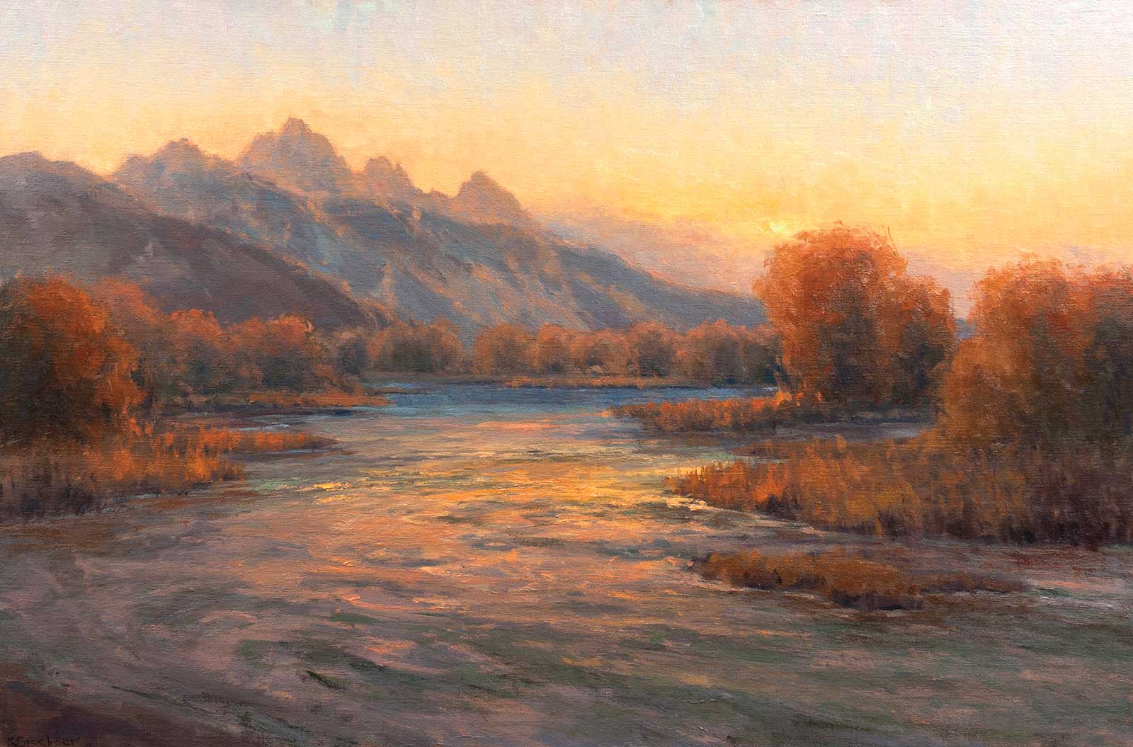
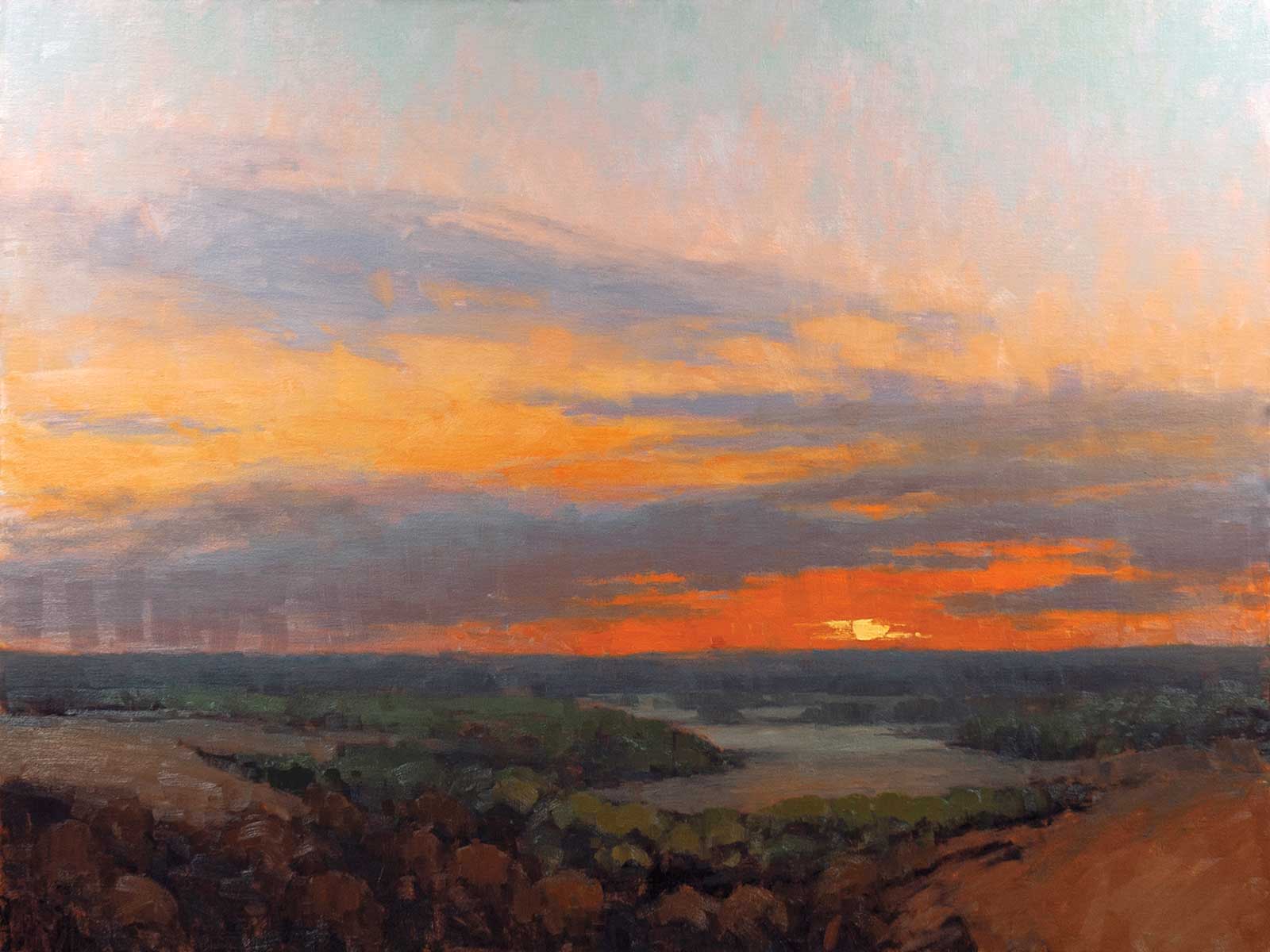
Last Moments of the Day, oil on linen, 24 x 36" (60 x 91 cm) This is a studio painting capturing evening light on the Tetons and the Snake River. There are several locations near Wilson, Wyoming, where I go to plein air paint along the Snake River. This particular evening, there were no clouds in the sky so the sunset happened very quickly. My goal was to capture the warm wash of light across the mountains, trees and water. This place never disappoints!
I distinctly remember the moment I started to understand how to capture painting clouds in plein air. It was one of those really lovely autumn days. The air was crisp. The fall colors were almost in full splendor. Many layers of almost perfect, fluffy clouds were moving across the sky. I was blocking in the large cloud shapes. They had form, but felt stiff, not natural. I started to notice that the thin, wispy ends of the clouds move in the same direction of the wind. Moving the brush in the same direction of the wind while making the cloud shapes, and creating “tails” on the edges of the clouds using that same brush direction shows the movement of the clouds. I was hooked!
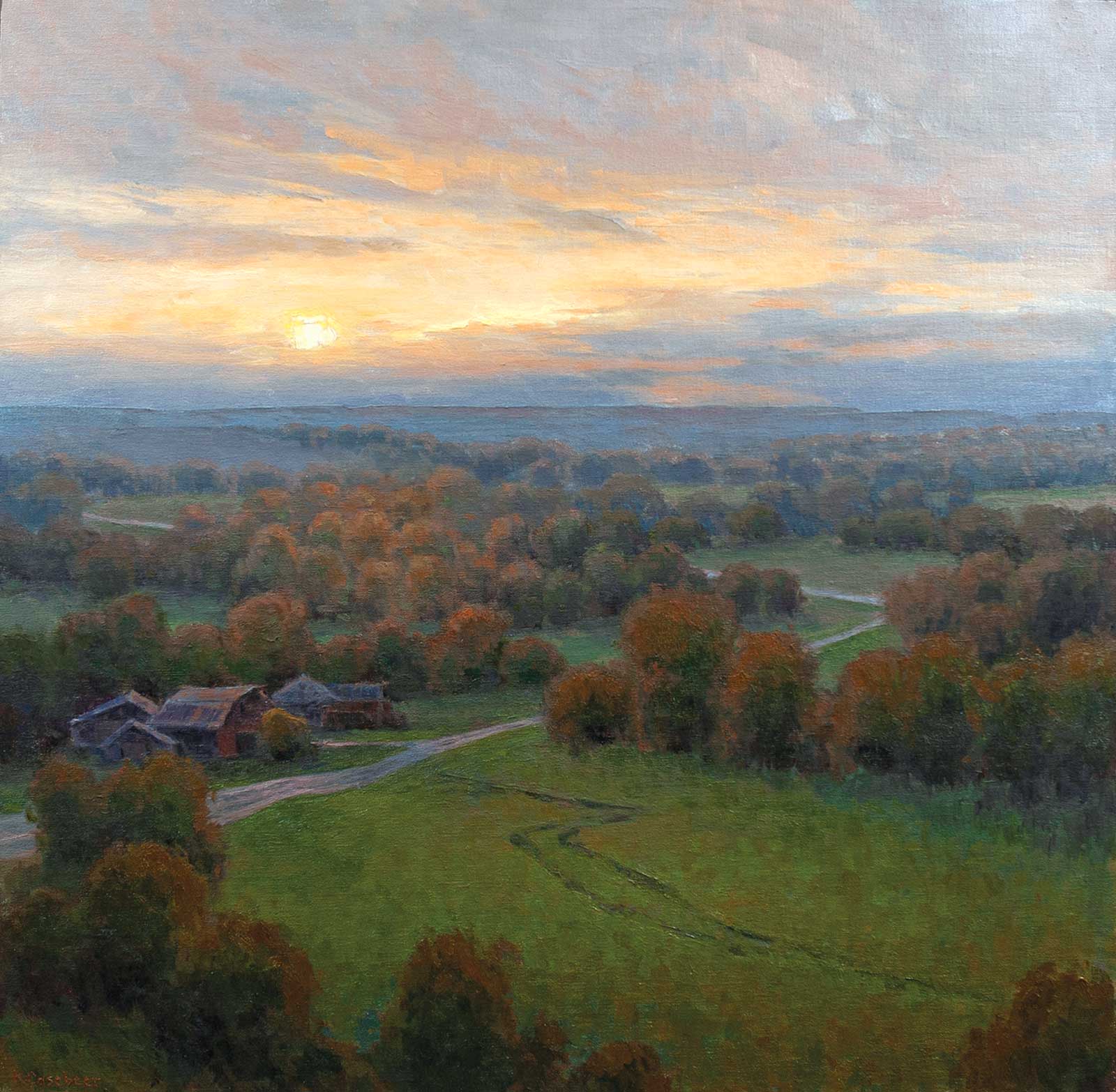
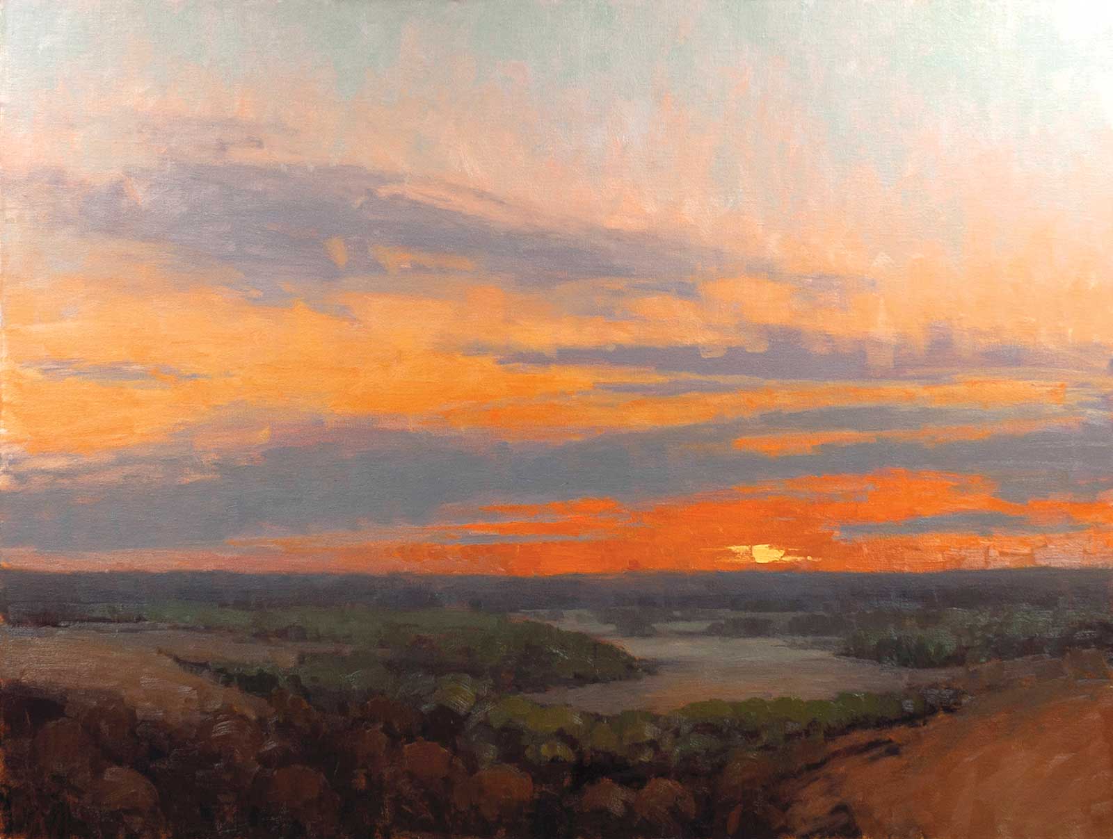
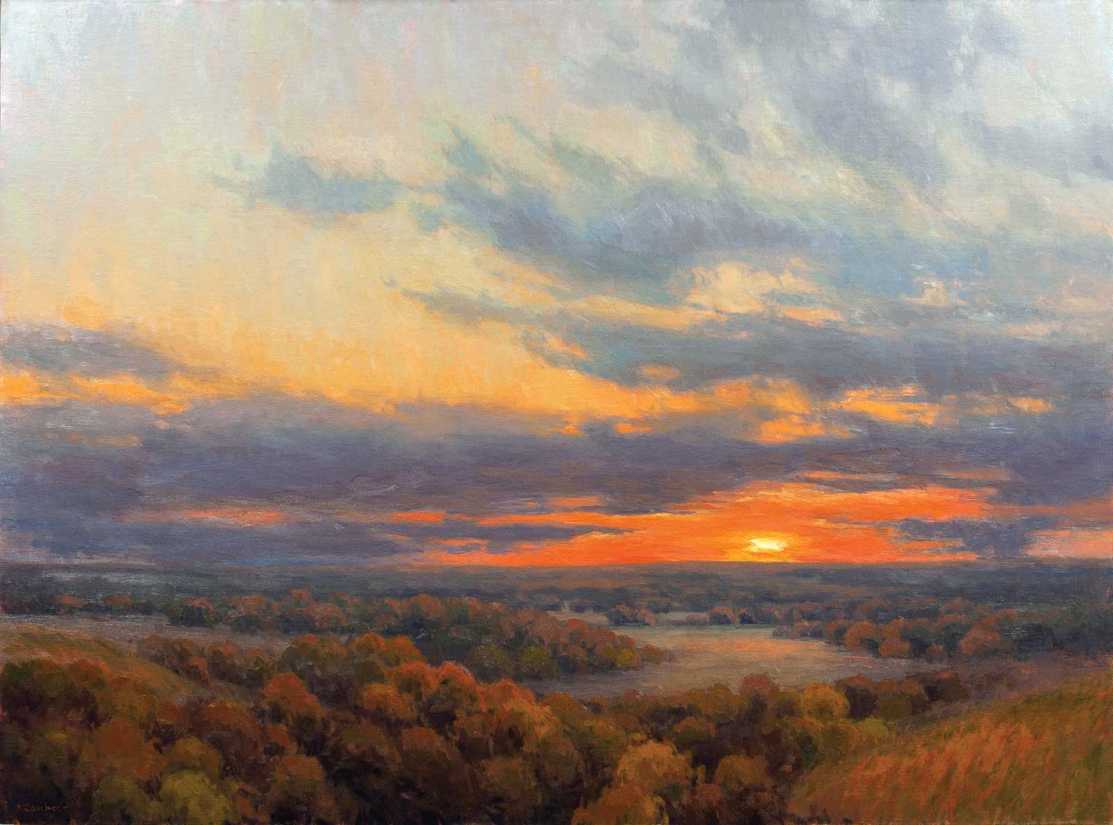
Last Light on the Ranch, oil on linen, 30 x 30"(76 x 76 cm) I’ve painted plein air from the top of this hill many times. The pattern of trees and fields are interesting to me, so that plus the expanse of space is what I focused on in this studio painting. The light filtered through the clouds created a haze over the landscape. This painting captures the subtleties resulting from the soft light and distance.
It is this energy from the plein air work that I continually strive to bring to my larger studio work. Keeping the plein air paintings close by while painting in the studio reminds me of the wind, weather, and how I felt during the plein air painting experience. Plein air painting is a sprint while studio painting, especially a larger piece, is a marathon. I start by thinking about what I want to say regarding the location I’m considering painting. Am I showing how big the landscape feels? How intimate? What do I already have as references? Photos? Plein air paintings? I try to have both photos and plein air paintings available to me because they have different roles to play. Even if a plein air painting isn’t from the exact same spot, it can still be useful to explain the color temperature, saturation and value that I saw. Photos don’t show color and value accurately. Photos don’t typically show the nuances of temperature shifts either. What photos can help with is to find interesting compositions.
With the plein air and photo references selected, it’s time to start playing with composition. I’ll make enough thumbnails in my sketchbook until I’m comfortable with my chosen composition.
Once I have a grayscale sketch, a color study, photo references and plein airs, I’m ready to begin a large studio piece. Having a well-thought-out design at my disposal makes me feel confident and frees me to be in the moment when painting with much less worry of what might happen during the process. Planning the composition, values and color frees me up to play more with brushwork, texture and pushing the boundaries of color.
My Art in the Making Room to Breathe
 Reference Photos
Reference Photos
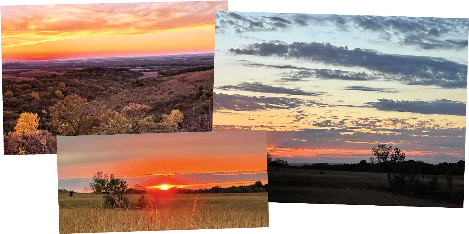
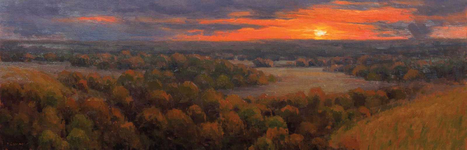
I have a photo reference of the landscape from the overlook where this scene is located, but I don’t like the clouds in the sky. I found photo references of a sunset and clouds with oranges and violets that I like better. These photos are late evening which is also the time of day I took the photo of the landscape. When putting different reference photos together, it’s important to keep the time of day and type of light similar.
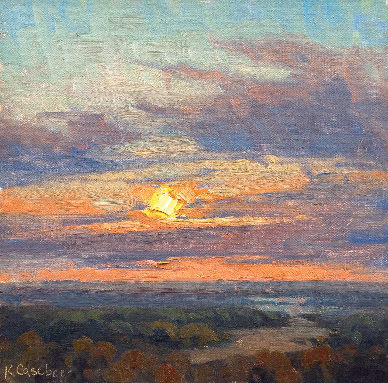
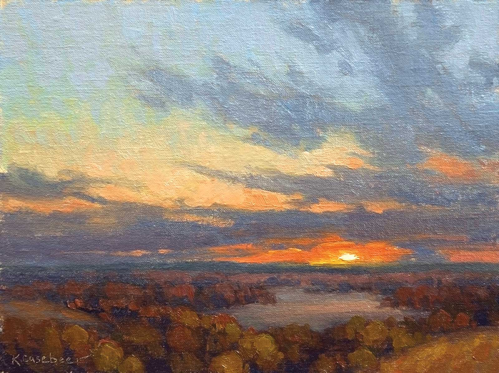
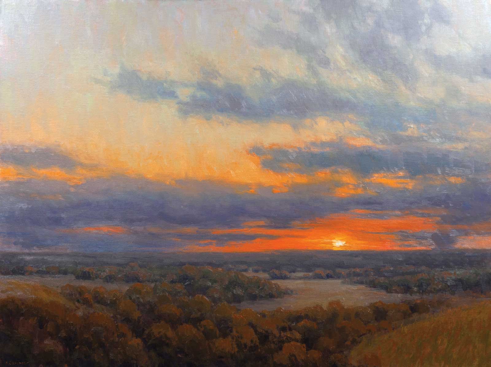
Konza Evening Overlook. This is a plein air painting from this location. The light wasn’t as intense as the photo indicated. I want the studio piece to be closer to the color palette of the plein air but with more intense oranges in the sky.
 Stage 1
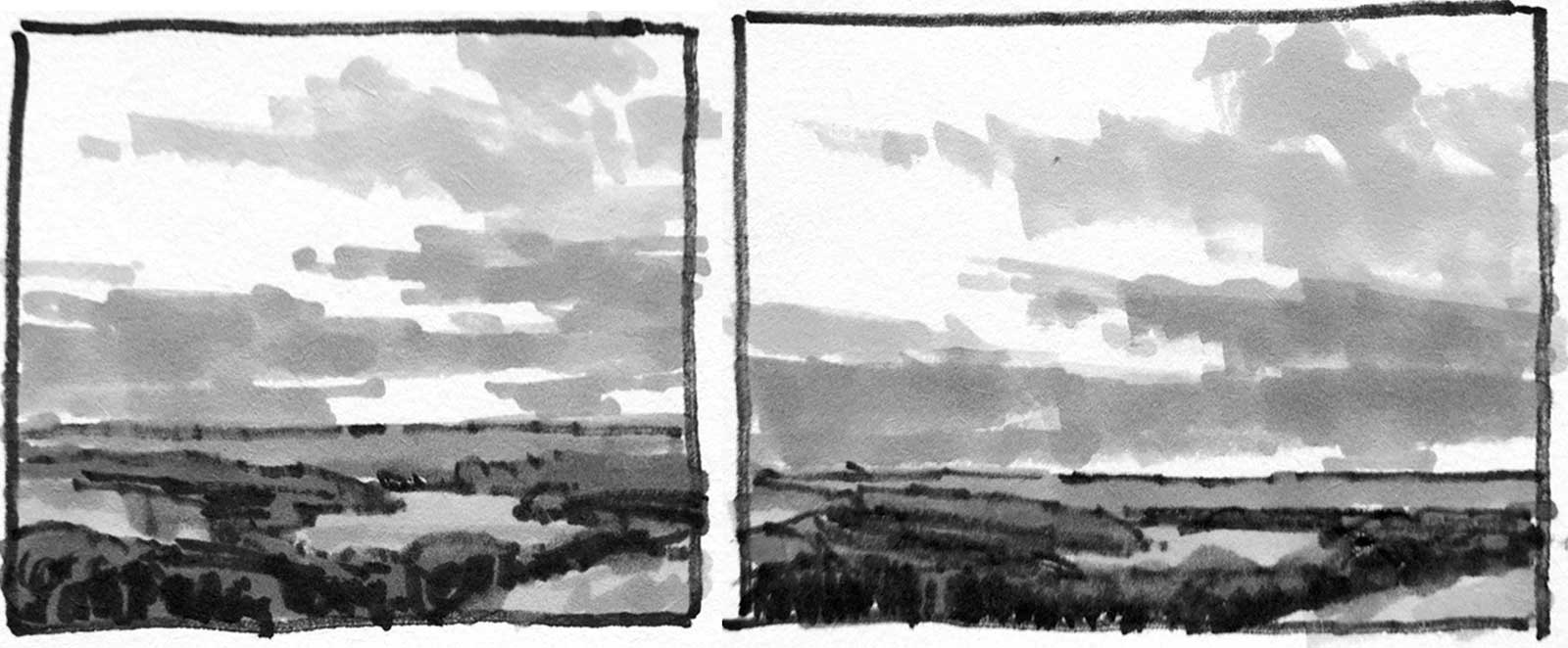
Stage 1 Thumbnail Sketches
I create thumbnails with design markers to find my composition. This piece is about the sky, so it will be two thirds sky and one third land. I try a few different proportions to see if I like the square format or the horizontal format.
 Stage 2
Stage 2 Color Study
A small color study helps test combining the thumbnail design and plein air color combination. For the 36-by-48-inch painting, the color study is proportionately 9 by 12 inches in size.
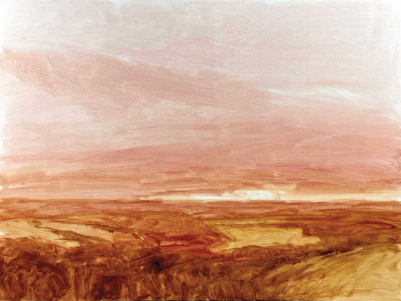 Stage 3
Stage 3 Monochromatic Underpainting
I start the 36-by-48-inch painting with a monochromatic underpainting. This underpainting gets the design on the canvas by following the value thumbnail. I use warm, transparent colors in the underpainting: transparent orange, transparent earth orange, asphaltum and sometimes alizarin permanent. The alizarin wash in the sky will set the tone for the saturated sky colors.
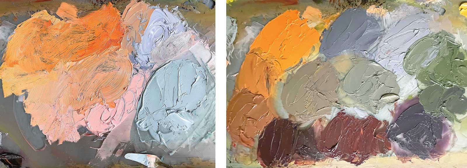 Stage 4
Stage 4 Premixing Colors
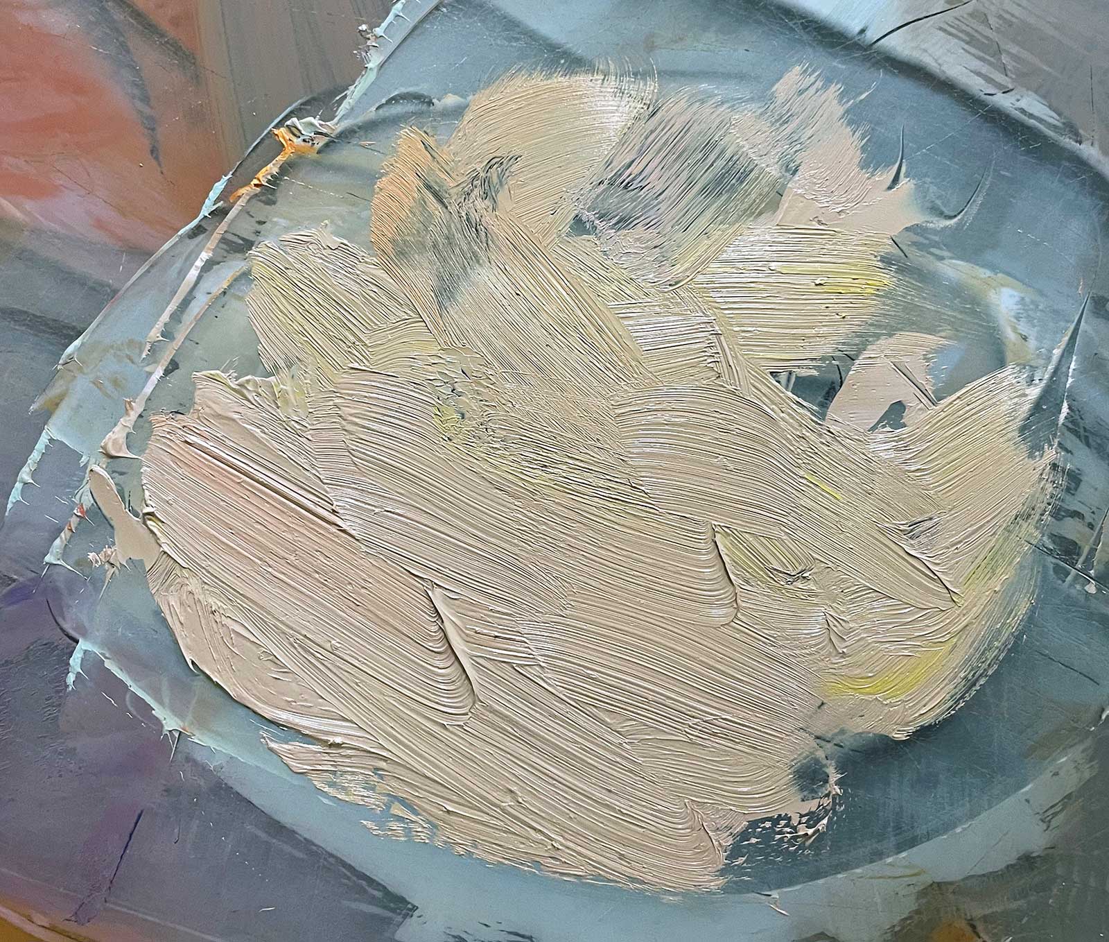
I premix colors on my palette before I start the block-in which allows for a painting rhythm, since I’m not stopping to mix color. Premixing also helps the colors have unity. I mix large piles of base colors, then mix piles of neutrals by pulling paint from the base colors so the palette will work together.
 Stage 5
Stage 5 Block In Sky and Land
In the block in phase, the goal is to find the middle value and the shadow value of each big shape and use them to fill the canvas. The middle value of each shape varies. The middle value of the sky is much lighter than the middle value of the trees. This painting has a large amount of sky, so I start the block-in with the sky first and then the land, because the sky palette affects the land. During the block in phase, I decided to eliminate some of the upper clouds that I had in the color study. I became concerned that the sky would get too busy. Even with all this preparation, sometimes there’s still some experimentation! What works in a small painting doesn’t always translate perfectly to a much larger painting.
 Stage 6
Stage 6 Finding Forms
It’s time to find form, which means adding the areas of each shape where light is hitting that shape, and areas that are in shadow because light isn’t hitting that part of the shape. The temperature of these lights and darks depends on the temperature of the light. In smaller shapes, finding form may be enough to make an area interesting.
 Stage 7
Stage 7 Temperature Shifts
In open spaces, such as the sky, where finding form isn’t relevant, color temperature shifts are important. The sky is blocked in with cool blue. I use this blue as a base to mix warmer color. These colors are placed next to each other in the sky to create a more interesting area. They are different temperatures but not different values. Standing further away, these colors will blend to form an overall impression of color.
 Stage 8
Stage 8 Warming the Sky
Here I use transparent orange to change the blue to a warm, unsaturated green that works well in the sky. Transparent orange is an earthy orange that warms color without over saturating the color.
 Stage 9
Stage 9 More Warmth
Adding more transparent orange as well as some cadmium red light turns the color to a warm, unsaturated gray which will blend well into the saturated oranges.
 Stage 10
Stage 10 Adjusting Cloud Shapes
Standing back to evaluate the painting, I feel as though the size and shape of the clouds are too similar. They are also very horizontal and could use more diagonal and vertical direction. I adjust cloud shapes to the original color study idea. The upper sky clouds are too heavy in the large painting, so I lighten their value.
 Stage 11
Stage 11 Little Adjustments
The composition is working, so it’s time to make smaller adjustments to the painting. I connect the cloud shapes better and find movement. I also make color shifts in the clouds and make the sky smoother, and then add color shifts in the land.
 Stage 12
Stage 12 Highlights
There’s a transition from green in the back trees to warm green and red in the front trees. However, the overall effect isn’t interesting and needs more variety. I add warm highlights to the green trees in the background, and make some foreground trees more green, some more red.
 Stage 13
Stage 13 Additional Texture and Color
I add more brush work to show grasses in the foreground hill. I also add more texture and color variety in the trees as well as the fields.
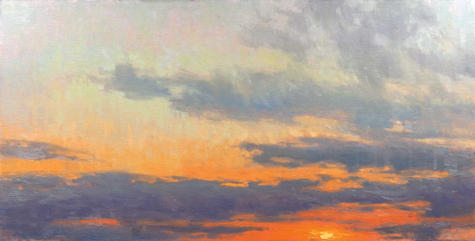
 Stage 14
Stage 14 Finished Artwork
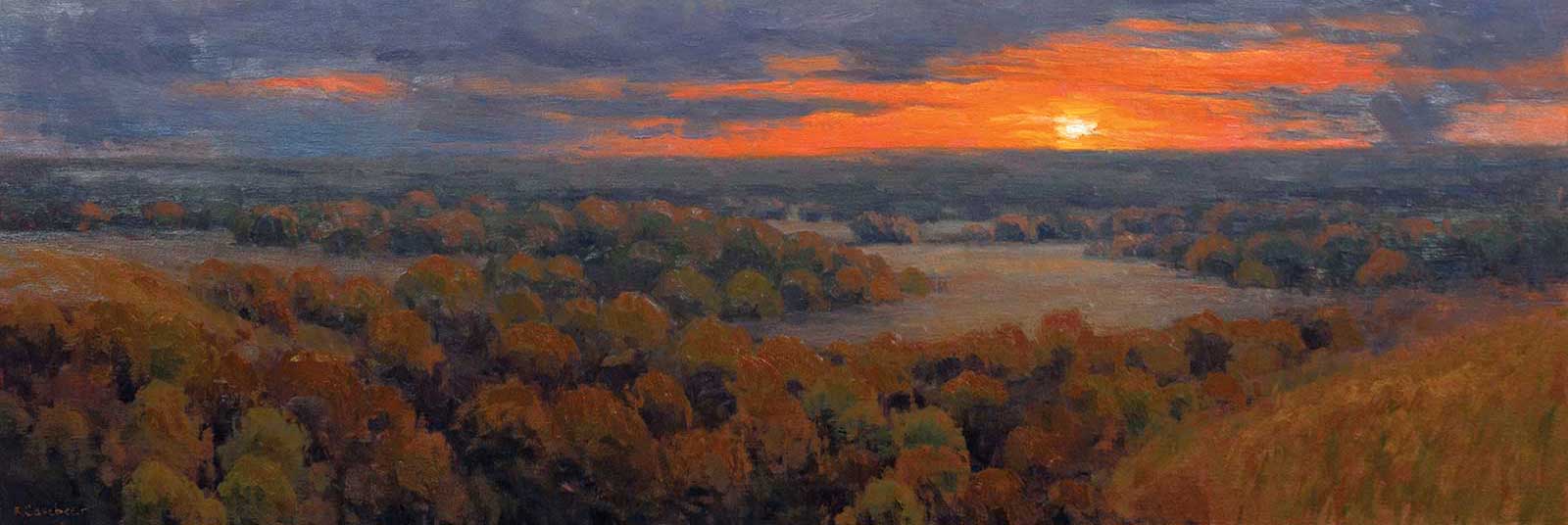
Room to Breathe, oil on linen, 36 x 48” (91 x 121 cm) In the final version, I make more color adjustments to the trees and foreground grasses and add warm light to the middle field. I adjust the shape of the sun slightly and emphasize highlights on the clouds’ bottom edges. I elongate a few of the clouds to show more movement.
About the Artist
 Kim Casebeer
Kim Casebeer spent her childhood exploring outdoors on her family farm and has a lengthy connection to the landscape. Though she travels across the United States to paint in plein air, she always comes back to her first love–the big skies and rolling hills of Kansas.
Casebeer received her Bachelor of Fine Arts from Kansas State University in 1992. She is a Master Signature Member of the American Women Artists and a Signature Member of the Oil Painters of America and the Pastel Society of America. She is featured in the Grand Teton and Yellowstone section of The Art of the National Parks.
Casebeer has received many national awards including honorable mention in the PleinAir Salon, and the OPA Memorial Impressionist Award of Excellence. Her plein air piece, Oxbow Triptych, received the Superintendent’s Award and is in the Grand Teton National Park permanent collection.Casebeer is represented by multiple galleries across the United States, including Broadmoor Galleries in Colorado, FourSquare ART in Arizona, Grapevine Gallery in Oklahoma, Masterpiece Gallery in New Mexico, Mountain Trails Gallery in Wyoming, and Prairiebrooke Arts, Reuben Saunders Gallery and SNW Gallery, all in Kansas.
Contact at
kim@kimcasebeer.com
www.kimcasebeer.com