


Since 2018, I’ve been making watercolor and acrylic paintings on unprimed MDF panel. Sometimes, the painting is allowed to dry in between layers, but I do switch between them while the painting is still wet. While I don’t typically mix watercolor and acrylic paint on the palette to achieve a particular color, I do mix the watercolors with acrylic mediums. The earliest paintings I made this way do not show any signs of deterioration, but this combination of materials has not been evaluated for its long-term stability.
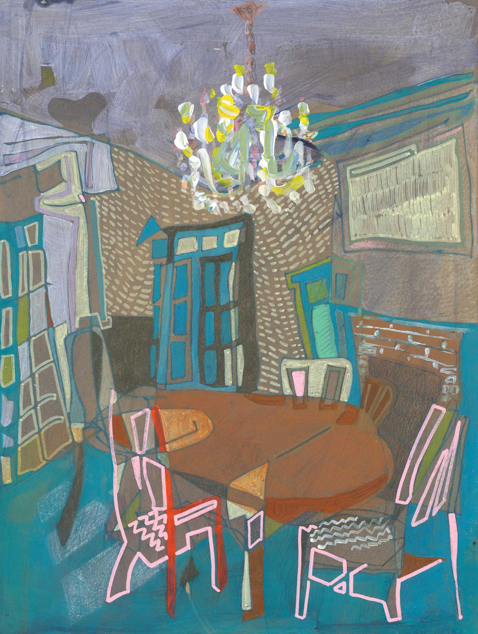
30 S 2nd Street No. 01, watercolor and acrylic on MDF panel, 12 x 9 x 1" (30 x 22 x 2 cm) In a later stage of this painting, I covered the entire surface in a transparent layer of smalt blue before painting the chandelier. Because the yellow of the chandelier and the pink lines of the chairs are the only warm colors in the painting, they stand out against the cool blue.
I have chosen to work on unprimed MDF panel because of its dynamic surface properties. Early dry-on-dry layers can be wiped away with a damp towel to reveal a pristine surface, but wet layers are so quickly absorbed that they do not have time to be dragged across the surface with a brush. It is only after a series of layers have been absorbed into the panel that acrylic paint markers can be introduced without vanishing beneath the surface. Once heavy bodied layers of acrylic paint are added, the difference between the transparent and opaque passages of paint are even more apparent.
I use liquid watercolors that come out of dropper bottles, moist paint that I can squeeze out of tubes, dry paints in pans, and watercolor pencils and sticks that I can draw with. The range of dry, moist and liquid, combined with watercolor’s tendency to reactivate when it becomes wet, provide endless possibilities for application.
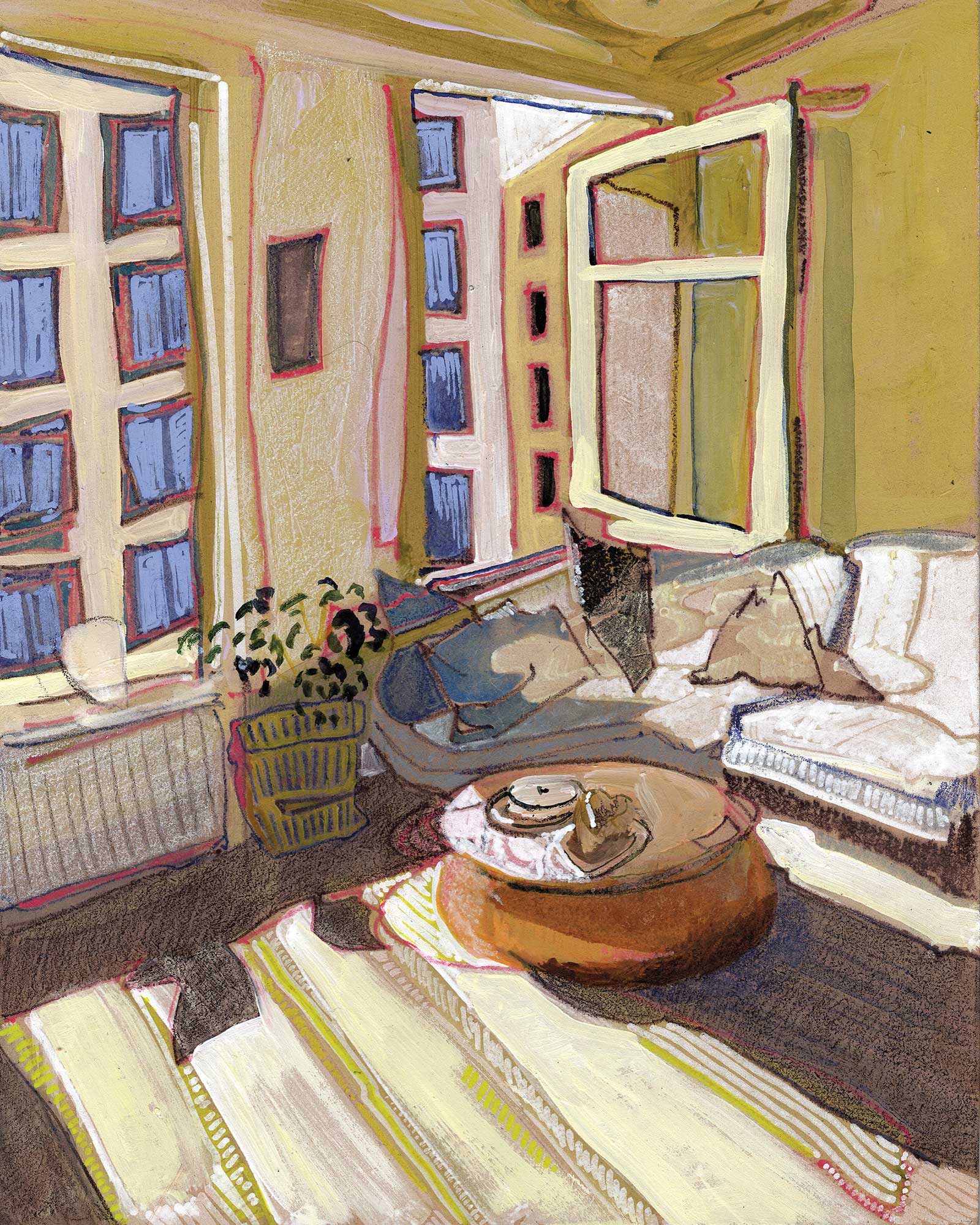
Dani’s Home in California No. 02, watercolor and acrylic on MDF panel, 10 x 8 x 1" (25 x 20 x 2 cm) The high contrast color value fills this room with sunlight. Notice that the bright passages on the floorboards use a thick layer of opaque paint, while the parts in shadow are transparent and shaded with a dry watercolor pencil.
In contrast to the delicate fluidity of my watercolors, I favor heavy body acrylic paint. Even if the color itself is transparent, painting an object with the thick consistency of heavy body acrylics makes it seem solid. I also use acrylic paint makers, which allow me to make marks with a consistent thickness over both passages of acrylic and watercolor.
My paintings are colorful, but the value, temperature and opacity of a chosen color is often more important than the hue. With each round of edits, I attempt to adjust the color in order to create a cohesive composition. Each of my paintings is entirely improvised; I never have a plan of what a painting will look like when it is complete. This makes it tricky to determine when a painting is finished. Sometimes, I hide paintings from myself. When I find them weeks or months later, I’m able to evaluate them with fresh eyes and the final touch the painting needs is usually obvious to me.
Although I use photo references, I never set out to faithfully render what I see in a photograph. I typically discard the references about halfway through a painting in order to focus on resolving the painting that is in front of me. Over the years, I’ve found images in vintage home remodeling catalogs, Craigslist sublet rentals ads and real estate listings. I also make a few dozen custom paintings for clients each year based on photos they send me of their own homes.
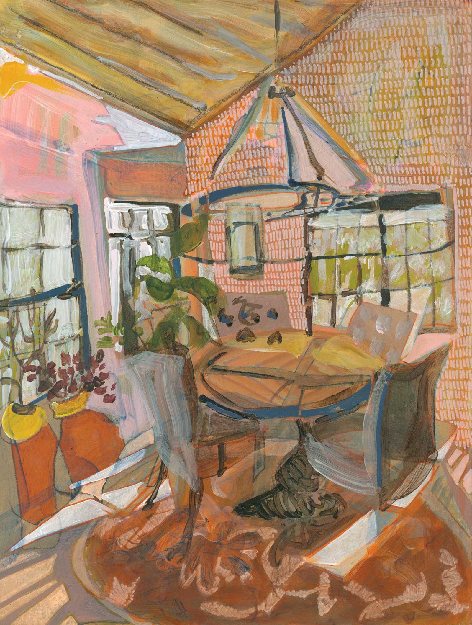
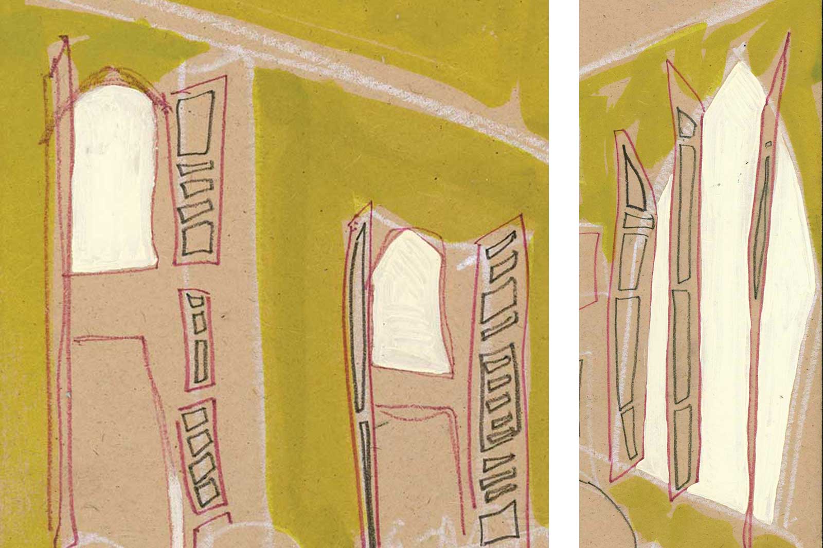
Untitled, watercolor and acrylic on MDF panel, 12 x 9" (30 x 22 cm) The rows of tic marks in the background on the right unify the wall without turning it into a solid shape.
I find painting domestic interior spaces to be both challenging and rewarding. They provide me with an opportunity to paint organic and geometric shapes and also patterns. They’re also an accessible subject matter for casual viewers; regardless of how much I exaggerate or distort color and scale within a composition, once someone is able to recognize a door or a window, they’re quickly able to develop a narrative to make sense of what they see.
My Art in the Making Garrison, NY No. 301
 Stage 1
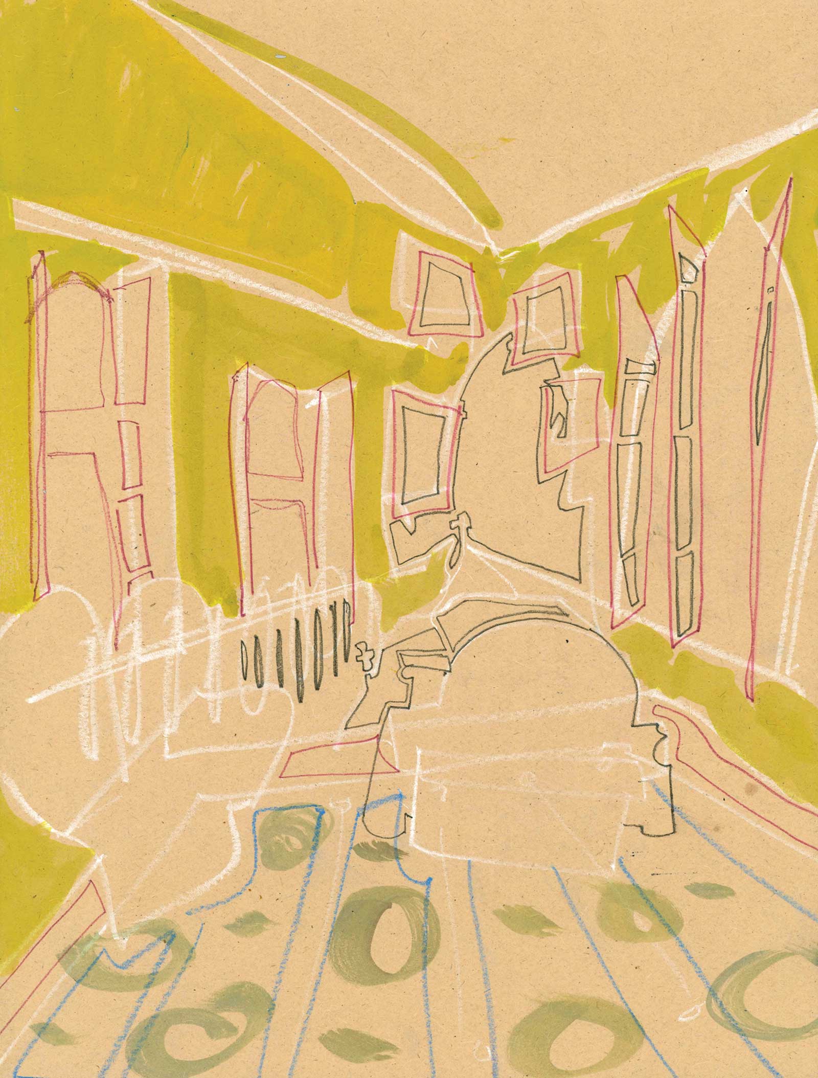
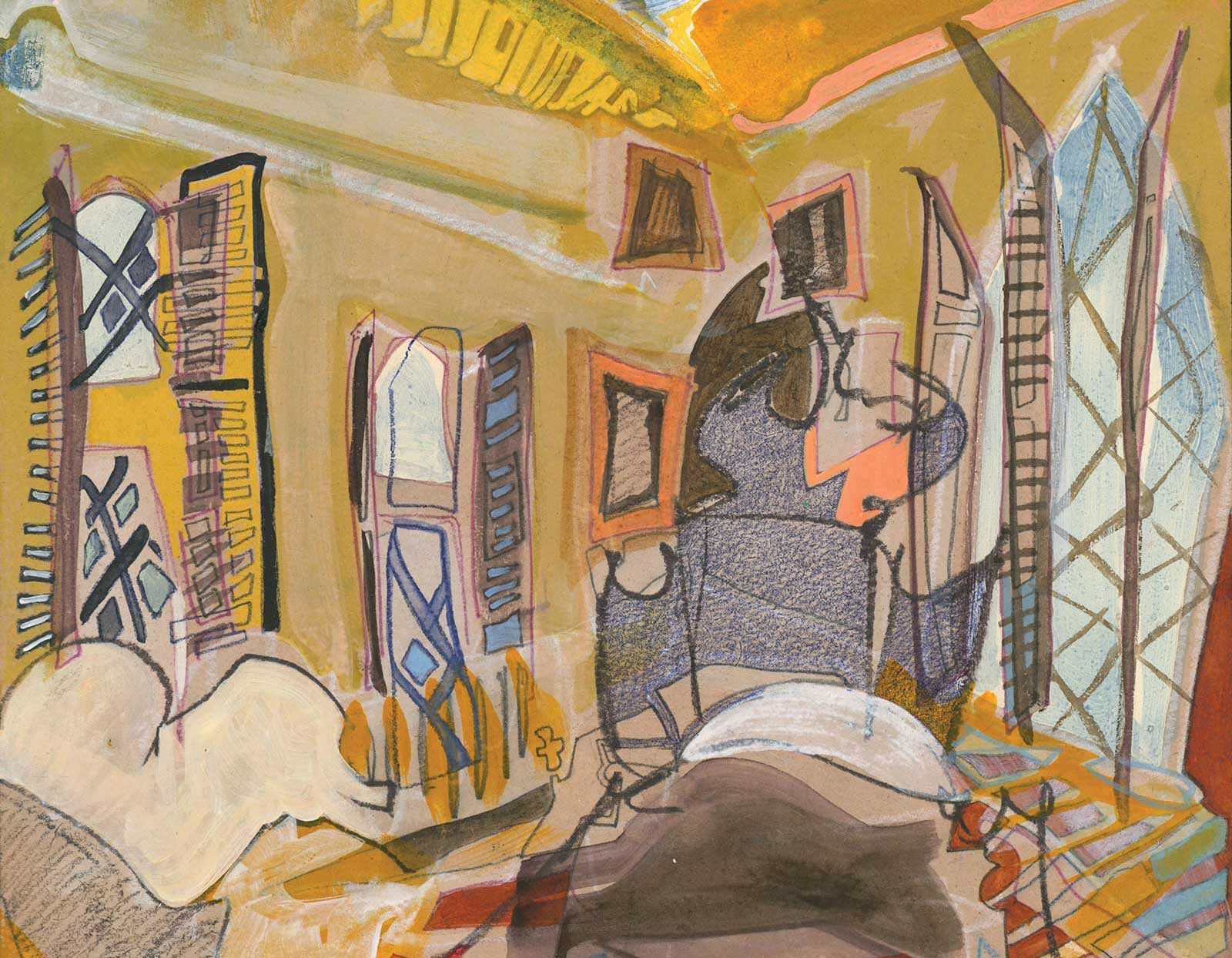
Stage 1 Major Forms
I start by sketching in the biggest shapes. The first lines were drawn with white and refined with dark brown and purple. The color is not important at this stage, but the contrast of lights and darks helps me more easily see the edits I’ve made.
 Stage 2
Stage 2 Adding Green to the Walls
The major change in this round is the watercolor green I’ve added to the walls. The early lines have created boundaries of positive and negative space, allowing me to “fill in“ the color of the wall. I’m also beginning to put shapes inside the carpet, though they aren’t a direct rending of the actual pattern.
 Stage 3
Stage 3 White on Windows
I’ve added an opaque layer of white to the windows. This will make the sunlight outside seem brighter, as it blocks the brown color of the surface. I’ve also added more pattern to the carpet, but I’m responding to the lines and shapes that are already there, rather than rending the actual pattern of the carpet.
 Stage 4
Stage 4 Positive and Negative Shapes
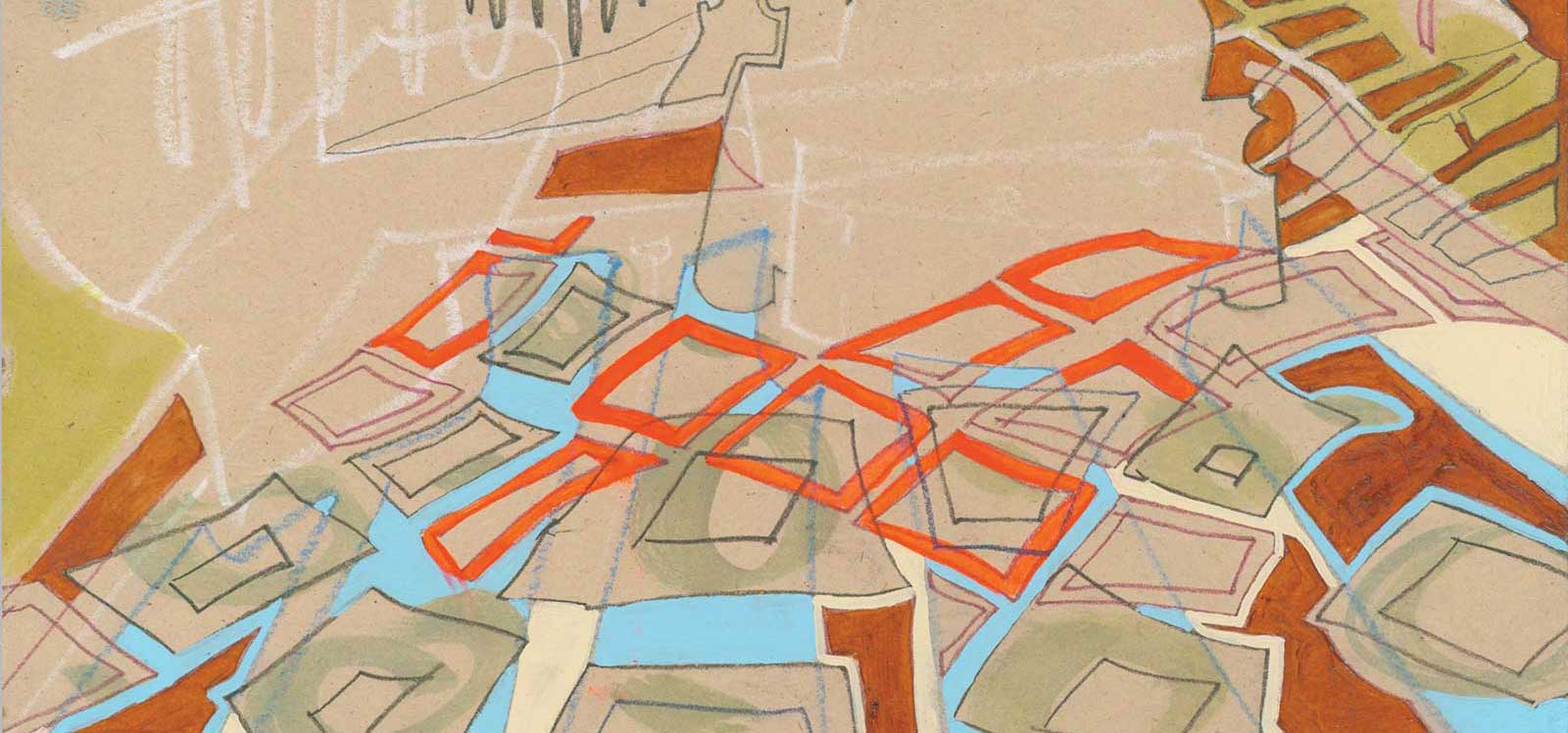
I am coloring in the positive and negative shapes formed by the lines I’ve drawn in the carpet. I’ve used a small brush to carefully paint the delicate blue, pink, white and brown areas.
 Stage 5
Stage 5 Loose Layer
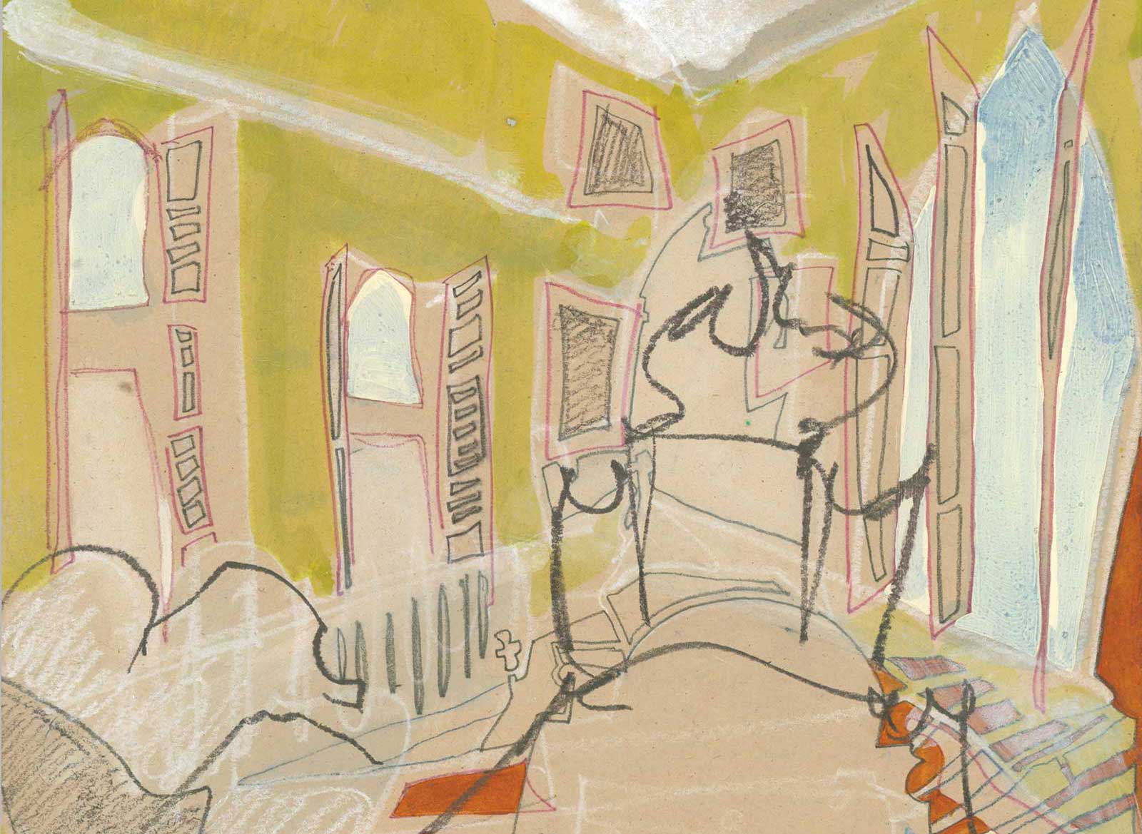
In contrast to the tightly controlled previous layers, this layer is more gestural. I’ve used a dark watercolor stick to quickly draw in the couch on the left and the fancy headboard of the bed. A watercolor wash of blue, particularly in the window on the right, adds a sense of atmosphere outside. While it was never my intention to make a faithful rendering of this room, this is likely the point in which I discard my source imagery and began working to resolve the painting that I have in front of me.
 Stage 6
Stage 6 Depth and Temperature
As the painting develops and objects settle into place, I don’t erase the early lines; this creates slivers of shapes that make these spaces feel like they are vibrating and collapsing. This is particularly evident in the ceiling. The white line from the first layer has become the bottom edge of the yellow swoosh on the top right, which makes the wall appear taller. In order to create a sense of depth, I’ve also begun shifting the color temperature of the walls in relation to each other; the wall on the left has a series of blue/green watercolor marks, painted dry-on dry, which makes the wall appear in shadow.
 Stage 7
Stage 7 Introducing Paint Markers
I have continued to adjust the wall on the left. There is a layer of white acrylic paint, which gets more opaque as it gets further up into the corner. Not only does the acrylic shift the color value, it also begins to block the ability of the panel to absorb layers, which allows me to introduce paint markers, such as the yellow paint marker I used to cover the blue/green watercolor marks at the ceiling and create a subtle pattern within the flat yellow wall. Lime green tick marks, also made with a paint marker, soften the transition from the ceiling to the wall on the right.
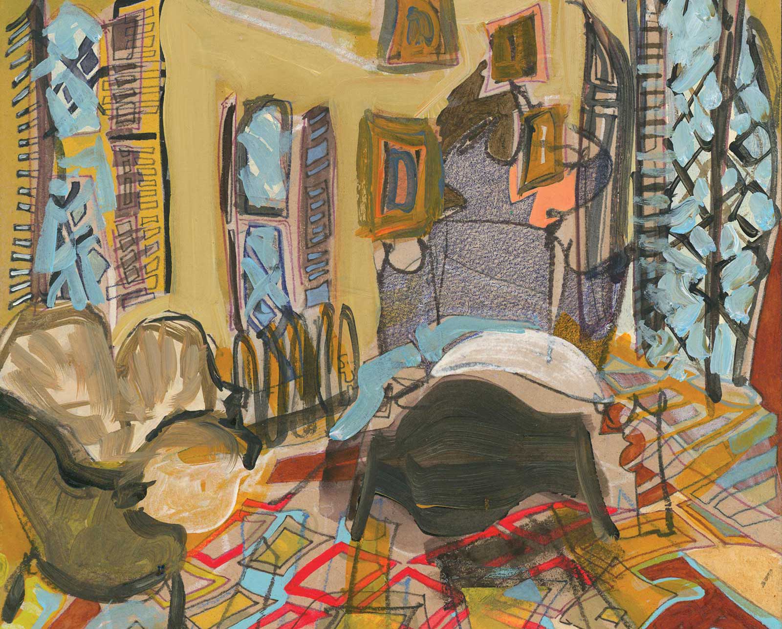 Stage 8
Stage 8 Thicker Acrylic Layers
So far, my layers have mostly been thin and transparent, which allow me to adjust the temperature and value of color based on the hues surrounding it in order to create depth. I introduce thicker layers of acrylic paint here, which make the couch, the bed and the picture frames feel more solid.
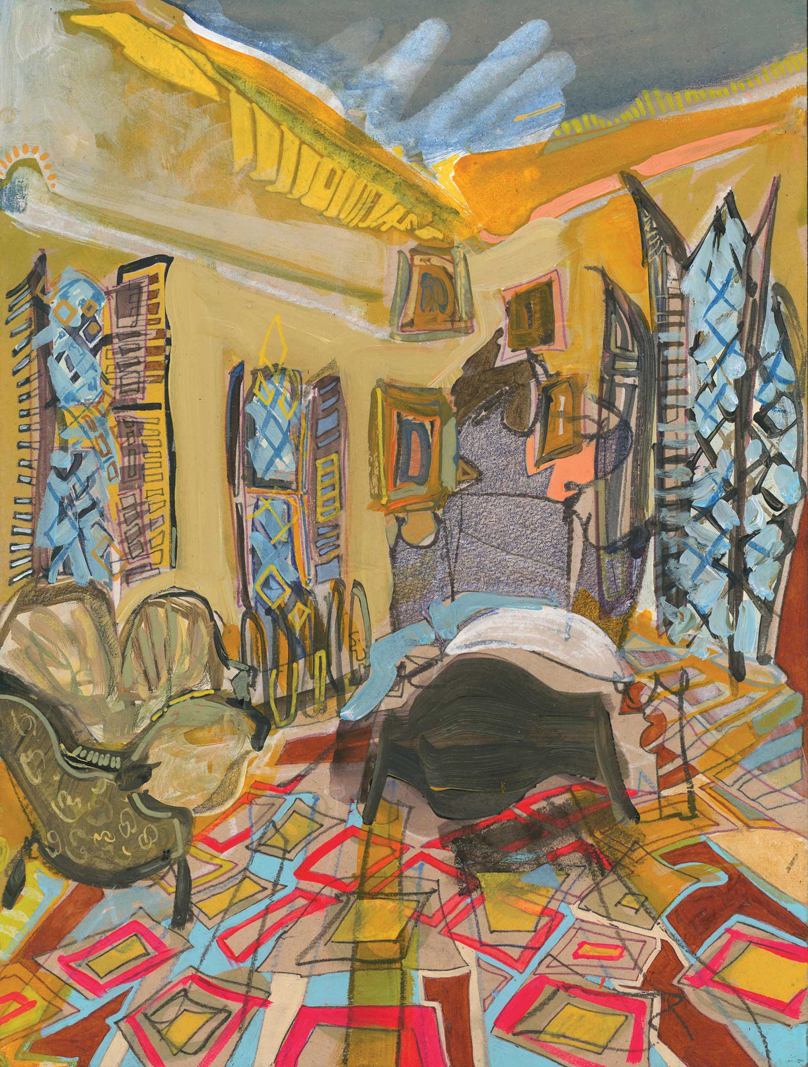 Stage 9
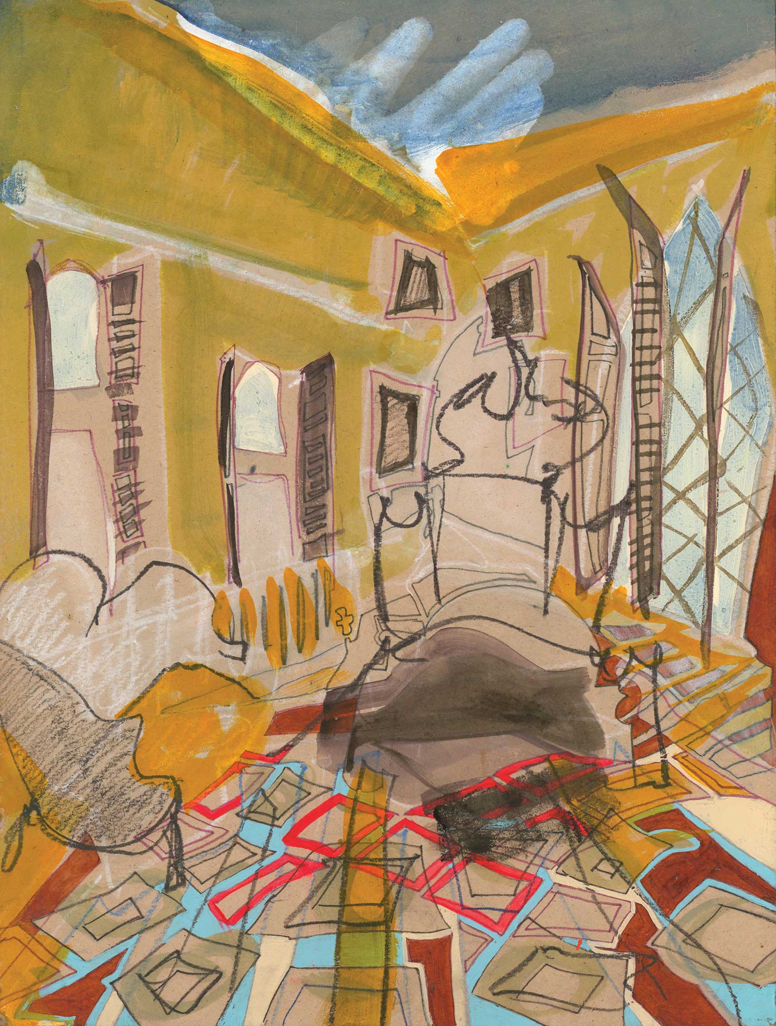
Stage 9 Finished Artwork
Garrison, NY No. 301, watercolor and acrylic on MDF panel, 20 x 16" (50 x 40 cm)
The final round of edits is used to add finer details to within the smallest moments of the painting. Gray green paint markers make the couch appear to be upholstered in a paisley pattern. Yellow paint marker diamonds elongate the window in the center, blue watercolors brushstrokes in the window on the right either read as a stained glass or suggest branches outside.
About the Artist
 Erika Stearly
In the years since completing her MFA at Indiana University of Pennsylvania, Erika Stearly was awarded residencies and taught at a handful of colleges and universities in the Northeast USA. Currently, she is devoted exclusively to her personal studio practice. Stearly primarily sells original and custom paintings directly to clients around the world, although she is represented by PxP Contemporary, an online art gallery, and Boxheart Gallery in Pittsburgh, Pennsylvania. She consigns paintings with Design Supply in Birmingham, Alabama, and continues to develop relationships with other boutique interior design firms across North America. She is particularly interested in finding a partner who can help her better serve clients in Australia. Stearly debuts new paintings via her website and Instagram each April, August and December, and is preparing for a solo exhibition with Boxheart Gallery in early 2023.
Contact at
www.erikastearly.com