


I’ve always loved animals, and this love was steadily growing, so my husband and I chose to travel to areas where you can find animals in their natural habitat. It was wonderful to see how they behaved and how they hunted. We went to South Africa, Botswana and Zambia, as well as Norway, Sweden, Ecuador and the Galapagos Islands. Nature was the key focus of our trips. For the last few years, we have been returning to Bonaire, where the underwater world is amazing. Whenever we travel, I always take my camera. I love using my photography skills to capture the natural beauty and maybe to inspire my next drawing.
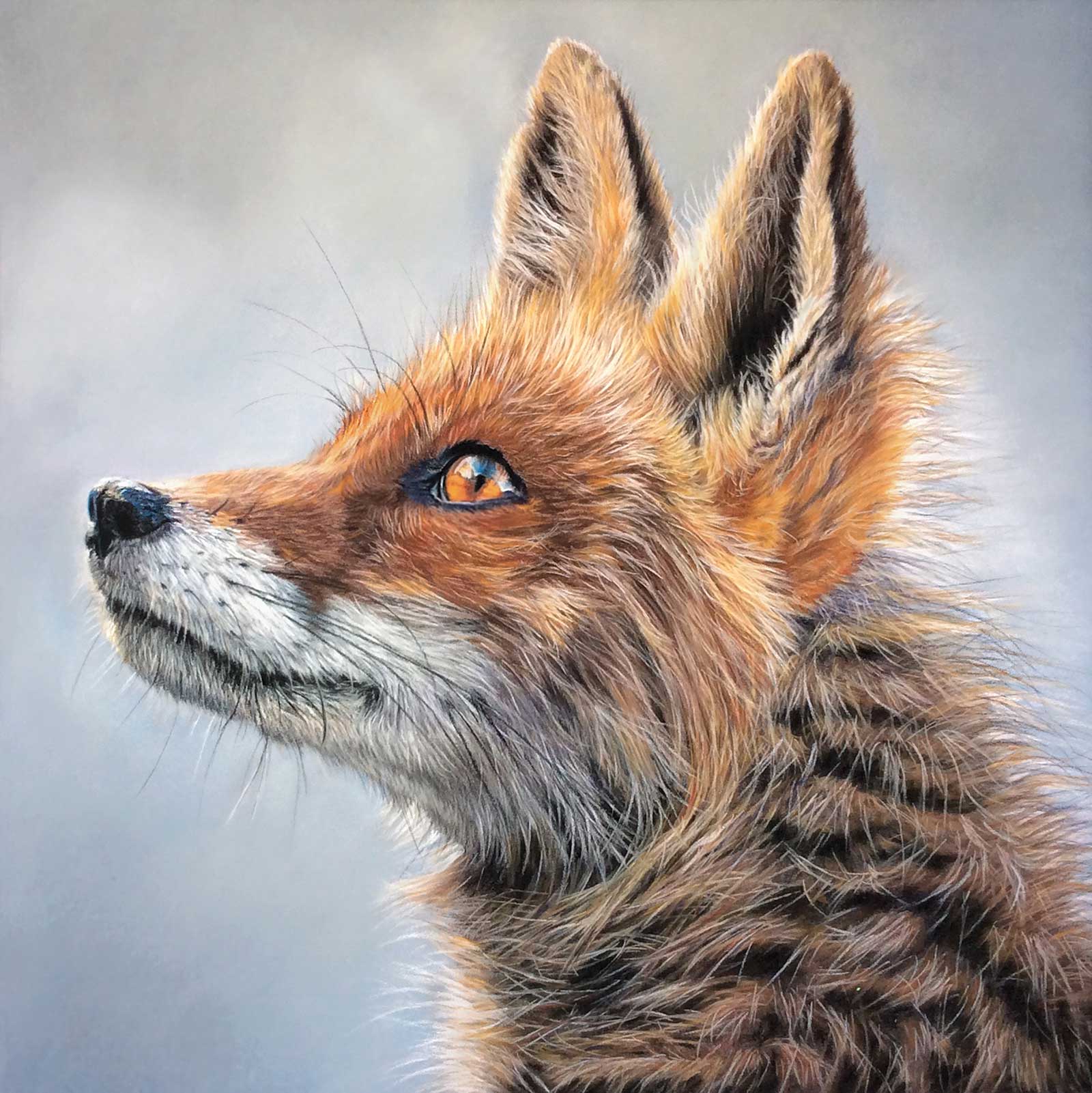
Hope, Softpastel and pastel pencils on pastelmat, 12½ x 12½" (32 x 32 cm) The posture and illumination of the fox give it a hopeful appearance. The backlit fur, together with the cool tones of the background, make the fox pop out.
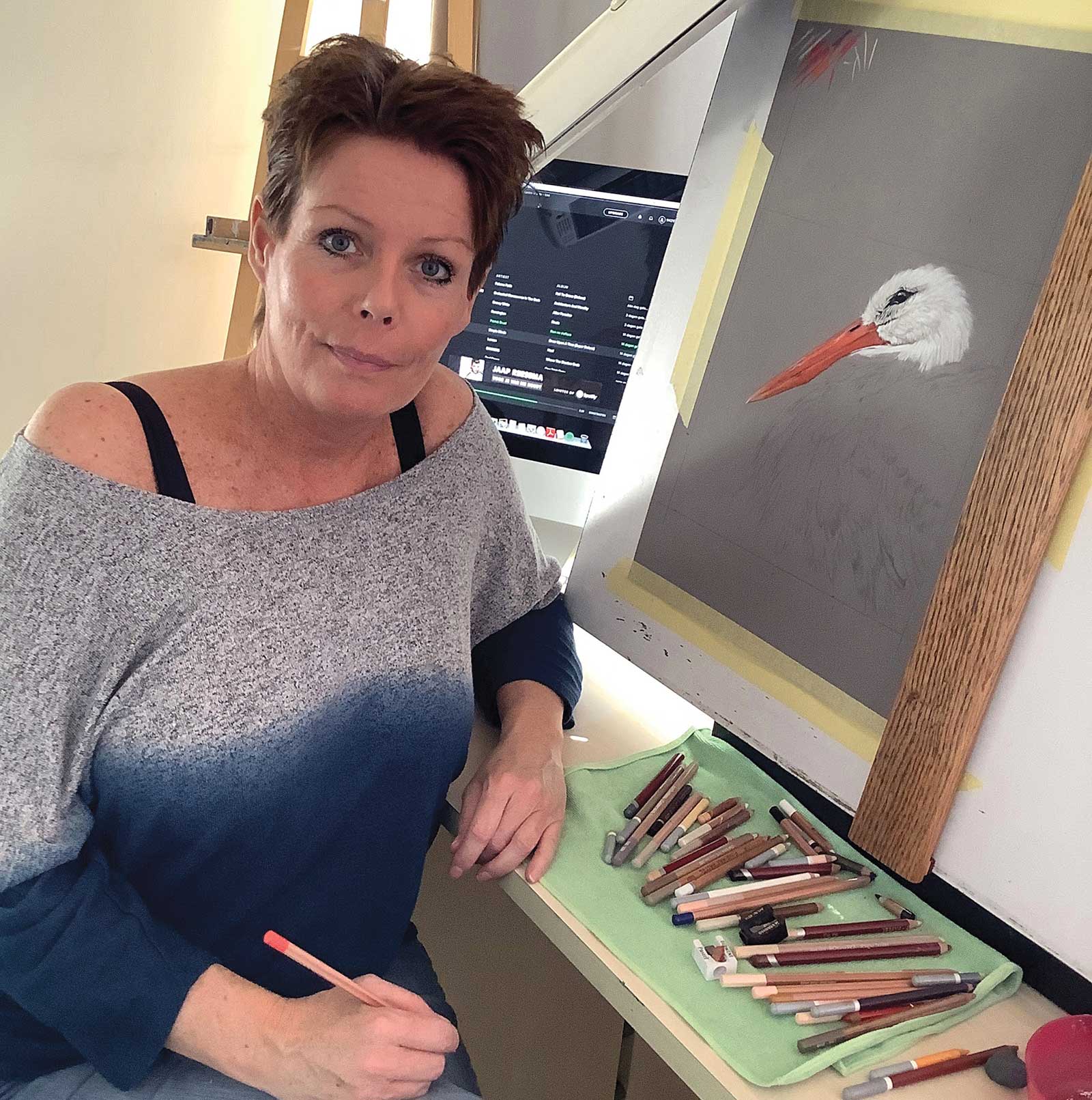
When I have chosen my subject, I search for a good photo reference. Sometimes I take them myself to get exactly what I need. Next, I crop or rotate the images or use different colors so that it becomes what I have envisioned. Sometimes I will combine two separate photos into one drawing. The background is sometimes simplified so that all the viewer’s attention goes to the subject. Then I start the actual drawing, by sketching the image’s outline shapes. After that, I create the underpainting with a medium color. And from there, I carefully build up the layers. Each area will be completed separately, adding darker tones and light into the drawing. I usually start in the left-hand corner of the drawing. But if you have a complex drawing, like feathers, you have to work in a different way. It depends on how easily you can build up those layers.
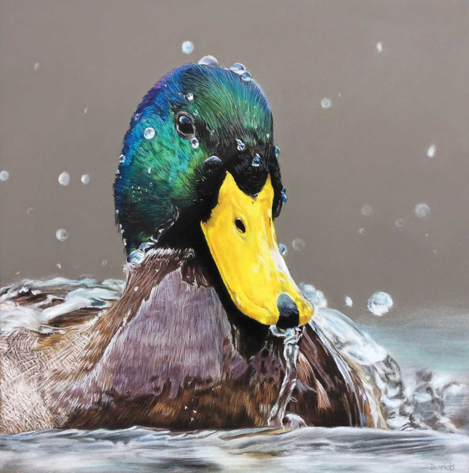
Splash, Softpastel and pastel pencils on pastelmat, 10 x 10" (26 x 26 cm) For this drawing, I chose to keep the gray pastelmat color as the background since it contrasts well with the brilliant colors of the duck’s head. Photo reference: Jan-Willem Mantel.
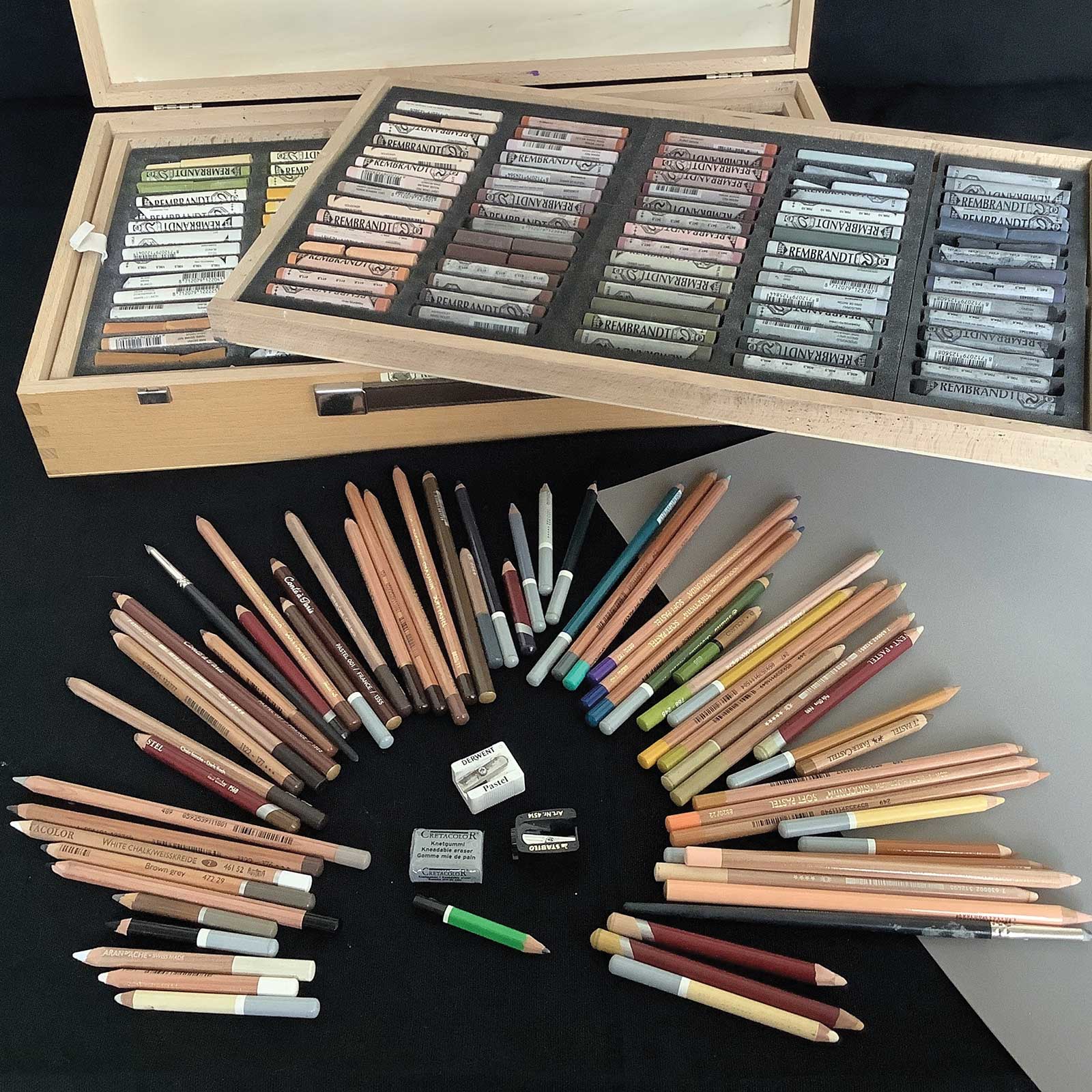
I mostly use Clairefontaine pastelmat, but I sometimes use Canson Mi-Teintes Touch, which is also a good paper. For finer details I find that pastelmat is the most suitable. The Rembrandt pastels I use are for backgrounds and for the underpaintings. I also use them to darken or lighten some areas. For the finer details, I use pastel pencils. I use various brands of semi-hard pastel pencils like Faber Castell or Derwent, but also Carbothello, Cretacolor, Conté and the softer Caran d’ache. Mostly I like to buy them separately because each brand has its own color palette and hardness scales.
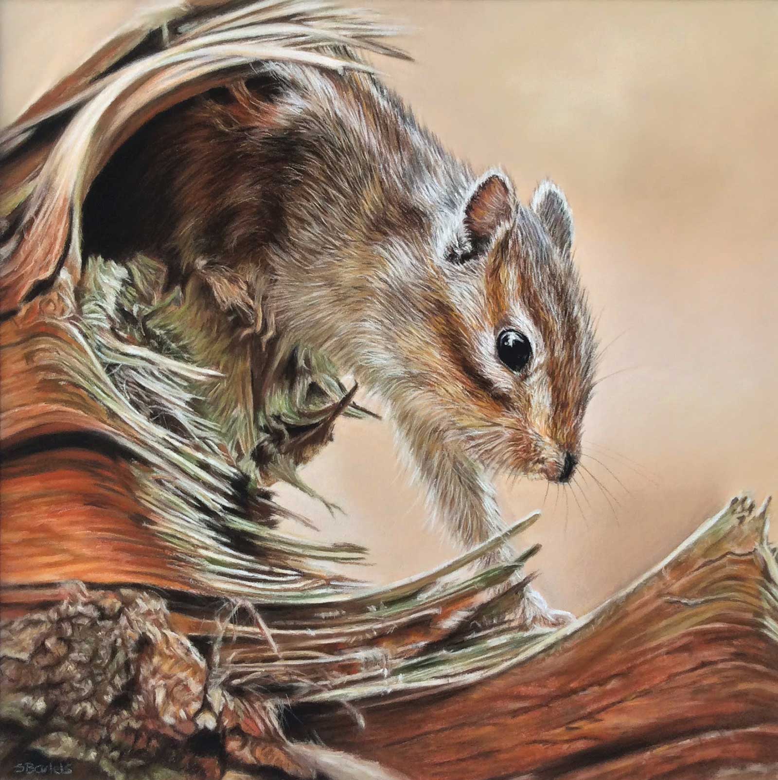
Venturing Out, Softpastel and pastel pencils on pastelmat, 10 x 10" (26 x 26 cm) I enjoy drawing smaller creatures, and this was such a sweet one to draw. What I particularly liked about this composition was how the stump frames the chipmunk as he emerges. I feel this image gives you a brief glimpse into his world, before he quickly scampers away. Photo reference: Marleen van Eijk.
I love using pastels because they are so well suited for achieving a realistic effect. They are also very versatile in use, giving so many creative possibilities. One of the key features of my drawings is the animal or subject being brought to life. That’s my goal; not making the animal more beautiful, but trying to draw in such a way that the specific personality shines through. I always choose my subject carefully. It must connect in some way and it must convey emotion. This also depends on what my own emotions are at the time. Therefore, in my wildlife drawings, you can see my own emotions shine through, even though that’s not always my intention.
I have recently started using acrylic paints, as I wanted to try something completely different and I’m finding it really enjoyable. My next challenge is to experiment with a looser style, in both mediums. However, realism remains a style that I will continue to do.
My Art in the Making Watching over me
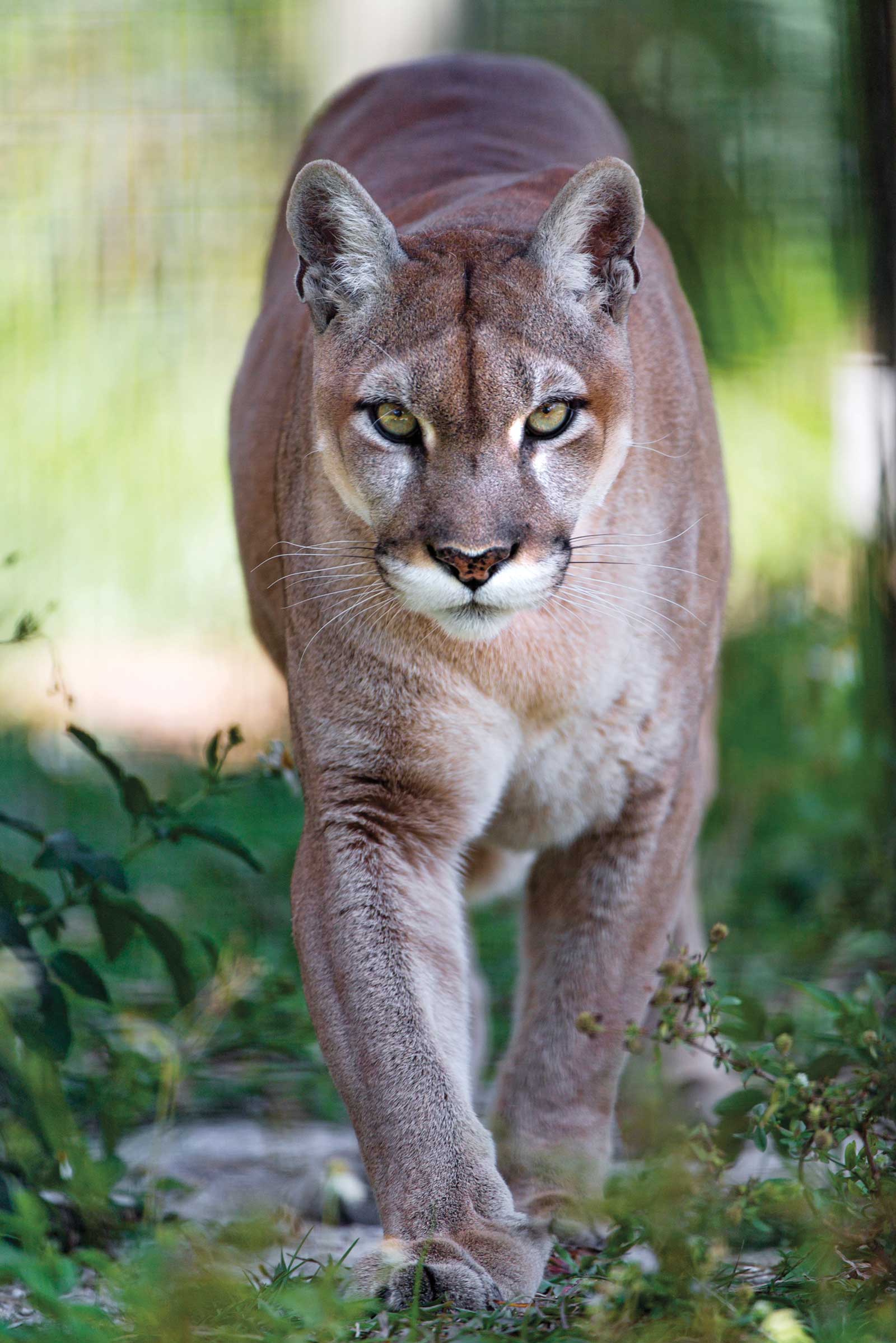 Reference photo
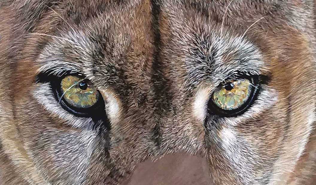
For this demonstration I chose this particular picture because I was intrigued by the eyes of the puma and wanted to capture that feeling in my drawing. I cropped and changed it so that the main focus is on the eyes and his expression.
 Stage 1
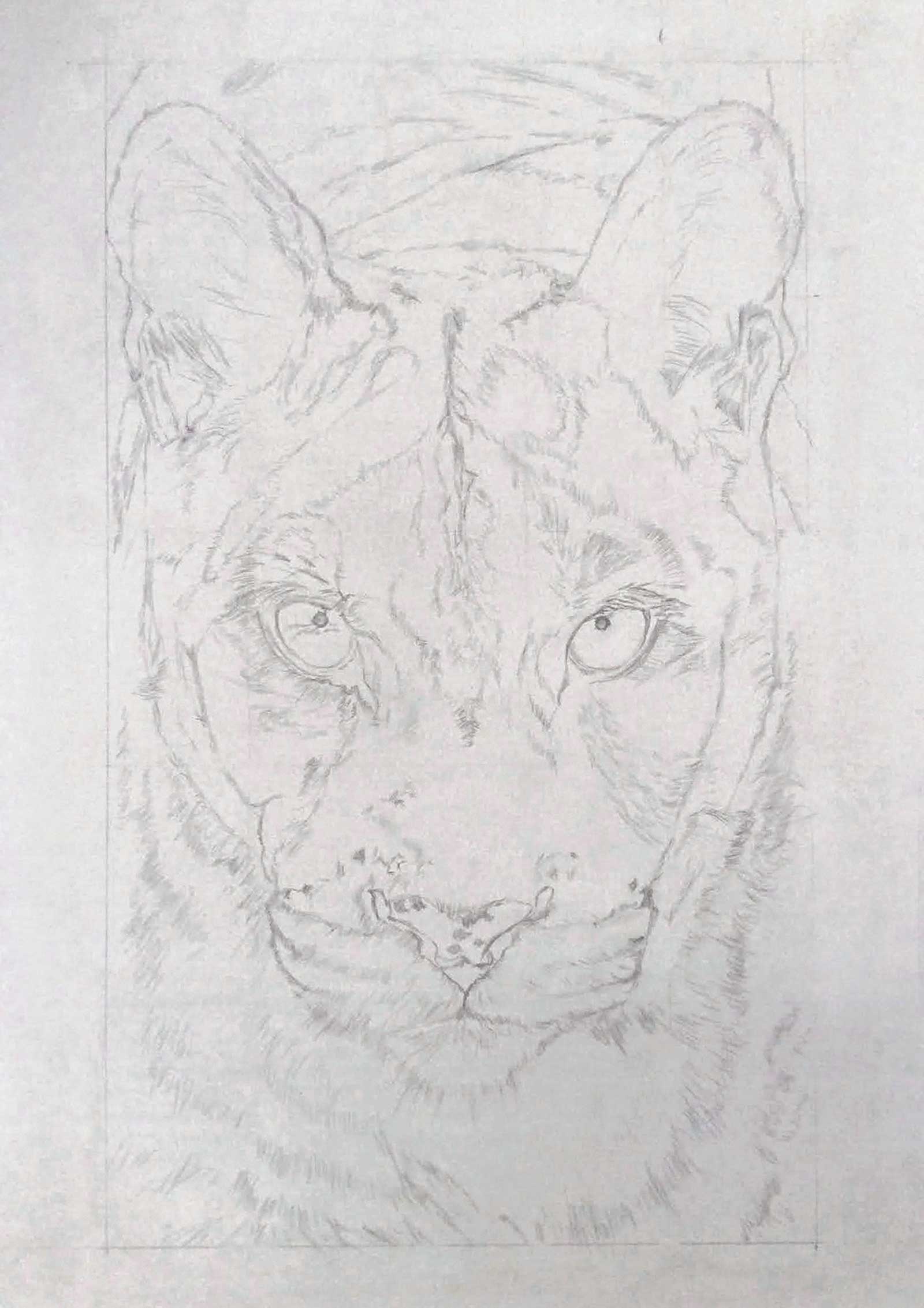
Stage 1 Outline Drawing
On this occasion, I chose to put a lot of details into the outline drawing. I used my iMac to view the reference photo because I can zoom in and see all of the details more clearly. To draw the outline details, I used 2B and HB pencils.
WHAT THE ARTIST USED
Pastels and pastel pencils
Gray pastel paper, 20 x 27" (50 x 70 cm)
Additional Supplies
iMac and drawing board, Pencil sharpeners, 2B pencil, Kneadable eraser
 Stage 2
Stage 2 Blocking in Mid-tones Darker Values
Also named the ugly phase—I used the Rembrandt pastels to add many different types of browns, and I also used black and purple pastels. No detailing was added at this stage.
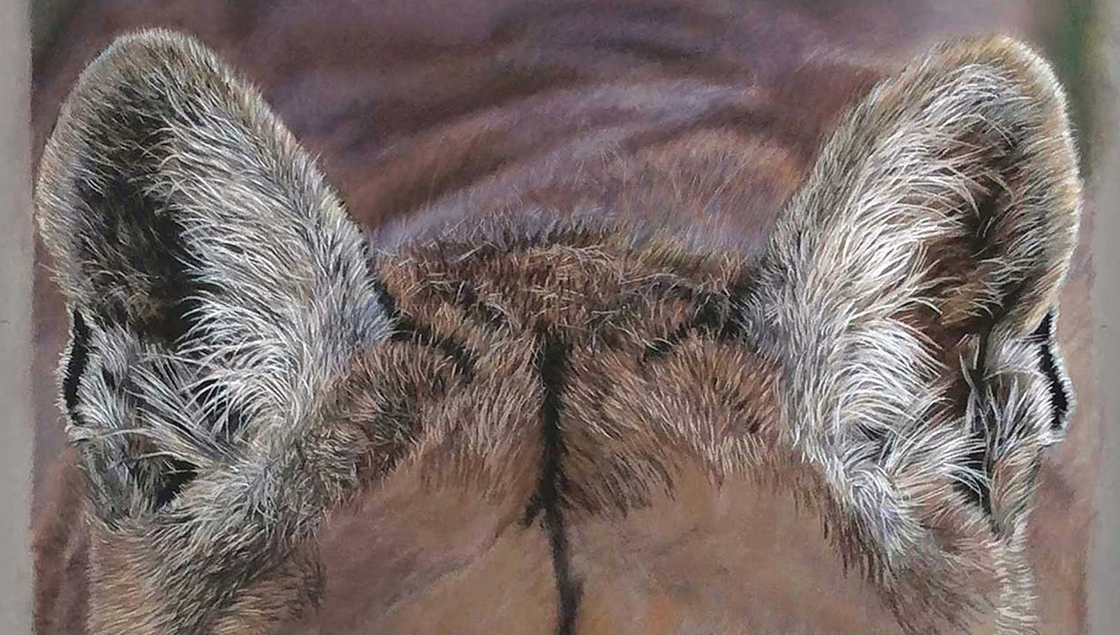 Stage 3
Stage 3 Drawing the Ears
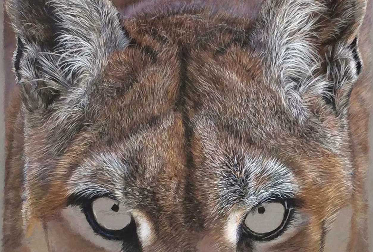
I started in this case in the left-hand corner with the shoulder area and his ears. I used pastels first, then pastel pencils on top, slowly working from dark to light. For the ears I used different shades of gray, browny-gray, browns, olive-brown, some blacks, some purple and ochre. Building up the layers is the most important element in creating a realistic effect.
 Stage 4
Stage 4 The Forehead
There were lots of thick, short hairs to draw in different shades of color from dark brown to reddish brown. I began with the black/brown stripe on his forehead and worked towards the sides from there. I drew all the different directions of the hairs and adjusted the various values of the fur for a natural effect.
 Stage 5
Stage 5 Drawing the Eyes
I always love doing this stage as it “comes to life” a bit. Here I am also drawing the left and right sides of the puma’s head. I used a lot of different colors in the eyes. This stage is all about sharp pastel pencils, because of all those small details. To maintain a good sharpness, I use two kinds of quality pastel pencil sharpeners.
 Stage 6
Stage 6 Drawing the Nose and Mouth
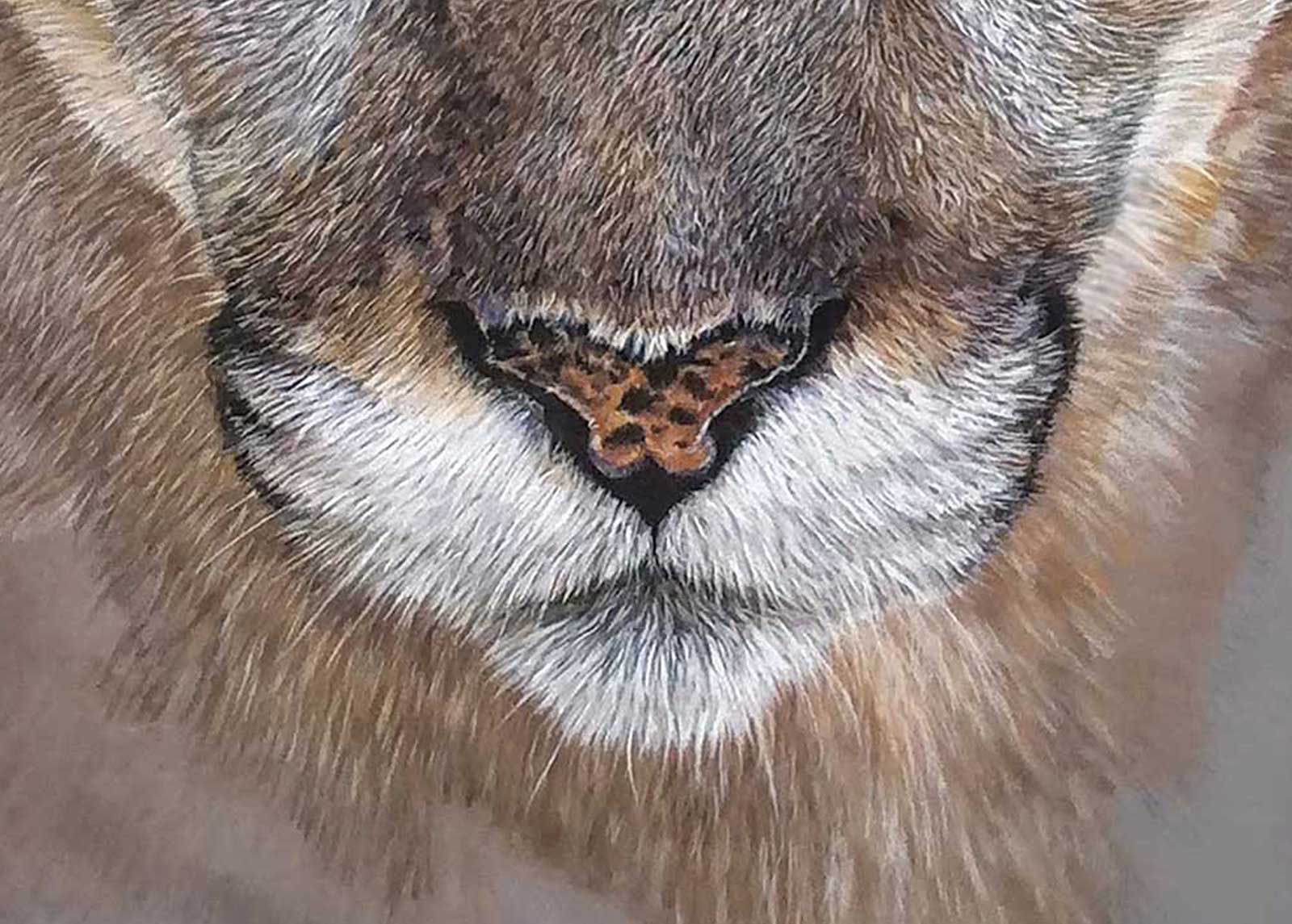
There were many details on the nose, requiring lots of browns, ochre and chocolate-brown, which were also done with pastel pencils. The highlights in the fur were made with light flesh and azuren white. For the nose itself, I used reds, pinks, oranges, plus some blacks and purples. For the mouth area, I first used grays for the underlayer. Then some purple and some blues, and from there I used lighter colors, slowly building up the layers.
 Stage 7
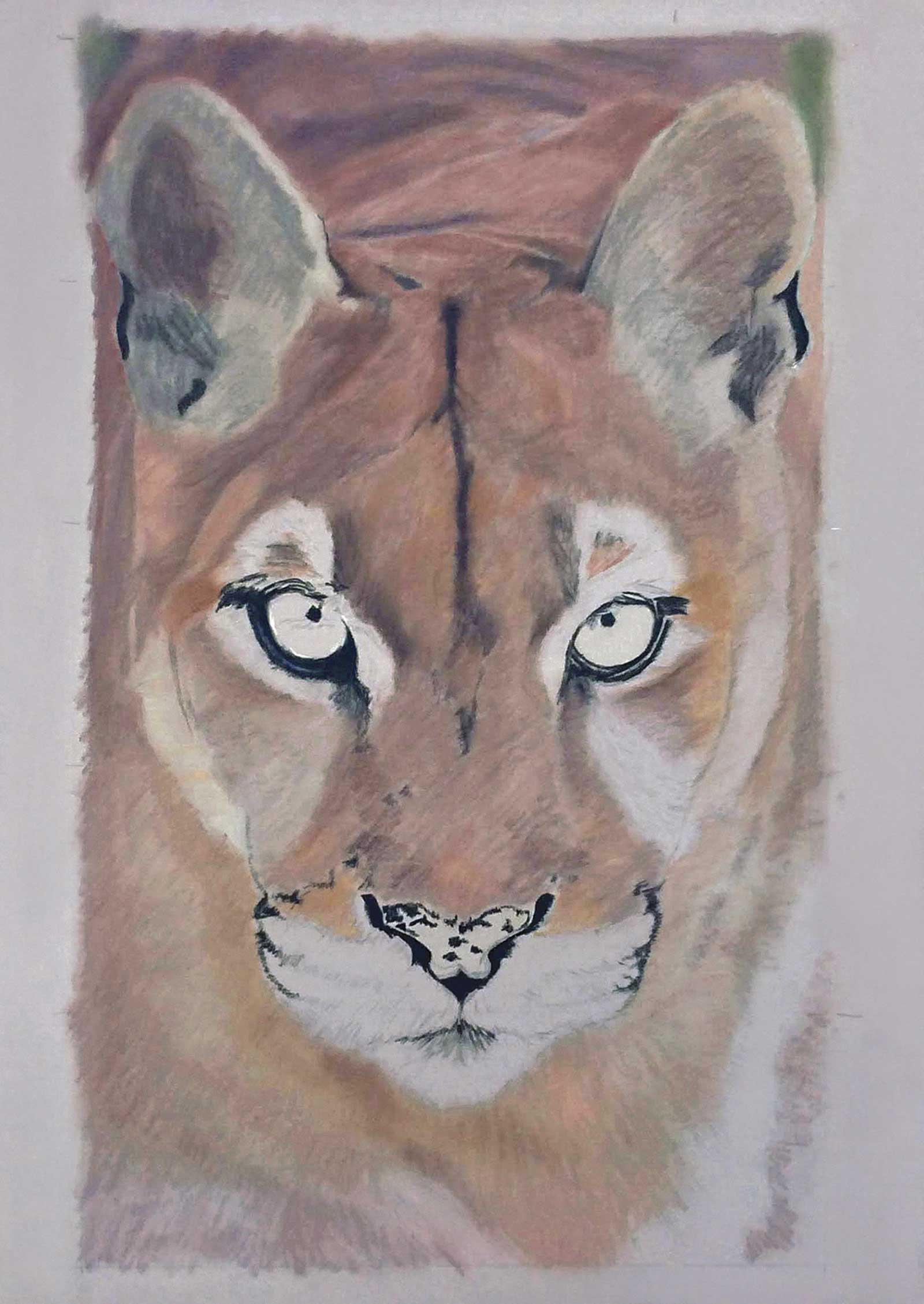
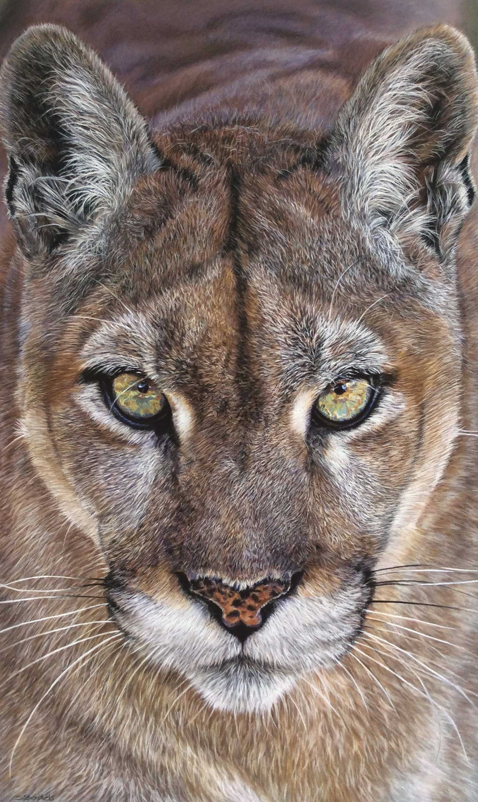
Stage 7 Finished Artwork
Watching over me, pastel and pastel pencils on pastelmat, 19½ x 12" (50 x 30 cm). After finishing the body and whiskers and getting those final details in place, my drawing is finished. I really loved creating this puma with those staring eyes. The whole time I was drawing him, he was watching my every move, or so it seemed.
About the Artist
 Sandra Bartels
After studying design, Sandra Bartels worked in advertising as a designer/desktop publisher for many years. She loves to travel and take walks in nature. In 2016, she started drawing realism with pastels. She is a self-taught artist and continues to develop her pastel technique. Her inspiration mostly comes from nature and animals. Capturing the personality and expression of an animal is especially important to her.
In 2019 and 2021 she had the opportunity to exhibit in the Netherlands at the Staphorsius Gallery in Westzaan. She also entered her wildlife drawings into the ‘Wildlife Artist of the Year 2019’ competition hosted by the David Shepherd Wildlife Foundation. She was delighted when her drawings were selected to be part of the finalists’ exhibition held at the Mall Galleries in London. She became a finalist again in 2020 and recently in 2021, when she also won an honorable mention.
In 2021 she participated the American Art Awards, winning 3rd and 4th place in the realism animal category. She also became a finalist in 2021 at the Richeson75 competition, in the category Animals, Birds & Wildlife.
Contact at
info@sandrabartelsartist.nl
www.sandrabartelsartist.nl