


Portraiture and realistic painting in gouache is an often difficult task for painters starting with the medium because of its unique properties. Gouache does not tend to layer very well, making painting with it a challenge at first. The challenges I most often hear about when it comes to gouache painting are that the colors in the painting tend to get muddy fairly easily, and getting a smooth consistency is difficult. There are many techniques one can use to achieve a successful gouache painting, the specific techniques I use are “color blocking” and having a bright underpainting to allow for the colors in a painting to be more harmonious. In my experience, gouache paintings have been best achieved using a maximum of two layers. I typically block in the main colors of the image, whether it be a portrait or landscape, then add a thin layer of details to complete the painting. Because this technique of blocking in colors does inevitably leave spots of open, white paper, I always use a colored underpainting choosing a color that goes best with my color scheme. With portraits, I often use a pink or orange underpainting for lighter skin because it brings out the undertones best. With darker skin I opt for an orange or yellow underpainting. I get many questions about why one should try an underpainting with gouache and the main reasons are that it allows for the color to shine through the semi-translucent paint to unify the color palette, and also because it covers any gaps in the painting with the color blocking technique I use. This avoids leaving spots of white paper remaining in the finished piece.
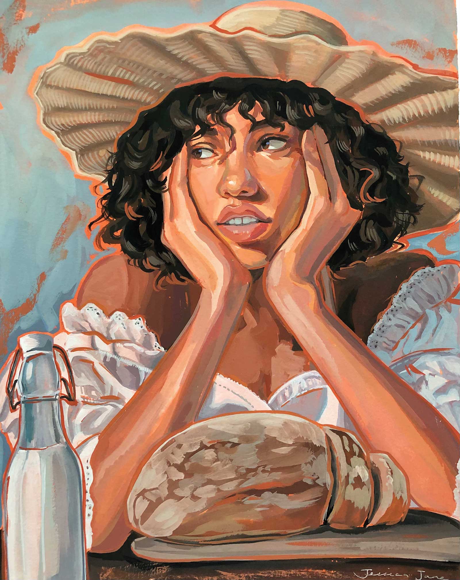
Afternoon Brunch, gouache on watercolor paper, 18 x 12" (45 x 30 cm) This piece was achieved using a bright orange powdered watercolor underpainting and the colors were blocked in with a single layer followed by details added on a second layer. The shadow colors I used feature many purples and blues because they agree well with the skin tone.
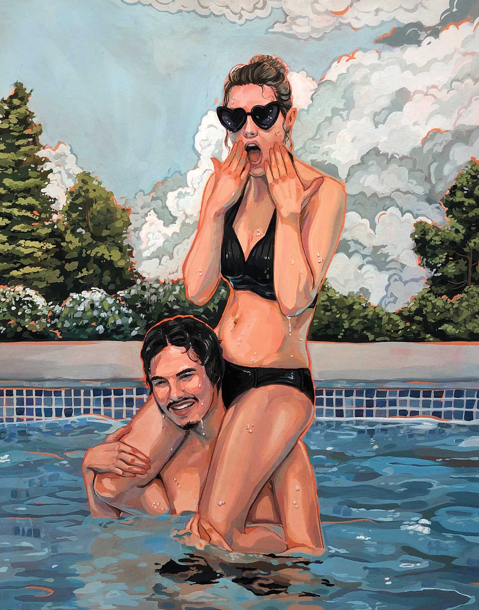
Pool Day, gouache on watercolor paper, 18 x 12" (45 x 30 cm) This piece started with an orange powdered watercolor underpainting to contrast the main blues in the image. The skin has shadows of combinations of purple, green and burnt sienna. There are also blue reflections across the skin to give the appearance of the water being reflected.
Gouache can also be a tricky medium because of its ability to reactivate. This is why I approach gouache paintings with a two layer maximum as to prevent previous layers reactivating with the addition of more paint. Gouache’s reactivation capabilities can also be a benefit though, especially when it comes to colors in a painting. When I paint I mix colors on a plexiglass palette where the gouache quickly dries. For each part of the painting, I try to incorporate colors I have previously used elsewhere to make the colors harmonious. In this demonstration, I reactivated some skin tones I previously mixed and added them into the hair and parts of the background. Paint to water ratios with gouache is also tricky to learn at first. For my paintings, I usually first wet my brush with water then pick up a small amount of paint and place it on my palette and add more water as needed. If the gouache is not applying to the paper smoothly, there is not enough water added so I wet my brush and try again. If the gouache is applying streaky, there is too much water added or the color chosen is too translucent and needs to have a more opaque paint mixed in, which is usually why when I mix colors for my painting I always add a decent amount of white gouache to each color to thicken the paint.
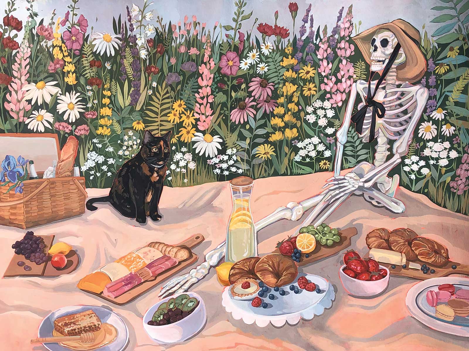
The Picnic, gouache on watercolor paper, 18 x 24" (45 x 60 cm) This piece began with an orange powdered watercolor underpainting followed by color blocks of the main colors in the image. Then details were added to the foreground. Finally, the background was added from left to right with a floral pattern. The orange underpainting allowed for a warm tone to the image as can be seen in the blanket. A very thin layer of white was applied, which was translucent enough to allow for the orange to show through.
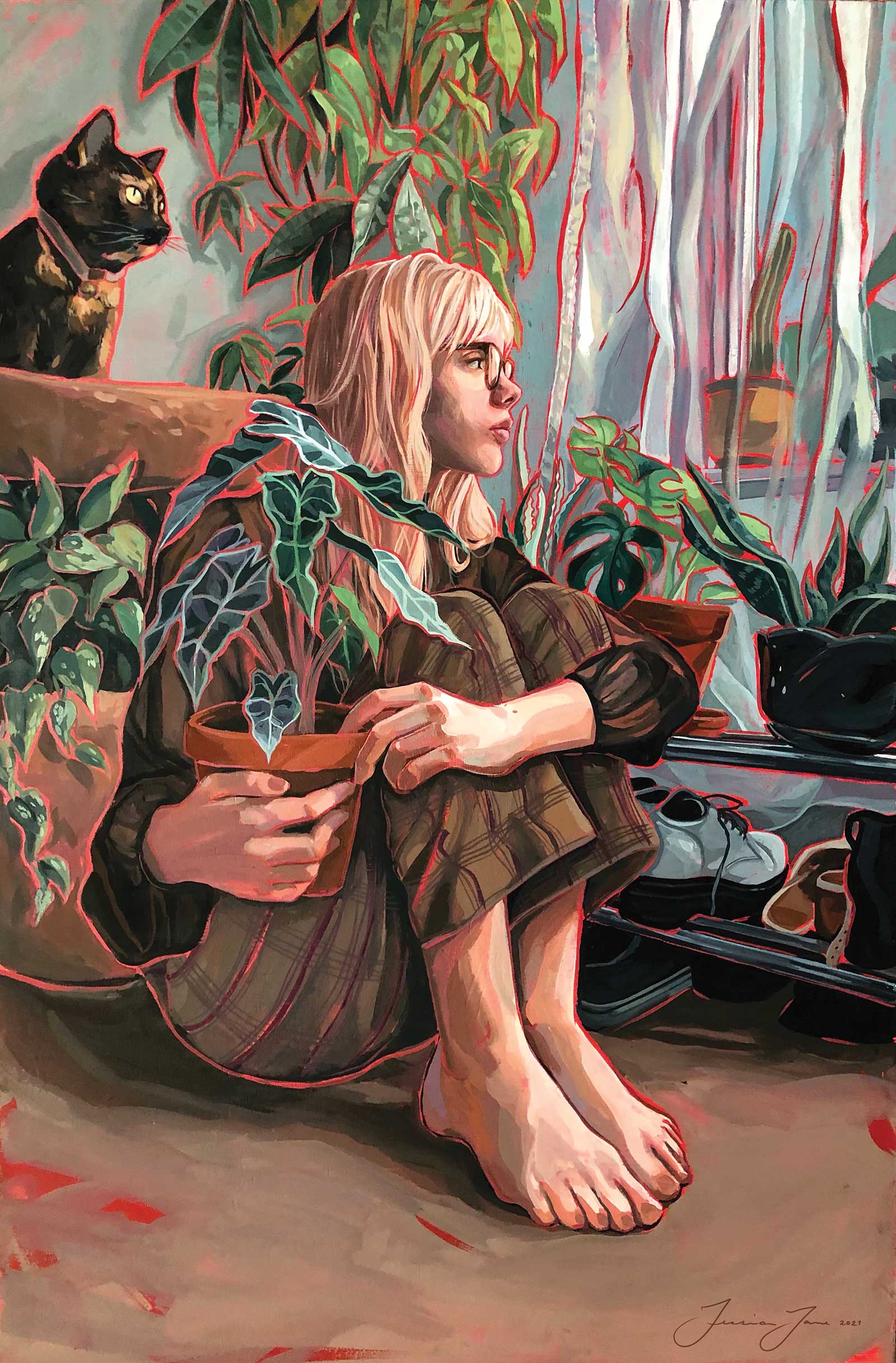
Houseplant Jungle, acrylic and gouache on acrylic gesso primed plywood panel, 24 x 12" (60 x 30 cm) This piece began with priming the wood panel with acrylic gesso then sanded with sandpaper. Then an acrylic base of pink was painted on in two thin layers. The subject was then sketched in and painted with gouache. Because the base was completed in acrylic, it allowed the gouache to stick and blend well on the wood panel.
When considering colors in a painting, it can sometimes be difficult to determine the best tones to add into skin for a realistic look and prevent the skin from looking “washed out.” For many years it has been a struggle for me to skip the tan and brown colors in skin and try a more unique approach. To add depth into both light and dark skin now, instead of the typical browns many artists use for shadows, I apply shades of green and purple. Greens and purples add a lot more depth to the skin tones of the painting than the usual browns and make the overall color palette more interesting to look at. Adding bright oranges to some parts of the skin too in combination to a colored underpainting can bring a portrait to life.
My current painting technique for all subject matter is to first conceptualize a color palette, then choose an underpainting color that I think best suits the desired effect. If my goal is to have a warm atmosphere in the painting, I will most likely choose a bright orange underpainting. After the underpainting is applied to the paper, I sketch the subject. Then, I apply the darkest parts of the painting in black. Many artists start with light colors, however, I have found with gouache’s ability to layer light on dark, that putting the darkest parts of the painting first allows me to define the shapes best. After this, I apply the main colors of the image with the blocking in technique. I condense the main colors into several brushstrokes of paint and then once that is dry paint a very thin layer of detail. Adding many layers, and particularly thick layers in gouache, creates the issue of colors blending and turning a gray-brown color. Finally, I apply the background and make the stylistic decision to allow many areas of the colored underpainting to show on the finished artwork.
My Art in the Making Morning Light
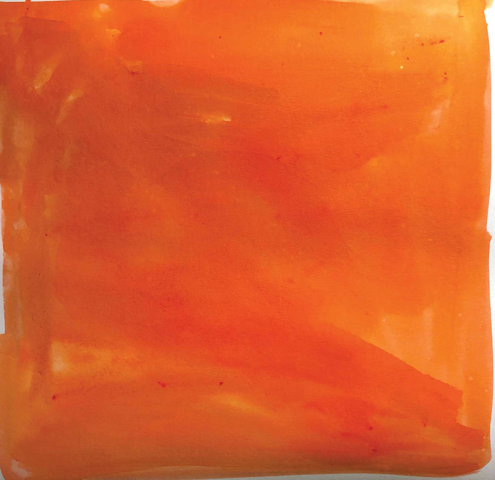 Stage 1
Stage 1 Thin Layer of Water
I begin the painting by adding a thin layer of water to a thick watercolor paper. I then apply a thin yet vibrant layer of Ken Oliver Color Burst watercolors, which are a type of powdered watercolor that has an extremely vibrant color and does not lift once dry.
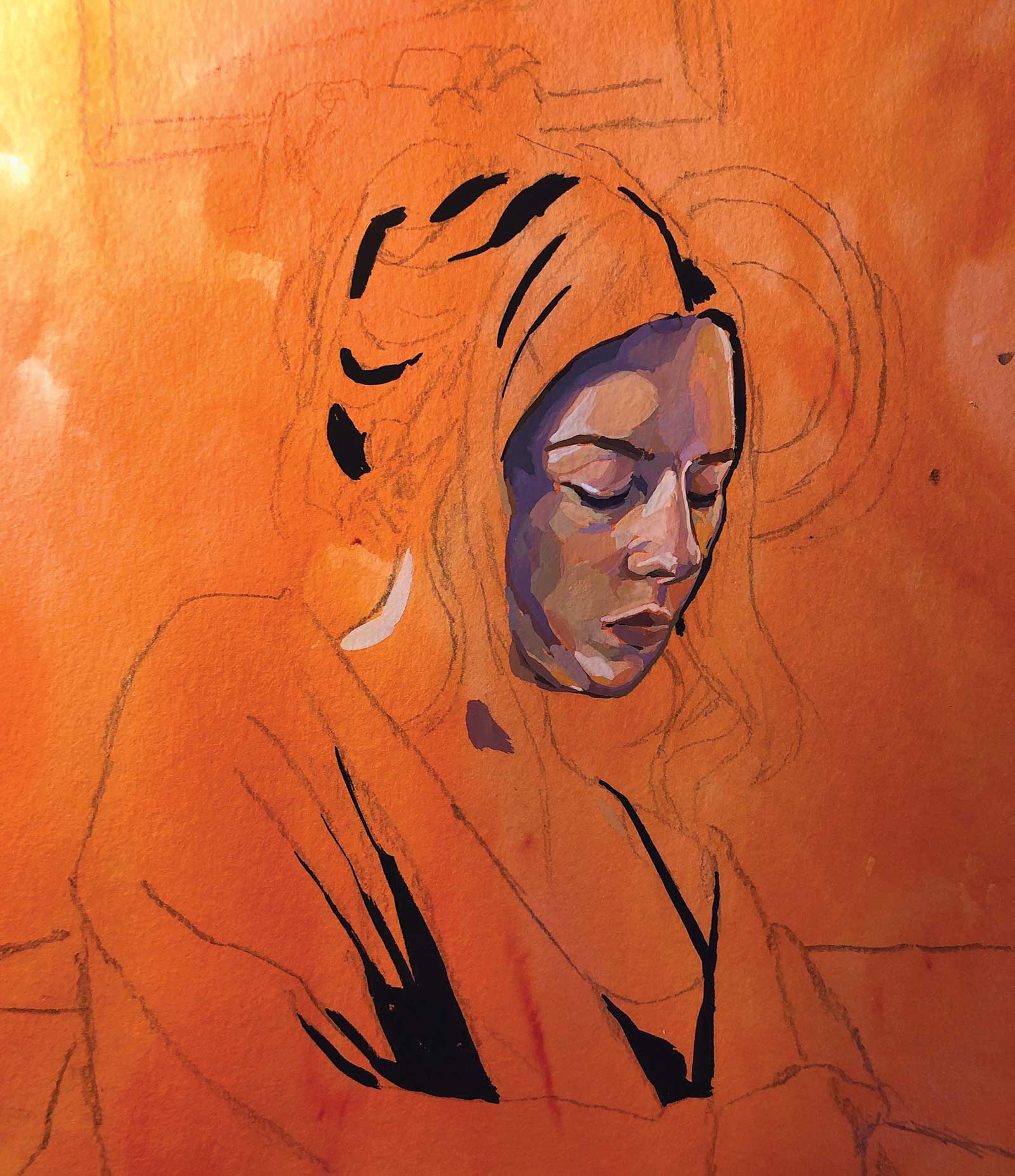 Stage 2
Stage 2 Sketching the Subject
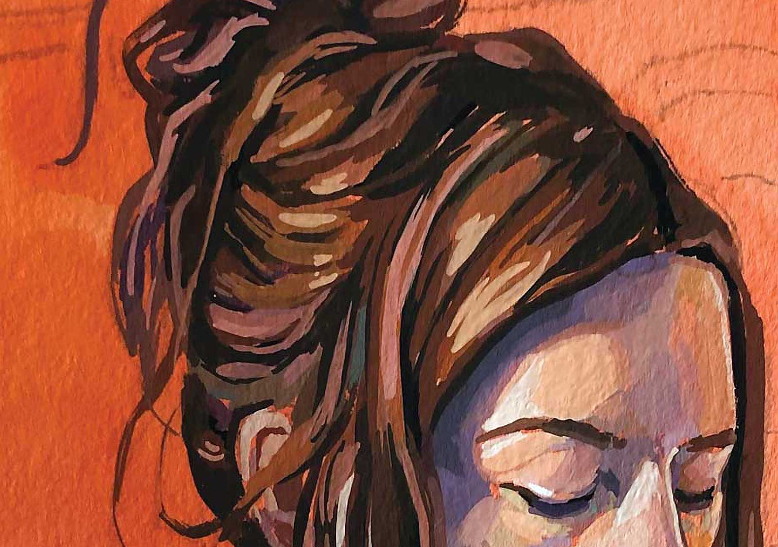
The subject is then sketched onto the paper after the underpainting dries. I apply the darkest areas of the image in black gouache, then block in the main tones in the skin. For the darkest shadows in the face I apply several different shades of purple to convey the depth. In addition to the purple, green and orange are mixed together and applied to other shadowed areas. The green will dull the orange paint and works well for shadowed areas that are not significantly dark.
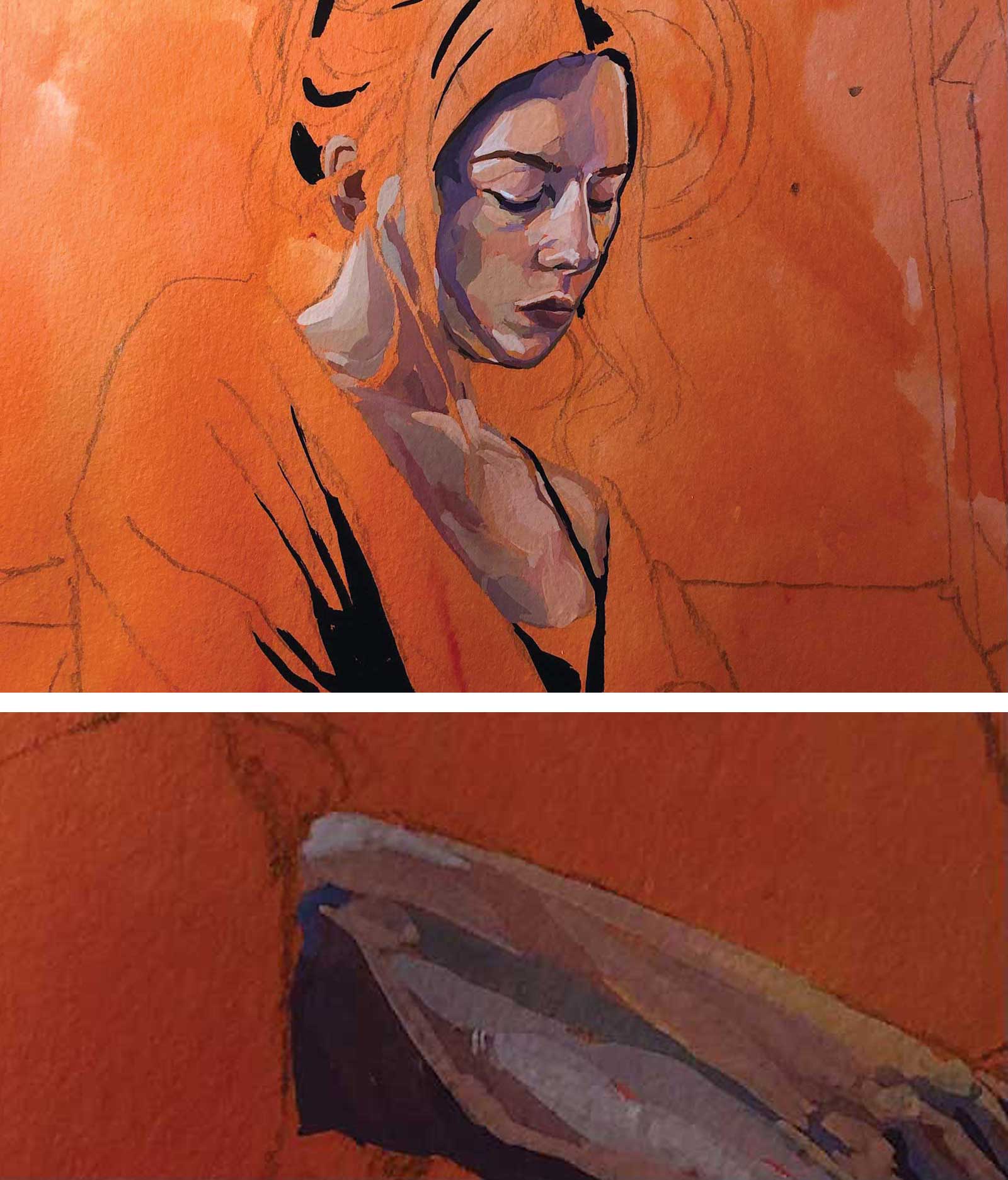 Stage 3
Stage 3 Mixing Skin Tone
The skin of the chest and hand are then blocked in, using many similar colors to the face. For a majority of the skin, I mix a marigold orange with a burnt sienna, and add a large amount of white to achieve the desired skin tone. With this mixed skin tone I add magentas, greens, blues and purples as needed for the shadows and highlights. Because the background is a vibrant orange, the brightest highlights in the skin are achieved using pure white which is translucent enough to allow for some of the orange underpainting to show through as it dries.
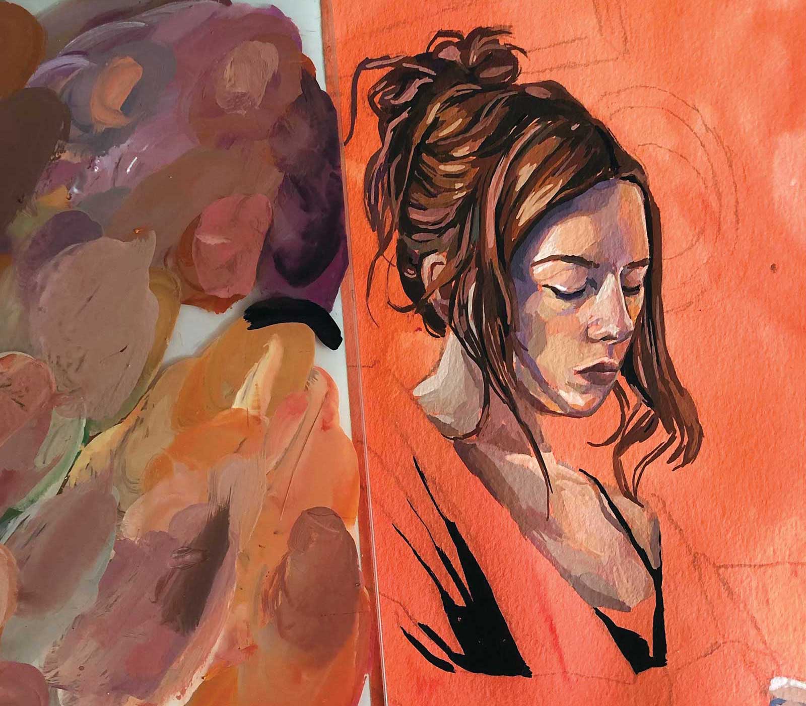 Stage 4
Stage 4 Starting the Hair
To choose colors for the hair in this image I tend to use colors already on my palette to keep the colors overall harmonious. I blocked in a large amount of the hair with burnt sienna and used pink and orange skin tones still on my palette to create the highlights in the hair.
 Stage 5
Stage 5 Additional Depth
To add more depth to the hair, I also chose to use some of the green skin tones in the hair mixed with more burnt sienna. Because gouache can be reactivated with water, I mix my colors on a plexiglass palette and reuse previously mixed colors throughout the image.
 Stage 6
Stage 6 Background
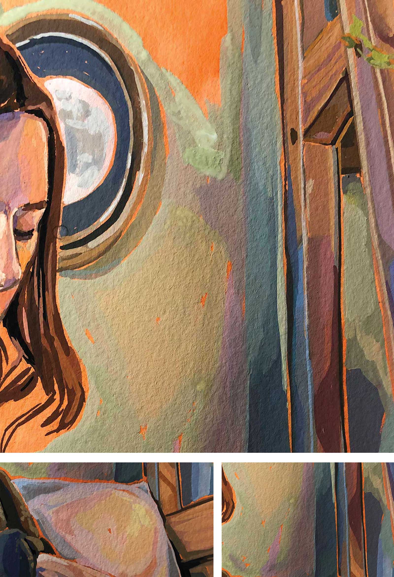
For the background of this image I chose to use greens and blues since they allow the main focal point, the woman, to stand out. These greens and blues are mixed with a significant amount of white since gouache tends to dry darker than it appears when wet. I stylistically decided to leave some of the orange underpainting to show through by leaving gaps between the background and the focal point. While leaving these gaps is not necessary, I believe it adds more vibrancy to the overall image and separates the background from the focal point.
 Stage 7
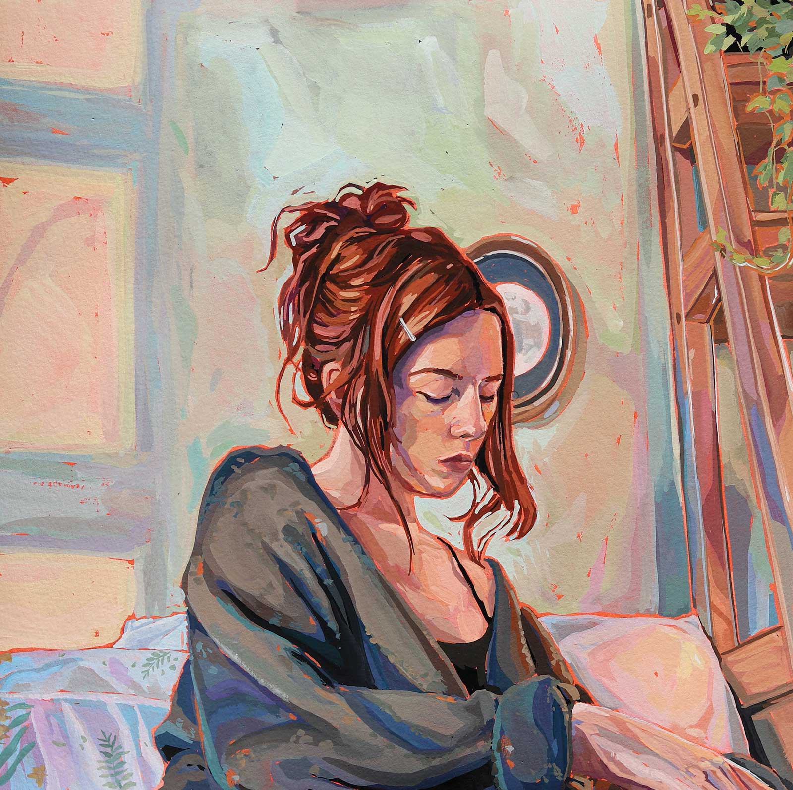
Stage 7 Finished Artwork
Morning Light, gouache on watercolor paper, 12 x 12" (30 x 30 cm)
About the Artist
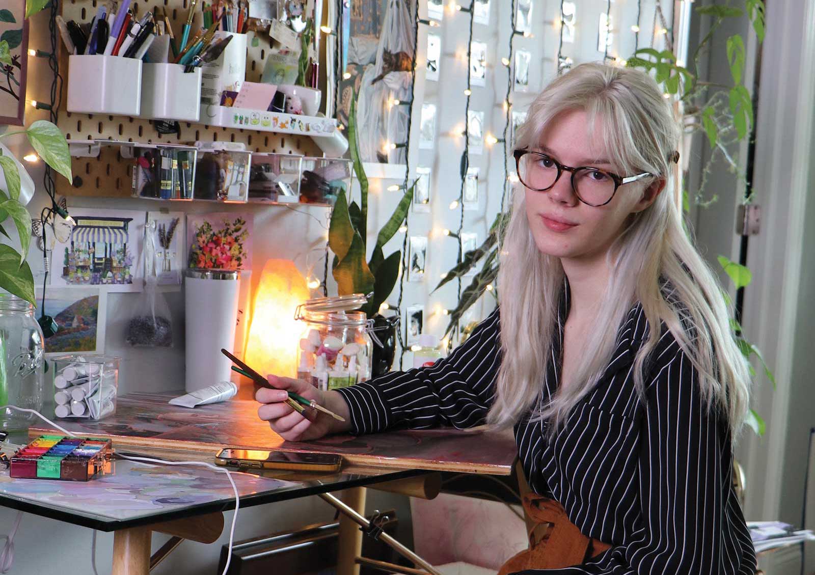 Jessica Jane
Jessica Jane is a painter using primarily gouache but occasionally watercolors and acrylics. She grew up in southern California and moved to central Ohio a few years ago where she discovered gouache after attempting to buy watercolors and accidentally picking up gouache instead. She’s been painting as long as she can remember but also has a large interest in science and engineering. She loves to paint images of things and people that are special to her, which often includes her cat, coffee and her ridiculously large collection of houseplants. Prints of her artwork can be found at www.artpal.com/sijesns. Detailed video tutorials can be found on her TikTok @sijesns.
Contact at
sijesn@gmail.com