


I can’t pinpoint the exact moment my work went from static to dramatic, but it all came down to understanding color temperature and implementing temperature shifting within a consistent value throughout my paintings. As it all clicked, I also started mixing my paint differently, and it made color mixing issues a thing of the past as I discovered matching color is not the goal. Primarily one just needs to think in terms of value and temperature. Sure, hue plays a role, but nothing more than saying I need it red, green, violet, etc.
Color temperature can be difficult to understand and convoluted when you first dive into it. However, it is worth pursuing at any stage of your endeavors. To review color temperature, globally on the color wheel yellow, orange and red are considered warm, while greens, blues and violets are considered cool. Specifically, though, each color has warm and cool varieties depending on the pigment used.
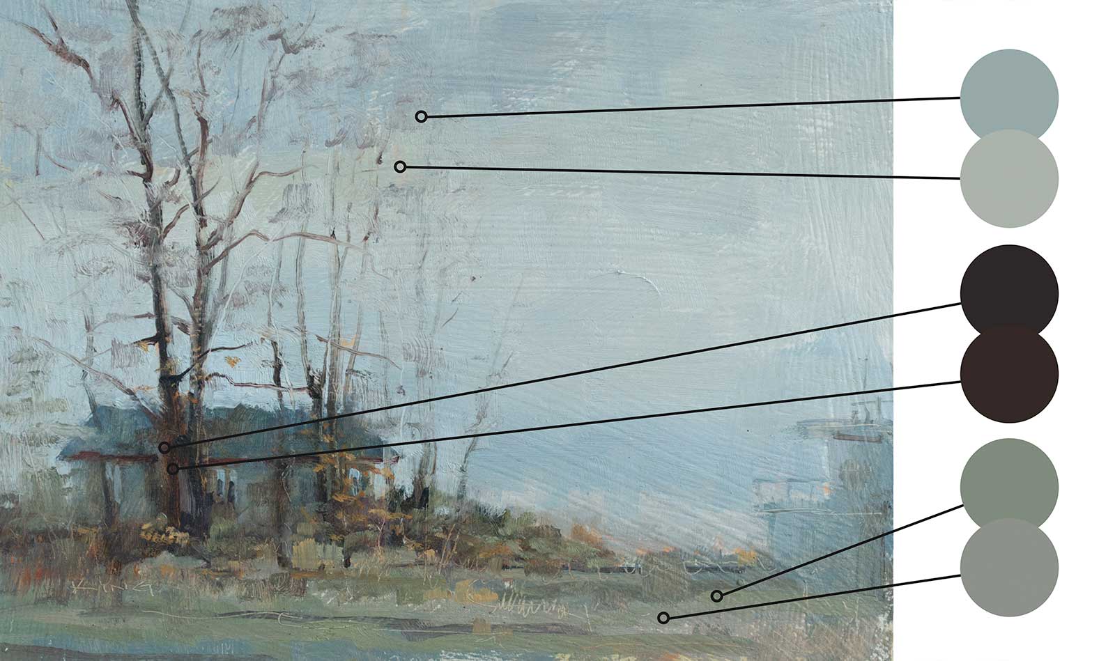 Michael King, Boathouse, oil on panel, 9 x 12" (22 x 30 cm)
Boathouse was painted on location on a cloudy day that provided the cool light throughout this piece. The sky is banded with a variety of cool mixes, but notice how each band is a different relative color temperature, giving a greater sense of depth and interest without a lot of effort. You really notice the warmth of the shadows in the trees although they are quite dark. Within that warmth is a variety of small temperature shifts to give even these thin trees a sense of interest. Lastly the cool light on the grasses maintains the mood of the paintings while the shift in temperature provides the variety, a sense of interest, but most importantly, a sense of life to the piece.
I also want to preface with two other thoughts:
1. Temperature is solely a man-made construct, much like the names that we give colors. However, thinking in temperature aids significantly in improving your painting outcome and in understanding how to see and mix colors.
2. Temperature only comes into play when comparing one mix to another. Thinking in temperature is liberating as it removes the desire to match a color exactly, which I believe is the primary reason artists have such a hard time mixing what they want.
Once you understand the nuances, it changes everything. A color is no longer a blueish green, a yellow white or a reddish violet, they become a cool green, a warm white and a warm violet. Why does that matter? Because one no longer has to worry about matching the color exactly. Just establish the general hue, match the value, then mix it warmer or cooler as required. It’s that easy.
There is a guiding principle in representational painting that states “warm light, cool shadows” and “cool light, warm shadows.” In other words, if your scene/object is lit with warm light, the cast and form shadows will be cool and vice versa. This is a very simplified statement as there can be other factors that influence light and shadow areas, such as reflective light or a secondary light source.
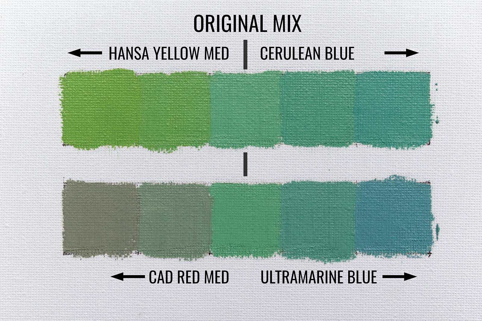
Figure A
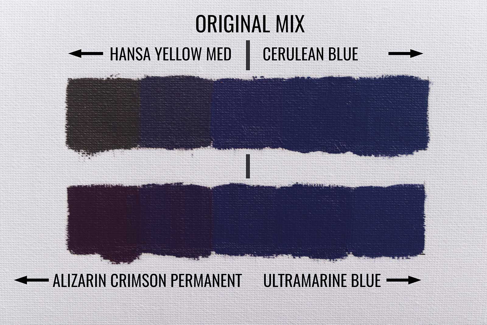
Figure B
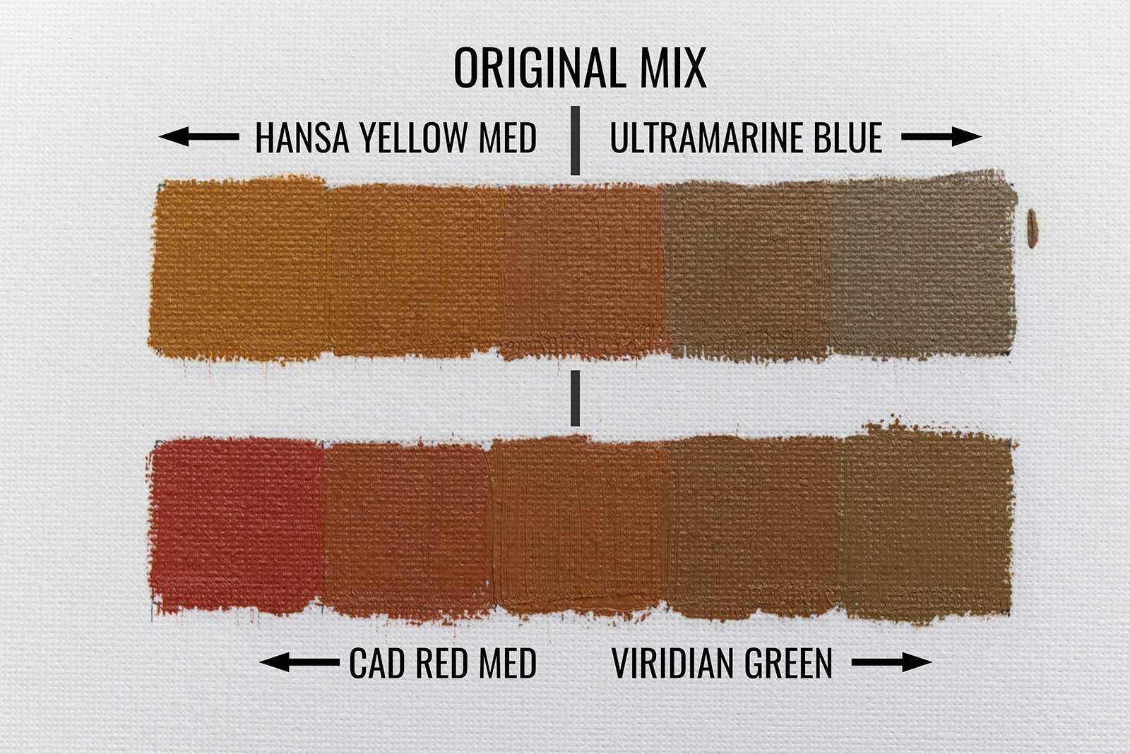
Figure C
Knowing this principle, we can say there are two main areas of a painting, the light and the shadow, with each opposite of each other in temperature.This brings me to the main discussion of this article, the shifting of color temperature within these two broad areas of light and shadow. Some call it color bending, others color shifting, but I find both of those misleading. One should think more in terms of the temperature and the pigment used to shift it. Do I warm a mix with warm or cool red, yellow or orange? Do I cool a color with a warm or cool blue, green or violet? Each has a different use depending on your final goal and each choice is dependent on the pigment used. For example, a red will warm but dull the chroma of a green mixture, whereas a yellow will warm and enhance the chroma of a green mixture. Getting into more detail, a cool yellow will help enhance the chroma and a green mix more than a warm yellow; however both will warm the mixture from its original state.
In the color swatches (Figures A, B and C) you can see how your choice of pigment can affect the chroma of a mix. In each swatch, all the mixes are intended to be the same value. You can tell when two mixes are the same value by squinting—if the edges of the two mixes blend together, their values are the same.
In Figure A the central swatches of green are a mix of viridian green, hansa yellow medium and white. The top bar has this mix warmed with hansa yellow medium, left of the central swatch, and cooled with cerulean blue, right of the central swatch. Notice how the chroma of the colors is kept relatively high. In the bottom bar the mix was warmed with cadmium red medium and cooled with ultramarine blue. On the cooler side, the chroma reduction had a minimal shift using the ultramarine blue. On the warm side, you can see the chroma was entirely killed as we added more and more cadmium red medium.
In Figure B we see this happen as well. This time the main central swatches of violet were made with ultramarine blue and alizarin crimson permanent. The top row was warmed with hansa yellow medium and cooled with cerulean blue. The bottom row was warmed with alizarin crimson permanent and cooled with ultramarine blue. While the cerulean blue didn’t change the chroma of the mix a lot, the hansa yellow medium certainly killed it to a more neutral mix.
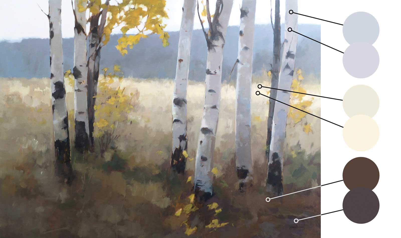 Maria Josenhans, Trembling Aspens, oil on canvas, 36 x 48" (91 x 121 cm)
Trembling Aspens falls into the warm light, cool shadows realm. The light coming over the right side of the distant hills of the background, putting the hills into the cool spectrum.
The shadows in the bark of the trees come to life with the variety of light warms and cools. The warm tones coming from the reflected grasses surrounding the trees and the cools due to being in shadow with the blues being influenced by the sky. Comparing the warm tones in the bark to the warm tones in the light, the warm tones in the bark are quite cool.
The warm light on the grasses behind the trees is dappled with a variety of warm and cool mixes, providing a sense of life within. Again, the cools of the lit grass are very much warmer than anything in the shadows. The sense of warm and cool can only really be seen when those two values are close to each other and compared relatively.
Lastly, the cool shadow on the grass in the foreground, created by the trees’ canopy, is shifting between a variety of warm and cool browns. In some instances, a much cooler violet and blues were used in areas, but still all within the same general value. In fact, utilizing the violet in the shadows, that are dominated by browns, really tells me color matching is a waste of time. I encourage you to stop dominating your thinking with matching color and focus instead on matching the value and color temperature.
Lastly, Figure C represents a more practical skin tone mix. The base color is mixed with yellow ochre, cad red medium, ultramarine blue, transparent red oxide and white. The top row was warmed with hansa yellow medium and cooled with ultramarine blue while the bottom row was warmed with cad red medium and cooled with viridian green. Notice the distinct difference between the warm and cool mixes between the two rows. Simply by choosing the correct pigment to warm and cool a mix, an artist can also choose how chromatic or dull the final mix will be.
As an artist, why would you want or need to shift color temperature in an area of a painting? For one, it mimics what nature already does and helps create that sense of reality by providing information without a lot of detail. Secondly, it can provide a sense of detail where there is none. For example, add depth to a distant tree line, enhance the sparkle in a body of water or bring life to shadows.
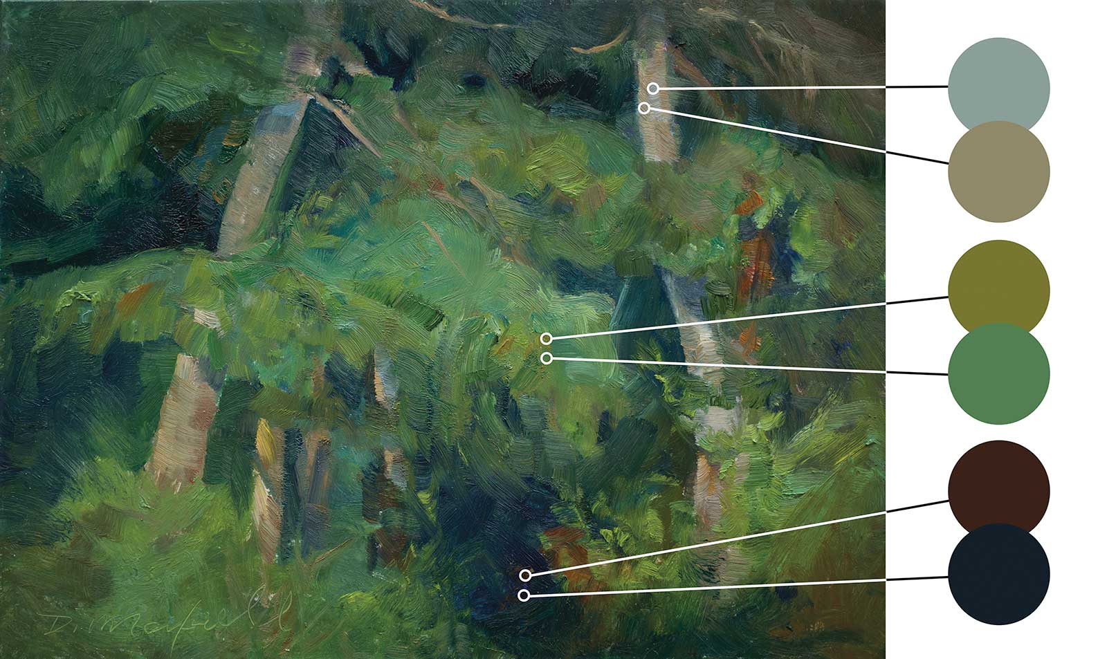 Denise Maxwell, Edge of the Forest, oil on board, 9 x 12" (22 x 30 cm)
Edge of the Forest, focusing on the foliage of the conifer trees we find in the west coast of Canada, the painting is dominated by greens while providing a variety of perceived color due to temperature shifting.
While our child’s mind tells us tree trunks are brown, notice the artist chose warm and cool neutrals to represent them in both shadow and light. One being just slightly darker in value than the other, thus providing an area of rest and guiding our eye to the right. The light on the foliage moves from warm ochres to cool greens that play off each other to provide the viewer with a sense of light, depth and focus. I find that my eyes dance from one piney bough to another, while sometimes shifting into the shadows before coming out again. Speaking of which, those deep cool darks that provide such a sense of depth and let you feel the inner expanse of the forest aren’t created with just using one static mix, but a variety of temperature shifting mixes.
Some might be asking, “How can you shift temperature in a cool area without making it warm?” and vice versa. This is where it can be confusing. Shifting a cool mix to be warmer does not make the color mix as warm as what is in the lights. The new mix is just warmer than what you had before. On the reverse end, a warm mix shifting to cool is just cooler than your previous mix, but not cooler than the shadows. Color temperature is 100 percent relative through constant comparison.
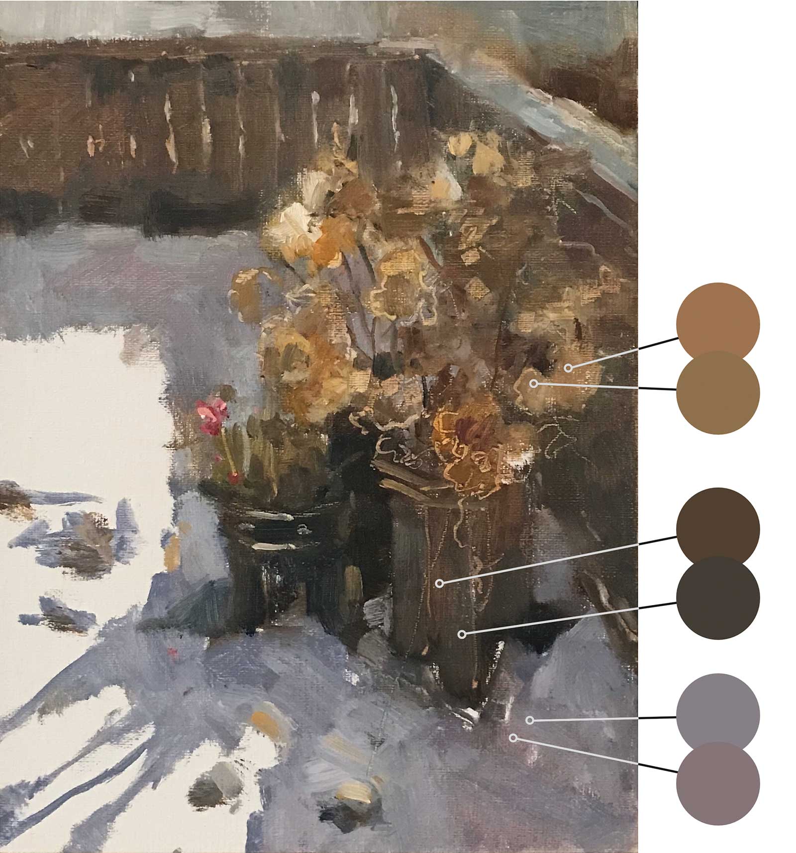 Shirley Williams, An Early Snow Fall, oil on linen, 8 x 6" (20 x 15 cm)
In An Early Snow Fall, warm light basks the scene dominated by cooler shadows. The shadows on the snow continually shift from warm to cool wherever it is seen. Moving into the flower pots there is a subtle but effective temperature shift that brings a life and airiness to the unnoticed object. Lastly, we move into the dead, but far from lifeless, flowers and find ourselves drawn to the focal point of the painting where there is light kissing a small grouping of flowers just left of center. This focal point is allowed to play out due to the surrounding shadow as it provides enough contrast to pop. With that, homage has to be paid to the multitude of temperature shifting done in the shadows of its companions. While not to be outright noticed, you can easily find interest and life where there is only shadow.
Keep in mind that you are also trying to keep the mixtures as close to the same value as possible. If you are trying to cool a light value mixture with an ultramarine blue, it will also darken the value, so you’ll need to to add white to lighten it again.
The best way to really understand the visual appeal of shifting color temperature within the same or close value is with actual examples. I could show images of the masters and their work, but I want to show you this skill is not limited to the masters. There are thousands of artists currently out there that do this to achieve great results. The examples throughout are of my own work and by artists that are close friends of mine that I frequently paint with. This is another tip, always paint with someone better than you.
About the Artist
 Michael King
Michael King is a contemporary Canadian painter and art instructor based in Port Coquitlam, British Columbia. He works primarily as an oil painter and is known for his soft plein air landscapes, but he also enjoys painting modern still lifes and portraits. With an eye for how light, shadow and color temperature form the fundamental elements of a scene, King’s practice blends representation with impressionistic aesthetics. This juxtaposition of technique and intuition creates paintings that are poised between observational realism and abstraction.
Contact at
www.michaelking.ca