


I’ve experimented with both watercolor and acrylic painting, but my preferred and only medium now is acrylic. I’ve always had an eye for photography and editing photos so coming up with my own still life set-up comes naturally to me. I feel this is an essential part and a great starting point for an interesting composition. My architectural background comes in handy for working out perspective and sketching out my drawings.
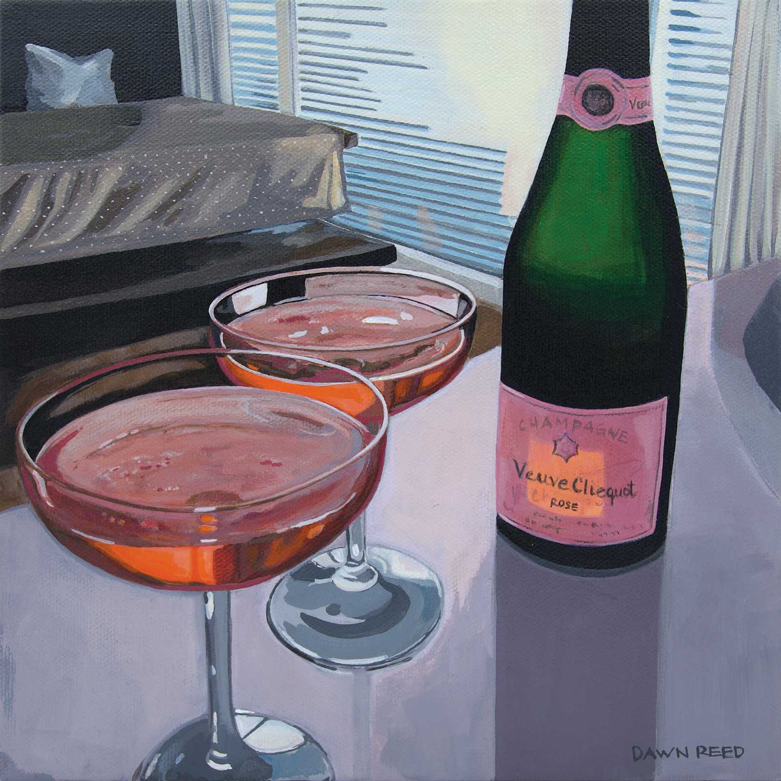
To Us, acrylic on canvas, 10 x 10" (25 x 25 cm) Anniversaries are a very special time, and I couldn’t resist capturing this moment last October. With COVID-19 this was our best option—a bit of bubbly at home. The light shining through the dark green bottle casting a strong shadow on the worktop, the rose and orange colored champagne with the reflection of light pouring through the champagne glasses made such interesting shapes to paint.
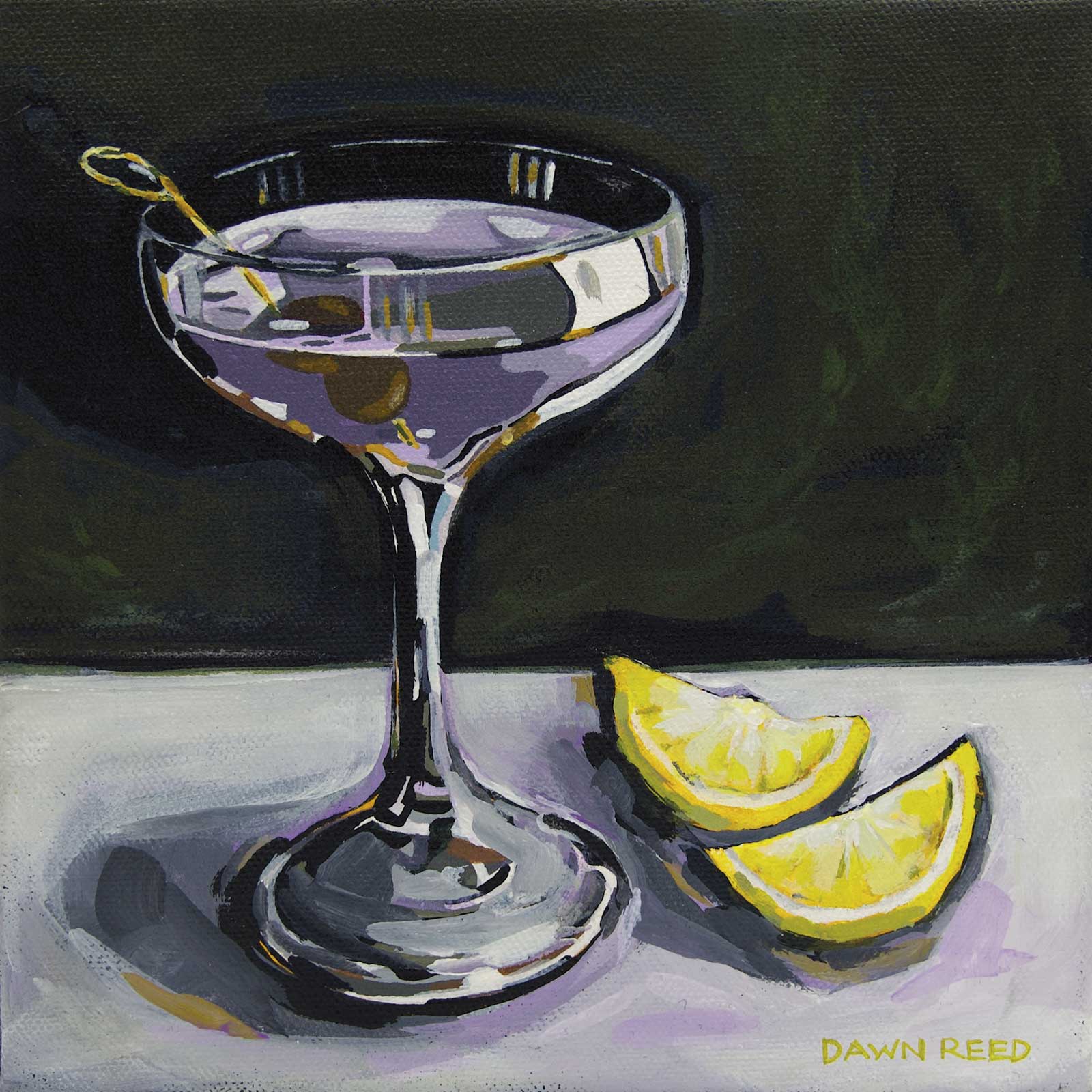
The Empress, acrylic on canvas, 8 x 8" (20 x 20 cm) Living on Vancouver Island is like a dream. There’s beautiful scenery around every corner, but one thing it also has is a great local craft distillery. A favorite drink of mine is the Empress 1908 Gin & Tonic; its butterfly blossom gives it its natural indigo color, perfect first for a still life painting, and secondly, a great cocktail. I’ve added olives not because it’ll taste good, but because it makes for a more interesting composition.
I always start my process the same, researching and planning my still life reference before I sketch out my drawing. Then I paint my whole canvas in one vibrant color like medium magenta, cadmium red or phthalo yellow green. Once my canvas is dry I can sketch out my composition with a light pencil. Then I select the colors I use based on my photo or still life reference, using a Sta-Wet palette to keep my acrylic paints from drying out.
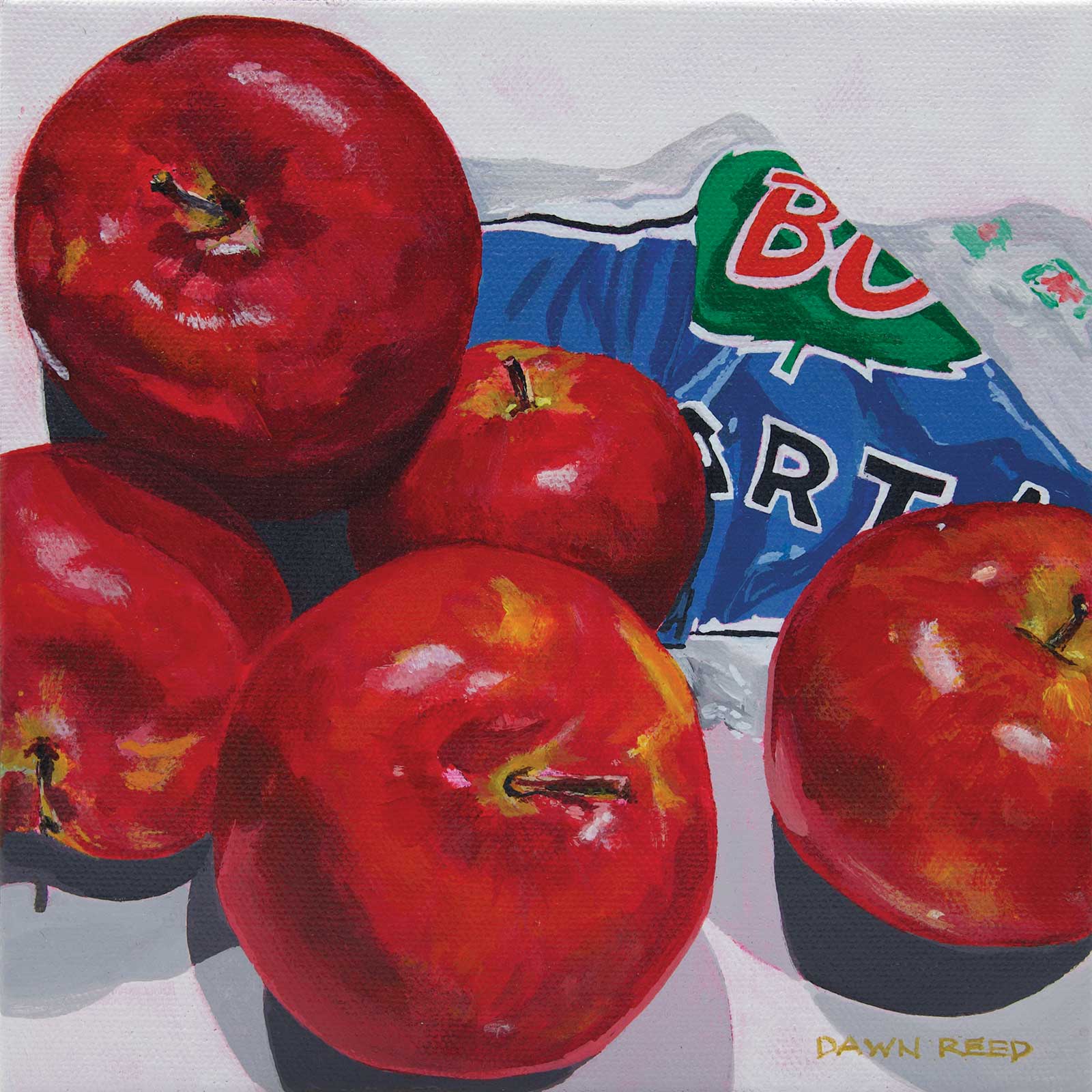
Dem Apples, acrylic on canvas, 8 x 8" (20 x 20 cm) I try to challenge myself to paint many different objects and painting reds and oranges is a little bit harder because of the transparency of the pigment. I was looking in my pantry for something to paint and decided to dump a bag of McIntosh apples out on my island worktop. With a little arranging, I had my next subject to paint. What I loved about this is the contrast of the intense colors with the crisp clean shadows on the surface of the worktop.
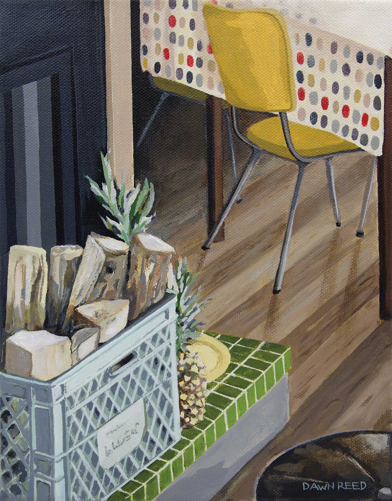
Crate of wood, acrylic on canvas, 10 x 8" (25 x 20 cm) I find that I’m most inspired by subjects that are close to my heart that have sentimental meaning. One of my favorite series that I’ve painted is of my Auntie’s cabin “Turtle Lake.” It’s as if I’ve captured many treasured memories in time. In this painting the light polka dot tablecloth strongly contrasts with the dark background that draws your eye into the room.
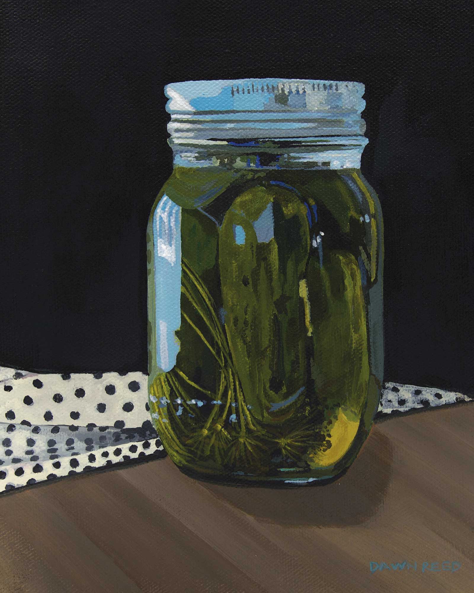
Jarred Pickles, acrylic on canvas, 10 x 8" (25 x 20 cm) This is a small jar of pickles my brother canned last year. It’s interesting how, as an artist, everything you see is a potential still life. When painting glass I paint the background and surrounding area, then the objects inside the jar. Because the jar is transparent it picks up a lot of the surrounding reflections. These patterns of colors that appear on the outside of the jar can be quite a jump in value being the lightest color in the painting.
Once I’ve mixed my paint colors I can start to block in larger areas. At this stage I look at my painting as a bunch of shapes rather than the whole image, working out a balance of values.
Then I work on the details trying to create interesting textures, shapes and design until I feel my painting is almost complete. After a little refinement and highlights, I finish the piece by applying a varnish to it after it is completely dry. This provides a layer of protection and enhances colors more than just using paint alone. —