



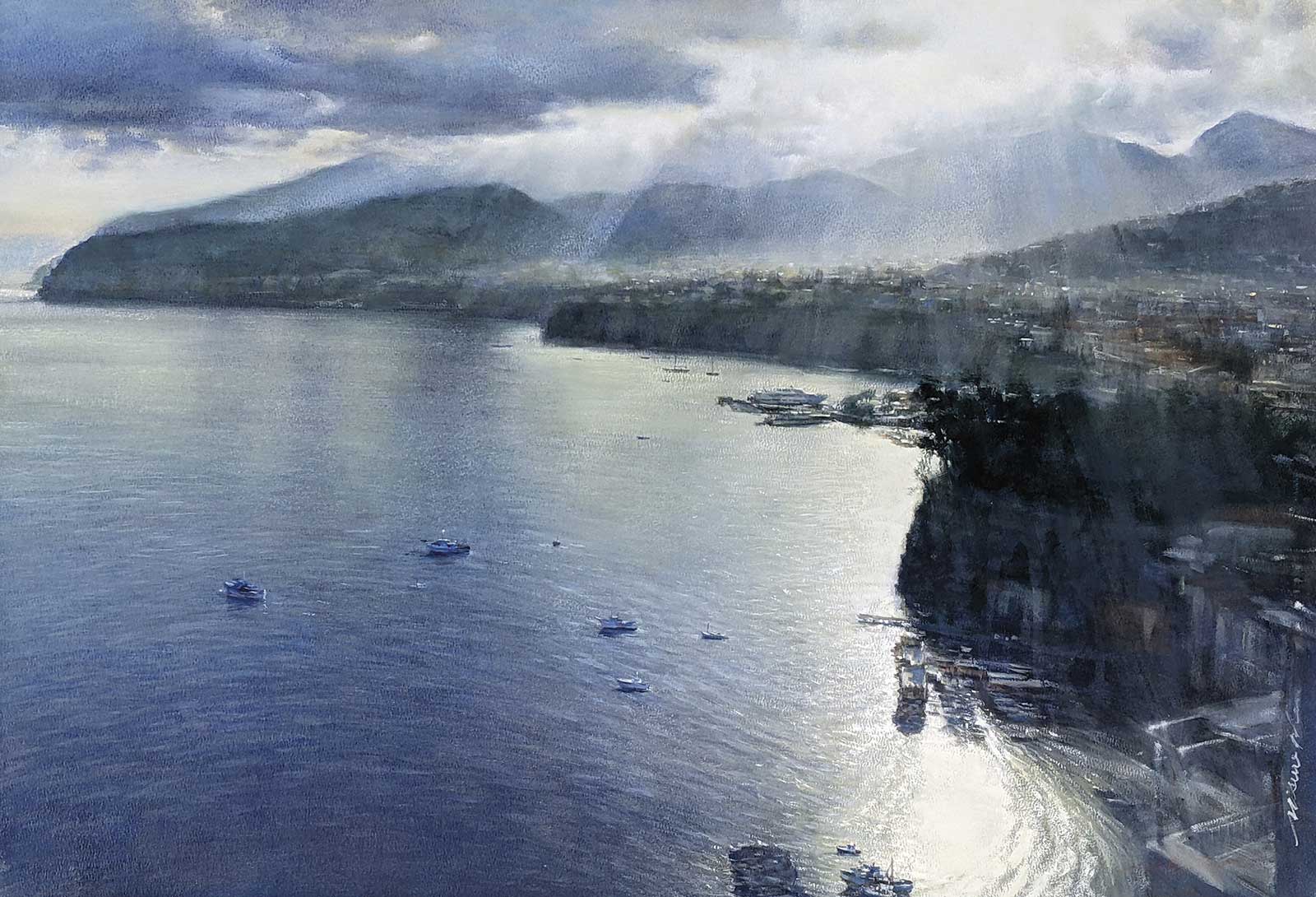
 Morning light, gouache, 21½ x 30½" (54½ x 78 cm)
Grand Prize
Grand Prize is a four-page editorial feature in American Art Collector magazine
Misure Nien, Changhua City
Inexhaustible Oceans
Misure Nien lives on the beautiful island of Formosa, Taiwan. “I have always felt that there are many beautiful things in the world, and I insist on truth, beauty and love to interpret the things or subjects I see,” says the artist. A painter for more than 30 years, his paintings reflect the gentle, delicate nature of the medium in which he works. His Grand Prize-winning Morning light depicts soft rays of sunlight playing over the surface of the coastline in the early morning hours. “Many beautiful things [come from] atmosphere and feeling,” the artist continues, “because they cannot be touched and cannot be grasped, as if they exist and do not exist [all at once].”
Nien draws the scenes he experiences first hand in his travels, inspired by the beauty of nature and the wonder of humanity. Often, these studies can move between realistic and abstract depictions. “I aspire to the Eden-like atmosphere of beautiful landscapes, and I hope to present Eastern elements and philosophical views in my future abstract exploration,” he says.
Light and shadow are core tenets of Nien’s work, revealing “a point in time and a sense of atmosphere and space in a painting.” He adds, “In this work I am more concerned with the weight of light particles [and] the physicality of the visual sensation in the atmosphere. I try to push the distance or create fog, and use the reflection of the sea to offset the details of certain objects. I know what my visual sensations want and try to present my feelings. I think this style highlights my own creative habits.”
Nien is always studying and learning about the world around him. He hopes to continue to mature in his artwork, his creative expression and his interactions with the rest of the world. “The wisdom of art,” he says, “is like an inexhaustible ocean of learning.”
My Inspiration
The natural landscape can touch the heart deeply. This is a calm and sunny morning, the clouds are gradually dissipating, and the sea is full of water. The overlooking perspective is very small between the vast mountains and the sea. The light shines through the clouds and mist, like the coming of God. This is the strongest motivation for creating this work. I hope to show my feelings and move others.
My Design Strategy
Generally depicting the far-reaching seascape and sky layout will be presented in the form of a C, U or L shape. I use the inverted L method. Usually, this method will appear very monotonous, with abundant clouds and brightly reflected sunlight in the morning. It makes up for the dull composition, and adds a lot of energy to the picture. It is also easier to use atmospheric perspective to create visual emotions. The houses on the cliffs and the fishing boats on the sea are like an architect’s scale to show the visual scene.
My Working Process
Creators are accustomed to using their own well-used media to create, which is easy to express the emotion of the painting. I like that water-based media are especially easy to use the technique of rendering skills to express moisture and atmosphere. Nature is unpredictable, so I took photos and recorded the scene at that time and then finished it in the studio. In this work I chose to use opaque paint because it can be smudged and thickly painted at will. I wanted to convey the feeling of water vapor—the quality of the air, the sun and the morning atmosphere. I think opaque white can add more layers, and the reflection of light and the texture of the atmosphere will not feel thin and light.
Contact Details
Email: misure@gmail.com
Website: www.instagram.com/misurenien
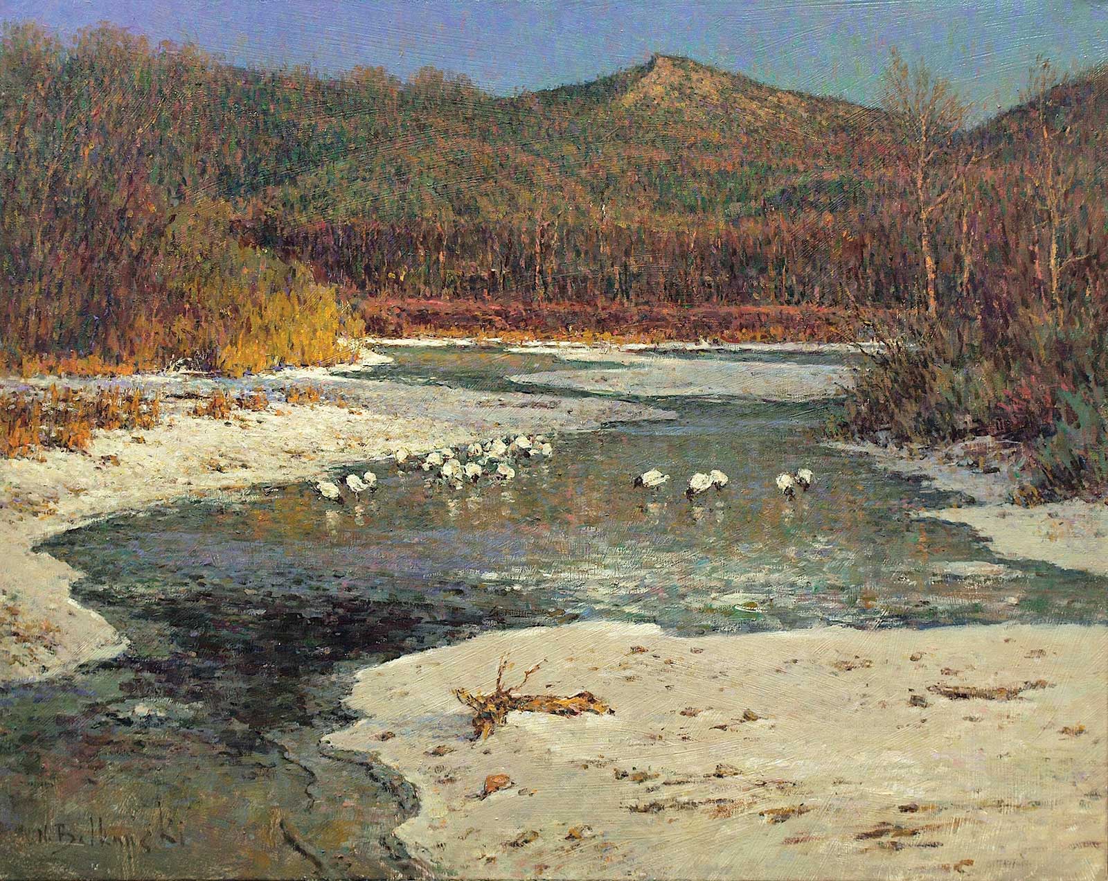 End of March, oil on canvas, 24 x 30" (60 x 76 cm)
Second Prize
Second Prize is a two-page editorial feature in American Art Collector magazine
Nikolo Balkanski, Colorado, USA
My Inspiration
It was one of those March days when the sun shines hot and the wind blows cold, when it is summer in the light and winter in the shade. I’m fascinated by water, and in most of my paintings I love to paint water of any shape or form.
What’s special about including water is that it can be used to bring life to any composition in sophisticated ways. The shape of the body of water can be manipulated to create curves and diagonals that guide a viewer’s eye through a painting. Its colors can create a mood and suggest atmosphere, and its texture adds interest to any natural scene.
My Design Strategy
I believe a truly good painting has two important qualities: an interesting concept and a fine expression of that idea. For me, art is not about recording nature accurately, creating a technically perfect painting. It’s about expressing my vision and emotion, about interpreting nature in a way that allows me to make a statement.
My Working Process
I began each painting by keeping in mind the three basic elements of design: line, values and color. These are the structural building blocks of any composition, and they’re controlled by the principles of balance, rhythm and dominance, which all depend upon proportion.
Of course, as I became more experienced I stopped thinking of these principles individually and started to deal with them simultaneously. I have many artistic tools available to help communicate or express my concepts, including value pattern and paint quality, but I think one of the most powerful tools I use is color, particularly color harmony.
Contact Details
Email: nikbal@me.com
Website: www.nikolobalkanski.com
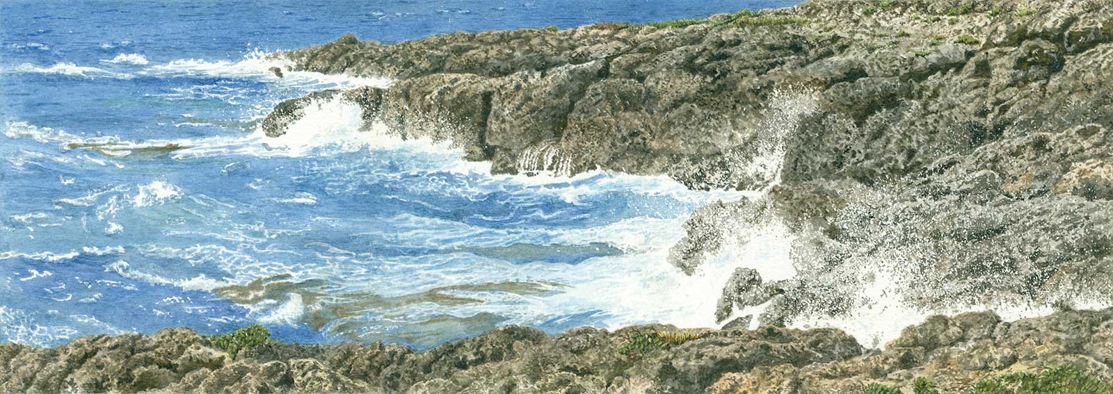 Jonian sea. Pulsano. Luogovivo. NE wind, watercolor, 5 x 13½" (12½ x 35 cm)
Third Prize
Third Prize is a one-page editorial feature in American Art Collector magazine
Giovanni Cera, Florence, Italy
My Inspiration
I was born in Apulia, Italy, close to the shore of the Jonian Sea, with which I’ve had always a familiar relation. Its water is beautiful when smooth, showing a cobalt blue color, but it’s more beautiful and attractive when the sea is rough. Being part of the closed Mediterranean Sea, it less often has waves, but sometimes it happens. Two summers ago, for a few days, there was a heavy “Greek” wind with blue skies, excellent light and high waves! I took the rare opportunity, ran to the coast near the bay of Luogovivo and got some photos.
My Design Strategy
Based on my preferences, a seascape is more interesting when depicted in a long and narrow framing. In this case the sky was clear without clouds, not interesting for the purpose of the general composition, so I removed it from view and focused on the water. The composition was divided approximately in three parts: the first with almost only sea, the second balanced sea and rocks, and the third with only dark rocks. The white spray between the rocks and sea give life and movement to the painting as a whole. Without spray, the piece would appear static.
My Working Process
The figure is painted in watercolor on white paper with the use of mask liquid. I applied at least three layers of color, which became gradually thicker in order to achieve the right saturation. Watercolor is an excellent medium for painting thin details, when not using a wet-on-wet technique. The compactness of the color for the last layer was almost like condensed milk, and the size of the brush used was the smallest possible. The graphic effect of the spray was achieved by splattering the mask liquid from a hard short brush. I spent a significant amount of time working on the calcareous sharp rocks with a thin brush.
Contact Details
Email: ciuccio51@yahoo.it
Website: www.flickr.com/photos/ciuccio51
Finalists
Each receives an Award Certificate and a one-year subscription to International Artist magazine PLUS having their work seen worldwide by international galleries looking for new talent.
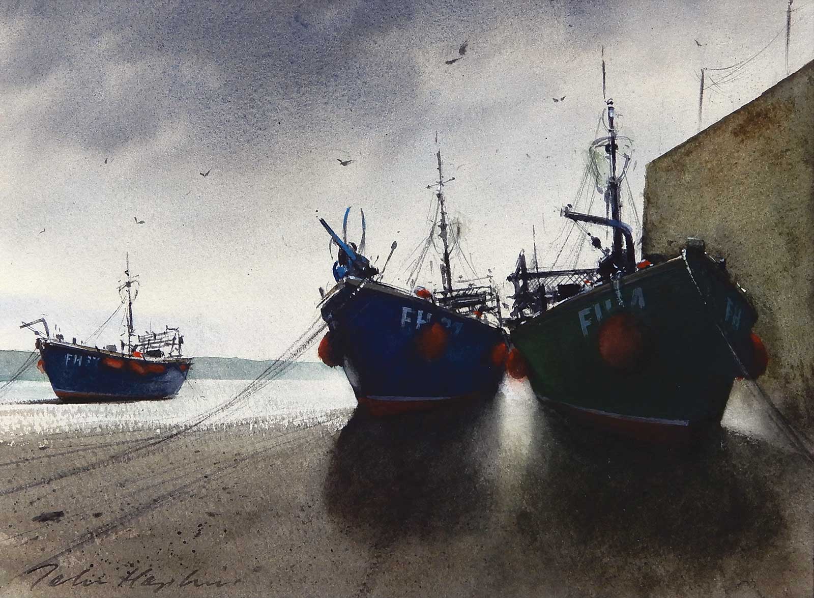 Low Tide, Portscatho, Cornwall, watercolor, 10 x 13½" (26 x 35 cm)
John Hopkins, West Midlands, UK
My Inspiration
My artistic inspiration comes firstly from drawing, and for me, picking up a pencil triggers the creative process. Secondly, it comes from my preferred medium of watercolor. Once I have decided on the subject of the painting, which is often the most difficult part, I work on the composition and then produce a tonal or color study before attempting to create a successful painting with all the unpredictability of watercolor.
My Design Strategy
I conceived this painting whilst on an early morning stroll down to the harbor at Portscatho, a small fishing village in Cornwall. Looking towards the light would give me a strong tonal contrast and also minimize the color range. In my composition I selected a low eye level and decided to juxtapose the two nearer fishing boats to create the dramatic effect. I did consider placing figures in the picture but decided not to because it would create an unnecessary narrative.
My Working Process
I began with a simple wet-in-wet sky, a pale yellow ochre wash then a mix of cobalt blue and burnt sienna for the clouds. I painted the beach with graduated washes of raw umber, burnt sienna and cobalt blue with a dry brush technique and spattering for texture. For the boats, I used much thicker pigment for intensity and contrast. Finally, the details on the boats and elsewhere were drawn sketchily with a fine brush with a mainly neutral tint.
Contact Details
Email: johnhopkinsart@gmail.com
Website: www.johnhopkinsart.co.uk
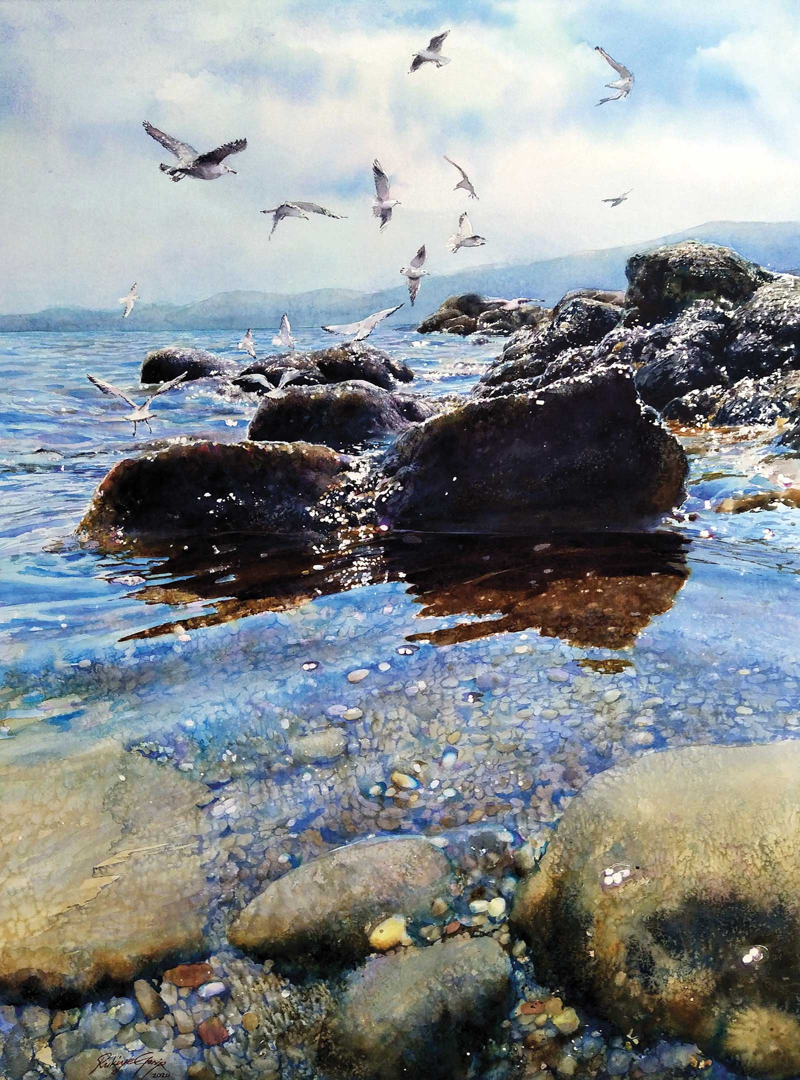 Seagulls and Seashore, watercolor, 30 x 22" (76 x 55 cm)
Rukiye Garipe, Balıkesir, Turkey
My Inspiration
Water is our source of life. While painting the water, I feel like I am in and moving with it. The movement of the water, the lights playing in the curves of the waves, the reflected colors and the stones visible under the transparent water have always been my source of inspiration. When we look at transparent water, we can simultaneously see what is on the surface of the water, what is underneath and what is reflected from its surroundings and from the sky. We’re seeing so many different areas at the same time that the human eye almost can’t take all of it in—color, energy, what it contains, what it carries. It is exciting to be able to feel the things that it infiltrates, reaches, feeds and multiplies.
My Design Strategy
This view of one of the magnificent shores of Balıkesir, where we live in western Turkey. The water droplets shining on the wet, dark colored rocks, the shadows, the stones visible in the water and the seagulls accompanying the sky in the distance. I created this composition using a few photos I took. The dark rocks in my reference photos covered a large area. In order to preserve the light-dark balance in the composition, I did not draw some of them, and reduced the size of others. I placed the seagulls in the foreground, though they were actually in the background, by changing their movement, direction and size.
My Working Process
I drew the rocks, the seagulls and the outlines of the waves with a pencil. I used masking fluid to protect the white shimmers. I applied the tones of blue that dominate the whole picture with the wet-on-wet technique (ultramarine blue and winsor blue), and I created small stony areas using yellow ochre and burnt umber. Before the colors dried, I sprinkled salt to create texture. I painted the final appearance of dark rocks and their shadows with blends of indigo, burnt umber, violet and ultramarine colors. I removed the masking fluid and painted the seagulls. I completed the painting by detailing the darkness of and reflections in the waves.
Contact Details
Email: rukiyegarip@hotmail.com
Website: www.instagram.com/rukiyegarip
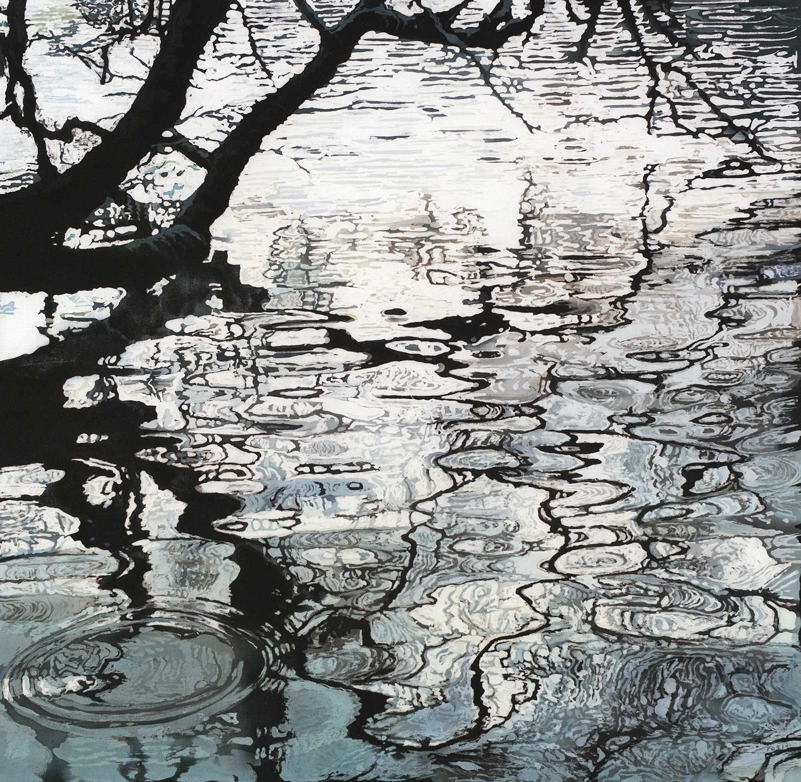 Reflections of a Tree, batik/watercolor, wax and dyes on fabric, 17 x 17" (43 x 43 cm)
Rosi Robinson, Sussex, UK
My Inspiration
My inspiration for this batik painting originates from my love of water and from watching the constantly moving patterns and reflections that I’m mesmerised by in lakes, rivers, the sea and even puddles. I love watching the ripples, the movement of water and how it reflects what’s above. In this case this batik painting was inspired by the reflections of a tree in a lake, near where I live in Sussex, United Kingdom.
My Design Strategy
When I go for walks, I’m always drawn to water, wherever it is in the landscape. I take lots of photographs of reflections with the idea of turning them into a batik painting. Often when I photograph, it’s a sunny day with blue skies reflected in the water. However, on the day I took photos for this batik, the sky was cloudy and gray. What attracted me was the tonal quality of the reflections—subtle grays contrasting with the black silhouette of the branches.
My Working Process
For this batik painting, I outlined a design in black pen on paper, incorporating a couple of my photographs of the reflections and traced the design in pencil onto white cotton fabric. I started by applying hot wax to the areas I wanted to keep white, using waxing tools. Similar to watercolor painting, I dampened the fabric before I applied a pale gray dye over the whole batik, using a sponge brush. Once the dye had dried, I then waxed the areas I wanted to keep pale gray and applied a slightly darker blue/gray wash over the fabric. I repeated this process working from light to dark, by waxing the paler colors of the ripples and leaving areas in the fabric unwaxed, so the darker dyes could penetrate the cloth. Each application was very subtly different in tone.
Contact Details
Email: rosirob@aol.com
Website: www.rosirobinson.com
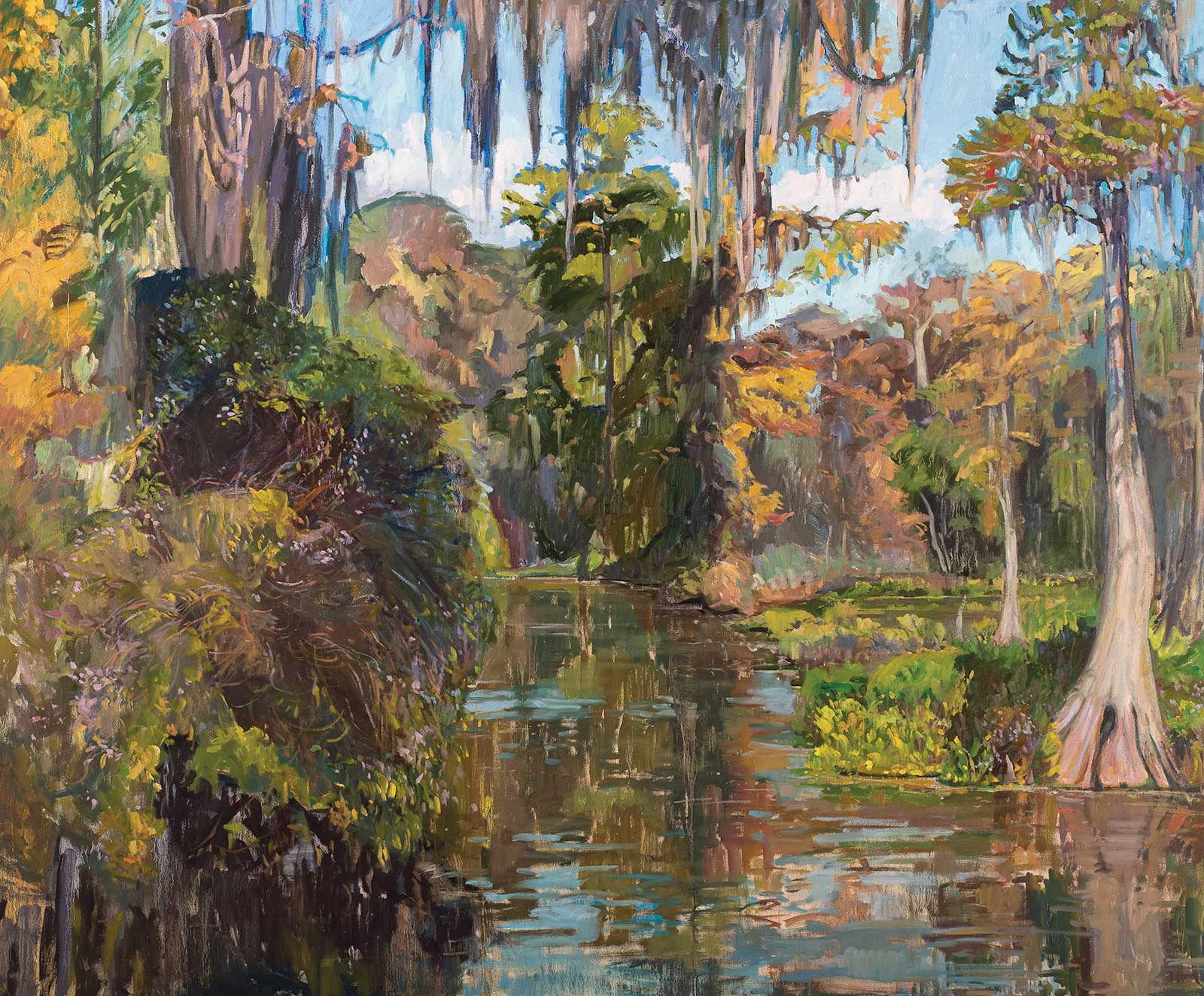 Wakulla River Drift, oil, 60 x 72" (152 x 182 cm)
Blair Petersen, Updike Florida
My Inspiration
Florida is harsh but magical when you can find an untouched stretch. My homeland is being consumed by development, so I paint landscapes to remind people of the beauty we need to preserve. “Wakulla” is Timucuan, the language of the 200,000 strong tribe indigenous to Florida. We don’t know exactly what it means since the tribe is extinct, but something like “spring of water.” My ancestors settled near Wakulla in the 1800s, and I return yearly with my children to paint.
My Design Strategy
I loved this scene because of the fall aster blooming at the base of the moss-hung cypress trees. It is a composite of two photos, because sometimes rivers are just wider than you would like for your canvas. I always take many pictures so that I am sure to have options from the same lighting scenario. I was careful to quiet the highlights so the delicate violets of the aster would show.
My Working Process
I began with drippy washes of color, diluted with Gamsol. I had an opening in five days and it is a 6-foot canvas, so I wanted to cover the white quickly. I subscribe to the idea of “abstract realism,” so I begin the painting using dark large shapes, and built toward the light just using brush strokes. This sort of order from chaos approach makes for paintings that read well from a distance.
Contact Details
Email: peb406@aol.com
Website: www.bupdikeart.com
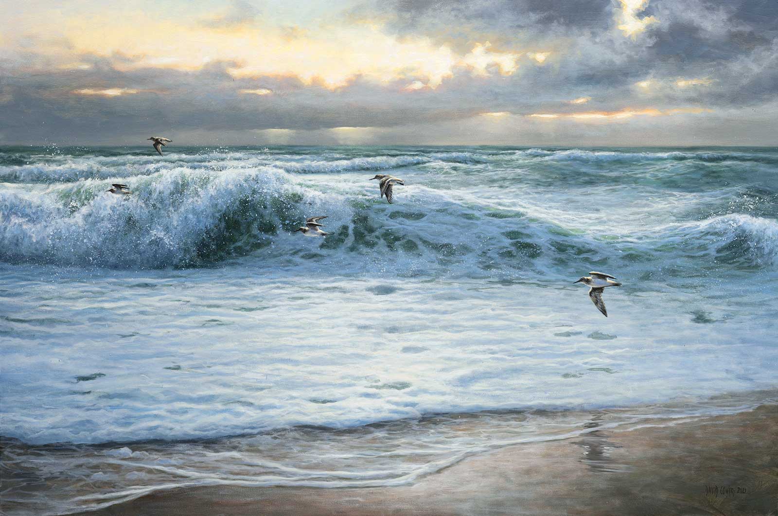 Stormy afternoon, Dunlin flight, oil, 24 x 36" (60 x 91 cm)
David Cowdry, Carmarthenshire, UK
My Inspiration
Inspiration for this painting was the easy part. After all, who can fail to be inspired when standing upon the shore looking out to sea whatever the weather? In this case it was the beach where I proposed to my wife, Jill, a special place full of drama and beautiful light. The energy of the waves and the light as the storm cleared was all I needed to get me into the studio.
My Design Strategy
A sense of the drama and atmosphere of the seascape was paramount. The wave crashing was tricky to compose but once I had roughed in where I wanted it, I painted freely as I usually try to do. The expanse of foam I felt needed some depth so the addition of the Dunlin flying through helps to give the seascape an illusion of space and some wildness, which I quite like.
My Working Process
I work quickly and instinctively, preferring to feel my way through a painting and to let it breathe rather than have my ideas set in stone. Each painting seems to find its own way of appearing upon the canvas in front of me. I tend not to question and just get on with it. The birds were an afterthought, an aid to give a sense of space and also to represent life on this storm torn stretch of coast.
Contact Details
Email: davidcowdry57@gmail.com
Website: www.facebook.com/davidcowdryart