


Have you ever come across a really interesting subject that sits in the back of your head for ages? Ideas are churned over, colors considered, composition explored, but you always seem to put off getting started.
This interesting building on a windy, United Kingdom coastal waterfront is one of those subjects. I have sketched it and thought about it for three or four years. Finally, I decided to make a start.
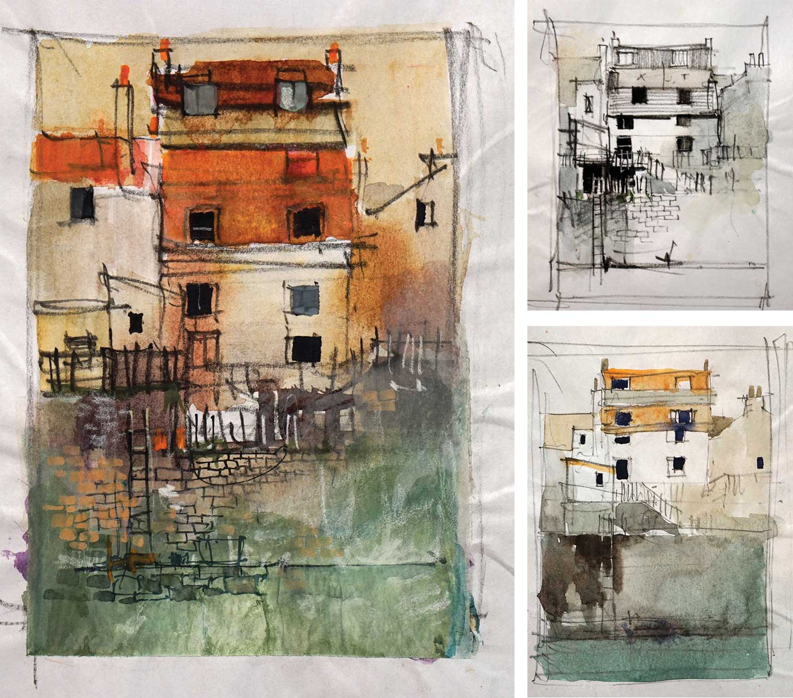
I did a few rough sketches to shuffle around composition and colors. My plan wasn’t to select one of the sketches and reproduce it, but rather to explore different options with the sketches, then allow the painting to meander between them depending on how things emerge.
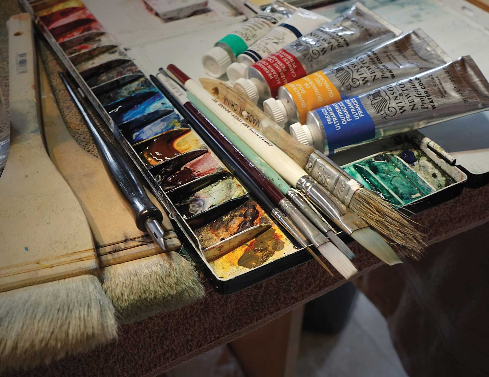
I started with my usual handful of colors:
French ultramarine blue, Phthalo blue, Quinacridone gold, Permanent alizarin crimson
As the painting progressed burnt sienna pigment ink and tinted gesso were introduced.
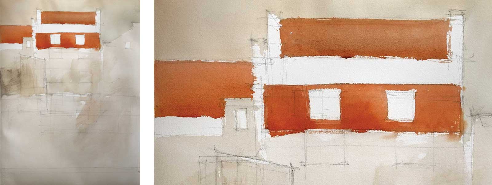
The first job was to draw the composition onto a full sheet of Arches 300 gsm medium cold-pressed paper with a charcoal pencil. Once the drawing was in place a dirty yellow/brown wash was scrubbed loosely over most of the paper, leaving a few patches of white paper around the focal area in the main building. Next the terracotta roofs were applied. All this was done with a ½-inch and a 2-inch bristle brush.
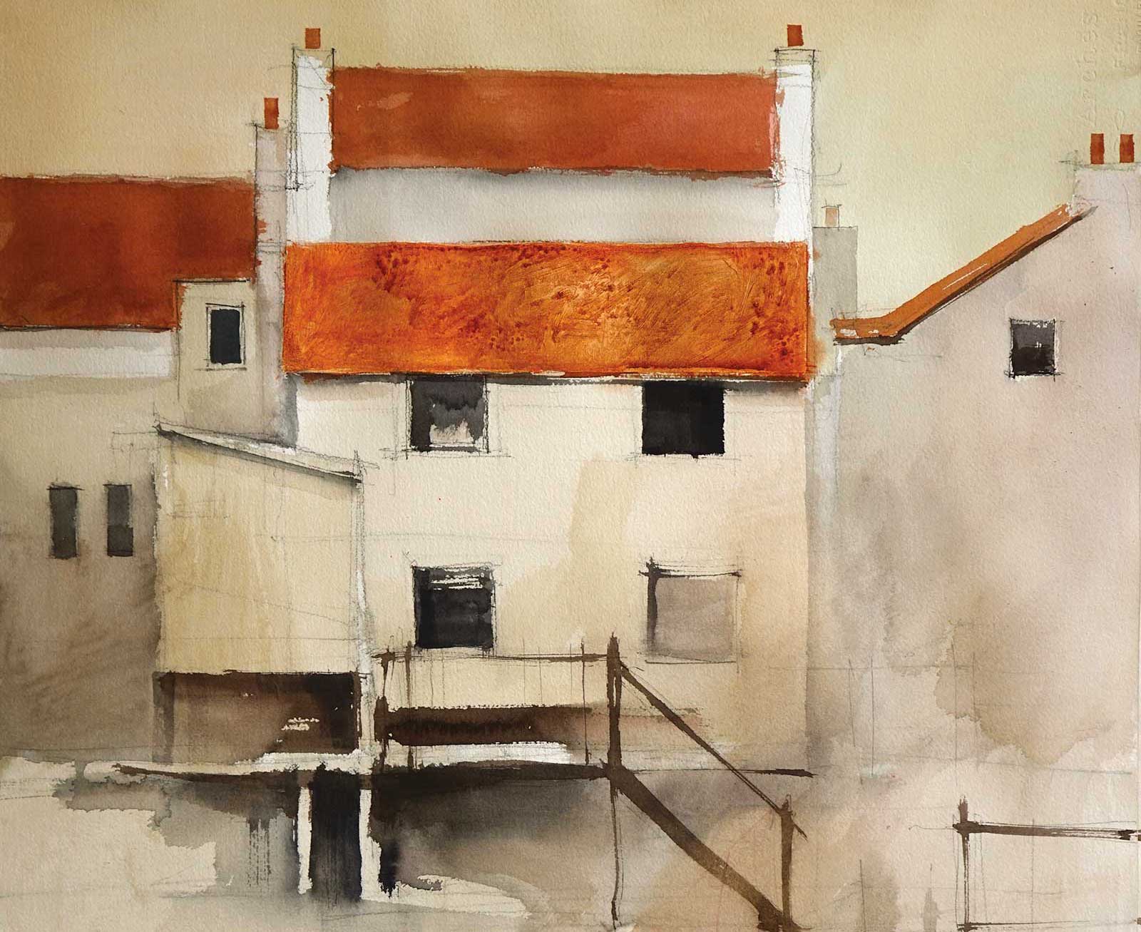
Next, still using the ½-inch bristle brush, some detail was built up in the buildings with a dark mixture of French ultramarine blue, alizarin crimson and quinacridone gold. This color was mixed as dark as possible then modified with water as it was applied. I like to use the rough bristle brush for these initial darks to keep the marks loose and interesting. I changed my mind about the attics in the terracotta roof as it was becoming too busy. The ladder was moved to the righthand side of the painting to create a more diagonal path up to the focal area.
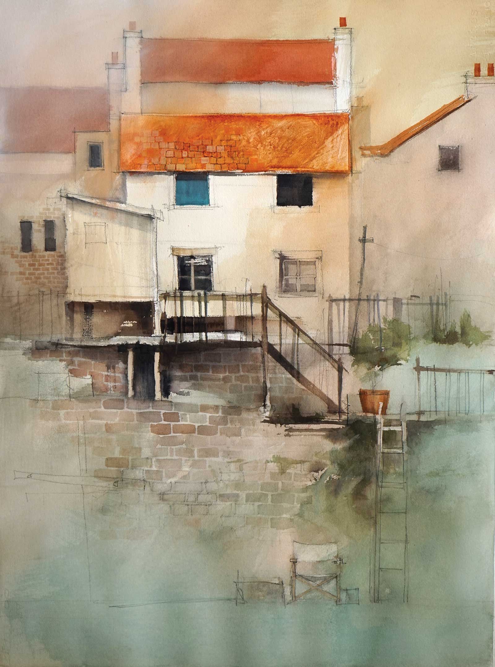
Moving on to smaller flat brushes and a no. 1 rigger, detail was added to the stone and brick walls, railings, windows and the suggestion of foliage on the righthand side.
A wash of dirty phthalo blue (phthalo blue with a tiny amount of alizarin and quinacridone gold) was worked up from the bottom to cool the foreground and give relief to the overall warm color temperature. A glaze of thin gesso was painted over the top left corner to push back the surrounding buildings and soften the chimneys.
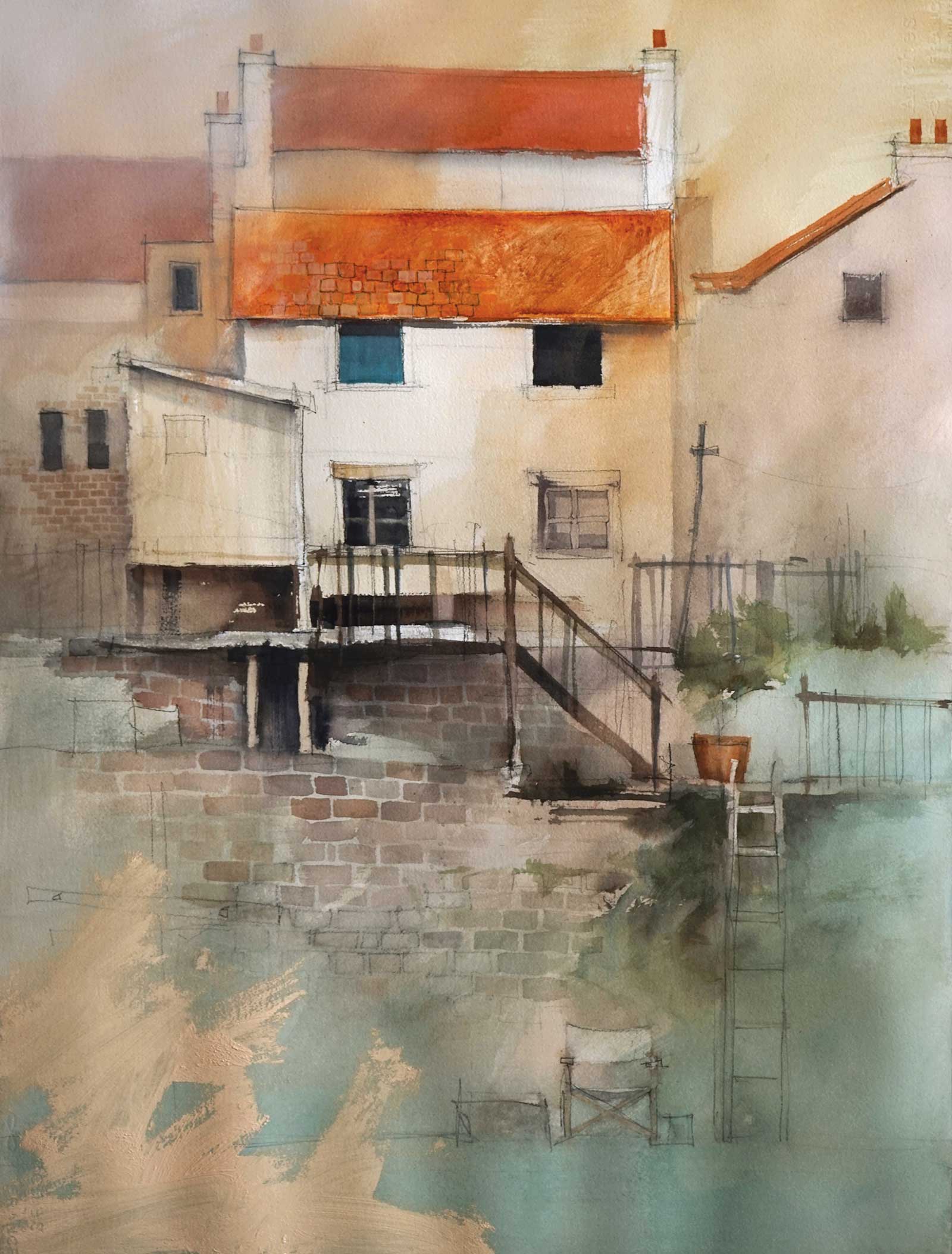
Here you can see the rough application of white gesso tinted with a little yellow ochre and burnt sienna acrylic paint. As soon as this was applied the brush was vigorously washed clean and the tinted gesso was scrubbed over and diluted. Careful attention was paid to breaking up the edges of the gesso. Once wet and dilute, a dry Hake brush was feathered gently over the surface, one stroke at a time. The Hake was scrubbed clean on an old towel between each stroke. The idea of this tinted gesso glaze is to put a gradation from warm to cool across the foreground and also provide a toothy texture for some understated charcoal detail.
A similar warm gesso glaze was applied to the top righthand corner, pushing back the neighbouring building and losing the chimney. This glaze dried too dark and warm, so (in the next step) a very thin white gesso glaze was applied over the top.
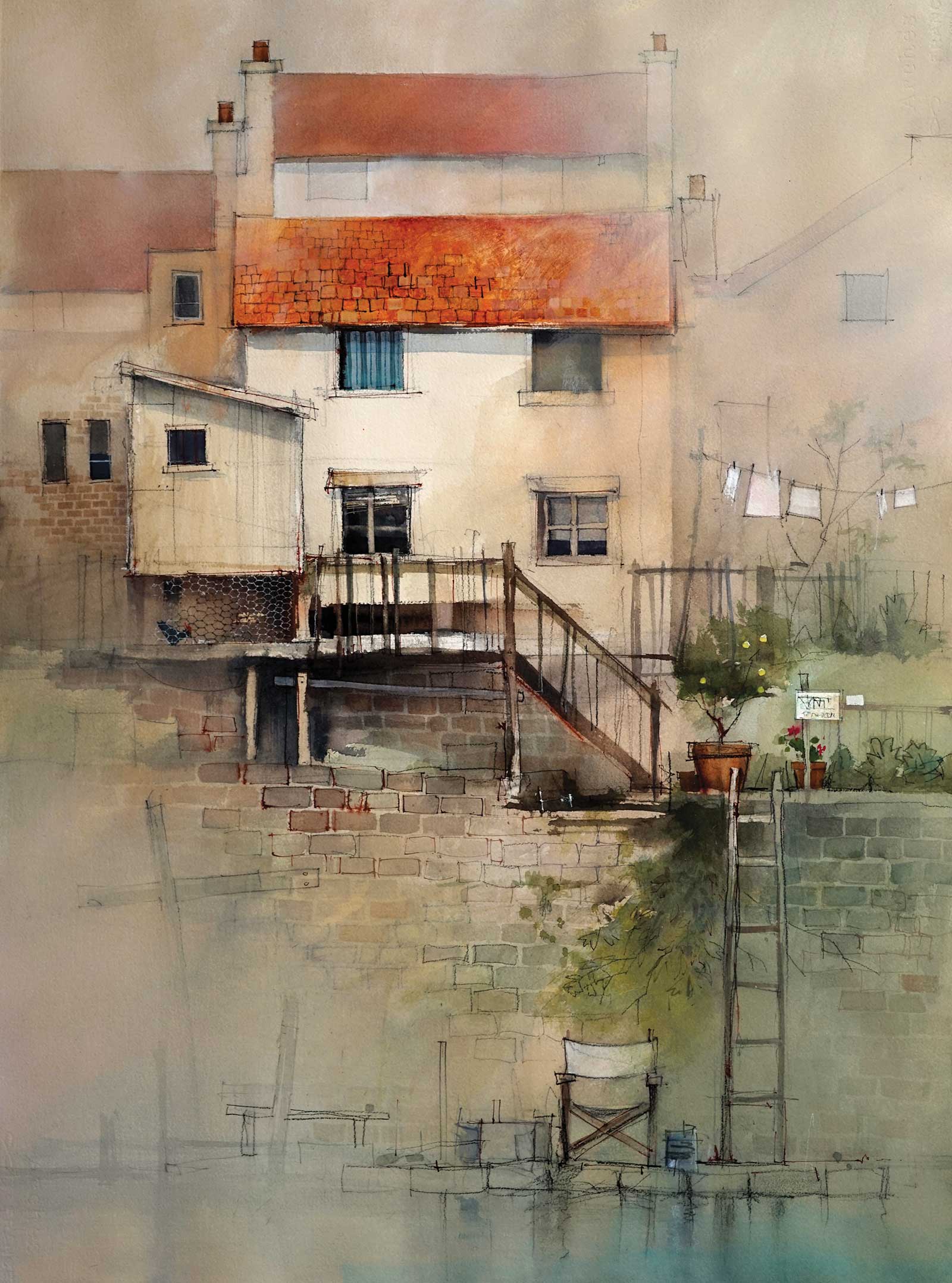
The final step was to refine detail along the path from the foreground chair, up the ladder and stairs and onto the landing. The washing on the right was made cooler and whiter with gesso and some simple, understated detail was added to the lower left with a charcoal pencil.
I like to have the less important areas appear sketchy and understated to amplify the detail in the focal areas. The empty director’s chair and the title Pondering The Waterfront hints at the missing figure sitting and watching the water. The title is also a nod to my four-year procrastination before starting this painting. —
Contact at www.johnlovett.com