



My inspiration comes from nature-themed scenes—landscape, skyscape, animals, forests and flowers. I choose oils for their versatility and their potential to capture the light on a landscape. They are easy to blend, apply evenly on the surface and can be wiped out completely if needed. I will take many photographs of the subject and make a small field painting if I can. My goal during outdoor sessions is only to paint an impression of the scene, rather than a complete rendition. At the studio, I will use these color studies, and I will modify the composition if needed. A careful study of the scene allows me to make a unique plan, and I get immersed in the scene as if I were there. Previous studies serve to decipher which colors and values are important, and the photographs will help me to decide about composition. I usually paint places I have visited previously; I find that even if I couldn’t get an outdoor study, I remember the way they felt.
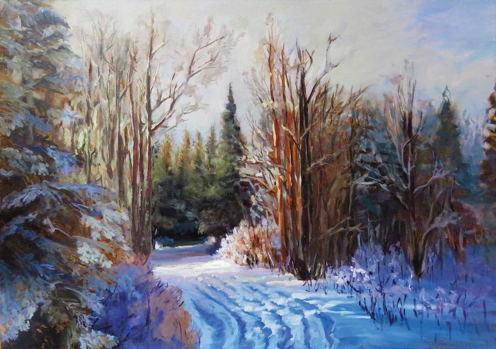
Sparkling Forest, oil on canvas, 20 x 28" (50 x 71) The warm light of the sunset appeared through the tree spaces, infusing the otherwise shaded scene with warm light on this cold winter day. The light from the sun reflected on the snow together with the trunks of the trees produced a warm focal point. This was contrasted by the cooler and darker shadows produced by the trees. The blue reflected light from the sky on the snow surface made the focal point more pronounced due to its complementary nature.
My plan is unique to each painting, and I’ll begin by asking myself a series of questions that directly respond to the necessities that each image requires. This way of thinking immerses me in the scene and creates one-of-a-kind paintings.
Why am I painting this? What feelings arise when I look at it? What elements or colors are important to give me those feelings? Which are the elements that comprise the composition? I create my own “narrated” value scale. I will assign the highest number to the darkest dark and the lowest to the lightest light and establish all other values comparing with those two. This will only be a guide to start the painting. I state which element in the painting is the darkest and I find the next element that is less dark, and so on by comparison.
Where is the light coming from? Is it a warm or cool light? What kinds of perspectives need to be followed and where? Aerial, linear, or both? Are there gradations that will help me to convey a three-dimensional object? Cool to warm, dark to light, hard edges, same value with different temperature mixtures side by side?
I’ll also need to decide on a palette before starting to paint. It’s important to choose which colors will be closer to the actual colors on the painting to achieve better color harmony. However, I select a higher number of colors that relate to my center of interest, especially when color is my driving force to paint the particular image. For example, for the following demonstration I chose six different colors between yellow and red, but only one green and one blue.
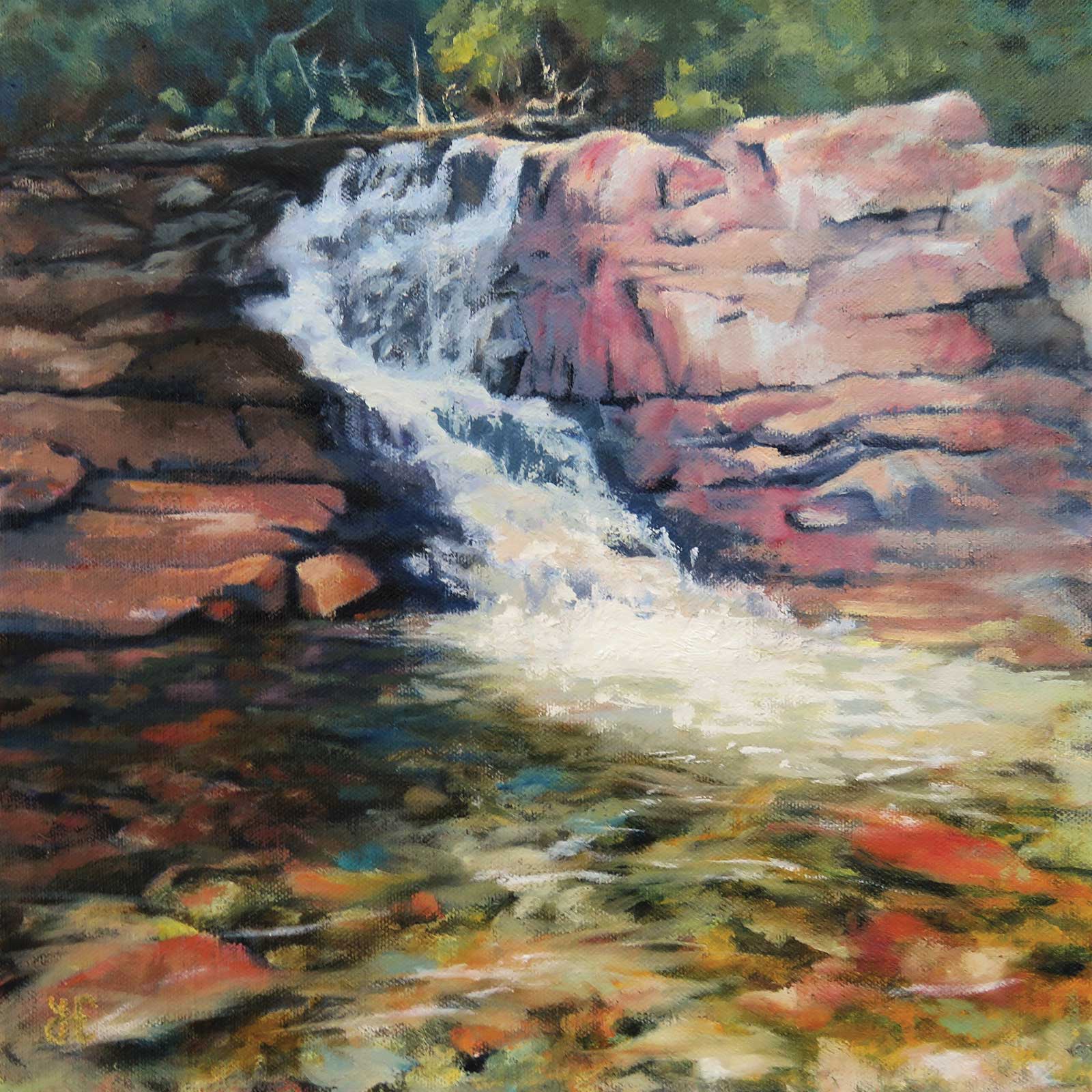
Soft Cascade, oil on canvas, 12 x 12" (30 x 30 cm) Inspired during a hike on a summer day, the fresh water sparkled under the sun, cheerful, colorful and bright. The loose brushstrokes with opaque paint on top of transparent glazes helped to achieve the transparency of the water.
After I feel I have a good idea of what I am going to paint and how, I might arrange the elements again if it is needed to get a better composition. I do this just with a quick sketch or I use an image program on the computer. I decide what elements to paint first. I paint from back to front for landscapes and skyscapes, this way you can increase the level of detail and chroma closer to the viewer. However, for animals and flowers, I will start with the shadow colors, followed by the light, with the background being the last area I paint. This approach gives me more control over the finished image.
When painting skies, the focus is on value and color temperature, followed by edges. Painting sunsets and sunrises outdoors poses many challenges that will need to be overcome. The first difficulty is the short time they last; the second is the lack of good light in order to see your palette. You can also observe them and paint them just from previous observations. The sun will be the lightest and warmest element in the painting. Any other shape or color will be influenced by the presence or absence of the warm light and the direction that irradiates. The edges will be mostly soft because of the organic nature of the landscape. The planes are what determine value and temperature. The closer and more perpendicular to the sun’s rays, the lighter and warmer the plane will be. You will find that during sunset since the air is full of moisture and dust, the setting sun will be accompanied by more red and yellow clouds. However during a sunrise, since the air is much clearer, the colors will be pinker and cleaner. Another characteristic of photographs is that they usually show all shadows darker than they are. The naked eye will usually see some local color on the ground.
A wet-on-wet technique is what allows me to make smooth transitions. By preparing slightly different mixtures of paint and applying them one next to the other, there is only a little blending that needs to be done. This allows me to achieve colorful transitions that won’t lose intensity through too much blending.
My Design and Composition Tactics
Keep Colors Clean
Mix paint batches before you start painting. Only blend paint mixtures that are beside each other with a soft, synthetic brush.
Apply Paint Thinly at the Beginning
Use a synthetic brush on a smooth surface to be able to apply a thin coat of paint. Add fat content to the paint to be able to make a new layer on top.
Have a Complete Plan Before You Start
Have your checklist ready, with relevant questions for you, before painting. The questions will help you understand the motive behind your artistic selection and design a plan to achieve your goals.
Test Value and Temperature Relative to the Painting
Every time you add a color mixture to the painting, check the value and temperature relative to the paint already on the surface, not the photo. Even if it is not the same as the photograph, it might work on the painting itself.
My Art in the Making Sunrise on the Beach
Before any painting starts, I make a plan using the questions previously posed above. In this demonstration, the feelings that I wish to elicit are of hope and renewal. Warm colors and smooth transitions are paramount to give a sense of comfort. Technically, color temperature and value will help with the shapes of the clouds and explain the direction of the light. I chose an ample selection of warm colors for this palette to make transitions on the light side. In contrast, only two colors were selected to increase value and cool off mixtures. I set up the colors from warm to cool. Most of them are transparent colors, which will help to better control the color intensity and temperature without modifying the value. Even though I prepare the color mixtures before starting to paint, they can be modified if needed. By comparing the color mixture with the painting already on the surface, I decide if the value and temperature are correct and if not, I change them. The details of the bright backlit clouds and the sun’s reflection on the water will give this painting life.
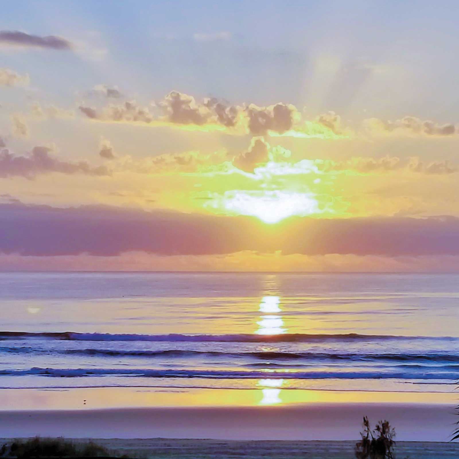 Photo reference
WHAT THE ARTIST USED
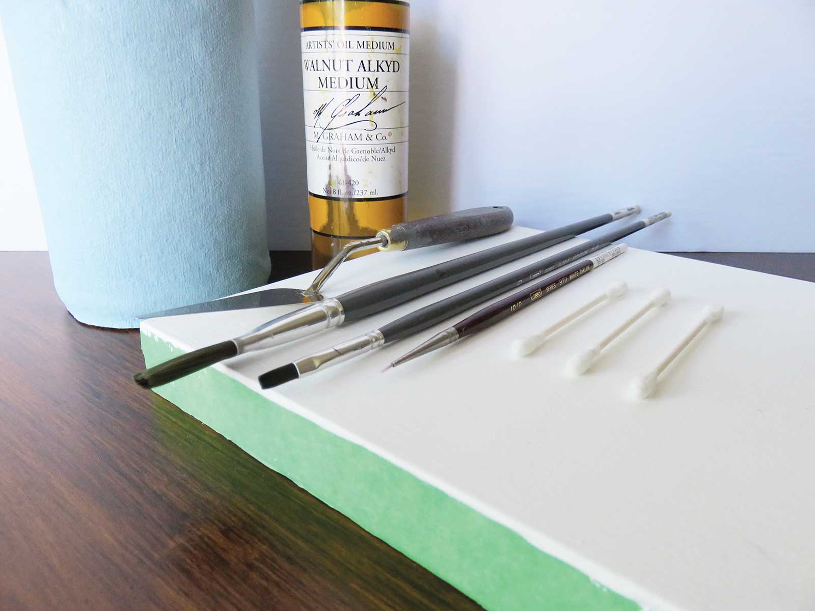
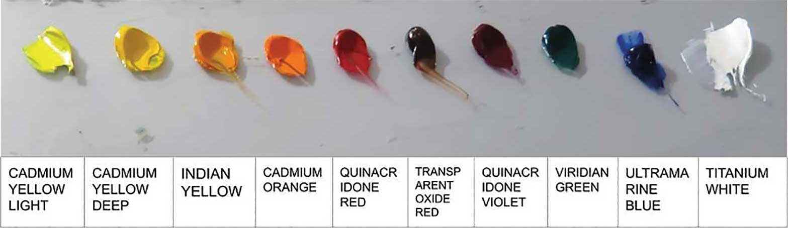
Oils
Cadmium yellow light, Cadmium yellow deep, Indian yellow, Cadmium orange, Quinacridone red, Transparent oxide red, Quinacridone violet, Viridian green, Ultramarine blue, Titanium white
Additional Materials
One cradled birch panel prepared with PVA glue (two coats), Acrylic gesso (two coats), Palette knife, Glass palette, Synthetic brushes (sizes 1, 3, 4 and 6), Cotton swabs, Paper towels, Walnut oil medium, Odor-free solvent
 Stage 1
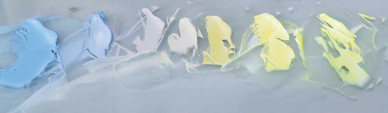
Stage 1 Color Mixing for the Sky
I start mixing the paint for the sky from top to bottom. The sky is darker and cooler at its highest point and becomes warmer and lighter the closer to the sun.
 Stage 2
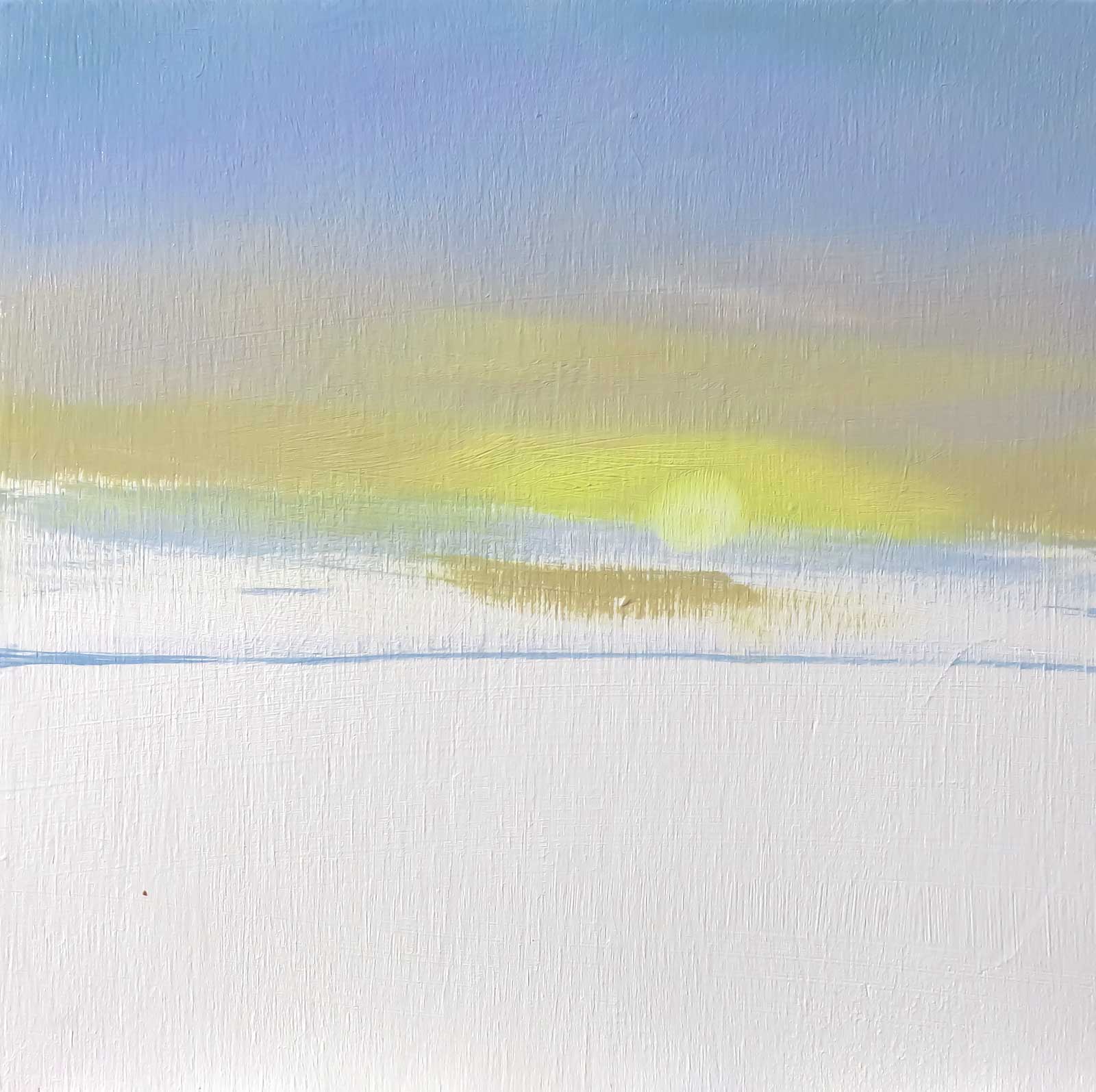
Stage 2 Sky Color Application
Using a synthetic brush I apply the color mixtures one next to the other thinly and then blend them from the sun outwards. A very little quantity of odor-free solvent can be used here to thin the paint and improve fluidity. I use a cotton swab to take the paint off where the sun will be.
 Stage 3
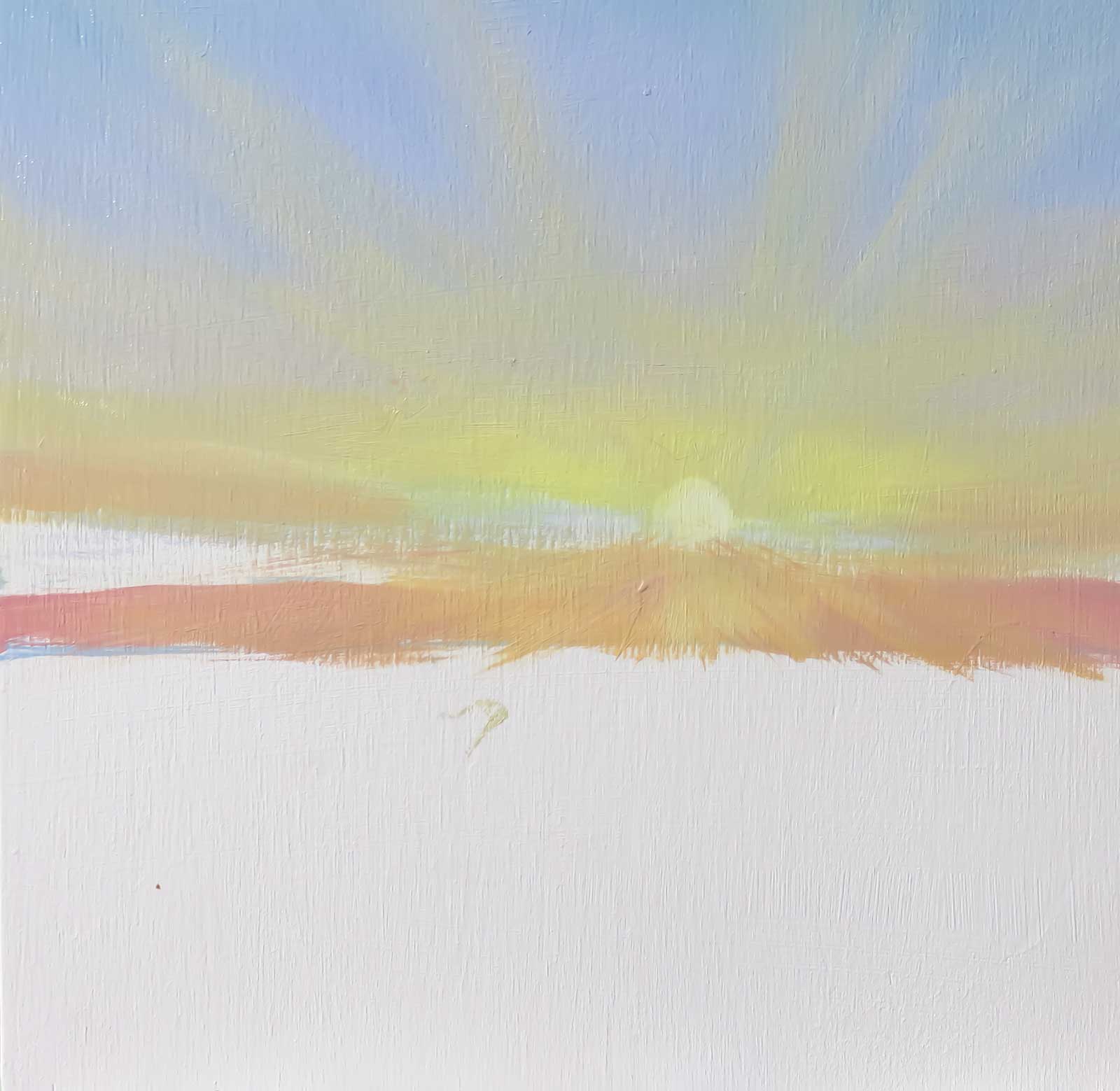
Stage 3 Mix More Colors and Start Sunrays
I prepare a warmer mixture for the lower part of the sky and draw the sunrays from a point in the middle of the sun outwards using a slightly warmer and lighter mixture than the sky.
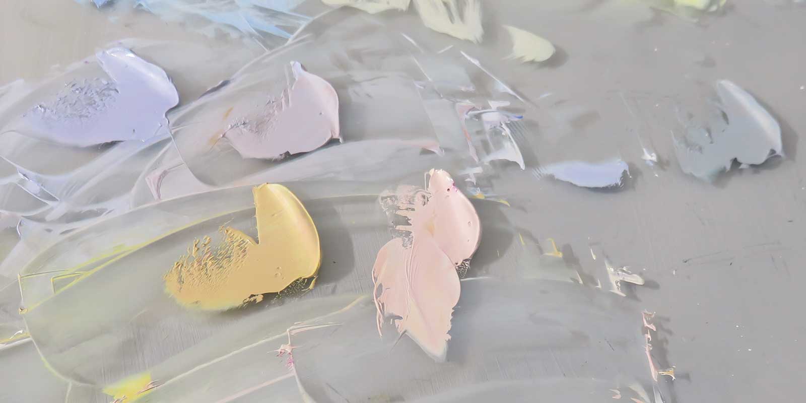 Stage 4
Stage 4 Mix Colors for the Water
The water colors are a reflection of the sky, only warmer and duller, except when it is reflecting the sun, where the warm colors are more intense.
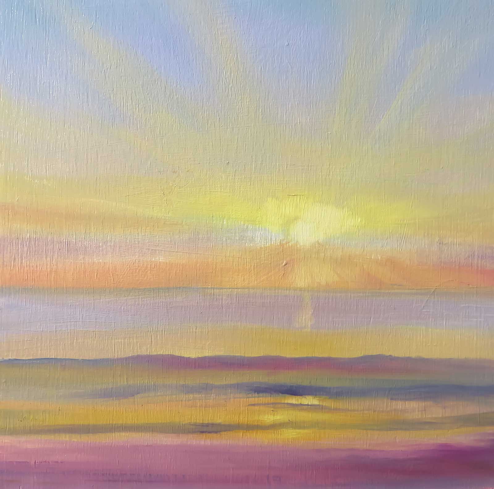 Stage 5
Stage 5 Color Applications on the Water and Beach
The water on the horizon is bluer but has a similar value to the sky because of aerial perspective. The water mirrors the sky above on the flat surfaces and becomes darker when there is a wave because the plane changes to vertical, therefore impeding the light from reaching the other side.
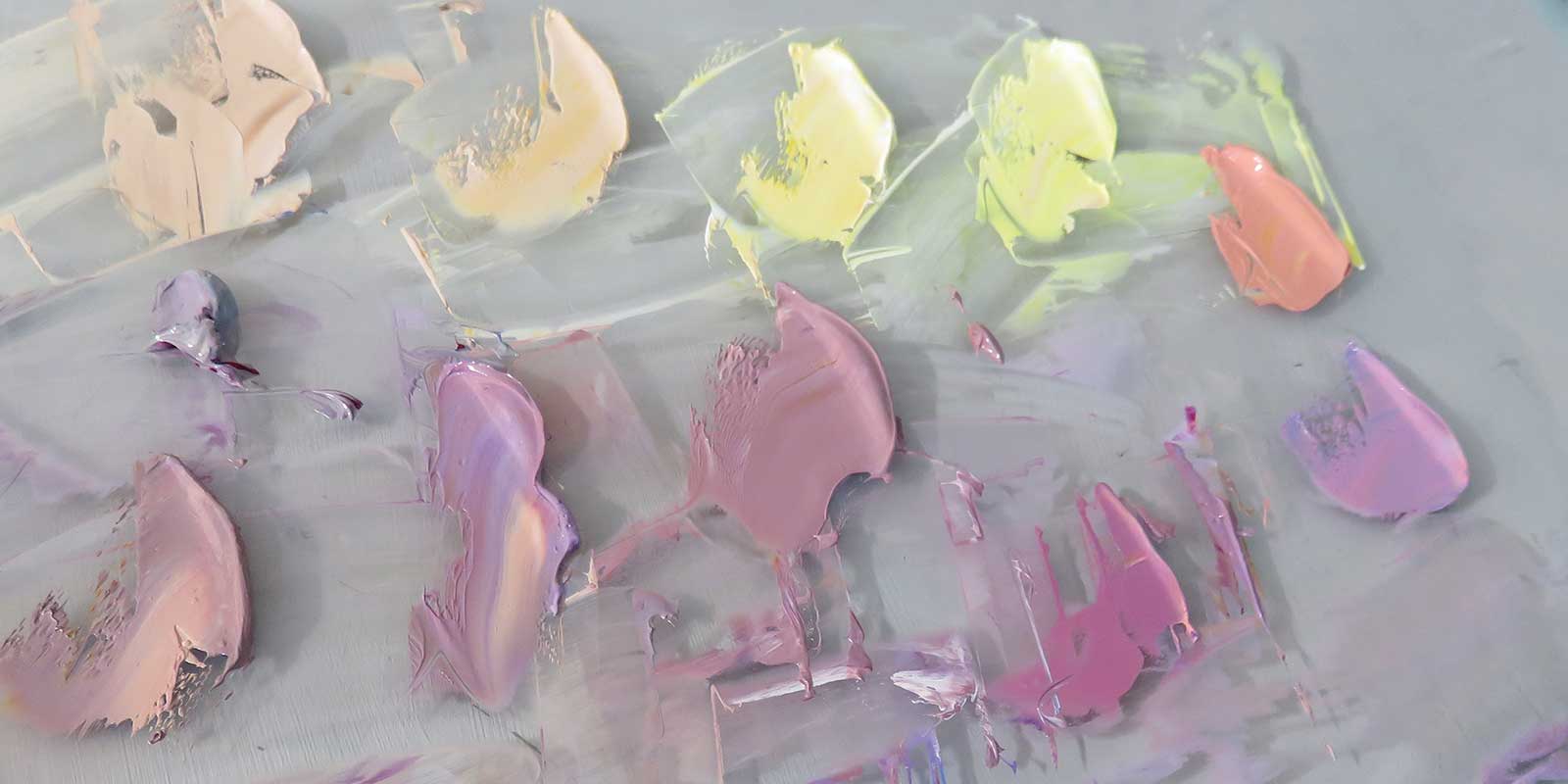 Stage 6
Stage 6 Mix Colors for the Clouds
The clouds have a warmer and lighter color for their interaction with the sun rays, and a darker and cooler color for the absence of direct contact with the light. I make pairs that will go together on each cloud.
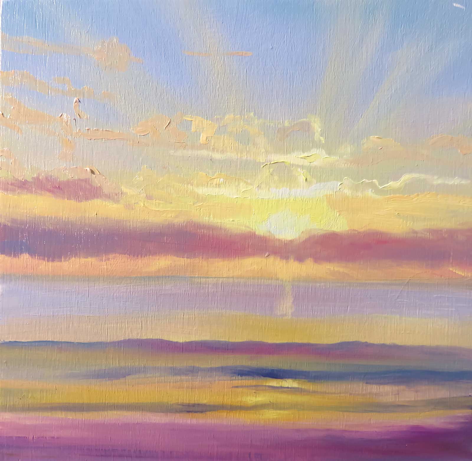 Stage 7
Stage 7 Application of the Cloud Mixtures
I add walnut oil to the paint batches and I carefully apply them on top of the previous paint. I am especially careful of the direction the paint is applied to try to make “painterly” brush marks.
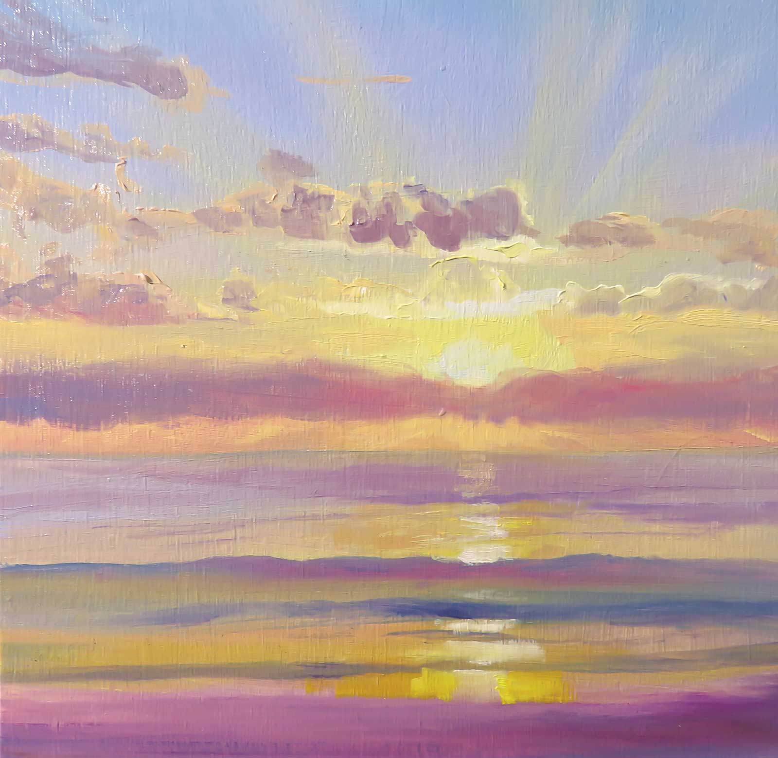 Stage 8
Stage 8 Clouds
I add the shades to the clouds, always taking into account the places where light might spill from the border of the cloud, making the shade warmer and lighter.
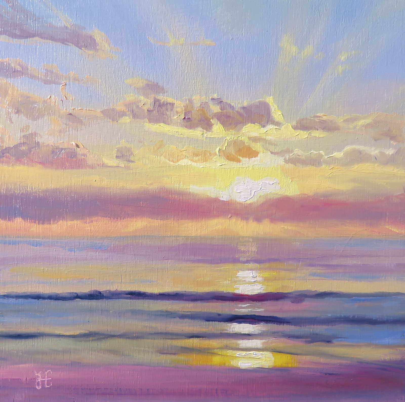 Stage 9
Stage 9 Last Details
I add thicker paint taking into account the direction of the light and the reflections to waves, clouds, sun and sun reflections.
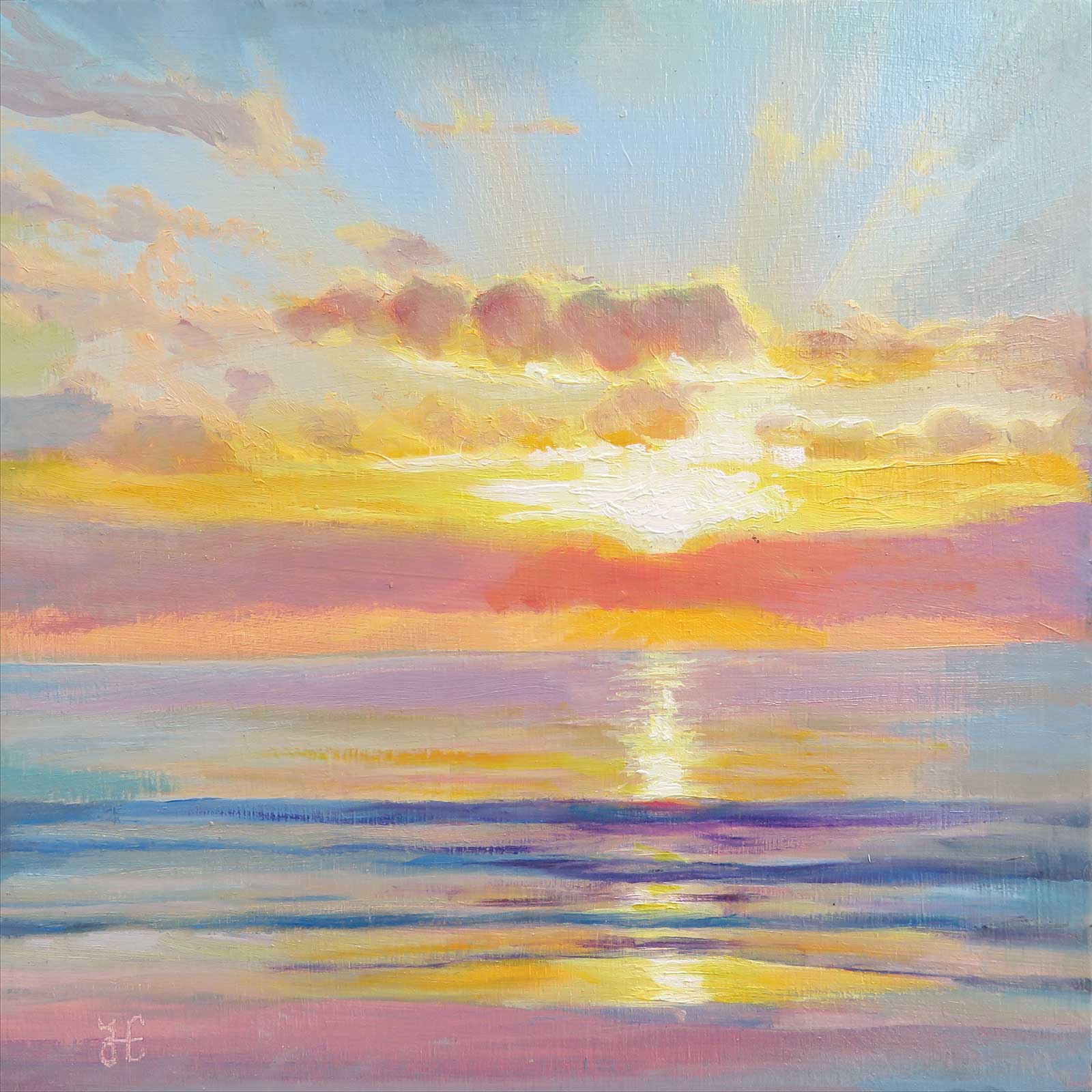 Stage 10
Stage 10 Value and Color Intensity Correction
Sunrise on the Beach, oil on wood panel, 8 x 8" (20 x 20 cm)
If values are too light or color intensity is not enough, you can adjust the values after it is dry to the touch using transparent glazes with walnut oil and solvent.
About the Artist
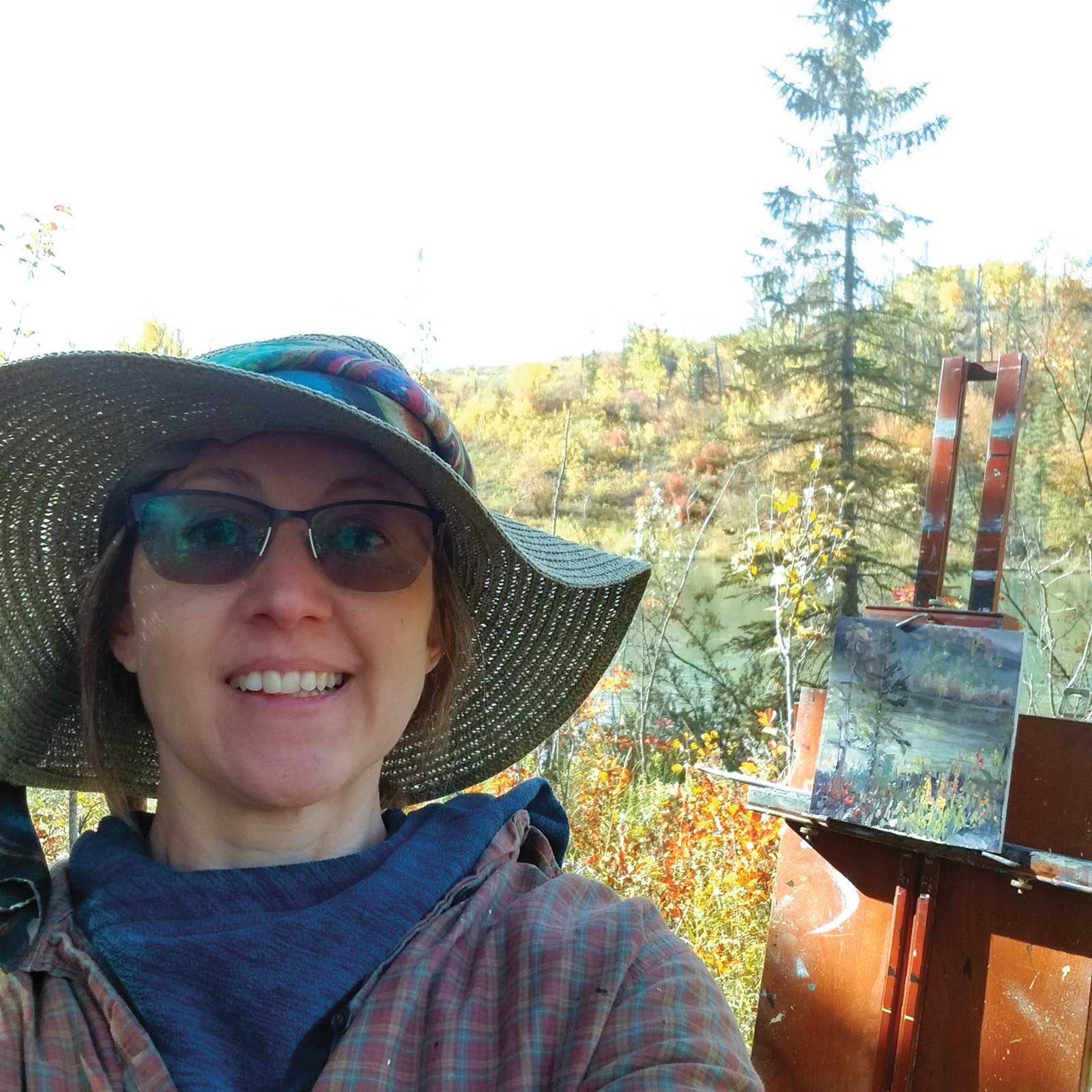 Yanina Eberhard
Yanina Eberhard is an award-winning Argentine-Canadian impressionist artist. Her paintings are a testament to her determination to capture a vision informed by her admiration for the natural world. Her paintings start with a pull of attraction to an everyday object or landscape. They become tangible in her studio, where she designs a plan through a rigorous analysis of the image and her memories. The intention of her art is for viewers to feel as if they’ve found the exact words they were in pursuit of. Every painting has its own story, created from photographs and memories alike. In 2018 she began selling her paintings at art shows and online with good reception. She is now an active member of many prestigious art organizations. Her art is part of private collections in Europe, North America and South America.
Represented by
Paint ur Art Out, Alberta, Canada www.painturartout.com
Leighton Art Centre, Alberta, Canada www.leightoncentre.org