


To create art is not to copy reality slavishly. For me, a good painting is not only loosely based on representation, it is also a metaphor of energy and the constant flux of spatial relationships. Beyond the world of appearance, I sense a vibrational force that can only be described as the “vital impetus” or “energy of life.” As an artist, I choose to explore this phenomenon through my paintings.
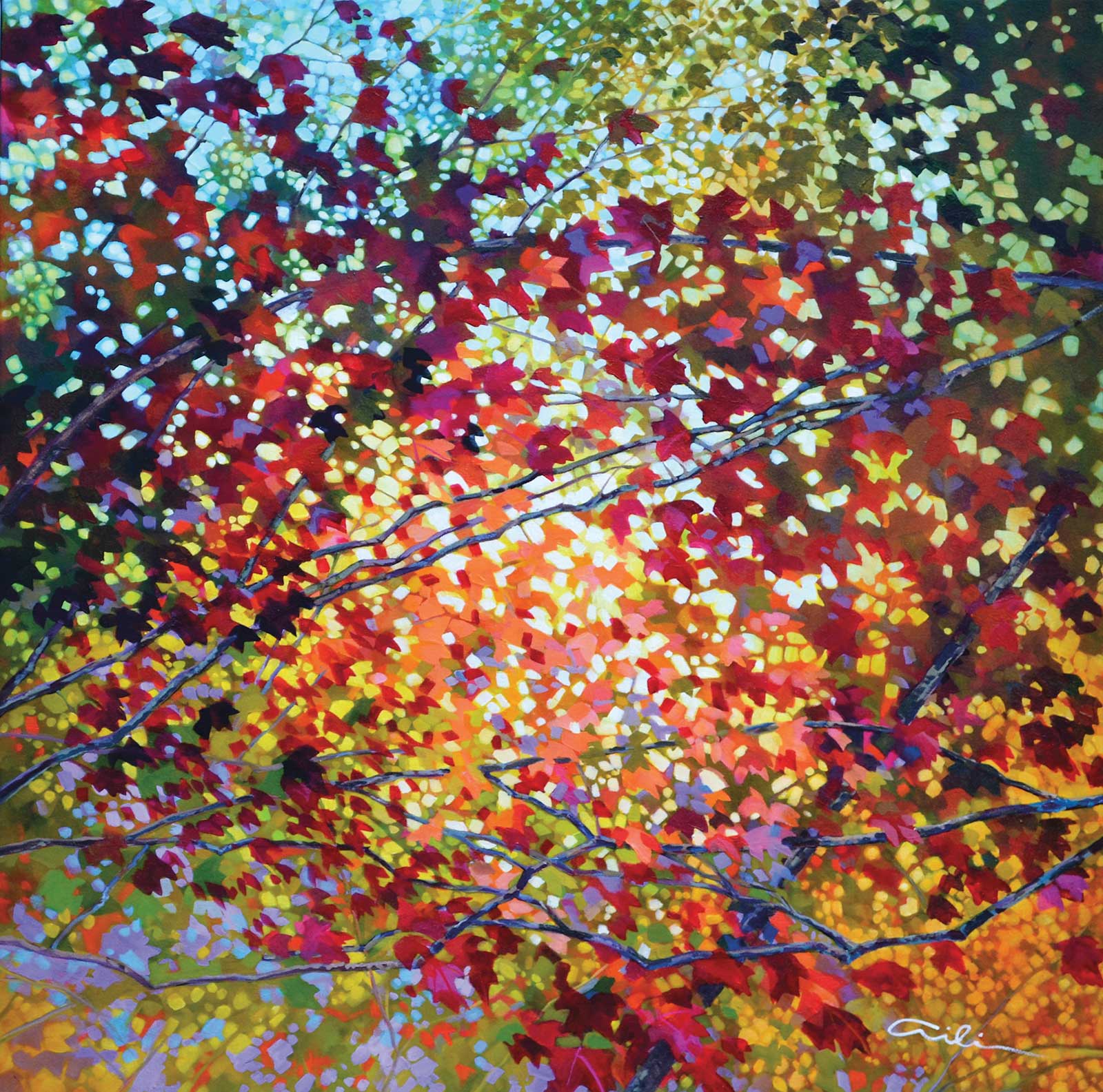
Nebula, acrylic on canvas, 36 x 36" (91 x 91 cm) Autumn leaves are my favorite subject matter. The basic design here is a sphere with diagonal lines.
Artists are on a journey of self-discovery through art; we are aware of the sights and sounds and sensory data of the world, and are able to almost intuitively perceive the profound significance of form, color and line. The creative process starts with being a witness of reality and then evolves into being an active participant of the creative force of nature by manifesting a personal interpretation with paint on canvas. In other words, the perceiver projects what is perceived and then creates a work that is stylistically original because it has evolved from a unique individual who is portraying the relationship between subjective experience and everything else. This creative process involves a plunge into the very source of passion and daring: it is getting to one’s “center” which is connected with the rhythm and harmony of the whole universe. Art provides us with a way to experience ourselves in relation to the universe through aesthetic emotion. To paraphrase Clive Bell, “It is the mark of great art that its appeal is universal and eternal, is independent of time and place, and arouses aesthetic ecstasy.”
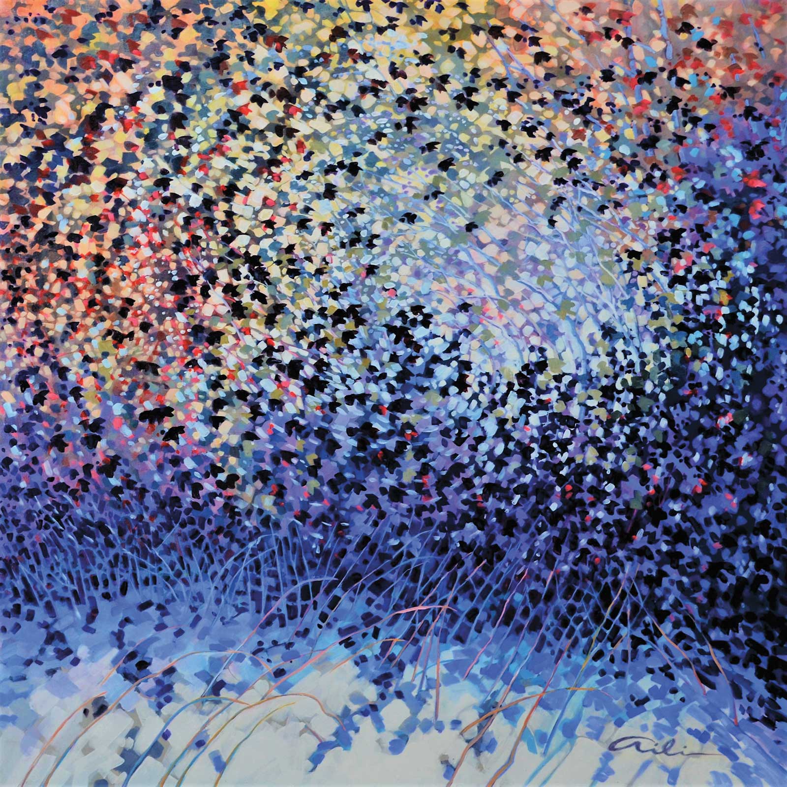
Kaleidoscope, acrylic on canvas, 30 x 40" (76 x 101 cm) Color is an important component to this painting. I used many glazes of nickel azo yellow and magenta to create this affect. It glows! The basic design is verticals cut by subtle diagonals.
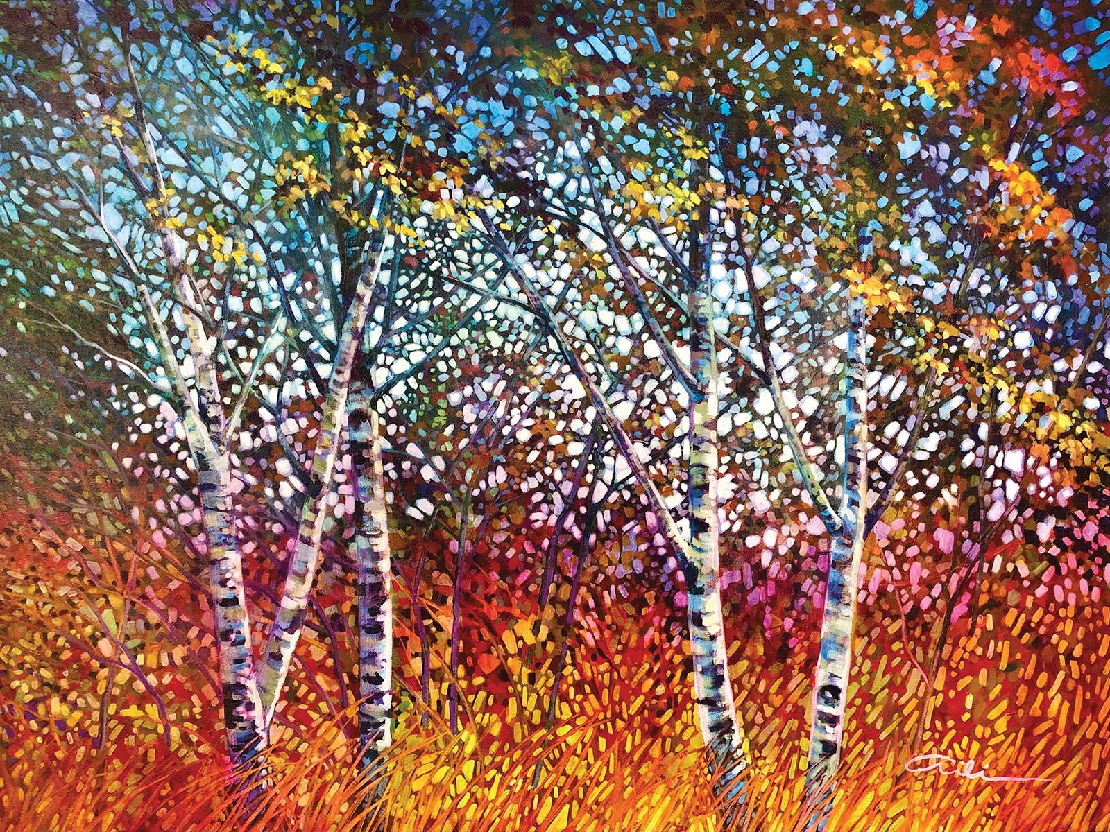
Winter’s Bloom, acrylic on canvas, 36 x 36" (91 x 91 cm) On occasion I paint a winter scene, or sometimes just the “memory of winter,” this piece having the design of a sphere resting on a horizontal plane. I was happy to use mainly cool colors rather than the usual warm colors of autumn.
Organizing the rhythms of nature into patterns that shape the overall composition of the painting requires constant attention and a critical eye. But it is worth the effort because this is what gives momentum to most paintings. To confirm an overall design, I usually begin with a quick sketch that breaks down the scene into basic shapes. This aspect of design involves calculated planning, but I also leave my options open to be able to modify and improve the design as I go along. Each painting has many possible outcomes. Part of the joy of creation is to remain flexible and see what happens!
My Art in the Making Golden Pond
I always have my phone/camera handy when I walk in the woods near my house, just in case there is something that catches my eye. Afterward I eagerly sort through all the possibilities and choose a photo that inspires me to create my next painting. This inspiration is usually based on an underlying abstract composition that I discover in the image. With this particular photo I realized that the composition worked better as a square rather than as a rectangle, so I cropped the photo and printed out a square version to attach to my easel for reference.
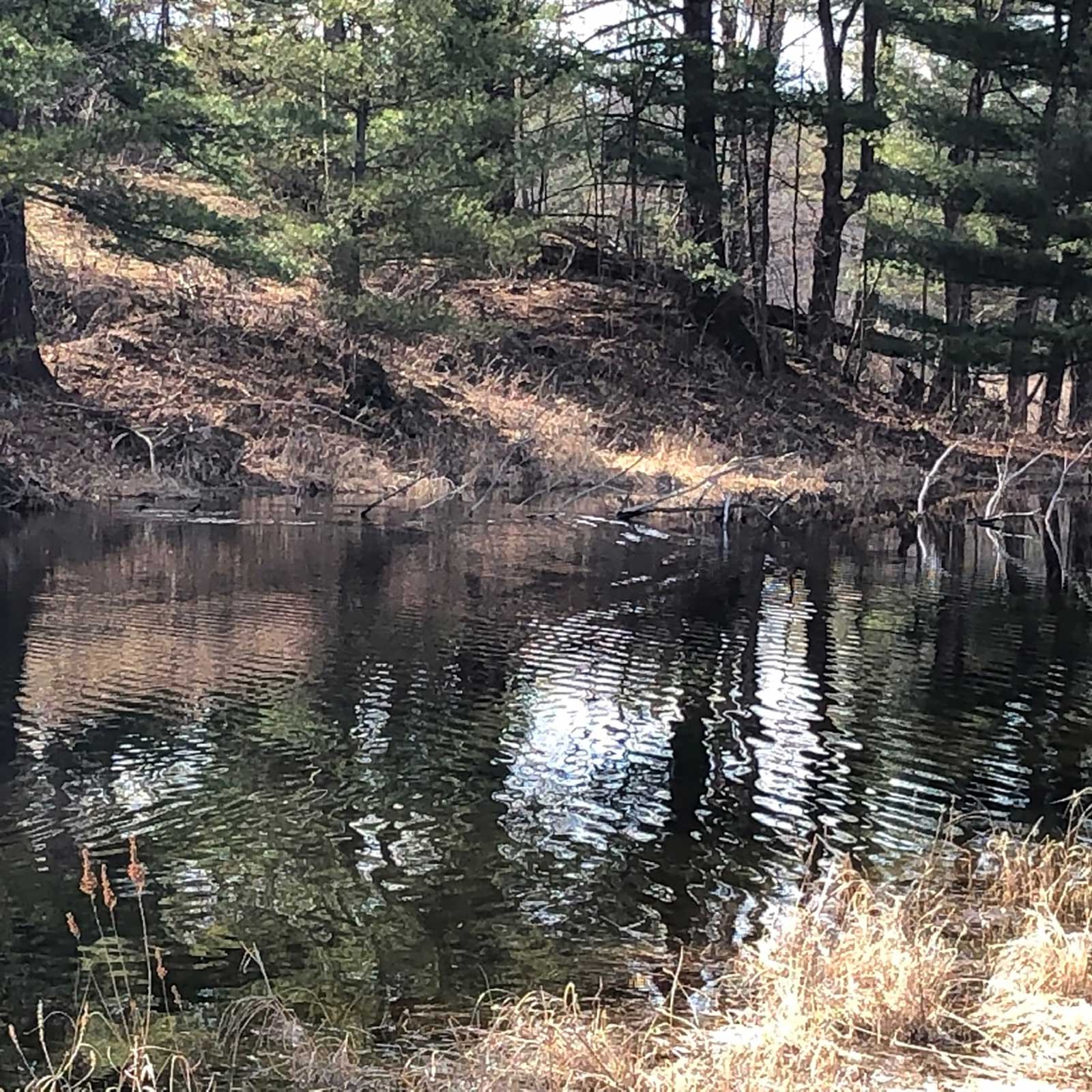 Reference photo
 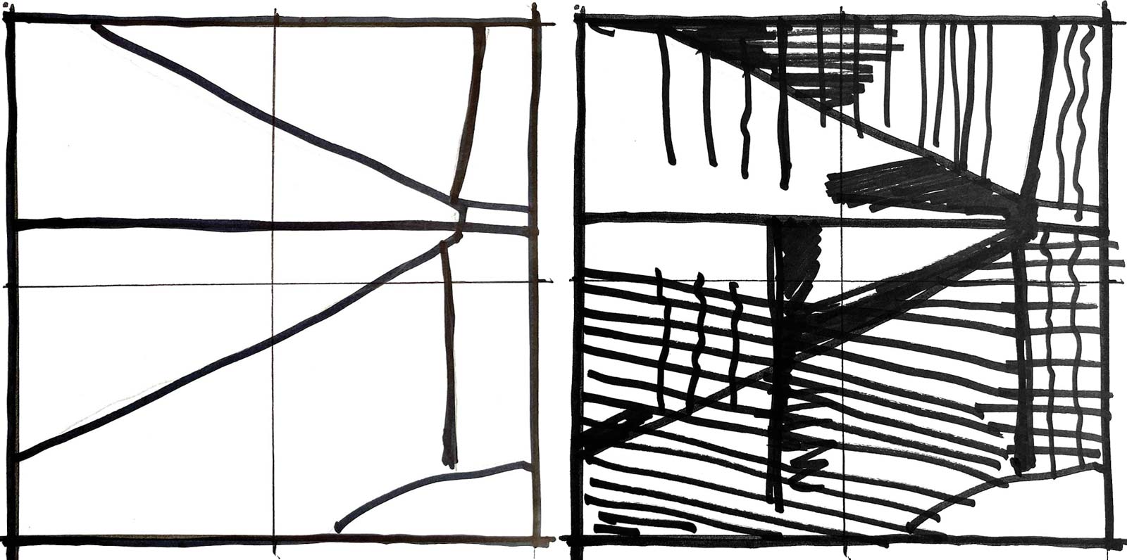 Stage 1
 Stage 1 Thumbnails
Thumbnail 1 (above) is my first attempt at analysing the composition. I drew a rough 5-by-5-inch square with black marker and divided it into halves both vertically and horizontally. That helped me determine where to draw the shoreline. I noticed that the shoreline is in the middle of a reclining equilateral triangle that is created by the combination of reality and its reflection. Thumbnail 2 (right) is a quick “notan” to determine the lights and darks and to explore a few more patterns and repetitive lines. I taped this notan to my easel to remind myself about the overall pattern.
 Stage 2
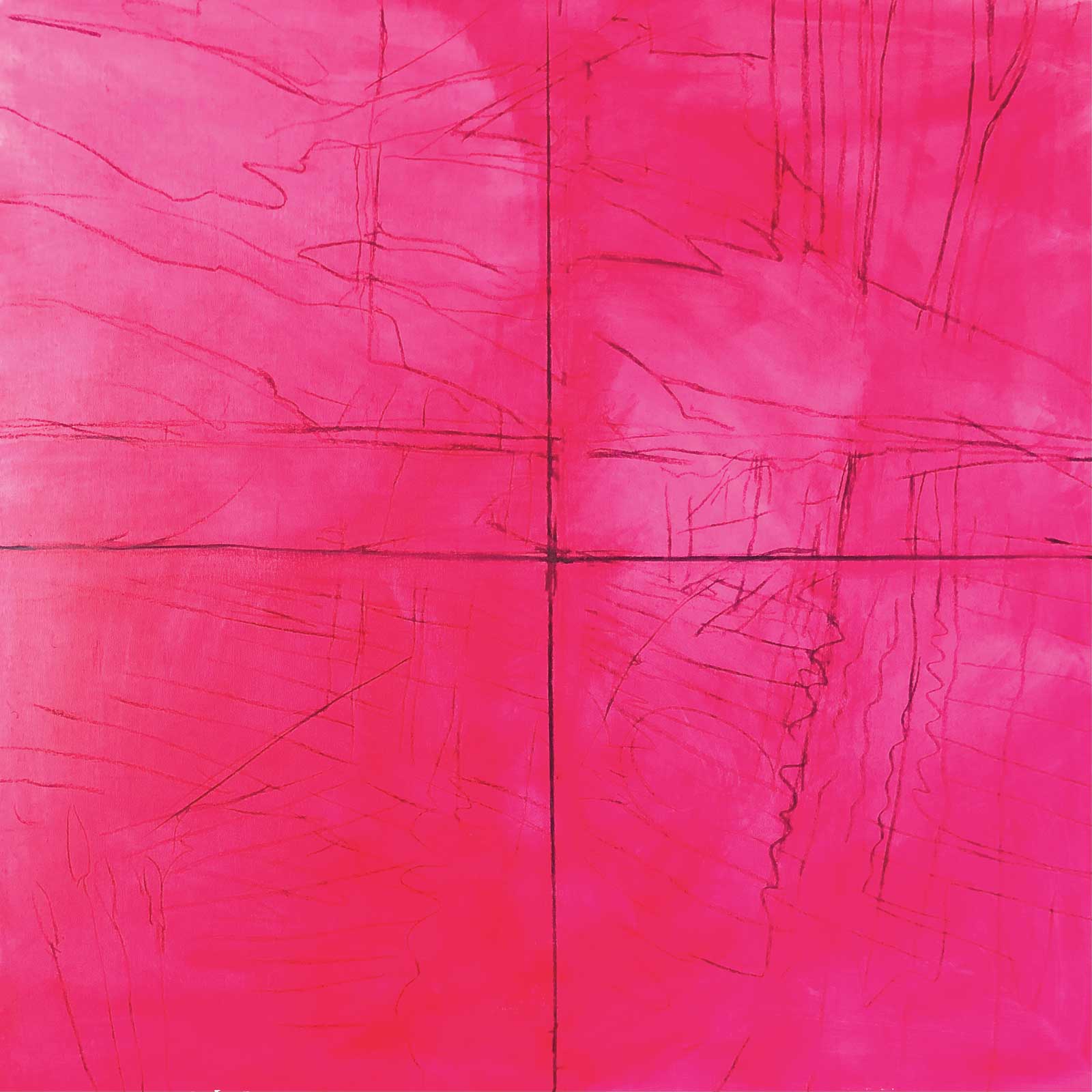
Stage 2 Light Sketch
I decided to use a square gallery size canvas, 40 by 40 by 1½ inches, which I stained with magenta. I carefully divided the canvas into halves and then very lightly sketched in the design with vine charcoal.
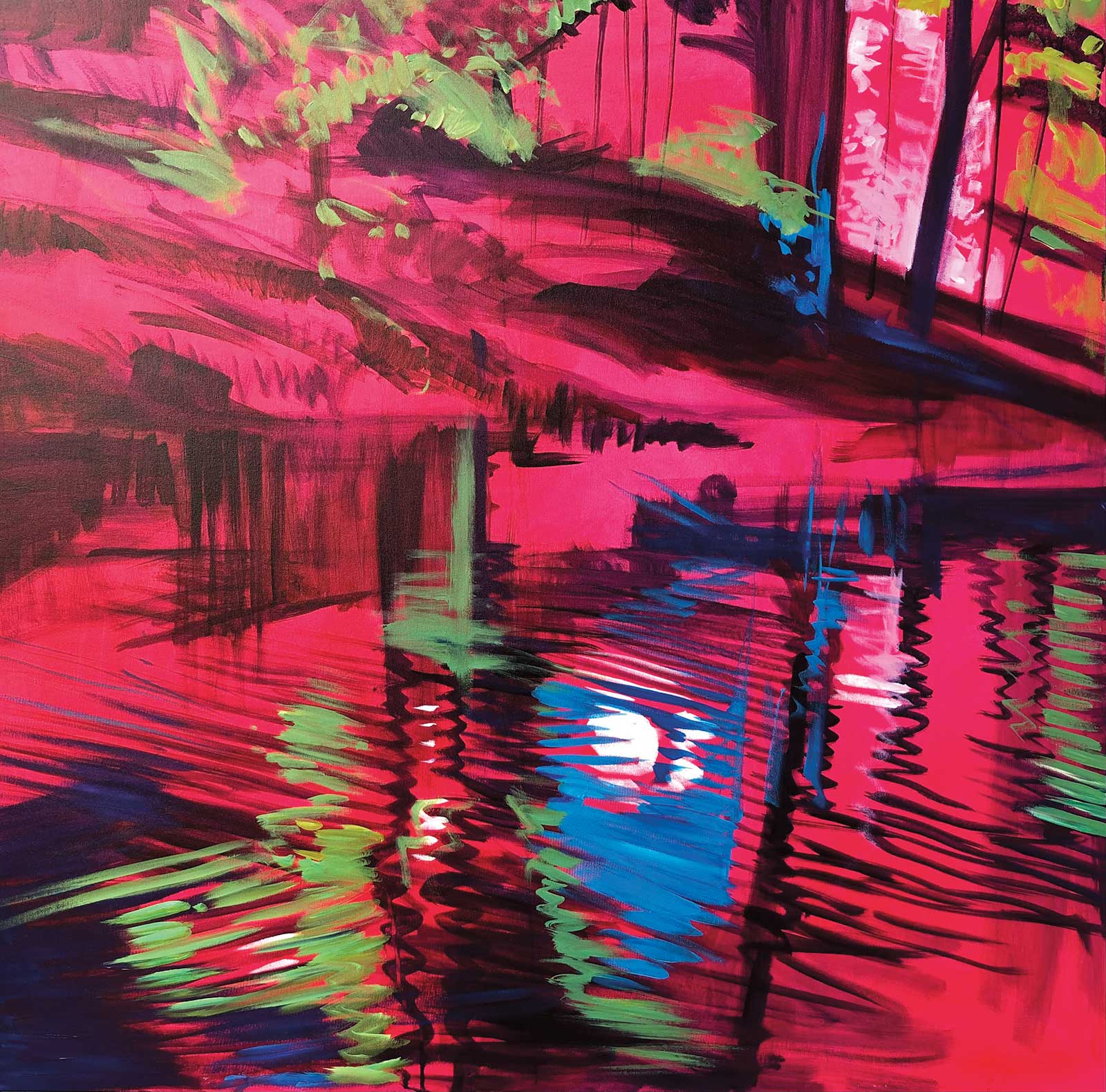
 Stage 3
Stage 3 Putting in the Darks
My thumbnail notan helps me block in my darks with acrylic on the canvas. I wanted to stay loose at this stage and used a 1-inch brush with watered-down Payne’s gray. Any remaining lines of charcoal were brushed off with a rag.
 Stage 4
Stage 4 Lightest Lights
Now that I had my darks in place, I looked for the lightest lights. Once these were established, I began to introduce color.
 Stage 5
Stage 5 Complementary Colors
When I added greens and blues, I was introducing the richness that complementary colors bring to the magenta stain.
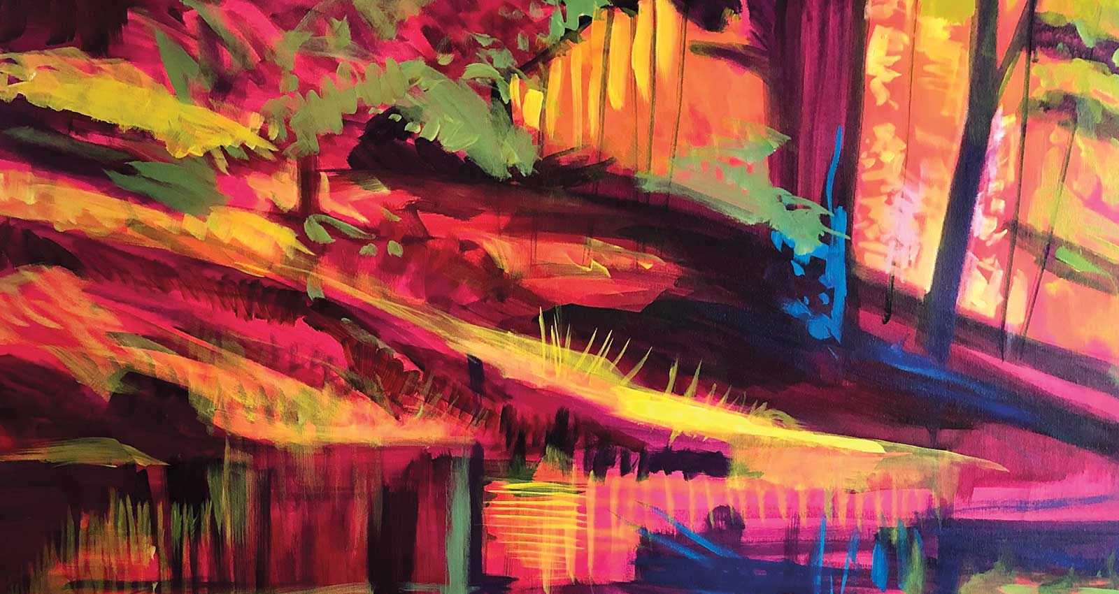 Stage 6
Stage 6 Yellow
I added yellow which helped bring out the lighter areas of the composition and made the painting glow.
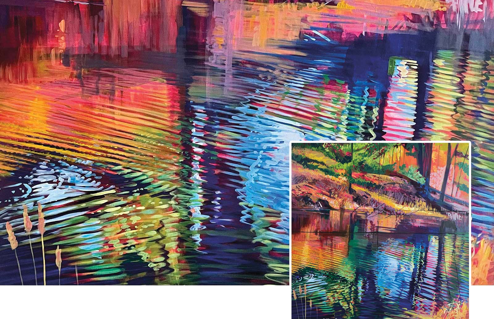 Stage 7
Stage 7 Water
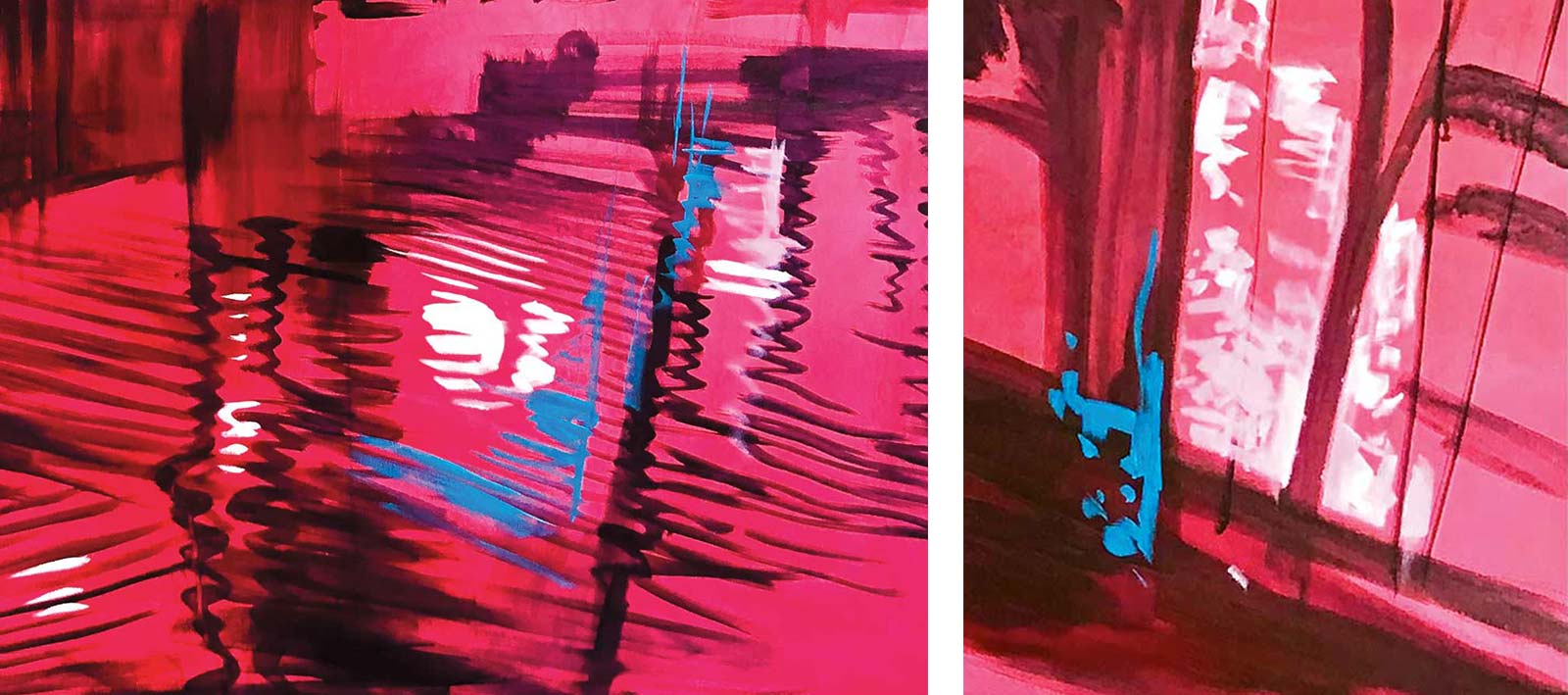
The patterns in water are important to this composition so I worked quickly and enthusiastically to develop the ripples into repetitive patterns.
 Stage 8
Stage 8 Realism
After working on this painting for a couple of days I sat back and took stock: I realized that I had added too many details and that the painting was looking far too realistic for my liking. My intention was not to create a “pretty picture.” This must change!
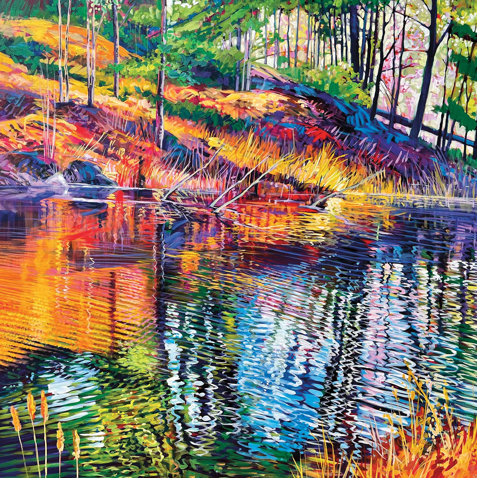
 Stage 9
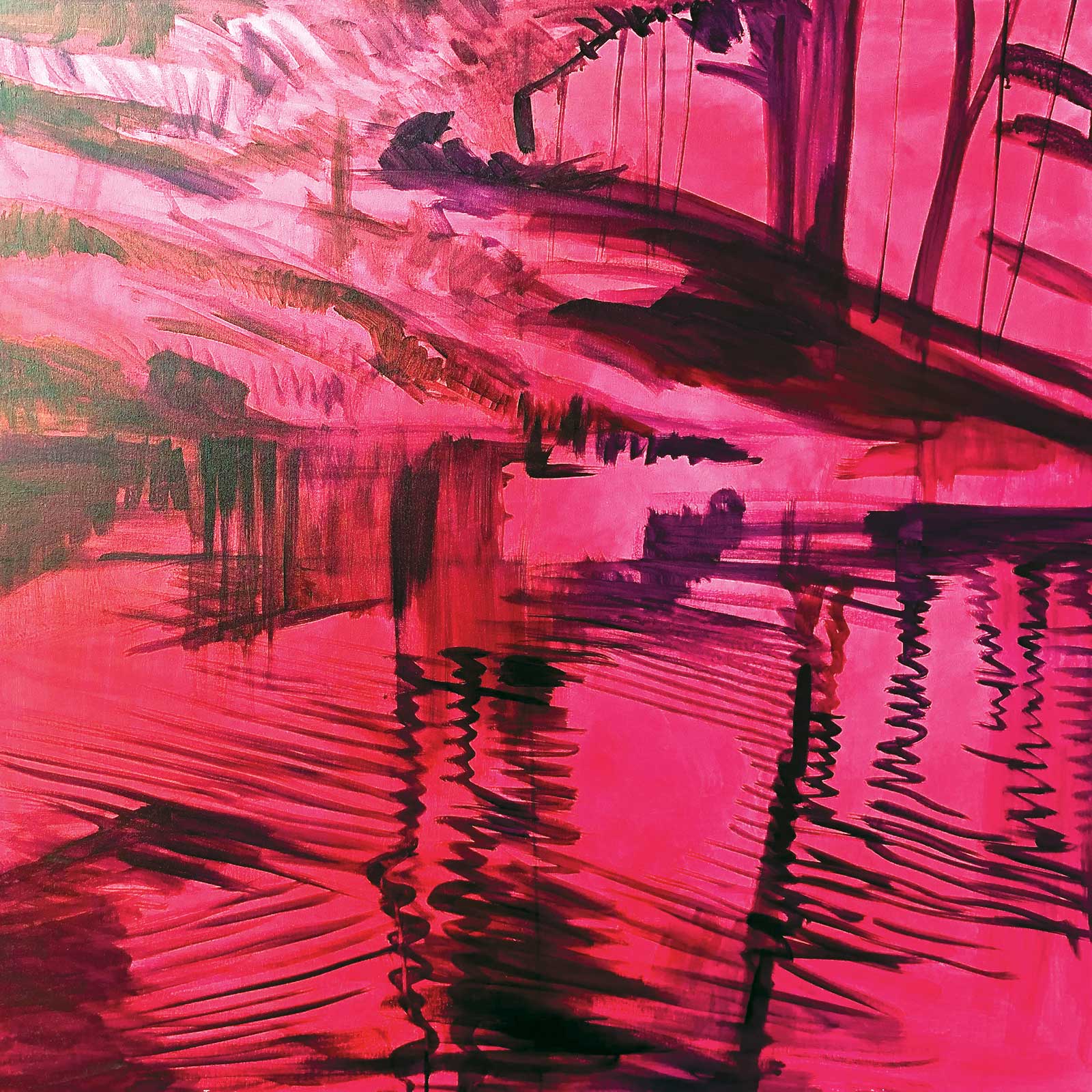
Stage 9 Finished Artwork
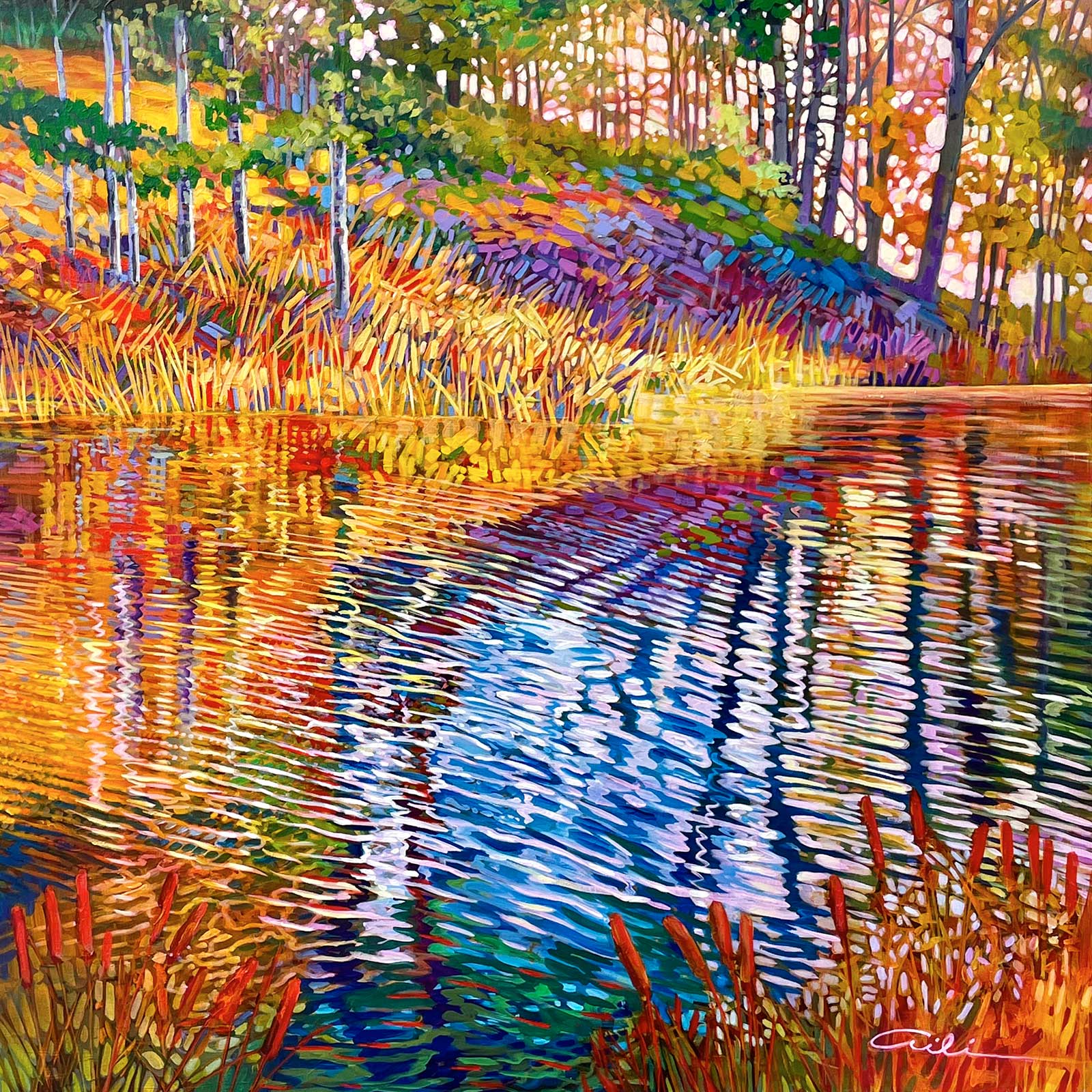
Golden Pond, acrylic on canvas, 40 x 40 x 1½" (101 x 101 x 3 cm)
In order to simplify the composition, I began to eliminate certain elements (such as the white branches in the water and the fallen log at the horizon). Mainly, I wanted to bring back more of an “abstracted feel” to the painting, rather than portraying a realistic representation—so I overpainted much of the painting to break down the recognizable forms into short color units and brushstrokes. The final version of the painting now reflected “energy and vibration” instead of being a realistic landscape. I was glad I took the extra steps necessary to align the painting with my desire to portray “elan vital.” The painting was so vibrant that it sold, right off the easel, to a neighbor who happened to drop by!
About the Artist
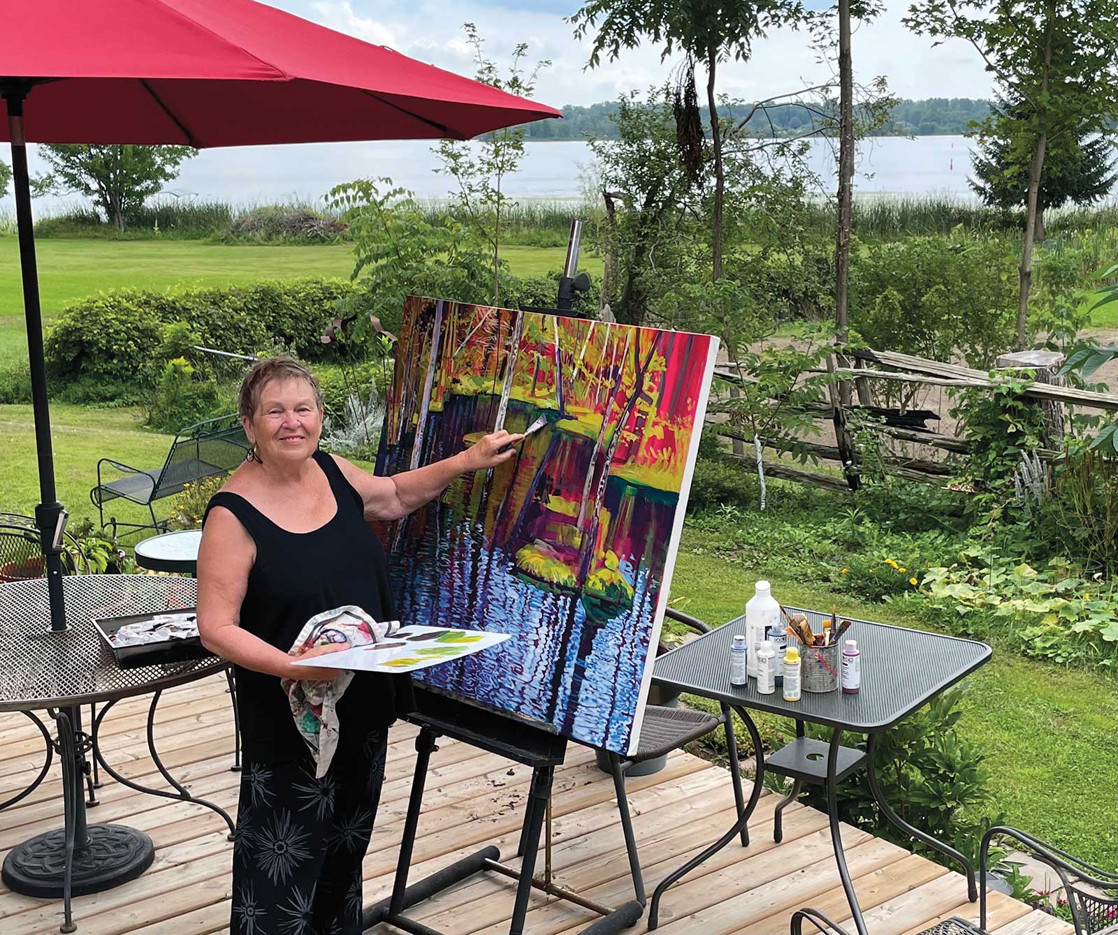 Aili Kurtis
Aili Kurtis is an award-winning artist who explores the rhythms and patterns of nature. She has spent all her adult life studying, teaching and working as an artist in the realms of both fine art and graphic design. Raised in the Canadian north, Kurtis developed a great love for painting raw landscapes as well as portraits of indigenous people. She left the north to study art at the Ontario College of Art (Toronto) and Ecole des Beaux-Arts (Montreal), and received a BA in art education from the University of Quebec in Montreal.
When Kurtis moved to Ottawa she worked as the art director of a TV station, a graphic designer and illustrator, a courtroom artist, a landscape and portrait instructor at the Ottawa School of Art, and as the creative director of a high-tech company. Her interest in art and philosophy has led her on travels across the world.
Represented by
Studio 87, Perth, ON, Canada www.studio87art.com
Galerie Bloom, Montreal, PQ, Canada www.galeriebloom.com
Gallery Raymond, Kingston, ON, Canada www.galleryraymond.com
Butter Gallery, Collingwood, ON, Canada www.buttergallery.ca
Contact at
ailikurtis.fineartstudioonline.com