


One of the joys of still life painting for me is the ability to completely control the composition before my pencil touches the paper. If I were to paint a landscape, I could move things around in my head or draw things differently to make a better composition. But I couldn’t rotate a building 30 degrees and see how the light and environment changes. When I set up a still life, I have full control. A glass bottle can be moved or rotated to see how the light passes through, and how the colors change on nearby objects.
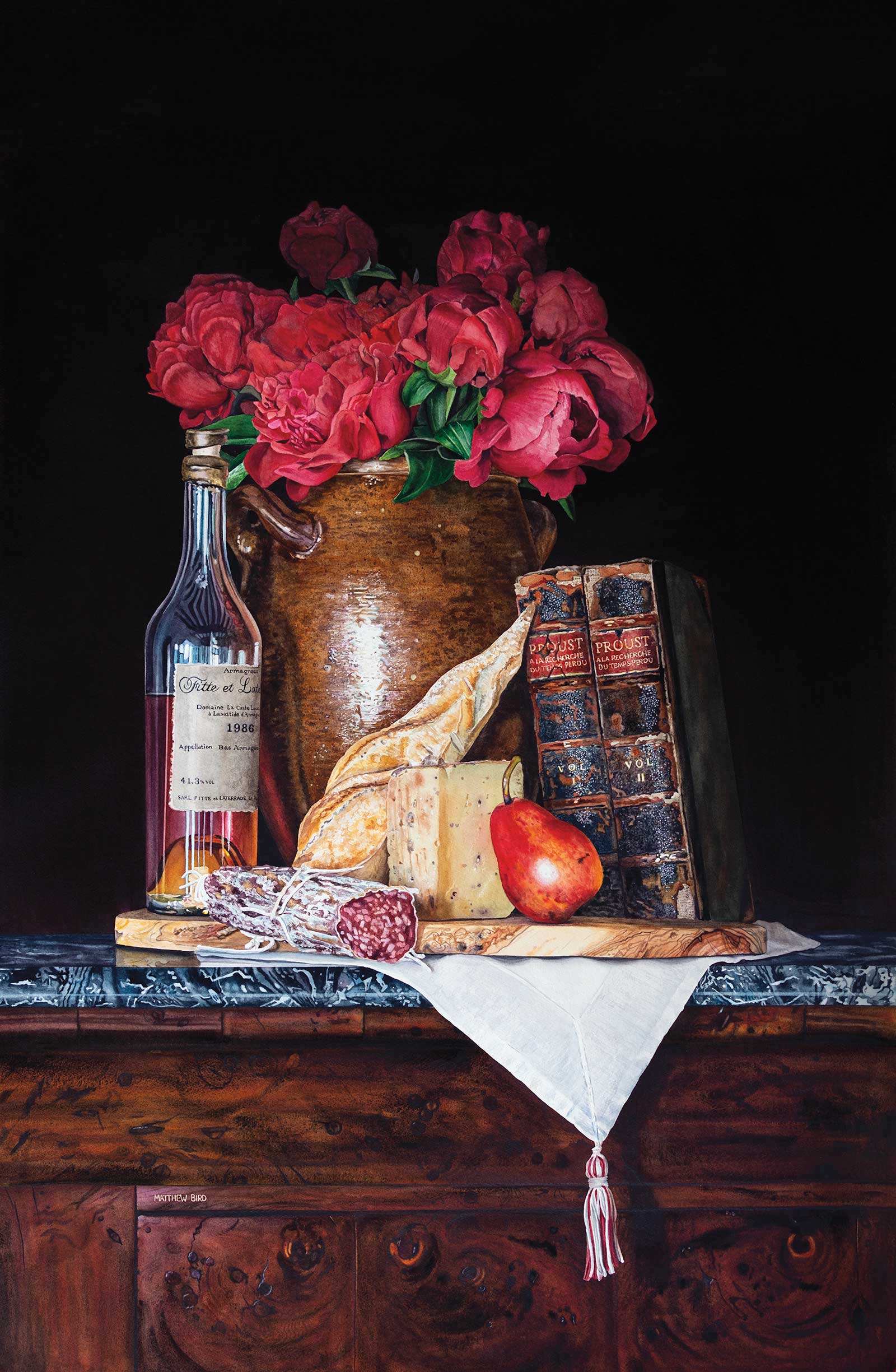
This Provencal Life, watercolor on paper, 41 x 29½" (104 x 75 cm) This painting was commissioned for a château in France, to go above a fireplace. Because a specific space was in mind, I knew the dimensions, and that the high ceiling would require a vertical composition. I placed the peonies in a tall vessel to elevate the floral arrangement to the top of the painting. The cloth and tassel point downward which allowed me to explore the rich, burl wood finish of the furniture. This texture was a fun challenge to paint and adds to a rich composition.
This freedom to play with the arrangement is a fun part of the process. It can take days for me to develop a concept and compile all the elements I want to use. I will arrange the objects over and over until I’m satisfied with the composition.
Whatever the story or narrative that I’m creating, I want all the pieces to be genuine. I have a large collection of props, some of which I return to repeatedly and others that are still waiting for the right supporting actors. My style requires everything fit together naturally to make the painting work.
The other aspect of still life painting that I enjoy is the freedom to explore different textures and objects that I don’t normally find in my figurative work. Sometimes an entire still life is composed around an intriguing texture that has sparked my imagination—something that I have never painted before, but looks to be a fun challenge. (See Magnolia Still Life for an example.) The way light plays on different surfaces is endlessly fascinating to me.
Historically, food has always held an appeal for still life artists. I have continued this tradition, often painting lavish tables with expensive seafood, but I also enjoy the humbler, more common ingredients like bread and fruit. No matter the object, I enjoy revealing the inherent beauty that is often overlooked.
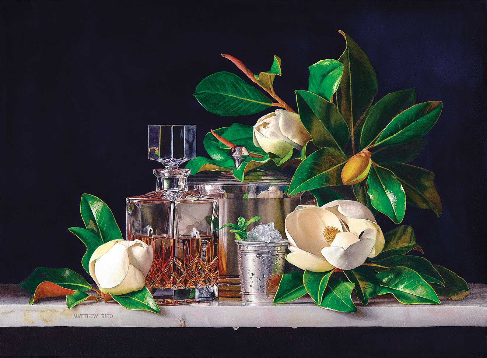
Magnolia Still Life, watercolor on paper, 22 x 30" (55 x 76 cm) This painting started with the condensation on the julep cup. I thought that would be a fun texture to explore and developed the entire painting from there. Believing this to be the most challenging part of the painting, I did the condensation first, thinking if I errored I could easily start over. It wasn’t until the painting was almost finished that I realized the tiny water drops were reflected in the cut crystal.
For this demonstration, I thought I’d do something a little different, and break away from the black background I often employ. I wanted to create an “Old World” feel and establish a sense of the room into which the viewer is gazing. Creating a plaster wall with raking light from an unseen window would anchor the still life into a certain atmosphere and give everything a home.
From there, I drew on inspiration from 17th-century Dutch masters Jan Davidszoon de Heem and Pieter Claesz, using the dramatic lighting to reveal the beautiful textures and colors on display. Here, simple kitchen ingredients are transformed into exquisitely observed objects that demand contemplation. I hope you enjoy.
My Design and Composition Tactics
• Creating the Atmosphere Often my still life work incorporates a dark black background, but for this painting I wanted to include a plaster wall to help establish a sense of place—that we’re seeing a small part of a larger room. The hanging utensils also aid in the “Old World” feel.
• Light as a Design Element The wall also enabled me to use the light from an unseen window to rake across the surface, creating an important compositional element. The eye follows the light from the upper left down to the table and around the painting clockwise.
• Triangular Composition In a triangular design; the painting is split perfectly from the top left corner to the lower right.
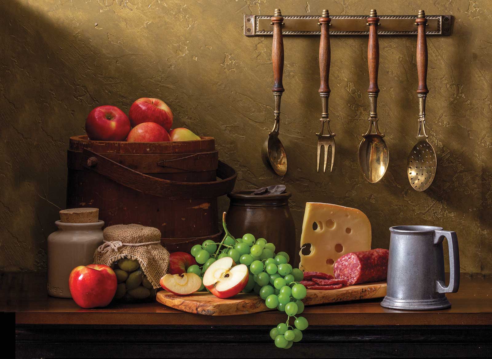
My Art in the Making Country Kitchen
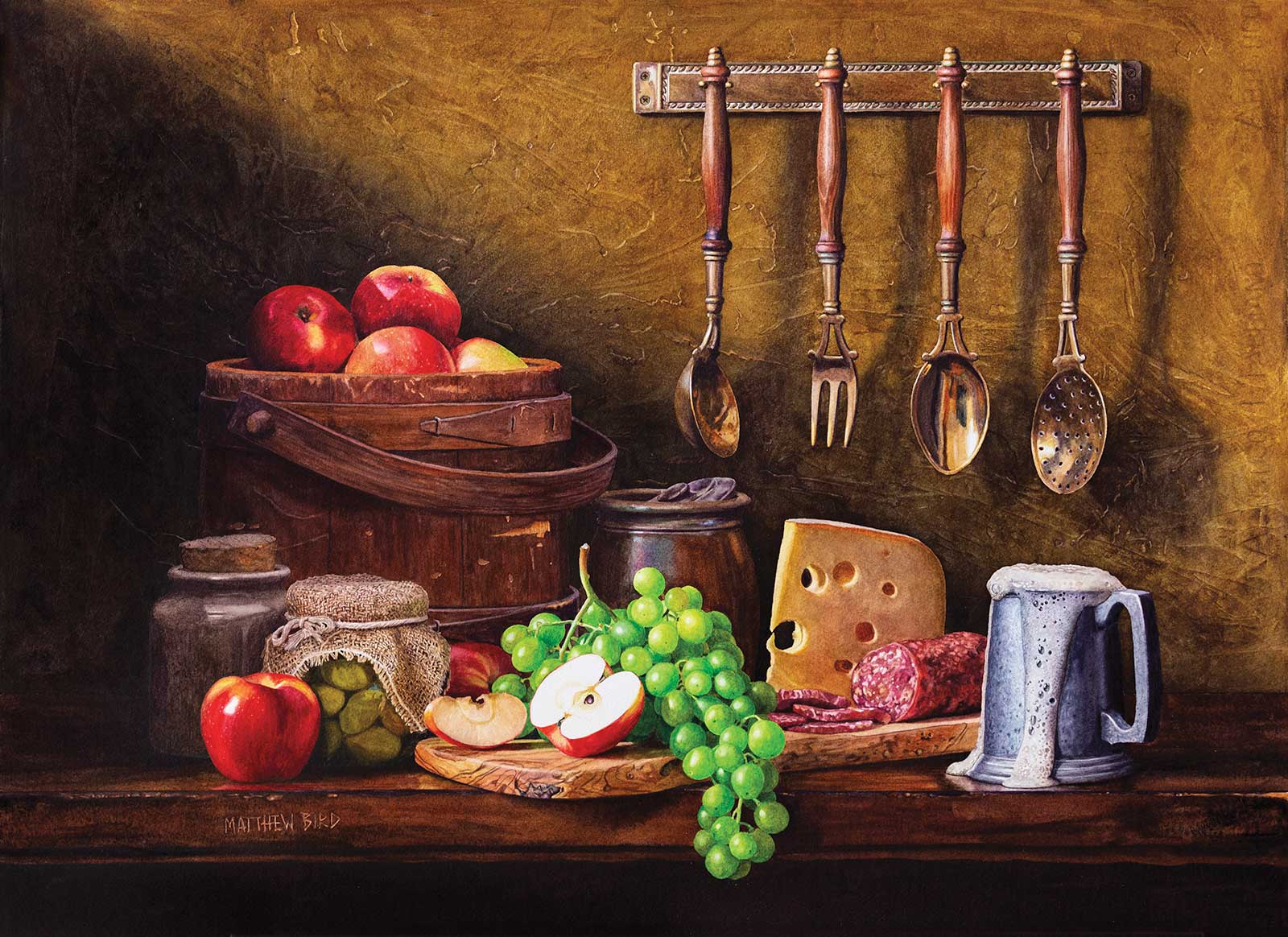
The painting Country Kitchen is a tour-de-force of textures and surfaces. For a painting like this, I generally work on one element at a time, bringing it to a high level of finish before moving on. I work from the back of the painting to the front, left to right, masking off surrounding elements as needed. Once everything is painted in, I step back and start making overall adjustments, mostly deepening values as needed.
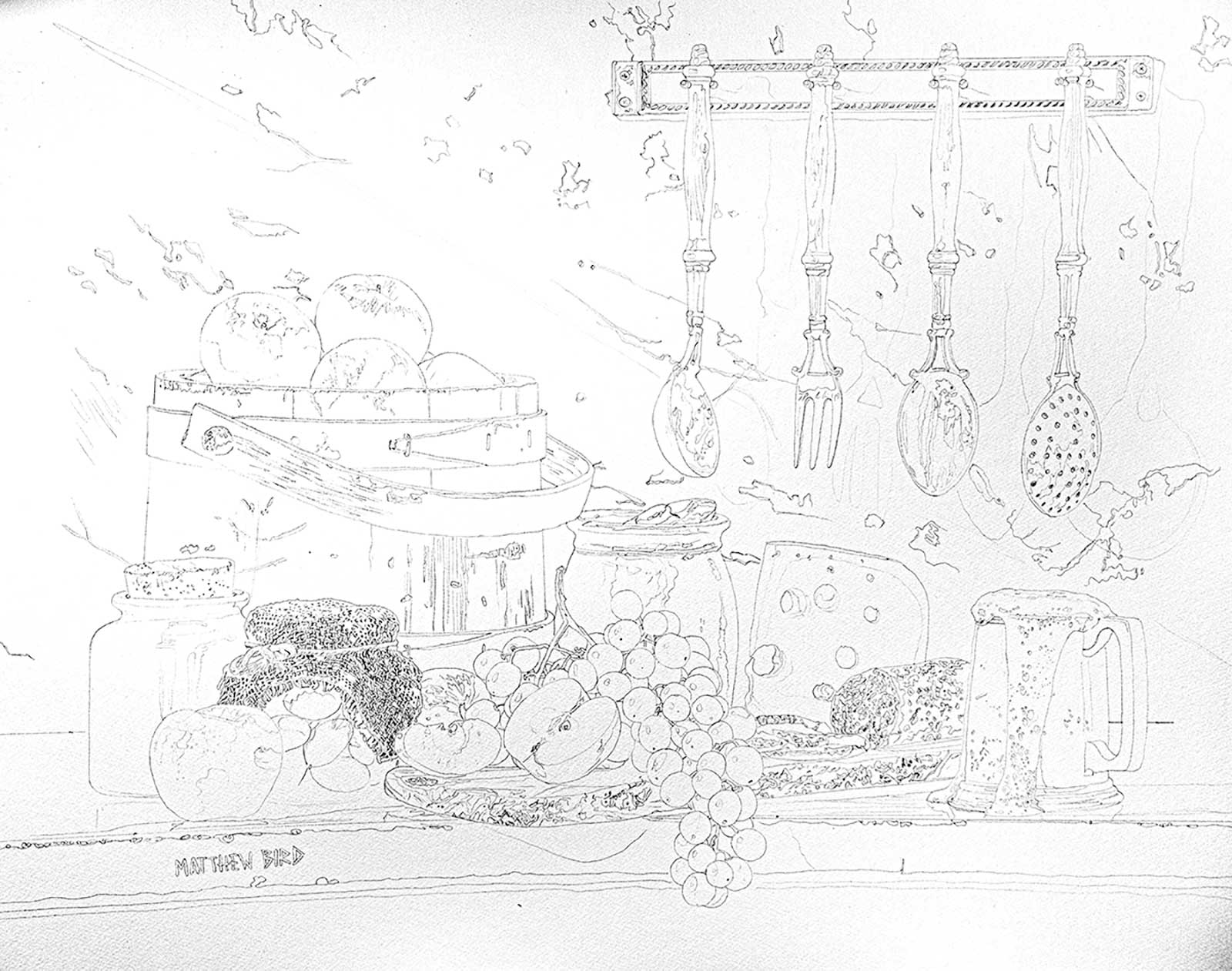
Reference Photo
 Stage 1
Stage 1 Pencil on Paper
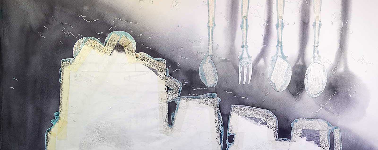
My drawing is done on 300 pound Fabriano paper with a 4H pencil. I plan everything out at this stage and spend a lot of time capturing all the details. A good drawing is the basis of a great painting. When painting realism with watercolor, you’ll never get great results from a poor drawing.
 Stage 2
Stage 2 Underpainting
The underpainting helps to establish shadows and values. I wet the surface with water and use Payne’s gray wet into wet for soft edges.
 Stage 3
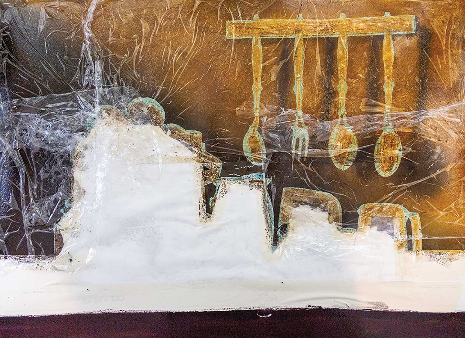
Stage 3 Wall Texture
The wall is done with a combination of techniques. I use direct observation to draw and mask certain marks and then plastic wrap on wet paint to enhance the texture.
 Stage 4
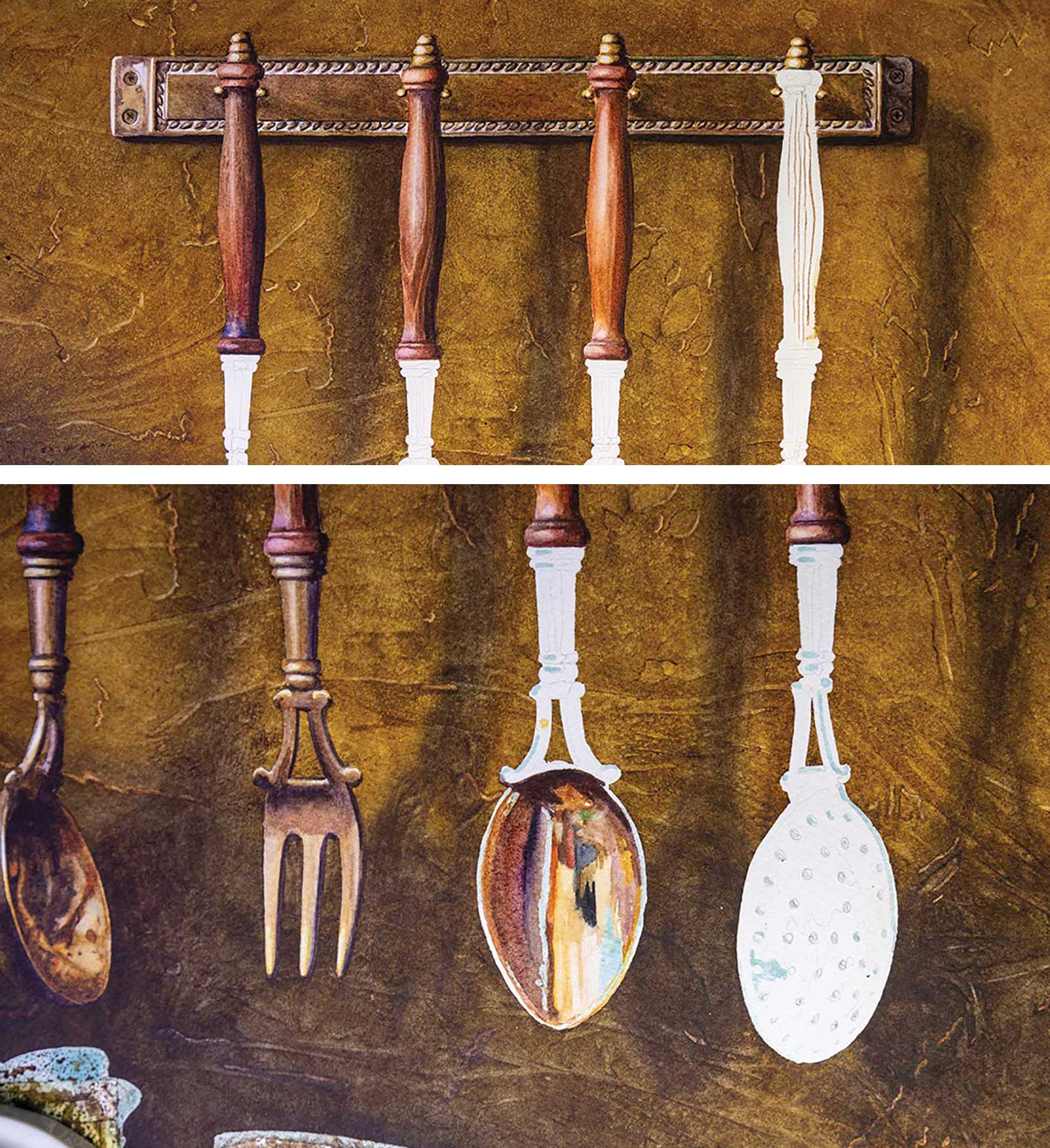
Stage 4 Wood and Metal
I paint the wood handles, starting with the wood grain and building up the colors to the proper values. The shiny surfaces require liquid mask to save the highlights.
 Stage 5
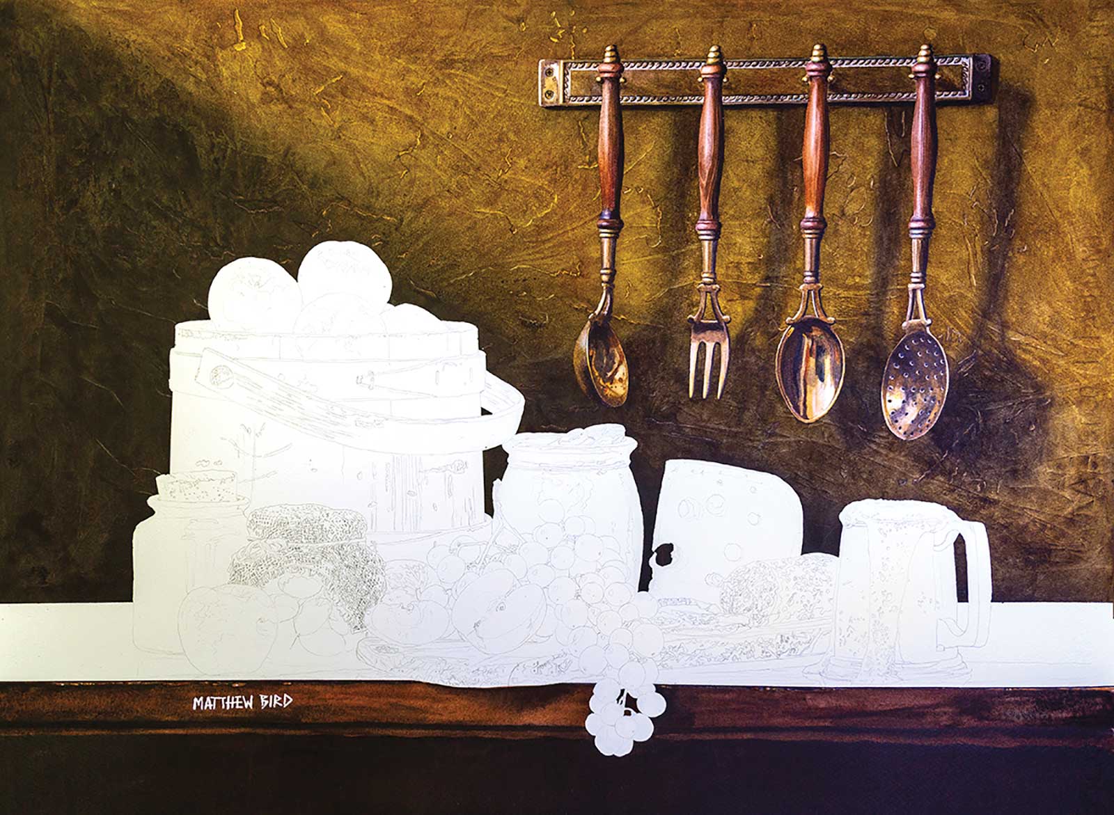
Stage 5 Complete Background
With the masking removed, I move on to the table elements. Note the signature, which I usually paint last, but I wanted to have it carved into the wood, so I used liquid mask to preserve the white.
 Stage 6
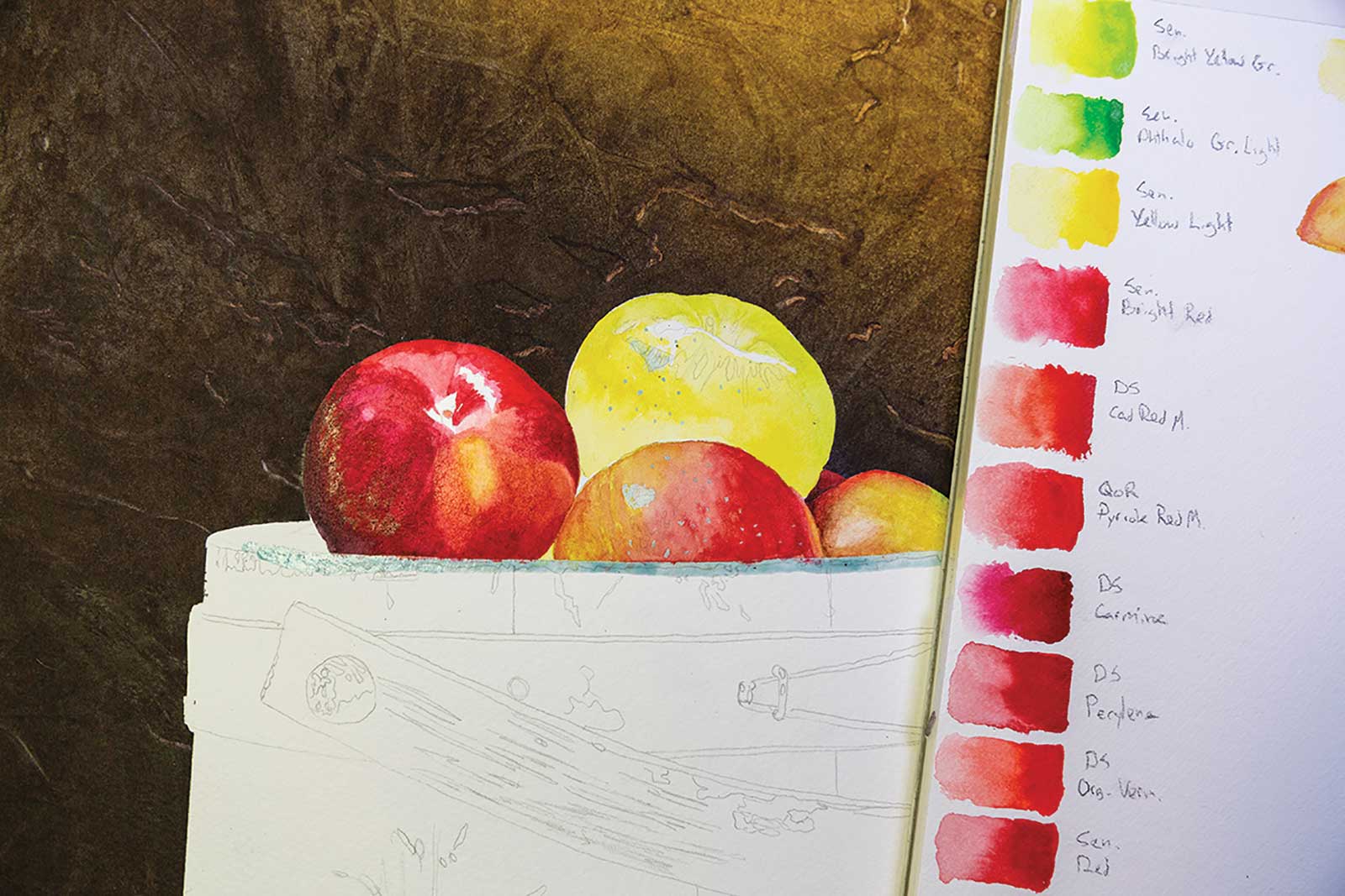
Stage 6 Pigment Selection
Sometimes finding the right pigment can be crucial; here I test a number of colors for the apples. I use yellow light for the underpainting, and then work wet into wet with red and green to build up the forms.
 Stage 7
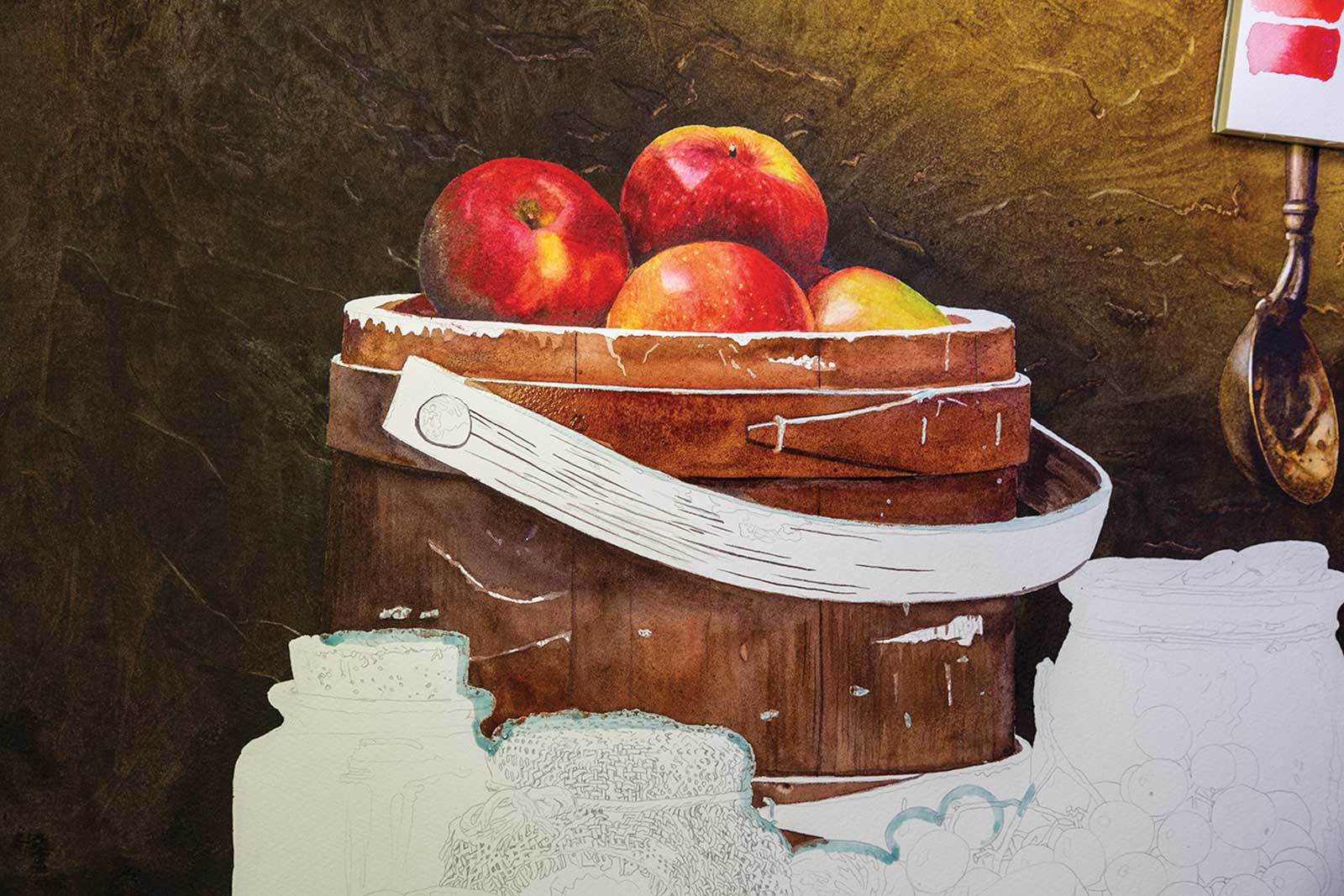
Stage 7 Wooden Bucket
The wooden bucket is more distressed, but I paint it in the same manner as the utensils, wood grain first, wet on dry, then establish the form working wet into wet. Foreground objects are masked to preserve edges.
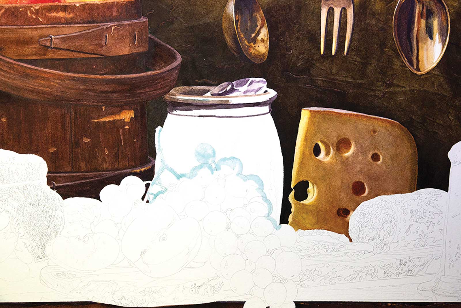
 Stage 8
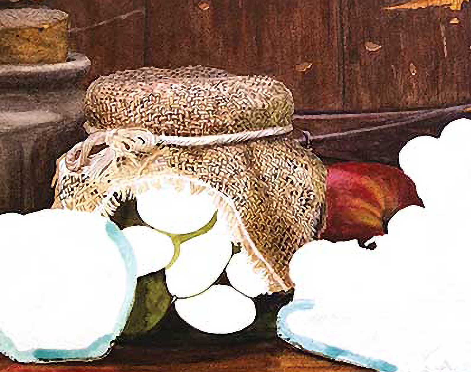
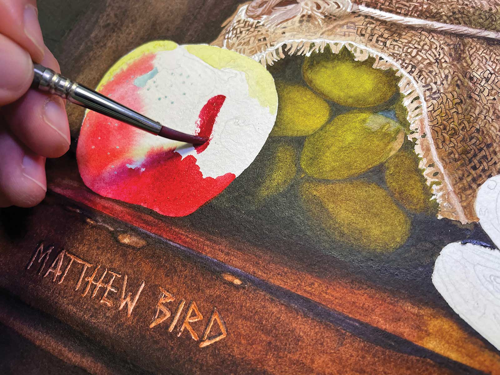
Stage 8 Jar of Olives
I paint the fine lines of the burlap weave using a no. 2 round on dry paper, then glazed over it to create the flow of the fabric, wet on wet. The olives had a base of green gold and then layers are added working wet into wet.
 Stage 9
Stage 9 Foreground Apple
I use liquid mask on the foreground apple for the highlight and a few of the spots on the flesh, then the same process as the other apples. With the mask removed, I glaze over the spots for the proper color.
 Stage 10
Stage 10 Ceramic Jar
The tricky thing about this jar is the iridescent finish. With the highlights masked, I use Van Dyke brown as a base color and add cobalt green, mineral violet and quin rose to achieve the color spectrum of the glazed surface.
 Stage 11
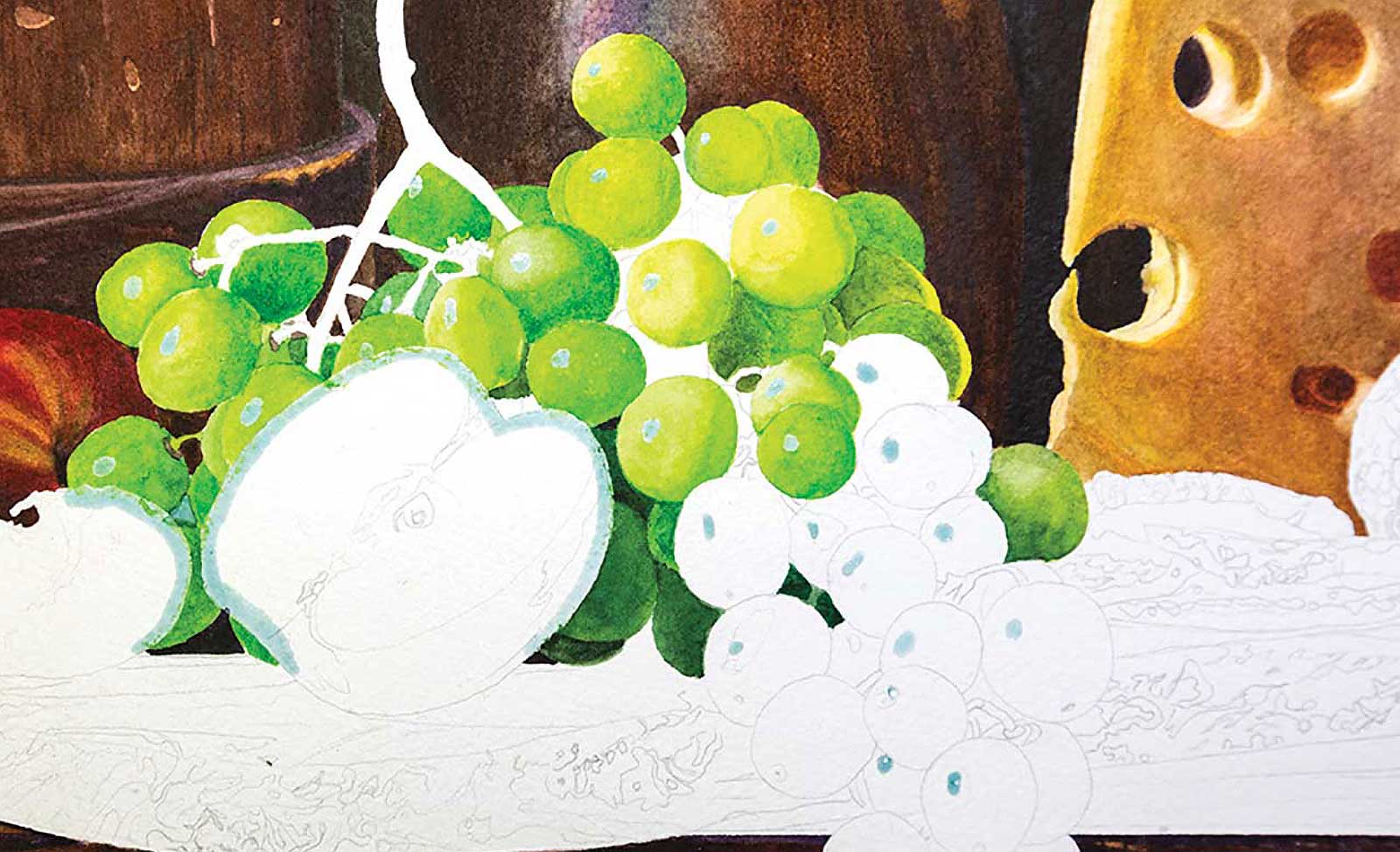
Stage 11 Grapes
Grapes can seem like a challenge, but I break it down and paint each individually. I mask the highlights and paint wet into wet using a light yellow and phthalo green.
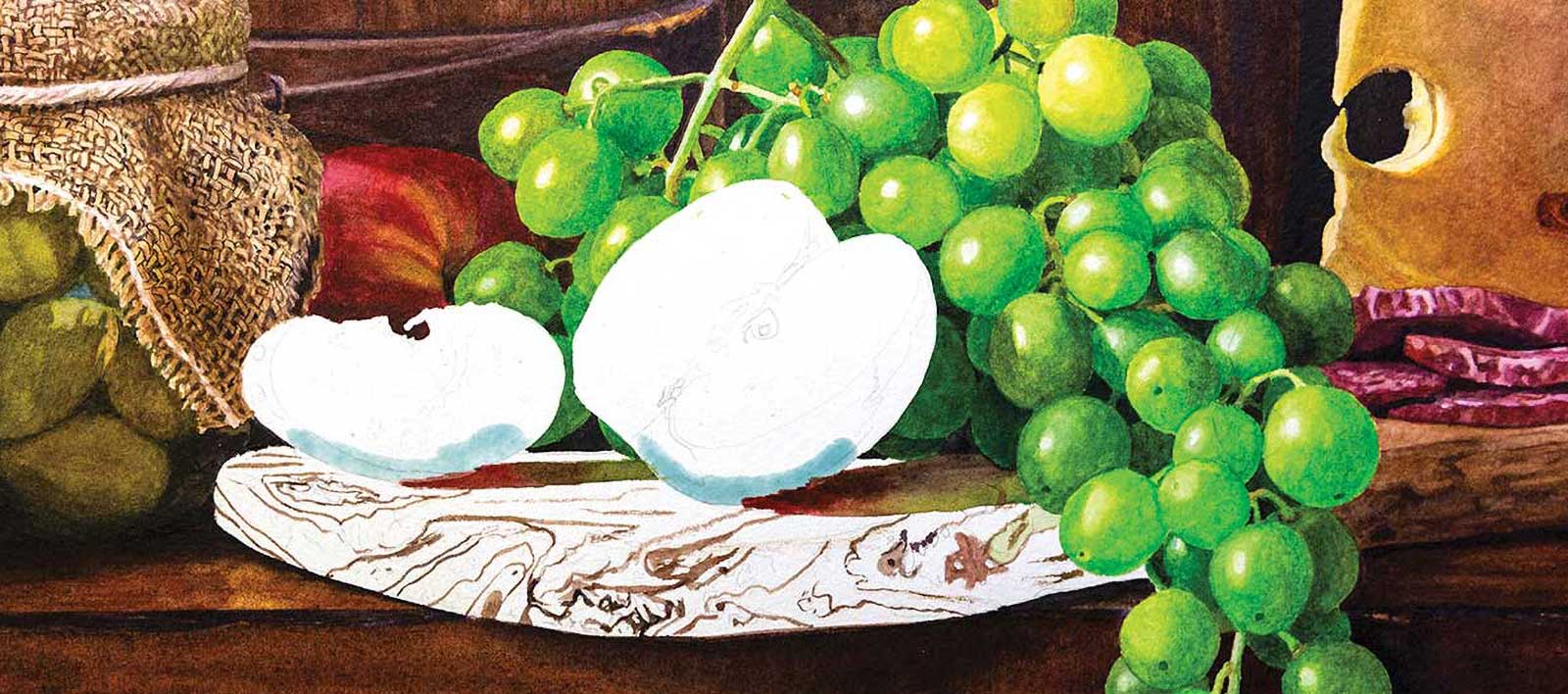 Stage 12
Stage 12 Charcuterie Board
The grain of the olive wood is painted first, wet on dry. After masking the apples, I paint their shadows wet into wet; a deep red near the shadow crevice that bleeds out to a greenish hue from the reflected light of the grapes.
 Stage 13
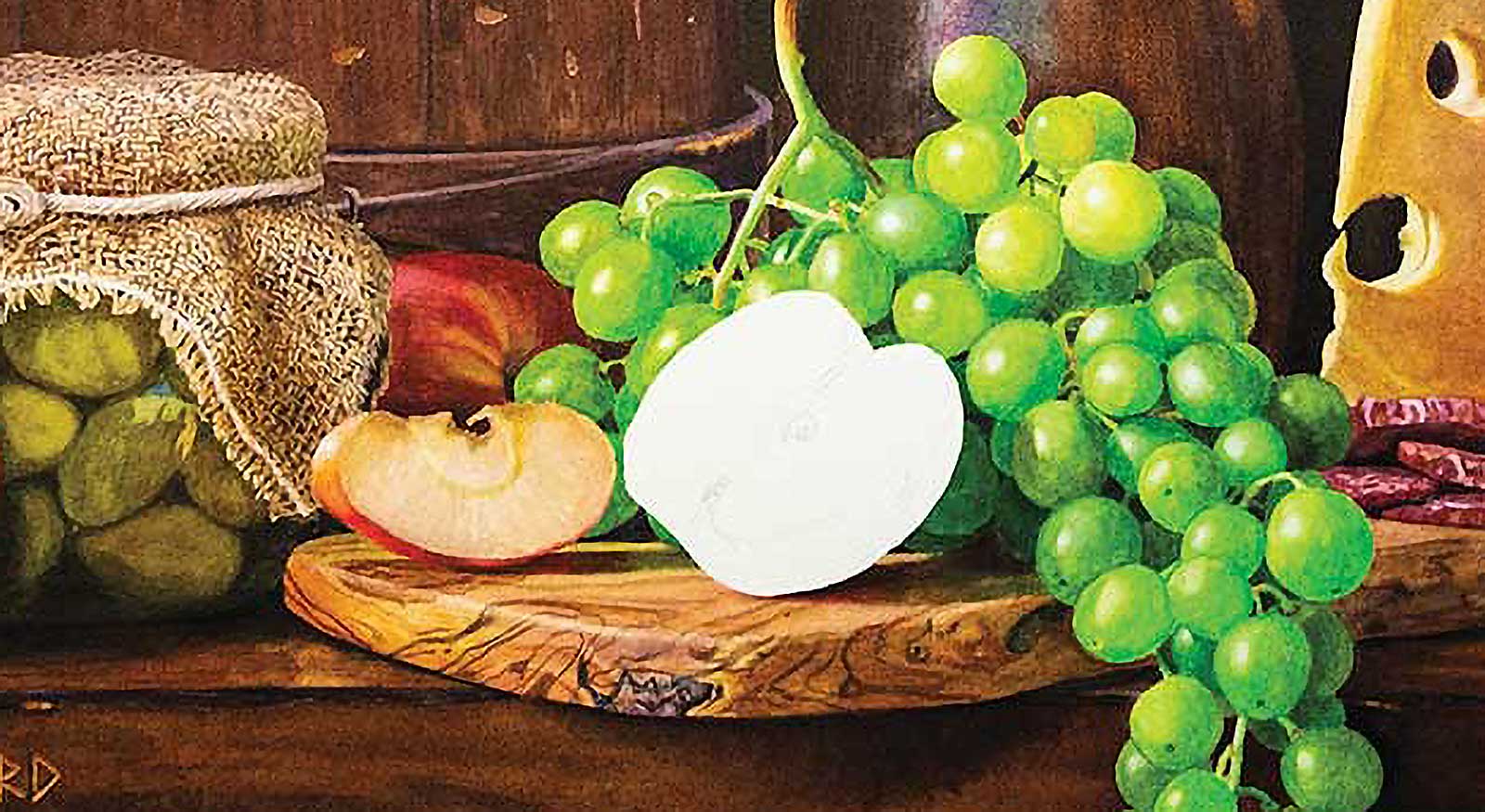
Stage 13 Other Apples
The board is finished using browns and quinacridone deep gold, working wet into wet to achieve soft transitions. The broad side of the apple slice is facing away from the light source, so the “white” is actually a much warmer, middle value as opposed to the large apple half which is bright white.
 Stage 14
Stage 14 Pewter and Foam
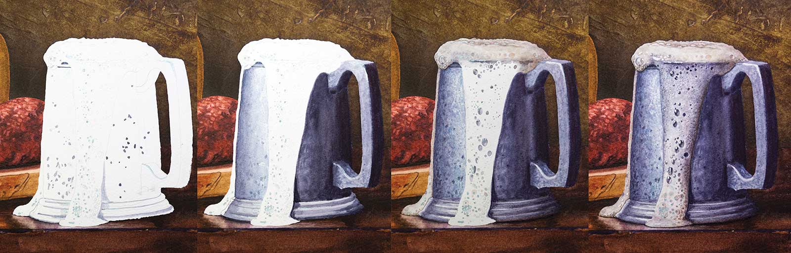
The final element I tackle is the mug of beer. This is painted in two parts: the pewter and the foam. I use liquid mask to preserve some white highlights in the bubbles. Then, I paint some of the spots on the metal that will form some of the texture. Wet into wet with Payne’s gray and cerulean blue I block in the mug. I use a dry brush technique to finish off the pewter texture.
For the foam, I start with the larger bubbles and paint wet on dry to mark where they will be. Then wet into wet washes build up the three dimensional volume of the form. Areas where the foam is thin, more gray is used to indicate translucency and the pewter showing from underneath. When the masking is removed, the highlights on the tiny bubbles pop out and the illusion is complete.
 Stage 15
Stage 15 Finished Artwork
Country Kitchen, watercolor on paper, 22 x 30" (55 x 76 cm)
About the Artist
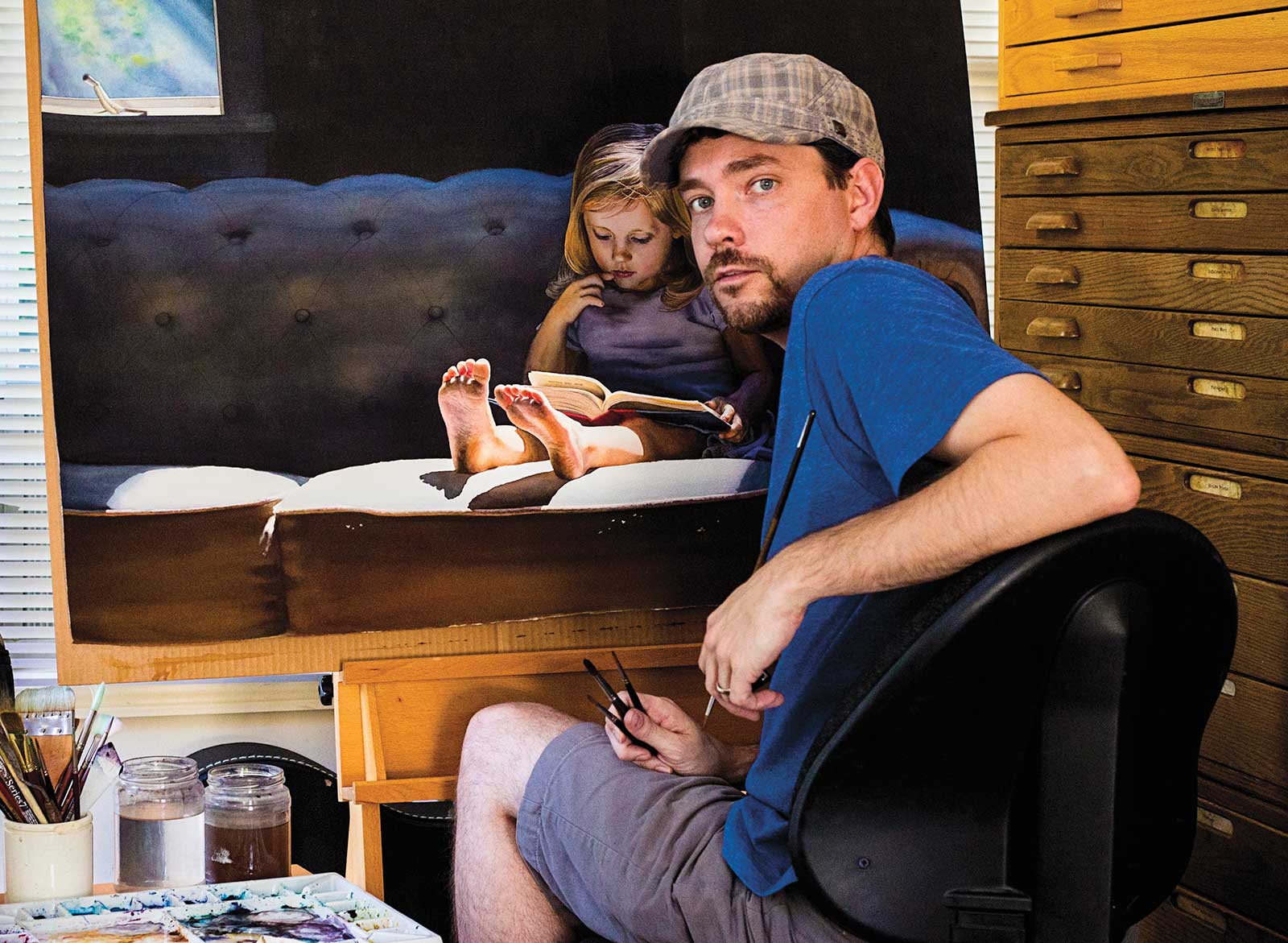 Matthew Bird
Matthew Bird is an American painter. Born in Baltimore, Maryland, he graduated with honors from the Pratt Institute of Art in New York City, in 2000. He is a signature member of numerous organizations, including the National Watercolor Society where he served as vice president, and his award-winning watercolor paintings have been exhibited in shows across the United States, as well as in Canada, China, England, Greece, Hong Kong and Italy. His work is in permanent museum collections as well as numerous private collections.
A sought after teacher, Bird offers online workshops from his studio. He lives with his wife and children outside Baltimore.