


At an exhibit of Van Gogh’s paintings, I discovered that the texture of the originals had a powerful impact. Intrigued with the effect, I began experimenting to get a similar emotional power in my work.
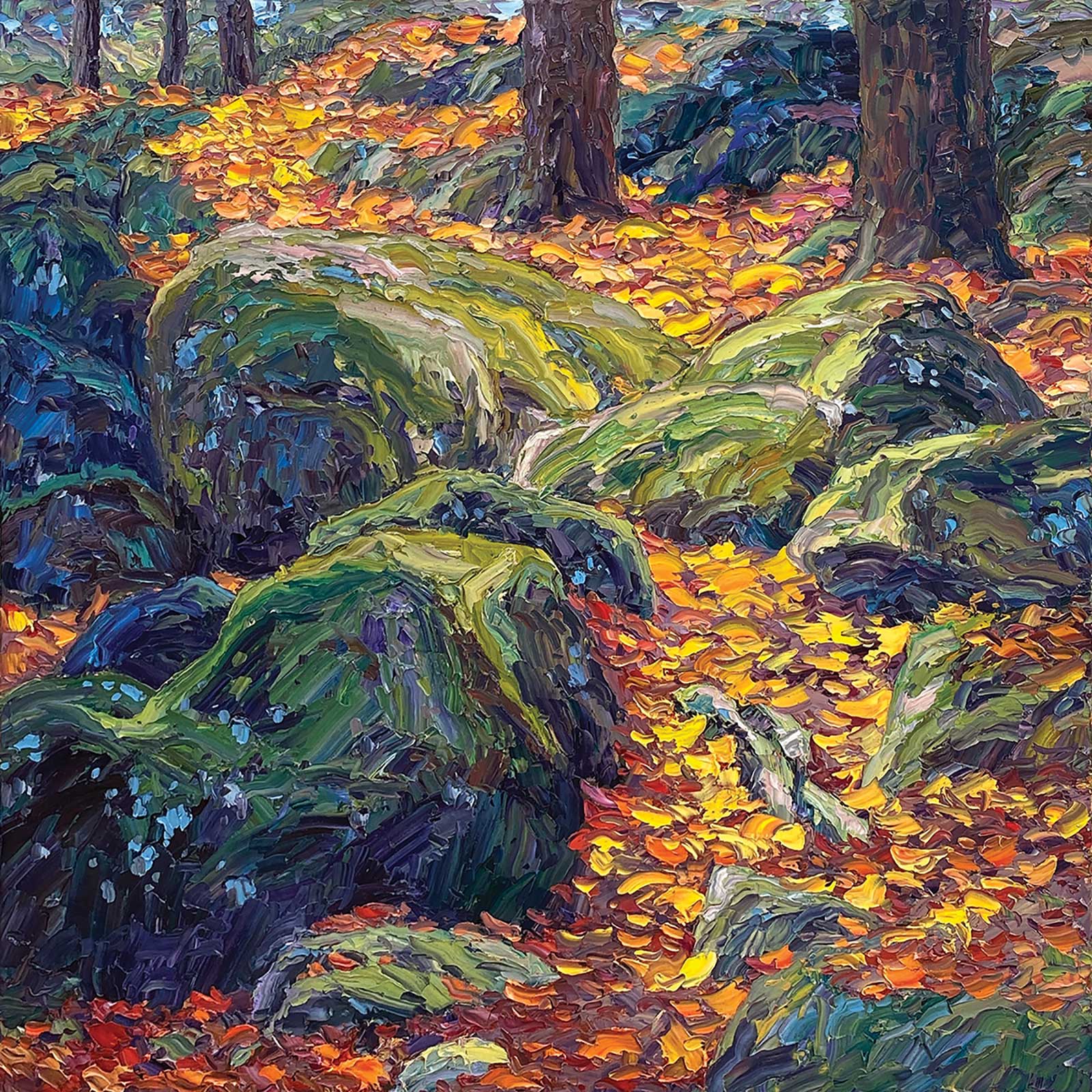
Rocks and Moss, oil, 48 x 48" (121 x 121 cm) I painted this piece using a previous acrylic painting and a woodcut of the same design as reference. I used complementary hues of green and red, as well as yellow and purple, to give color vitality and maximum contrast.
Although I experimented with various paint additives to thicken the texture, I ultimately decided to keep my mixtures as simple as possible. I now use cremnitz white primarily as a thickener in the lights. In the darks, I generally use high-quality, thick-bodied paint straight from the tube. When painting on a panel, I often add cold wax to get a thicker paint application. I use cold wax medium on larger panels to scale up a small sketch’s bold texture.
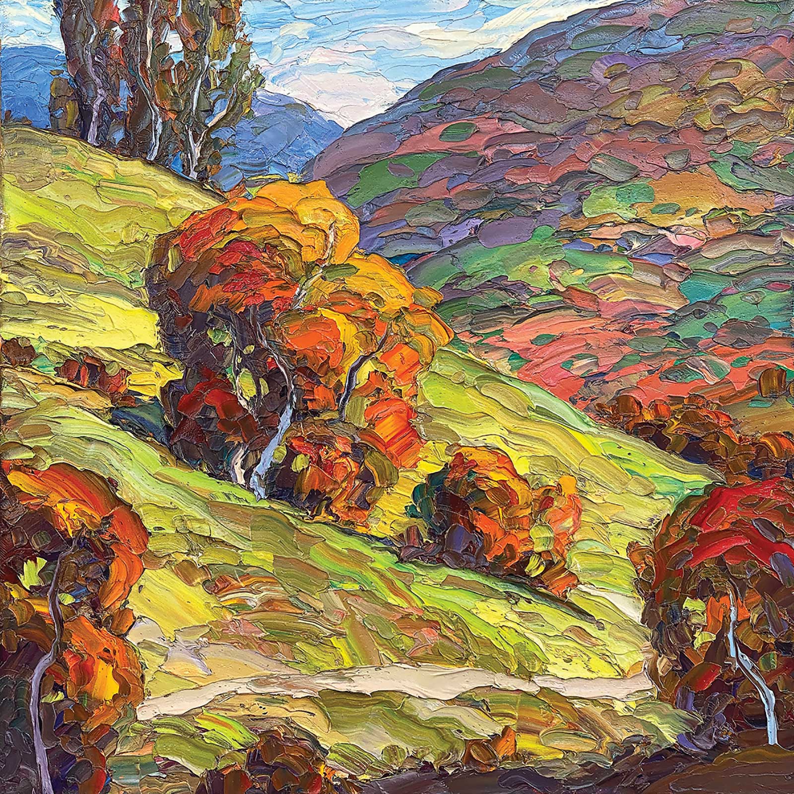
Solitary Path, oil, 18 x 18" (45 x 45 cm) I created this painting from a variety of plein air sketches. The major lines of the scene lead the eye through a visual journey that is rewarded with contrasts between reds and greens. It is important to have a hierarchy of texture and color throughout the scene.
While I love impasto, a painting will lose energy if every passage is painted with the same textural intensity. Lighter areas should be more textured. Darker areas should have less texture. Although this is a common academic practice, for me, texture is a metaphor for energy, not a replication of the visual world.
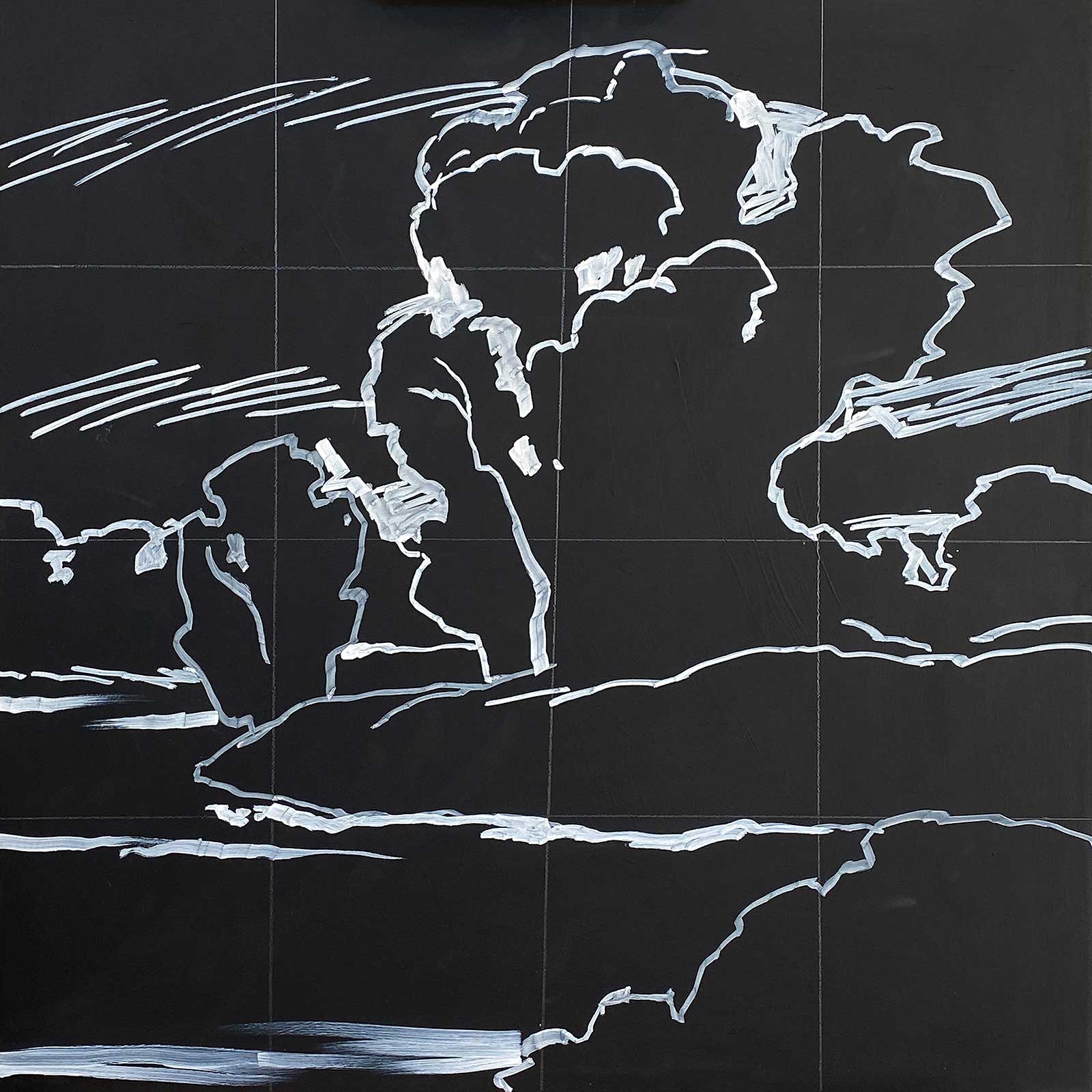
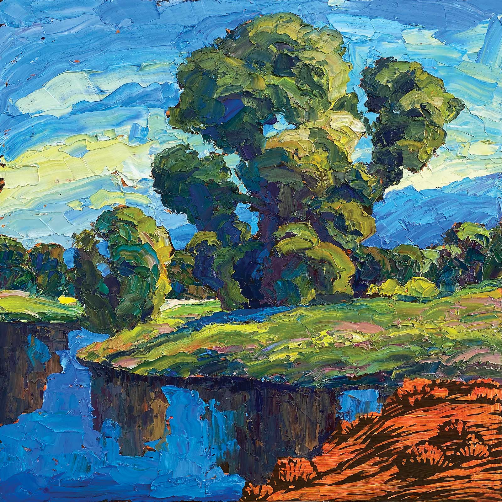
I used to work from photos but now prefer to work from field sketches. After priming with black gesso, I draw onto the canvas or panel with white acrylic markers. Drawing directly on the surface, rather than sizing up a small sketch, ensures that the design will work at a larger scale. When complete, the underpainting resembles a woodcut. Since I started my career as a woodcut illustrator, the method allows me to think about composing in a similar way—working from dark to light.
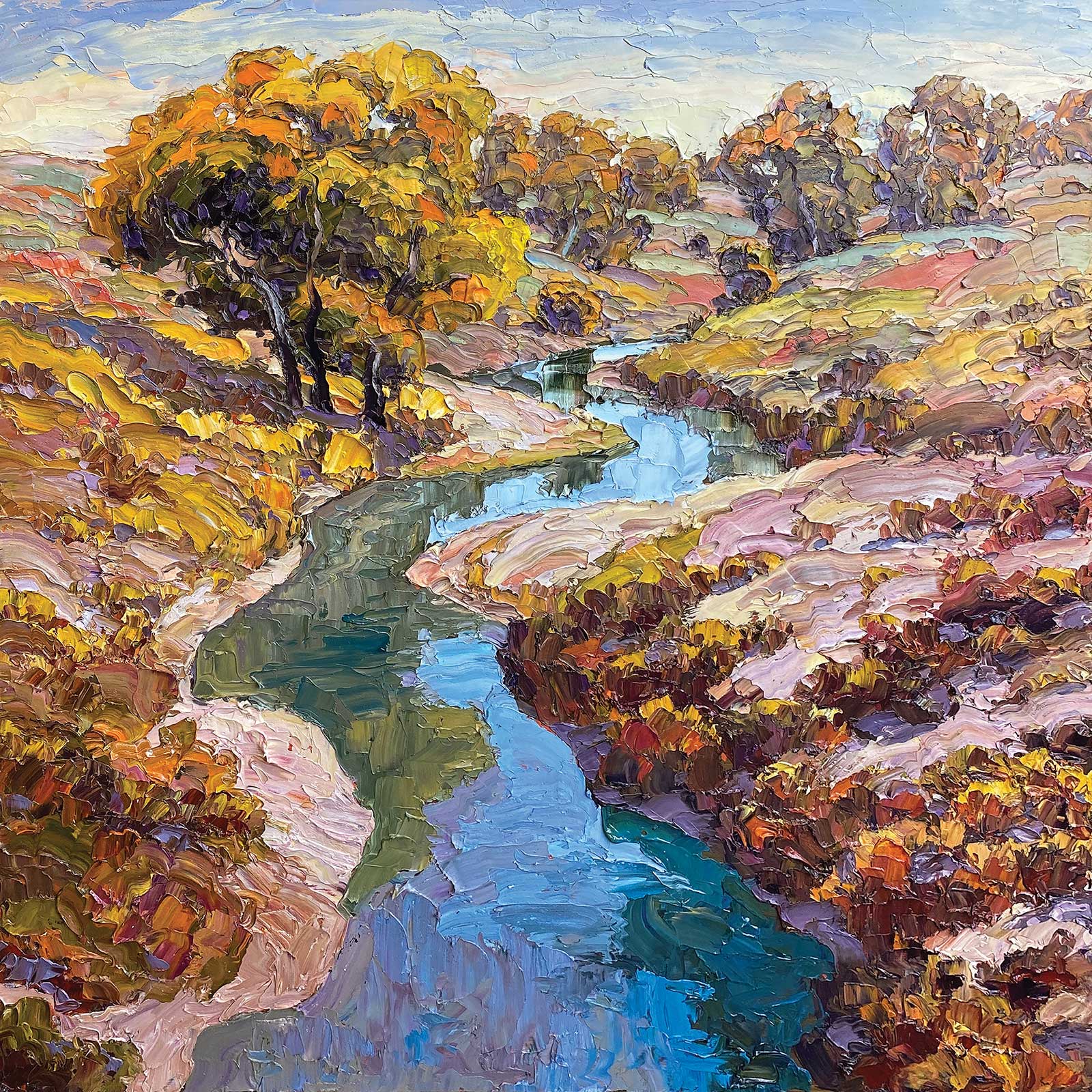
Wild Horse Creek, oil, 34 x 34" (86 x 86 cm) The colors of autumn inspired this painting. I love the way various bushes and patches of weeds create patterns on banks and distant hills. Part of my focus is to use complementary colors to achieve maximum visual energy. It was a challenge to represent the patterns with as few paint strokes as possible yet create an energetic field of color.
Underpainting is a more rational mode, and it matters less if I am tired or distracted. I take as long as I need, using black gesso like an eraser, adding strokes of white acrylic as much as necessary. After the acrylic marker is dry, I tone the canvas orange. When it’s time to apply oil paint, I have to be in a highly inspired and energized state. When the moment is right, I paint the entire painting in one or two days of intense focus. I sleep when necessary and return to the canvas only when I am in top form. When the paint begins to skin over, and I can no longer spontaneously apply paint into the wet surface, the painting is done.
My Art in the Making By the River
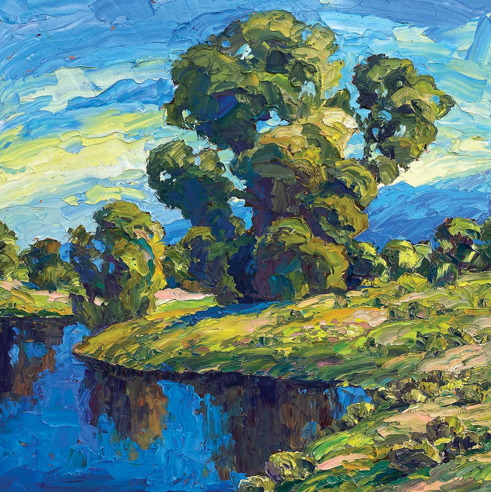
Although texture is essential to my work, it is only one aspect of the overall painting. Composing a painting is organizing shape, value and color into a unified whole. To simplify the process, I do an underpainting to focus on linear and spatial composition. Solving such problems allows me to focus entirely on color and texture when applying paint. Such preparation enables me to enter a flow state that might otherwise elude me.
 Reference Photo
Reference Photo
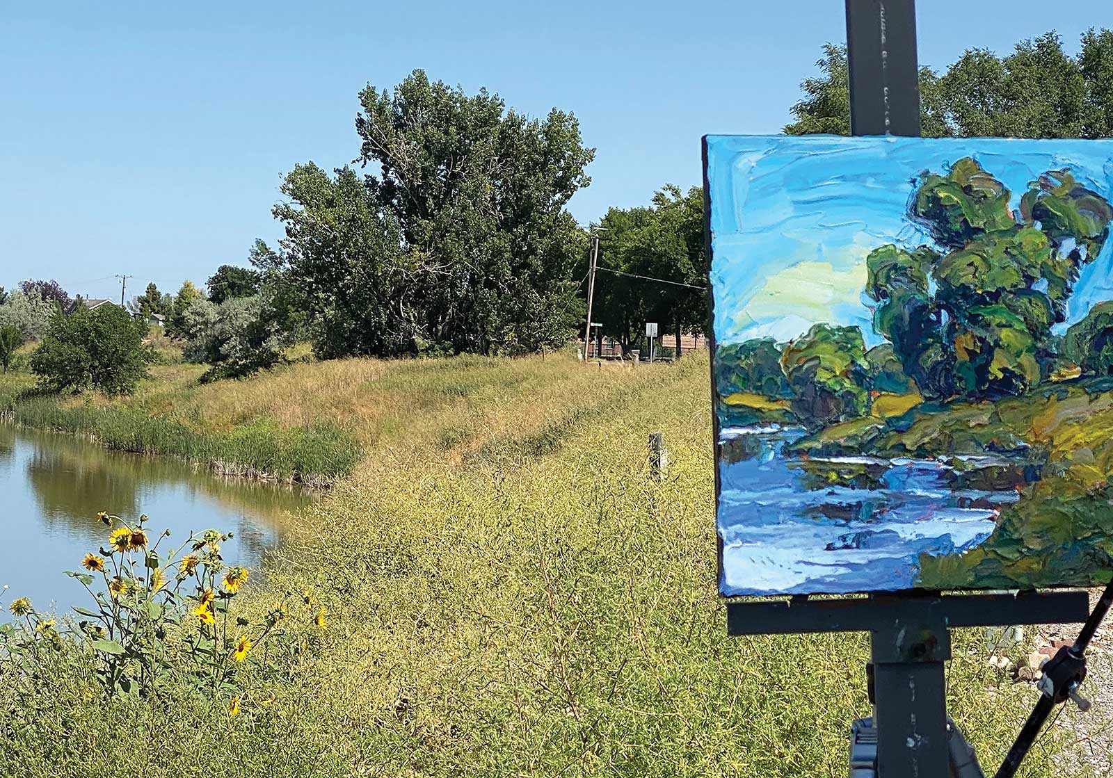
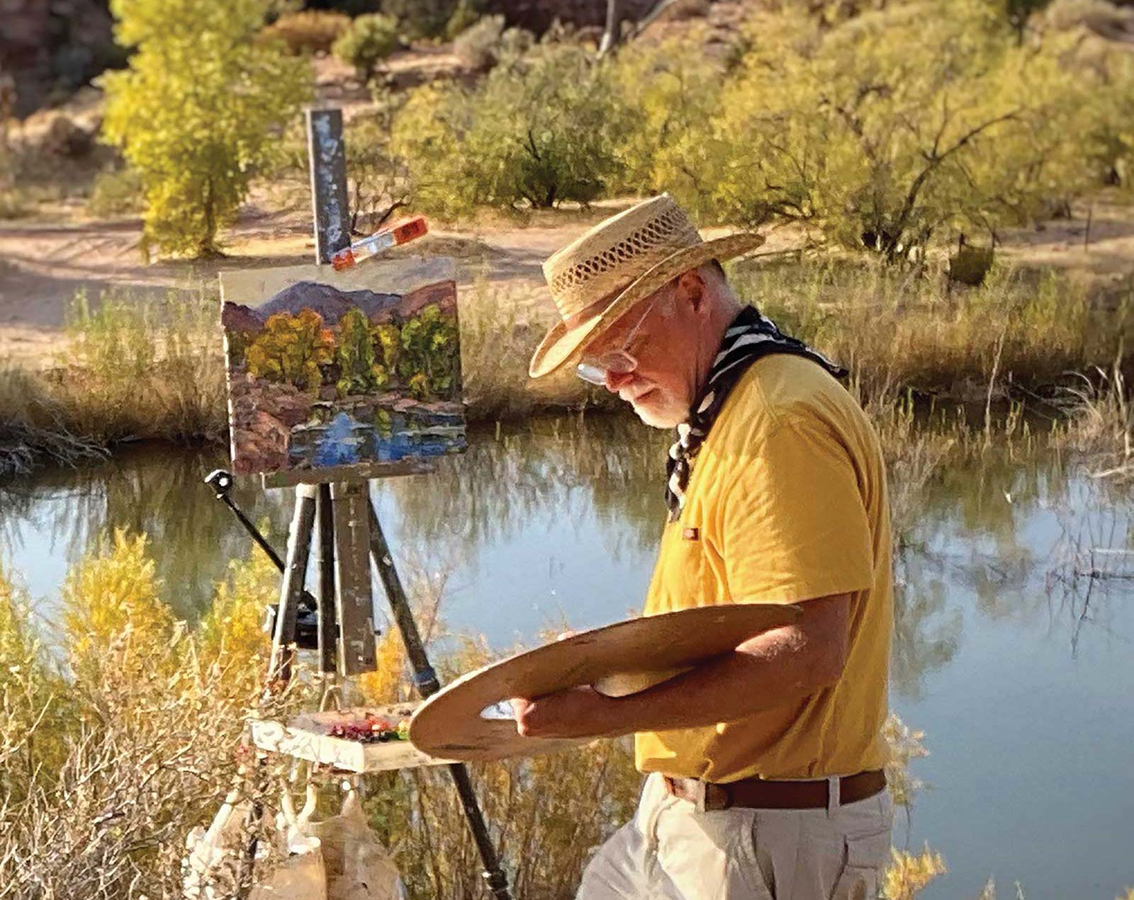
While I occasionally paint from photos, I prefer painting from plein air sketches. This photo shows my field setup with the original scene. Painting outdoors allows me to record more complex colors, especially in the shadows.
WHAT THE ARTIST USED
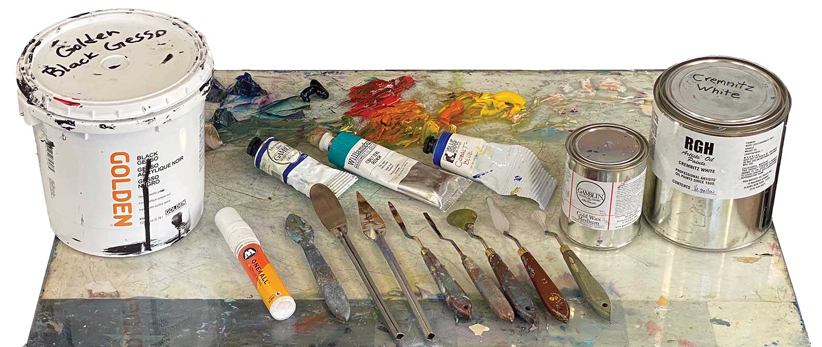
Oils
Cremnitz white, Cadmium lemon yellow, Cadmium yellow deep, Indian yellow, Cadmium orange deep, Cadmium red light, Quinacridone violet, Cobalt blue, Pthalo blue, Ultramarine blue, Dioxazine purple
Additional Colors on My Palette
Titanium white, Pthalo green, Pthalo turquoise, Yellow ochre, Transparent red oxide, Cobalt teal
Palette Knives
Titanium Oakblade CP3, Titanium Oakblade DMD-3, Titanium Oakblade STR-6, Holbein #6S, Creative Mark T-3, RGM New Age 32
Painting Surface
Canvas with three coats of black gesso, 15 mm white acrylic marker, Liquid matte medium, High flow acrylic, hansa yellow medium and quinacridone red
Additional Supplies
Canvas scraper, Facial tissues
 Stage 1
Stage 1 Drawing the Underpainting
Stage 1Stage 1 Drawing the Underpainting
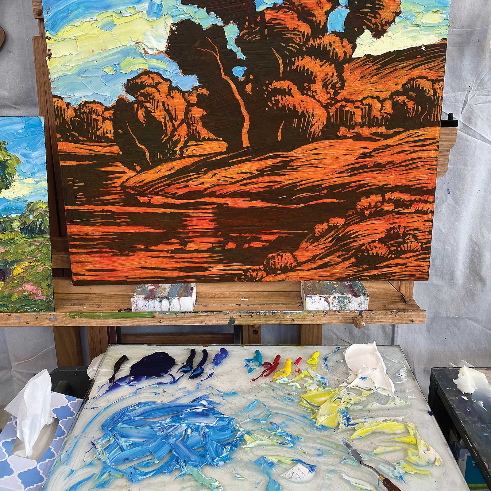
I start the underpainting by drawing with an acrylic marker on a wooden panel coated with three layers of black gesso.
 Stage 2
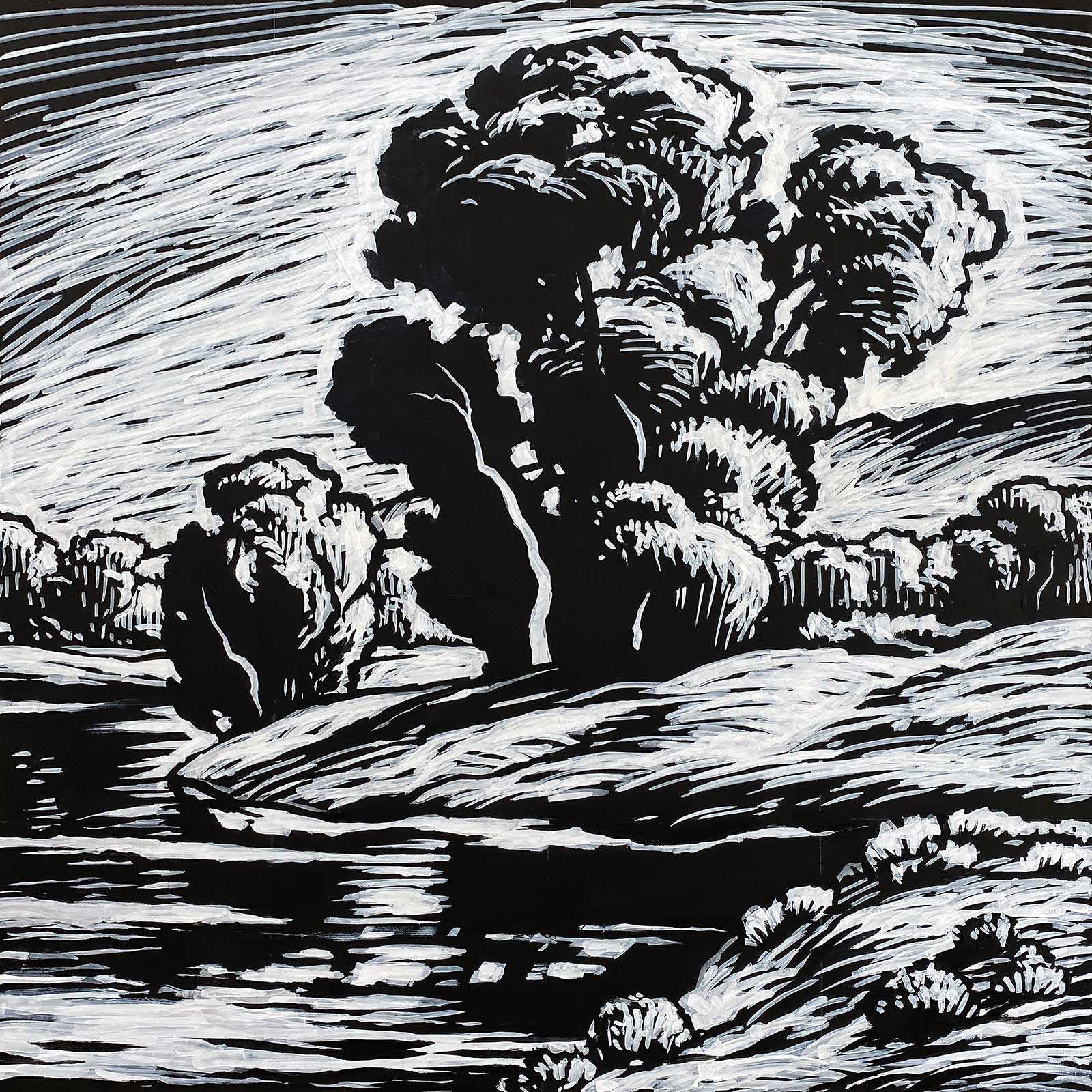
Stage 2 Adjusting the Drawing
Stage 2Stage 2 Adjusting the Drawing
Lines and shapes are in constant flux as I adjust forms and lines of energy throughout the composition. The technique gives the freedom to explore compositional variations.
 Stage 3
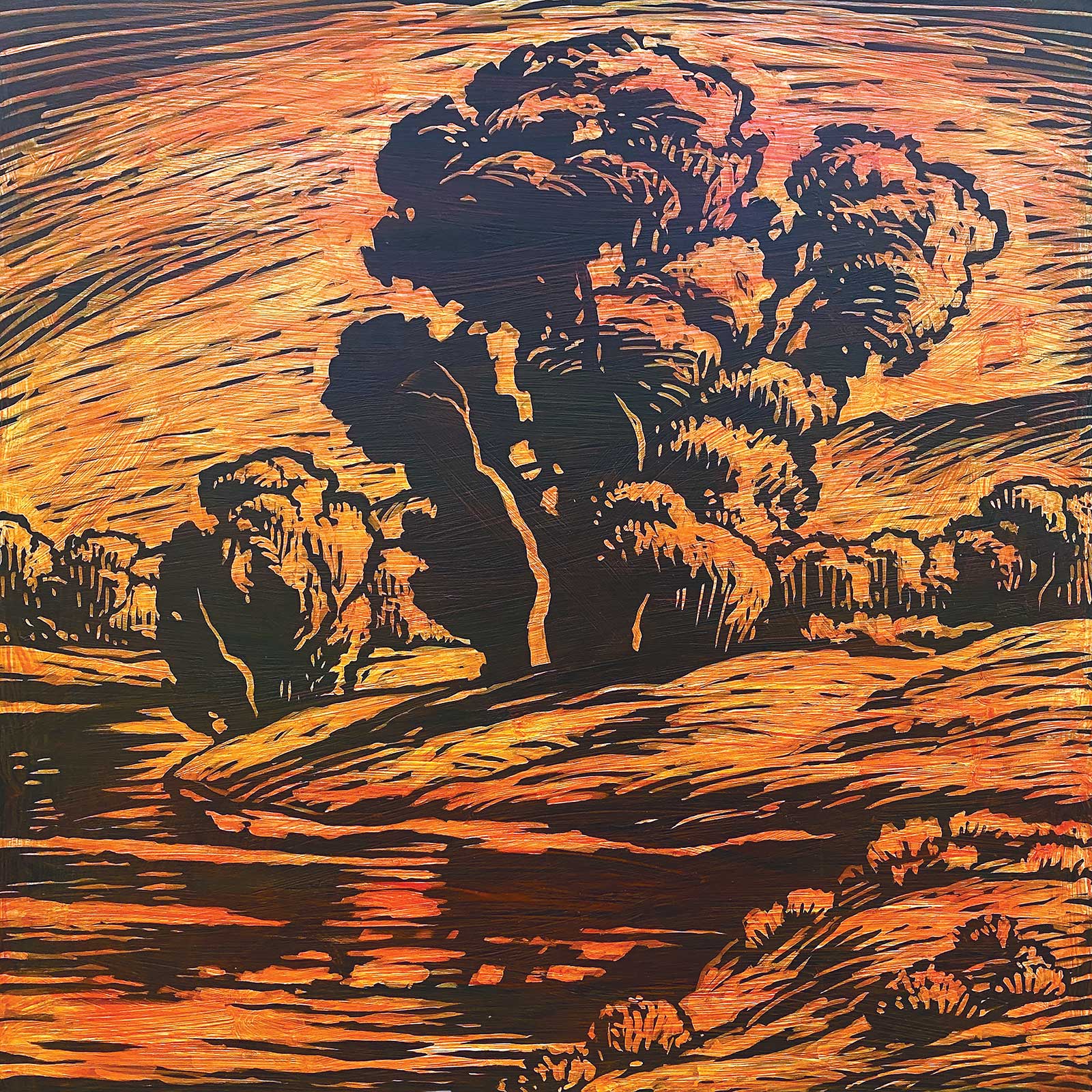
Stage 3 Toning the Panel
Stage 3Stage 3 Toning the Panel
I paint a toned layer of fluid matte acrylic medium over the surface. The orange shimmering through in places provides contrast to the primarily green painting. The matte surface provides tooth for the subsequent layer of oil paint.
 Stage 4
Stage 4 Mixing Color
Stage 4Stage 4 Mixing Color
I use large amounts of paint on my palette and lightly mix the color. I lightly swipe my palette knife through select mounds of color, applying the paint in spontaneous swathes, mixing as little as possible.
 Stage 5
Stage 5 Painting in Oils
Stage 5Stage 5 Painting in Oils
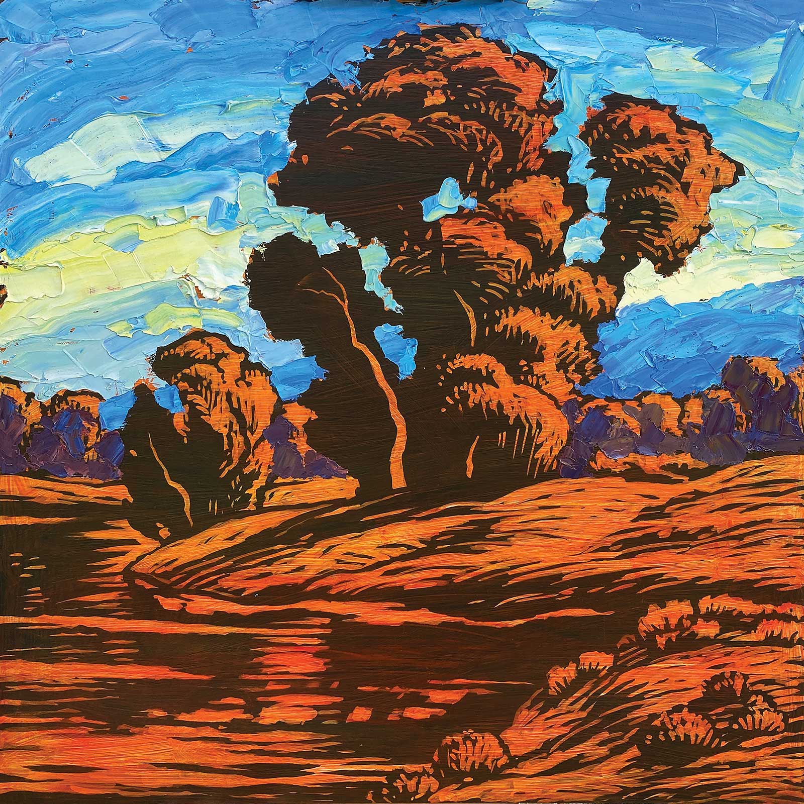
I paint in sections starting with the sky and work forward. I try to err on the side of loosely mixed colors. I can always go back and blend colors or edges. If I over blend and get dull color I scrape off the paint.
 Stage 6
Stage 6 Using Multiple Colors
Stage 6Stage 6 Using Multiple Colors
I use at least two colors in each stroke, if not more. Skies will vibrate if pinks, light blues and light yellows are combined. I use titanium palette knives to blend edges.
 Stage 7
Stage 7 Mixing on the Canvas
Stage 7Stage 7 Mixing on the Canvas
I often lay down some color in an area only to partially cover it with a subsequent layer. If one application of colors doesn’t work, it can be corrected by layering complementary colors over the top.
 Stage 8
Stage 8 Adding Cold Wax Medium
Stage 8Stage 8 Adding Cold Wax Medium
I want the light foliage and water to have lots of color complexity, so I add cold wax medium to make the first layer easier to paint over with analogous colors.
 Stage 9
Stage 9 Adding Texture in the Foreground
Stage 9Stage 9 Adding Texture in the Foreground
As I work toward the foreground I add more cold wax medium to bulk up the texture. Forms nearer the picture plane should look more spontaneous and abstract, in this case, only subtly suggesting weeds and shrubs.
 Stage 10
Stage 10 Keep Paint Fresh
Stage 10Stage 10 Keep Paint Fresh
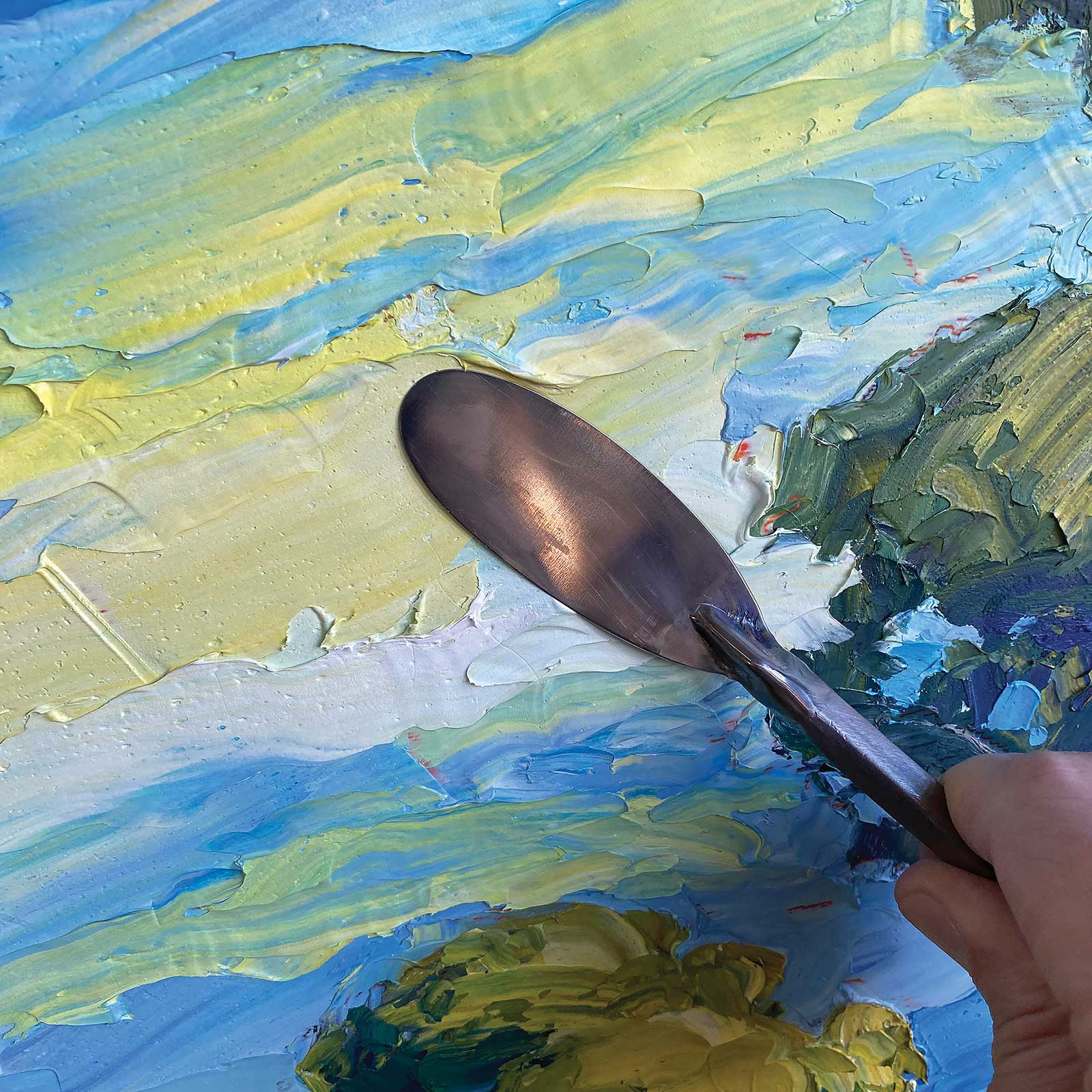
Each stroke should look as fresh as possible and read as an abstraction up close. If the color begins to over blend on the panel, I scrape it off and mix fresh paint.
 Stage 11
Stage 11 Overpainting
Stage 11Stage 11 Overpainting
Since I added cold wax medium to the foreground of the painting I can easily overpaint with interesting textural strokes—in this case the water reflection and highlights of the shrubs.
 Stage 12
Stage 12 Adding Finishing Touches
Stage 12Stage 12 Adding Finishing Touches
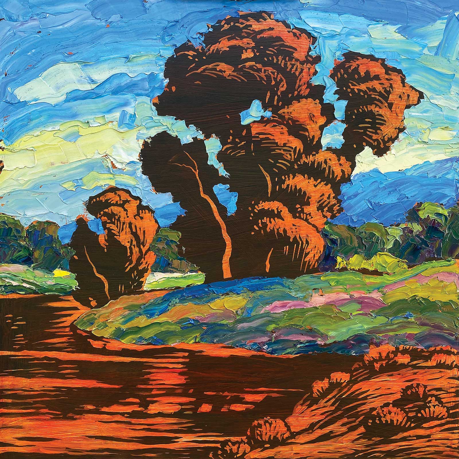
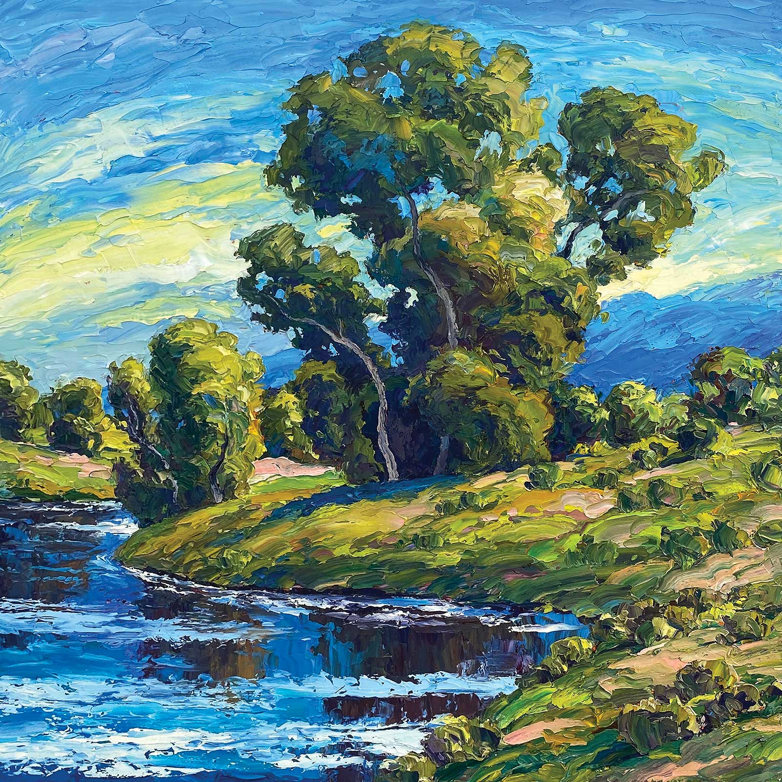
By the River, oil, 14 x 14" (35 x 35 cm)
Toward the last stages I add details such as the tree trunks and soften various edges. My technique depends on spontaneity. The entire painting was painted in a nine-hour session.
About the Artist
 Brad Teare
Brad Teare’s work evolved from various influences, including Edgar Payne and William Wendt. Growing up in Kansas, he knew the work of fellow Kansans Birger Sanzén and Robert Henri. Teare later traveled to northern Idaho, built a log cabin in Moscow Mountain’s foothills, and began his study at the University of Idaho and later at Utah State University.
Teare moved to New York to pursue an illustration career. He worked for The New York Times and Random House, where he illustrated for authors such as James Michener, Anne Tyler and Alice Walker.
An exhibit of Van Gogh paintings at the Metropolitan Museum reinforced his love for thick paint. Teare later left New York to pursue a career as a landscape painter, settling in a picturesque valley in Utah. His studio, situated between Yellowstone and Arches, provides him with a lifetime of spectacular scenery.
Represented by:
Manitou Galleries, Santa Fe, NM, USA, www.manitougalleries.com
Anthony’s Fine Art, Salt Lake City, UT, USA, www.anthonysfineart.com
Lovetts Gallery, Tulsa, OK, USA, www.lovettsgallery.com
Leopold Gallery, Kansas City, MO, USA, www.leopoldgallery.com
Contact at
info@bradteare.com
www.bradteare.com