


I live in Vancouver, Canada, a beautiful city surrounded by nature. The contrast between the architectural man-made buildings and the wilderness of ocean, forests and mountains around it are a source of endless inspiration. In an attempt to record as many beautiful fleeting moments as I can, I have begun drawing the city and surrounding landscapes with ink, a medium well suited to capturing light and darkness, and expressing fine detail and broad expanses.
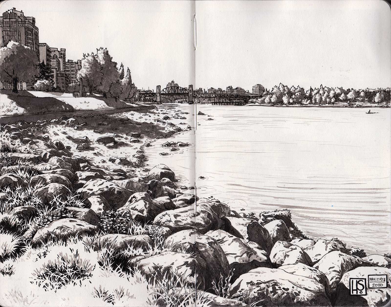 The View From Sunset Beach, pen and ink wash made from India ink, 7 x 9" (17 x 22 cm) The striking morning light on the beach was the inspiration for this drawing. I used my usual mix of pen and ink washes, creating an intricate foreground that recedes into a background with little detail that still manages to imply the urban environment. Playing with the negative spaces in the grass highlights one of my favorite techniques for creating shadow and depth.
When starting a new subject in ink, I often use the same approach and techniques. Once I know what it is I plan on creating, my next step is to begin to figure out how to simplify the subject. This can feel daunting at first since I’m often depicting a city or forest scene, both of which can be quite complex. By trying to break down a scene into simple shapes and forms it allows me to quickly sketch out the overall drawing without getting lost in details. After identifying my focal point, I’ll start sketching out the largest overall shapes first, often trees, buildings, mountains, etc. Once I’m satisfied with the roughed out sketch I’ll double check the composition. I’ll also make sure that I’ve placed my horizon line and vanishing points (when visible) since it’s very important to refer back to in order to make sure my perspective stays accurate.
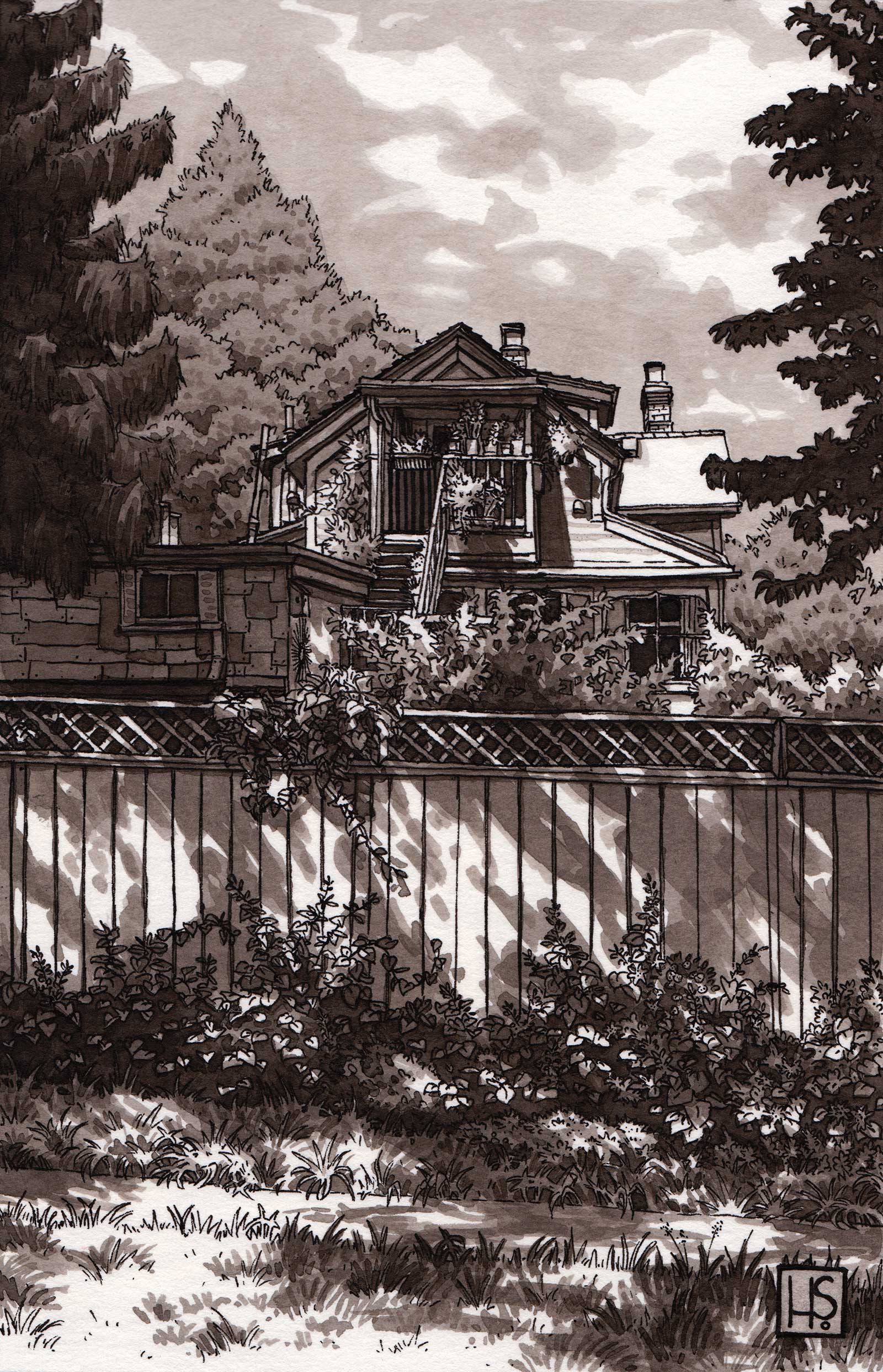 Sunlit Backyard, pen and ink wash made from India ink, 7 x 4½" (17 x 11 cm) I really wanted to focus on the dappled light on the fence and plants in the foreground, as well as the light on the house in the background. I used ink washes to establish the contrasting light, which I felt was key for this piece.
Next I’ll start refining the drawing and adding in some of the more important details. Things like key structural lines on buildings, or a tree that needs to be highlighted amongst a grouping of trees will get drawn in with more detail. At this point I’m not worrying about getting in every single detail, only the most important ones that are needed to convey the overall shapes.
Once that’s done, depending on the size and complexity of the drawing I’m doing I’ll either further refine the drawing and add in more details if necessary, or I’ll jump straight in with a pen. My pen of choice is a Sakura Micron Pen size 01. I find that it has the perfect size tip for the small drawings I tend to do. The surface I like to use for my ink drawings is Etchr’s Hot Press Sketchbooks. The paper is acid free, and most importantly 100 percent cotton, so it allows me to layer on many ink washes without worrying about buckling the paper.
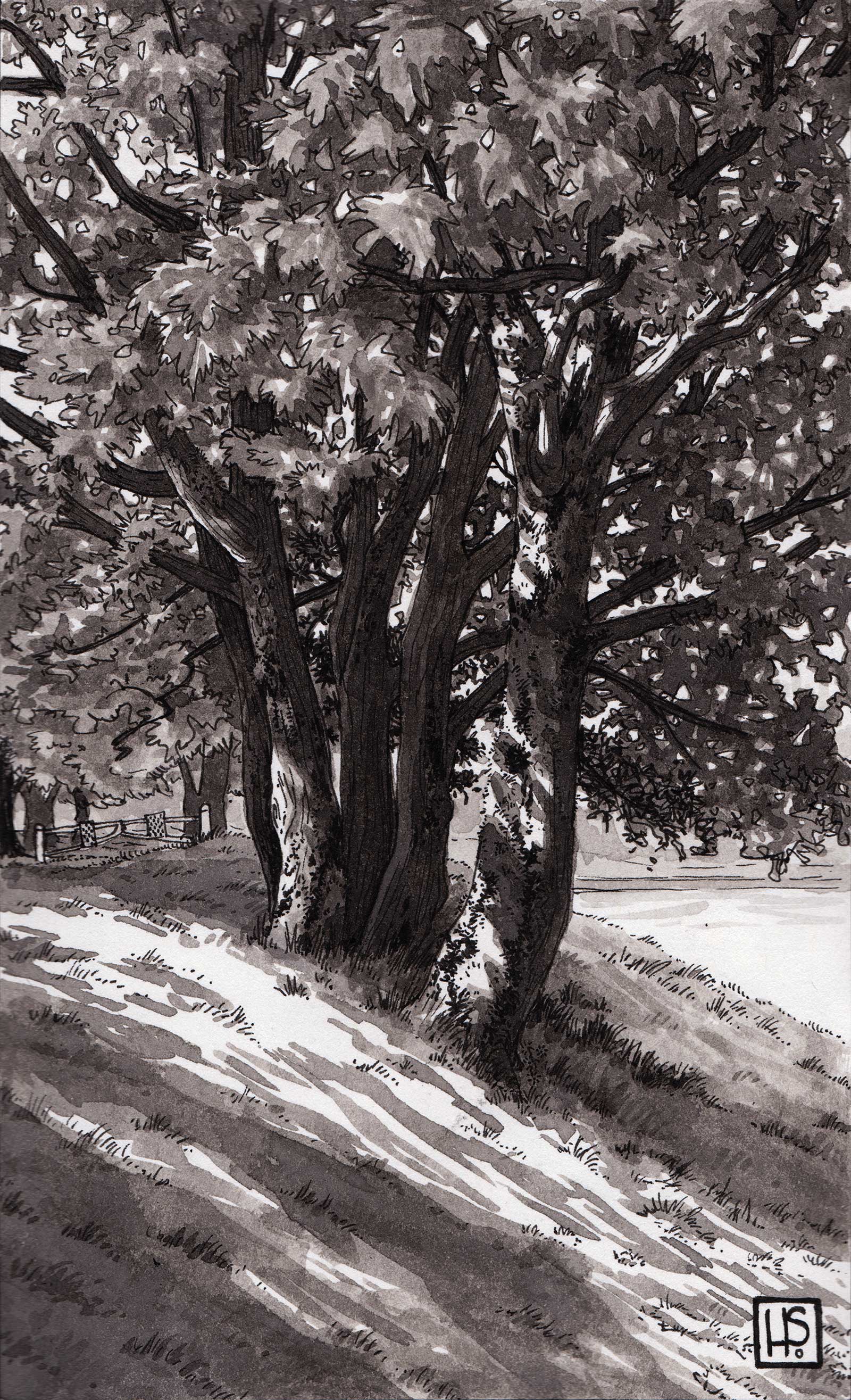
Morning Light, pen and ink wash made from India ink, 7 x 4½" (17 x 11 cm) This piece was inspired by the patch of light against a tree that I often pass. The focus of this drawing was to capture the splash of light in front of the trees and on their trunks.
When starting the pen work, I’ll use a ruler and draw in the outside border of my drawing first. After that I discard the ruler and draw the rest of my lines freehanded. I like to start drawing what’s in the foreground first, or the front areas where I know there are overlapping shapes. That way I’m less likely to draw over something I don’t want to draw over. When drawing buildings, I like to draw in the outer lines or important inner main lines first. Similarly to the sketching stage, I like to work with the broad shapes first, working my way to the details last. The smallest details come at the end, once I’m sure that the rest of the drawing is sound.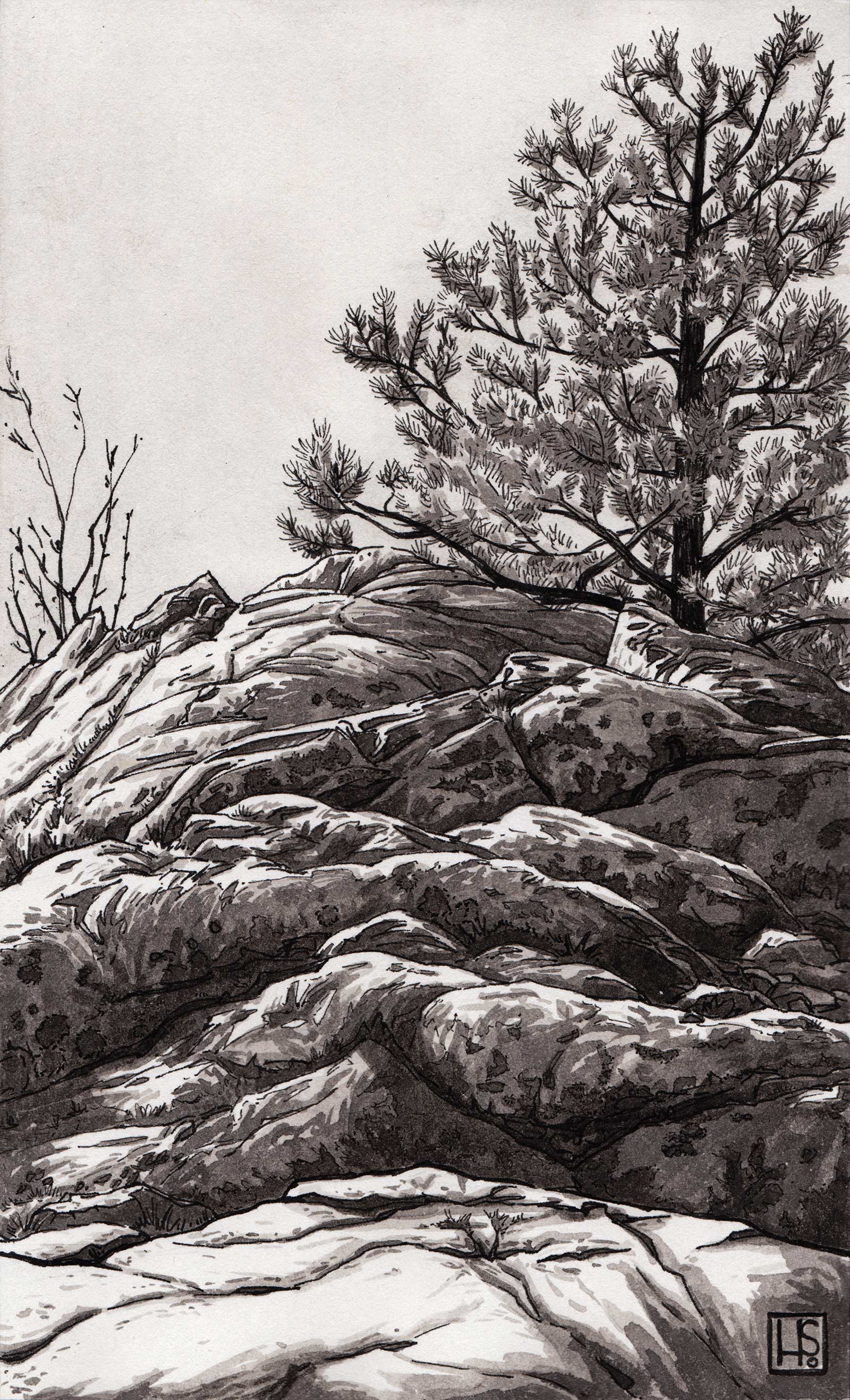
Rocks at Whytecliff Park, pen and ink wash made from India ink, 6½ x 4" (16 x 10 cm) The focus of this drawing is the broad, smooth sun-bleached rocks with the contrasting tree jutting up behind them. I liked the way they differ from each other, the rounded planes of the rock and the prickly branches of the tree.
Next comes the ink washes. My favorite ink to use is Speedball Super Black India Ink. It’s rich and gorgeous straight out of the bottle and it makes fantastic ink washes. I start by adding water and a few drops of the ink to some glass jars I’ve saved. My preference is to work with three different ink washes of varying values, one that is very light, one of a light/medium value, and a third that is darker than the others, but not so dark that it is approaching black. By having these various ink washes I can build up my values in layers, making it very easy to control how dark I want to make an area. I’ll brush on the washes layer by layer with a watercolor brush, not sticking to any rules about which wash to use first. One of the many good qualities about ink is that it dries quickly, so I can usually do a piece of art in one sitting.
In the end, I strive to achieve a piece that conveys light and form through value. I find that ink is a perfect medium for this as it satisfies both my love of painting and drawing.
My Design and Composition Tactics
• Focus on Strong Lighting and Values The contrast of light and dark values is a key element to my ink drawings. I use it to draw the viewer to where I want them to look as well as create a sense of depth and lighting.
• Areas of High and Low Details I like to have a combination of areas of high and low details in my work. This fine balance is essential to having a detailed piece feel comfortable to the viewer instead of noisy.
• A Balance of Urban and Nature The mixture of nature and the mechanical or man-made is something that fascinates me and that I love to put into my drawing. Their differences placed together in a delicate balance is something I often try to invoke.
• Building Up Ink Washes I like to work with one to three ink washes of different values. That way I can build them up slowly and end up with a wide range of values in my pieces.
My Art in the Making Early Morning on Cambie Street
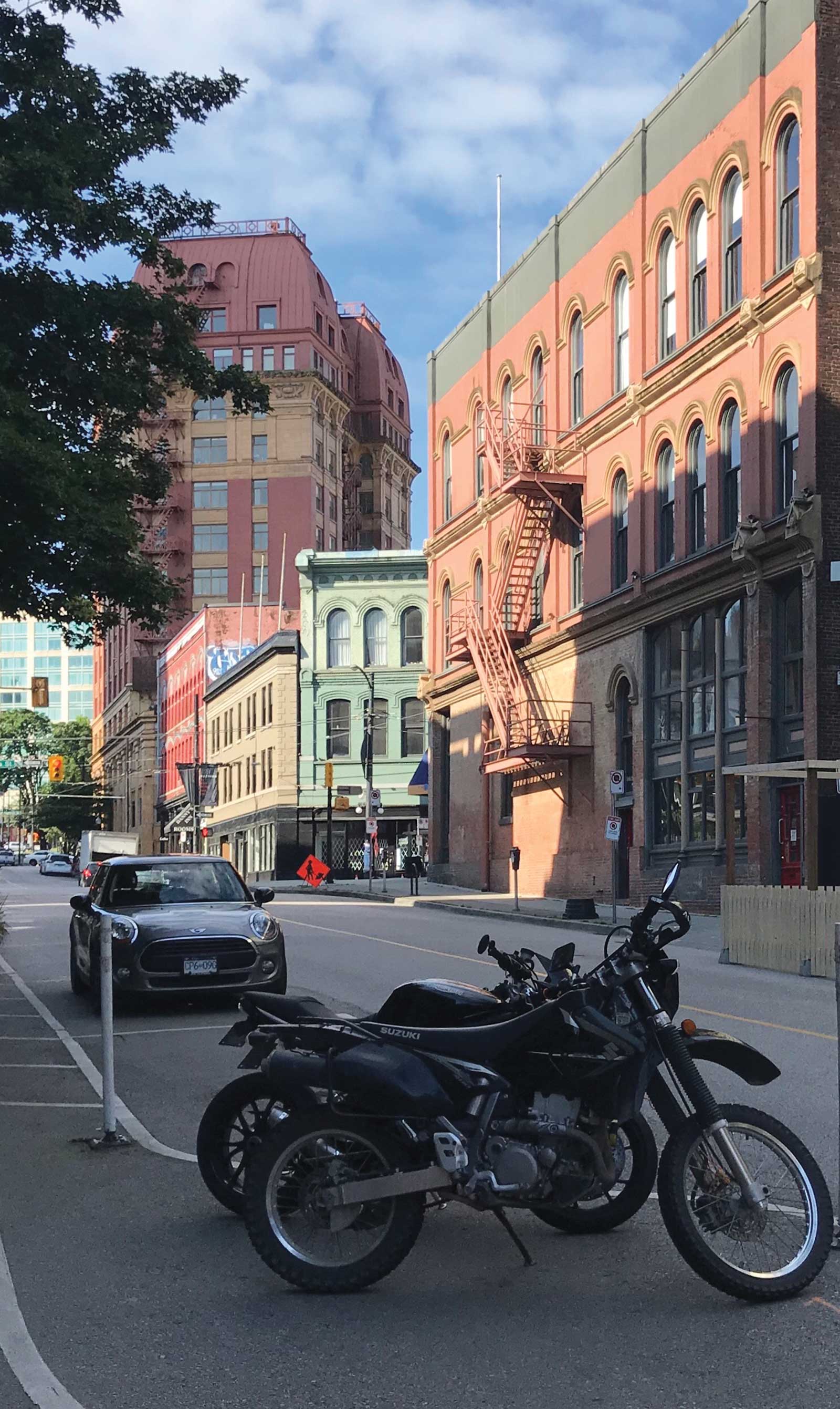 Reference photo
Reference photo
Whenever I’m walking around outside I’m always keeping an eye out for my next drawing or painting. It doesn’t matter if I’m on my way to the grocery store or heading to work, I’m on the lookout for a composition or lighting that stands out to me. Luckily for me I always carry a camera with me, and I snap pictures of anything I find inspiring. In this case I was walking around the neighborhood known as Gastown in downtown Vancouver when I spotted some buildings that I knew I had to draw. I will usually snap multiple pictures, trying to find the right angle and composition as well as any details I think will be important to my drawing. This makes things easier for me when I start sketching things out.
WHAT THE ARTIST USED
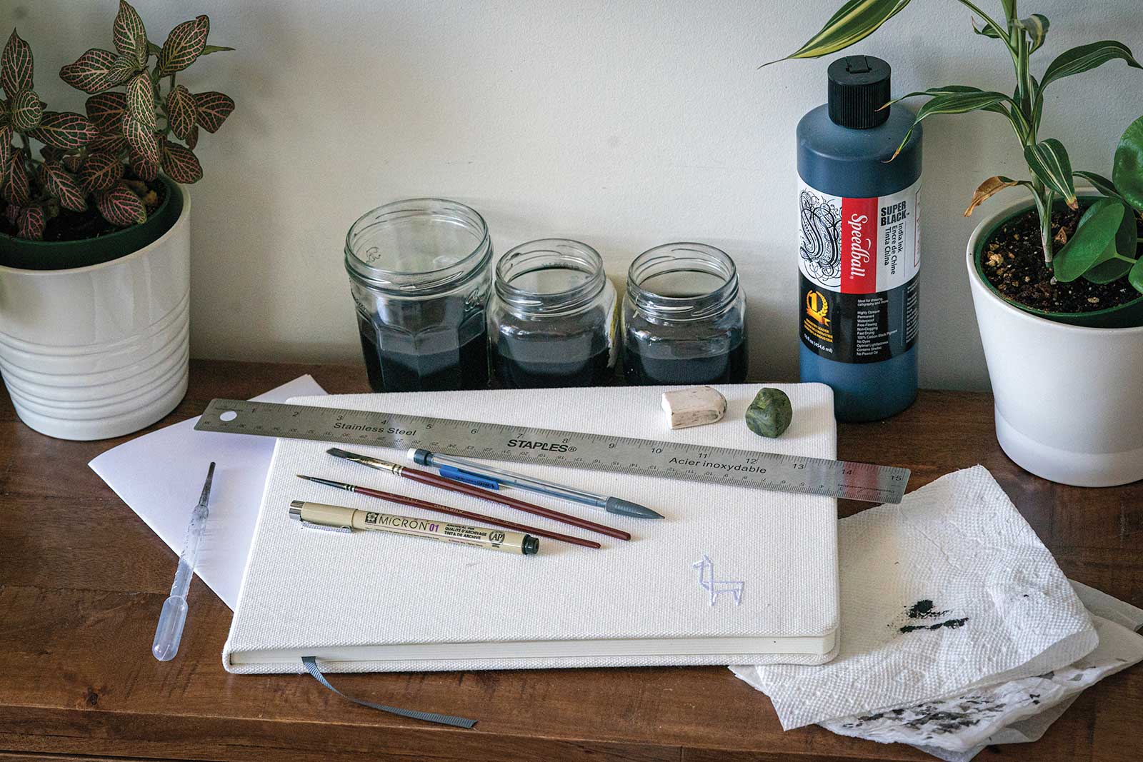 A4 Sketchbook, 220g Hot Press, Speedball Super Black India Ink, Plastic eye dropper, Three small jars of water, one with a light ink wash, one with a medium ink wash, one with a dark ink wash, Sakura Micron Pen size 01, Watercolor brushes: sizes 0 & ¼, HB Pencil, White eraser, Kneadable eraser, 30 cm ruler, Paper towel, Scrap paper
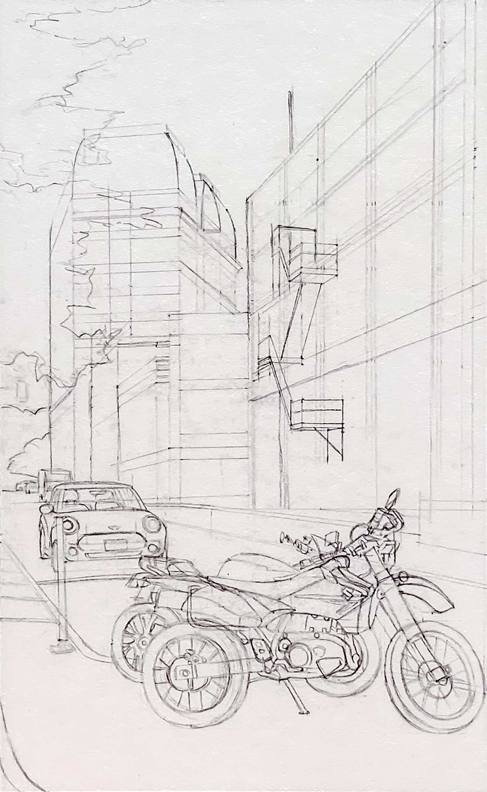 Stage 1
Stage 1 The Composition and The Sketch
Once I have some pictures of the subject I’m interested in drawing, I’ll make a few sketches until I settle on a composition that I like. In this case the final sketch is very close in composition to the photo that I took. Using an HB pencil, I establish the border of the drawing on my paper first, and then I add the horizon line. I find that for architectural drawings it is very important to have the horizon line drawn in to maintain the accuracy of the perspective I’ve chosen. I then start to lightly rough in the buildings, eyeballing the angles and the perspective.
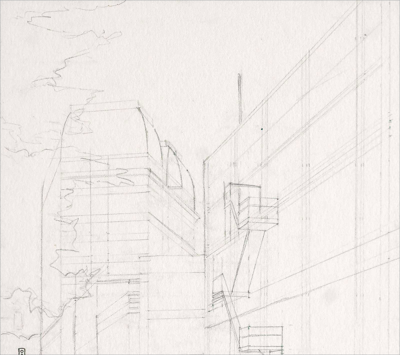 Stage 2
 Stage 2 Refining the Sketch
Next I start refining the sketch by using a ruler to see how accurately I’ve drawn my perspective. I start drawing over my initial light sketch and use a ruler to put in a few of the most important lines where the perspective is crucial. Once that’s done I start to sketch in any other important large elements, a rough shape for a tree, and a more refined car and motorcycles that show up in the foreground.
 Stage 3
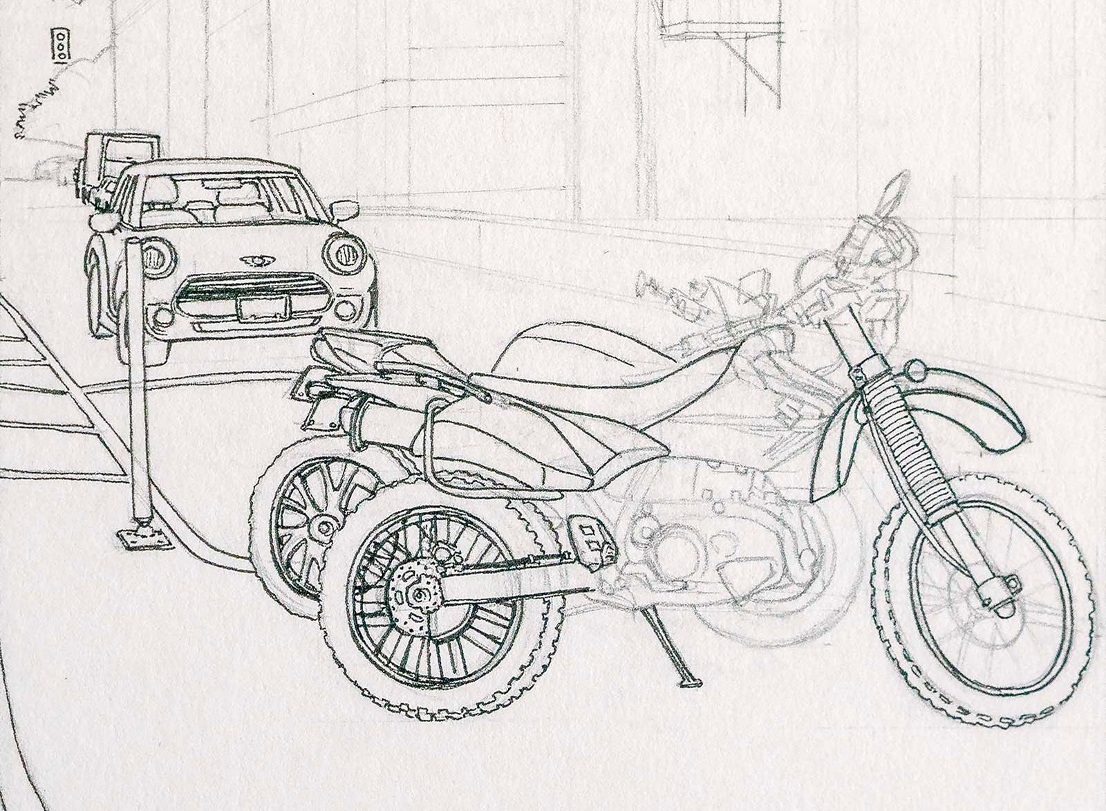
Stage 3 Starting the Foreground Ink Lines
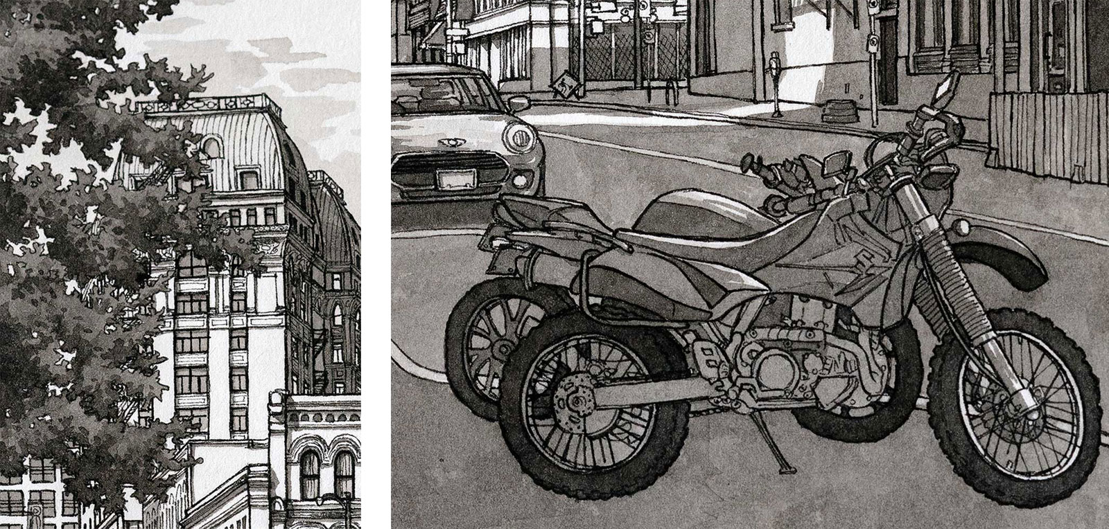
Once I’m satisfied that my sketch has the main elements established, I start adding the first inked lines. Using a Sakura Micron Pen size 01, I start with the foreground elements, the motorcycles and the car. They are large and appear in front of the buildings, making them important to finish first so that they aren’t accidentally drawn over if I had started the background first.
 Stage 4
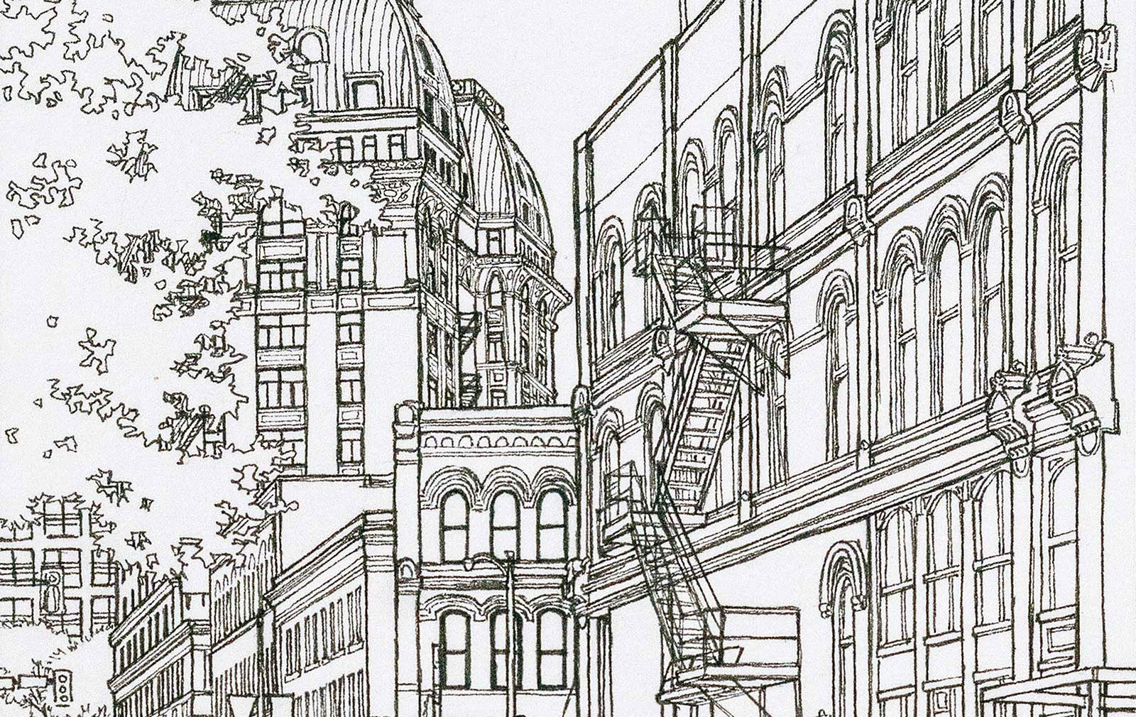
Stage 4 Starting the Background Ink Lines
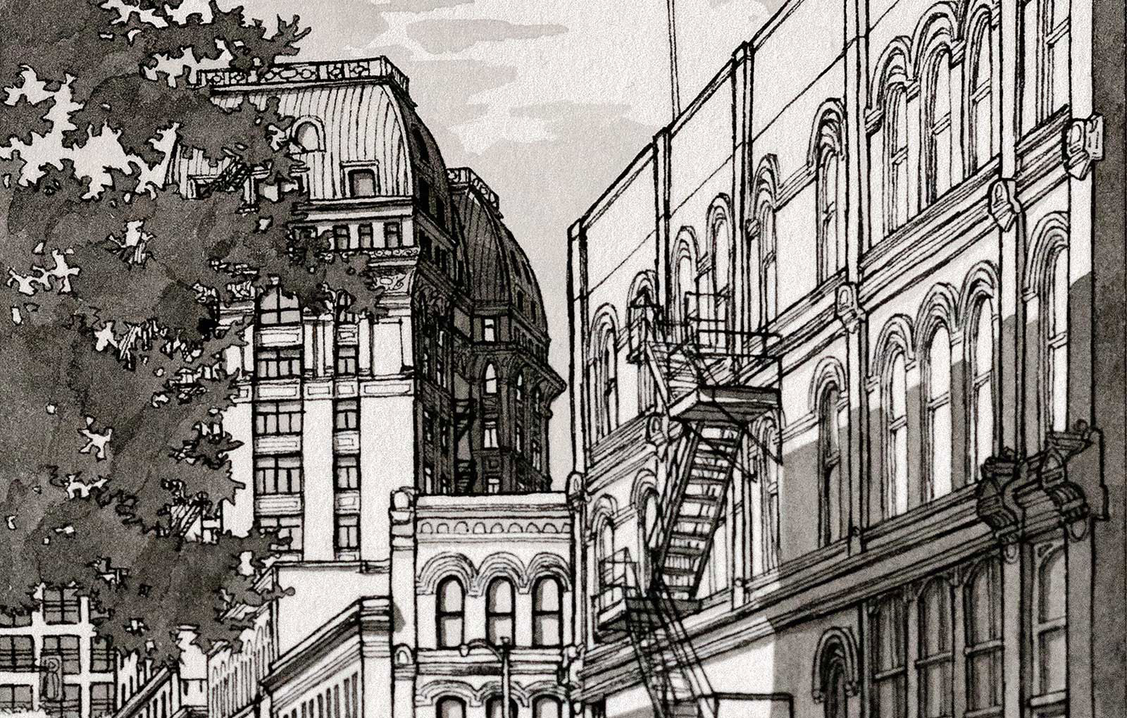
Next I start the ink lines of the buildings and foliage in the background, starting with the trees on the left side and then with the large building on the right. I establish the main structural lines first, working on the outlines, and then working my way inwards on the balconies and lines between the various floors of the building. Once that’s done I work on the windows and the details of the building. After that I start on the back buildings, repeating that same process of starting with the outlines and main structural lines first, then the details last.
 Stage 5
Stage 5 Refining the Ink Lines
Once I’m done the first pass of the ink lines, I do a second pass over parts of it to further refine the drawing. I thicken the lines in areas where I want to show weight, or in areas where I want to create depth. Thick lines over thin ones make the areas with the thick lines look closer to the viewer. Thinner lines look farther away. I play with this until I’m satisfied that the drawing looks like the lines are creating a sense of depth.
 Stage 6
Stage 6 The First Ink Wash
After the line drawing is done I start the first ink wash. I take one of the small glass jars, fill it halfway with water and then add a few drops of Speedball Super Black India Ink with a plastic eye dropper. I test the mixture of water and ink until it’s a pale grey with barely any darkness to it when I apply it to a test sheet of paper. Once I’m satisfied with the light value, I paint over all areas of the drawing where I want there to be shadows at some point, regardless of how dark or light I want those shadows to appear in the end. This will serve as a guide as I’m layering and building up the other ink washes. I add no ink washes to the areas I want to keep in bright light.
 Stage 7
 Stage 7 Adding in the First Darker Ink Washes
Now that the first light layer of ink wash is laid in, I mix two more ink washes, one of a medium darkness, and the other much darker than the other two washes. I start painting in some of the darkest areas first, so that I have a gauge of how dark I want to go, and if one layer will be enough or not. Then I start adding some darker washes to some other areas, again to test their values.
 Stage 8
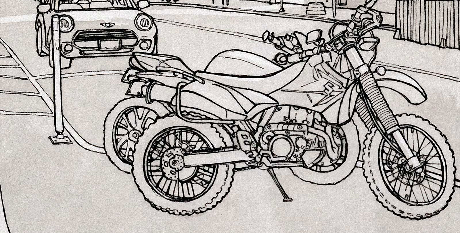
 Stage 8 Building Up More Washes
At this stage I’m adding more of all three ink washes to the drawing, painting them in with the broader brush for the large areas, and the smaller one for the detailed parts. The ink washes dry fairly fast so I can paint over one area within minutes of having already painted it.
 Stage 8 Stage 9 The Final Washes
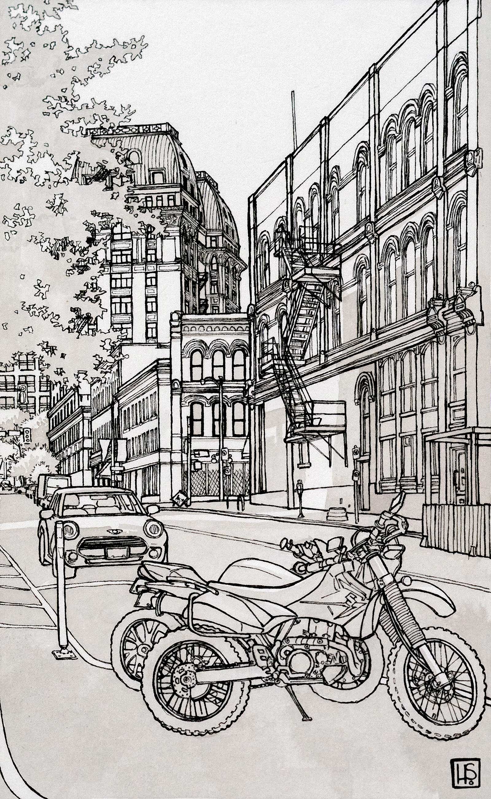
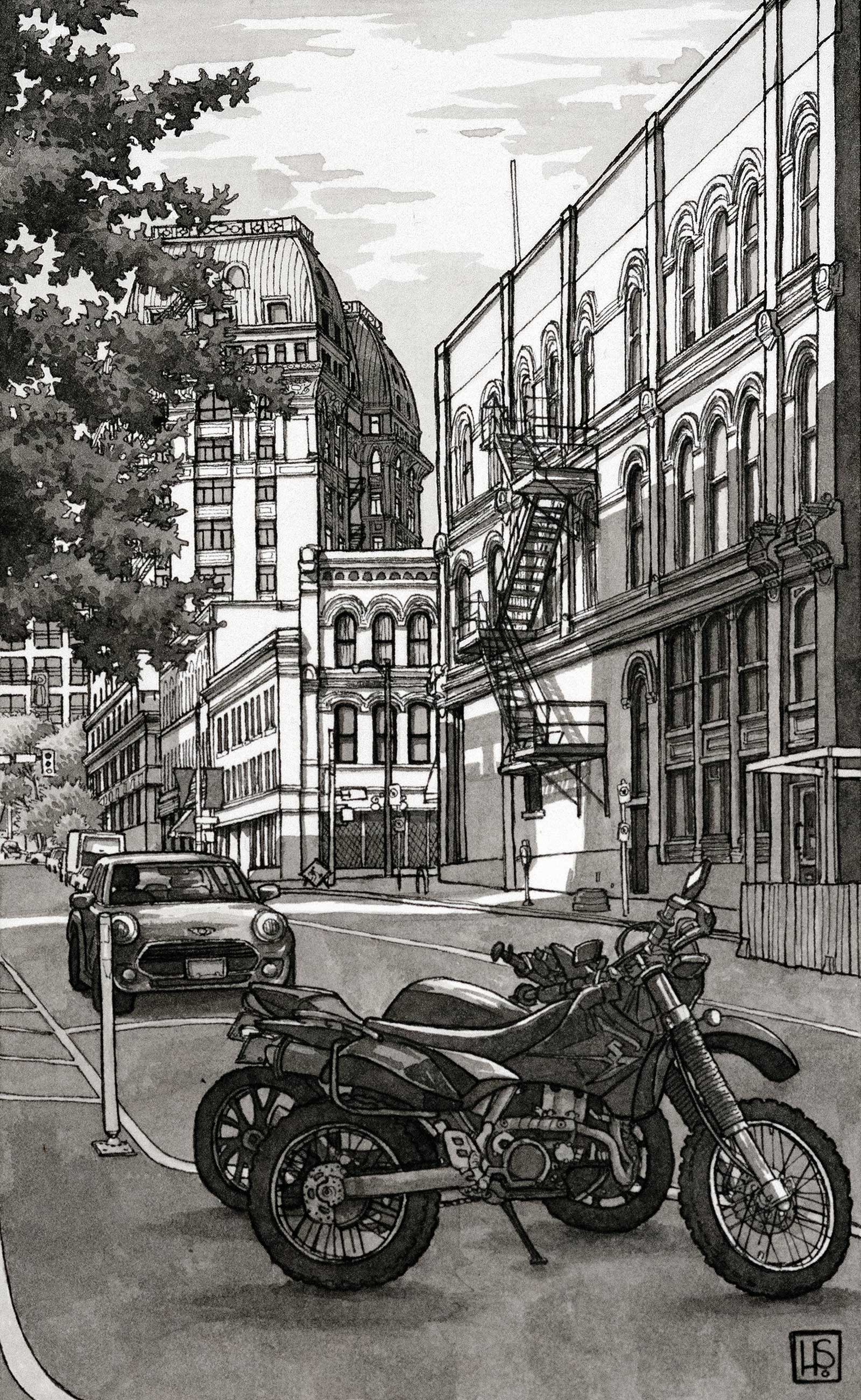
Early Morning on Cambie Street, pen and India ink, 7¾ x 45⁄8" (19 x 11½ cm)
Once I’ve built up my washes throughout the drawing and I’m fairly satisfied, I take a step back and figure out where I need to make adjustments to my values. I then add in the final washes to darken areas that aren’t dark enough, to add contrast where it’s needed to separate one section from another, or to add focus to an area.
ABOUT THE ARTIST
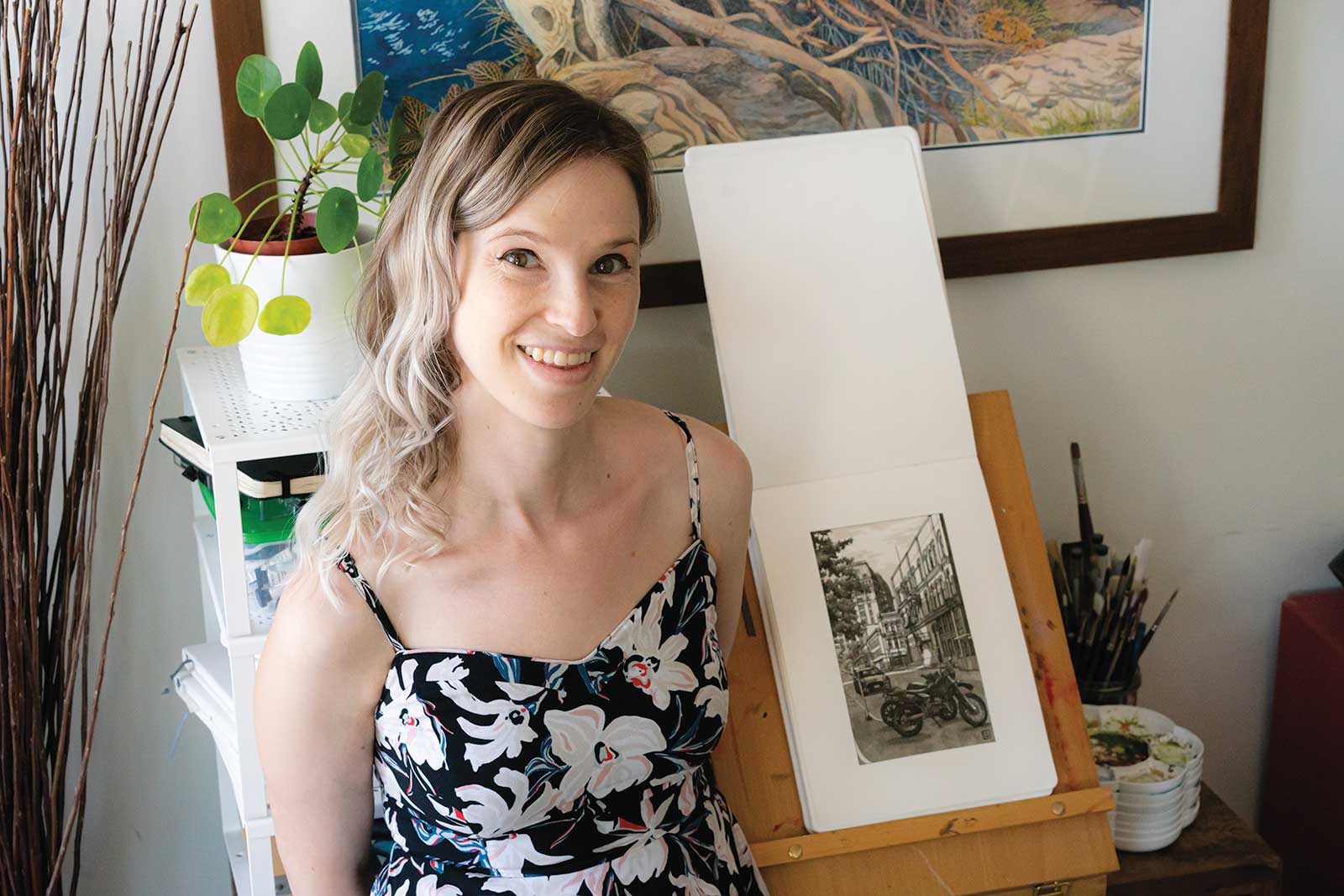 Heather Souliere in her studioHeather Souliere is a Canadian illustrator and urban sketcher who has worked for almost 20 years in the animation and film industry working primarily on computer animated movies as a texture painter. Classically trained in hand drawn animation at Sheridan College, and in computer animation at Seneca College she has worked on over a dozen movies that have been theatrically released. When not working on films, Souliere spends her time doing urban sketches in Vancouver, BC, Canada, and occasionally escapes to the mountains to paint.