


Your tastes in painting may change over time, but one thing that’s always sparked my imagination and inspired me is the idea of using both abstraction and realism in the same painting. There’s something so special about having painterly abstract areas which let the mind spread its wings, seamlessly blending into focal areas of crisp detail. It’s very similar to when a jazz piece regains the melody or rhythm after some loose riffing.
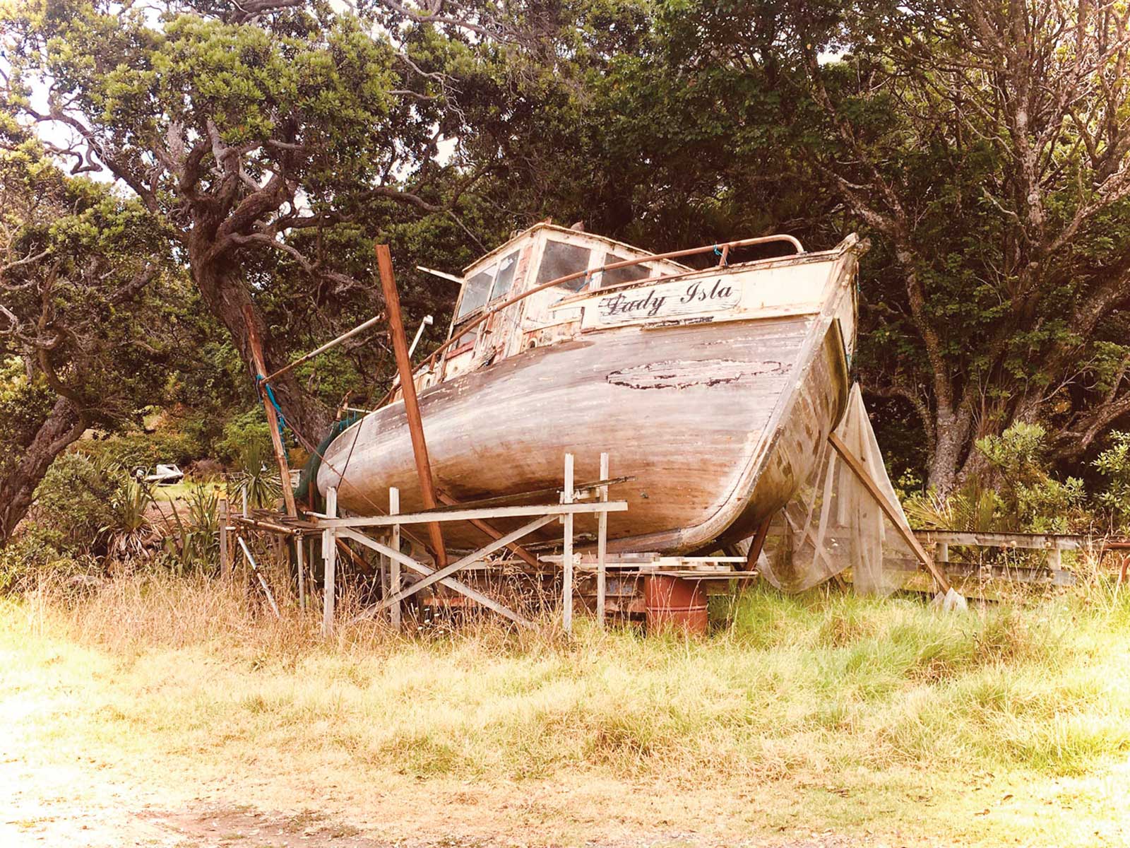
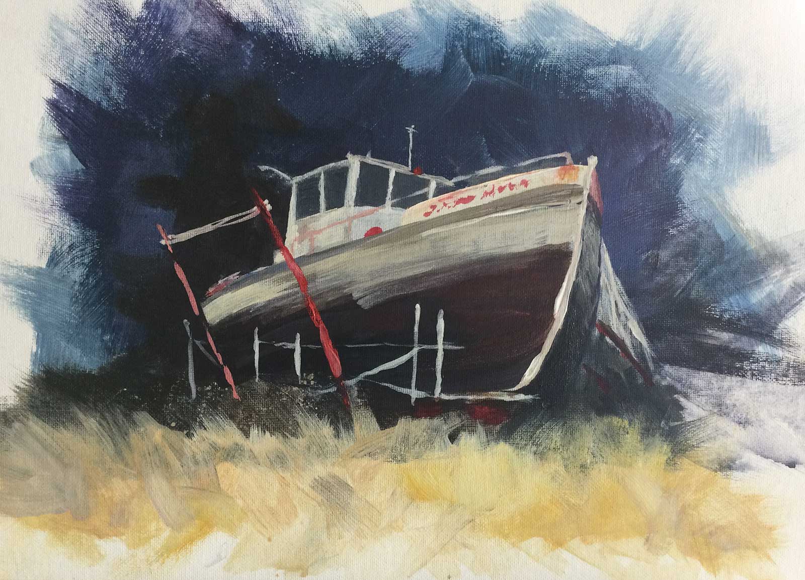
Reference Photo: Lady Island, Great Barrier Island, New Zealand.
In this painting I’ve used abstraction in the foreground and background, throwing the paint around and letting it do its thing, and then tightened up on some careful detail in the boat itself. To achieve this I use a really large brush in the background, literally throwing paint on, having a loose idea of the big color statement I want to make, but then painting very rapidly so that my mind doesn’t get a chance to plan brushstrokes or worry over small details. Take a big inhale and just breathe it onto the canvas with as much abandon as you can muster. I also employ splattering, dabbing paint off with a rag, and a palette knife at times.
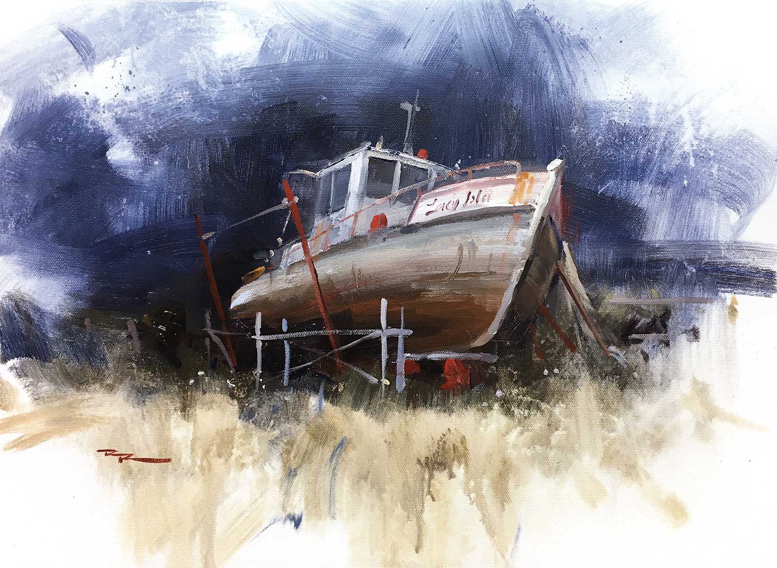
Richard Robinson, Better Days Demo, acrylic on canvas, 15 x 20" (38 x 50 cm)
Then it’s time to switch gears and smaller brushes, slowing down and focusing on creating realistic form, but letting it be loose in some places so that it can merge smoothly with the loose background and avoid looking like a paper cut-out. Keep those few things in mind next time you’re painting this way and see difference it makes. Enjoy!
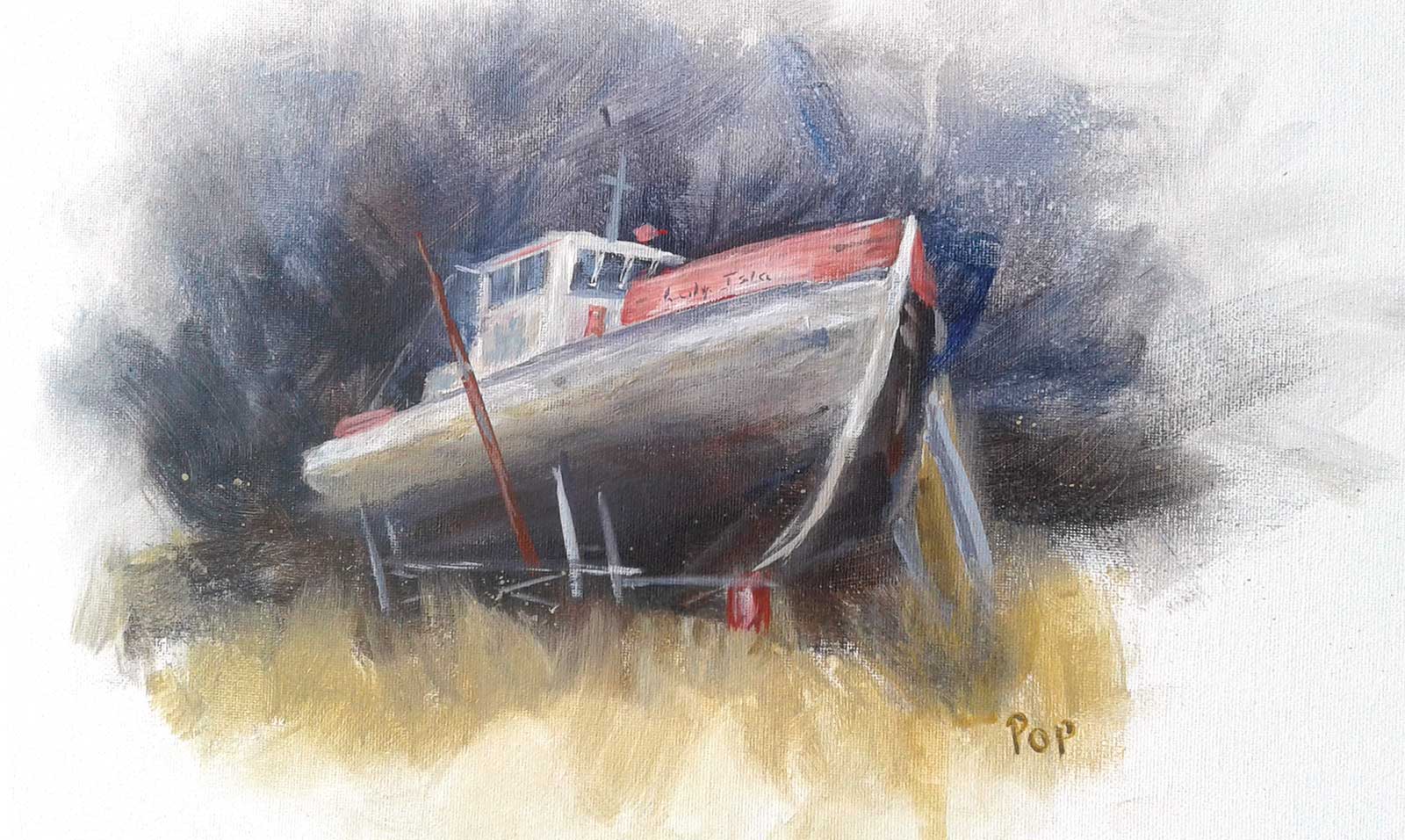
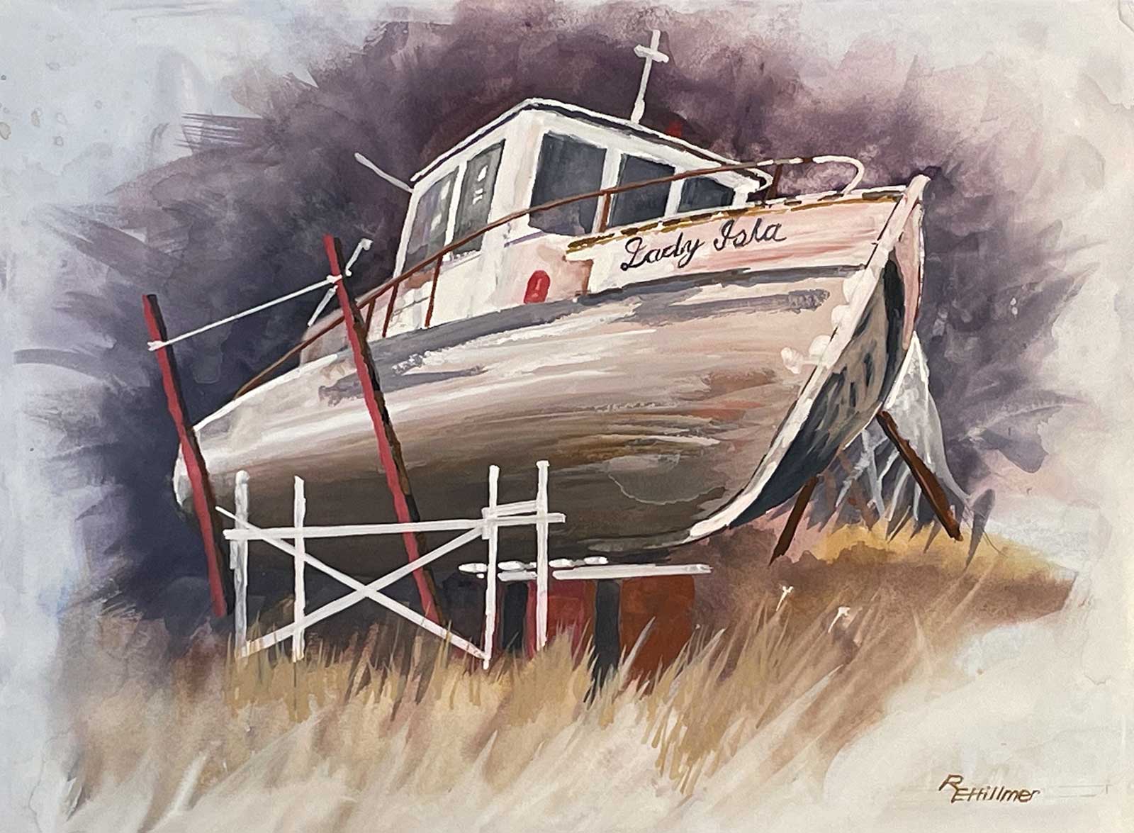 Better Days, watercolor and gouache
Eric Hillmer
Hey Eric, great painting! I love that you gave it a go in watercolor and gouache. Great attention to detail, and you’ve done a great job of creating the rounded form of the hull as it moves into shadow—not easy! Nice job of the grasses transitioning from abstract to real too, and they’re not overworked which is great to see.
I would have liked to see you use a much bigger brush for blocking in the dark background because it’s not quite achieved the loose painterly feel that that can allow. You’ve spent some time making the scaffolding quite detailed and tightly drawn but if you’re going to be that specific about it I’d want to see some color variation (rust, paint, etc.) on those white bars and also some strong cast shadows where they overlap. Other than that, all good—beautiful work!
 Old boat, acrylic with oil glazing on canvas, 16 x 20" (40 x 50 cm)
Elena Sokolova
Great work, Elena! Interesting approach you took in glazing over impasto acrylics with oils. The rich textures you’ve created by doing that really do suit this subject and that’s a great achievement to have your technique speak about your subject. I do feel like some of the grass could have more structure to make it more real. Perhaps just a few highlights of ragweed or similar.
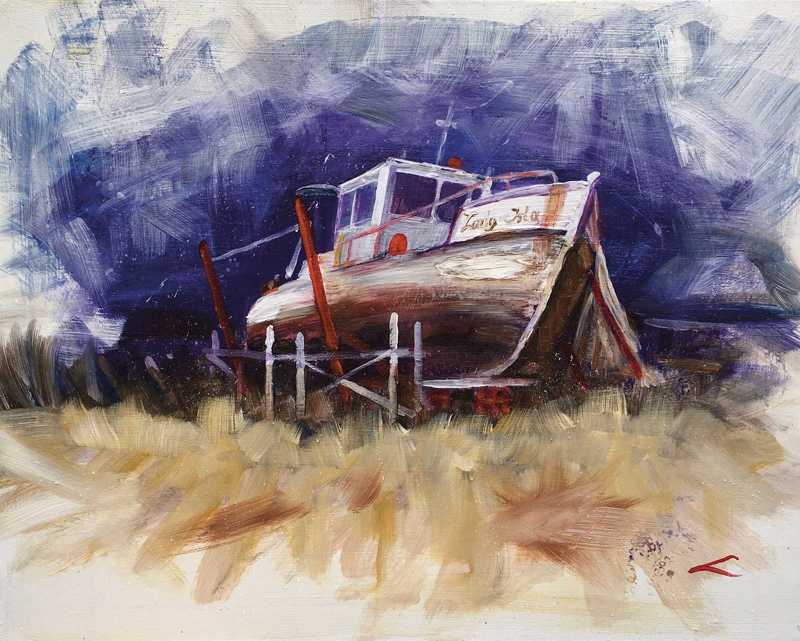
 Better Days Lesson, acrylic, 12 x 16" (30 x 40 cm)
Jill Frazier
Nice one Jill! Love your energetic brushwork and strong value contrast. Dramatic! Couple of things to think about: look at the color in the long curving vertical stroke of the bow. In yours the color and value are the same for the whole stroke. In mine the color varies a little from cool to warm and gets darker at the bottom as it flows under the hull into the shadow.
That small feature is an important one because without it, in yours, the hull is being flattened out because the color isn’t making it curve away into shadow. Easy to fix. Similarly, the broad dark brown area on the hull next to this line could do with more light in the midsection before it curves into shade. Make those two small changes and the boat will look a lot more three-dimensional. Other than that, nice job!
 Forgotten
Evelyn Tuhi-Herewini
Good job Evelyn. This is not a great photo of your painting, but I can see how this would look in the flesh. A tip for photographing your painting, take it from a slight angle above your painting to avoid glare and then straighten the image using the perspective tools under the cropping function. If your phone camera doesn’t have that function, then you can download an app called JotNot which does the same thing.
Also I’ve noticed you’re taking the photo in the shade indoors close to a big window (which is good). You’ll likely need to increase the exposure a little and tint the photo a little warmer after taking the photo, all of which is available in the editing functions of any recent smartphone camera. As for the painting the only thing I’d like to see is the drawing of the boat done a little better. Comparing it in the mirror with the original photo will help a lot with that. Currently the side of the hull needs a little more curve, and the front line of the bow has developed a bit of a wobble. Small wobbles good, big wobbles not so good. Good work! —
About Your Tutor
 Richard Robinson
Richard Robinson is one of New Zealand’s premier outdoor painters. You can view his extensive online lessons at www.mypaintingclub.com.
Get the full video lesson here: www.mypaintingclub.com/lessons/216-better-days