


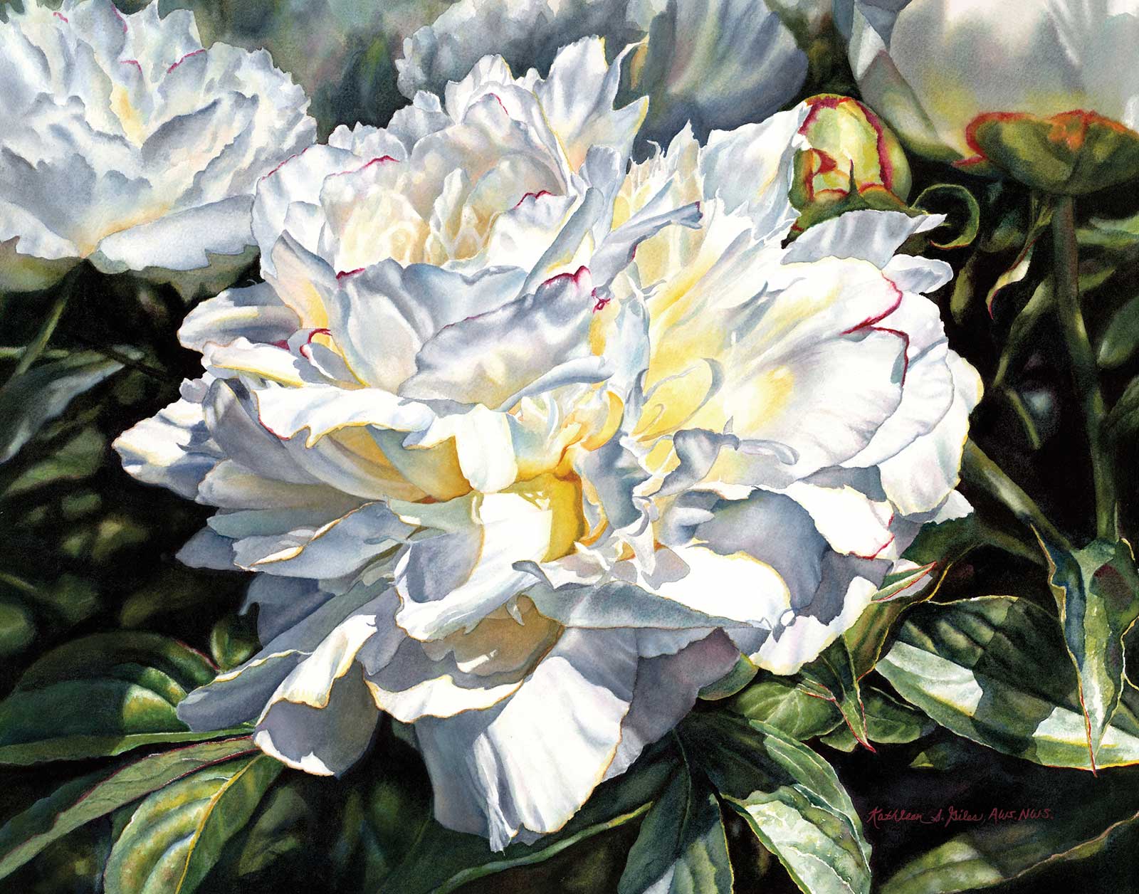
 Perfect Peony, watercolor, 17½ x 22" (44 x 55 cm)
Grand Prize is a four-page editorial feature in American Art Collector magazine
Kathleen S. Giles, New York, USA
The Gardener
The watercolors of New York-based artist Kathleen S. Giles tell a story or capture a moment in time, and she finds that the best way to do this is through realism. “When I first started painting I didn’t have the skill to paint the way I do today. I fluctuated between trying to be realistic and going with a looser washy style. I was often encouraged to loosen up. If I tried to paint that way, I was never happy with the result,” she says. An avid gardener, Giles loves flowers just as much as she loves capturing their unique, delicate beauty, exactly as they are. “As the art world has swung toward a renewed appreciation for representational work, I too embraced my love of it and continued to hone my skills,” Giles adds.
She’s also developed her eye as a photographer over the years, enabling her to utilize better reference materials with which to draw intricate details. The artist explains that over the course of nearly 30 years, she has had time to figure out what she wants “to emphasize, what things I want to soften and what things I want to remove. I don’t feel that I have painted my best painting yet, and that motivates me continually.”
As a watercolor teacher for many years, Giles also finds that explaining her process and reasoning to others helps improve her own understanding of her painting practice. “It’s like I am teaching myself through reinforcement,” she says. “My work often begins with an idea. Then I begin to plan how to get the photographic reference that fits my idea. I have asked people to pose for me, worked with candid covert shots, waited and waited for the sun to shine and any other number of things to get the picture I wanted. I then always use a photo editing program on my computer to blend, crop and otherwise modify the original scene. This creative process is one of the most important parts of a new work, and it all happens before I touch the paper.”
My Inspiration
I am a gardener and love peonies as much as I love painting. Peonies are one of my favorites, and I have planted 12 peonies in my garden over the years. As they bloom I photograph them on the plant in natural light and indoors in various still life setups.
My Design Strategy
When editing a reference photo I often crop in tightly to increase the drama. On this piece I knew I wanted to include the entire flower because all the folds and shadows told story of its beauty. I included a few background flowers as supporting actors in order to add depth and set the mood. I liked the tilt of the main flower but adjusted the angle of the right vertical stem to make it straighter. On my computer, I lightened some of the leaves in the lower third of the painting so I could see the details. I have learned that middle value transitions are very important. If my flower was surrounded with very dark darks it would look pasted on and unrealistic.
My Working Process
Peonies are complex flowers. I often start my paintings by brushing in the yellows and that’s what I did here. Placing my yellows around the interior of the flower assured that they would be clean, fresh and start to establish my value pattern. In order to preserve the freshness of the blues and grays, I worked wet-into-wet on one petal at a time. I used some sky blue, a semi-transparent paint, in some of my blue gray mixtures on the shadowed petals on the left. That was the color I saw there. I also know that a little opacity in spots enables the transparent sections to really glow. I kept the background flowers softer and put my hardest edges in the foreground. I painted in the leaf details and then lightly shadowed them. I felt the movement in the foreground helped the eye travel around the painting. Since my main peony had so much clean white paper, I knew it would stand out despite the leaf detail.
Contact Details
Email: kgilesstudio@hotmail.com
Website: www.kgilesstudio.com
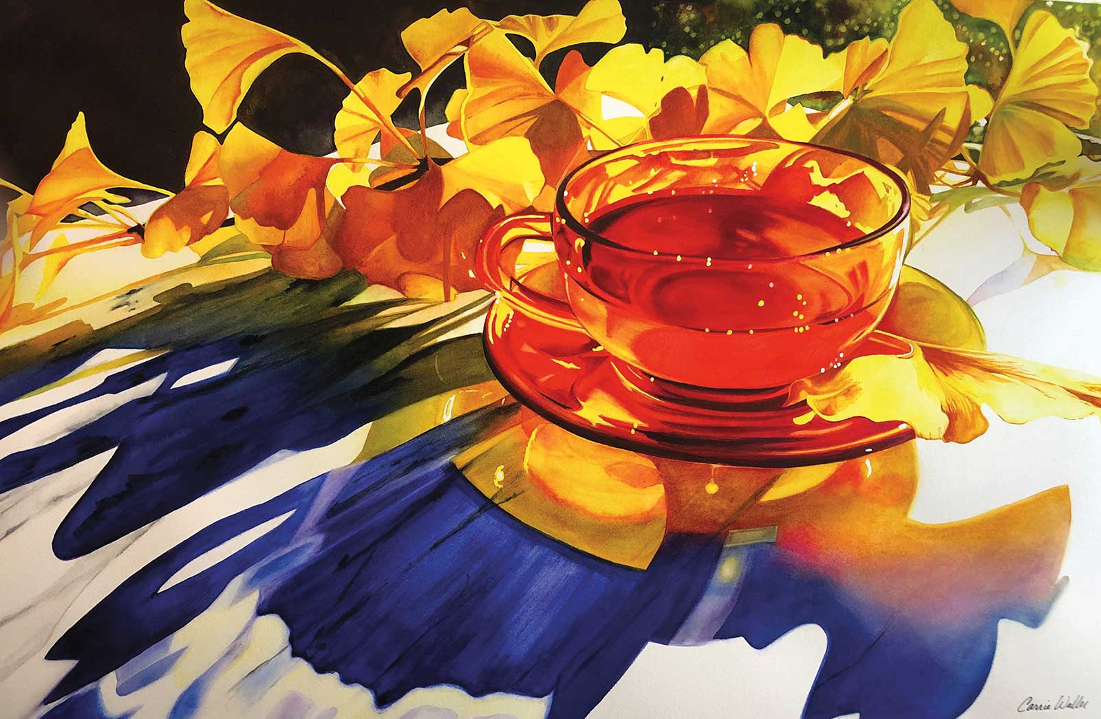 Ikigai, watercolor on paper, 20 x 30" (50 x 76 cm)
Second Prize is a two-page editorial feature in American Art Collector magazine
Carrie Waller, Armed Forces Pacific
My Inspiration
Ikigai means “reason for being” in Japanese. I have been living in Japan for over seven years and am in love with the culture and country. Fall in Japan is one of my favorite seasons. Golden gingko leaves are an experience on their own but, sitting down for a cup of tea on a crisp, sunlit, fall day with a backdrop of golden gingko leaves is a reason for being. As an artist, my reason for being is to capture these beautiful experiences and share my point of view. My muse is light. I love when dramatic lighting highlights the beauty of everyday objects and makes the ordinary, extraordinary.
My Design Strategy
Dramatic lighting, the strong color story and a gorgeous subject was the combination I was looking for when setting up this still life. I placed the tea cup off center to provide more interest for the viewer. Semi-backlit lighting created dramatic shadows that take center stage and bring an element of drama. The primary color triad with a sprinkling of tertiary colors adds to the strength of this composition. The deliberate white spaces give your eye a rest and directs you through the painting. The design and deep colors in the foreground really accentuate the gingko leaves and allows them to be a beautiful accessory adding sparkle to the piece.
My Working Process
Each painting begins with a very detailed drawing. I then mask out all of the white areas using a ruling pen. I paint with dried, pan, watercolors and a round, size 4, synthetic brush predominantly. Flat brushes are used occasionally, where needed, such as in the background, or the shadow areas of this painting. My goal is to have nice even washes. Using a mixture of controlled, wet-on-wet techniques, as well as dry-on-wet, I paint one area at a time. I complete each area before moving to the next, which helps establish my values immediately. Using this method I know whether the painting is going to be successful from the beginning. My paintings typically take a month or longer to complete.
Contact Details
Email: carriewallerart@gmail.com
Website: www.carriewallerfineart.com
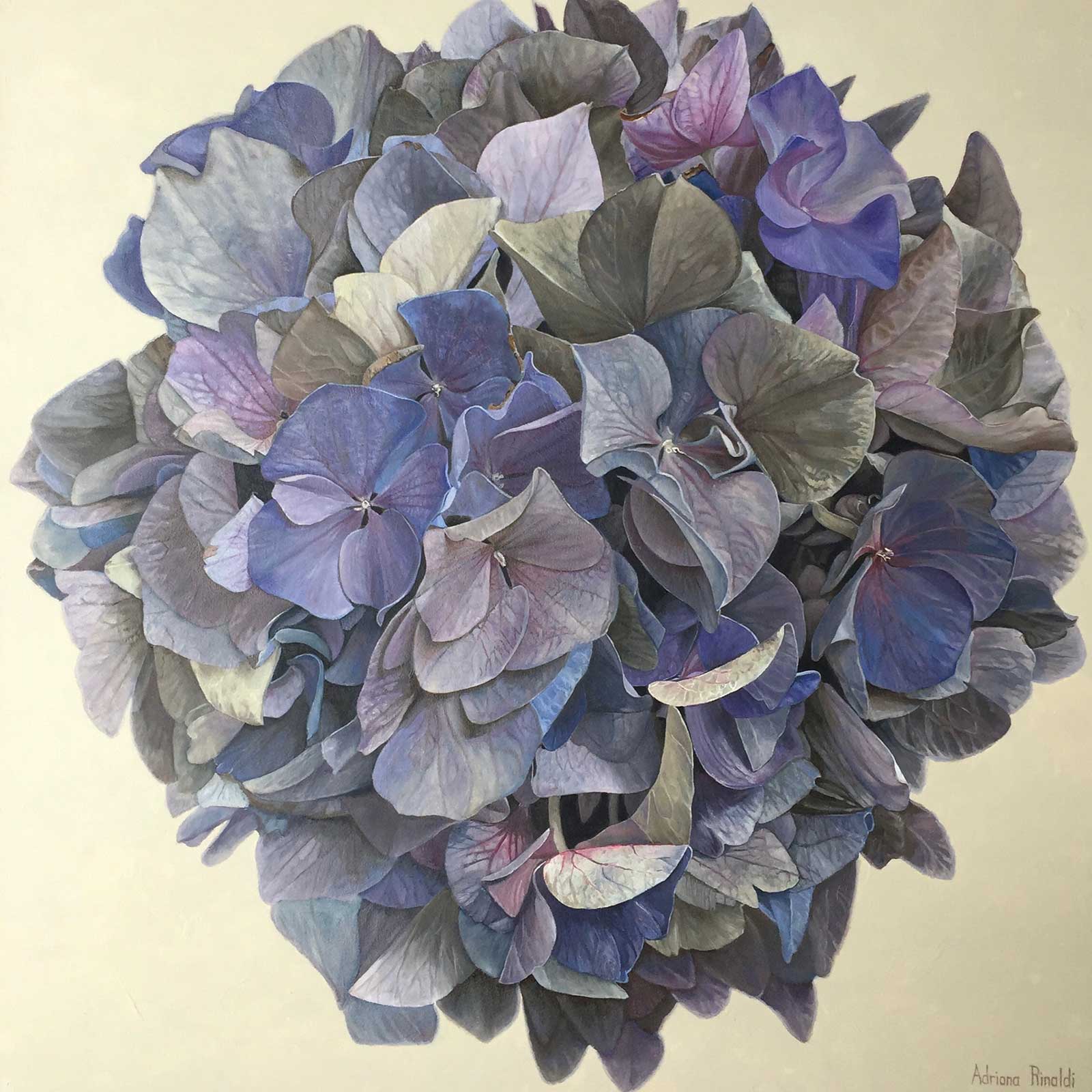 Plum Pudding, oil, 36 x 36" (91 x 91 cm)
Third Prize is a one-page editorial feature in American Art Collector magazine
Adriana Rinaldi, Ontario, CA
My Inspiration
Flowers evoke memories. The smell, the delicacy, the colors. Our floral season in Canada is limited, so the first signs of spring is cause to celebrate. I was inspired to paint Plum Pudding after purchasing a hydrangea plant as a gift. When I looked at it and really thought about it as a painting subject, I realized what a perfect little bouquet it was. Hundreds of little flowers wrapped up in a perfect bouquet. Hydrangeas come in a multitude of endless colors and variations. When I began painting, it was florals that caught my attention for their endless possibilities. Whether on canvas or in a vase, who doesn’t like a bouquet of flowers to put a smile on your face and brighten up your home?
My Design Strategy
For this painting I decided to make the hydrangea the “star of the show” by isolating it in the center of a perfectly square large canvas. I prefer to paint on a large canvas to make the florals larger than life. The focus is solely on the hydrangea like a bullseye in the middle. I did not want any other distractions in the background such as leaves or background colorings, so I left the background a plain color.
My Working Process
I use a modernized version of Renaissance traditional oil glazing painting, taught to me by Canadian artist Kathy Marlene Bailey. I build up detail, color and luminosity slowly and have a limited fundamental palette of four to six colors.
For this painting, I used acrylic gesso ground, with a bit of acrylic blue mixed in to create a medium value blue ground. When cured, I gridded my canvas with chalk and then transferred the gridded photo image by copying it to the canvas with chalk. I then started with my oil painting. I created a monochromatic oil underpainting—a grisaille (I chose blue for this instead of the traditional brown because it worked better for the periwinkle color of the hydrangea). After this, throughout each glaze, I worked one flower at a time. First I glazed with blue. Then I dropped in little bits of the target colors into the wet glazes to steer into the required periwinkle and mauve directions. To refine each glaze and to make my painting pop with contrast, I also dropped into my glazes mixtures of raw umber and blue to darken and white to lighten up areas. In my last glazes, I finished off areas with glazing to harden the colors—to maximize their luminosity.
Contact Details
Email: arty.adri@live.com
Website: www.adrianarinaldi.com
FINALISTS
Each receives an Award Certificate and a one-year subscription to International Artist magazine PLUS having their work seen worldwide by international galleries looking for new talent.
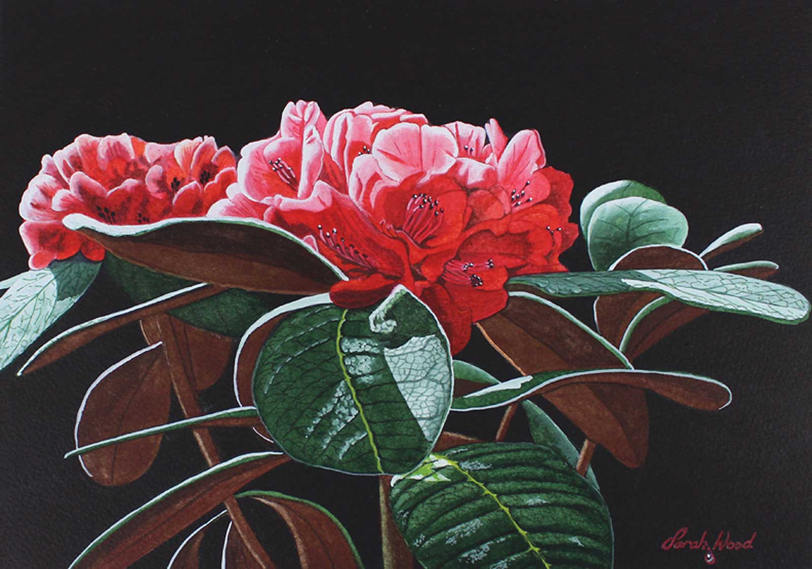 Rhododendron, watercolor, 8 x 11½" (20.3 x 29 cm)
Sarah Wood, Wirral, UK
My Inspiration
Color was the inspiration for this painting. I was visiting Ness Botanic Gardens, a favorite haunt of mine. I am often there looking for subjects to paint. The color of the flowers, bright but gentle at the same time, and the sunlight highlighting the plant were striking. I knew this would make a good subject to paint and would work well against a dark background.
My Design Strategy
I plotted out my composition, working from sketches I had drawn in the gardens and from photographs. I usually spend a lot of time thinking about my design before I act. I drew thumbnail sketches to help me choose the final layout. The flower head is the main feature in the painting, but I also wanted to include as many leaves as possible so I could show the highlights of sunlight striking them.
My Working Process
Having drawn my composition with as much detail as possible, I painted the first light washes of color over the whole image. Next I painted the background; this took several washes of paint. With watercolor it is important to be patient and build up washes layer after layer. Then I concentrated on the flowers and leaves, adding washes of color gradually. I finished by adding white gouache for the highlights on the leaves and flowers.
Contact Details
Email: sarahdiwood@gmail.com
Website: www.sarahwoodart.com
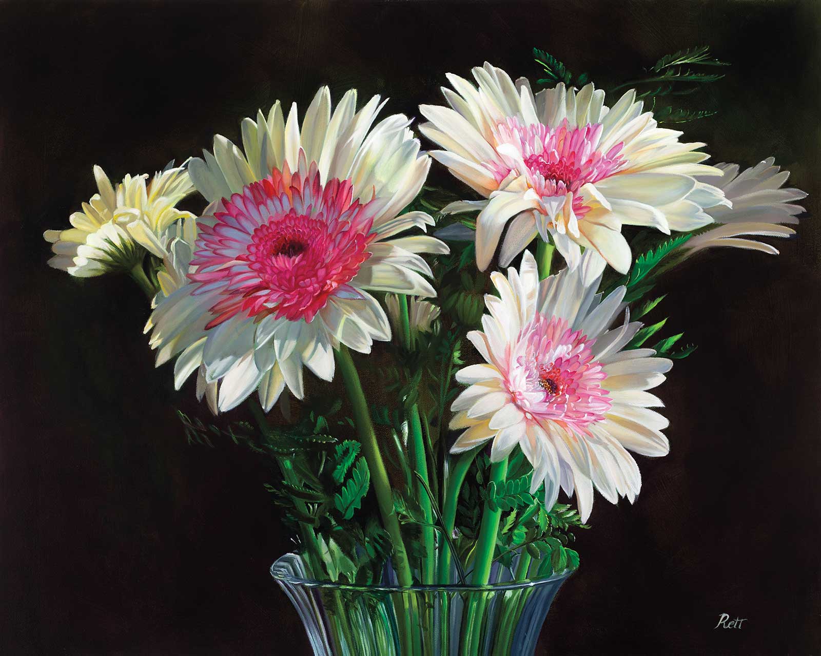 Krystal’s Gerber Daisies, oil, 24 x 30" (60 x 76 cm)
Loretta McNair, California, USA
My Inspiration
A few years ago a dear friend, Krystal, surprised me with a birthday gift of the most beautiful flowers I had seen. I took several photos to always remember them, never thinking I’d paint them someday. After all, I was a portrait and figurative artist. Recently a local gallery asked me for a series of dramatic florals where the flower consumed most of the canvas so the grain in the petals was noticeable.
My Design Strategy
I remembered the saved photos of these daisies, and it struck me how perfect they were for the series, especially with the afternoon light and shadows weaving in and out of the petals and leaves. To make the white flowers more dramatic I painted a dark background (mixing carbazole violet with sap green) behind them, and added light yellows to match the angular sunlight. To honor my kind-hearted friend, I titled the painting after her.
My Working Process
I prepared all canvases in the series simultaneously with several layers of a mid-tone green/gray base and employed the same palette consistently. I worked on three to four floral pieces simultaneously, alternating in order to allow the oils time to dry. This also prevents myself from becoming bored with the sometimes tedious detail work.
Contact Details
Email: info@lorettamcnair.com
Website: www.lorettamcnair.com
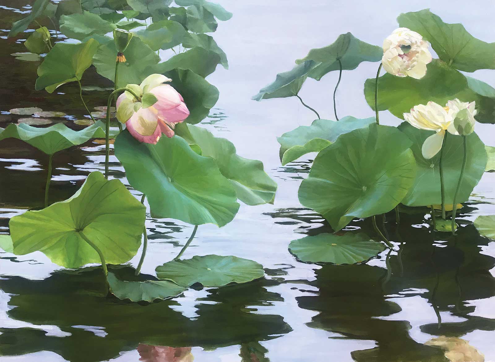 Lotus Garden, oil, 29 x 37½" (73 x 95 cm)
 Sheri Farabaugh, Colorado, USA
My Inspiration
I have been painting lotus since I first saw them a few years ago at Denver Botanic Gardens. The leaves are graceful, distinct and expressive. Their reflection in the pond below creates a beautiful abstract shape. The flowers have bold petals surrounding a very unique seed pod that becomes even more interesting as it matures.
My Design Strategy
Because I’m focusing on the shapes made by the leaves and reflections, I used a light background, blending sky and water into a single backdrop. I like to have a few pads with some damage or yellowing for a bit of color other than green and for realism. I place the grouping so that the reflections are a dominant part of the painting, taking care not to put the transition from plants to reflections right in the middle of the canvas.
My Working Process
Using a cradled birch (or other wood) board makes it easier for me to paint smoothly and with fine detail. The size is usually 24 by 36 inches or larger as this subject has more impact in a large format. I use a grid to keep my drawing true to my design and begin blocking in all shapes with a thin layer of paint. Many layers follow, building up color and shape. I search for colors other than green—purple often works well. Finally details are added with a fine synthetic brush.
Contact Details
Email: slfarabaugh@hotmail.com
Website: www.sherifarabaugh.com
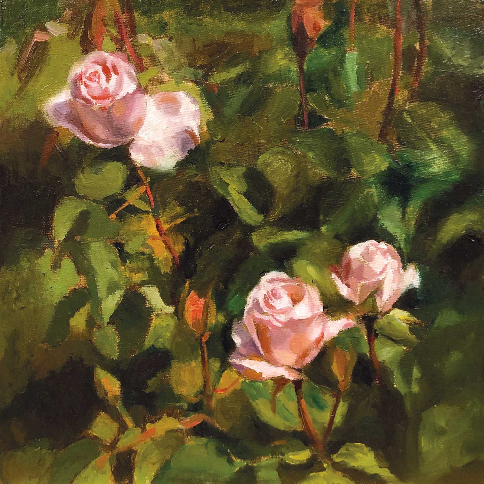 Three Light Pink Roses, oil on linen panel, 8 x 8" (20 x 20 cm)
Hilary Gomes, California, USA
My Inspiration
My inspiration to paint Three Light Pink Roses came from visits to Filoli Gardens in Woodside, California. This past spring, the beauty of the blooming roses inspired me to paint the early morning Bay Area light, color temperature, form, space and subtle shifts of tonality. My painting aims to convey the ephemeral poetic beauty and experience of contemplation while observing outdoor floral subject matter.
My Design Strategy
I used the triangle or pyramid design strategy found in nature and throughout art history to paint Three Light Pink Roses. The dark green background in the negative space creates a value contrast to the light triangle arrangement of the light rose buds. I focused on color harmony, temperature and value. The light pink cool and warm tints of the roses complement the dark warm, cool, muted and earth green shades of the background.
My Working Process
It took two sittings to complete this water-mixable oil painting working indirectly from a photo source. I started by painting a raw umber imprimatura on an oil linen panel. Then I drew the major shadow shapes and painted the underpainting. I premixed the subtle cool and warm light pink tints of the roses, earth and dark green leaf shades. Finally, I painted the roses followed by the background.
Contact Details
Email: email@hilarygomesfineart.com
Website: www.hilarygomesfineart.com
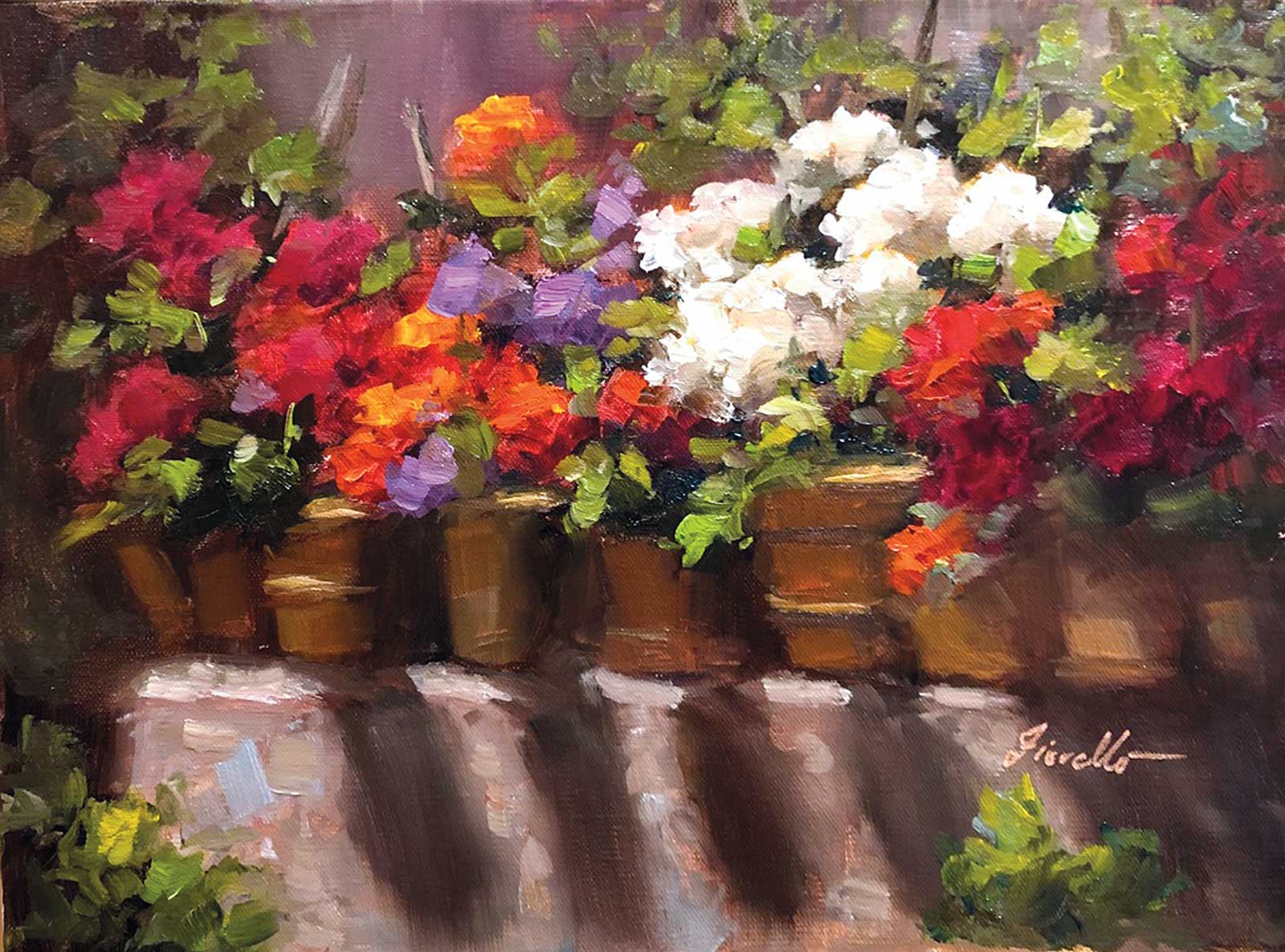 Wall of Flowers, oil on panel, 9 x 12" (22 x 30 cm)
Pat Fiorello, Atlanta, USA
My Inspiration
Wall of Flowers was inspired by the light in a charming little garden in Pienza, Italy. I live in the US but have been teaching art workshops internationally since 2006. During one of my painting trips to Tuscany, I discovered this small alleyway, filled with plants and trees. The drama of the light on the flowers and feeling of lushness captured my heart. Whenever I go back to Pienza, it’s the first place I go.
My Design Strategy
I couldn’t paint this on location, so I used a photo as my jumping off point. Among other edits, I flipped the direction of the flowers and sunlight from the original image. Thinking of this as more of an outdoor still life than a landscape, I wanted the painting to read from left to right, with the white flowers being the crescendo of light and the red flowers in shade keeping the viewer in the painting.
My Working Process
Painting alla prima, on an untoned canvas, I did an underpainting wash of colors using only transparent oil paints, approximating where I wanted the various elements to be. Next, I painted the shadow side, then the light shape for each of the flower groupings, mindful of using thicker paint and more descriptive brushwork for the flowers in the sunlit areas. I finished up the wall and background in neutral colors to contrast the brilliance of the flowers.
Contact Details
Email: patfiorello@aol.com
Website: www.patfiorello.com
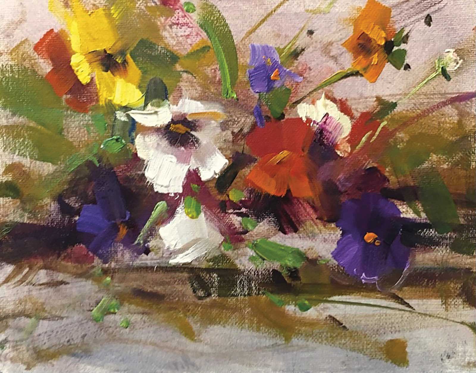 Mix Pansies, oil, 8 x 10" (20 x 25 cm)
Mostafa Keyhani, Ontario, CA
My Inspiration
Flowers are my inspiration because they bring peace and happiness in our home with lovely colors. I can paint them easily from life inside my studio or even outside in the garden. Painting flowers also allows me to learn more about different issues such as light, color, texture, values and different shapes (soft, hard and lost edges).
My Design Strategy
My design strategy focuses on some very important elements such as lines, composition, color, light and texture. I prefer to paint flowers alla prima because this technique allows me to play with colors and create thick brushstrokes. My work is in the field of modern impressionism and is also about capturing the essence of certain light. I am known for my use of thick sculptural paint and spontaneous brushwork.
My Working Process
I start by toning my canvas to create a base of warm colors. I try to finish all of my paintings alla prima because when they are still wet I can play with colors to create more thick and strong brushwork. I try to select the best composition for my painting, then begin blocking light and shadows, placing lightest lights and darkest darks to gain a sense of value. From there I am able to cover the entire canvas with a layer of color worked into the darks, midtones and highlights. Later I try to add more thick paint in the lightest light areas.
Contact Details
Email: keyhaniart@gmail.com
Website: www.keyhaniart.com
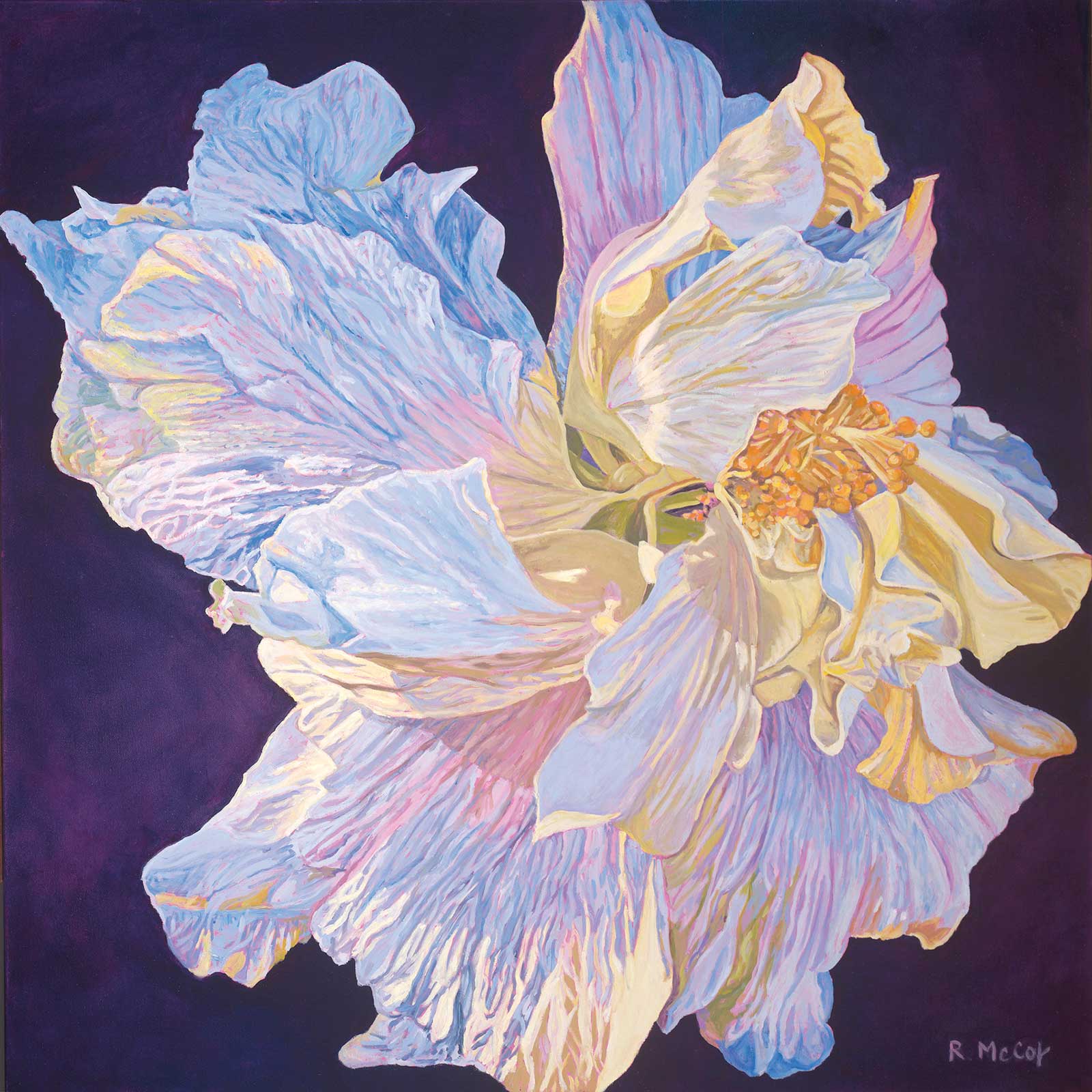 Let Your Light Shine Again, oil, 36 x 36" (91 x 91 cm)
Robin McCoy, Hawaii, USA
My Inspiration
I’ve noticed that the light is different here. On the island of Kaua’i the moist tropical air makes the flowers glow, especially white ones like this double hibiscus. I find constant inspiration through gardening. During the 2020 lockdown, I would walk in my garden to see what to paint next. It was wonderful to have so much time to create. This flower stood out to remind me that the light will always shine again.
My Design Strategy
My goal is to draw the viewer in, always wondering what may be under that next petal or leaf. Lately I been painting my flowers afloat in dark backgrounds over pink acrylic underpaint so the viewer connects directly with the flower. I direct the gaze with layers of paint and lines towards the center of the flower. I use contrasting colors of purple and yellow to add drama and blue hues for softness.
My Working Process
For this piece I used a 36-inch square linen canvas. I printed out an image from one of my garden walks, transferring it onto the canvas—which I had prepared with a base coat of pink—using the grid technique. After pencil drawing the flower, I paint the lightest areas first, then build up with thin layers. This piece has eight layers. At the very end I touch up areas that can be pushed lighter and darker.
Contact Details
Email: robin@robinmccoyfinearts.com
Website: www.robinmccoyfinearts.com
 Jeannette, colored pencil, 11½ x 11½" (29 x 29 cm)
Megan J. Seiter, California, USA
My Inspiration
I’m endlessly inspired by the colors, textures and shapes of flowers. Every flower I draw presents a new challenge and forces me to find a way to describe its specific beauty through colored pencil. My inspiration for this particular drawing came from a single parrot tulip, which I found to be incredibly vibrant and charismatic.
My Design Strategy
My design process started simply, with the flower. Tulips are so expressive that they rarely need any coaxing to create a dynamic composition. Their flexible stems bend to find the sunlight, and this flower stem in particular had a wonderful curve. I added some pittosporum leaves to fill out the arrangement, and I photographed the flowers in the last few moments of sunset so that the soft orange light would pick up the colors in the tulip petals.
My Working Process
I love working with colored pencils on sanded pastel paper. The texture of the paper is similar to a fine grit sandpaper, and it can hold several layers of colored pencil before it becomes oversaturated with wax. I used wax-based colored pencils to build the vase and flower, starting with the deepest darks to establish a full range of values. For the table, I turned to oil-based pencils, which are wonderful to use for large surface areas and blend well with a tortillion.
Contact Details
Email: ms@meganseiter.com
Website: www.meganseiter.com
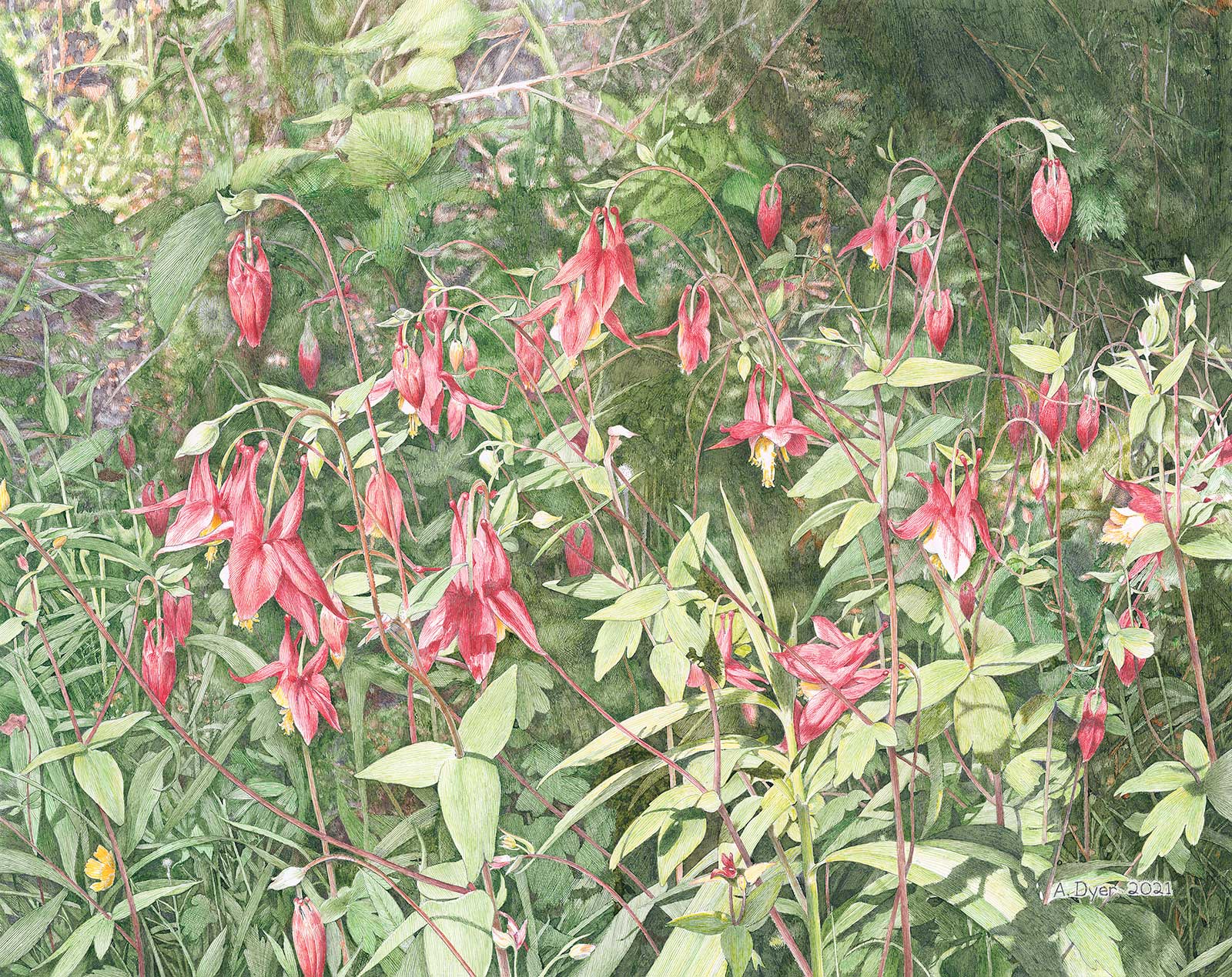 Wild Columbine, pen and ink, 16 x 20" (40 x 50 cm)
Ann Dyer, Michigan, USA
My Inspiration
During the spring and summer months in Michigan’s Upper Peninsula I always enjoy looking for the current wildflowers that are in bloom. I like the delicate, unique shape of the wild columbine and felt the shady, woodland setting made a nice background to help emphasize the shape of the flowers. My hope is that people feel as I do—that this drawing is a welcome reminder of the beauty and relaxation nature brings us.
My Design Strategy
Once I found the setting I liked, the next step was to decide how close to arrange the flowers. This layout was settled upon because the shape of the flowers is easily seen, and it is just far enough away that a nice assortment of columbine can be seen. I wanted to use the negative space to help define the plant shapes and the darker background would help give the drawing some depth.
My Working Process
Hot-press illustration board was used for this drawing. I use a traditional crow quill dip pen with a metal nib. After a fairly detailed pencil drawing is completed, I like to fill in some of the darkest areas first. This helps determine how other colors are applied. The technique used is mostly linework and crosshatch with some stippling. Most inks are mixed and/or slightly diluted when applied.
Contact Details
Email: dyeram1@att.net
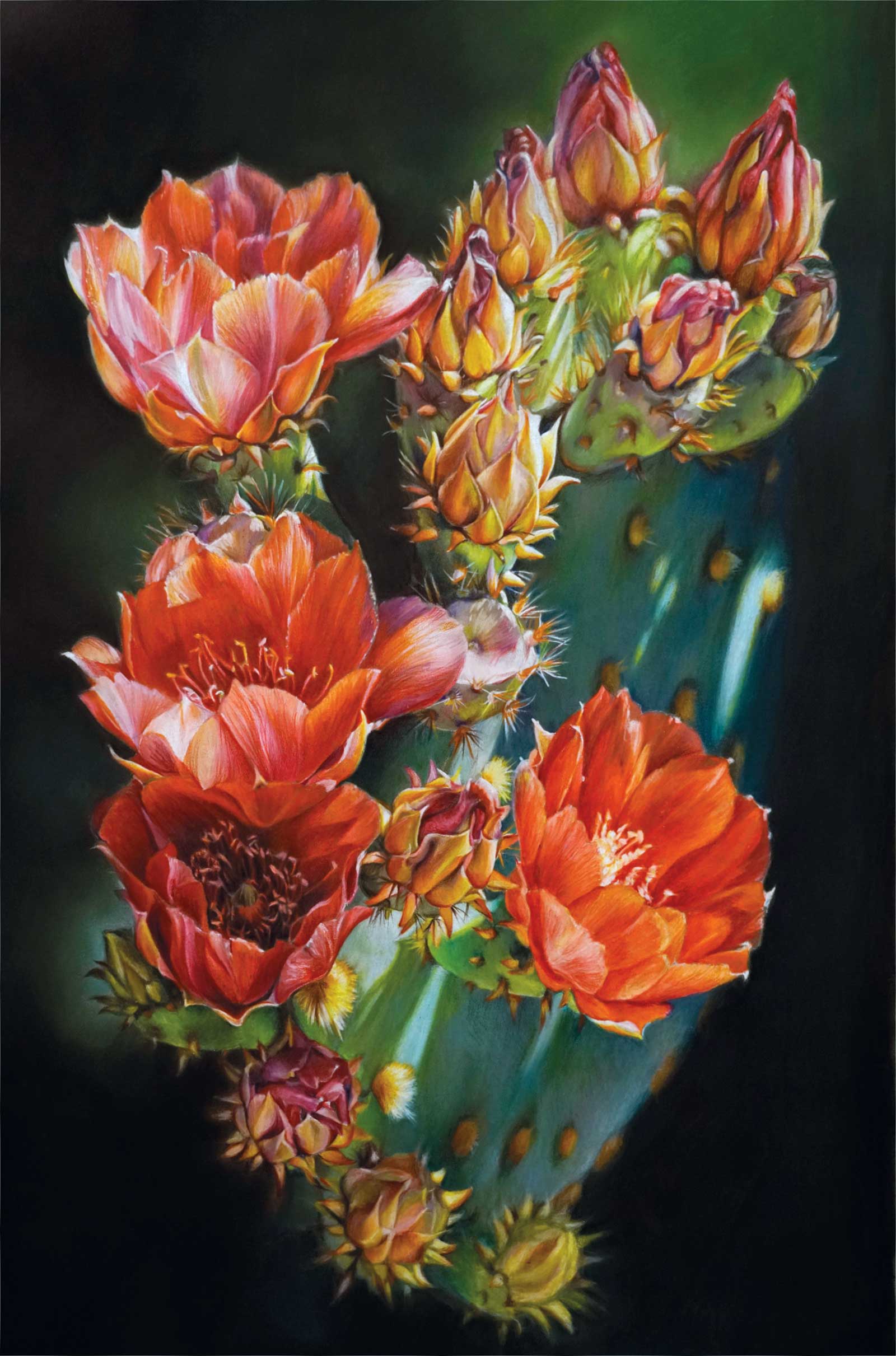 Prickly Paradise, colored pencil, 26 x 18" (66 x 45 cm)
Barbara Dahlstedt, Arizona, USA
My Inspiration
Prickly Paradise was inspired by a drive around the beautiful community of Anthem, Arizona, with my husband. Although many people regard the desert as a barren environment, we have grown to appreciate the everchanging flora with each season. When I saw the morning sun illuminating this rare red prickly pear cactus on our drive, I shouted, “Stop the car!” I hopped out, camera in hand and took advantage of the photo opportunity.
My Design Strategy
My composition developed by eliminating nonessential elements. I cropped my reference photo down to the most interesting portion and blurred the background to create a sense of mystery. By limiting my palette to variations of red and green, I emphasized the blooms. Repeating shapes of dots, buds, and blooms played an important role in leading the viewer’s eye throughout the composition. The diagonal thrust of the light gave movement to the overall design.
My Working Process
I developed an underpainting using lightfast colored pencils to establish the form of the subject and allowed the olive-green pastel paper to be the mid-tone value. Additional colors were applied on top of the underpainting. I used a solvent to blend the colored pencil. NuPastel was used on the background to create an ethereal effect.
Contact Details
Email: barbara@dahlstedtart.com
Website: www.dahlstedtart.com —