



With landscape-based paintings, no matter what the main subject is, the problem of what to do with that empty bit at the top often seems to crop up. It should be considered in the planning stage of a painting, not as an annoying space to be dealt with toward the end. The sky can have a big impact on, not just the balance of a painting, but the general atmosphere of the work you create. In this article we will explore different approaches to painting skies and their effect on the balance and atmosphere of the final result.
Next time you are painting a sky, consider the various options available. Often the best solution is not what appears in front of you, but something that relates better to the painting or the idea you are pursuing. —
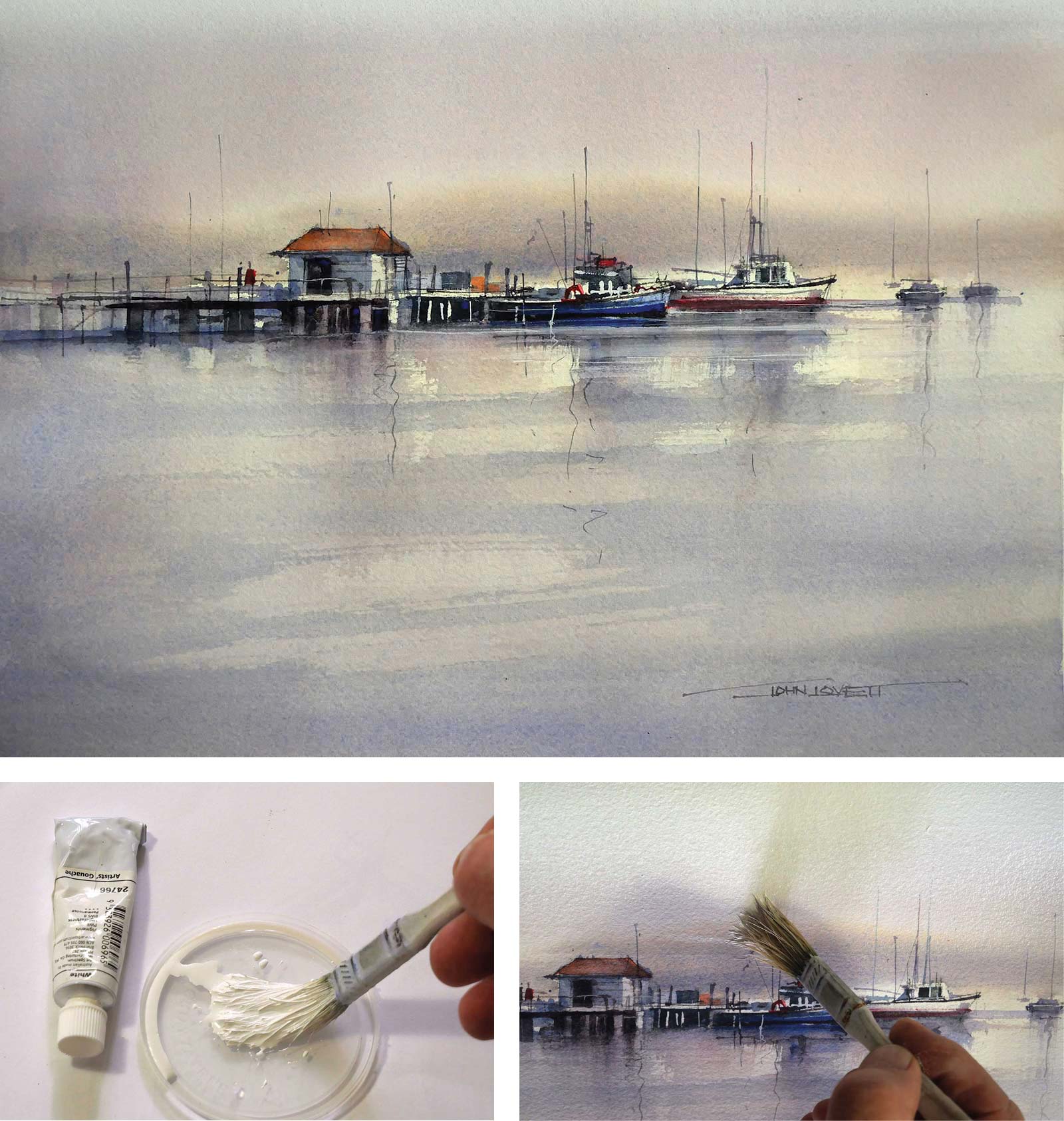 The soft translucent haze in the sky of this painting was made by layering washes of cobalt blue, permanent rose and aureolin, then adding a final graded wash of white Gouache. Each colored wash was allowed to dry before the next color was applied. The colored washes were made darker at the top, lighter toward the horizon, then darkening down through the water. Once the three colored washes were thoroughly dry the region around the distant hills was dampened to give a soft edge to the application of the hills. As the glazes were applied, white paper was preserved around some of the boats and buildings for the highlights. After all the detail was painted in and everything had dried, a gray wash was painted vertically down each side of the painting to concentrate attention in the focal area. The final step was to mix a watery solution of white gouache and wash it down across the sky to the top of the mountains. The bottom edge of this gouache wash was feathered out with a clean damp brush to make it invisible. As the gouache wash dried out, the result was a beautiful pearly gray.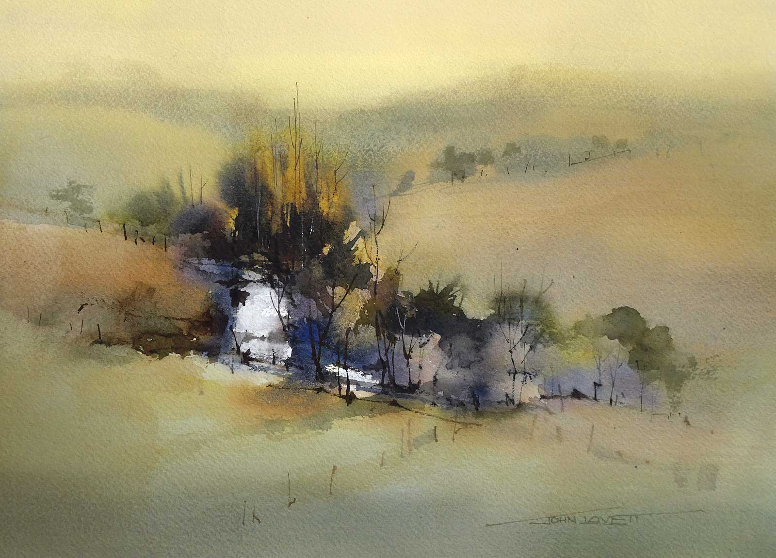
There is often a tendency to paint the sky just as it appears. This sometimes works but, more often than not, treating the sky as part of the overall plan of the painting will produce a better result. I ignored the blue/gray, cloudy sky in this landscape and replaced it with a color more harmonious with the rest of the painting. This gave the river and trees more impact and reinforced the hot, dry atmosphere of the rolling hills.
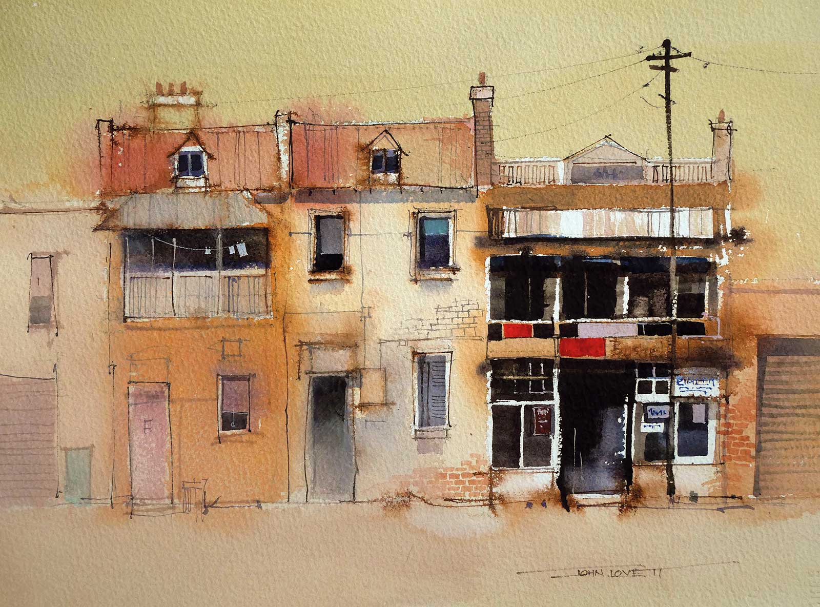
The sky in this painting was also painted in tight harmony with the rest of the painting. This dominant warm color causes more attention to go to the cool darks of the focal area.
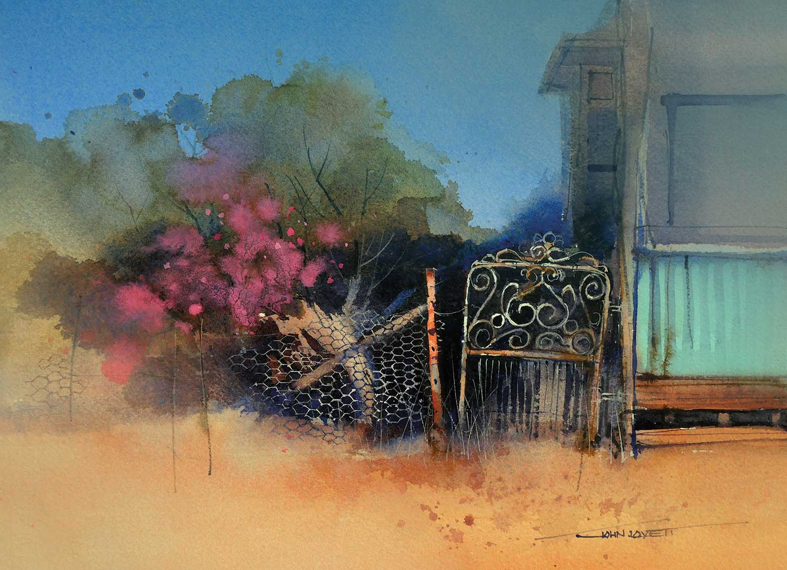 Sometimes the clarity and impact of a clear, blue sky just can’t be ignored. Contrasting the warmth and detail of the foreground with a simple flat sky really gives impact to the foreground. This sky was first washed in with a flat wash of cobalt blue. When the painting was almost finished the sky was dampened with a wet brush down over the edge of the trees and bushes. Into this area of dampness a mixture of white gouache and ultramarine gouache was worked through the sky and allowed to feather out towards the trees and building.
 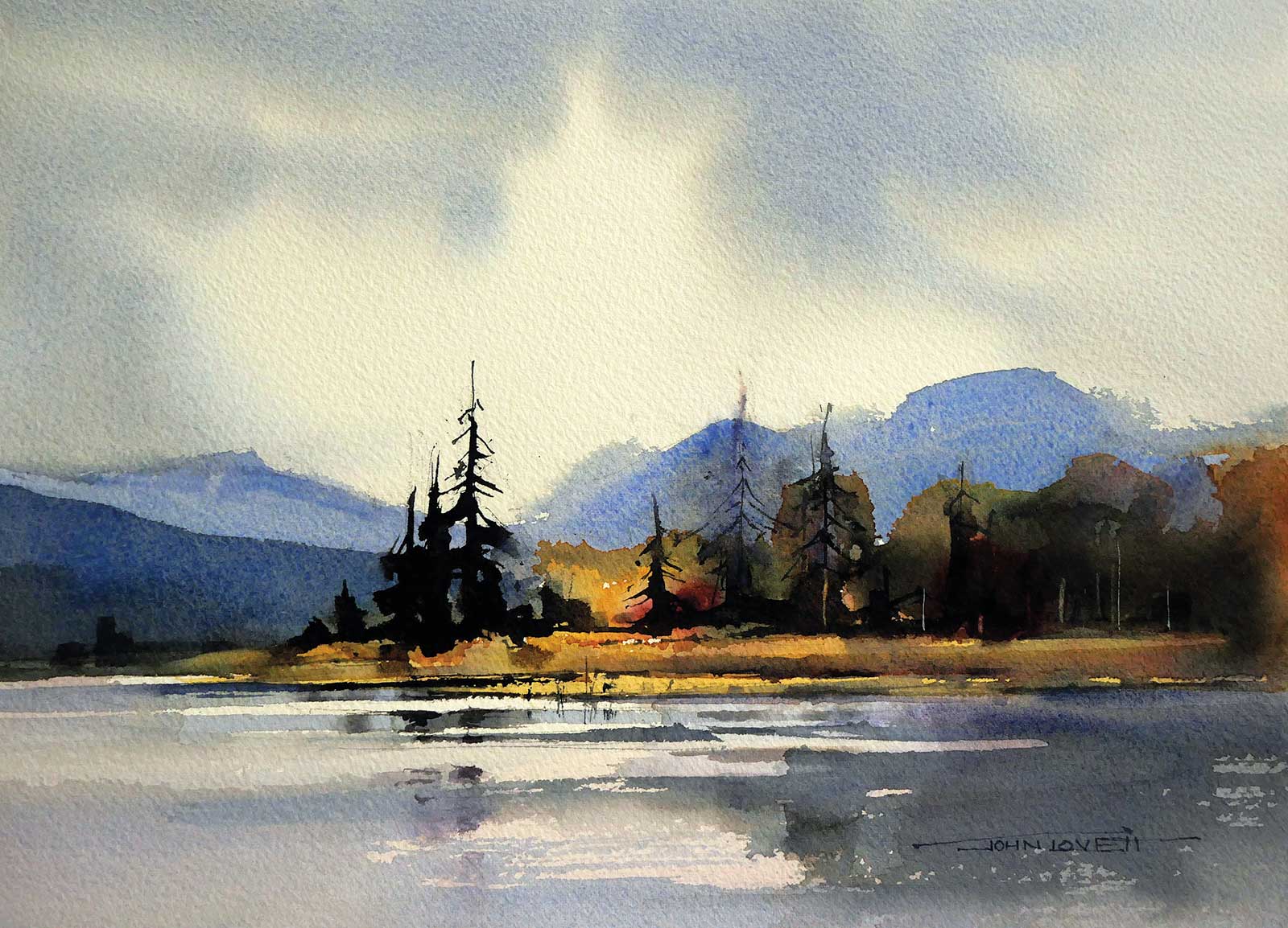 A pale warm under-wash of quinacridone gold and permanent rose was put down before the sky and details were applied to the painting. The under wash was allowed to dry thoroughly then the area of the sky and water was given a coat of clean water. Painting the sky was as simple as mixing some ultramarine, alizarin and a small amount of quinacridone gold to achieve a cool gray. This was then dropped onto the wet paper, leaving a patch of light around the focal area. A dry hake brush was used to smooth and manipulate the gray slightly, then it was left to dry.
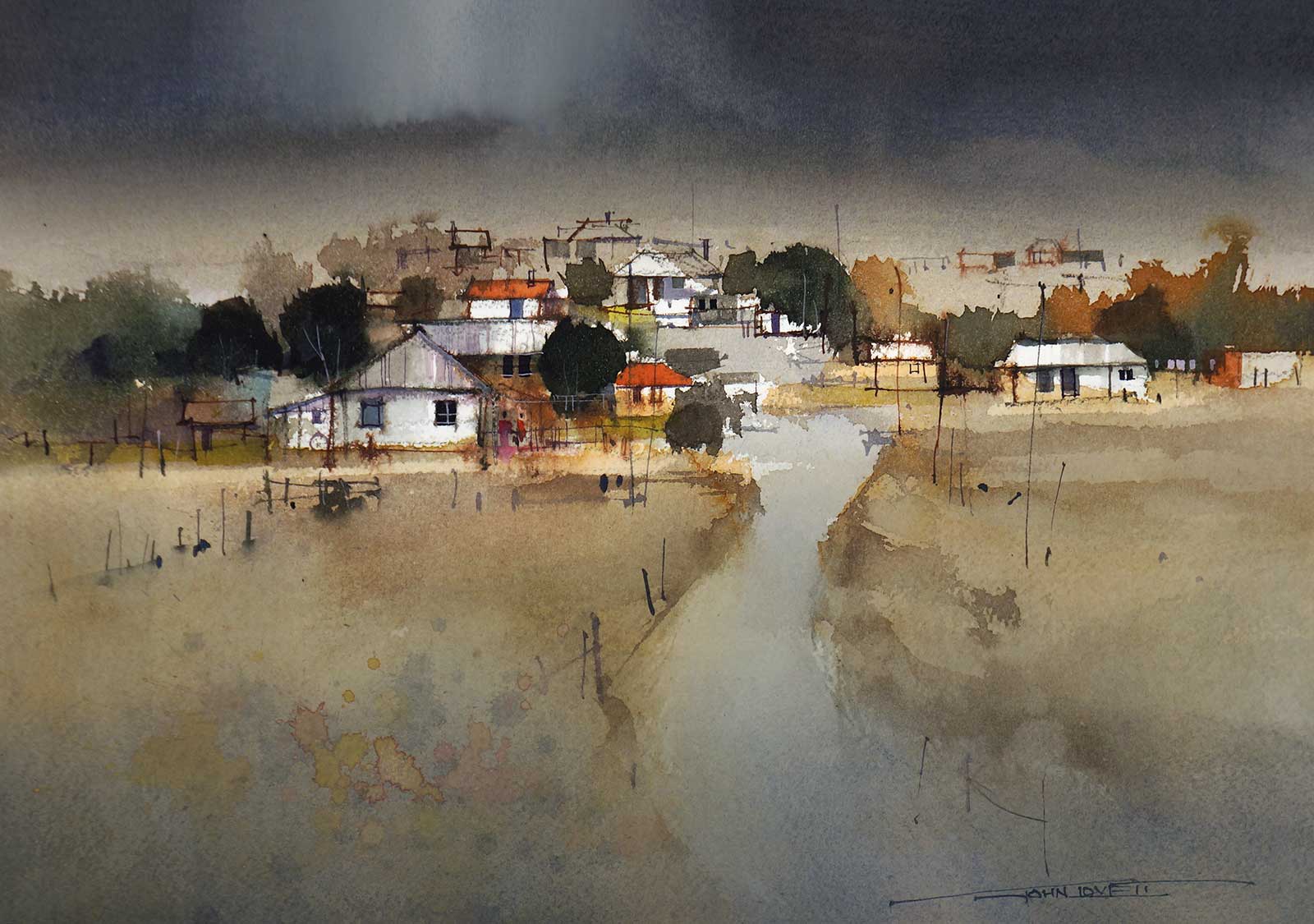
This dramatic sky was added toward the end of the painting with a wash of Indigo, softened along the bottom edge with a damp brush. While the Indigo was still wet some white gouache was worked in above the focal area and dragged vertically with a dry hake brush. After each upward stroke of the hake brush it was rubbed on a towel to remove any trace of gouache before the next stroke was made. To tie the sky and foreground, a wash of Indigo was graded up from the bottom of the painting. A splash of brown, tinted with white gouache, was used to add some interest over the indigo wash.
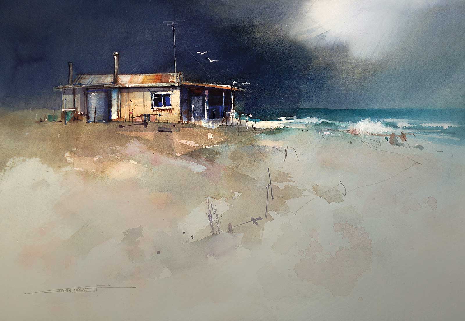
For this sky, I mixed ultramarine with a little alizarin and quinacridone gold. It was applied heavy and dark then lifted out toward the right-hand side with a dry hake brush. While the sky was still wet white gouache was dropped into the top right and carefully feathered with a dry hake brush, again, drying the brush between strokes to avoid gouache being dragged into the dark area. Small details added with ultramarine gouache put life into the dark shadows of the building.
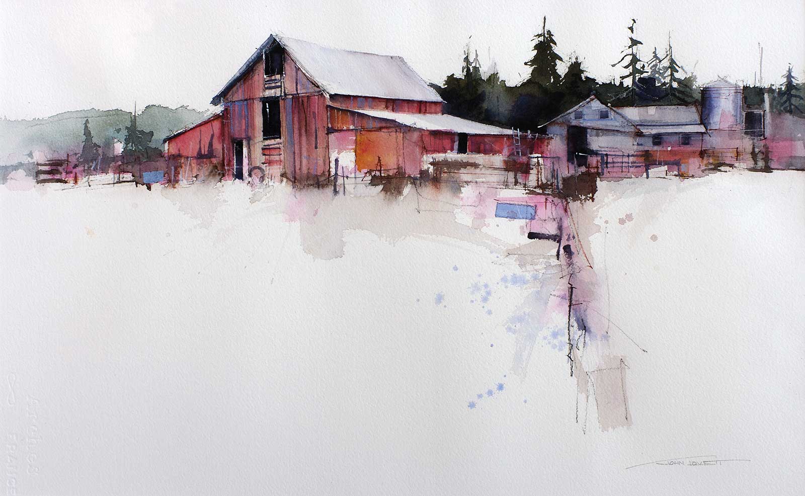
Skies don’t have to be dramatic—sometimes the opposite approach works better. In this painting, the sky and much of the foreground were simply left as white paper. The oscillating warms and cools of the subject and the contrasting darks have more power simply surrounded by white paper.