



In my early days of painting landscapes, there were countless questions in my mind: “Should I capture the exact colors of the scene?”, “Should I use black for the colors of the dark areas?”, “How to describe the atmosphere of a sunny day, a rainy day?” These questions often controlled my state of mind, making my paintings lack a variety of colors and making it difficult to express the atmosphere of the scenery. To take care of these issues, I’ve spent quite a while studying the landscape paintings of the masters and realized the method for making my artworks more realistic but also more romantic.
Focus on the atmosphere you want to capture, not the reality
The reality should be the reference, the inspiration, and the “material” to “build up” your work of art. The artist’s main goal is attempting to add personal ideas and mood to transform the realistic landscape into a painting of your own, yet portray the atmosphere of the scenery itself. Also, the perfect colors are not necessarily the same as the reality, but rather require going through your own “filter” to make your painting more alluring and romantic.
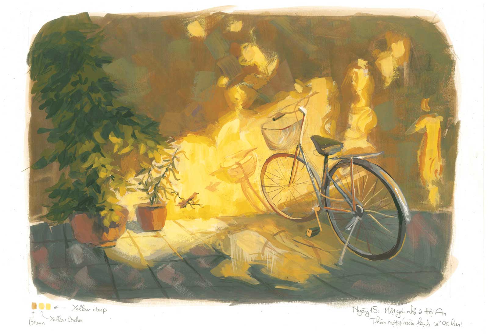 Dancing sunbeam, gouache on paper, 12 x 16" (30 x 40 cm). “Hoian” ancient town, has a variety of attractive features. From the magnificent river creeping along with the town to the picturesque, antiquated residences with a dusty trace of time, all of which bring a fascinating atmosphere for visitors to get lost in another era. This painting is a little corner I came across when I was there, the atmosphere was surprisingly pleasing as glimmering light dropped gently into golden splashes on the modest wall.
The perfect color gamut makes the perfect painting
A gamut is a geometric-shaped area of colors on the color wheel, built up with some “primary colors” as the corner colors of the shape. Choosing an appropriate color gamut is one of the most important preparations to create a lovely work of art. So what is an “appropriate” color palette? There is no such thing as an ideal recipe for you to apply, the key is the atmosphere you want to describe by balancing the relationship of warm and cool color. If it’s a sunny morning, choose a warm color gamut with “warm yellow” as the “key color” plus a small amount of bluish color for the cool shadow. If it is an overcast day, try to limit your gamut to the center of the color wheel, which gives you a variety of neutral colors to express the feeling of an overcast day. Additionally, with the same atmosphere of the landscape, you can use three primary colors for the color gamut, such as red, yellow and blue or magenta, yellow-green and Prussian blue. Regardless of which you pick, each set of colors will give an extraordinary effect. Hence, you should continue to explore in picking the right colors for your “perfect gamut.”
Choose a dynamic color and make it the “principal vocal” of your “painting show”
A film needs a fundamental character, a show needs a principal vocal, and a painting also needs its main color—dynamic color with the highest saturation for the gamut. However, the scenery doesn’t generally have a “highest saturation color,” or it’s two to three at the same time. This is the moment where you can be more creative, add your personal ideas and mood to the painting, pick a color in the scenery that you want to highlight, and make it the “principal vocal” of your “painting show.” Keep in mind, painting in a realistic style doesn’t mean capturing exact reality, and every so often you’ll require a little bit of “distortion” in addition to certain “tricks” to make your work of art more appealing.
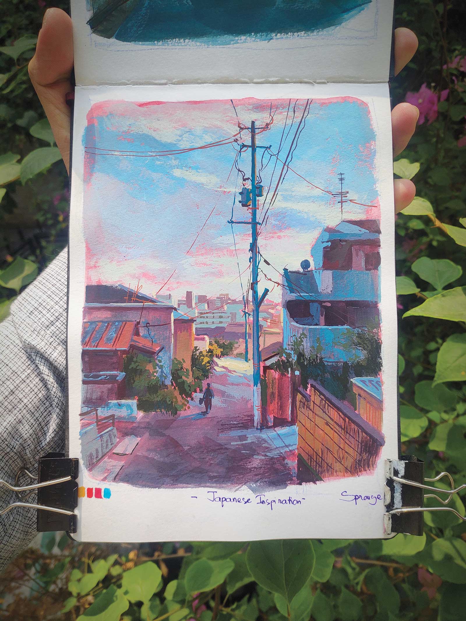 Japanese inspiration, acrylic gouache on watercolor sketchbook, 6½ x 5" (17 x 13 cm). Japan has lots of lovely scenery and townscapes, which inspires many artworks. With this painting, I wanted to capture the immense space of a town with the pole as the connection of the whole scene. A red underpainting is a perfect choice to create the attractive atmosphere of the twilight. Focus on what you want to express through your brushstrokes rather than what you see
In my perspective of making art, a lovely painting is not one with meticulous brushstrokes, but one that can express the artist’s idea and feature the primary subject. More specifically, the far and unimportant details should not be defined accurately, which actually helps emphasize the focal point of the painting. One quote I love particularly is: “Do not define but suggest the details.” Sometimes a flat brushstroke is sufficient to communicate the sensation of a sunbeam on the ground, or a bunch of round brushstrokes will make you feel like there is a hedge. Attempt to diversify the brushstrokes to create various effects and convey unique characteristics in your painting.
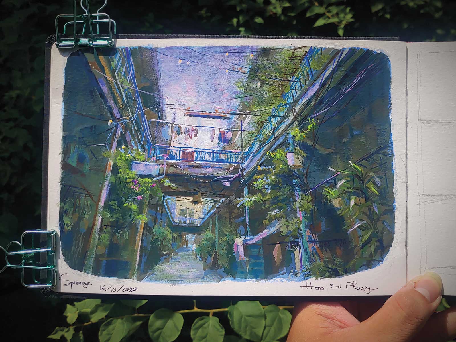 Glimmering alley, acrylic gouache on paper, 6 x 8" (15 x 20 cm)Hao Si Phuong Alley in Ho Chi Minh City, Vietnam, is lined with colorful ancient Chinese people’s houses, reflecting the time and cultural features. If you are standing on the ground and look up to the sky, a glimmering light in the alley will catch your attention. This dreamy moment is my inspiration for making this artwork, with the indigo light of the sky against the greenish tone of the scene.
My design and composition tactics
Composition design: The reality should be the reference and the inspiration for your work of art. The artist should then add personal ideas and design the reality again to transform the scenery into a painting with emotion.
Complementary underpainting: Apply the underpainting with a contrast color of the scenery key tone. As it will not be concealed and appear in the eventual outcome, it creates an interesting contrast effect of complementary colors.
Colors applying sequence: Neutral colors for the beginning stage make it easier to control the value and harmony of the whole painting’s color tone. The color accent of the highest chroma should be painted at the latest steps.
Brushes tactic: Use the biggest brushes for the start and smallest for the finish. Moreover, the old brushes with split hair are a perfect choice for creating the grass’ texture. —
My Art in the Making Lotus lake
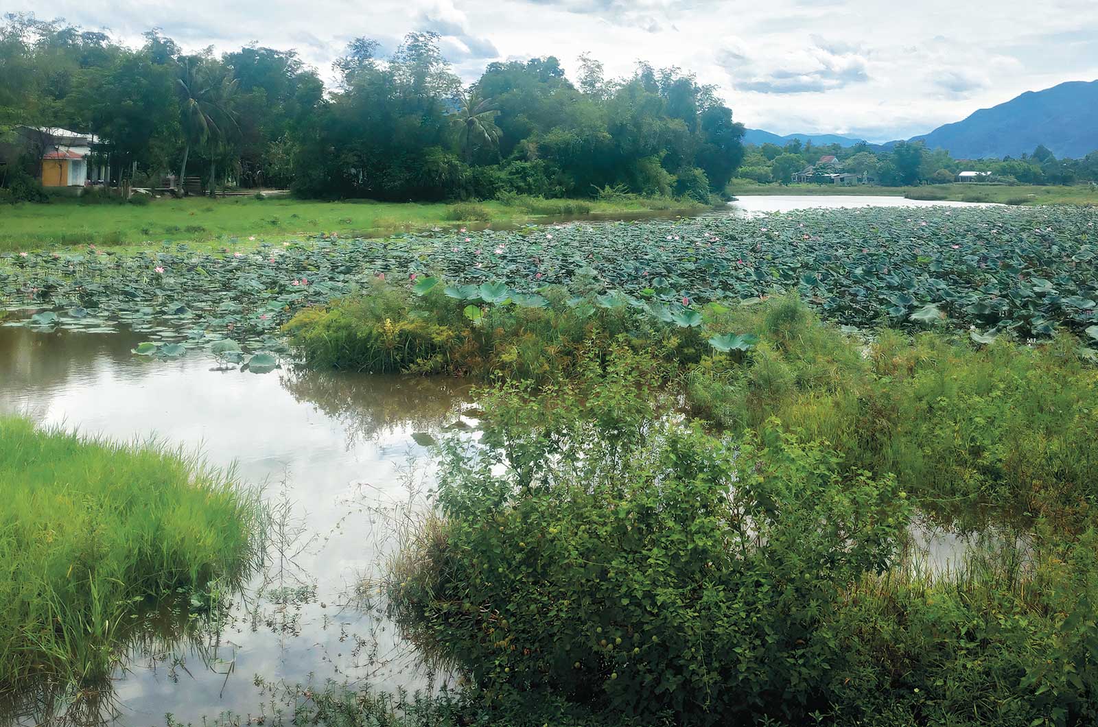 Photo Reference
 Stage 1
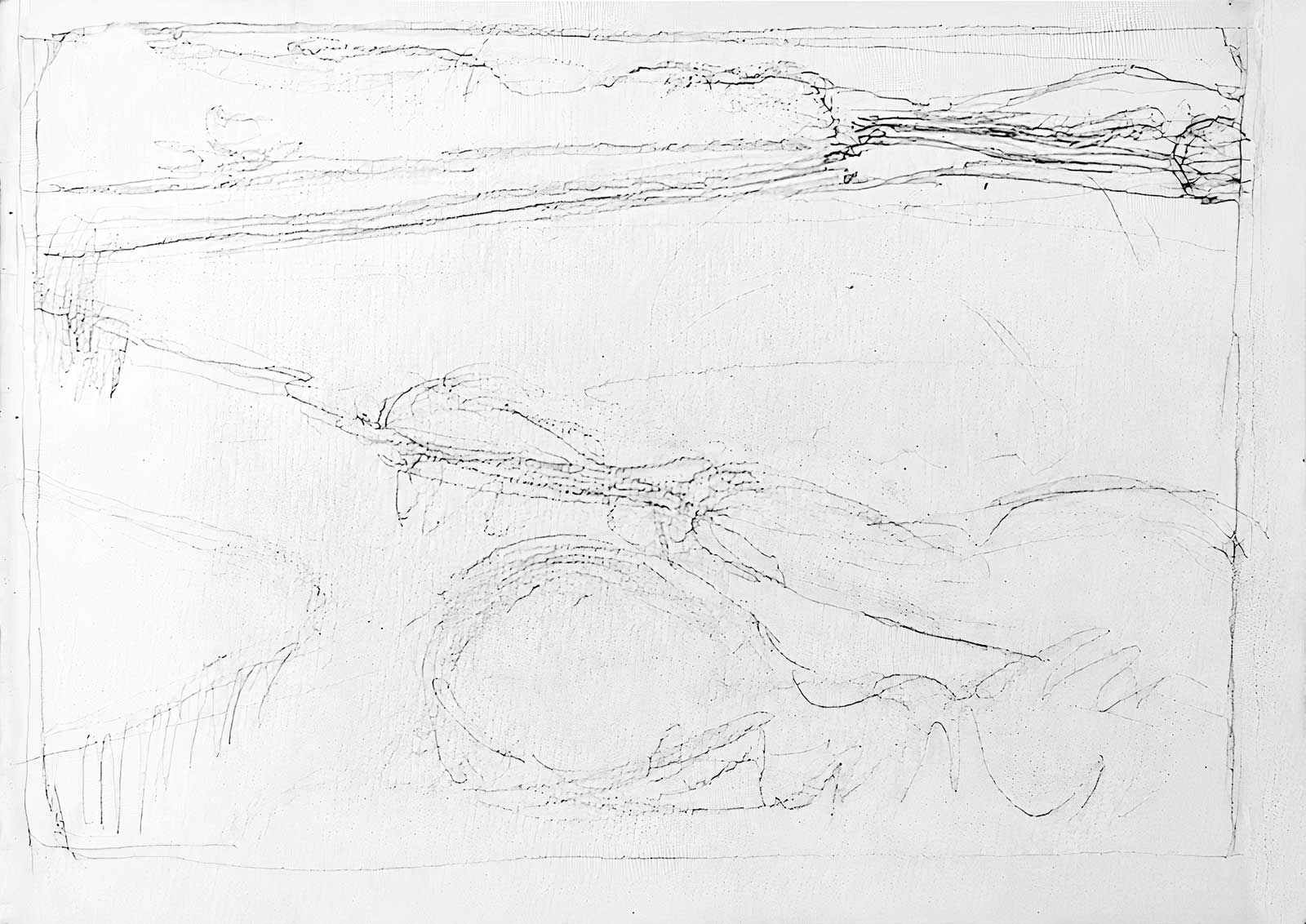
Stage 1 Building up the Composition
Draw the lines for building up the composition. This stage focuses on the big shape of the painting, not the fine details. Also, try not to follow the exact scenery yet, as the ideas for the composition of the lake should be the focal point.
WHAT THE ARTIST USED
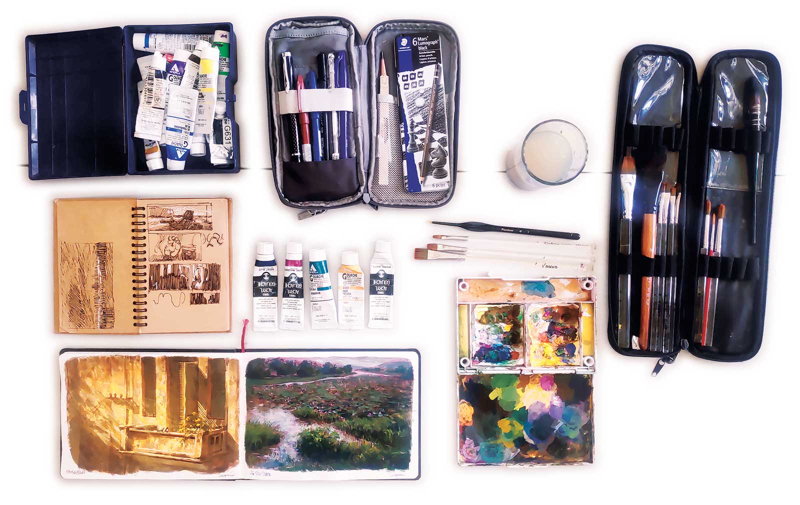
Acrylic Gouache
Night blue, Mixing magenta, Viridian, Deep yellow, Mixing white
Gouache
Zinc white
Watercolor
Bright rose
Brushes
Flat brush No. 4, 6, 8, 10, 15, Round brush No. 6, Liner round brush No. 3
Additional supplies
Watercolor sketchbook size A5, 3B pencil, Palette Water glass, Composition sketchbook, Gel pen, Paper clip, Drawing gum
 Stage 2
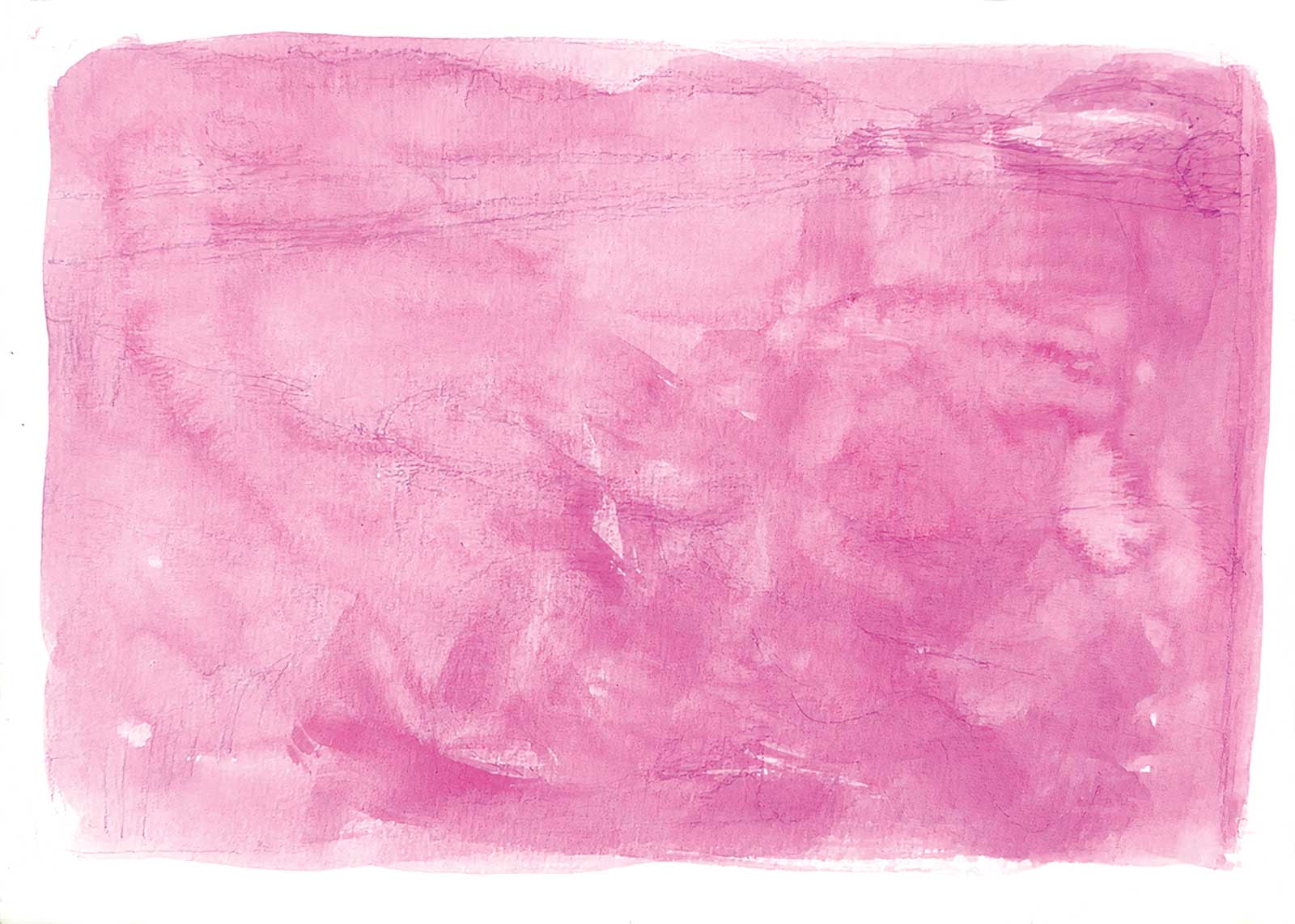
Stage 2 Apply the underlayer color
With an overcast day as the atmosphere and the key color being green, this complementary magenta color is a perfect choice as the underlayer. As it will not be concealed and appears in the finished piece, it creates an interesting contrast effect of green and magenta.
 Stage 3
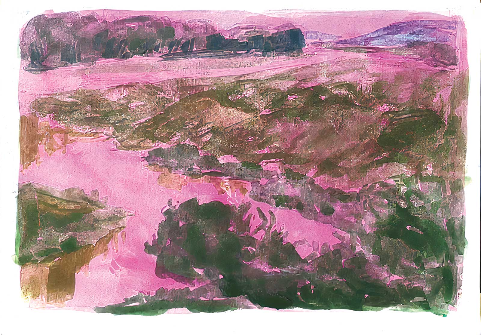
Stage 3 Big Dark Shapes
Paint the color of big dark shapes with the biggest flat brush. The chroma of color is not necessary at this stage, making it easier to check the relation of big, light and dark shapes in the composition.
 Stage 4
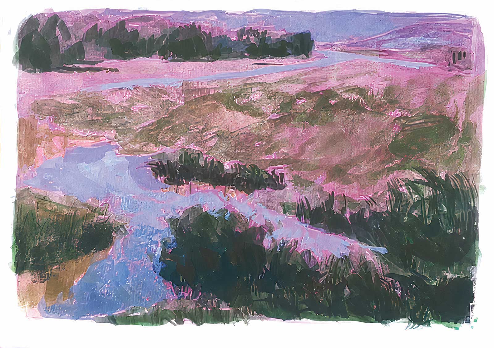
Stage 4 Checking the Grayscale
Paint the lightest and darkest area to see if the grayscale of the painting is correct.
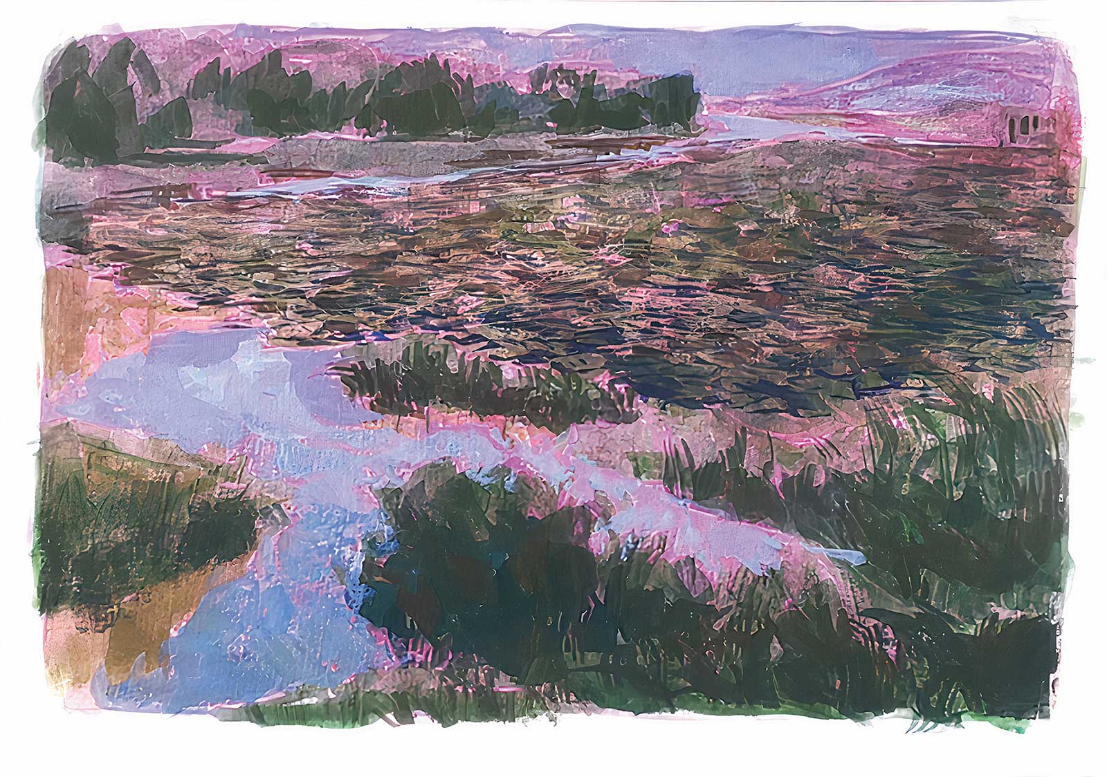 Stage 5
Stage 5 Fundamental Details
Going into the fundamental details of the lotus lake. The aim is to balance the value of the whole painting and preparation for “going into fine details” steps.
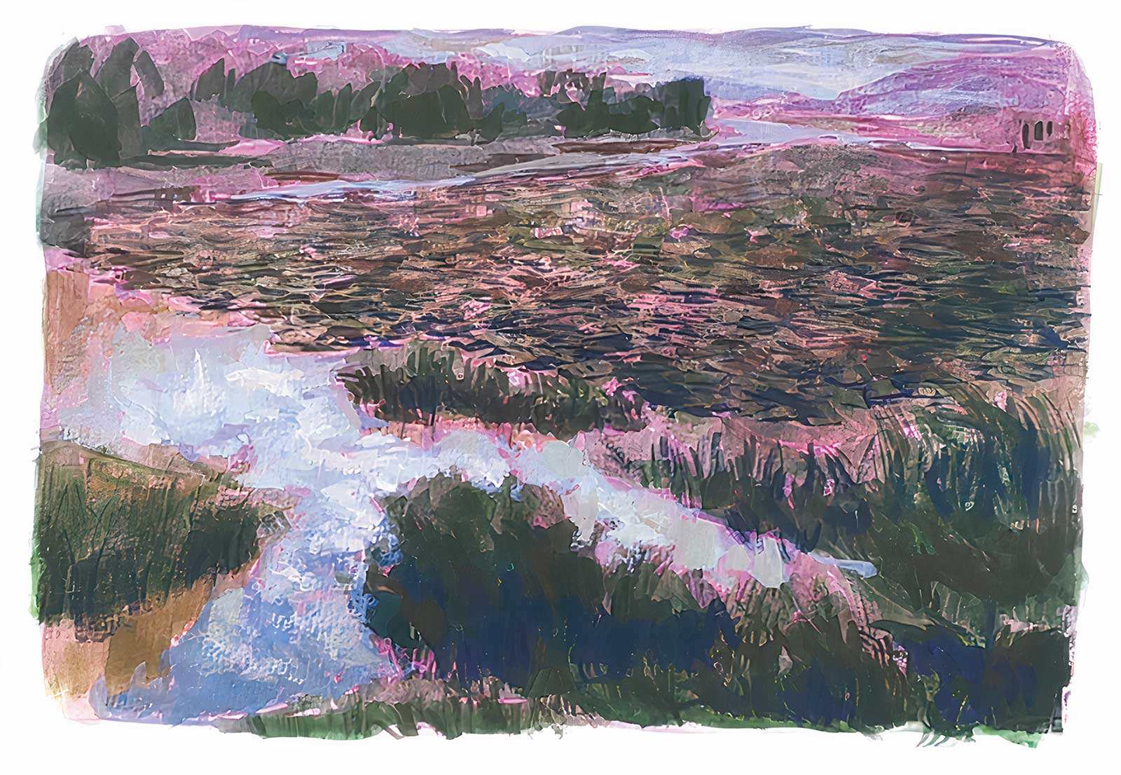 Stage 6
Stage 6 Foreground
Paint the foreground areas with round brushes and a gel pen. The color mixing should be considered with saturation, hue and value in mind, as this stage is one of the final steps.
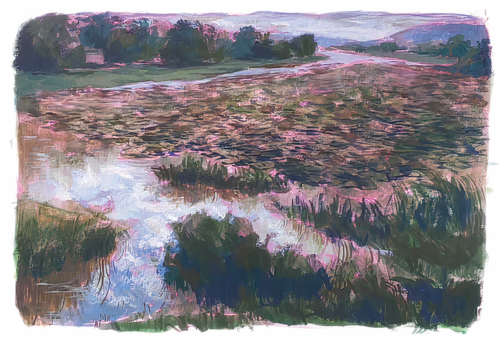 Stage 7
Stage 7 Background
Paint the background areas. The saturation and value of colors should not be as strong as the foreground’s, to create the depth of the painting.
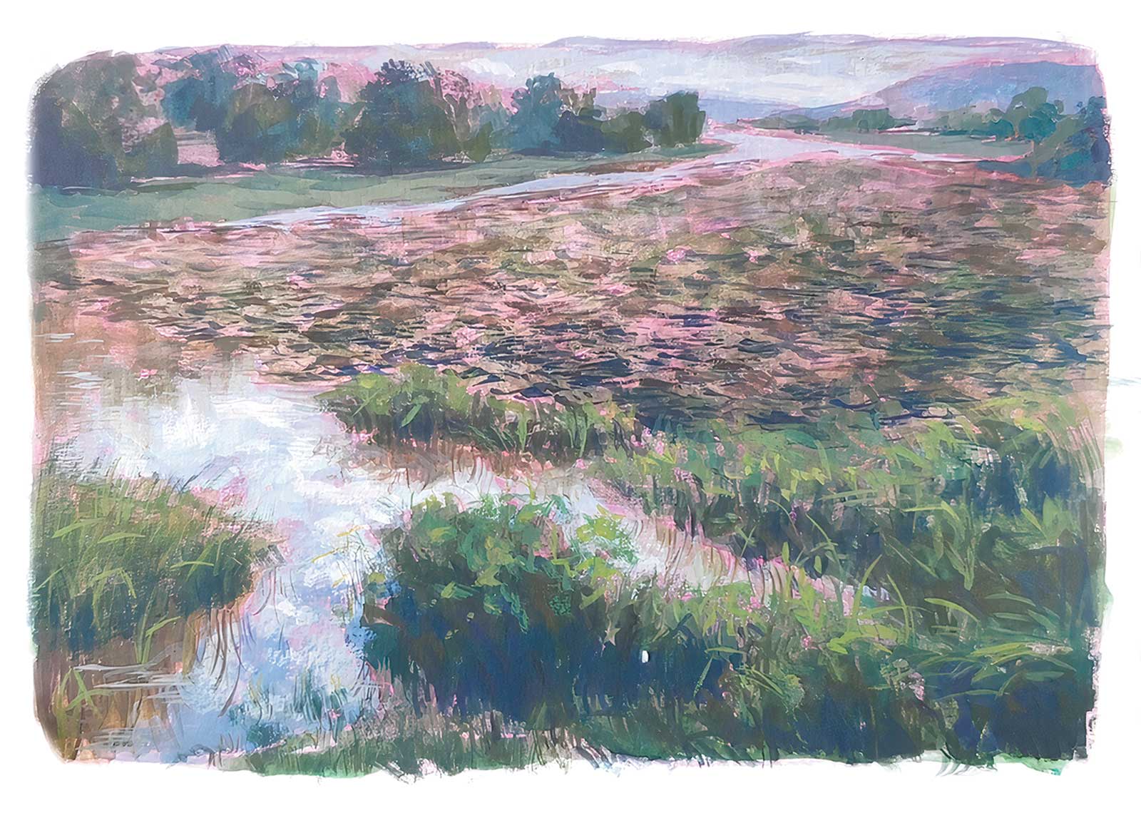 Stage 8
Stage 8 Additional Details
Complete the details of the closest bush with the small round brush and a variety of green colors.
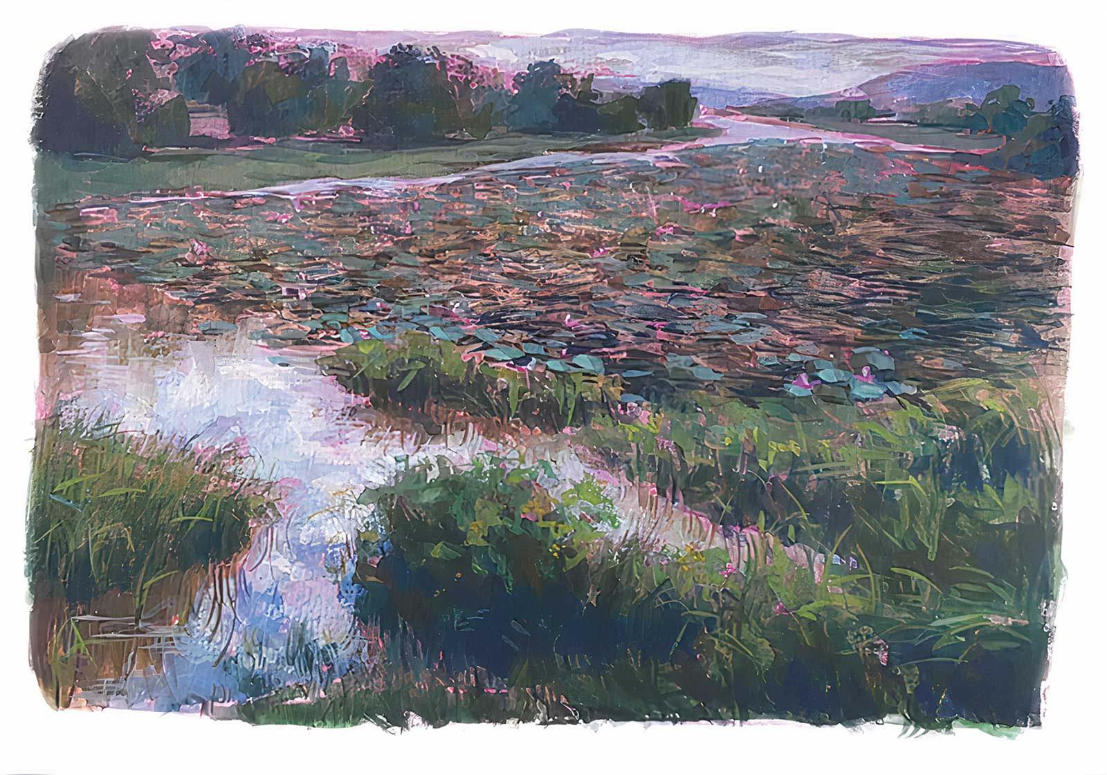 Stage 9
Stage 9 the lotus and its leaves
The atmosphere is an overcast day, covering the face-up leaves with a “cool green” color.
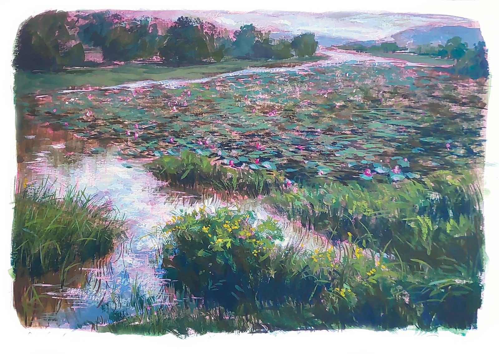 Stage 10
Stage 10 Finished Artwork
Lotus lake, acrylic gouache, 5 x 7" (13 x 18 cm)
Fixing unsatisfying details and finishing the painting. As the magenta is not strong enough for the lotus color, I mixed it with a little bright rose of holbein watercolor to achieve a bright pink color.
About the Artist
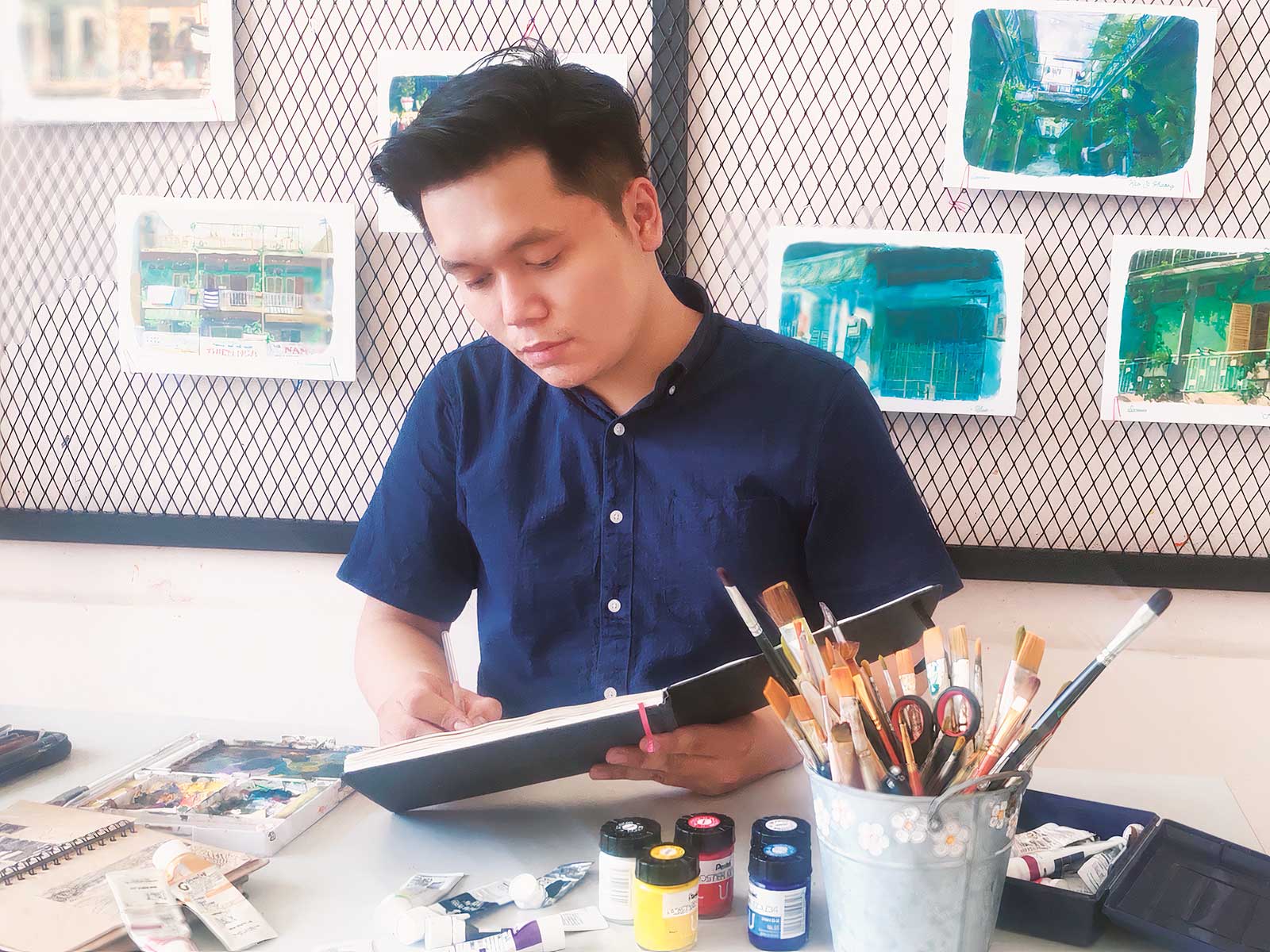 Alex Sprouse
Alex Sprouse is an artist based in Vietnam. From the first day of experiencing fine art, realistic painting has always been his passion and a way for the artist to capture specific scenery and moments in daily life. Fine art, for Sprouse, is not his only goal in life, but also inspires him to achieve his dreams. One of the first steps to achieving that dream was becoming the vice director at Zest Art Studio, an art teaching studio in Vietnam. In the near future, Sprouse’s plan is to develop more social networks, websites and personal exhibitions, helping him more easily connect to everyone and share more artworks as well as art knowledge.
Contact at
alexsprouse28@gmail.com