


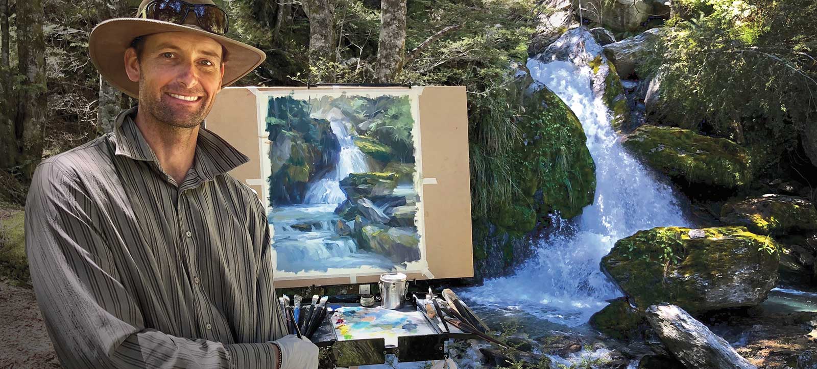
 Richard Robinson
About Your Tutor
Richard Robinson is one of New Zealand’s premier outdoor painters. You can view his extensive online lessons at www.mypaintingclub.com.
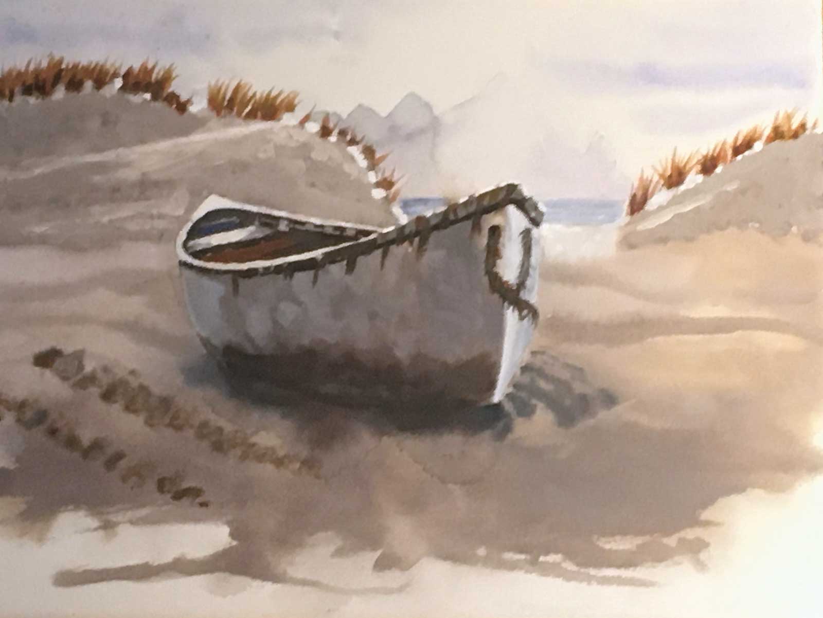
 Richard Robinson, After the Storm Demo, acrylic on canvas, 36 x 48" (91 x 121 cm)
Using acrylics like oils
Recently I’ve been painting more acrylics than oils, though for many years I focused on oils. Of course that makes me miss some of the effects I can achieve with oils, that are more difficult to achieve in acrylics. Ever found yourself in that position when painting with acrylics? It can be very frustrating. Acrylics dry so fast it makes it difficult, especially in a large painting, to achieve large blends and soft-edged paint effects.
Over time I’ve figured out a few tricks to make it much easier to paint in a wet-in-wet style in acrylics.
The key to it all is to keep the paint on your canvas wet, so here’s how to do that:
- Use lots of paint. If you have to keep stopping painting for remixing colors or putting more paint out on the palette, the paint on your canvas will dry. So lay out lots of paint on your palette and make you mixture piles bigger than you think you’ll need.
- Use a stay-wet palette. You can buy these in any art store although they’re easy to make yourself. Lay two sheets of paper towels over a baking tray, spray them with a spray bottle and then tape some baking paper over the top. Bingo! Also make a cover to stop the water evaporating when not in use.
- Plan your approach. It’s often easier to paint from the back to the front. That is, the sky, then the distant landscape, middle, foreground.
- Paint fast. Planning your approach helps you paint fast. When the paint is drying quickly you need to paint fast in order to achieve wet-in-wet effects, especially in a large painting. To that end, use larger brushes and load them with more paint.
- Keep it wet. Every five minutes mist your palette and your painting with a water spray bottle.
- Retarder medium. Use a retarder medium in your water sprayer and your cleaning jar and on your palette. If you use a lot on your palette the paint gets too thin though.
- Re-wettable acrylics. These re-workable paints really help with wet-in-wet effects. The two types I’ve used are Atelier Interactive acrylics and Golden Open acrylics. Golden Open is slightly more fluid than the Atelier paints. Both are good.
Keep those few things in mind next time you’re painting with acrylics and see the difference it makes. You should be able to achieve a very painterly wet-in-wet effect by implementing some or all of those tips. Enjoy!
Student Critiques
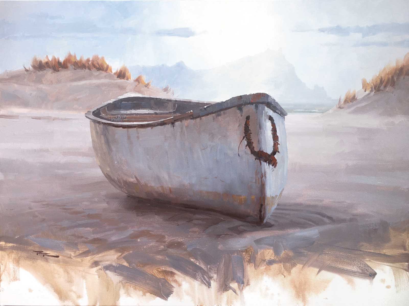
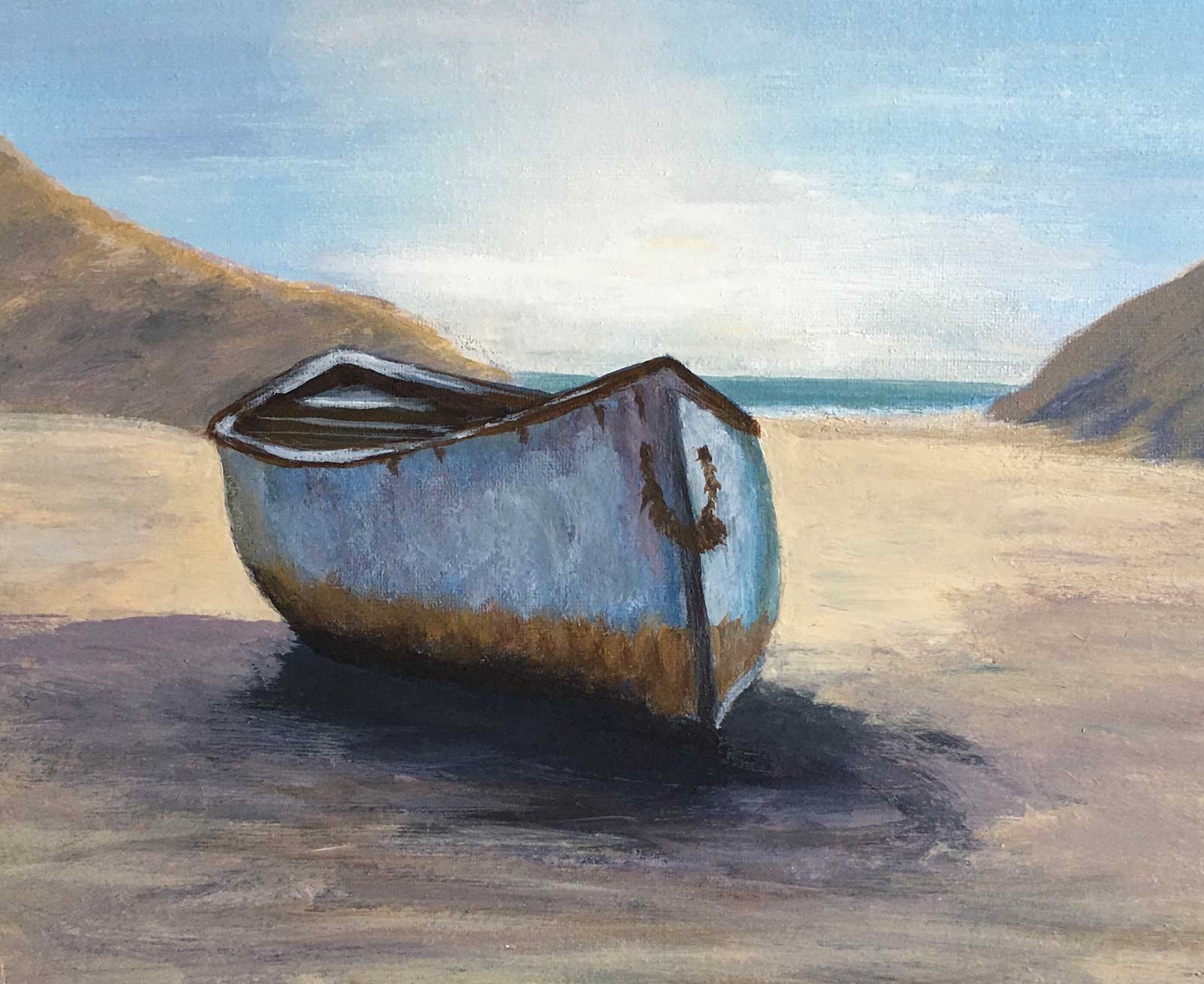
 After the storm, acrylic with oil glazing on canvas, 15½ x 19½" (40 x 50 cm)
Elena Sokolova
Hi Elena, an interesting effect you’ve achieved with the oil glazing over the acrylic. Nice to see you sneaking in a little mauve and blue—quite a shimmering color effect. Your drawing is very good in this one and there’s a lot of exciting gestural brushwork. Great to see! The only suggestion I have is to check the light blue/gray you have introduced to the shadow side of the boat because the value is a little too light and the color a little too blue. It’s just not sitting there quietly enough. You could try glazing a dark mixture over it but that will also affect the other colors there, making them too dark so I’d prefer to see it repainted. Overall very beautiful though!
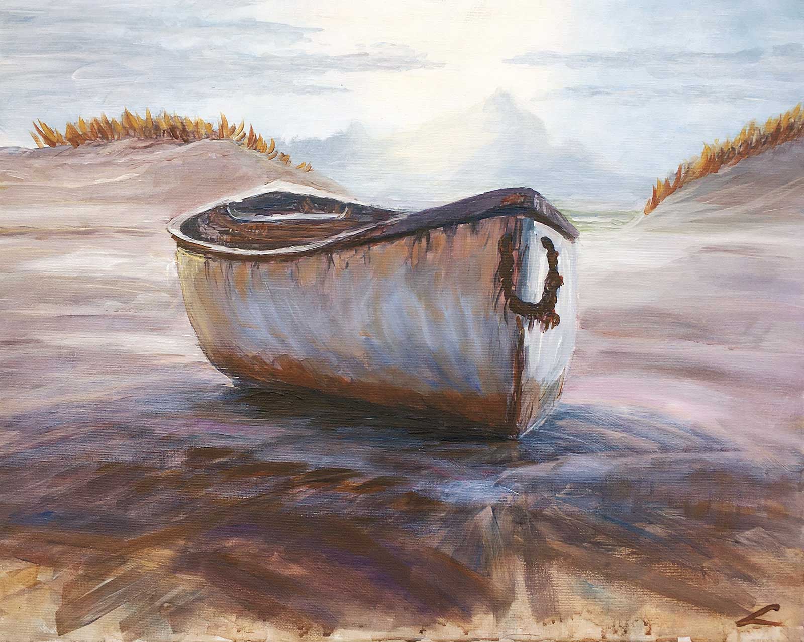
 Grandfather’s Traveler
Gregory Pavlot
Hey Gregory, great bold work! Good to see you painted it a large size and still managed to make it look very painterly. A lot of people struggle with that. Big brushes and loads of paint, that’s the ticket! You’ve got the atmospheric perspective working really well, which means you paid close attention to the relative values of your colors as they recede from foreground to background. Great! That really does look like sunlight in the sky and mountain. Good job there. You also managed to handle the subtly lighter values in the rear of the boat that help to project the bow forwards in space. Nice! Two things could do with thinking about next time:
- Be a little more careful with your drawing. With boats and anything symmetrical, subtle errors make a big difference. Compare it in a mirror to the photograph. You’ll instantly see the differences.
- Be more aware of the direction of your brushstrokes. Painting too many all in the same direction can flatten the image and loses an opportunity for variety. Hope that helps.
 After The Storm, watercolor and gouache
Eric Hillmer
Hey Eric, nice to see this one in watercolor! Great job too with all the colors and sense of light. It’s just the drawing letting you down a bit, and I’d spend some more time experimenting with making those splashy foregrounds on separate paper. Watercolor is perfect for that. Just takes a bit of practice.
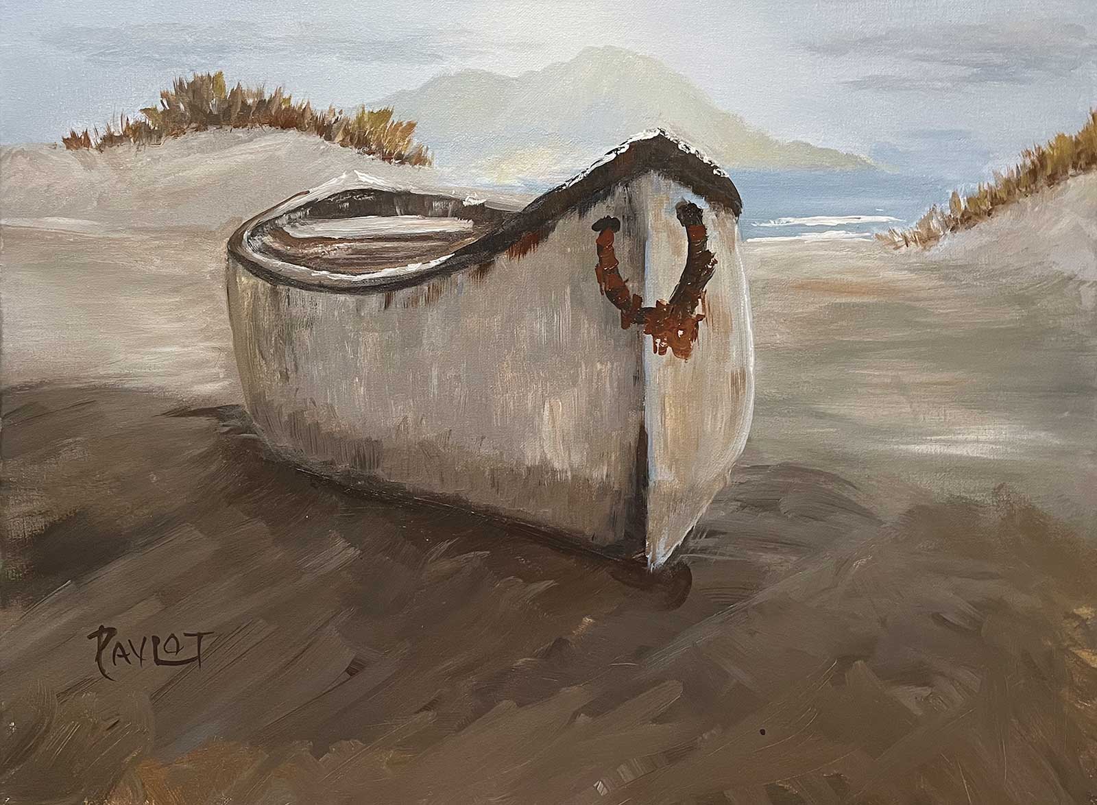
 Quiet Beach, acrylic
Barbara Magor
Hi Barbara, yes it does feel like a very quiet beach! The tighter your style, the more quiet the beach will seem. Looks like you’ve come to appreciate how fast normal acrylics dry, so you’ve ended up painting over dry layers and that gives you the grainy dry brush look with lots of hard edges. Maybe that’s what you were after, but it wasn’t what I was teaching. You know, that was about the seventh time I’ve painted that boat, so of course I can paint it very quickly now, which, combined with the techniques I showed in the video, gives a very painterly wet-in-wet look akin to oil paints. If you were to paint this one again you’d be able to paint it a little faster and avoid much of the drybrush look. Also, check your boat against the photo in a mirror. The drawing’s a bit wonky. You’ve created a good sense of light and space in the background. Good on you!
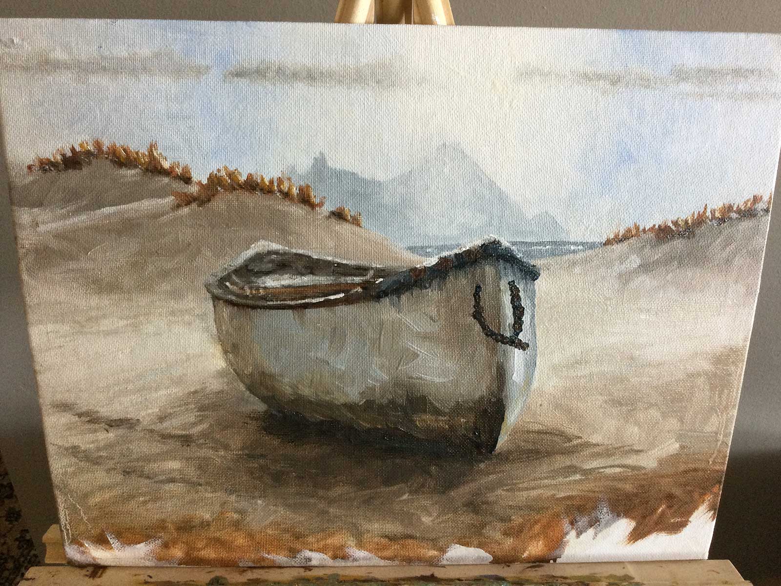 After The Storm oil video lesson 3.21
 Jill Frazier
Hi Jill, nice work. Great to see this on a smaller scale. I love your expressive brushwork that ties the whole painting together. Looks to me like you may be using a little too much painting medium with your oils, and it’s letting the weave of the canvas show through. Try painting with less medium and use bigger piles of paint. Other than that I’ve only got praise for this one. Nice!
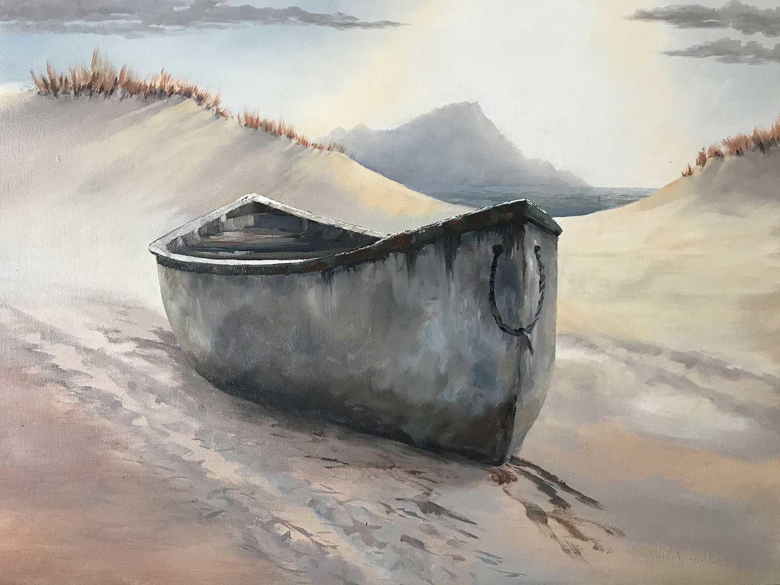 Washed up
Lindsay Shaw
Great work Lindsay! Love that intense glow in the sky and the real sense of light on the mountains. Beautiful subtle shadows cast by the dune grasses too, though the grasses themselves could do with a little fertilizer. The drawing of the boat is pretty decent and there’s a lot of nice expressive brushwork in there. If you darken the foreground sand a little more it will connect with the boat better and also provide a stronger sense of depth as the eye travels from the shade into the light. Nice job! —
Get the full video lesson here: www.mypaintingclub.com/lessons/215-After-the-Storm