



The twists and turns of my life and career shaped my perspective and technique. As a toddler, I painted the side of my father’s car with house paint and would stick my hands in my mom’s plants and use the soil to paint the walls. I did my first oil painting when I was 14, on my own, with no instruction, using a Sears catalog art supply kit.
At age 18, I attended Chicago’s School of the Art Institute for a year, then left to marry and start a family. Three kids and a divorce later, I returned to school to study graphic design while working several jobs. Eventually, I became art director for a national magazine, mastering production and design. My experiences in life came together in 2012 when I made the leap of faith decision to pursue art full time.
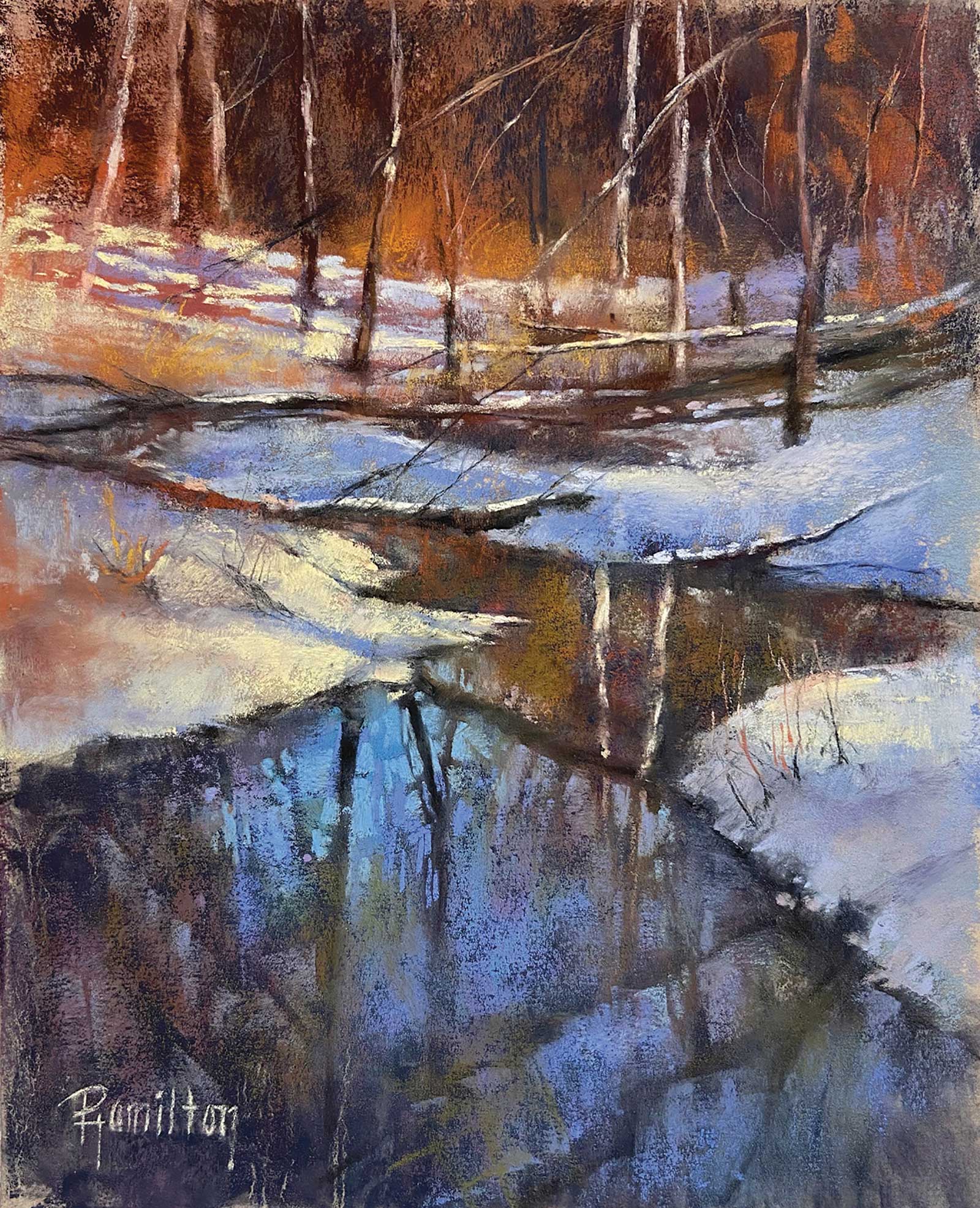 January Thaw, pastels, 10 x 8" (25 x 20 cm) In January of 2020, we had an unseasonably warm New Year’s Day melting most of December’s snow. My husband and I booted-up and went for a winter walk through a nearby forest preserve where I stopped to take photos of the brilliant blue sky reflecting into the pools of melting snow. I exaggerated the orange in the background trees to complement the strong blue in the foreground and used small abstract marks in various shades directly below the brightest snow to create visual interest.
 I’ve dabbled in many different mediums but have settled on pastels. I love their vibrancy, portability and versatility. Sometimes I work quickly and can complete a small pastel painting in a few hours. Other times, I start a piece and work on it off and on for weeks—that’s part of the beauty of pastels—there is no paint or paint mediums drying on a brush if left untouched. That’s not to say I don’t dabble with wet mediums. I love to experiment with different underpainting techniques. I apply anything from watercolor to acrylic inks to alcohol washes.
When it comes to composing a piece, my iPhone is my trusted companion, allowing me to capture a scene or idea anytime and anyplace. Living in northern Illinois, the weather is unpredictable and often inclement. I love to paint the landscape from life, but most of the year it’s not feasible. This is where I enlist the photo gallery on my phone to search for photos that speak to me. Then, using the editing tools, I crop and alter images to create a pleasing composition.
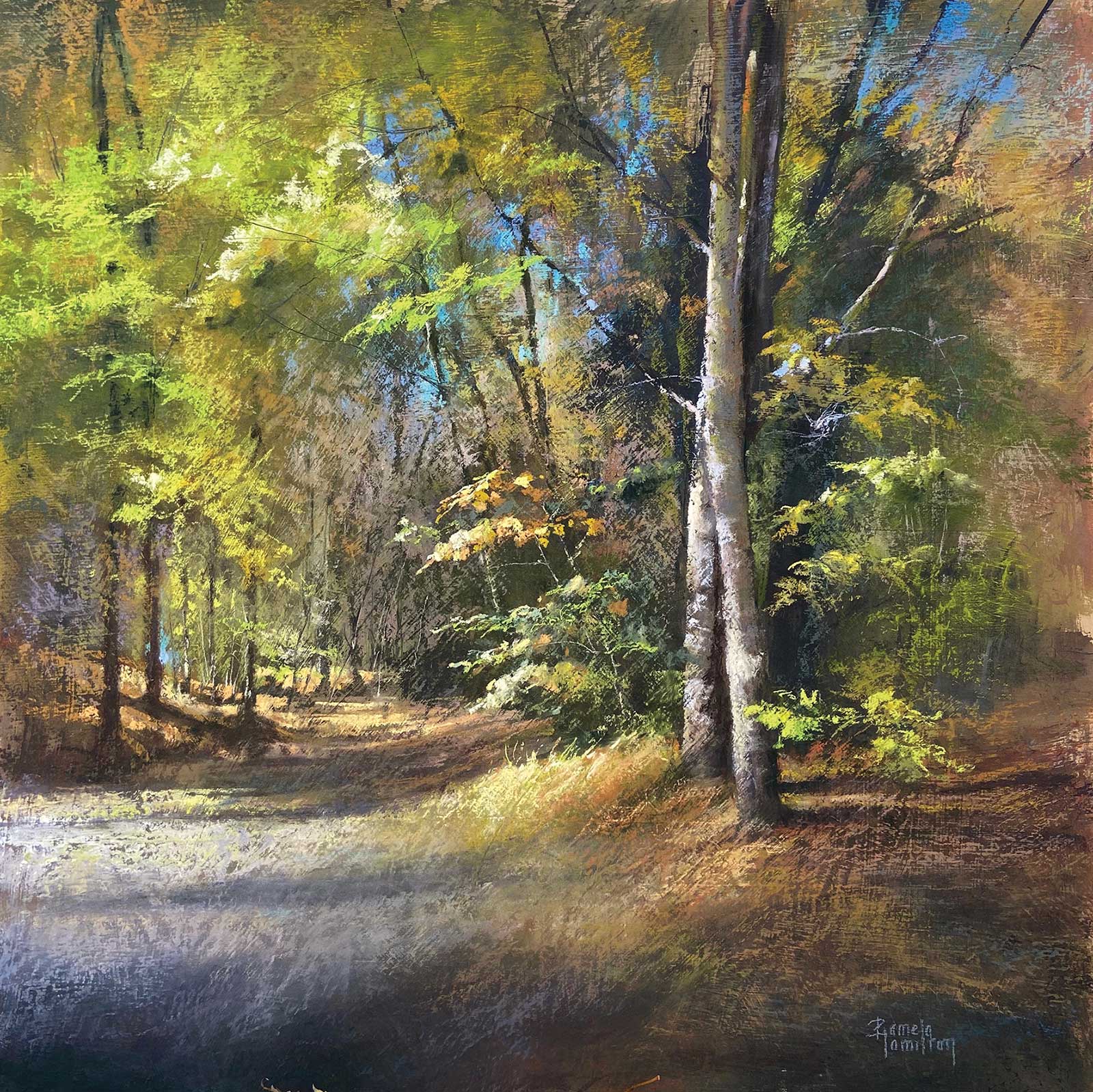 Woodside Lake Park, pastels, 24 x 24" (60 x 60 cm) This is an autumnal scene painted from a photo I took while camping near Cleveland, Ohio. I painted it on a piece of Masonite that I primed with pumice gel. I love the textural effect this technique creates. The painting process is basically the same, except I use a generous amount of Sennelier Latour Fixative to better adhere the pastels to the board between layers. I find this surface especially suitable for tree foliage, suggesting movement and sparkle in the trees.
Once in my studio and an idea in-hand, I choose a surface, either commercially made or hand-prepared. I draw a quick, loose sketch using either graphite or charcoal. At this stage I decide if an underpainting is desired. I then begin applying pastels—working dark to light—typically starting with my hardest pastels. Once my dark values are blocked in, I continue to layer softer pastels, challenging myself not to over work the edges of the piece. My goal is to place the smallest and brightest marks at the center of interest, ultimately creating a focal point.
Pastels are very forgiving. As a dry, opaque medium it’s very easy to brush off and reapply more pastels. I often reuse paper that I’ve rinsed off an old painting and am able to cover the ghost-image from the previous piece. I never tire of the creative possibilities with this medium.
My Art in the Making Sound of Clouds
 Reference Photo
 Reference Photo
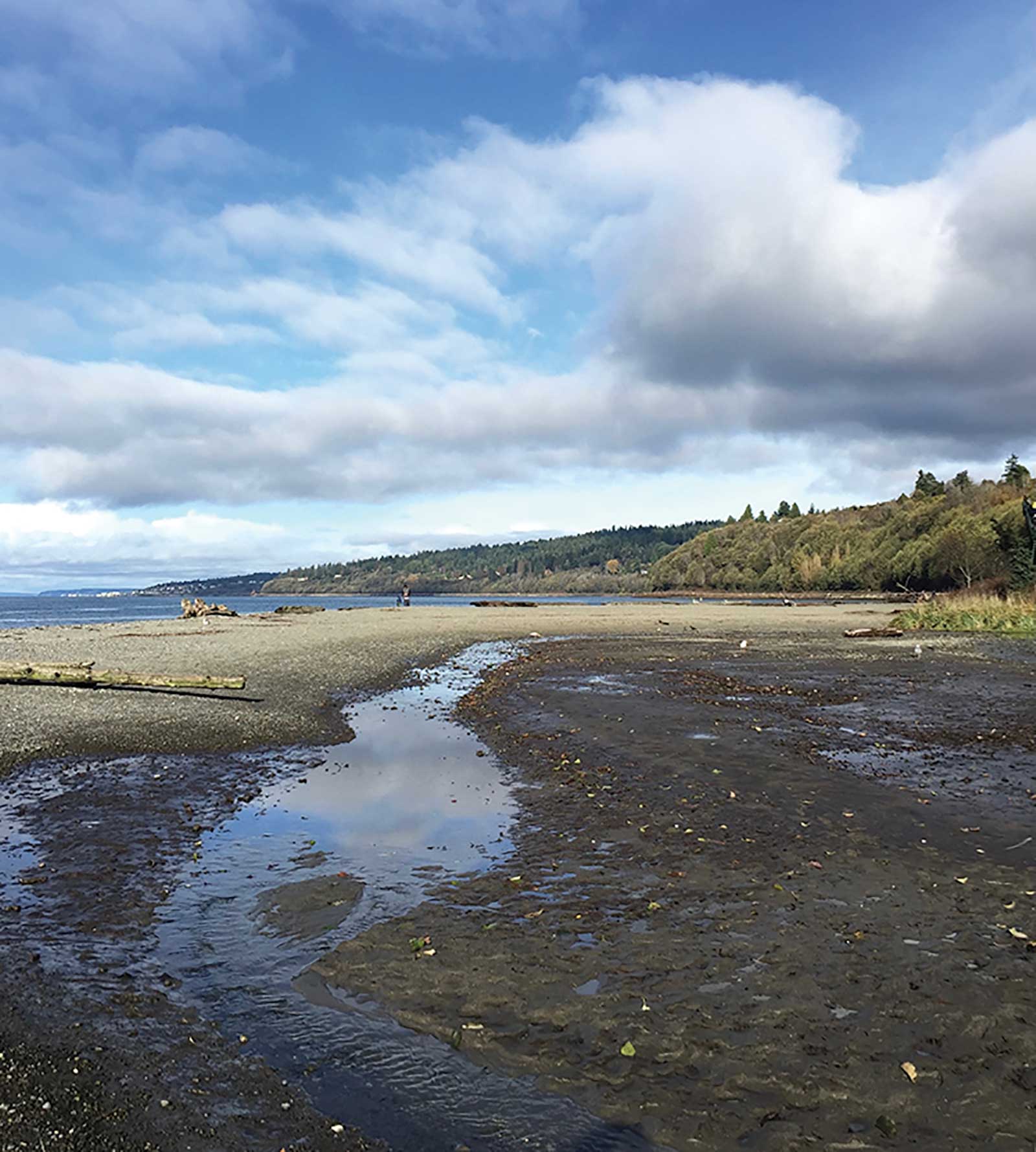
This photo was taken near Seattle, Washington, of mudflats along Puget Sound. I changed the format from square to vertical, enlarging the clouds to give them greater impact.
WHAT THE ARTIST USED
WHAT THE ARTIST USED
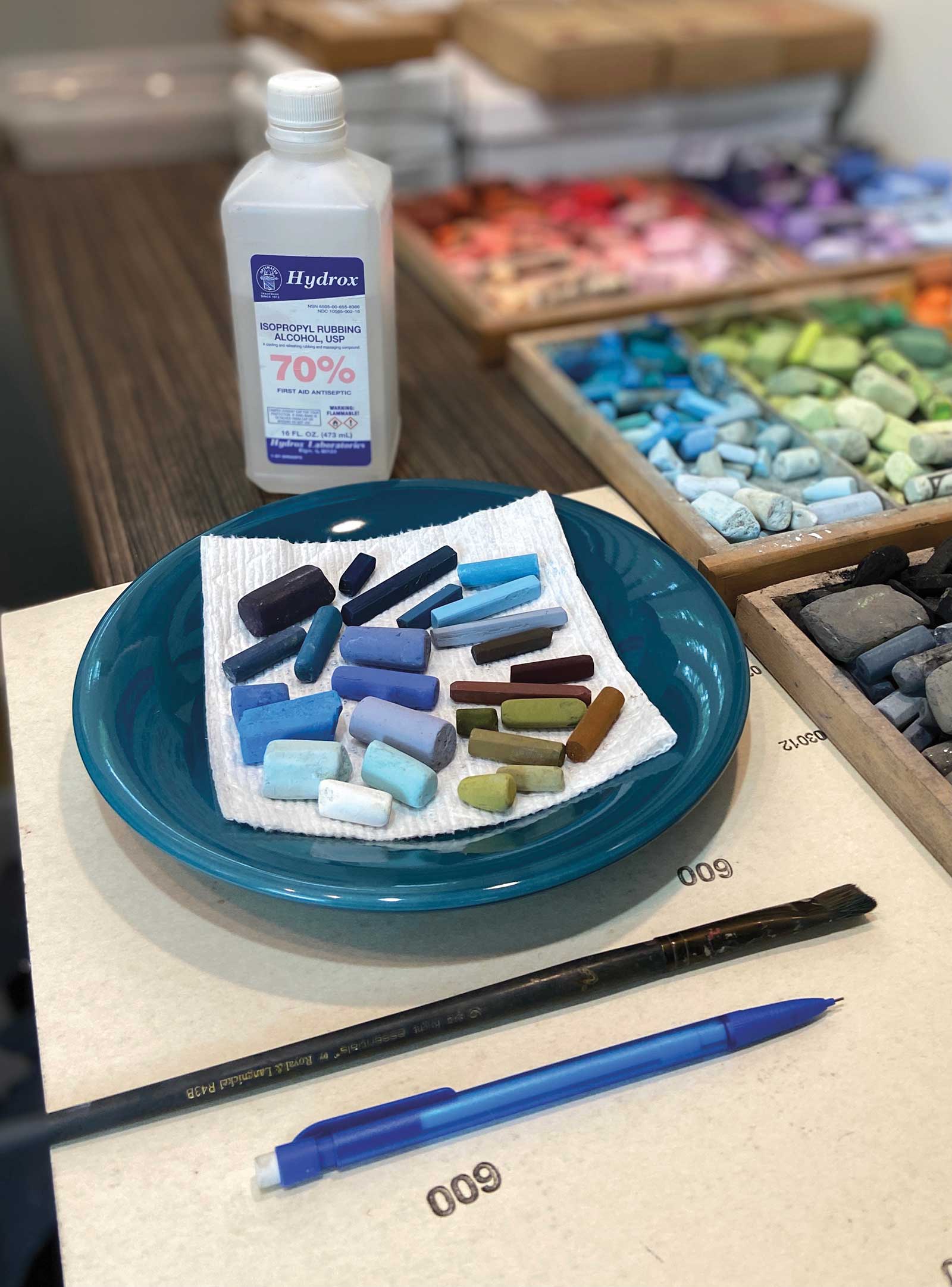
Pastel Brands (listed hard to soft)
NuPastels, Girault, Mount Vision, Great American Artworks, Gordon Becin Pastels, Sennelier Soft Pastels
Miscellaneous Supplies
UArt paper–600 grit, Mechanical pencil, Size 6 flat brush, 70% isopropyl alcohol, Disposable vinyl gloves, Paper towels
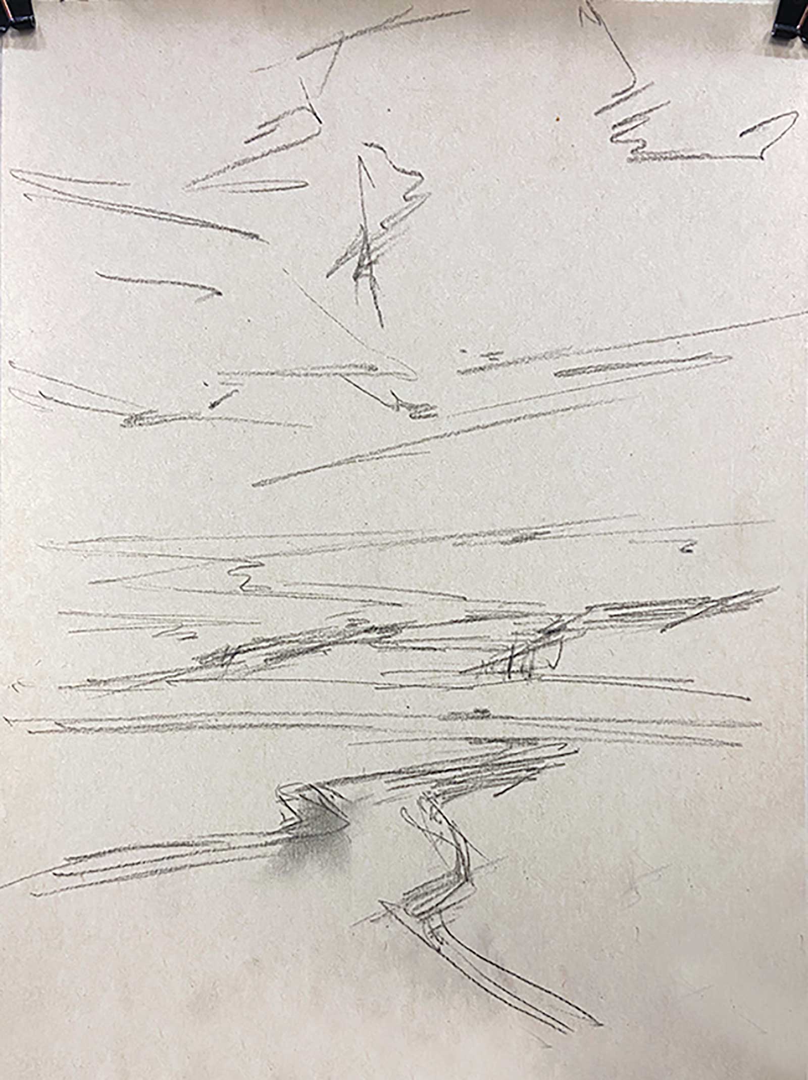 Stage 1
Stage 1 Sketch
On a 12-by-9-inch sheet of UArt paper, I quickly and loosely sketched using a mechanical pencil, not worrying about detail, just the position of the basic shapes. I was mindful of composition and placement of shapes using the rule of thirds.
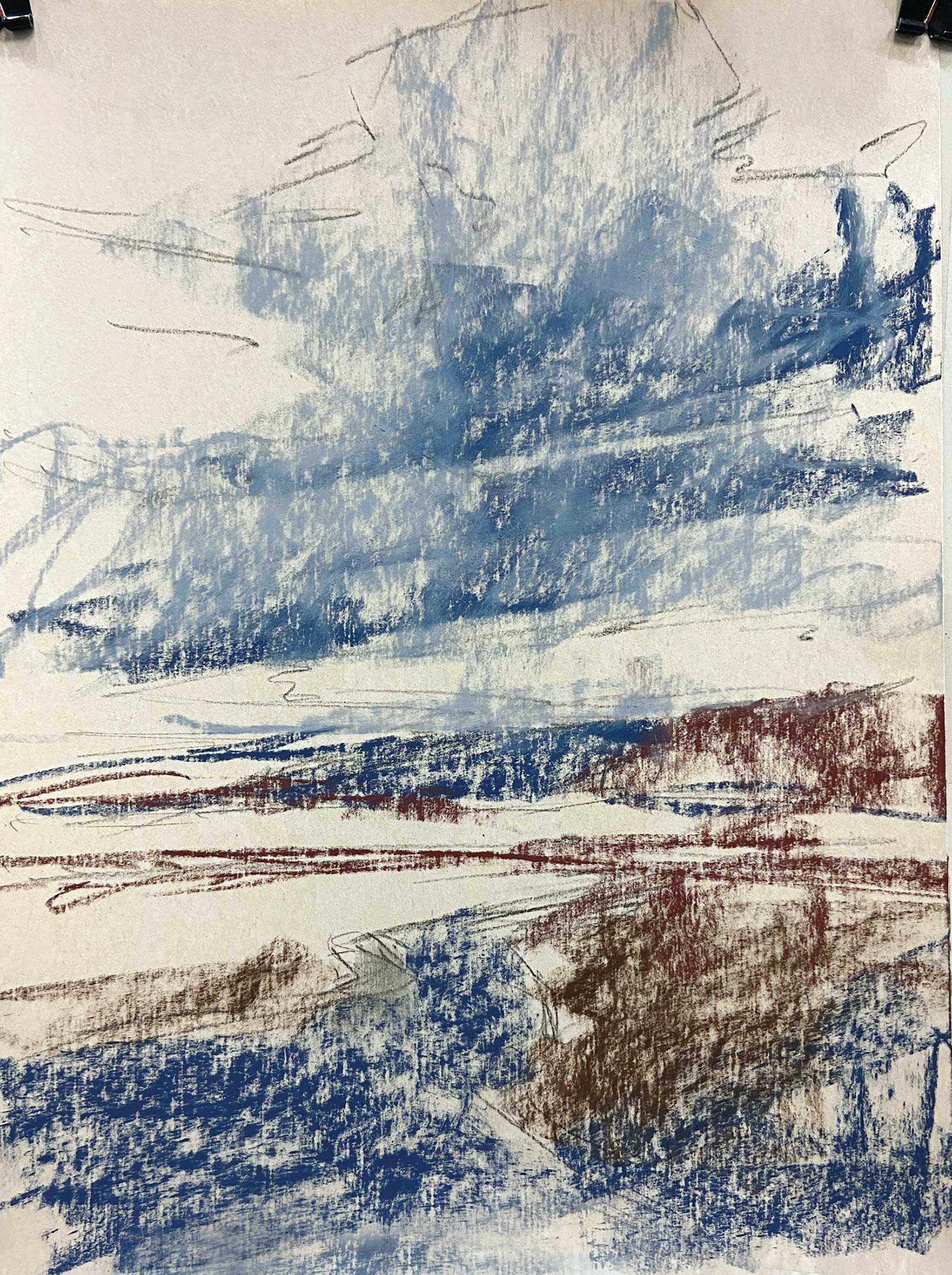 Stage 2
Stage 2 The Block-in
Using my hardest pastels, in this case NuPastels, I blocked in the darkest colors. This is the first stage of my underpainting.
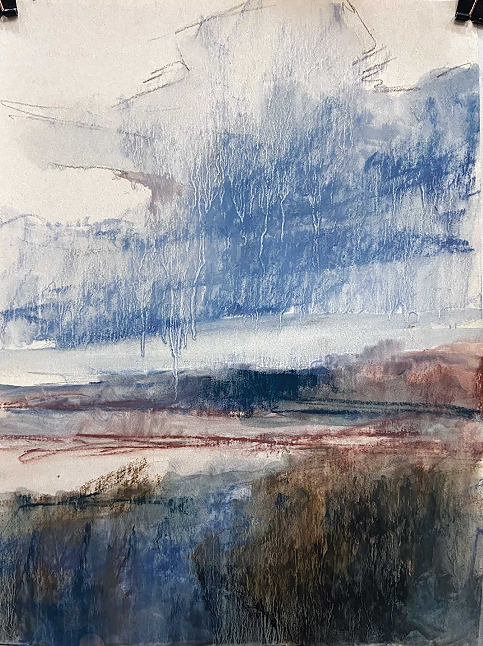 Stage 3
Stage 3 Completing the Underpainting
To complete the underpainting I applied isopropyl alcohol using a flat brush and a light touch, allowing the pastels to dissolve and drip onto the surface.
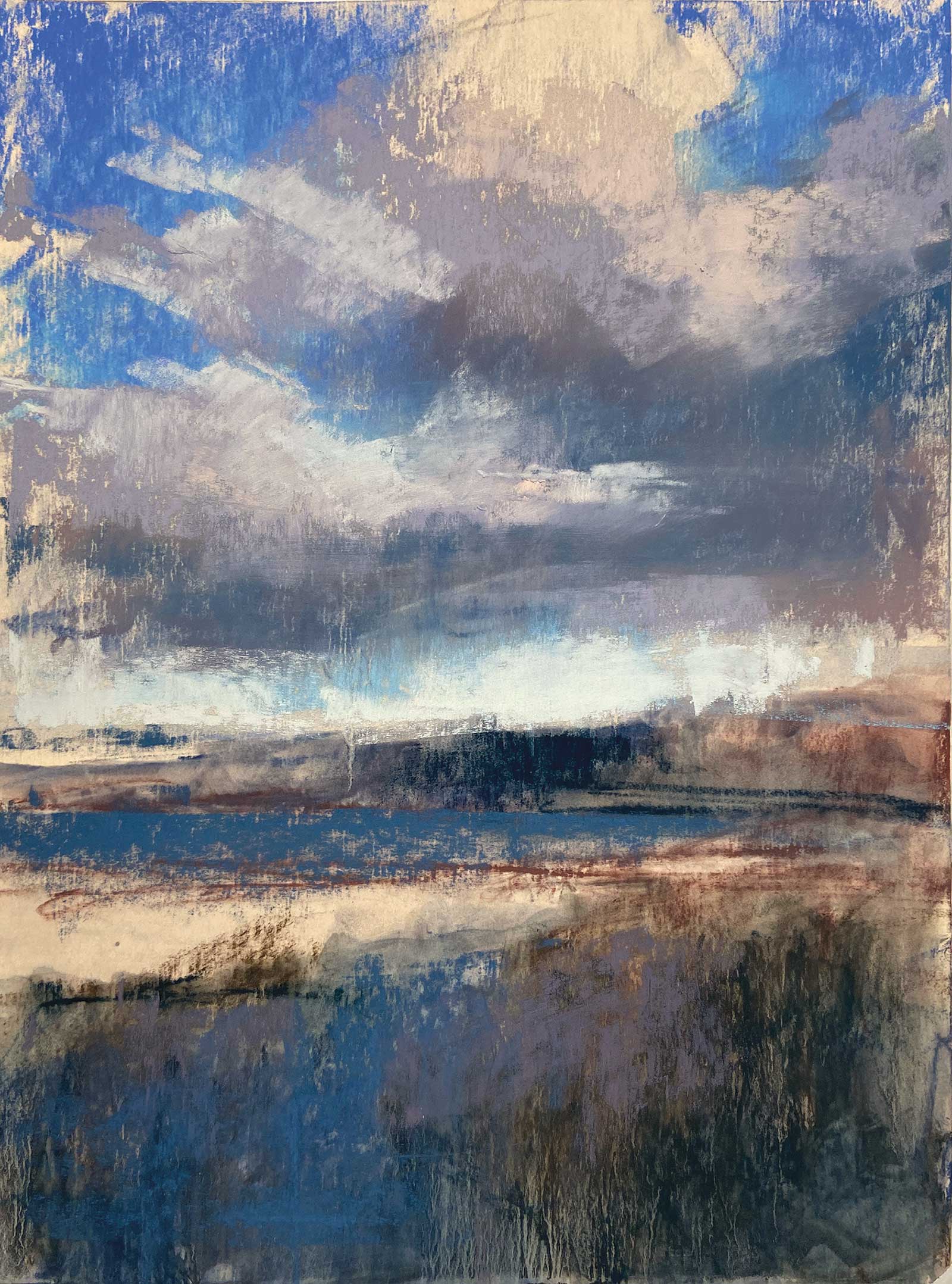 Stage 4
Stage 4 Beginning the Layers
Once the alcohol dried, I began layering softer—but not the softest—pastels over the underpainting, again being mindful of not painting too light too soon.
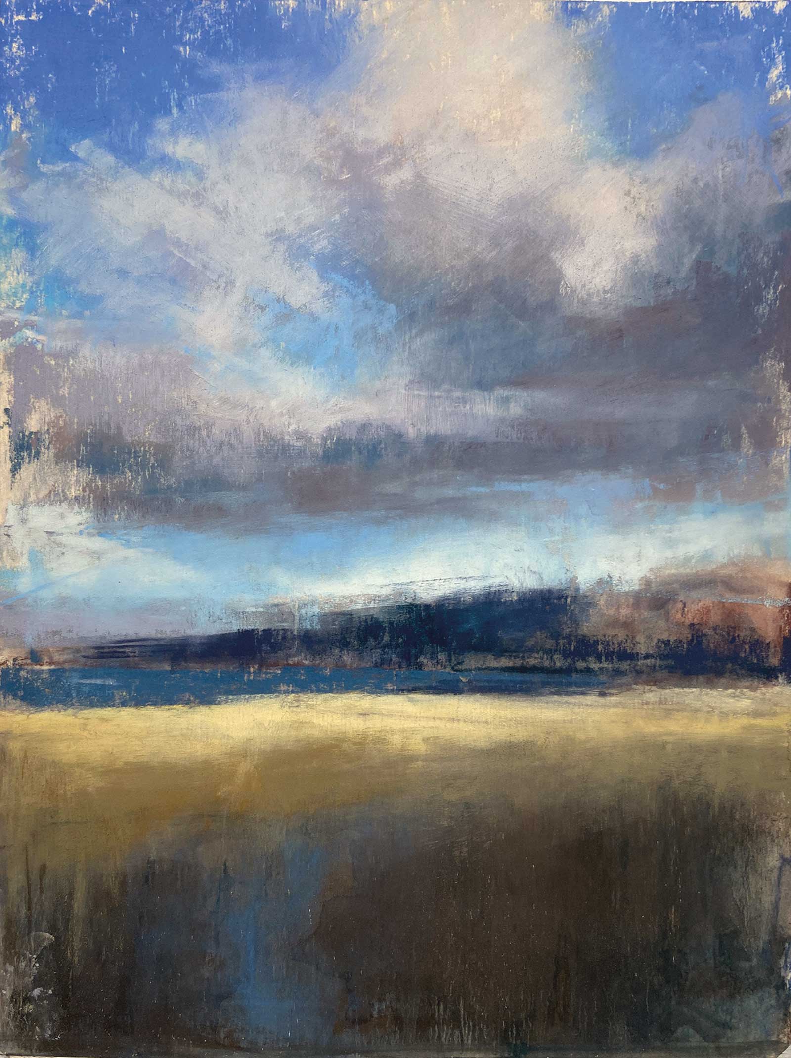 Stage 5
Stage 5 The Landscape Takes Shape
I continued to work on the clouds, briefly switching back to a gray NuPastel, allowing it to act as a blender softening the edges and pushing the medium into the blue of the sky. Using soft pastels, I add the suggestion of a distant shoreline, darkened the bottom of the beach and applied shades of ochre and cool golds to the midground.
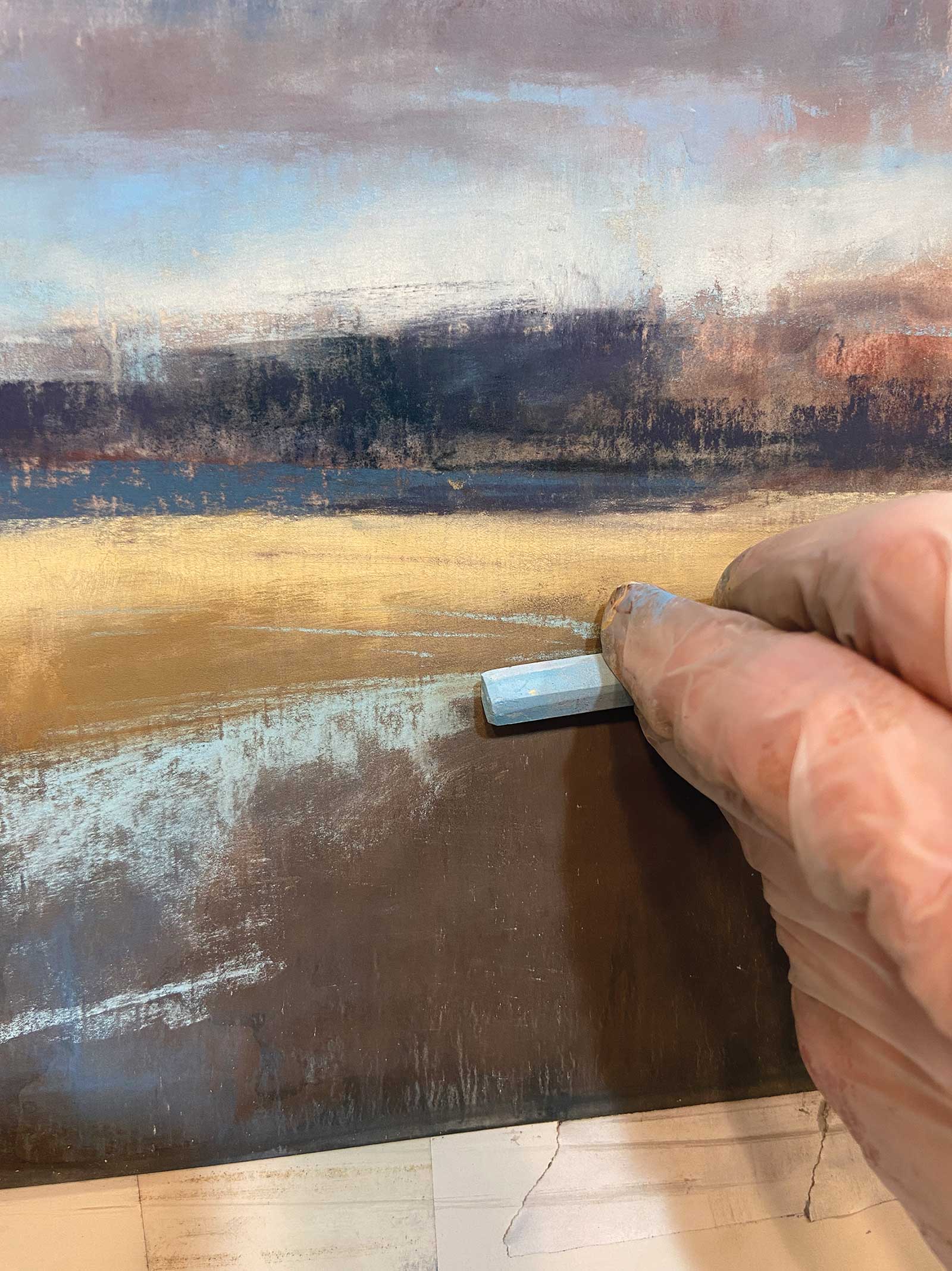 Stage 6
Stage 6 The S-curve
In this shot, I’m using a light blue NuPastel on its side to re-create the S-curve that was obliterated by the underpainting and the reflection of the sky into the mudflats on the shore.
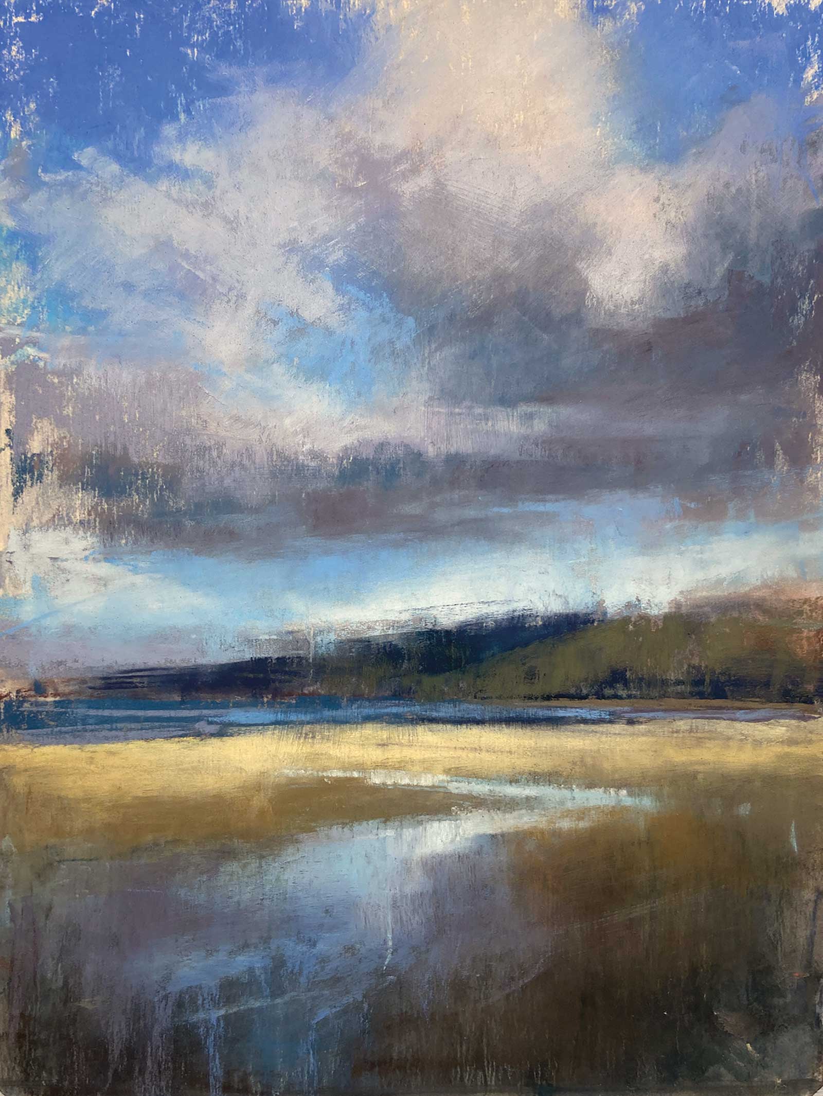 Stage 7
Stage 7 Making Adjustments
I continued to lightly skim a variety of warm and cool blues to create pleasing reflections avoiding placing too much detail at the base of my painting. I used light pressure which allows the darker pastels and bits of my underpainting to show through. Note that at this point I’m not exactly copying my reference photo.
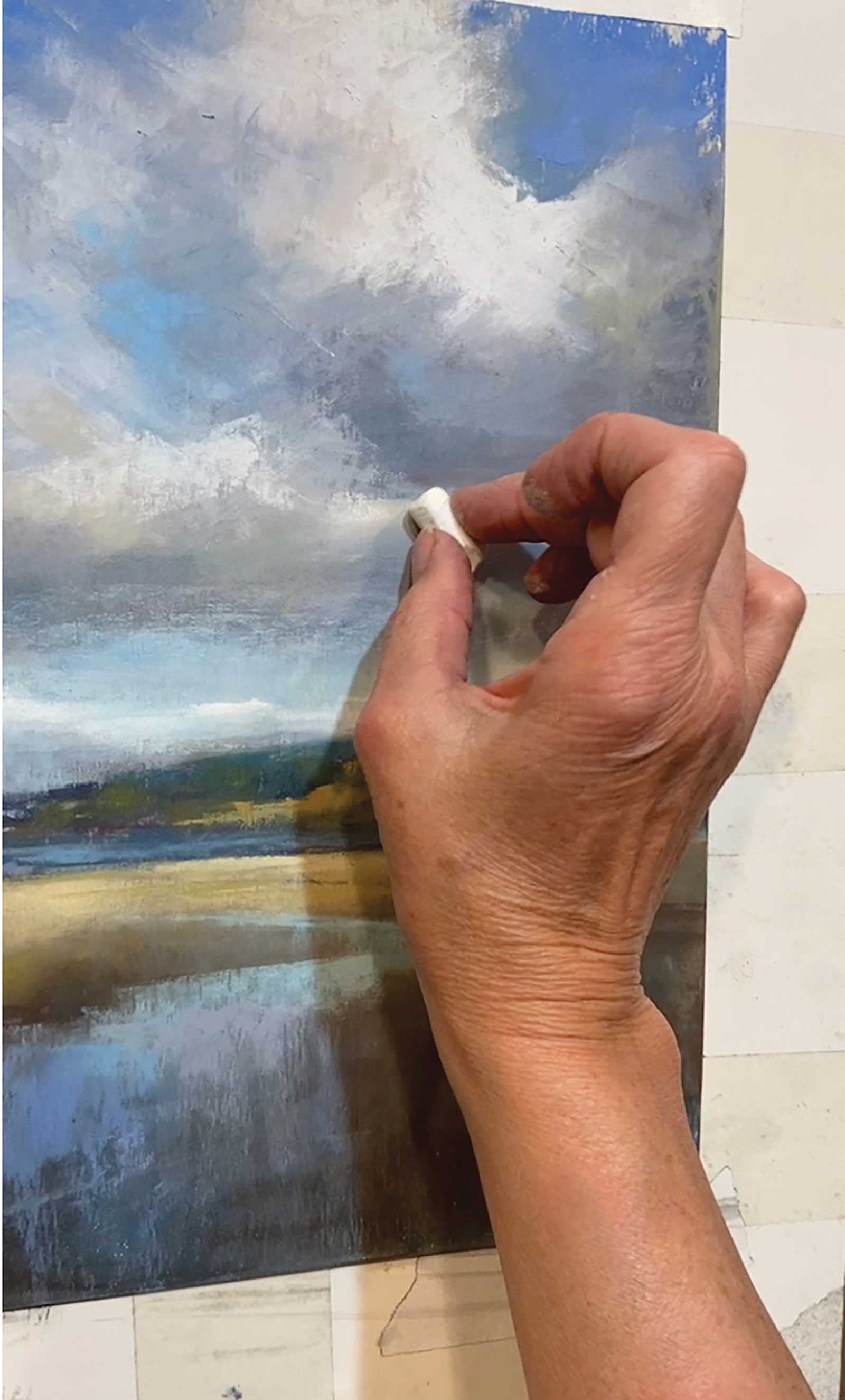 Stage 8
Stage 8 The Final Details
This is my favorite stage—it’s like decorating a birthday cake when you add those last pretty little details! I applied the brightest, lightest marks to the clouds and the lighter, higher chroma pastels to the tops of the distant hills.
 Stage 9
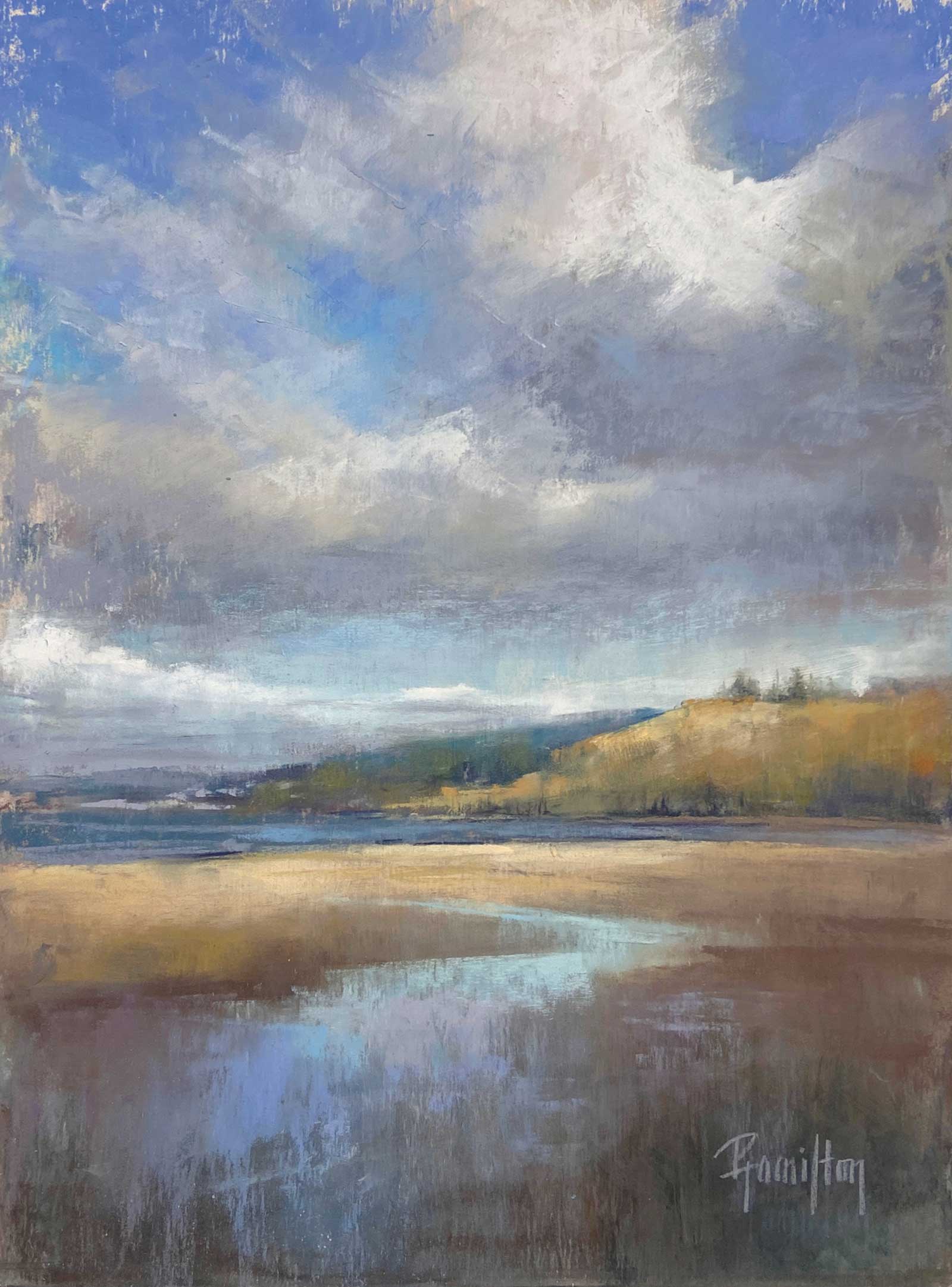
Stage 9 Finished Artwork
Sound of Clouds, pastel on UArt paper, 12 x 9" (30½ x 23 cm)
This piece is an excellent example of having an emotional connection to a painting. As I worked on it, I reflected on precious time spent with family and the beauty of that day.
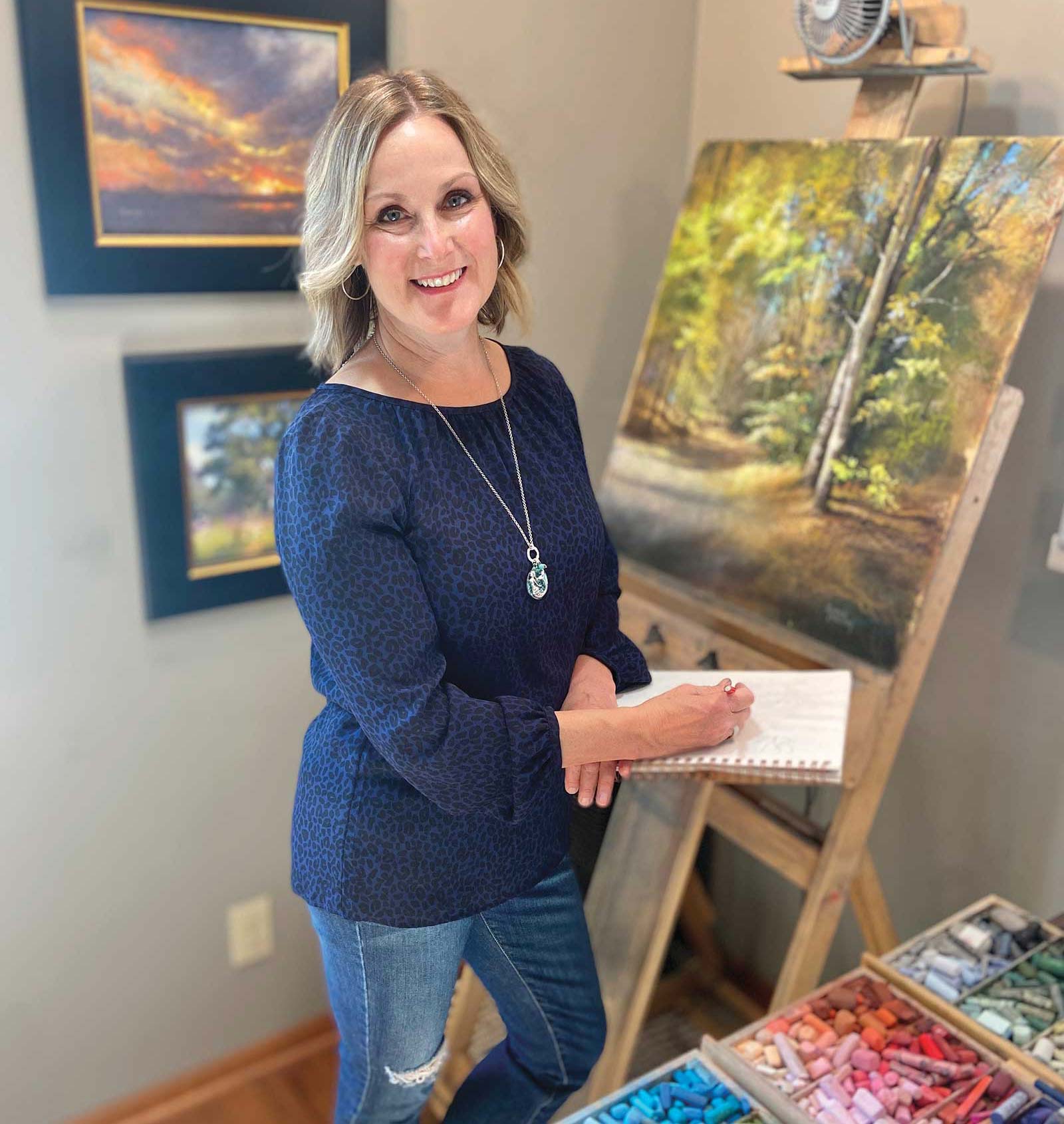 Pamela Hamilton in her studio
About the Artist
Pamela Hamilton in her studioAbout the Artist
An avid gardener and outdoor enthusiast, Pamela Hamilton’s art is heavily influenced by her love of nature. With limited formal training, she is primarily self-taught through dedicated practice, watching YouTube videos and attending workshops with some of today’s best American pastel artists.
Since 2011, Hamilton has participated in nearly 100 exhibits including top-ranking fine art fairs, juried international competitions and solo exhibits. She is the recipient of four Best in Show titles and numerous awards in other categories. She conducts weekly pastel classes at the Art Box in St. Charles, Illinois.
Hamilton’s work can be seen at Trend + Relic in St. Charles, and Edgewood Orchard Galleries in Fish Creek, Wisconsin. She is a signature member of both Chicago Pastel Painters and Pastel Society of America and has a private-label collection of Jack Richeson Hand-Rolled Soft Pastels, “Pamela Hamilton Basics & Brights.”
Contact at
www.artbypamelahamilton.com