


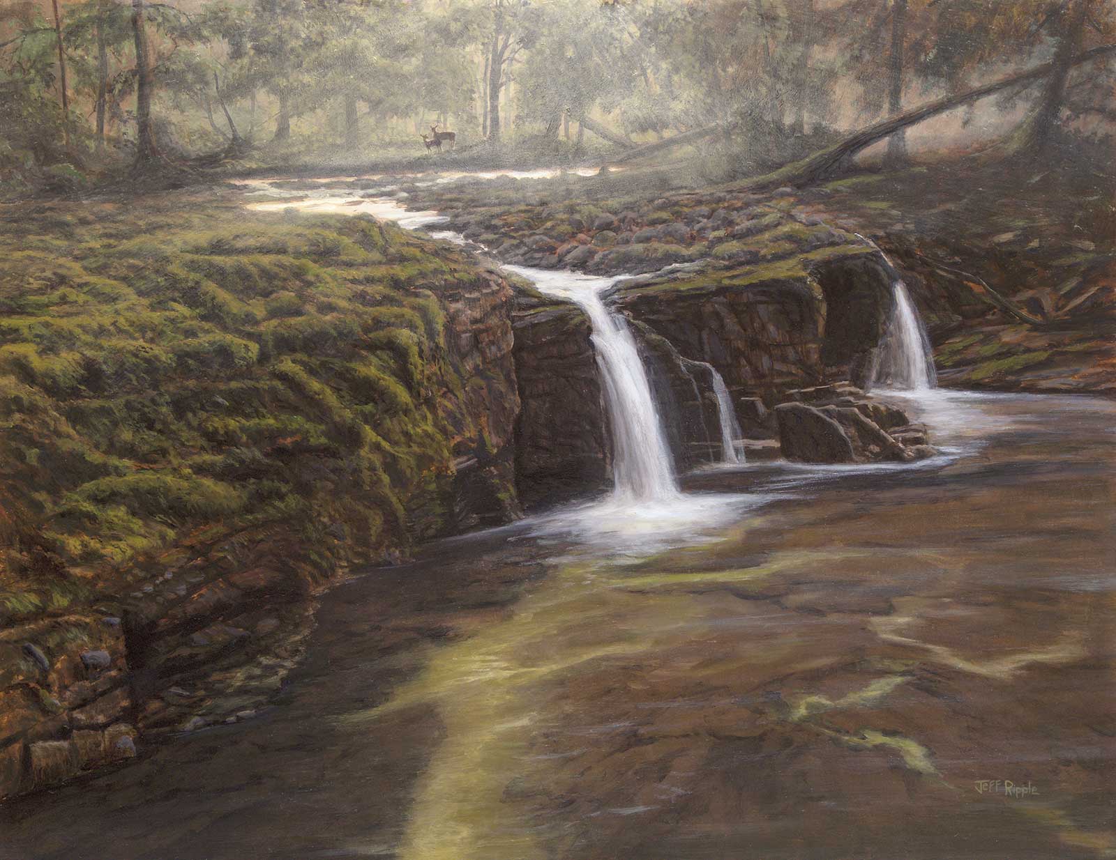
 Cash Creek Cascade, oil, 14 x 18" (35 x 45 cm)
Grand Prize is a four-page editorial feature in American Art Collector magazine
Jeff Ripple Florida, USA
Head in the Clouds
Realist landscape painter Jeff Ripple is always looking to the sky. It’s one of his main sources of inspiration, he says, taking in the changing behavior of clouds, and staying in tune with the “changing quality of light throughout the day.” He says, “I am always fascinated by the effects and quality of light on a landscape, and that is what I am moved to paint. Sometimes the golden light at the beginning or end of the day is so lovely it breaks your heart. I want people viewing my paintings to feel the atmosphere, whatever it might be. Maybe their hearts will break, too. I don’t consciously work with underlying themes or in continuing series, but I cannot take my eyes away from a beautiful sky. Many people tell me they are particularly drawn to my work because of the skies.”
Ripple painted birds as a child but didn’t focus on art again until his adult life, beginning as a landscape photographer in the 1980s, and a full-time landscape painter by 2010. He’s heavily influenced by the Hudson River School artists of the 19th century, and his own paintings reflect the rich, intense and innate beauty of nature.
“I am a realist painter, and I want my landscapes to be believable, even if they are invented. I spend a lot of time on my composition and drawing, often developing a monochromatic grisaille that serves as the foundation of design, drawing and values for a painting, particularly larger works and landscapes from imagination,” Ripple explains of his process. Often, he’ll also write notes about color mixing, brushes and additional ideas or concerns.
“In my landscapes, I am trying to go beyond realism to evoke the spirit of the place,” he says. “Despite the birth of a painting in my imagination, I am creating a scene that could have happened somewhere, sometime. It is a painting where my unique experiences and emotions meet the viewers’ to create the story we imagine when viewing it.”
My Inspiration
Cash Creek is a small stream that runs through a valley below my aunt and uncle’s home in southwest Missouri. On one visit several years ago, my uncle told me about the cascades and gave me some directions along with an ATV and a white shepherd named Callie for company. I spent most of the day there, sketching, taking notes, making a few reference photos, and getting lots of dog love. It was a profoundly peaceful experience, the woods luminous under a high overcast with some fog. I wanted the painting to invoke the sense of peace and quiet wonder from that day.
My Design Strategy
There was no elaborate design strategy for this commissioned painting. I used the path of the water as the main conduit for guiding the viewer through the painting, the white foam linking the woods bathed in soft light to the water in the shallow, clear pool. The creek naturally flowed as shown, so there was nothing to invent other than where to place and carefully draw the deer that the collectors wanted somewhere within the painting.
I owe a large debt to the 19th-century luminist painters. I refer to their work on a regular basis, including their drawings and oil sketches done in nature as well as their studio masterpieces that combined those sketches with imagination and no small amount of technical prowess.
My Working Process
I really wanted to nail the design and drawing early in Cash Creek Cascade, so I started with a detailed grisaille before adding glazes and scumbles to gradually lay in color. I used thicker paint in later color layers to build up the lights in the cascades as well as texture on some of the closest moss and limestone rock shelf.
I am finding myself using grisailles more often, particularly in my paintings from imagination where there may be a complicated design, lots of drawing, a wide range of values and probably several different reference sources for color and detail. I find it much easier to evaluate how I will handle color relationships in a painting when the drawing and values are mostly in place through the grisaille.
Contact Details
Email: jeff@jeffrippleart.com
Website: www.jeffrippleart.com
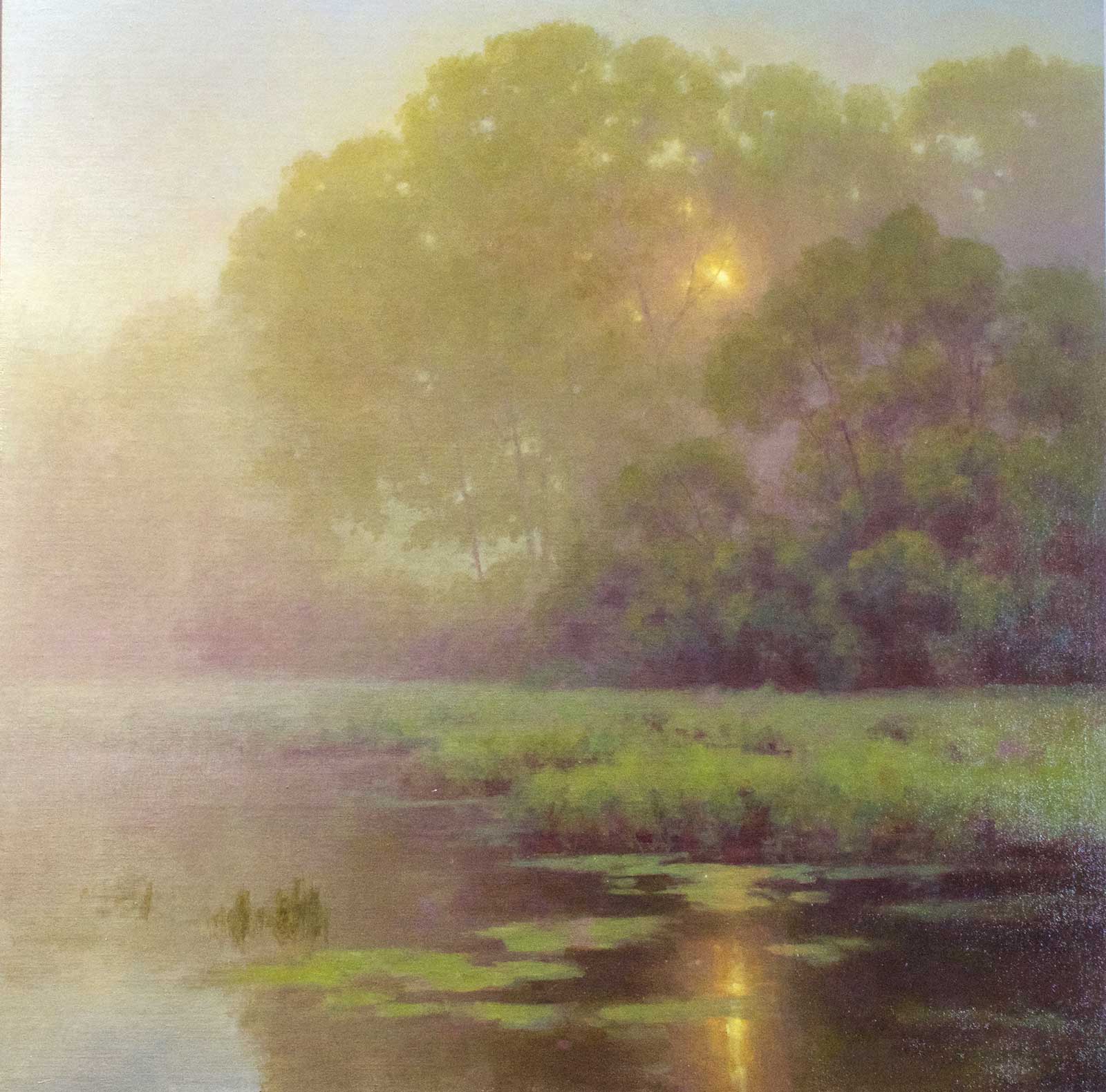 Morning Mystique, oil, 30 x 30" (76 x 76 cm)
Second Prize is a two-page editorial feature in American Art Collector magazine
Hillary Scott Massachusetts, USA
My Inspiration
As a tonalist painter, I am intrigued by light and atmosphere. One morning last September I was hit by a wall of fog as I stepped outside. Immediately I drove to one of my frequent painting spots and was not disappointed. The fog was so thick that one could not see beyond 20 feet or so, and the sun was burning through the trees and illuminating the water lilies. It was nothing short of magical. The scene was a landscape painters dream, and I knew this would be my next painting.
My Design Strategy
This is always the challenging part. A strong design is where the real work lies, and ultimately determines the success of the painting. My reference photos were not great and did not provide much help in designing the scene. I ended up choosing a low horizon line to really emphasize the layers of foliage and chose my focal point as the sun peeking through the trees. The secondary points of interest were the illuminated lily pads and that shimmer on the water. I worked out all of my color/design ideas in a small color study to ensure my concept was going to work and then forged ahead with the larger painting.
My Working Process
I started this painting as I do with many others by creating a tonal underpainting in burnt umber. This scene was undoubtedly the most challenging one I’ve done yet, as it was a compressed value structure. I had to be in complete control of the values, subtle temperature shifts and chroma or the painting would fail. I usually work dark to light but in a high key painting such as this, I work from light to dark. The value and temperature of the atmosphere determined every other aspect of this piece. I had to redo the sky a few times because if it dried even a half value too dark it threw off the rest of the painting. As my photos weren’t very helpful I had to rely quite a bit on memory and imagination to pull off the mood I was after. My palette consisted of titanium white, radiant blue, dioxazine purple, yellow ochre, olive green, viridian, burnt sienna, cadmium yellow medium and cadmium orange. To help control the chroma I also mixed up a neutral gray consisting of yellow ochre, ivory black and titanium white.
Contact Details
Email: hillary@hilllaryscottstudios.com
Website: www.hillaryscottfineart.com
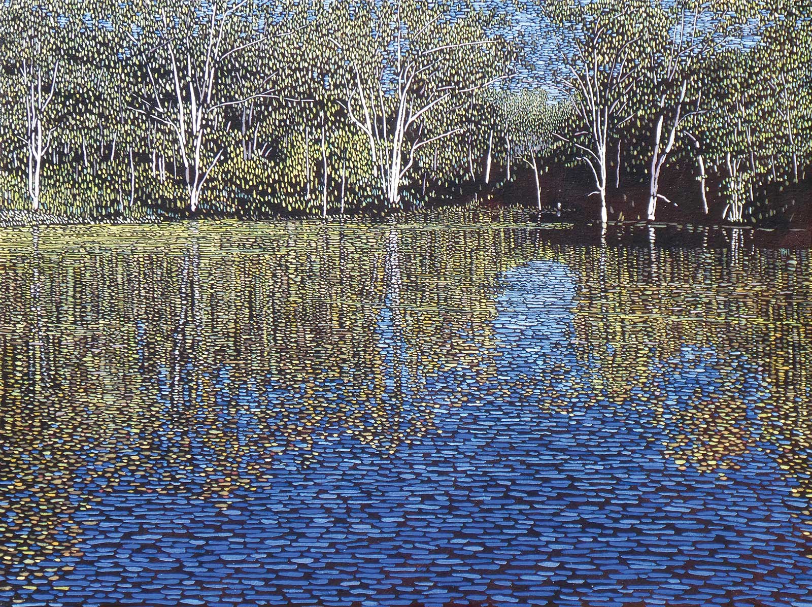 Noorumba, oil, 18 x 24" (45 x 60 cm)
Third Prize is a one-page editorial feature in American Art Collector magazine
Philip Miles New South Wales, AU
My Inspiration
This painting began as a commission for a friend and his wife who were planning to move houses and wanted a memento of the area where they had been living. They showed me this section of bush near their home as a place that was significant to them. Commissions are never easy and on the day I visited the site to take photographs, the sun wasn’t cooperating and I wasn’t getting a lot of inspiration. However, right at the end of the time I was there the sun came out and lit up the scene, so I was able to get some good shots which gave me the visual inspiration I needed.
My Design Strategy
I try to let the meaning of a painting drive the approach I take, and in this case the scene I was to portray held a lot of memories for my clients. These memories were both happy and sad and so I wanted to find a method which would convey both sides of that reality. Somewhere in my subconscious, the idea of painting blocks of color over a dark background sort of floated up. I wasn’t sure exactly how I would do this but I decided to make a feature of the tree trunks by painting them in realistic shapes and then restrict the rest of the painting to horizontal and vertical strokes (the vertical strokes suit the way eucalyptus leaves hang from the branch).
My Working Process
I began by putting down a dark layer using mainly raw umber with an odorless turps medium. Once that was dry, I began on the image using linseed oil as my medium. I painted in the tree trunks and began on the water and some of the leaves, using both warm and cool colors for contrast. At this stage I was still experimenting with the width of the brushstrokes and their spacing but eventually decided it would help with depth perception if I let both get narrower as they receded into the distance. I also decided to leave some areas blank. To finish, I rubbed on linseed oil and darkened up the raw umber underpainting.
Contact Details
Email: philmilesartist@gmail.com
Website: www.facebook.com/philip-miles-artist-139643256173422
Finalists
Each receives an Award Certificate and a one-year subscription to International Artist magazine PLUS having their work seen worldwide by international galleries looking for new talent.
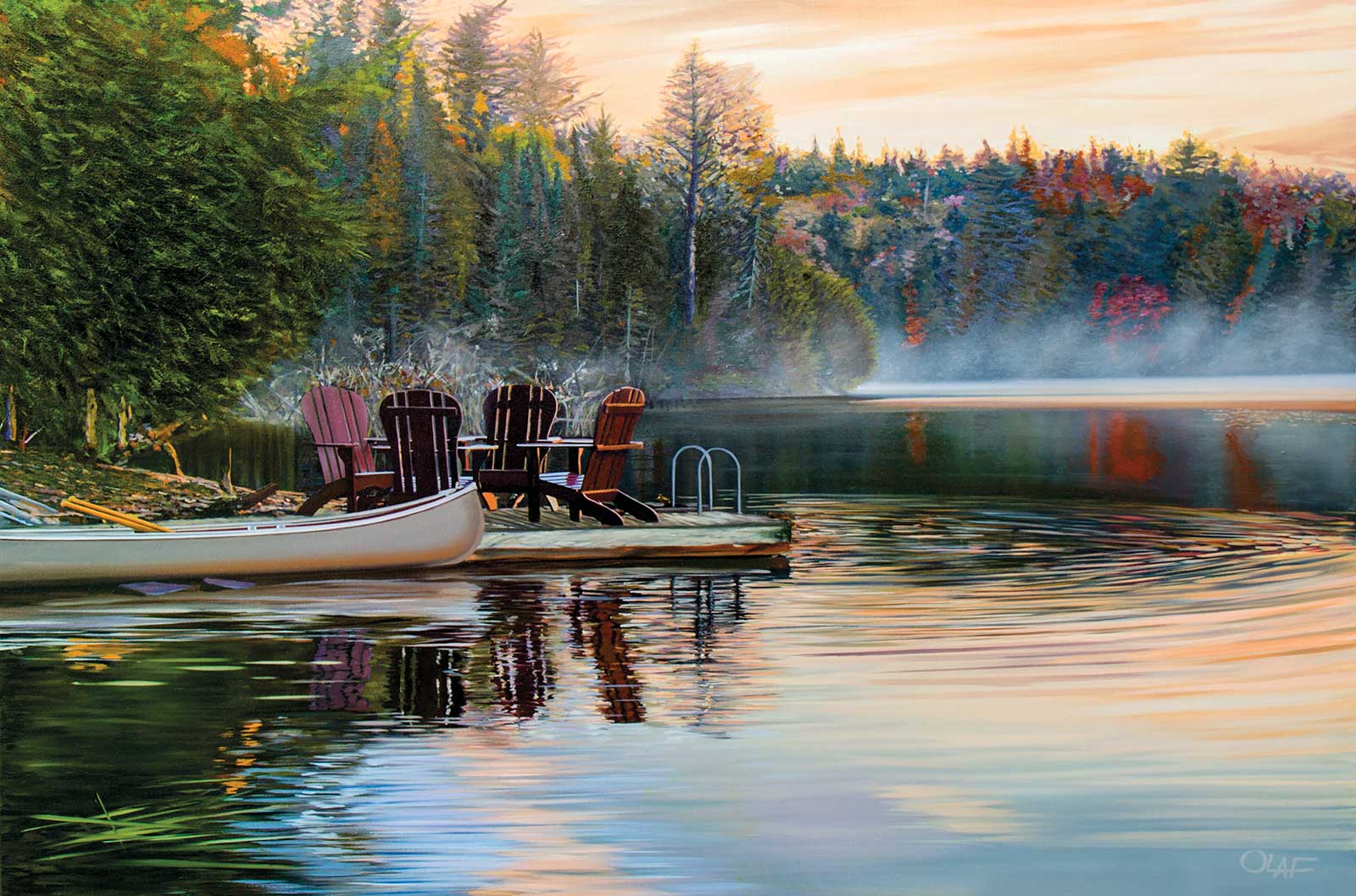 Breathless, oil, 40 x 60" (101 x 162 cm)
Olaf Schneider Ontario, Canada
My Inspiration
I open my eyes to the beauty of the day. Cool mornings, a sweater and a hat to keep out the early chill. Watching carefully for the little creatures that will soon migrate south or into hibernation. I could see my breath and for the first time, my own mortality. I caught the last of the autumn palette. The leaves have fallen to the forest floor creating the final days of the spectacular fall colors.
My Design Strategy
The composition is balanced allowing the admirer’s eye to wander throughout the entire image. The ripples lead you into the center and back to the focal point of the dock. The fog on the water gives a feeling of distance. The atmosphere in the foreground is most important, setting the mood for the painting.
My Working Process
Preliminary sketches help me to develop the concept and also eliminates the guesswork and the mistakes that may arise while working. I start with a base color, in this case a medium gray. I apply dark paint using small brushes to create the final outline. As the work continues to develop, I use the medium colors with smaller brushes and apply the lightest colors at the end.
Contact Details
Email: olaf_artist@mac.com
Website: www.olaf.ca
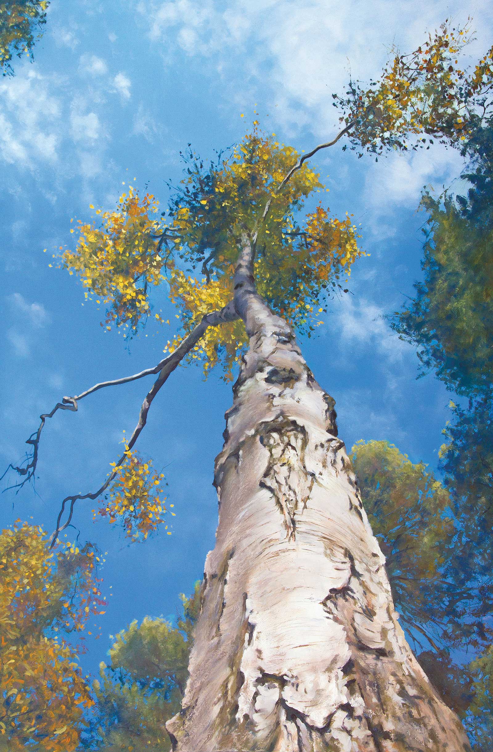 A Morning Stretch, oil, 36 x 24" (91 x 61 cm)
DJ West Midlands, UK,
My Inspiration
Painting trees from unusual perspectives has been a passion of mine for over 15 years now, and looking up into the tree canopy is a fascinating and unique perspective of a tree that we only catch fleeting glimpses of unless you are prepared to lie down and soak up the view above—which I highly recommend! The silver birch tree is known as “The Lady of the Woods,” and I wanted to incorporate the idea of a lady enjoying a morning stretch on awakening, into the painting.
My Design Strategy
The trunk of the tree launches itself into the painting helping to give a dynamic composition and lead the viewer high up into the branches and leaves above. Painting the trunk with perspective helps to create the illusion of depth in the painting, and detail in the foreground bark emphasizes this. In the bark textures halfway up the trunk where I painted an abstract reference to the “Lady of the Woods.”
My Working Process
I begin by laying down a bright sky using my fingers to paint the clouds. Leaves in the treetops are painted next using a variety of brushes and palette knives to provide me with a diverse range of shapes and marks. I then begin to sculpt the trunk with paint using a palette knife. Taking time to put the brushes down and enjoy the painting, as well as view it critically is an essential part of my process.
Contact Details
Email: artbydj@hotmail.co.uk
Website: www.artbydj.co.uk
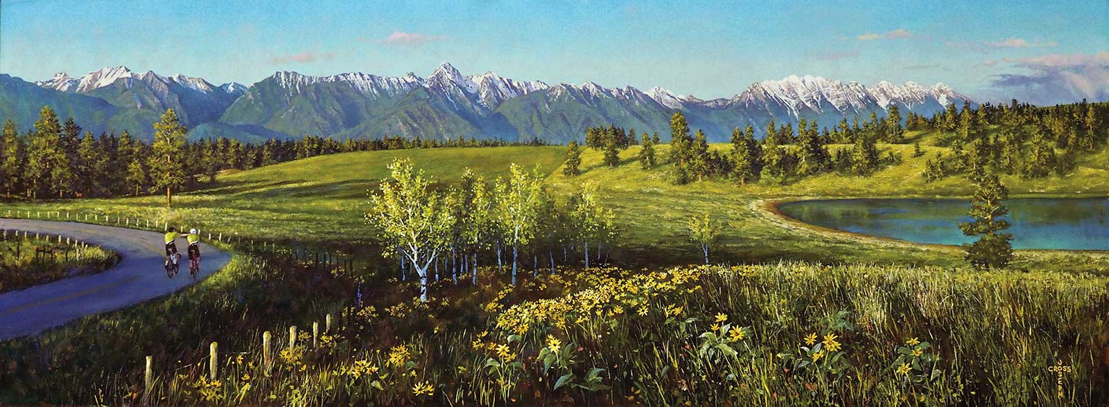 Spring Training for the Fondo, 18 x 48" (45 x 121 cm)
Joseph Cross British Columbia, Canada
My Inspiration
Rotary Clubs enhance our communities. When asked to support them through donating a painting for their annual Gran Fondo event, I quickly agreed. Being an avid cyclist and having lived very close to the location of this painting, I knew that cycling this scenic and winding road, having the splendor of the Rocky Mountains in full view, is what inspires most everyone who travels this route.
My Design Strategy
Composition was challenging in creating the joy of cycling amid such beauty. I wanted the flowering balsamroot to invite the viewer to the hills, then to the distant Steeples of the Rocky Mountains, with the cyclists being secondary, thus the long horizontal view. Mid-ground buildings and telephone poles were removed, because when cycling, it’s only the mountains and the feeling that matter. Strong early evening light gives it a peaceful glow.
My Working Process
After several site visits, gathering photographs, I designed the format and size of the painting on my computer. The layout is done loosely with charcoal on prepped MDF board, which is easy to change until I’m satisfied with the outline. Painting begins loosely with a base color, followed by my darkest darks with suggestions of lightest values. Details are added until I sense it’s finished.
Contact Details
Email: josephcrossart@me.com
Website: www.josephcrossart.com
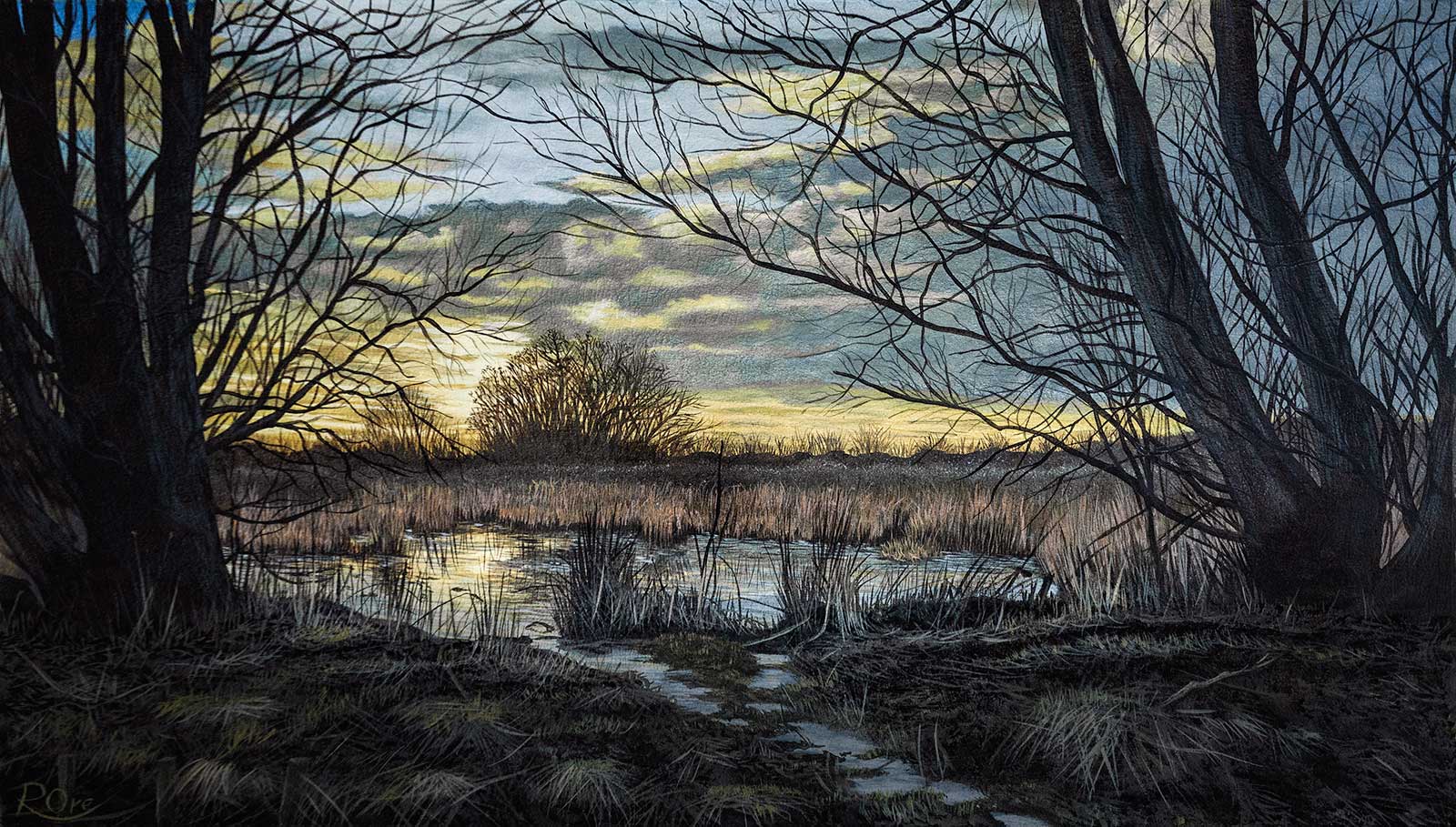 South Norwood Country Park, oil, 15½ x 23½" (40 x 60 cm)
Raymond Ore London, UK
My Inspiration
I have a diagnosis of autism and this means I need a lot of time alone. I mostly spend this time painting or going on long walks, and it’s on these walks I look out for potential reference material. I’m mostly attracted to the light and how it interacts with the environment but also the condition comes with an intense focus on detail, which I minimize but painting the detail is just too enjoyable.
My Design Strategy
After choosing the reference photo I’ll use an image editing program and play with the composition, color balance and light. This may include moving or deleting elements like trees. I will change the tonal value of areas to enhance the focal point usually by darkening them so they don’t stand out and compete. Photos often look flat so I’ll enhance the aerial perspective where I can, adding blue to the distance and using less contrast.
My Working Process
I start by sketching out the main elements very simply. Then I go straight in the first layer that is a very simplified version of the finished painting using just mid-tones; I’ll spend no more than about 40 minutes on it. The benefit of this layer is you immediately get to see if any adjustment is necessary and the next layer of paints flow better. I’ll then work from background to foreground in detail.
Contact Details
Email: ray@raymondorefineart.co.uk
Website: www.raymondorefineart.co.uk
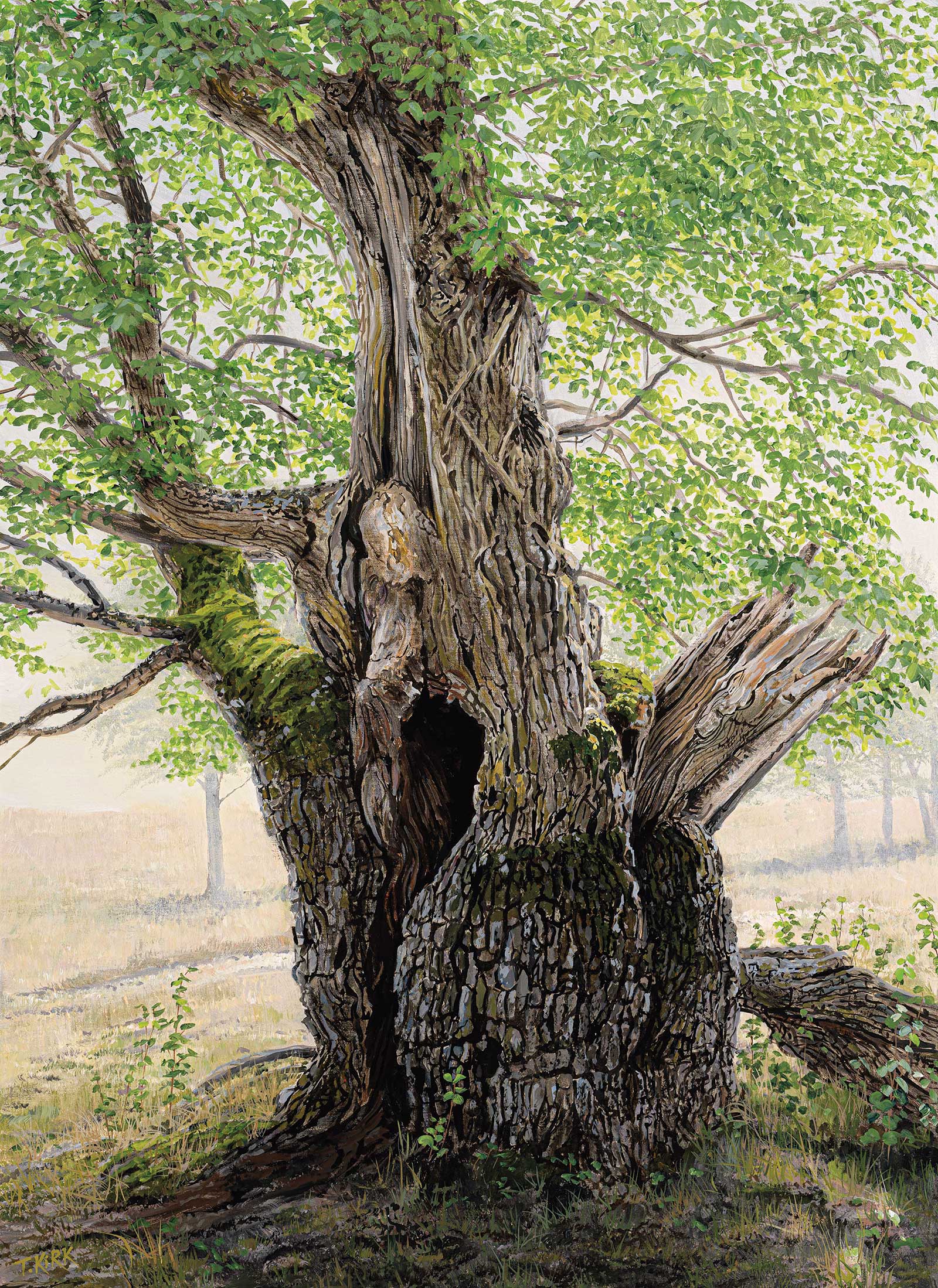 Hollow Oak, acrylic on canvas, 39 x 28½" (100 x 73 cm)
Troels Kirk Skane, Sweden
My Inspiration
I have been fascinated by old trees since early childhood. There is an air of history, endurance, strength and resilience over these wrinkled old beings that inspire me to paint their portraits. I am always searching for characterful trees to paint and find great pleasure in their company. This particular oak was found on the Gö island in the south of Sweden.
My Design Strategy
When doing the initial compositional sketches in the field, I search for the optimal angle and crop to display the tree’s features. I rearrange branches a little, and remove any disturbing elements in the back- and foreground, to isolate the tree. For this old oak, I chose to soften the lighting with a summery heat haze, to avoid too deep shadows and get a rich range of greens in the foliage.
My Working Process
A stretched Belgian linen canvas was given a coat of titanium white/naples yellow/ultramarine to establish the sky. I then drew the main tree features in pencil. The background was quickly painted, then hazed under glazings of white and naples yellow. A base coat of raw umber for the bark was followed by a fine detailing brush and a lot of patience. Finally the foliage was dotted in, from translucent lights to opaque darks.
Contact Details
Email: info@troelskirk.com
Website: www.troelskirk.com
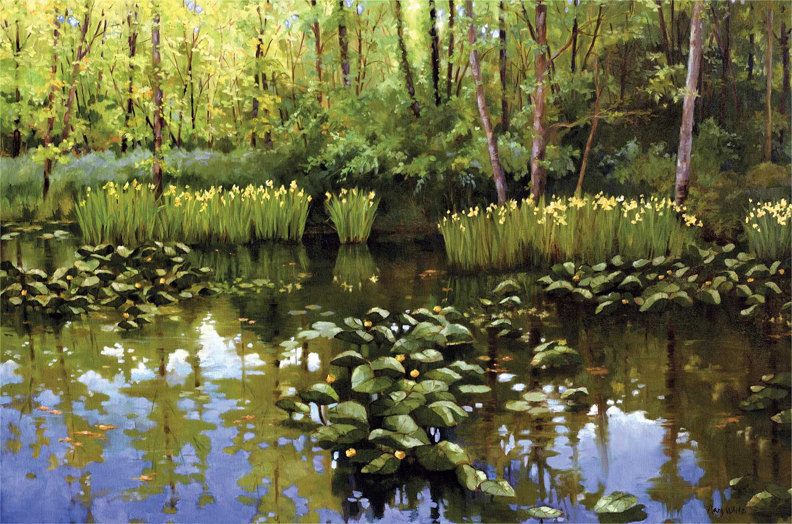 Iris and Lotus, oil, 24 x 36" (60 x 91 cm)
Mary White Ohio, USA
My Inspiration
I live on the edge of the beautiful Cuyahoga Valley National Park, where I frequently paint in plein air. The location I chose for this painting attracted me in the way the sunlight backlit the trees and created a brilliant blue sky reflection on the water’s surface. I love the ephemeral quality of this scene; it all changes so quickly, and I wanted to capture this brief moment in the season of spring.
My Design Strategy
I painted this scene originally as a small plein air piece. When working out the composition for the larger painting, I cropped out the sky above the tree line to focus more attention on the pond reflections. I edited the pattern of the lotus leaves in order to carry the viewer’s eyes around the painting. My goal for this painting was to create distinct planes of depth, and retain the brilliant sunlit colors.
My Working Process
For landscapes, I always tone my canvas with a thin wash of burnt sienna. I establish the large abstract shapes with vine charcoal, followed by more detailed drawing with burnt umber and a brush. I make some marks across the canvas, establishing my darkest and lightest colors. I keep my paint lean as I lay in my dark areas, building layers of colors, keeping my value contrasts well-defined, finishing with highlights of tinted white.
Contact Details
Email: maryeaglewhite@gmail.com
Website: www.marywhitefineart.com
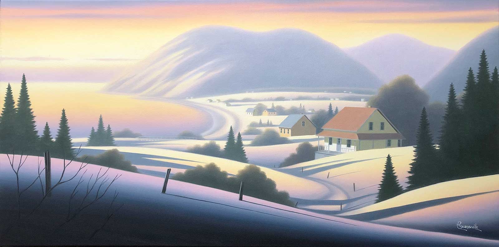 Fin d’hiver à l’Anse-Pleureuse, oil, 18 x 36" (45 x 91 cm)
Raymond Quenneville Quebec, Canada
My Inspiration
L’Anse-Pleureuse is a small village along the St. Lawrence River on the edge of the Gaspé Peninsula in Québec, Canada. Last time I went there, I was within a group of five artists (with Gérard Boulanger, Yvon Lemieux, Robert Roy and Yvon St-Aubin) who had as a mandate to produce a very special collection about the St-Lawrence. This painting has been created in this context and is now part of the collection Hommage au Saint-Laurent.
My Design Strategy
I visited this area many times over the years, doing sketches and photographs. On my last visit with the group in 2020, I did a small painting on site in order to capture the essence of the composition and the general feeling of the area. Having all that in mind and remembering the beauty of this coastal landscape during winter time, I finally decided to go ahead with a winter scene of the village.
My Working Process
Back to the studio, I transferred the sketch on a white canvas with minimal details using yellow ochre oil. Later on, I painted the whole landscape with a thin and diluted layer of oil colors. The following week I applied a second layer using pure oil. Another day was required to work out details and to complete the work.
Contact Details
Email: raymond.quenneville@gmail.com
Website: www.raymondquenneville.qc.ca
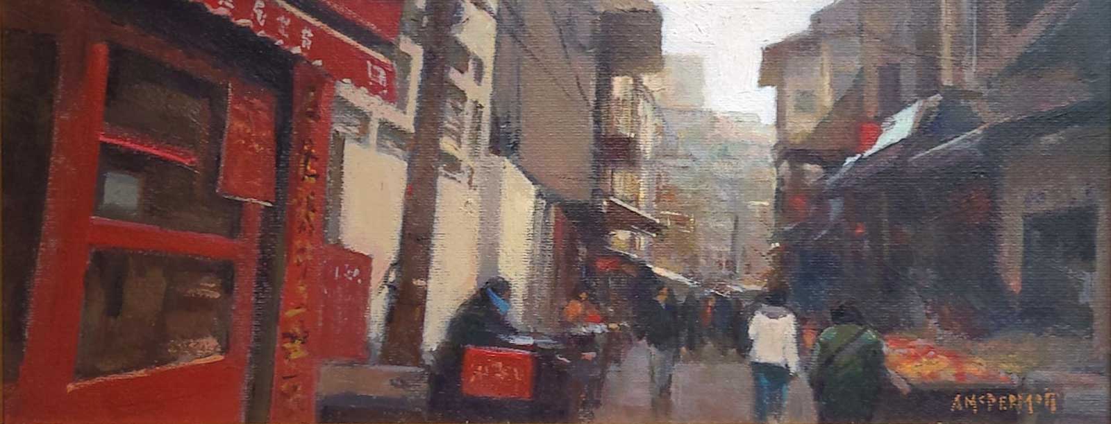 Moving Forward, acrylic, 6½ x 16" (16 x 40 cm)
Andrew McDermott British Columbia, Canada
My Inspiration
Urban city scenes are my favorite subjects to paint. I love creating buildings, cars and people bustling about. The lighting caught my eye in this scene of an outdoor market entrance while visiting Hong Kong.
My Working Process
Initially I don’t sketch or draw but begin to paint in black and white. At this stage it’s all about the values and composition. I then glaze with transparent color; this is the start of working fat over lean. I continually build up layers of color working from larger shapes to smaller shapes. finally adding details and making adjustments until I have my desired look. My aim in this piece was to capture a moment in time and also to have a sense of depth in the scene.
My Design Strategy
I love long formats either, horizontal or vertical. I find them much more interesting than many standard square and rectangle sizes. My main compositional focus was to create a visual lead in from the foreground to the background. Besides using shapes to create this lead in I also used the color red to guide the viewer’s eye down the side.
Contact Details
Email: mcdermottart@hotmail.com
Website: www.mcdermott-art.com
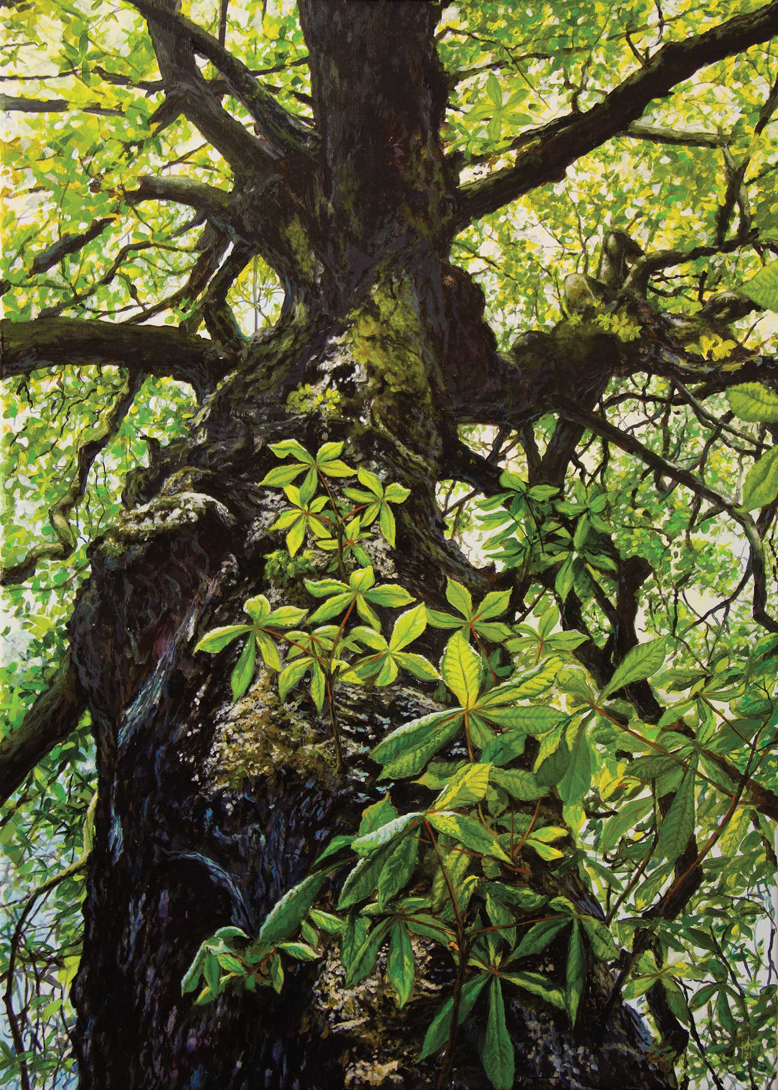 Chestnut Tree, acrylic, 27½ x 19½" (70 x 50 cm)
Jef De Corte Bijlokehof, Ghent
My Inspiration
I have always been fascinated by trees. When you look up to an old tree reaching its branches toward the sun, you realize that it has been there before you were born, and hopefully will still be there long after you are gone. History has left its marks on the bark, and the never ending play of the sunlight on the leaves and branches is always an inspiration for me to paint.
My Design Strategy
I was wandering in a small park nearby the Art Academy in Ghent while I was waiting for my son, who works there. Knowing I wanted to paint these beautiful old chestnut trees, I took several photographs with my phone. I already had a composition in mind with the old bark in the foreground and the interesting play of the upward branches. The new branches below, with the sunlit leaves, create a nice focal point.
My Working Process
Working from back to front, I started to paint roughly the background foliage and over that the dark color of the branches and the trunk. I add layer upon layer, creating an illusion of reality, but remaining playful in my brushstrokes. I knew the challenge in this painting would be to catch the play of sunlight in the leaves. I paid the most attention to detail of the leaves in the front.
Contact Details
Email: info@aeronaut.be
Website: www.jefdecorte.art
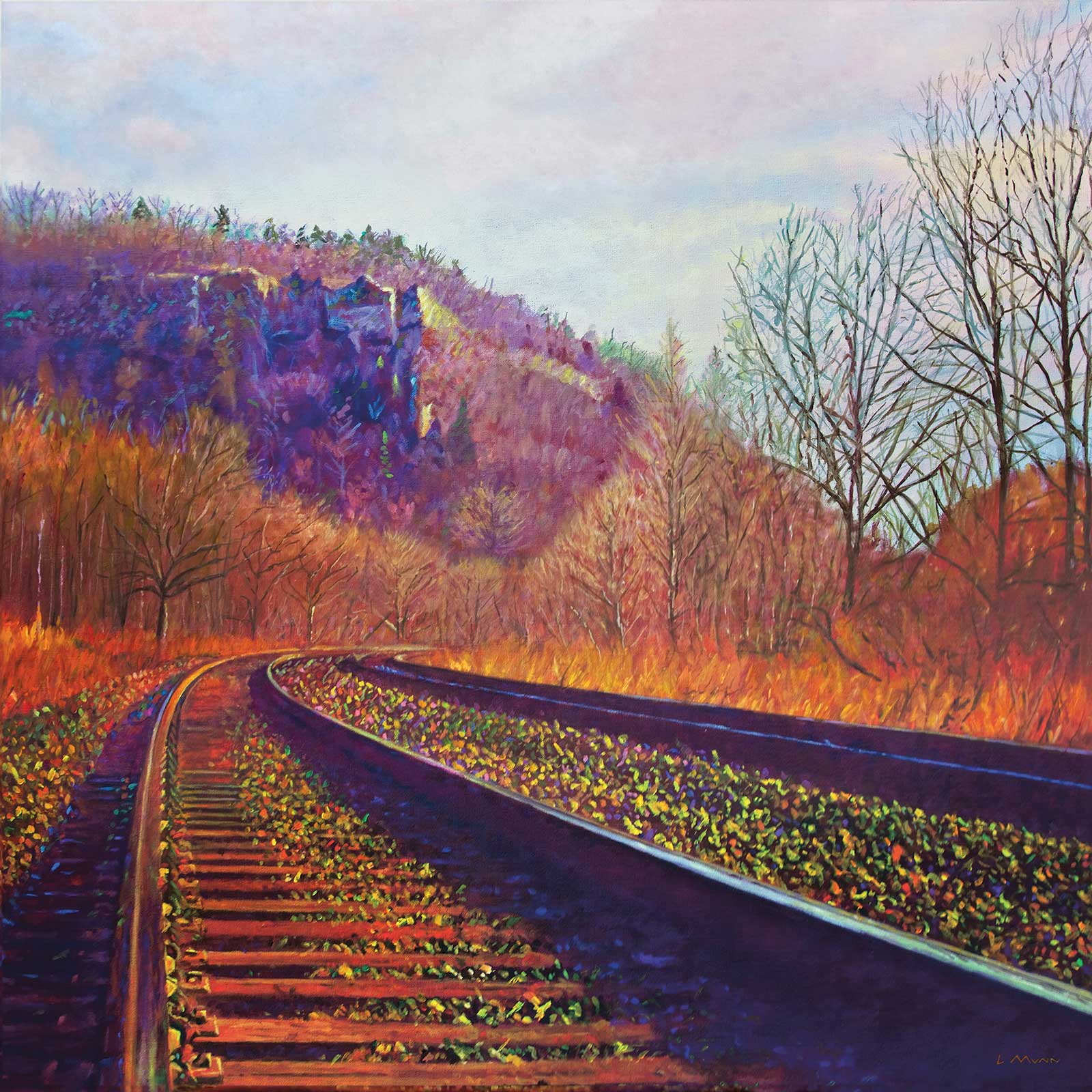 Missed the Last Train Home, acrylic, 36 x 36" (91 x 91 cm)
Lee Munn Ontario, Canada
My Inspiration
This painting is a view of Dundas Peak in Dundas, Ontario. I create most of my paintings from areas that I visit, in both Northern and Southern Ontario. But approximately one out of four of my paintings are done from photos that some of my friends have taken. This picture was taken by a wonderful Dundas photographer Cam Goede catching some powerful colors in late fall.
My Design Strategy
I really like to paint large. It is wonderful when the viewer is in front of a painting and has a strong feeling of being there in the moment. Landscape is my favorite subject; each season has amazing times to catch different views and strengths in the colors. Fall has to be my favorite time of year for artwork. I am inspired by light and how it changes the landscape visually and changes the mood of the moment.
My Working Process
When starting a piece I usually like to go out with my camera, a few paints and a small canvas for a basic plein air sketch. Then I come home to my studio to paint a larger, more detailed version. Starting with a basic tone, I put on a common colored gesso. As I paint, I start with the sky, trying to catch as much detail as I can within the clouds, but I usually always finish with the land. It is always the most detailed and can take some time to paint over with layers upon layers.
Contact Details
Email: leemunn@rogers.com
Website: www.leemunn.com