


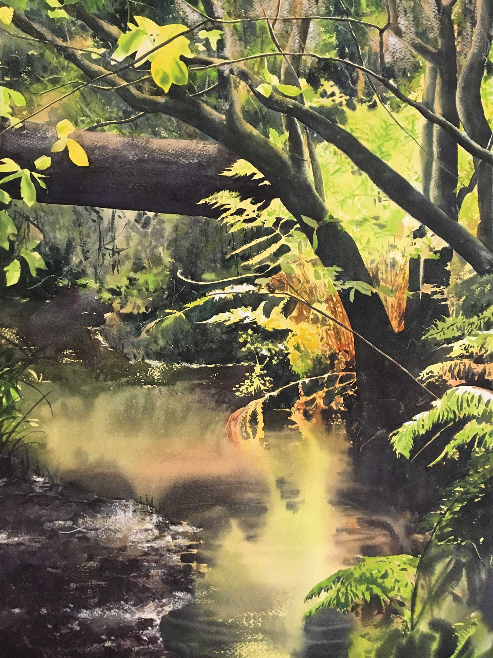
As a watercolor artist, I move from light to dark. And the lights, once relinquished, are hard to reclaim, sometimes impossible. As such, the lights are precious, and to be preserved. Which is true—illumination is what sings in a painting. The trap, however, is when we become too tentative and our fear of ruining the lights makes us do exactly that. Dynamic lighting needs strong, compelling darks to really succeed, and negative shapes can help us achieve that. We must be daring with our darks! The light is what sings, but the chorus of darks is what helps it do so.
 Inside, watercolor, 30 x 22" (76 x 55 cm)
The first thing that can happen when we begin to think negatively is that the “shoreline” between dark and light values can become more apparent—and much more important to us. When we paint dark positive shapes, we are often rendering objects, and the edges are presumed. A painting of a wheelbarrow, for example, has to have the shape of a wheelbarrow, if we are to decode it as viewers. But when we work negatively, we have to proactively build the dark shapes around what we are preserving. Suddenly, very little is presumed. That experience can make you particularly aware of your edges and push you to make them more varied and dynamic than normal.
Working negatively can also help us create more nuanced backgrounds in general. Often, when a positive shape is our focal point, we disregard the background—the sky, for example, is just what’s behind our tree in shadow. However, when we paint negatively that relationship is flipped. We spend a lot of time not painting our focal point, and instead dedicate a great deal of effort on everything around it, like a jewel in a crown. Focusing on negative shapes can help us activate what is normally just “extra” space.
Contrary to the typical narrative, where we easily read the dark positive shapes presented to us by the artist (backlit trees or mountains, houses, etc.), painting negatively asks viewers to see the “shapes made of light” first, in a dynamic, reversed order that can pull us in. Only after that does the painting begin to unfold, allowing us to see and mentally construct the darker objects. Building negative compositions that trap the light in this way, that hold on to the light the way hands brought together hold water, can feel backwards and counterintuitive in the beginning, but it can also open up new and compelling compositions that will grab ahold of your viewer’s attention for much longer. —
Stage by Stage Inside
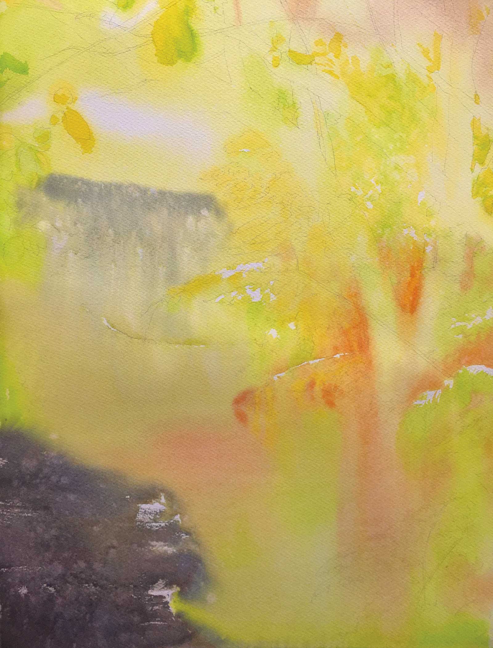 Stage 1
Stage 1 Rich, Bold Color
The first step is always easy and fun. The goal is to lay down rich, bold color with wet-into-wet strokes. This is as vibrant and bright as the painting will ever get, so I go for it. The only thing I’m really paying delicate attention to is preserving my whites.
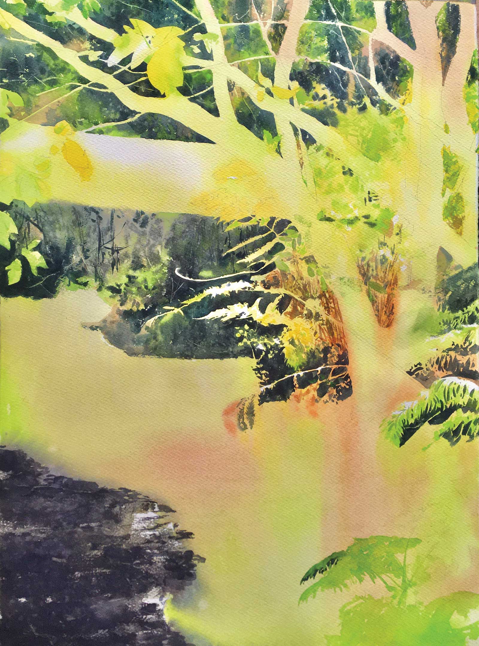 Stage 2
Stage 2 Building up The Background
I begin to paint negatively, building up the background in bite-sized pockets. This makes painting the complex edges manageable. This phase is primarily wet into wet, so any variety of value or hue is done now.
 Stage 3
Stage 3 Shadows
Here I add the fallen log and the shadows on the water. Note how the ferns really begin to take shape as I paint around them. I’m adding only the tiniest bits of pale chromatic shadow to them. The bulk of the work is done by not painting them.
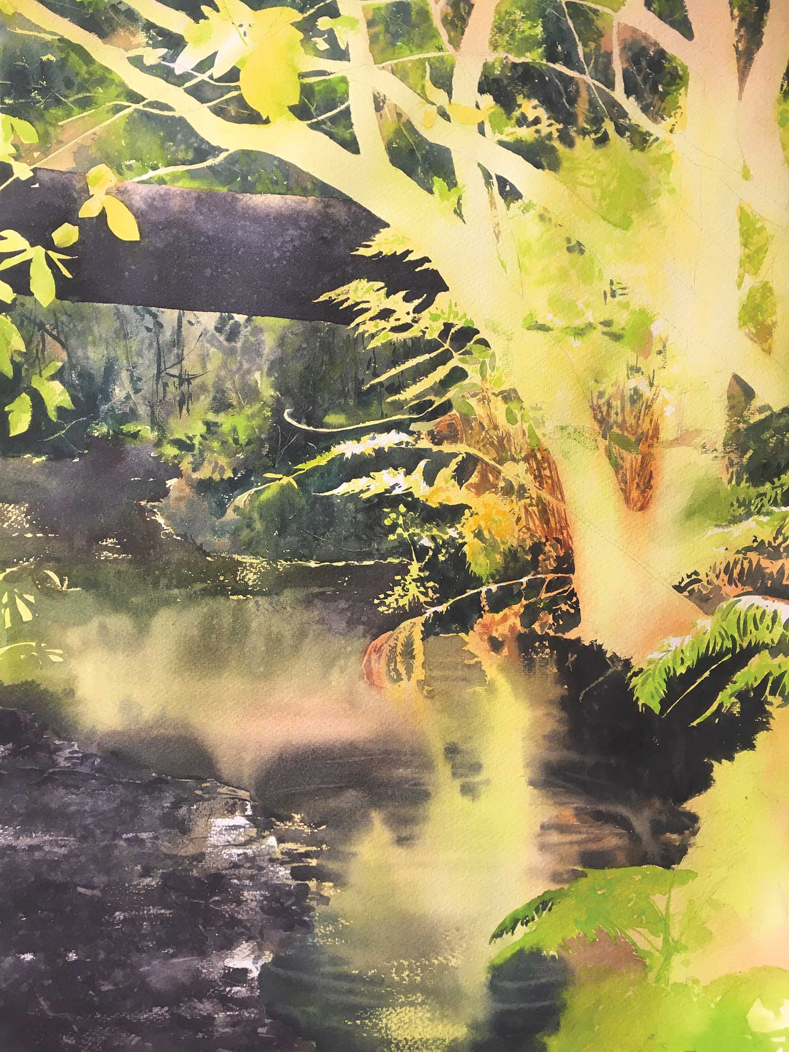
 stage 4
Stage 4 Dark Forms
I paint the dark forms of the winding trunks, and the last of the leaves begin to take shape. The lines of contrast guide you down to the ferns.
 Stage 5
Stage 5 Highlights and Other Details
I finish the last of the darks in the bottom right corner, and start to add highlights and details to background, adding interest to flat shapes.
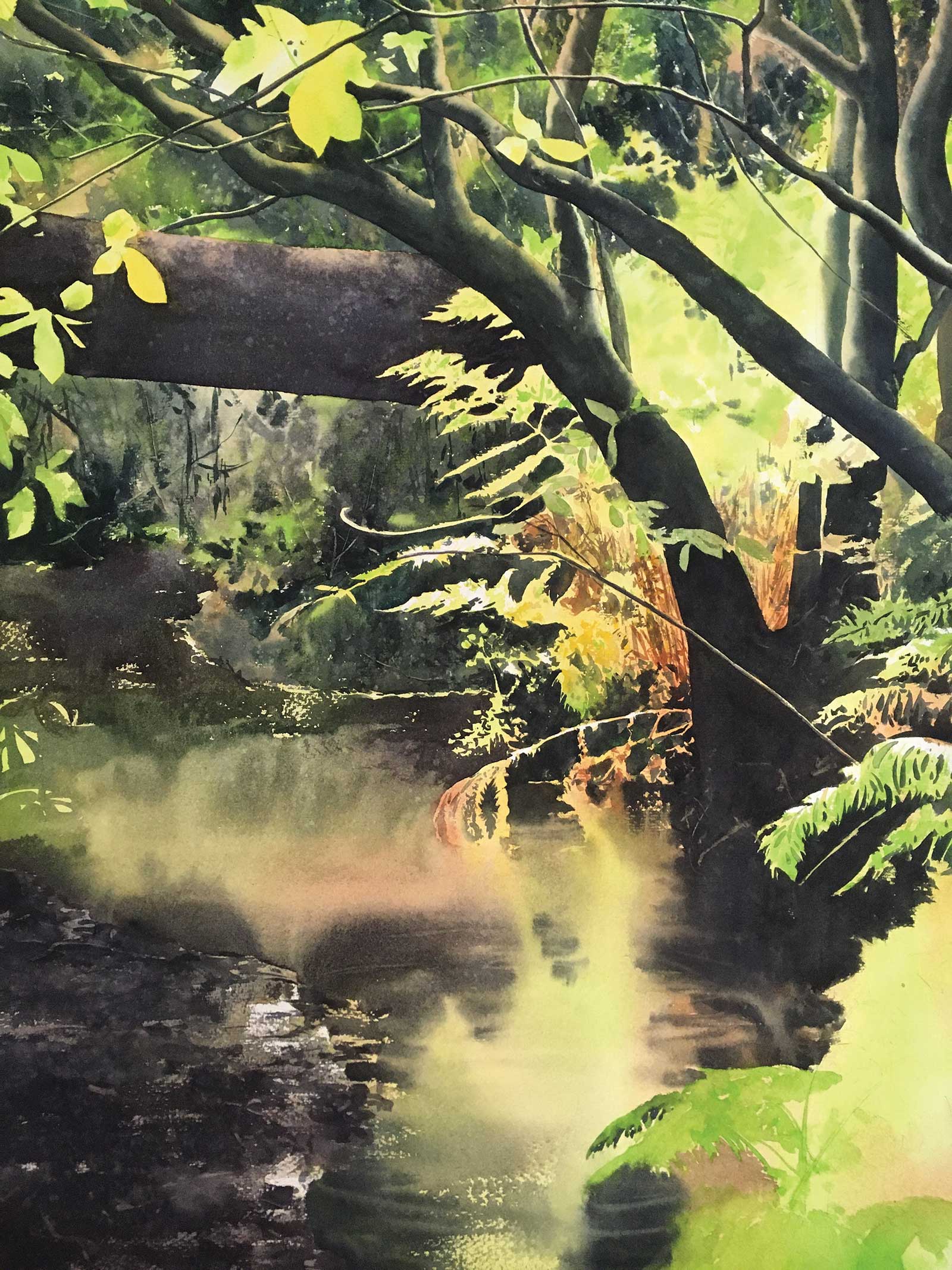
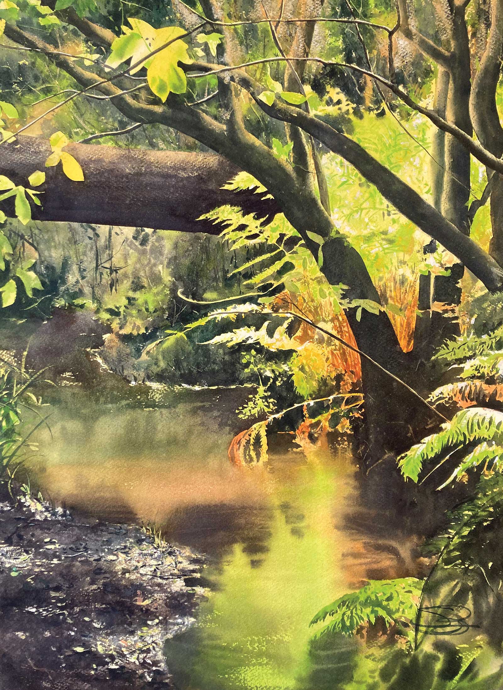 Stage 6 Inside, watercolor, 30 x 22" (76 x 55 cm)
Stage 6 Finished Artwork
I stretch the contrast more. Sharp, colored highlights go into the muddy shore with opaque paint to pull it into the foreground. I put a glaze on the water to make it darker and richer in color—I don’t want it to be as bright as the ferns.
The filigreed edges of the ferns, unfurling on the bank, provide a very dynamic “shoreline” between the light and dark values. The complex edges draw you in and provide many points of transit between the bright, negatively painted shapes and the more common, dark, positive shapes of the trunks. I add the last few white highlights to the ferns and call it finished. —