



When I prepare for one of my pastel paintings, I take a long time blending colors together on test paper to get the right tones and won’t begin the painting until I’ve at least got the colors for half the painting ready. I then take a mid-tone pastel on my white paper and begin drawing and mapping out the painting, filling in the respective darker and lighter areas carefully so I don’t lose the light of the white paper in the areas where I want maximum light.
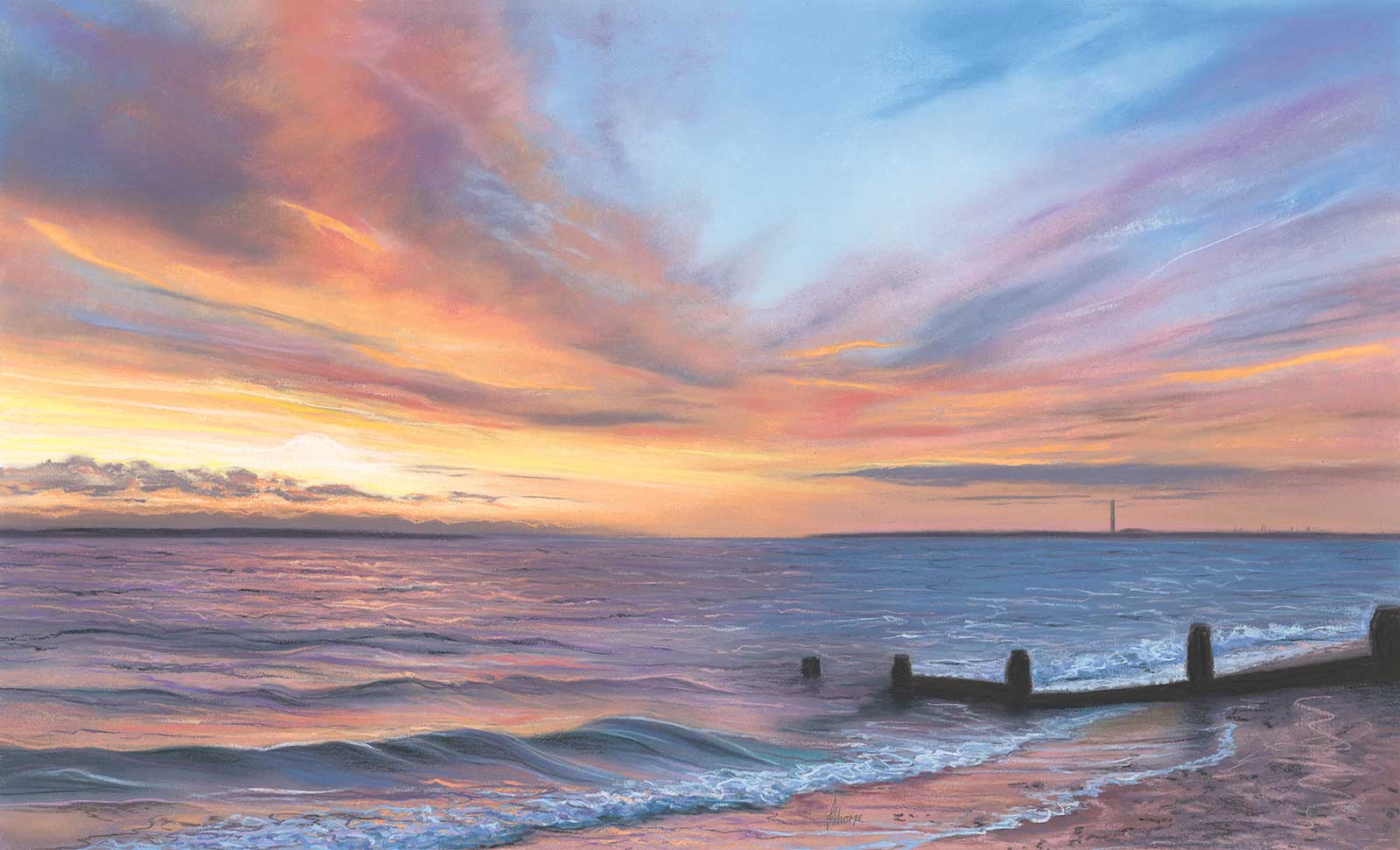
A Moment In Time, soft pastel, 24½ x 35½" (62 x 90 cm). As I stood gazing at this glorious sunset, I thought, I’ll never see the same sunset again and as I looked into the distance, poking up from the horizon I could see Fawley power stations landmark chimney rising high into the sky, its days are numbered and plans are in place for its demolition next year. The pandemic rages but will be gone one day. Everything we are and see is a moment in time.
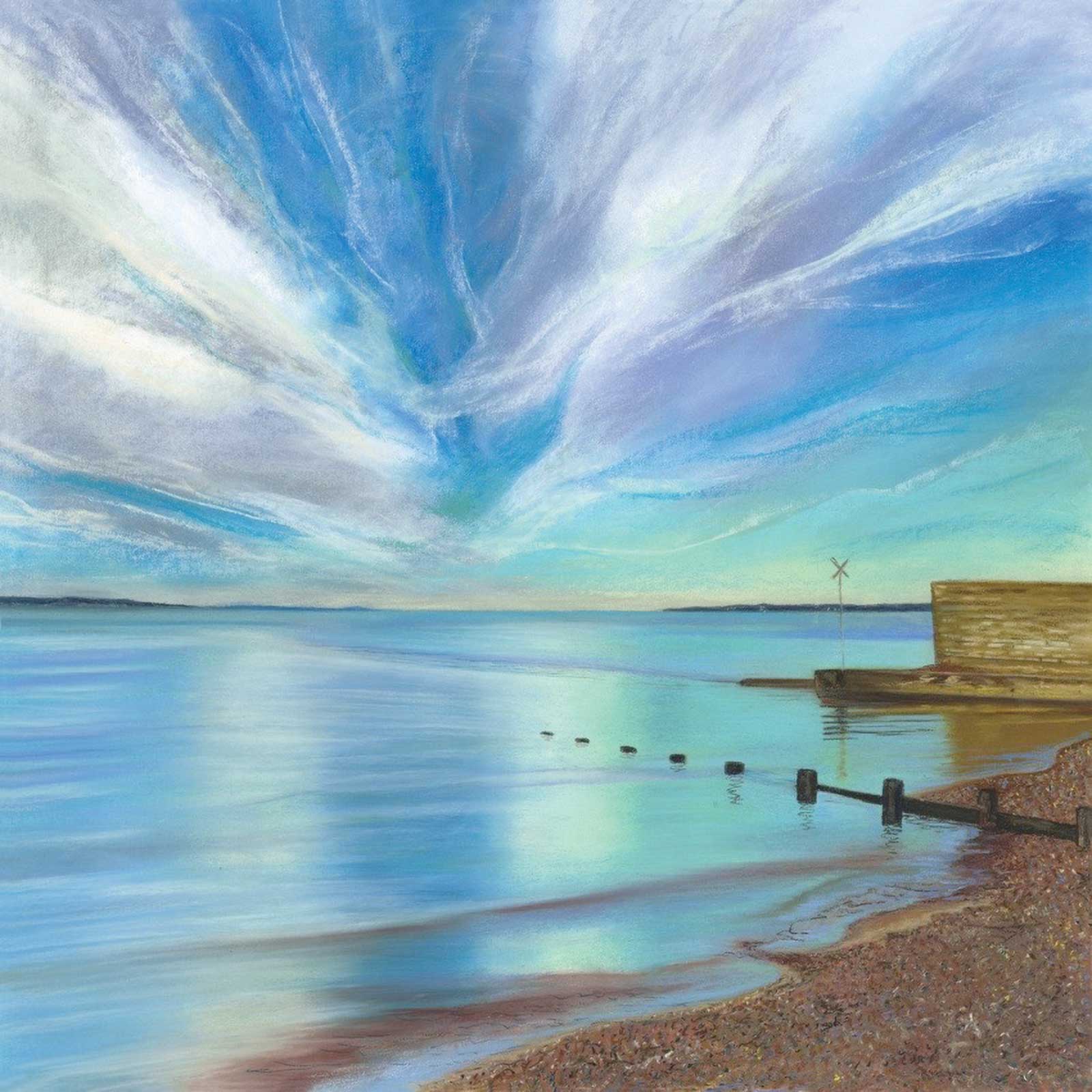
Mystical, soft pastel, 35½ x 35½" (90 x 90 cm). This is the start of my beach walk I take every day, and it’s never the same scene or feel. Some days it’s buzzing with people swimming, some days there is an army of dogs barking and chasing birds, and some days its deserted and tranquil. This day was mesmerising, the water was so still like a giant mirror reflecting the whimsical sky. It had a mystical quality and I just had to capture it.
This very first thin layer is rubbed in well and creates the base layer to build on. I then go in with a second layer of pastel and build up the depth and color, finishing with the final layer which picks out the detail and highlights. There’s not much room for error, once its full its full, and you can’t apply any more color. For the very detailed parts of my work I break the pastels into tiny shards and use the edges for the fiddly bits. Pastel pencils at this stage just slide over the top and don’t make an impression. To seal the finished painting I use a supermarket brand hairspray. Because it’s a cheap version it doesn’t have any additives and is basically a spray glue. In my experience some expensive fixatives tend to darken the painting.
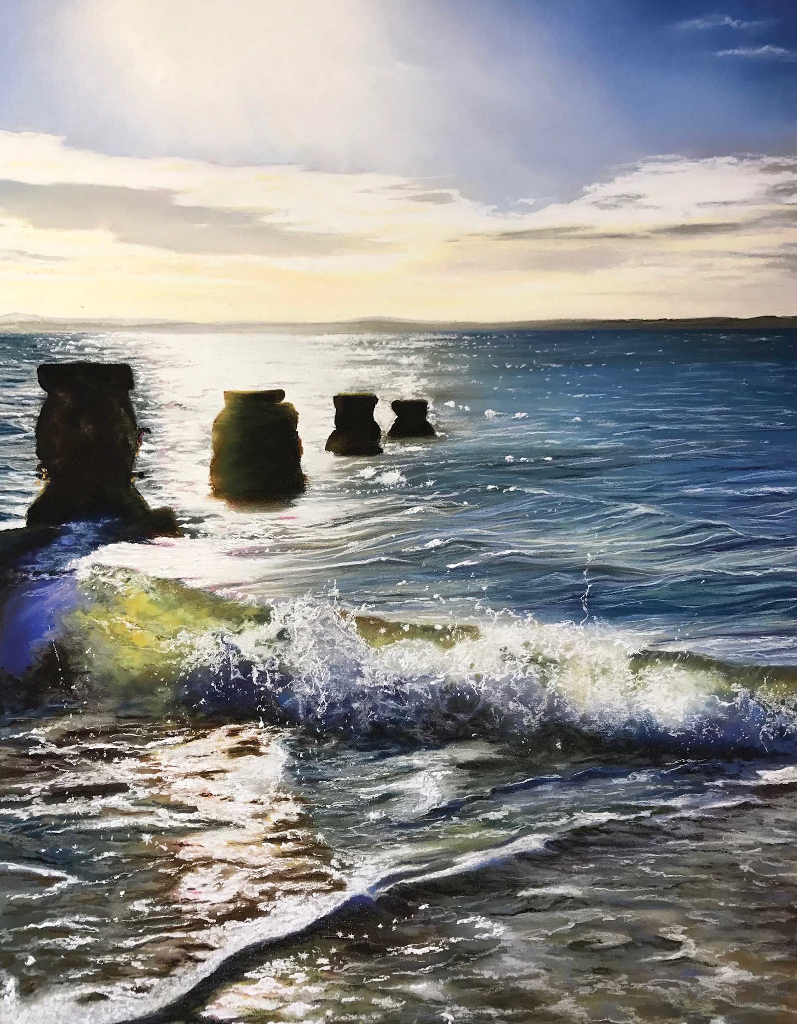
Brilliance, soft pastel, 45 x 29½" (115 x 75 cm) . I was fascinated with the brilliance of the sun. With the naked eye it was difficult to pick out the rainbow of colors in the scene because the sun was so bright, but once I started to paint, the more I painted, the more I saw. From bright pink in the sunbeam to vivid blue in the shaded areas, it all jumped out when I really looked.
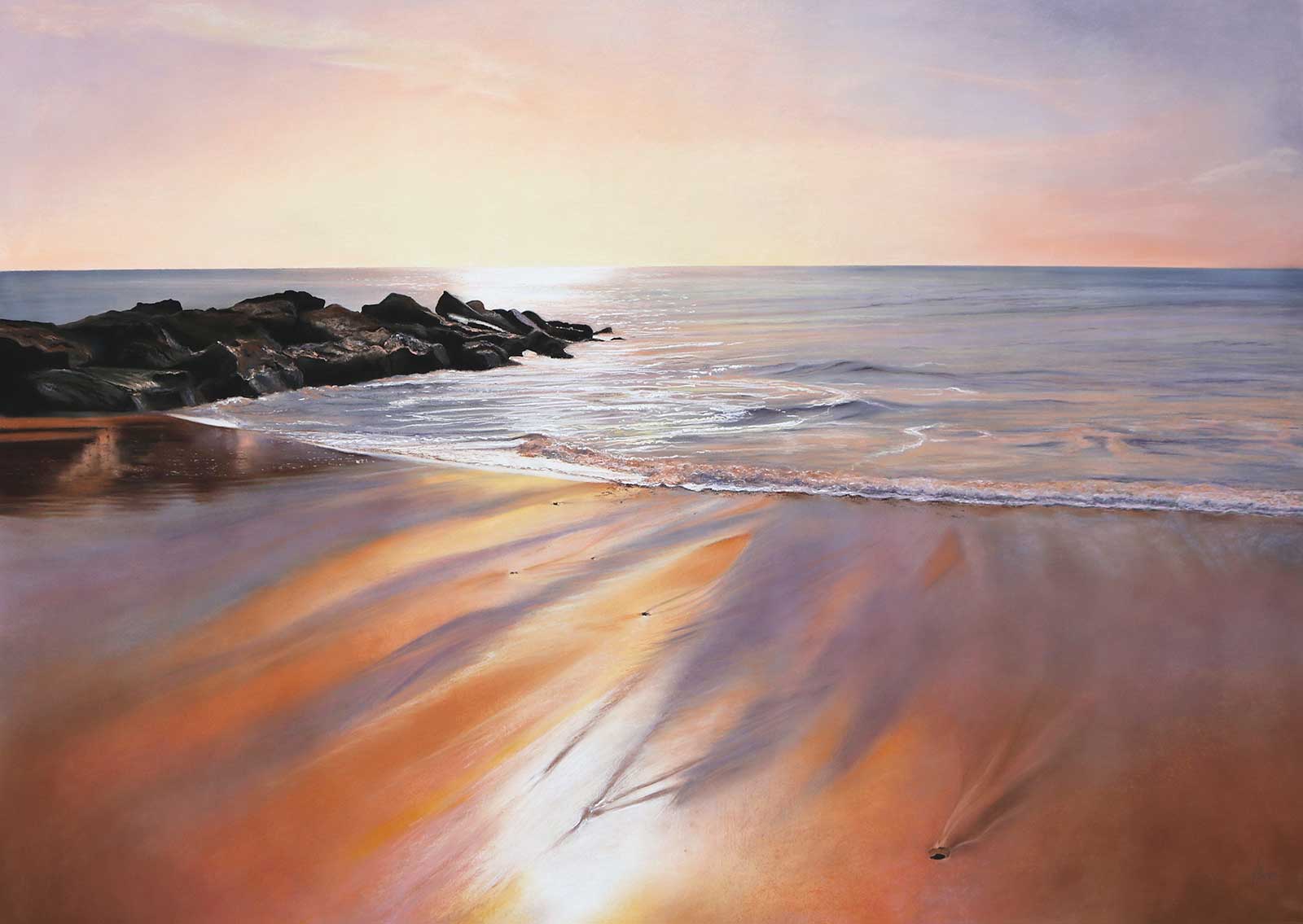
Blaze, soft pastel, 45 x 61" (115 x 155 cm). The sun was blazing down from the sky on a warm summer’s day at Hengistbury Head Beach. As the gentle waves rolled in and out on the wet sand, there were a few seconds just before the water was absorbed where the orange glow of the sun was reflected and the sand looked like it was on fire.
I think I’m drawn to soft pastels because it’s an immediate medium, there is no mixing on a palette, no brushes to find, you just pick them up and off you go. I get stuck in with my hands, I use my palms for the larger areas that need blending and my fingers to rub, dab and manipulate the pastels on the paper. You have to be careful with soft pastels not to mix the light and dark colors if you want vibrancy. It’s a delicate process which takes patience, some days I have loads and other days I get easily distracted. I tend to have a podcast or an audio book playing in the background. —
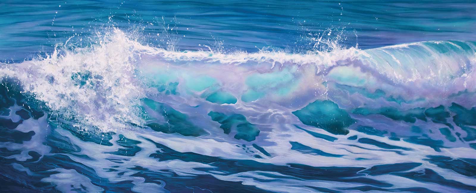
Magnificent, soft pastel, 35½ x 79" (90 x 200 cm). Aren’t waves magnificent? The way they rise from nowhere to a crescendo and then come crashing down only to start the whole process again. My aim is always to find the light in a painting and in this wave it was easy. I kept the color in the crest as crisp and pure as possible to give it the luminosity it required to back light it. Also, turquoise is my favorite color.
About the Artist
 Jennifer Thorpe
UK-based artist Jennifer Thorpe only found her love for painting five years ago, but she’s always been creative in one way or another. Never in her wildest dreams did she think she could produce a painting that others would appreciate, let alone win an award in a pastel exhibition at the Mall Galleries, London in her first year.
Thorpe is fueled by nature and its cycles, from day to day, month to month, it never fails to disappoint. She lives by the beach in Hill Head on the South Coast of England. Every day come rain or shine, Thorpe takes walks and each time she is filled with excitement and anticipation, camera in hand taking hundreds of photos every week. She already has a lifetime of material but can’t seem to stop collecting moments. Thorpe is always looking up or looking intently at the colors emerging through the crest of a wave, or at a sunset reflecting in wet sand. There’s always something wonderful to see, and this is why she loves to replicate what she sees realistically. Thorpe harnesses her ability to see the subtle changes in color and pick them out in her paintings.
Contact at
jenniferthorpeart@gmail.com
www.jenniferthorpeart.com