


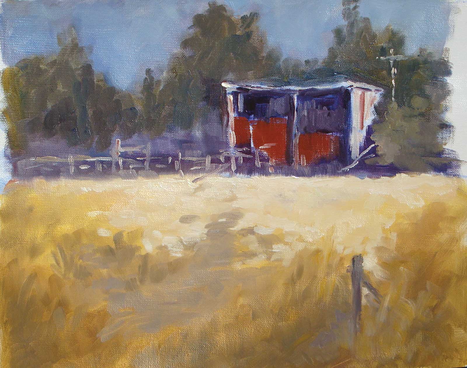
In every painting I try to create a single center of focus that grabs the attention more than any other part of the painting. This focal area is usually the thing I love most of all in the scene, the one thing that spurred me to paint it in the first place. Whether that’s a crashing wave, a particularly nicely lit rock, a glowing piece of beach, or in this case, a spot lit rustic barn—whatever it is, I try to make the whole painting become the stage for that focal area to strut its stuff on.
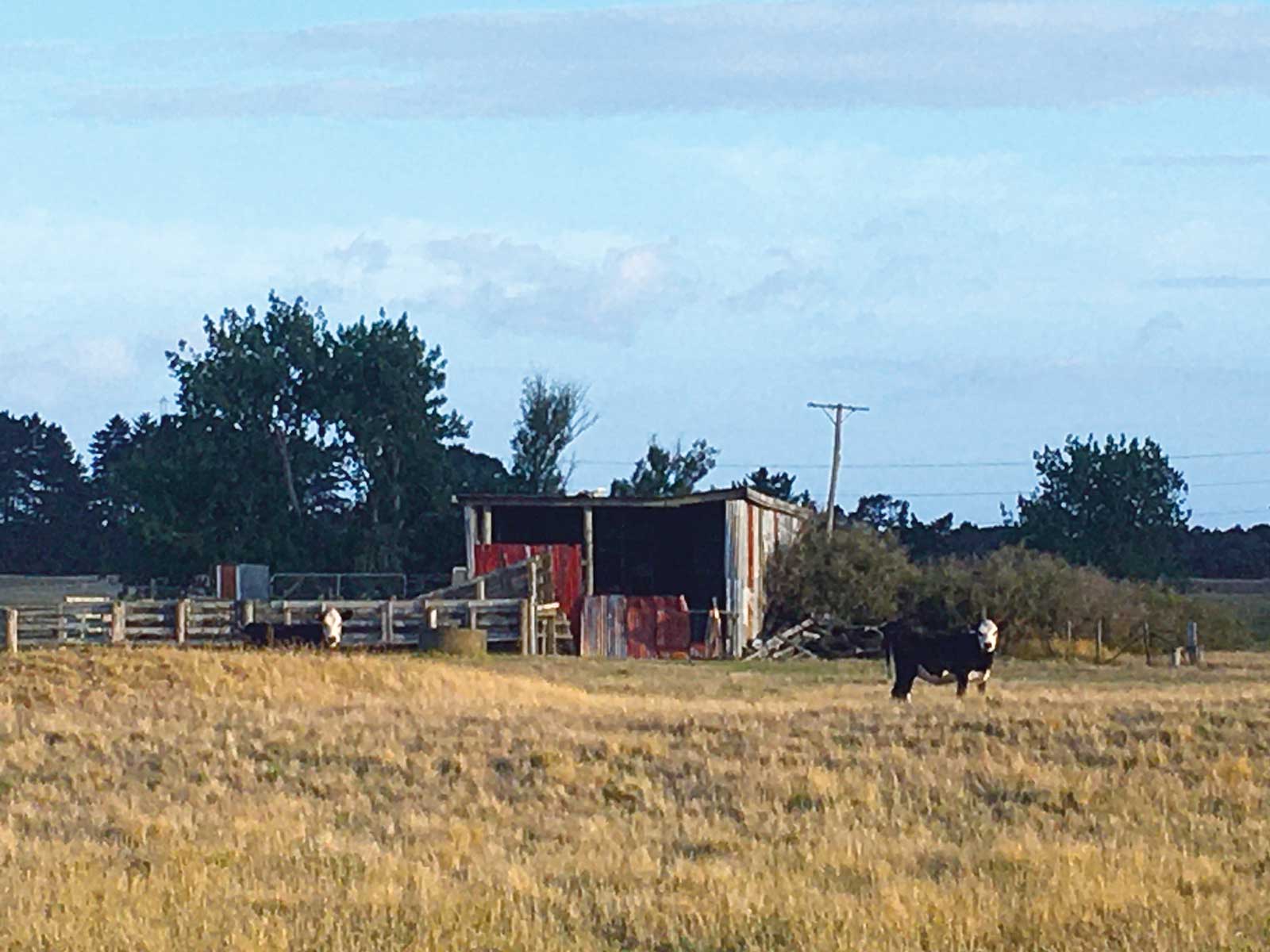
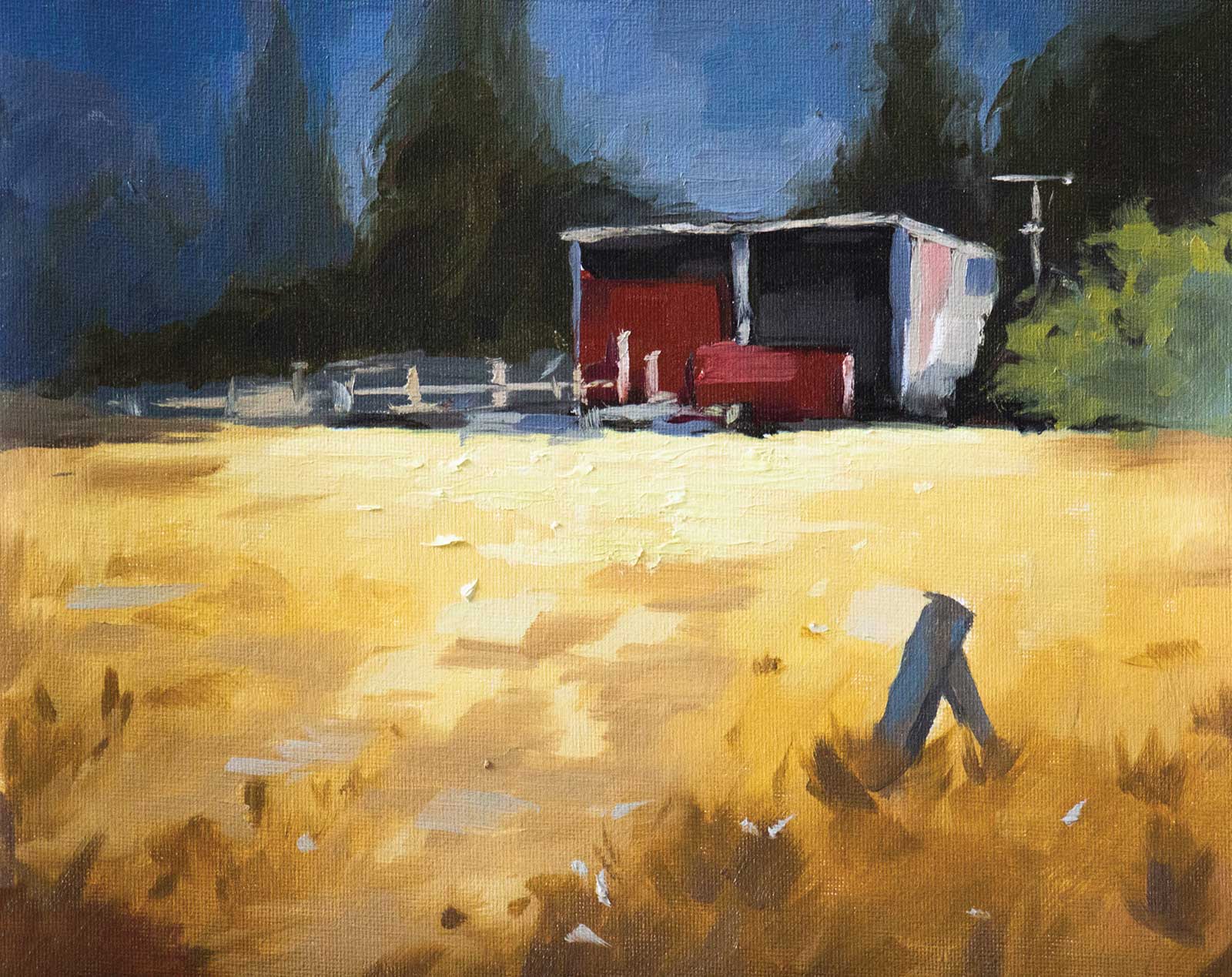
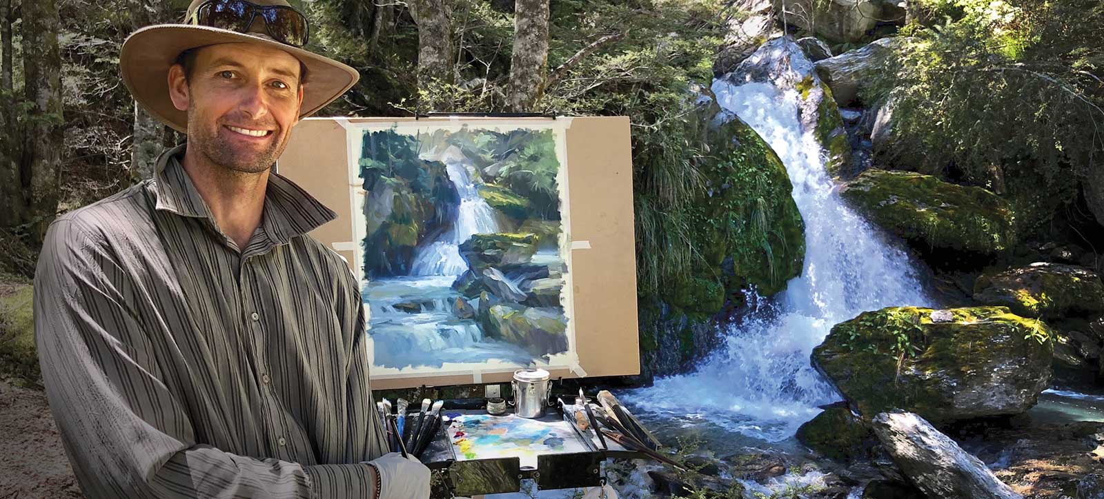
Resource Photo
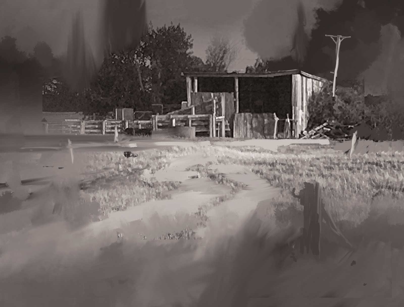
Sketch
When I see that done well in a painting, I get a much better sense of what the artist wants to express about a scene. It’s the feeling of the song, the main taste of the meal, the theme of the story. There are so many ways to actively direct the eye. In this rustic barn painting I’ve demonstrated five methods. Here they are in order of importance:
1. The spotlight effect. I’ve slightly shadowed everything outside of the center of interest. I especially darkened the background in order to make the highlights on the shed really pop.
2. Leading lines. I added the foreground path through the grass with interesting diagonals that lead to the shed. The angles of the dark hills also lead towards the shed.
3. Strongest contrast. The darkest dark and lightest light are found in the center of interest.
4. Most vibrant color. I’ve enhanced the red in the barn and the yellow grass, and slightly grayed down the colors outside of the center of focus.
5. Thickest paint. The thickest paint is applied in the light areas in the barn and sunlit grasses giving this a more interesting texture to attract the eye, in contrast to the relatively smooth paint outside that area.
Keep those five things in mind next time you’re building a painting and you’ll be surprised at the powerful effect you can achieve. It just takes a little planning. You can also improve your older paintings by applying these five ideas. Have a go and see what a difference it makes! —
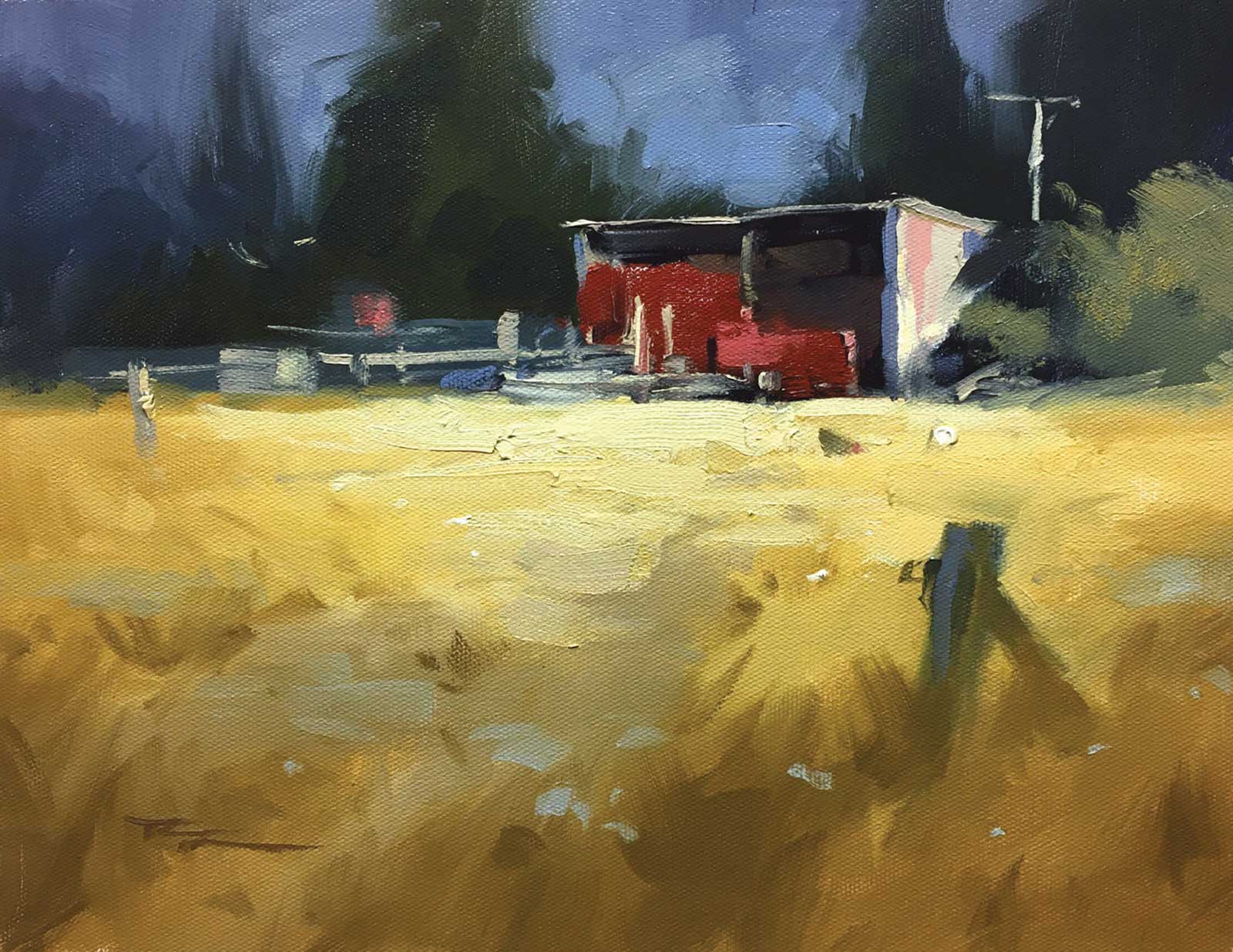
Richard Robinson, Rustic Farm Shed, oil on canvas, 10 x 12" (25 x 30 cm)
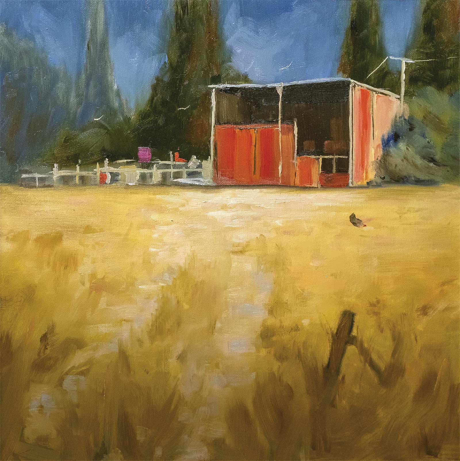
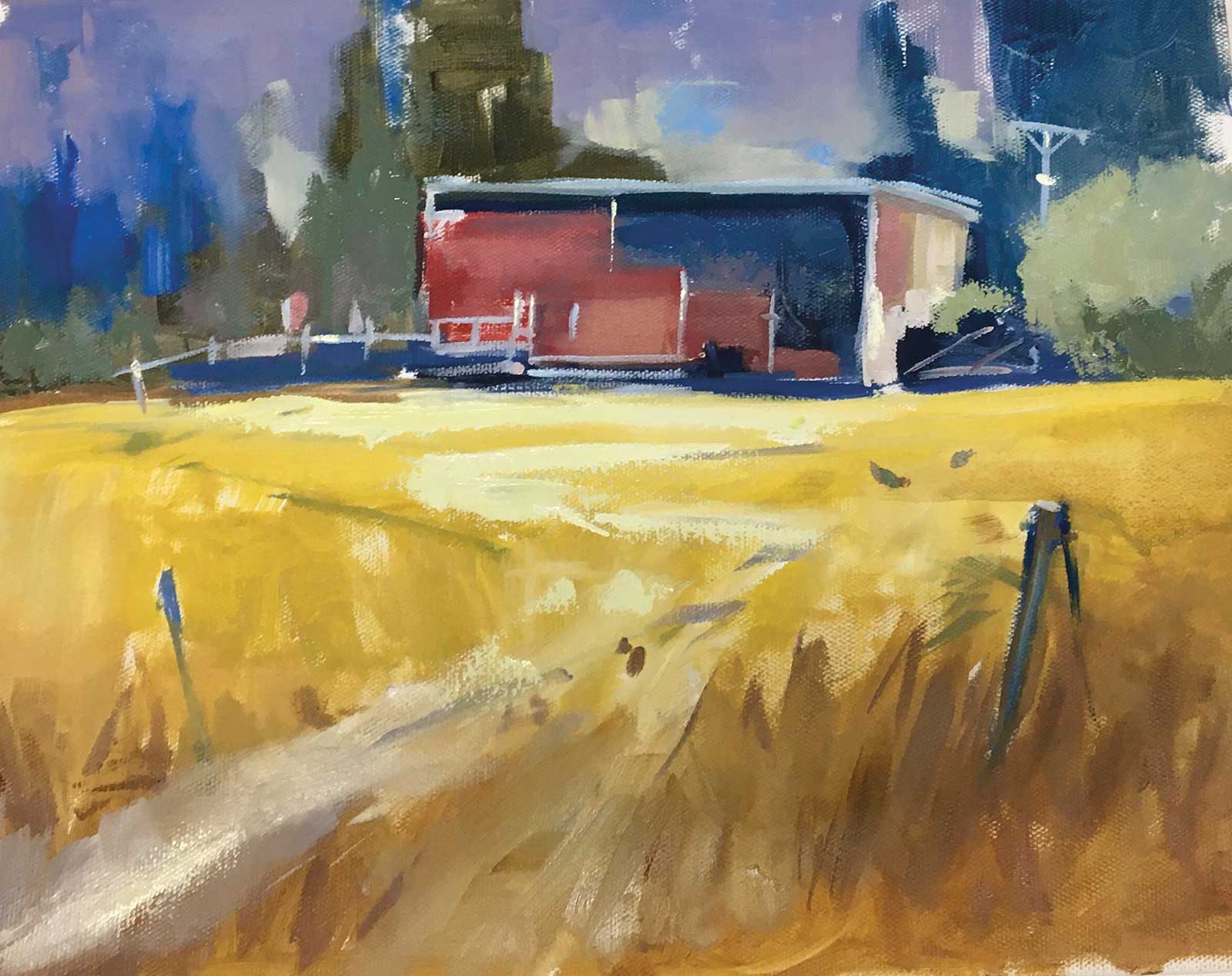
Student Critiques
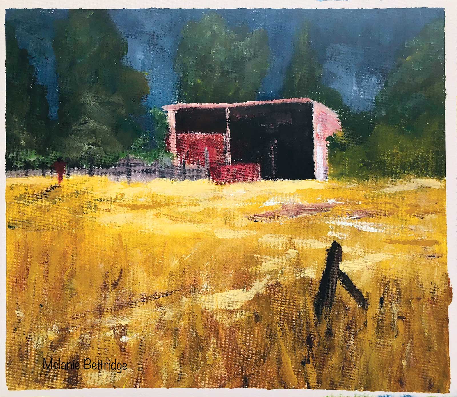
Melanie Bettridge
Good job Melanie. Very strong color and good value range from dark to light making this quite a punchy image. I’m not sure if this is oils or acrylics because it has a lot of dry brush effects like acrylics generally give, but it also has some impasto work as well. Either way, if you were trying to achieve the softer fluid look of wet-in-wet painting rather than drybrush, the key could lie in your choice of canvas. A smoother canvas with a good primer will absorb less paint than a thicker weave with less primer, making it easier to paint smoothly since there’s more paint left on the surface with each stroke. One student I had once accidentally painted on the rough unprimed back of the canvas, and it was an uphill struggle getting paint to cover the canvas. (Until I turned the canvas over).
Anyway, drybrush may have been your goal. One thing that would help the realism of your shed is to focus on getting the variety of color in the lit surfaces. At present it’s mostly all light pink, though a closer look at my demo painting and the photo will reveal blue-gray halftones throughout. Your small fence posts could do with some more attention too. Hope that helps.
Thelma Woodward
Hey Thelma, love the impressionistic feel of this! All those little brushstrokes are making this painting sing with vitality. The area behind the fences has got a little muddy with that mid gray—could do with some bushes in shadow or something there. Also, the light patch in front of the shed could be transitioned more softly into the foreground shadow to give a better sense of light and shade. That light area has also gone a bit flat because it needs a few thin horizontal shapes within it to help define its surface quality. Overall, great job!
Tiffany King
Beautiful work, Tiffany! The color and values are very strong, and you’ve kept your color pure throughout. I love the vibrant edge work you’ve treated your distant trees too—shimmering with energy. I wouldn’t change a thing, except to add some chickens for a little more interest. Nice!
Robert Ardill
Hi Robert, good effort here. You really nailed that soft shadow transition from foreground to midground, and that’s forcing the eye into the center of interest. Great to see you trying out the square format. Good subtle work showing the inside of the shed. I would like to see its poles thickened a bit and use some gray blue in there to delineate the shadow sides of the poles, etc. Having it all the same color is flattening it out. Your furthest tree on the left needs a lick of paint to stop the canvas showing through. Also you could try again with the fences. Looks like you started out with a regularly spaced fence and then thought better of it, adding some thicker bits. Thing is, everyone knows what a fence looks like and it’s your job as an artist to make something more lyrical out of it. Think of musical notes in a jazz piece—different weightings, different spacings, different timbres. You’re getting the idea, but it’s not quite there yet. Enjoy!
Rebecca Lockyear
Love the block style, Rebecca! Would like to do some more of that myself. Really good variety of shapes—big flat shapes contrasted with small crisp details. Nicely done! I wouldn’t change a thing except to just fill in a few holes where the canvas is showing through and make the shed more ramshackle by bowing the roof a little. Great!
About Your Tutor
 Richard Robinson
Richard Robinson is one of New Zealand’s premier outdoor painters. You can view his extensive online lessons at www.mypaintingclub.com.