


As a young child, I was always drawing. My two favorite subjects were sport and wildlife themes. Around first grade, I won first place in the San Francisco Chronicle’s contest with my drawing of an elephant and my prize was a pass to the San Francisco Zoo and an elephant key to the audio boxes in front of many of the enclosures. That award set me on my path that continues today.
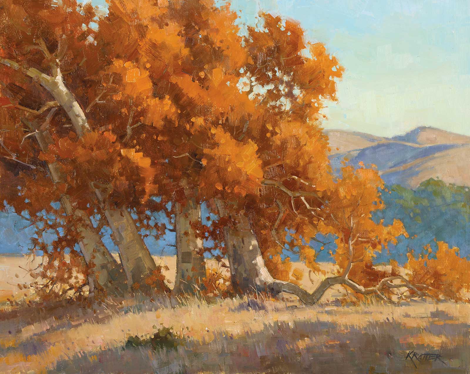
Autumn’s Last Breath, oil on linen panel, 16 x 20" (40 x 50 cm) The leaves of the sycamore trees were still clinging onto their branches. The design of the trees leaning to the left and the counterbalance of the bent limb to the right was what attracted me to the scene along with the orange and blue complementary colors. The foliage is a series of ovals, and the angled trunk shapes are unique to sycamores. I was very honored that this piece was accepted into the California Art Club’s Gold Medal Show in 2019.
In 1976 I was accepted to the prestigious Art Center College of Design in Pasadena, California, where I majored in illustration. Those years were the most formative as I learned solid drawing skills, composition and concepts, which are now so important in my wildlife work. I had many great teachers including Dwight Harmon, Dan McCaw and Joseph Henninger, but most influential was the young, outgoing and prolific artist Craig Nelson, even though I was never officially registered in his class. Fellow students were equally inspiring including Larry (Lawrence) Carroll and Tia Wallace who became my wife in 1981. In 1980 I graduated with a BFA in Illustration. Immediately thereafter I started my freelancing career which lasted the next 22 years. Sports and wildlife continued to be my favorite themes.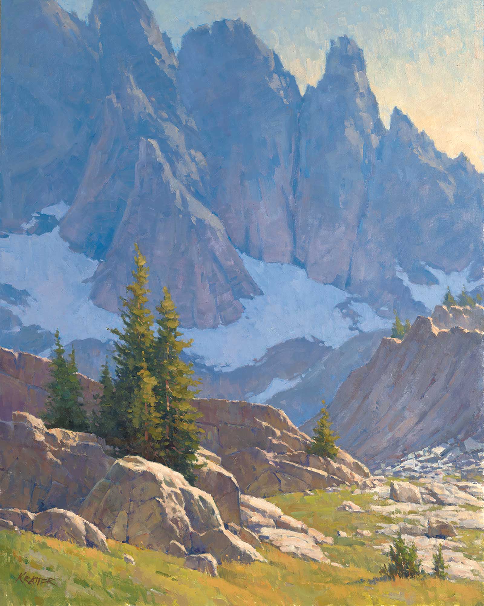
Sky Bound, oil on linen panel, 30 x 24" (76 x 60 cm) The first thing I saw was the diagonal shapes and the two vertical pine trees. I wanted the eye to zig-zag from the left foreground past the rocks and down the boulder-strewn area on the right, finally to the mountains, as if you were a hiker. The hazy atmosphere was a crucial aspect of the painting, and the low horizon makes the mountains feel like they rise high into the altitudes.
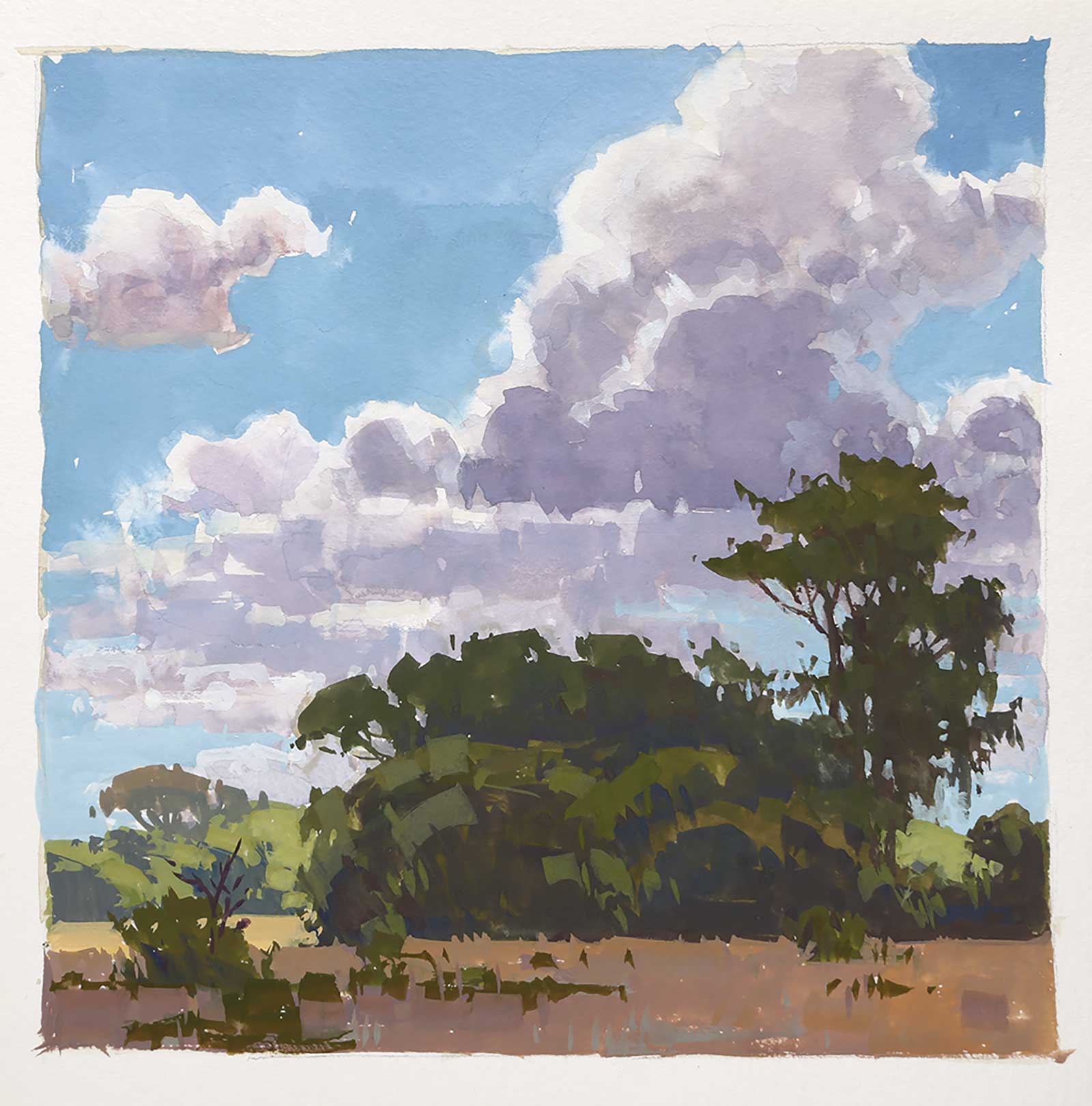
High Clouds, South Africa, gouache on watercolor paper, 7 x 7" (17 x 17 cm) I dropped the horizon line so I could include the huge, billowing clouds. The design of them is a series of ovals with flat bottoms and most of the trees are designed the same way. The other two trees are very unique and give them some personality and the silhouette shapes make them very graphic. The background trees in the sun act as accents to the painting.
My career changed overnight when I attended the first Sonoma Plein Air, an event that struck me deeply because of the fresh spontaneity of the landscape paintings that I saw. The next day I bought a set of oil paints and started painting outdoors and I haven’t looked back. Within a few months, I was asked to join a few galleries and participated in other plein air events throughout California.
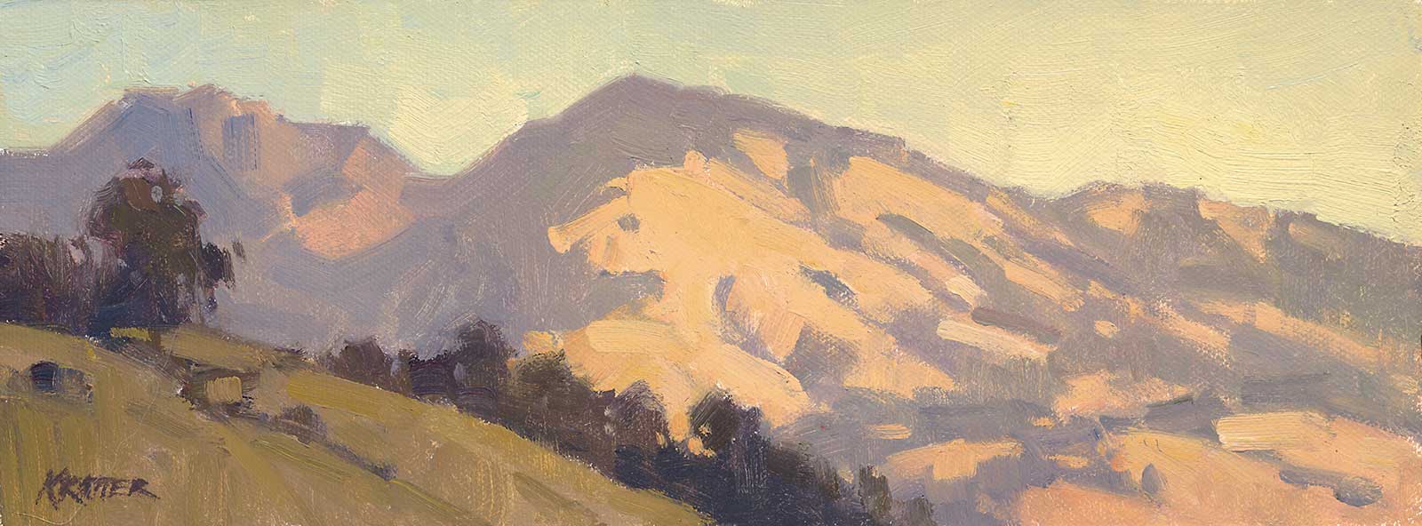
Mount Diablo, Golden Hour, oil on linen panel, 6 x 10" (15 x 25 cm) This might have been the fastest painting I’ve ever done. It took about 30 minutes because the light was changing so fast. I wanted the trees and grasses in the foreground to be in shadows and the mountain to be in the light. The golden hues of the light and the bluish shadows contrast with the muted and darker foreground.
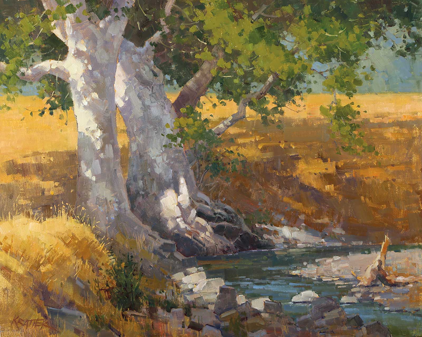
Creekside Curry Canyon, oil on linen panel, 16 x 20" (40 x 50 cm) I painted this in September and wanted the focus to be on the two sycamore trees while the winding creek would lead your eye into the piece. The trunks are like two pillars with strong, arm-like branches. The tree divides the horizontal band of the golden grasses. Dappled light was quite challenging to paint as it changed every few minutes. I followed my sketch which I kept at my feet rather than try to “chase the light.”
Traveling abroad is a very special treat, and I was fortunate to travel to three unique locations. My dad’s family is from Northern Italy, where I painted in the city of Venice and a small ski town in the Dolomites called Sappada. I still have relatives there and I plan to return with my family to paint and explore the rich, historical areas. For the past 40 years, I have been passionate about my work and I’ve never taken it for granted. It is truly a labor of love. —
My Art in the Making Golden Morning
Before I start my sketch, I set goals. In all my paintings I aim to enjoy the process. It’s so important even if I struggle. Sometimes I write down my goals on the easel or in my sketchbook. I want to loosen up, paint faster, paint bigger or I want a more thematic color scheme. Any idea is worth jotting down. On this particular piece, I wanted the scene to feel hot so I planned to use a very warm color theme with a complementary color theme of yellow and purple, both grayed down a bit.
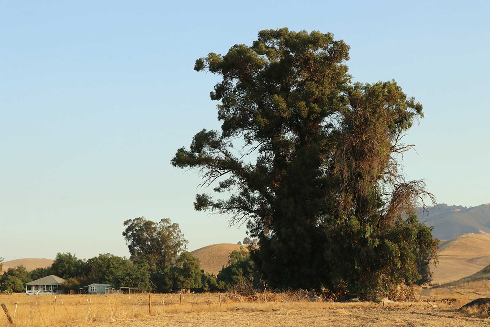
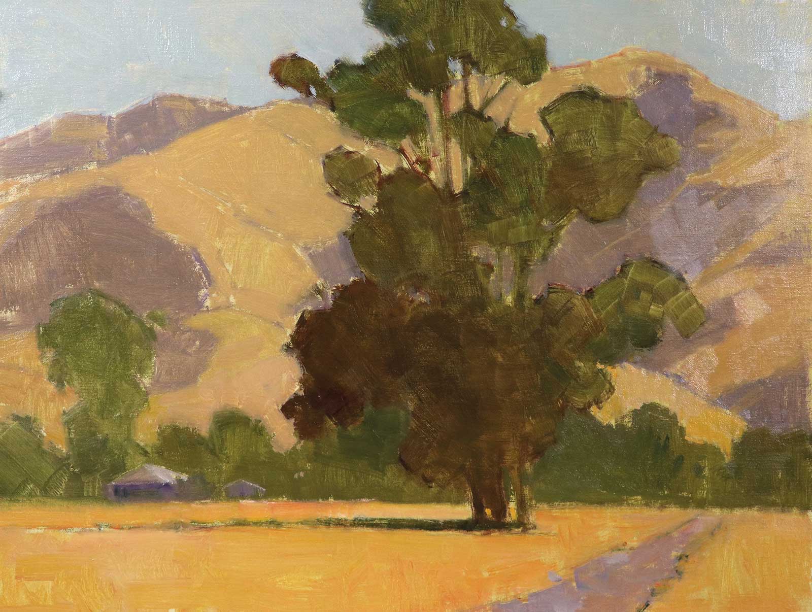
Reference Photo
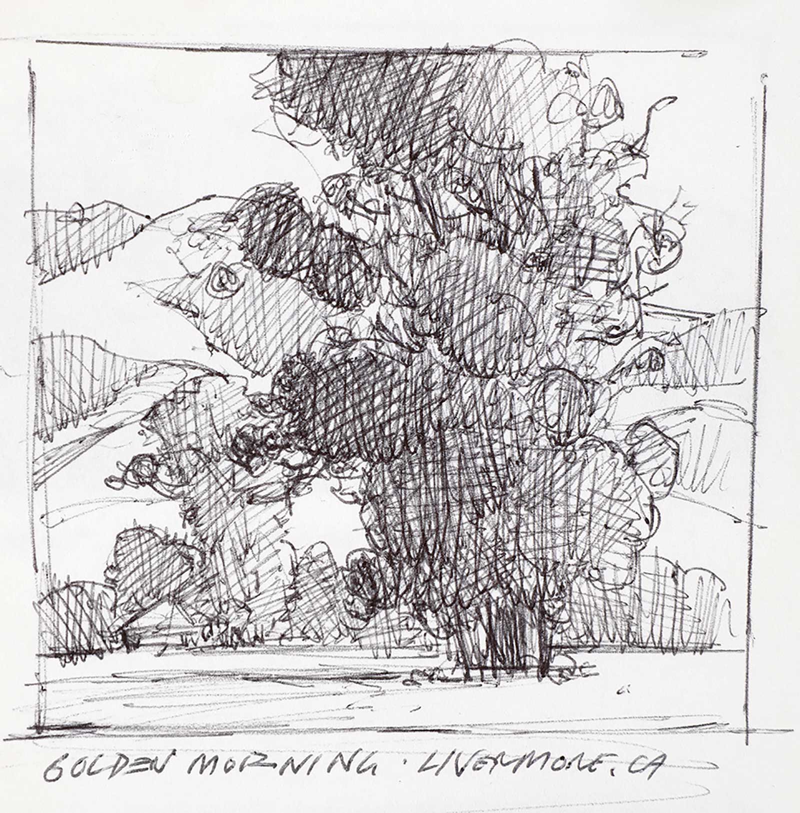 Stage 1
Stage 1 sketch
This was a quick, three-minute drawing I did on location. My goal was to simplify the composition into five unique shapes using only three values: white, gray and black. I always complete a quick sketch to determine if the scene is worth painting. I can’t emphasize how important this stage is. When teaching, I hold up my pen and sketchbook and tell my students these are the most important tools I use before I touch a brush to my canvas.1
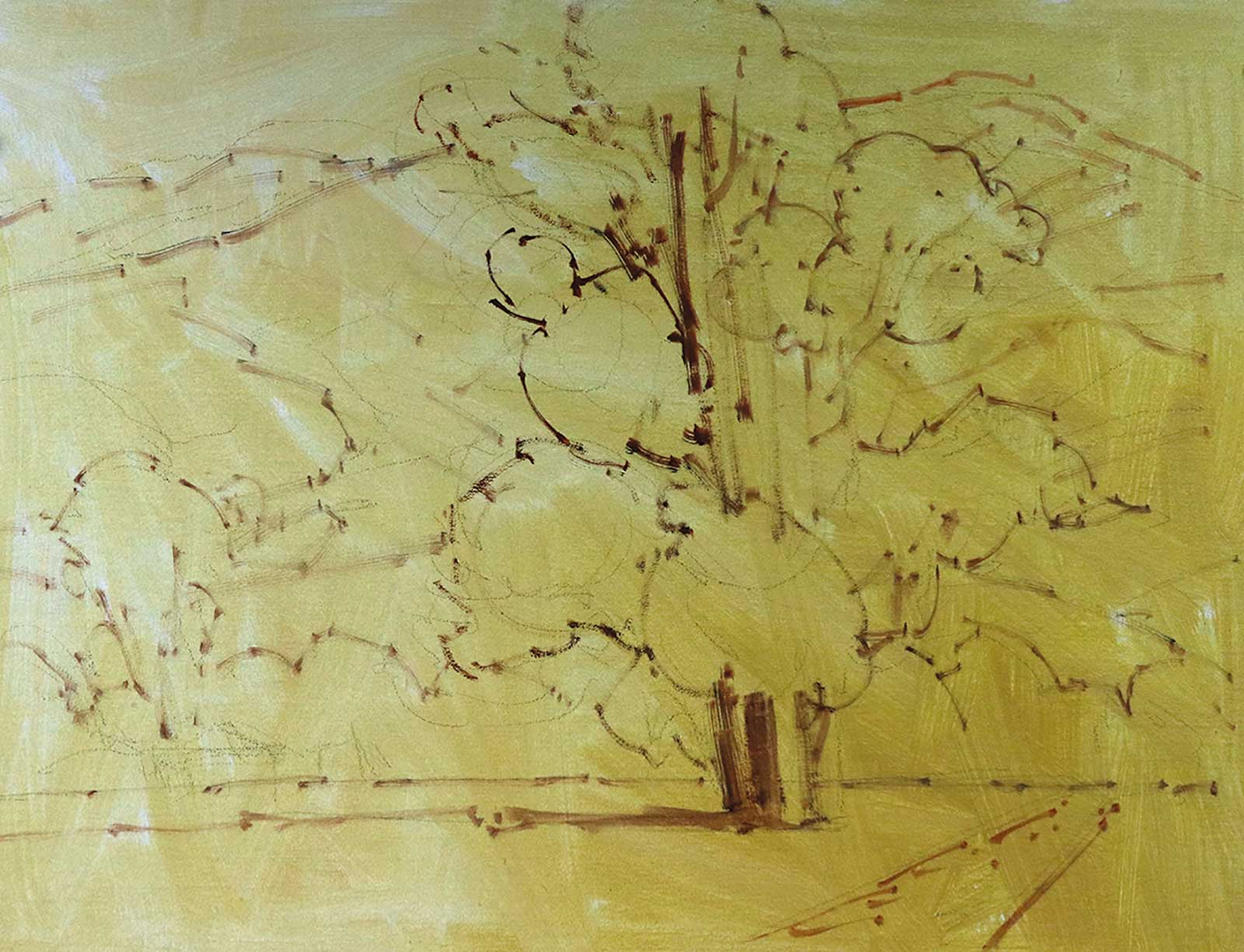 Stage 2
Stage 2 Priming the panel
Since this is a studio piece I have control over my lighting for this article. I primed my panel with a little yellow ochre and FastMatte. It’s white paint that dries quickly and also adds some grit to the surface which makes the paint grab a bit better. I did a light pencil drawing and then using a #2 bright brush with an umber color and drew in the shapes with the brush. That means I drew this scene three separate times before I ever really painted. For this painting, I used ten various ovals to represent the groups of foliage of the eucalyptus trees and some various vertical lines for the trunks and some angled lines for the branches. My buildings are intentionally crooked!
 Stage 3
Stage 3 Blocking in Major Shapes
Using a #8 bright brush, I blocked in all the major shapes with a very thin coat of paint. The eucalyptus tree is mainly sap green and a little alizarin crimson with a bit of titanium white. The shadows of the hills are purple with India yellow plus a little white. The foreground is mostly India yellow-orange and cadmium orange with white. The light side of the hills has a bit of red and white color in it. I’m trying to keep shapes very graphic and I’m not worried about the edges at this point in the process. I always step back at this stage to look at the composition and make adjustments if necessary. I tried to work at a brisk fairly brisk pace as if the light is changing and I’m still having fun!
 Stage 4
Stage 4 Focusing on brushwork
I blocked in the shadow shapes using #6 and #8 bright brushes. I’ve added a bit of orange in the eucalyptus trees and grayed down the middle ground trees with blue-gray. The hills have just a hint of manganese blue to add more atmosphere. I also want the viewer to know this is an early morning scene so about three-quarters of the trees are in the shadows. I’m now focusing on my brushwork in the light areas of the tree and I want to sculpt the shape of the foliage and other areas of importance. This is a very important step as I am drawing with the brush and my mark-making is critical to give my work its signature look.
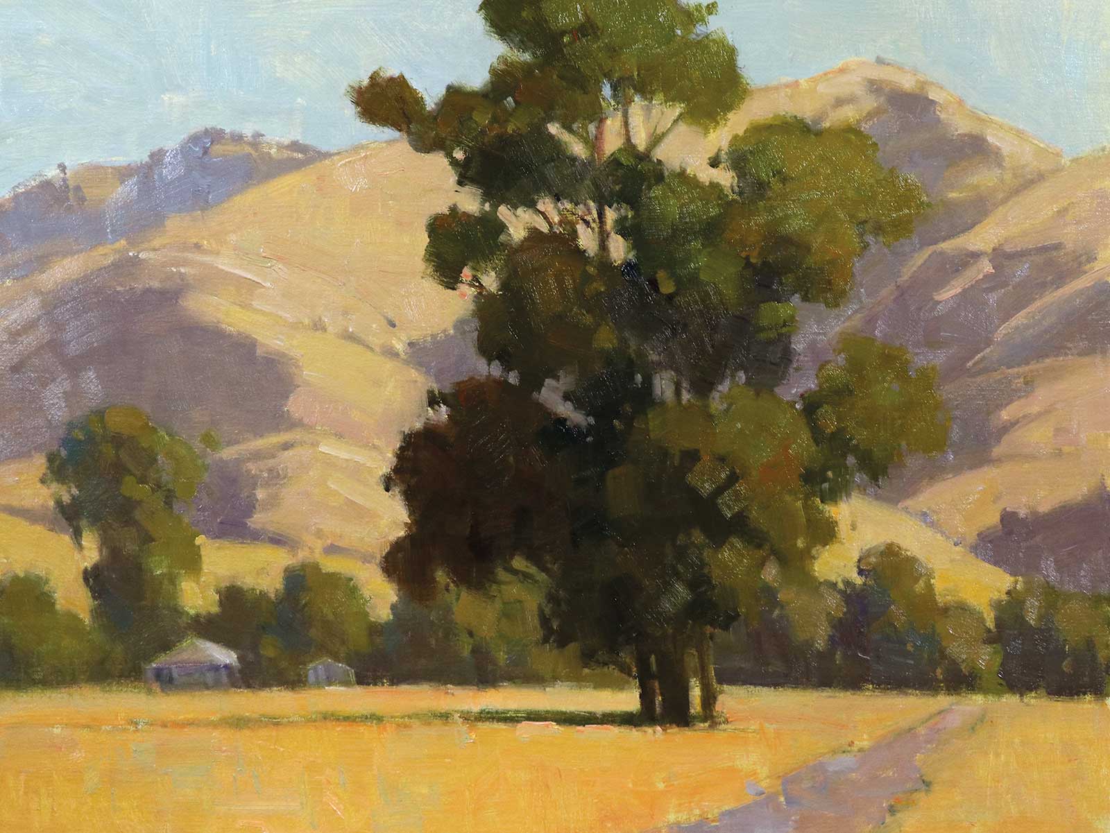
 Stage 5
Stage 5 Refinement Stage
I’m losing some of the edges of the tree by dragging my brush into the background by holding my brush lightly. I also get the same effect by pushing the paint with the brush at the edge of the foliage to soften it. I’ve slowed down at this stage, making more conscious decisions about my shapes. I added some very grayed down color for the trunks and branches of the trees. I also worked on the two buildings and straightened them too. The sky is a mixture of cobalt and manganese blue and just a little orange and white. Note: Sky holes can be tricky. These are the negative areas in the trees where the light comes in from the background. Avoid too many holes and stay away from the middle of the trees. I go back and forth painting the negative area of the light and then adding a loose group of leaves over it or a branch. Note: I keep backing up to make sure the impact I saw when I started. I ask myself, “what is the reward when the viewer comes up close to my painting?” It’s by brushwork and subtle color nuances. I sign the piece and tell myself, “Nailed it!”
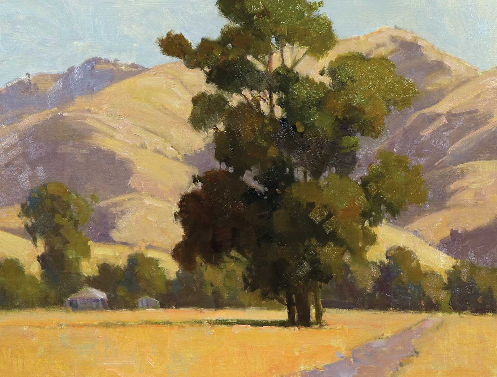
 Stage 6
Stage 6 Finished Artwork
Golden Morning, oil on linen panel, 12 x 16" (30 x 40 cm)
This piece sat around for a couple of weeks and I decided to make some adjustments. The trunks were a bit too dark and dull. I added a bit of purple, orange and white to add a lighter value. I also brightened the light side of the foliage and added some orange marks for accents. Now I’m done and I had a lot of fun.
About the Artist
 Paul Kratter
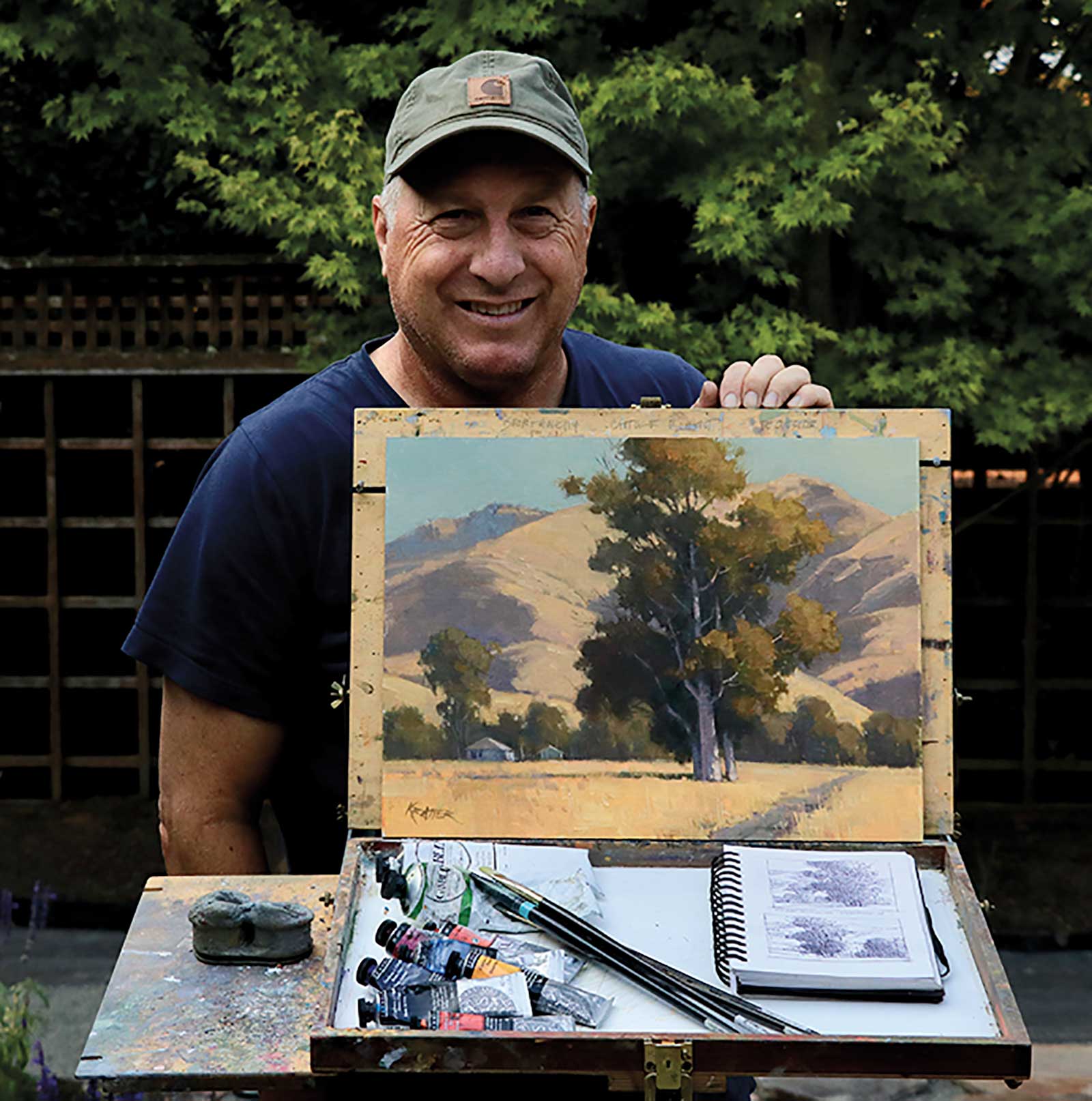
Paul Kratter attended Art Center College of Design in Pasadena, California, from 1976 to 1980, one of the most respected commercial art schools, and graduated with a BFA in illustration. During his time there, Kratter learned drawing, design and composition skills along with editorial concepts that still are the foundations in his artwork today. He started out as a freelance illustrator for 22 years with wildlife and sports themes as his favorite subjects. In 2002, Kratter switched to plein air painting almost overnight. The artist entered many outdoor events, from his home state in California to places as diverse as the Rockies, the Grand Canyon, Texas and Maryland. His two greatest honors are Signature Artist status in the California Art Club and Laguna Plein Air Painters Association.
Contact at
www.paulkratter.com