


Lately, I have been working on a series of small oil paintings of food. I have been painting with oils for many years, creating fairly realistic large-scale paintings of water, birds and flowers. When I taught painting classes, I demonstrated primarily with still life, and my recent return to this subject reminds me of the value of still life for honing observation and color sense. These small paintings are relatively fast and very enjoyable to do.
I usually paint my subjects from background to foreground, but I take a different approach with these small still life paintings: I begin with the most challenging and detailed element and work towards the larger and simpler areas of color. Small surface details (like sprinkles) are the final touch, but for the most part, I am finishing as I go.
My small still life paintings are on cradled wood panels, between 8 and 12 inches square. The panel surface allows for precise brushstrokes and clean lines. I first tape the edges off with masking tape to preserve the attractive wood sides, and then prepare the surface by alternately sanding and applying three coats of gesso. There remains some residual texture from brushing the gesso on; it is not as rough as canvas, nor as smooth as pre-primed or sprayed.
My process begins with a light sketch on the primed panel which identifies areas of highlight, shadow and changes in color with outlines. The more specific I am with the sketch, the faster the painting goes, as I have put in the work to observe the nuances of color and light at this stage.
This is an alla prima painting, meaning I work fast with wet paint to complete it in one session. The alla prima technique allows for easy blending, but means a steady hand is needed for hard edges and highlights so as not to pick up nearby colors. I do not use solvents or mediums in the paint, and ensure that the colors I mix are opaque enough for a final layer. I limit use of transparent colors like alizarin crimson to add depth to mixed hues without compromising the opacity.
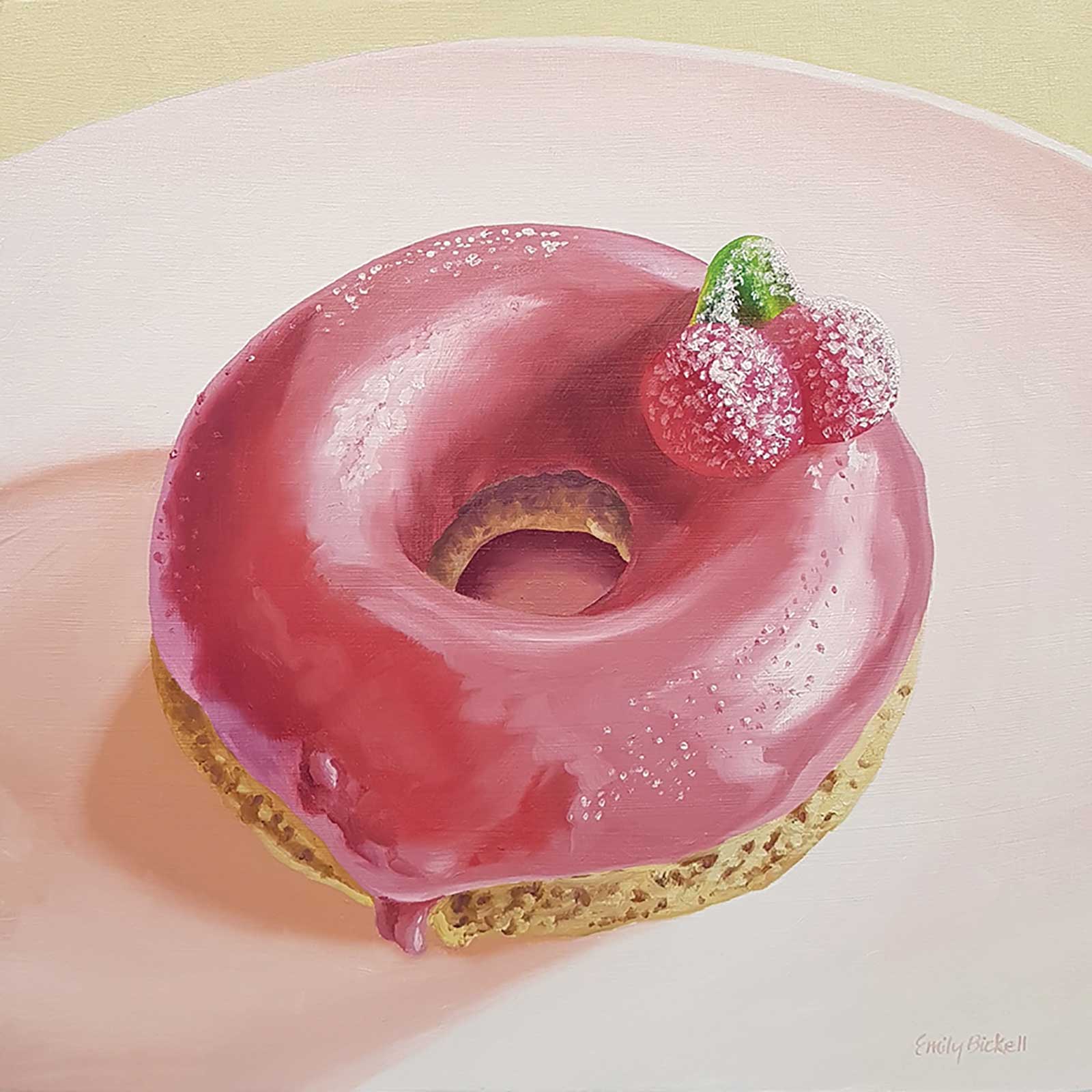 Cherry Donut, oil on cradled wood, 10 x 10" (25 x 25 cm)A boutique donut shop produced this beauty with a muted matte glaze and sour cherry candy. I stippled the paint on the candy to achieve that sugar-coated look. The cake donut base had a unique and interesting texture.For each separate area of the painting, I premix colors to match different hues and values of the subject on a glass palette, and arrange them on the palette roughly relating to where they will fall on the canvas. Color adjustments are made on the palette as I work and some blending on the panel as well, but I mostly stick to the colors I premix.
 I have a tendency to exaggerate intensity and value; I really love color, and it’s important to me to describe all the colors I see in paint. For the demonstration, I am not using black—the shadows are blue, violet and orange, and the highlights are white that is tinted violet and blue. In this demonstration, I used primarily orange and violet hues to represent the chocolate glaze. It presents as brown, but aside from a touch of vandyke brown in the mix to improve the opacity of some dark areas, it is not really brown at all.
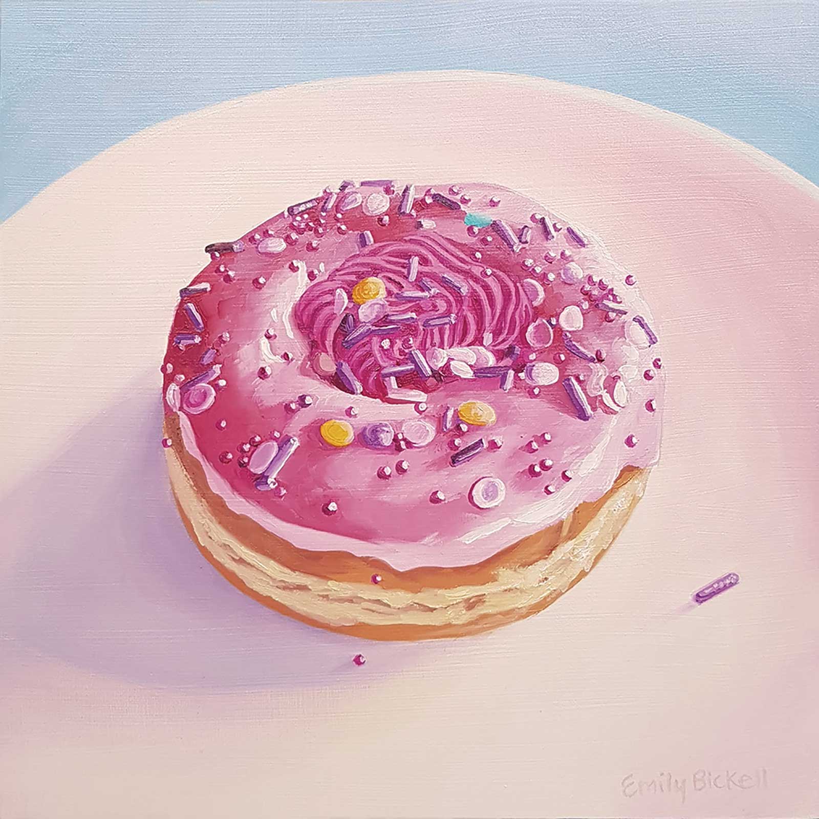
Strawberry Swirl, oil on cradled wood, 8 x 8" (20 x 20 cm)It was absolutely joyful to paint this complex donut because of all the colors and textures involved in the toppings, including the shiny glaze, matte whipped icing and various types of sprinkles.
As I paint, I keep several brushes in play—generally, one for each hue and value. I usually have at least four brushes on the go at any one time. This saves time and materials, as I don’t need to clean brushes between colors. For painting on a smooth surface, I like a fairly stiff synthetic brush, which gives a flat application of paint and works for both blending and edges. I tend to be hard on brushes, so I buy inexpensive ones and replace often. One of the brushes I used for this demonstration was swiped from my kids’ craft cupboard: a plastic-handled brush from a dollar store!To me, painting is like putting a puzzle together—shapes, hues and values forming a whole. Working each area separately to completion is very satisfying; breaking the image into parts in this way is a strategy I use to define the steps and create a plan for tackling even very complex subjects. In larger works I often return for a final pass with glazes to adjust value or color and create a cohesive whole, but in these small paintings I love alla prima with a limited palette. —
My Art in the Making Chocolate Dip 3
In this demonstration, I paint a donut from life, in alla prima style. Beginning with a drawing, I use oil paints to develop form with light and shadow, using saturation and value to define shape and dimension. A combination of hard-edge and wet-on-wet blending and an emphasis on color make this donut painting pop.
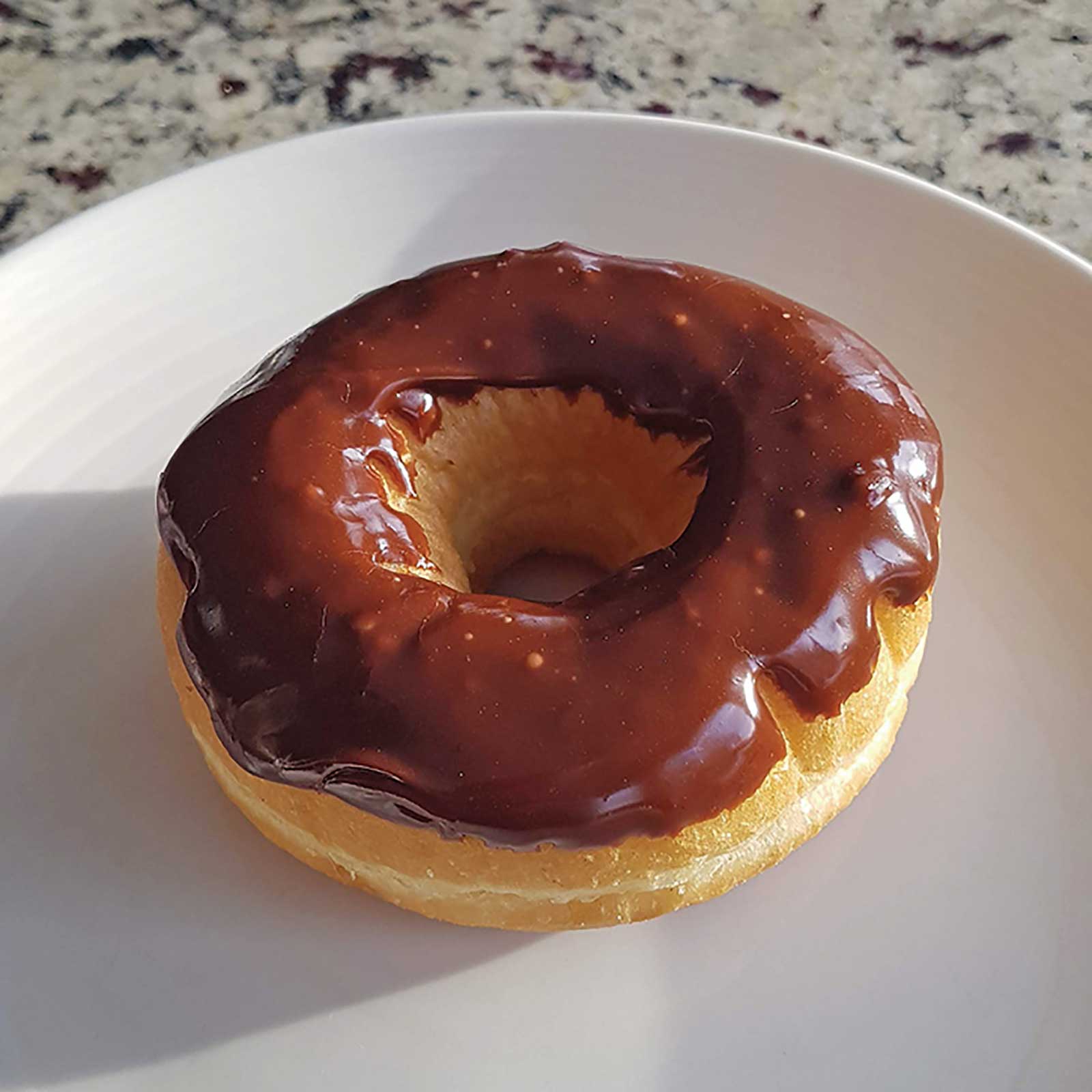 Photo Reference: The donut I was working from, lots of detail in the lights and shadows. The light from the side casts a long shadow and defines the form.
 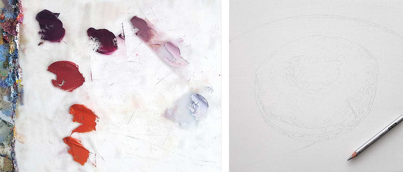 Stage 1
Stage 1 Preparation
I have prepared a 10-by-10-inch cradled wood panel with gesso, sanding after every coat. For my detailed sketch, I use a silver colored pencil, which will not blend with or bleed through the oil paint. These are the eight base colors I mixed for the glaze and highlights.
WHAT THE ARTIST USED
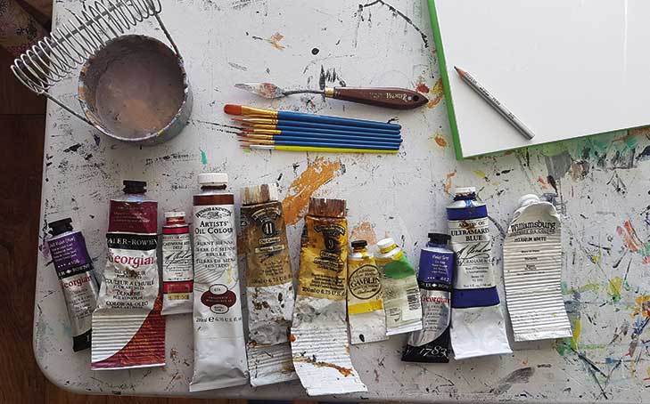
Oil colors
Cobalt violet, Alizarin crimson, Cadmium red deep, Burnt sienna, Vandyke brown, Cadmium yellow deep, Cadmium yellow medium, Winsor lemon, Violet gray, Ultramarine blue, Titanium white
Brushes
No. 2, 4, and 6 synthetic rounds; No. 6 synthetic filbert
Support
10 x 10" cradled wood panel
Additional supplies
Gesso, Gesso brush (2” flat bristle brush), Glass palette, Palette knife, Silver colored pencil, 1” masking tape, Eraser
 Stage 2
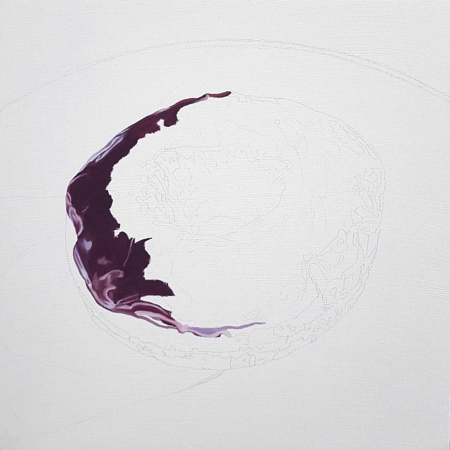
Stage 2 Starting the icing
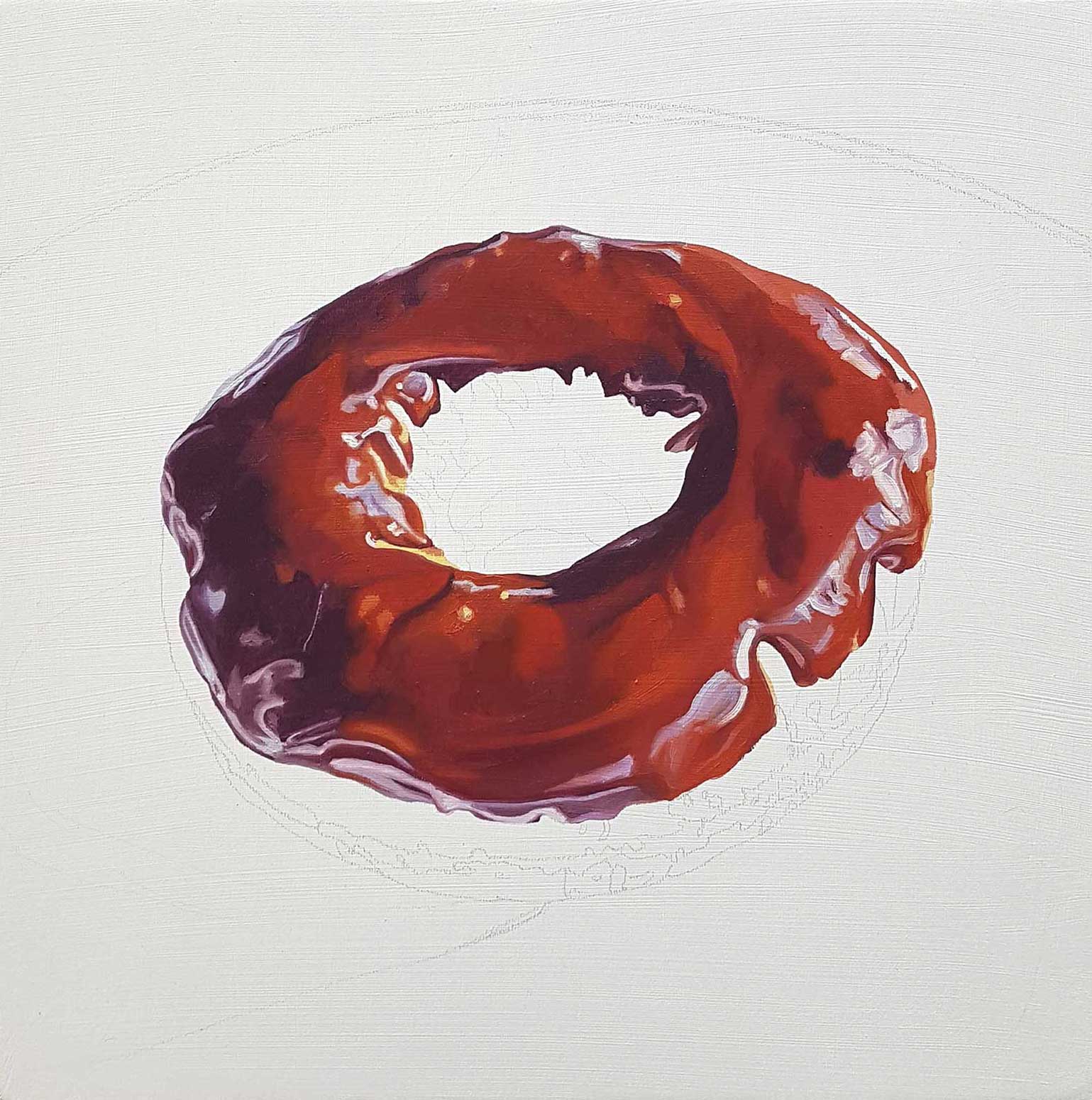
Having mixed several colors for the donut’s chocolate glaze, I begin at the edge of the donut, filling in the darkest shadows and reflected light on the glaze.
 Stage 3
Stage 3 Blending and Details
I am using wet-on-wet blending for the smooth areas and some hard-edge application on the details. The yellow reflected light on the inner curve is an unexpected color!
 Stage 4
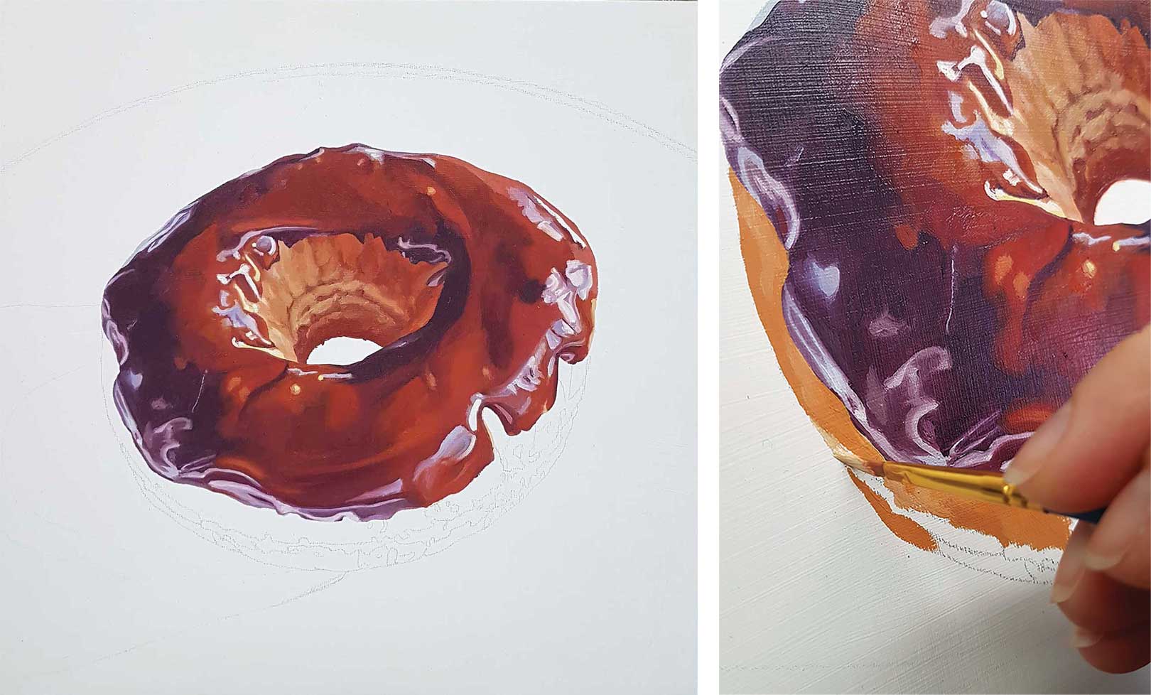
Stage 4 FInishing the Icing
The icing is complete. I find this the most satisfying stage, as now the most complex part is finished and the subject will begin to take shape from here out.
 Stage 5
Stage 5 Values
The center of the donut is mostly in shadow, so the colors are less saturated and the shape is defined by value shifts. The paint is applied more loosely to the pastry. The detail shot shows my paint application with a round brush, using my sketch as a guide.
 Stage 6
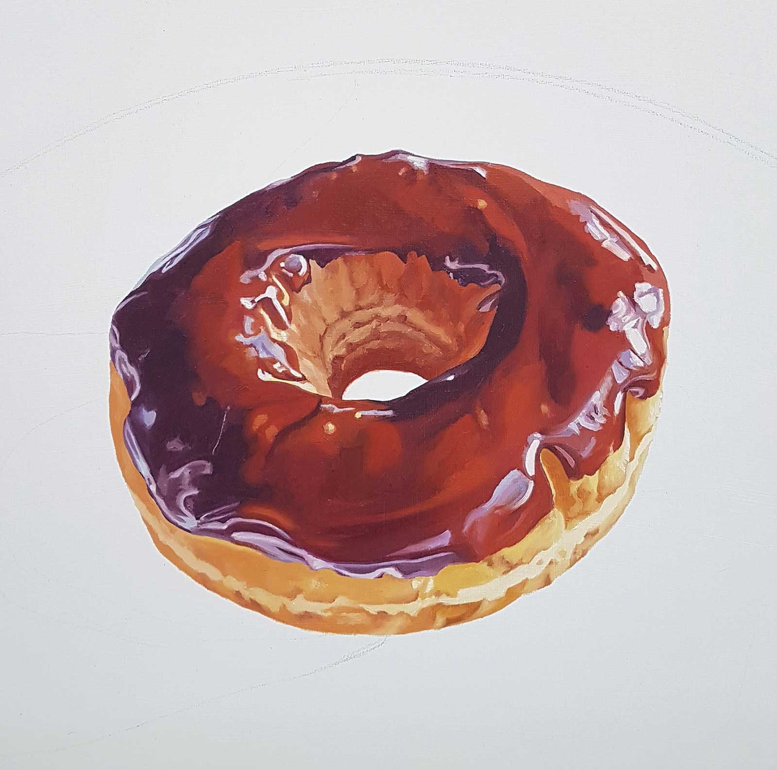
Stage 6 Base of donut
The donut’s base is relatively simple: a bit of blending of the main color in light, medium and dark shades, with some interesting saturated oranges in the furrows of the pastry.
 Stage 7
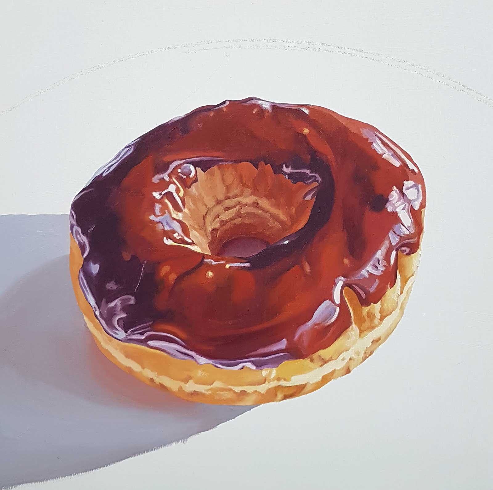
 Stage 7 Light Sources
I observe the reflected colors on the white plate and the cast shadows from multiple light sources. The enclosed circle within the donut hole is a warmer and more saturated color than the cast shadow.
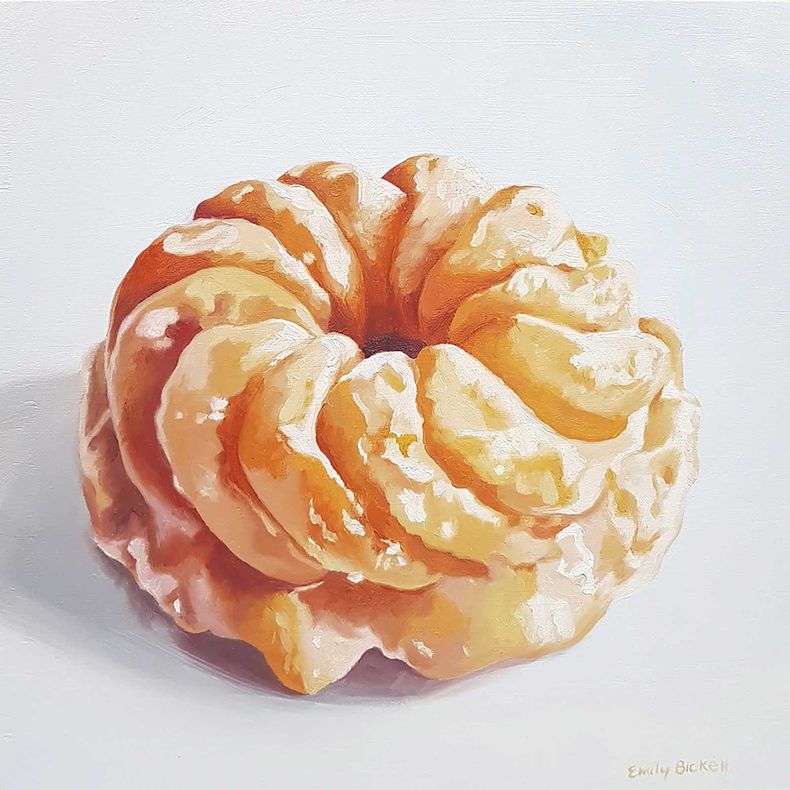
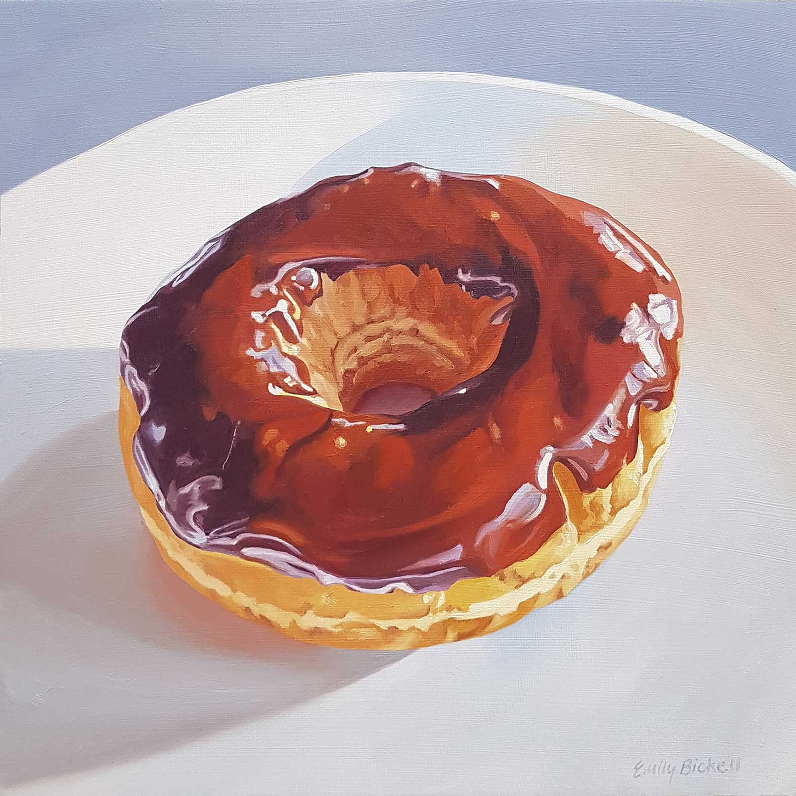 Chocolate Dip 3, oil on cradled wood, 10 x 10" (25 x 25 cm)
Stage 8 Finished Artwork
The final step is to complete the plate and background, considering the reflected color on the plate and the light falling on the concave surface, using curving brush strokes to emphasize the contours.
About the artist
 Emily Bickell
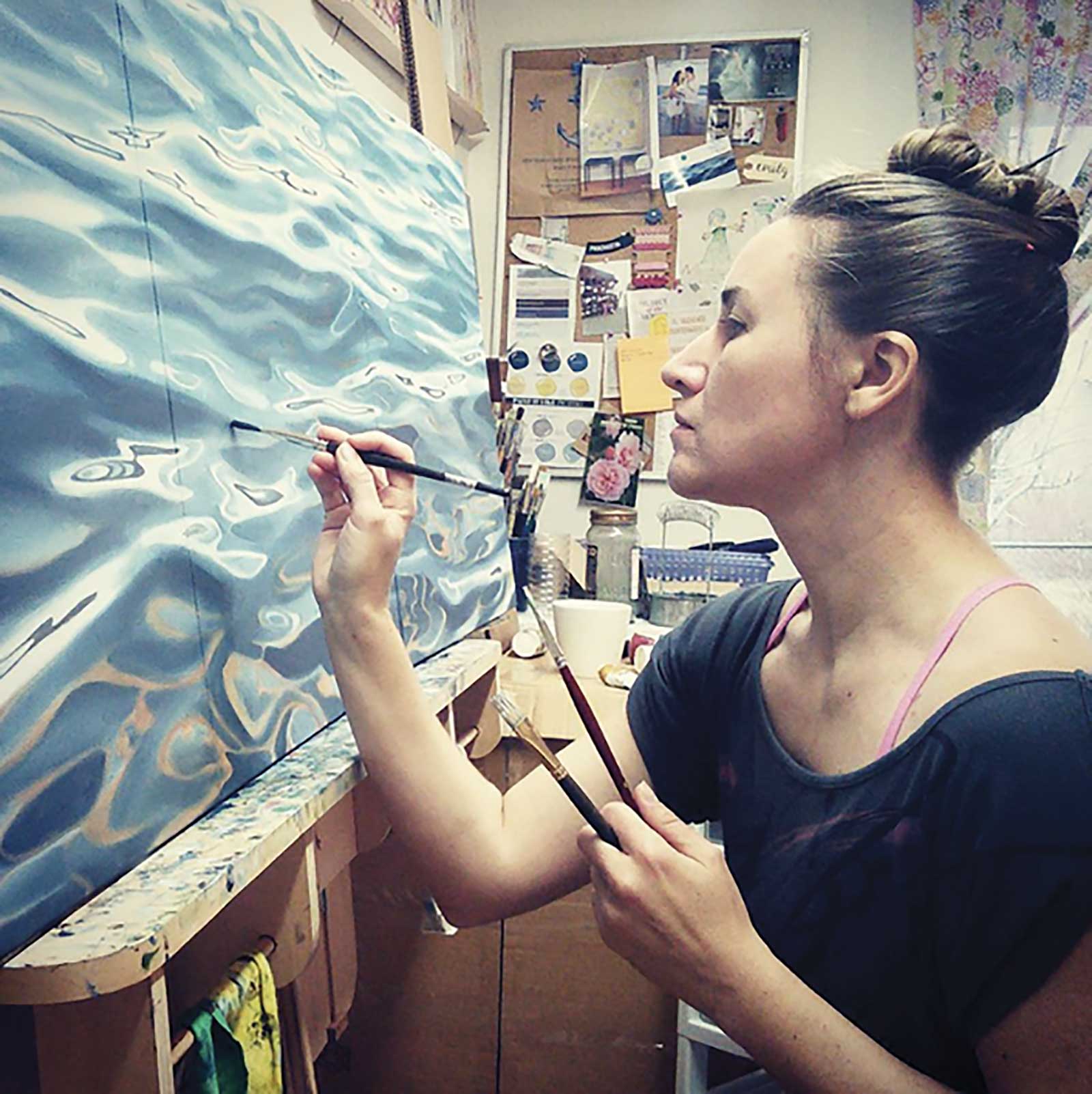
Emily Bickell grew up on the shore of Lake Ontario, Canada. In 1998 she received an Honors Bachelor of Arts degree in fine arts with a studio specialization in painting and printmaking from the University of Waterloo. A lifelong fascination with nature informs Bickell’s work. Her oil paintings of water float between abstraction and realism. The intricate patterns and colors in flowers and feathers inspire her paintings of plants and birds. Sometimes she paints food (just for fun)! Bickell’s artwork has been featured in magazines such as Canadian House & Home, Style at Home and Raum und Wohnen, and can be found in corporate and private collections across North America and Europe.
Represented by
• Art Interiors, Toronto, Ontario, Canada www.artinteriors.ca
• Steele Gallery, Niagara-on-the-Lake, Ontario, Canada, www.steelegallery.ca
• ArtMatch, Calgary, Alberta, Canada www.artmatch.ca
• Halde Galerie, Widen & St. Moritz, Switzerland www.haldegalerie.com