


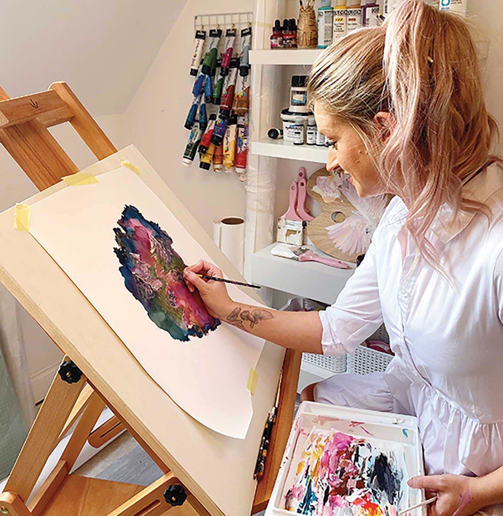
I am a mixed media artist from England and have been an artist for many years, taking my first commission as a teenager. Over my life, I have tried many different ways of creating work, but I now specialize in fluid media and a great deal of mixed media. The last couple of years, I have dedicated my time to my art more than ever and love the life that it gives me.
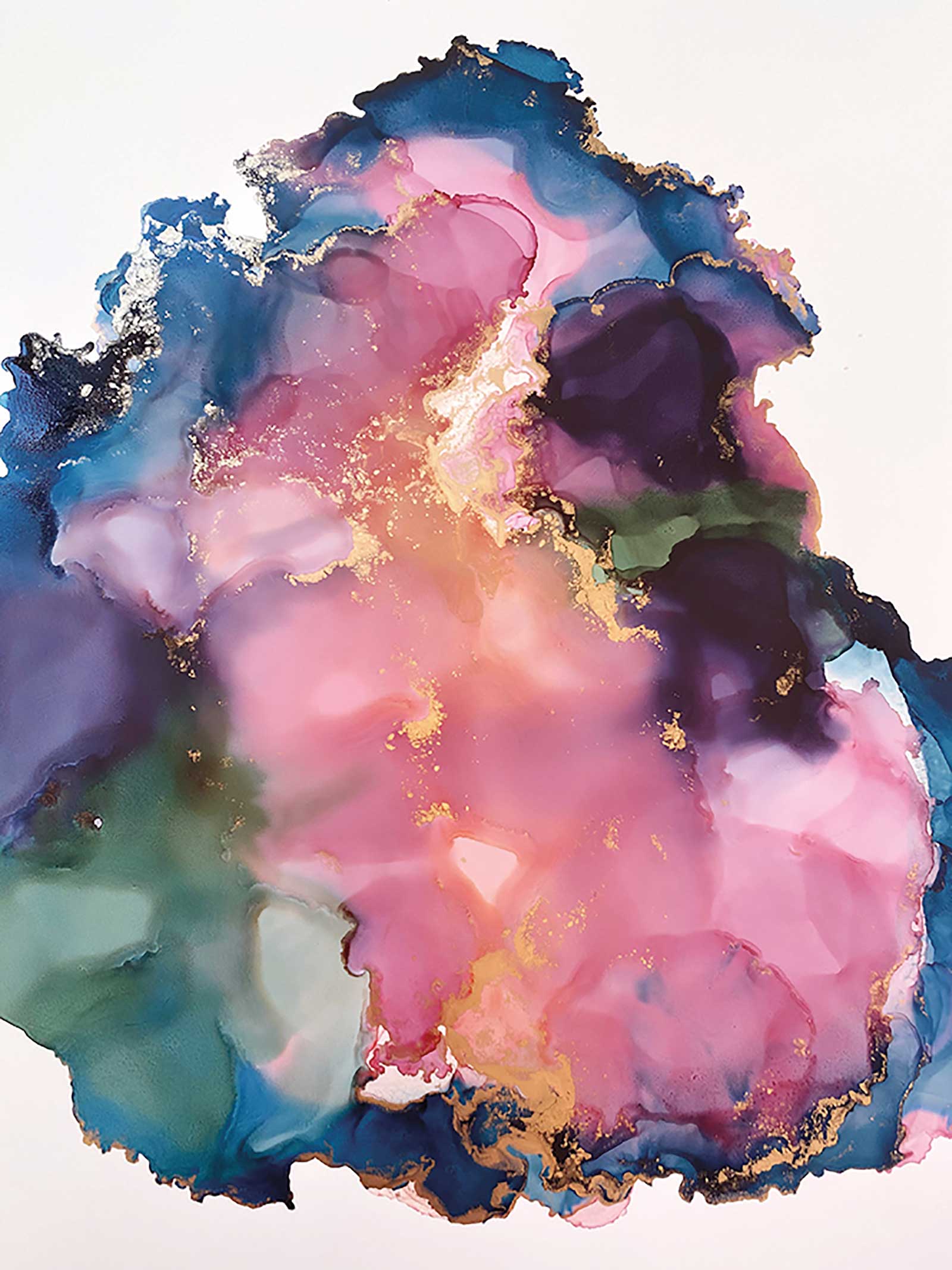
Grace Linda, alcohol ink and acrylic on Yupo paper, 24 x 16½" (60 x 42 cm) This piece was painted to suit a maximalist interior.
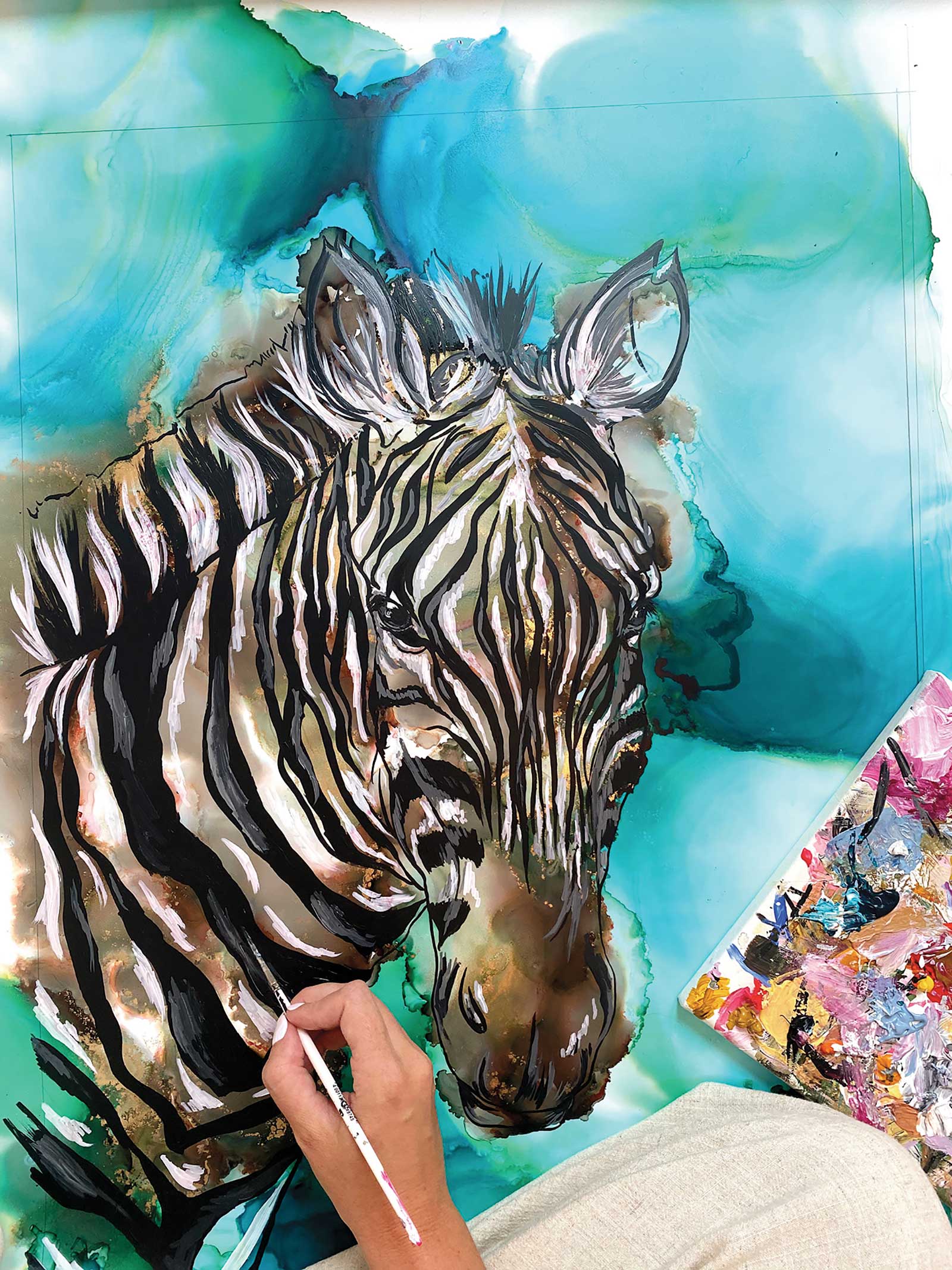
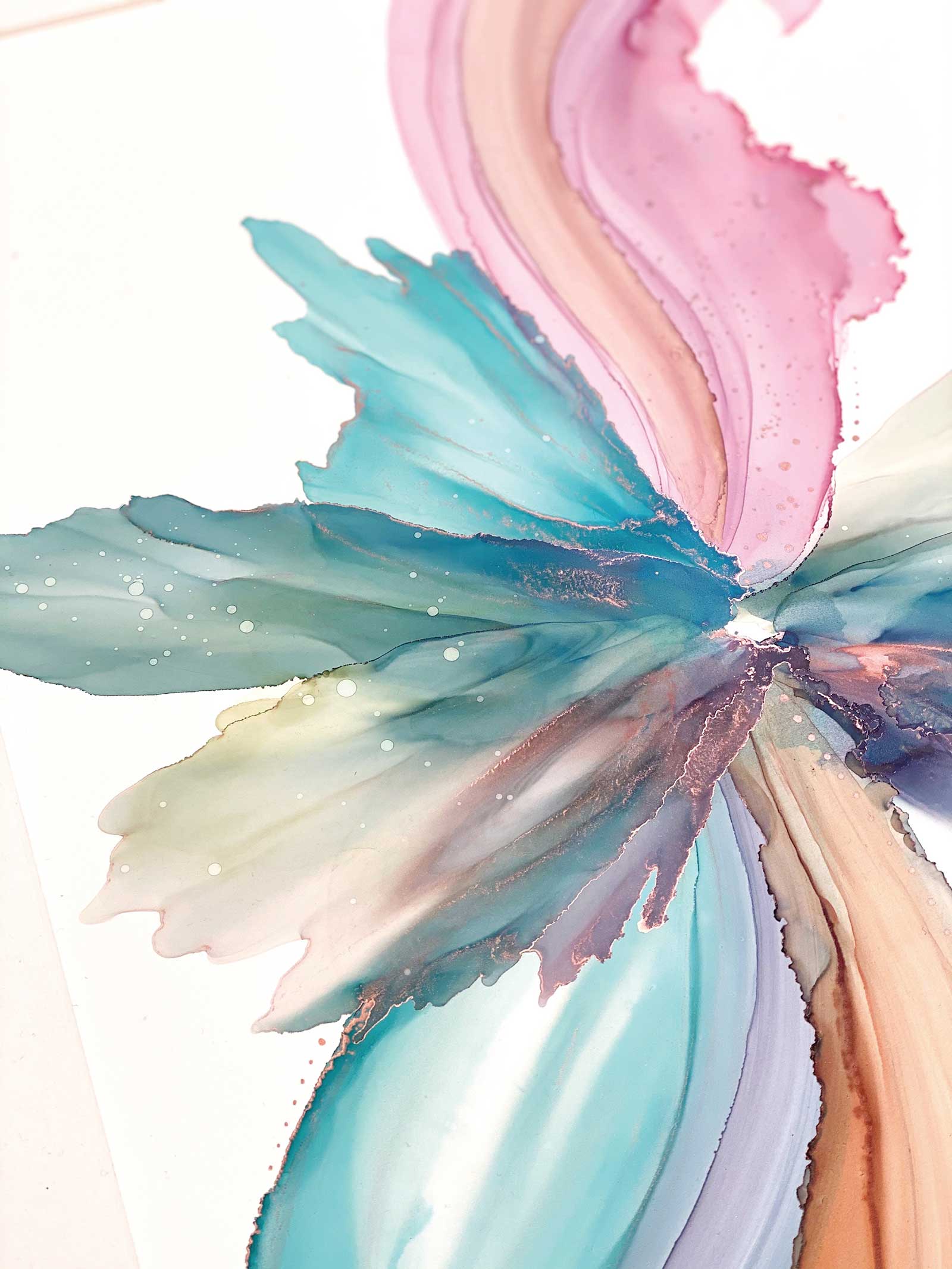
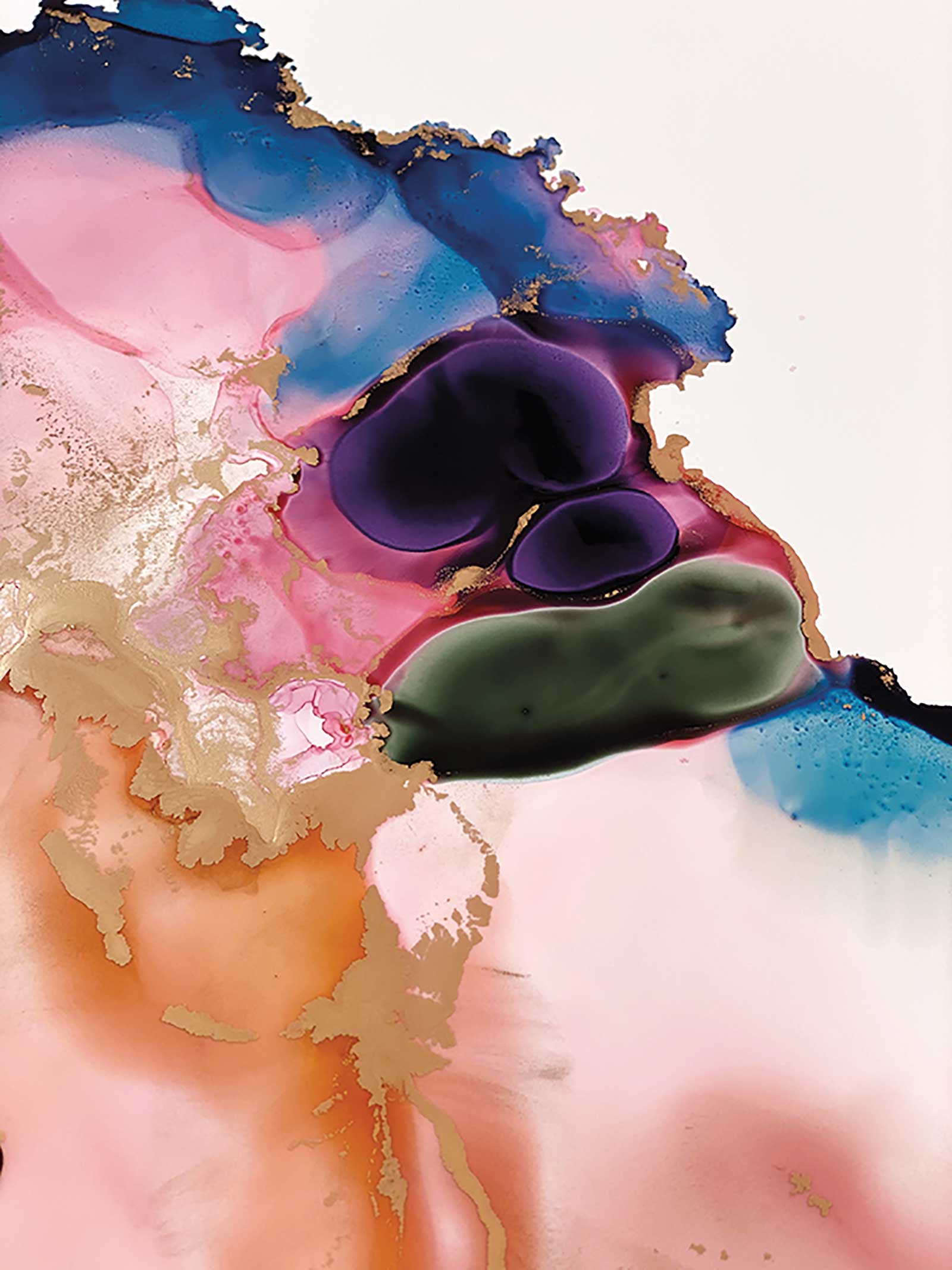
Most of my inspiration comes from nature, music and landscapes. However, I am also influenced by mythical stories and many abstract works. Ever since I was young, I was told I was “away with the fairies”—I guess there is a lot of truth in that! I started working with fluids because I immediately enjoyed the effects it was creating and found I could not stop.The fluids I work with are high pigment inks, mixed with an isopropanol alcohol, known more commonly as alcohol inking. I love working this way because it allows for the colors to be moved around on a non-porous surface. For this, most of the time I use Yupo which is a synthetic paper, but I can also use primed and sealed canvas, ceramic tiles and much more. The combination of the ink, alcohol and non-porous surface means I can create pools of color and move them around the surface, forming shapes and patterns. It allows me to create textures and depths to my work that I had never seen before. On top of this, I will sometimes use acrylic paints to bring out more detailed images.
Forest Fae, alcohol ink and acrylic on Yupo paper, 16½ x 12" (42 x 30 cm) One of my signature fairies. They were a product of some imaginative play with my inks and a great way to express myself.
Yupo is completely tree-free and recyclable, and unlike anything I had ever used before. Mostly it’s because of the texture and flexibility of it. The fact that I can layer the different media on top of the Yupo and inks means I can create some really unique pieces. It is by far my favorite paper I’ve ever worked with. It was immediately an enjoyable experience to work with—this was really important to me, and I’ve never looked back. The paper comes in many different sizes, so there are no limits to what you can create.
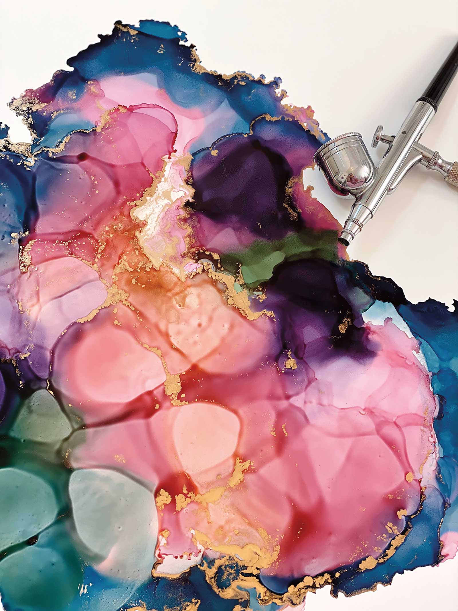
To move the ink around the surface, I use an airbrush, which you will see in the demonstration. The pen-style of the airbrush gives me great movement, and I can also vary the power it blows at, so I get great control. Other than that, I move the ink around with brushes, air blowers and almost anything I can get my hands on.
I do a mixture of my own creations as well as commission work, and in a variety of sizes. For the larger ones I love to spread out the large rolls across my studio floor. This allows me to free paint without restrictions. Along my journey I have learned many things about alcohol inking, and creating work using these media. The most important has been safety. For anyone looking to start with alcohol inking, it is vital to follow the safety guidelines. I always work in a well ventilated studio, and use a high grade respirator whenever I am working.
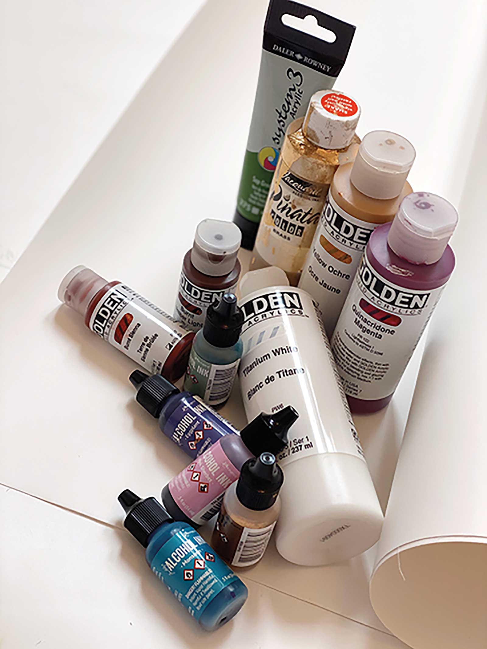
My most commonly used inks are from Ranger’s Tim Holtz Collection and Jacquard Products. I adore Tim’s color range, and the pigments are beyond beautiful. I always work with metallics, and both Tim and Jacquard create my favorite gold, brass and silver. For acrylics I always use Golden or Daler Rowney, for the quality of paint, and range of pigments. I will then seal my work with three layers of varnish spray. I will then apply three coats of UV-resistant gloss clear coating spray. This helps the inks set and keeps them protected. The respirator is vital when working with these sprays also, and I use a special area of my studio to apply them.
Shadow Mapping
I like to map out in my mind where the shadows will be. This helps me put down the colors in the right places and form the structure of the piece.
Color Mapping
One really important element with alcohol inks is to map where the colors will be put down. I do this before I begin any work. As they are fluid inks, they blend really quickly. If I am using certain colors but do not want them to blend and mix, then I have to position these right on the paper.
Open-minded Composition
Using a free-flowing media like alcohol ink means I have to react a lot to how they move and change as I am creating a piece. Therefore, I never have an exact image in my mind to create. My composition can change and evolve as I paint depending on what the inks want to do. —
My Art in the Making Prismatic Cliffs
 Stage 1
Stage 1 Prepping the Paper
Cutting the paper to size, this one is going to be an A3 piece (420 x 297 mm), but I cut larger to allow room to work. This is then cleaned with isopropanol alcohol, before selecting colors for my piece. Also, I make sure my room is well ventilated, and I put on my safety gear.
 Stage 2
Stage 2 Laying down Inks and Metallics
Using the isopropanol alcohol as a base, I then start laying down the inks and the metallics in the places that will begin to create the shadows and forms.
 Stage 3
Stage 3 Moving the Ink
I use my airbrush to move the ink and create marbled patterns.
 Stage 4
Stage 4 Waiting Period
I usually leave 24 to 48 hours between inking and painting. You can seal in this stage if you wish, but I prefer to do this at the end.
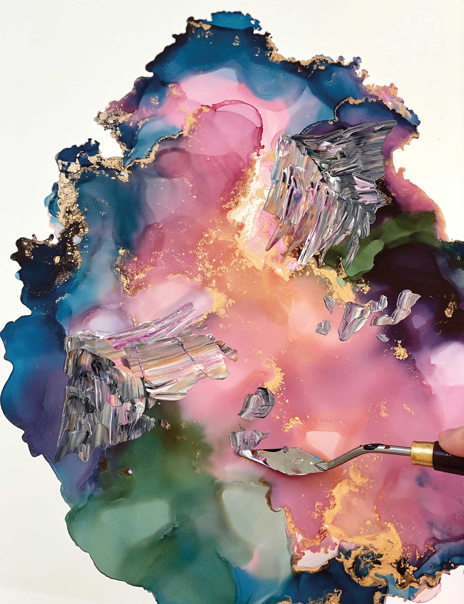
 Stage 5
Stage 5 Mixing Colors
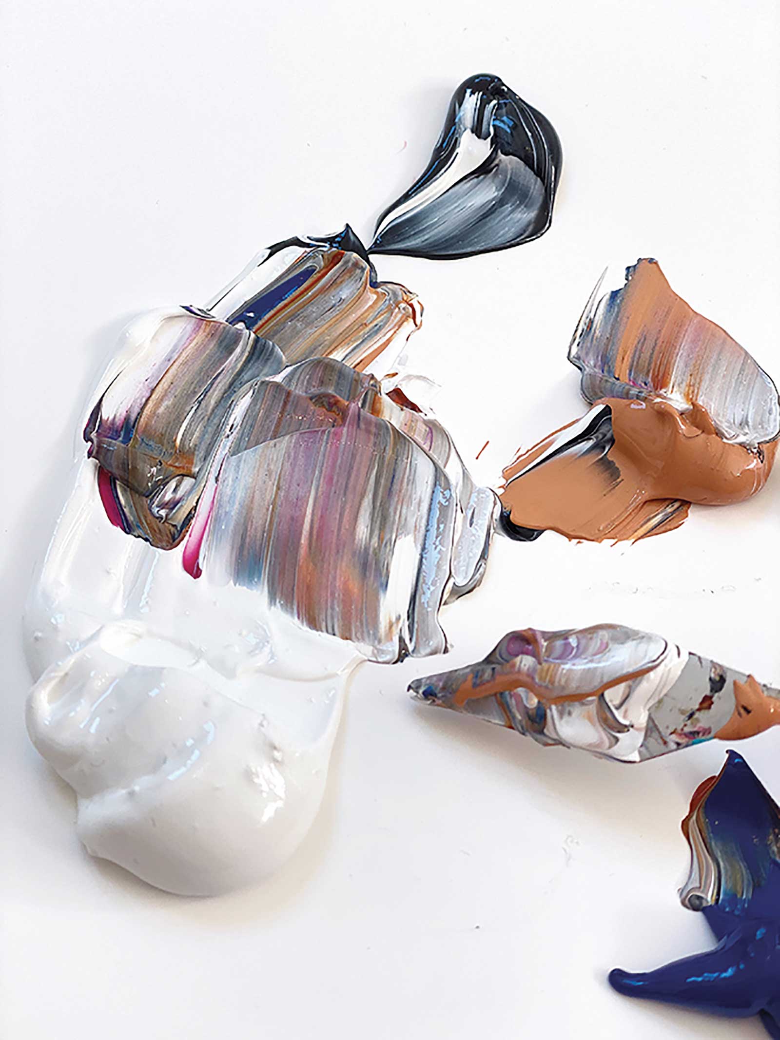
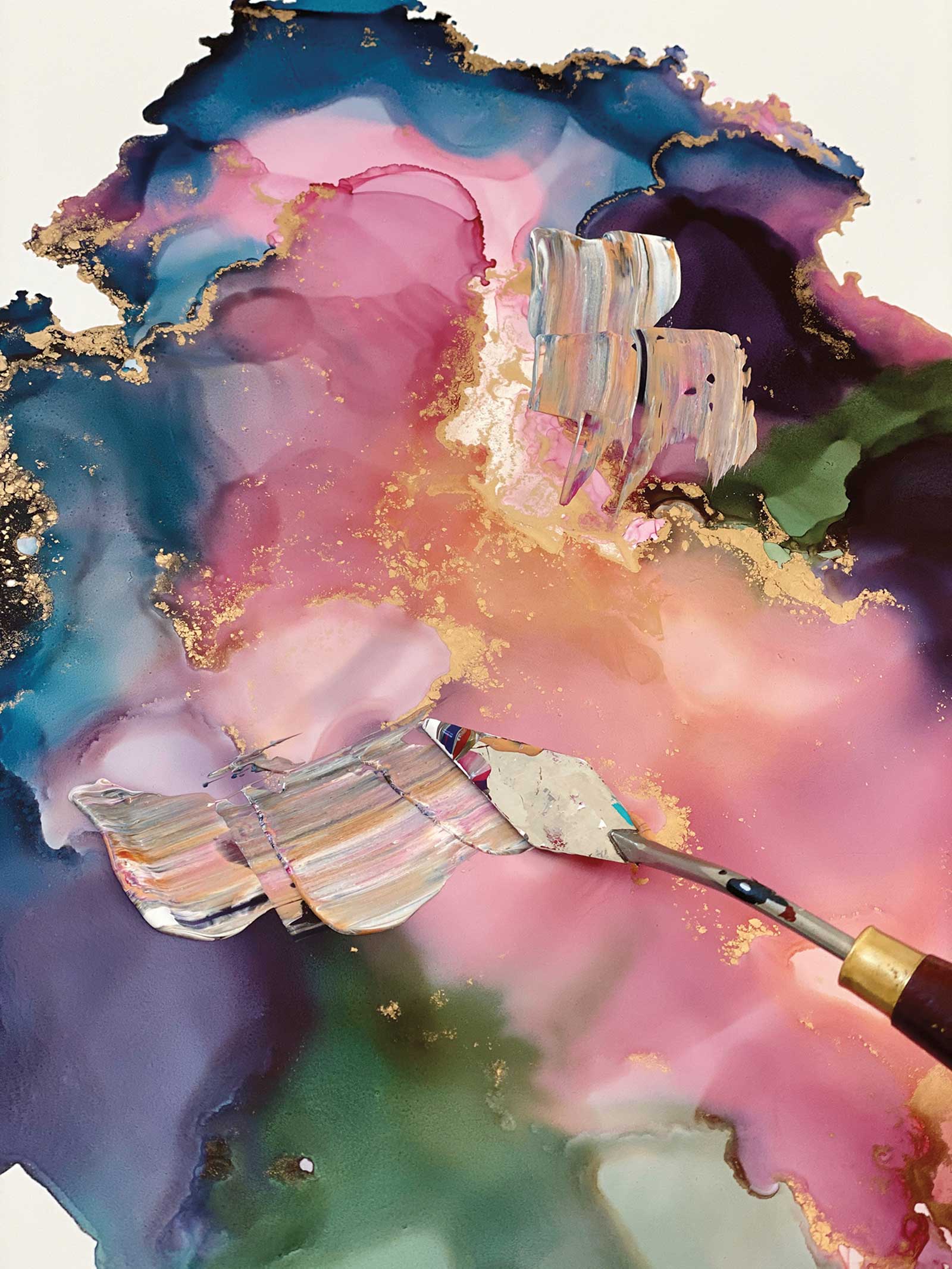
Using a palette knife, I like to loosely mix my colors so they are ready to apply to the top of the ink.
 Stage 6
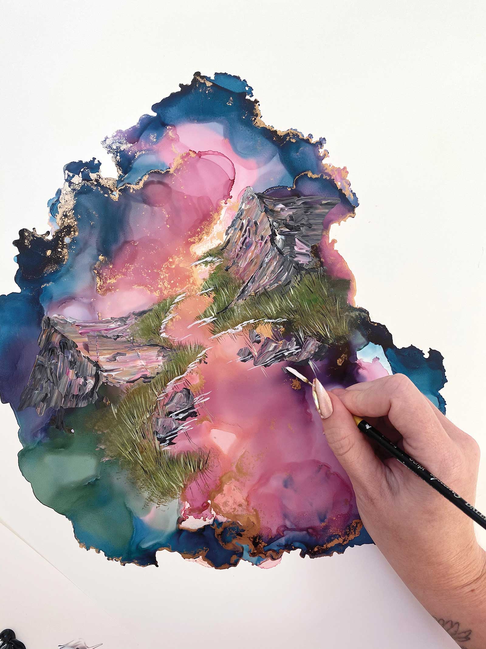
Stage 6 Carving Mountains
Now I carve the mountains where the darker inks are. I do not like to pre-plan this part, as I get better results free flowing.
 Stage 7
Stage 7 Building them Up
Using darker tones, I can build in the shapes of the mountains and smaller rock formations.
 Stage 8
Stage 8 Grasslands and Water
Using a fan brush, I start to mask in the grassland areas and the shape of any water in the landscape.
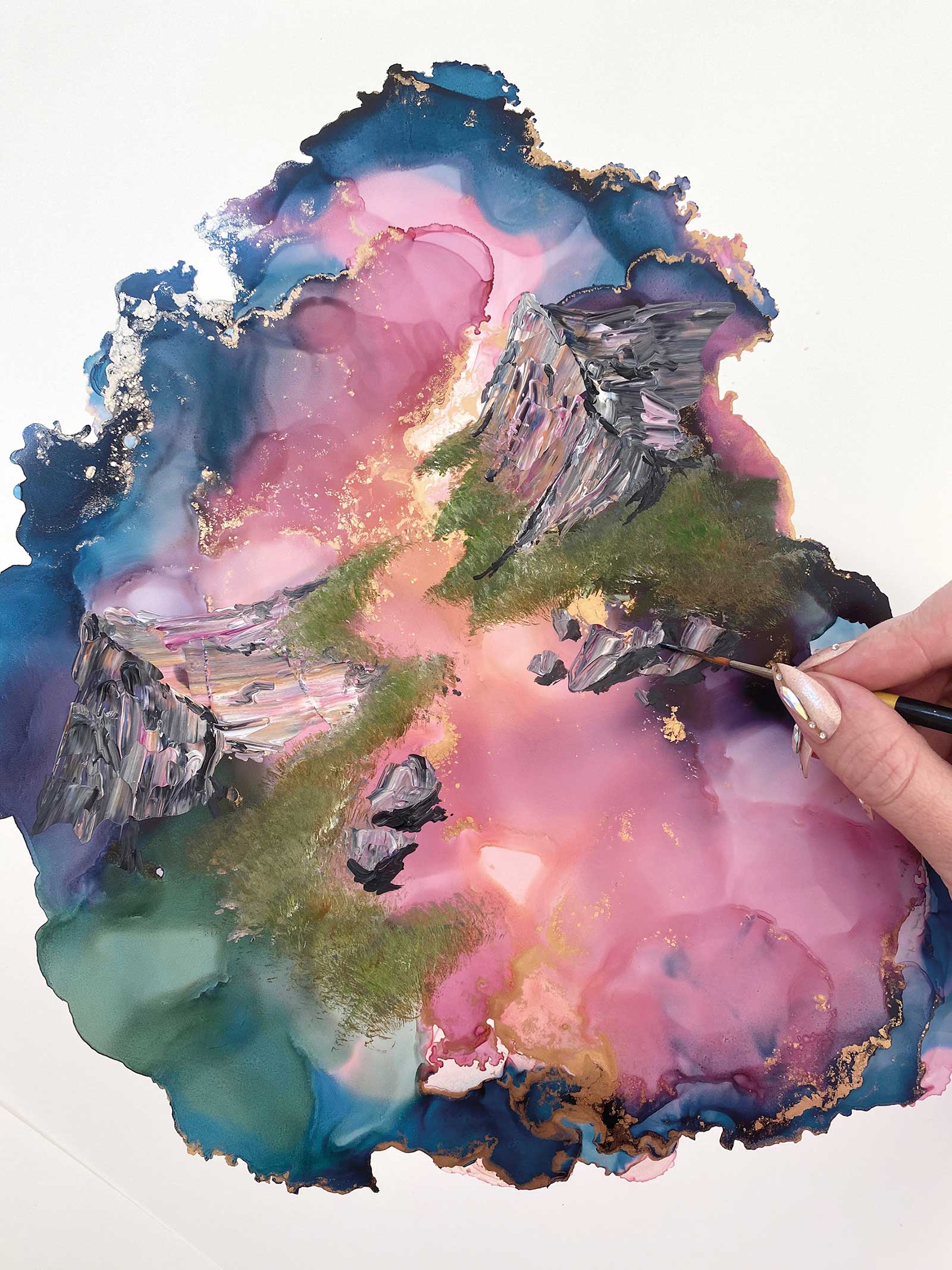 Stage 9
Stage 9 Adding Shadows
Adding shadow to the mountains and rocks in the water. I like to use small detail brushes for this part and as few strokes as possible.
 Stage 10
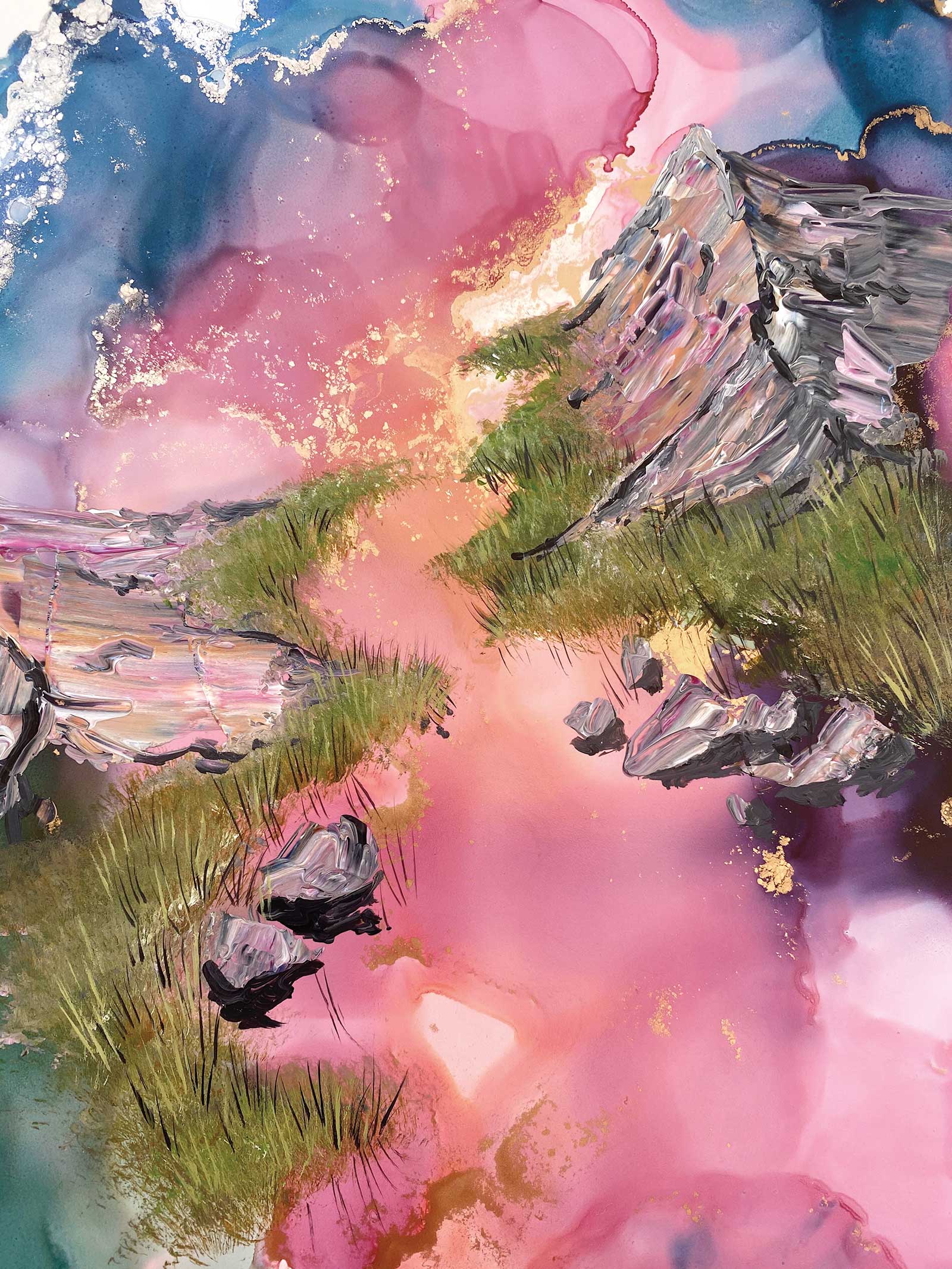
Stage 10 Depth and Texture
I will now add weeds and grass to add depth and texture, and make sure they’re mimicked in any reflections.
 Stage 11
Stage 11 Other Details
Using a light pink and white to create the water’s edge. At this stage, I see what other details I would like to add in.
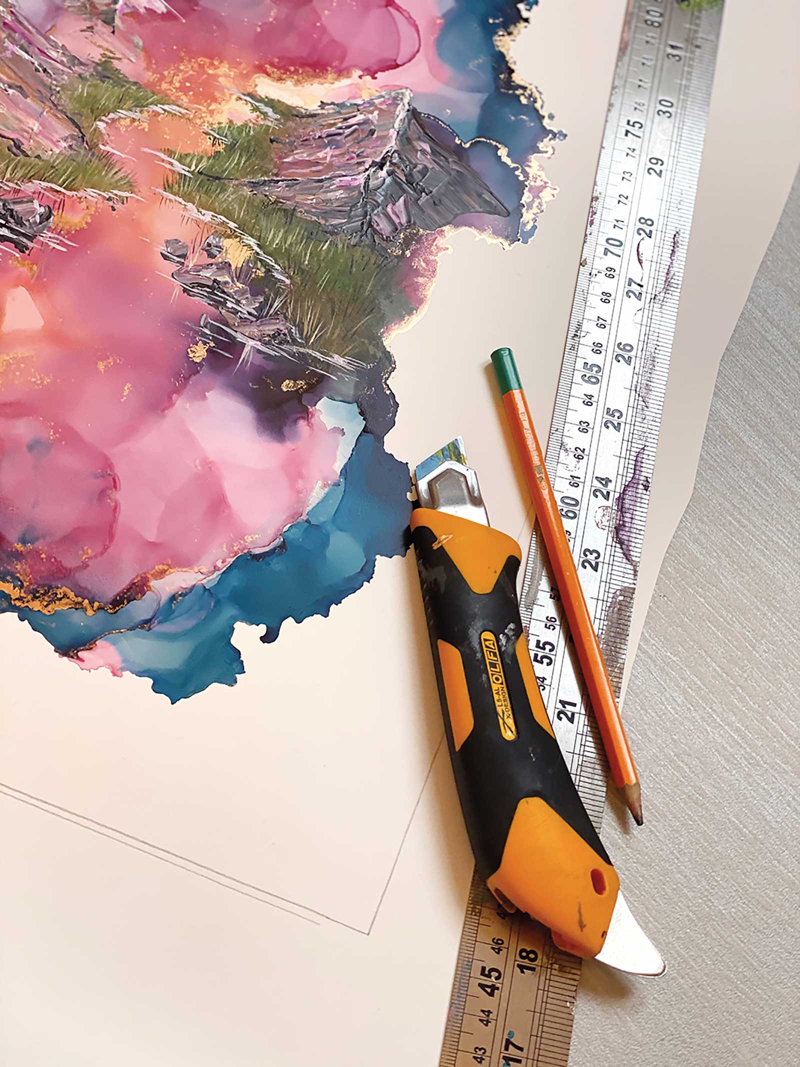 Stage 12
Stage 12 Sealing the Work
This is where I seal my artwork using the varnish and UV resistant spray. I then cut to size, A3 for this piece, and it is ready for framing.
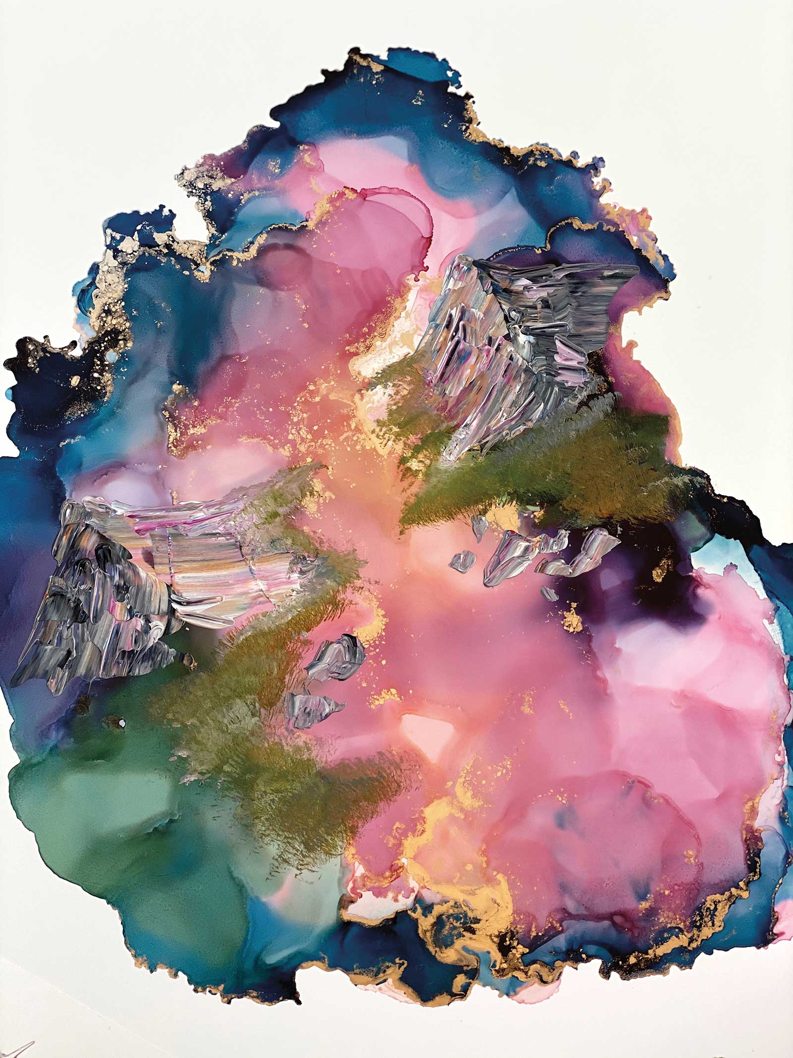
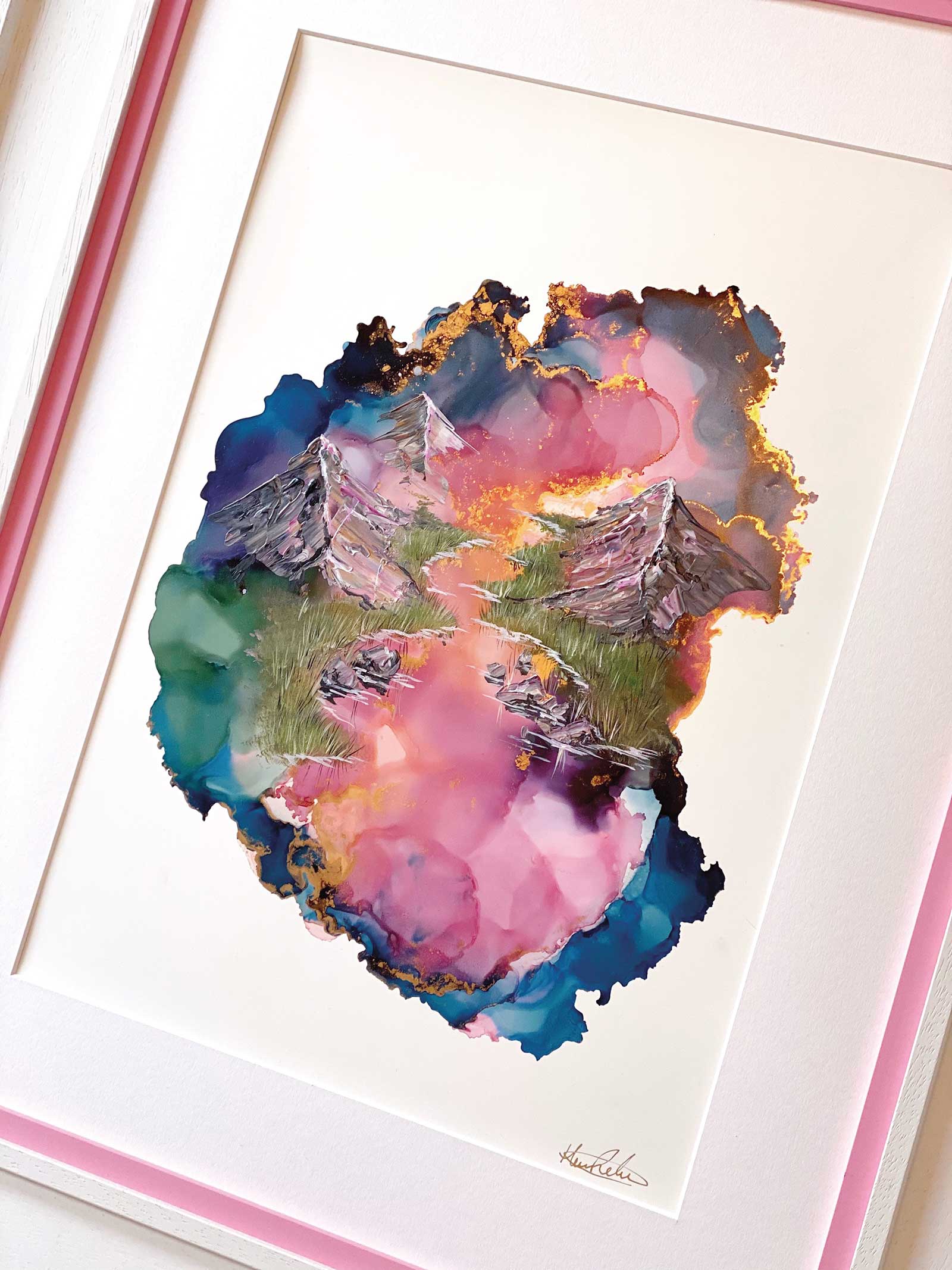 Stage 13
Stage 13 Finished Artwork
Prismatic Cliffs, alcohol ink and acrylic on Yupo paper, 16½ x 12" (42 x 30 cm)
Framing is an extremely important step, I work closely with my framer to create bespoke frames, that are unique to me. I then sign and photograph my work.
About the Artist
 Hannah Rose
As a self-trained artist, Hannah Rose has spent lots of time working on trial and error, practicing and re-practicing techniques, as well as being inspired by many great artists of all genres. However, learning by herself has been the best approach, she feels, because it is more based in play and enjoyment. Rose’s work is mostly displayed through social media, with Instagram as her main outlet. This allows the artist to interact with thousands of people around the world with close connections, as well as complement her artwork through descriptions and music.
Contact at
www.hannahrose.shop