


For nearly a decade I have been using charcoal and graphite, and there is something vulnerable about them that makes me familiar with them. I feel like I am recalling a moment or a memory from the past. It feels timeless, vintage, even Victorian Romantic. I have a steady stream of ideas and inspirations that allow me to create a work with just a feeling that charcoal gives me. These two mediums together can be used to convey powerful messages or create beauty with a specific mood that not only you can feel, but others can feel as well. It can be happy, sad, melancholic, nostalgic and euphoric.
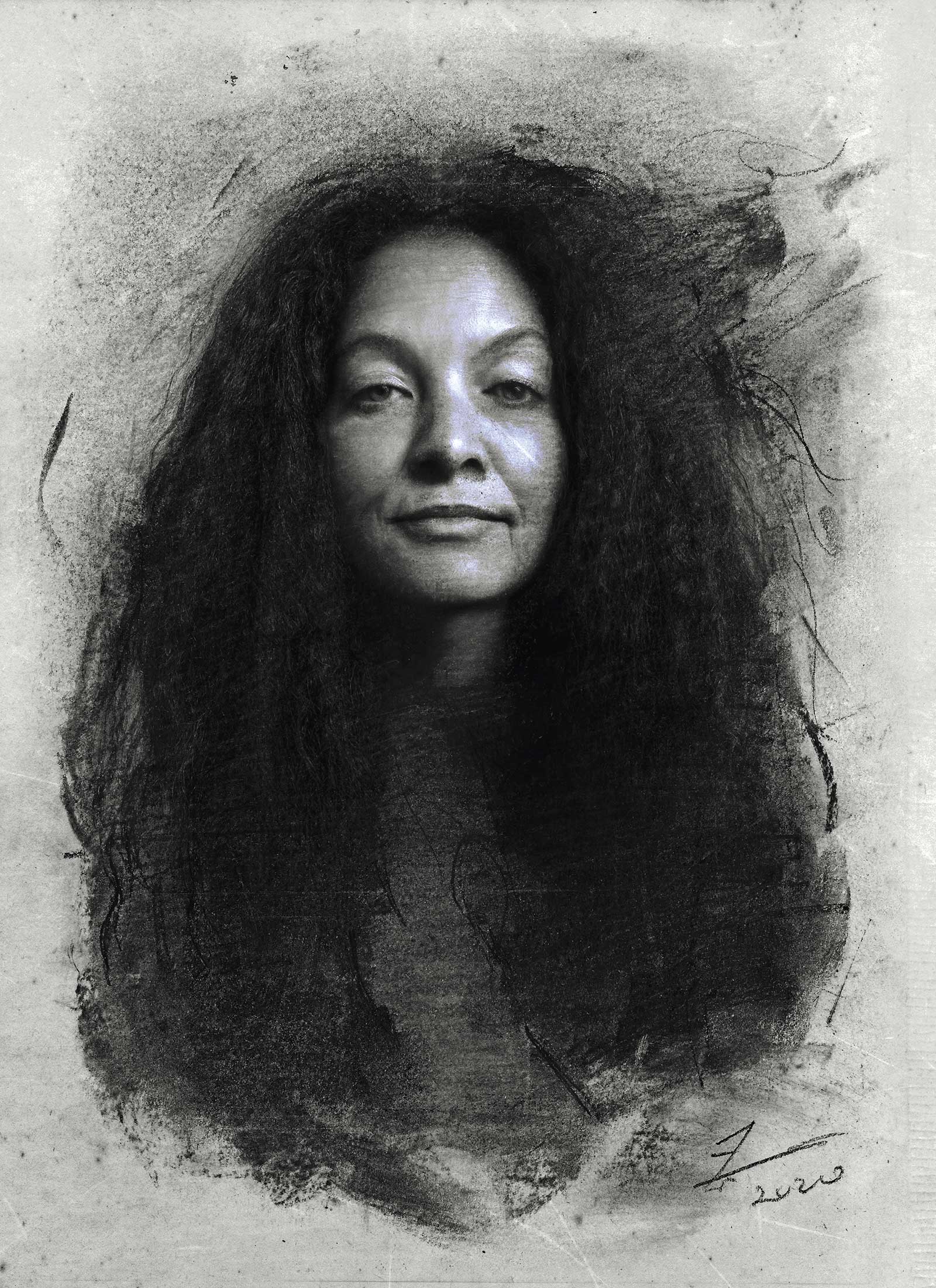
Self-portrait, charcoal, graphite and chalk on toned gray paper, 12 x 8½" (30 x 21 cm). This was my first ever finished portrait when I had just started out. I’d been reading art books by academics, freelancers and industry artists. I absorbed all I could from the books to begin the portrait, and I used a mirror and a camera set on self-timer to capture my likeness as close as possible.
My process for a drawing composition can sometimes change and evolve repeatedly, often in a direction I hadn’t envisioned. Nevertheless, I intend to stay true to myself and express my feelings on paper without overexaggerating the nature of the project I’m working on. This is because I want to keep it as clean as possible—too much information in your work without understanding your intentions can be confusing. To prevent that, I do my research to establish a foundation to build on.
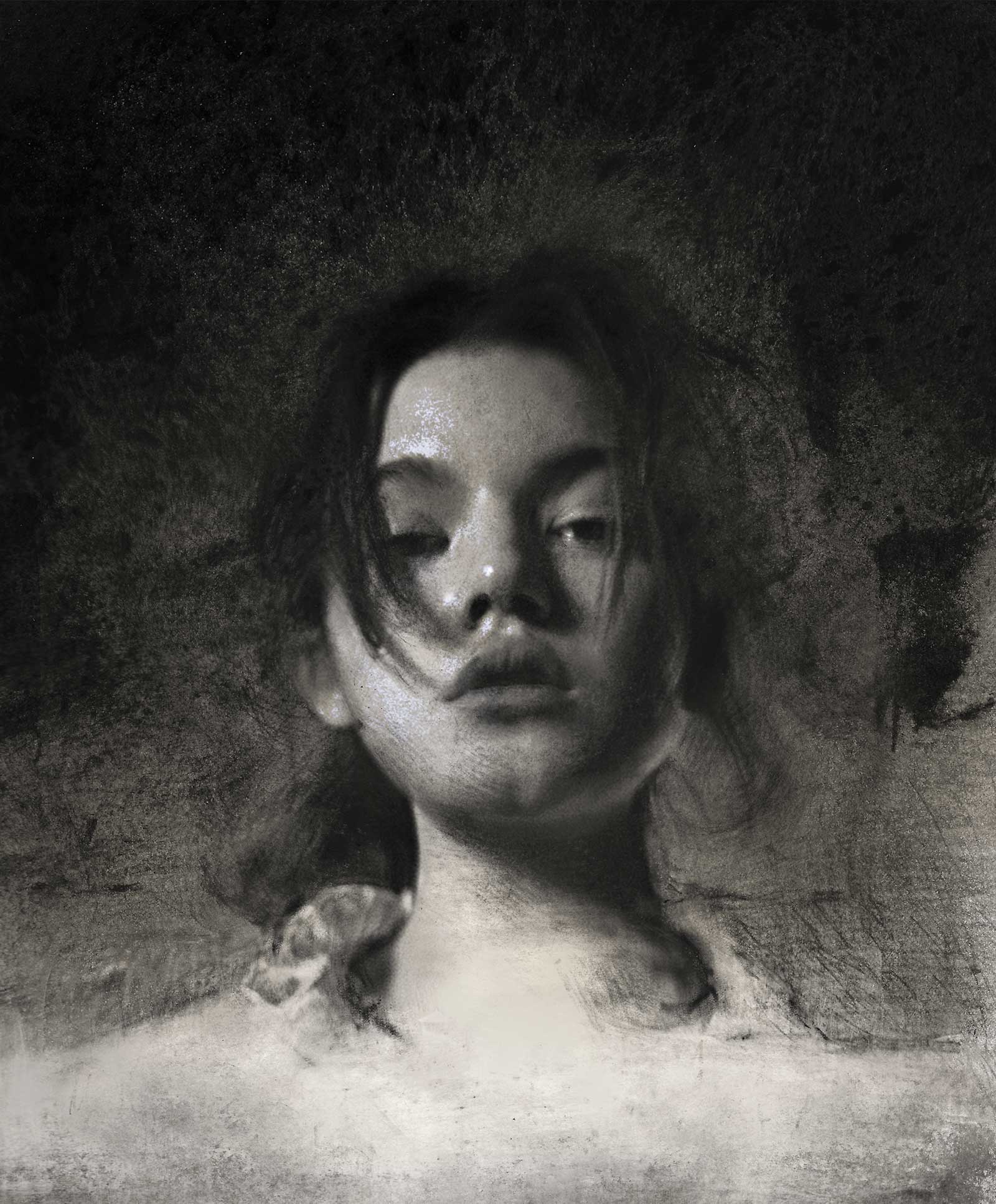
Amara, charcoal, white chalk and graphite on smooth cartridge paper, 12 x 8½" (30 x 21 cm). This drawing was made last year during Black History month in February. I toned the paper with a used napkin and ink to give it a timeless vintage look. I proceeded then with graphite and used charcoal, massed in, lifting out lights, drawing back in with charcoal pencil and chalk. I wanted to keep the work expressive, sensitive and as much accurate as possible.
I research often about many fundamental topics such as the subject theme, materials, references either from life or photo, the mood settings, how well the light works in relation to the overall form and other technical and critical considerations worth thinking about before advancing to the practice. The most intimate process to creating a piece of work is researching, and I mean the integral research of understanding your subject and what is it about, and how you intend to approach it on a level that can be visually understood at first glance. The last part of the research are the tools you’re going to use because they have to be the right kind of tools for your work. Of course, it takes some time to figure out which tools are the right kinds after experimenting with them. You must be able to understand your tools and be familiar with them.
Left: Christine, charcoal and graphite on smooth cartridge paper, 15 x 9" (38 x 22 cm) I was commissioned to draw something moody for a Norwegian musician. I was fortunate enough to get inspired by his music, the Norwegian sounds and the dark atmosphere around the archipelago. I wanted to implement all the elements in this drawing which would later be used as an album cover.
When I just started out, I found using charcoal to be the hardest application to work with because it’s a delicate tool. Charcoal has been utilized as a creative tool since the beginnings of human history, originating in caves where people drew using only burnt sticks of wood. With charcoals, I draw gently and softly, lightly controlling my pressure on the surface of the paper. I often use them together with graphite, jumping back and forth between the two mediums. I find if my pressure is touching the surface too boldly, the paper will suffer from smudging and marring, creating an overly shiny and muddled texture that nobody wants. For example, the less graphite I use, the less shine I get on the paper. This is why I alternate between the two mediums, creating the desired result based on my personal choices and approach to each work. With the blending stumps (and also graphite ranging from 2H to 2B) I gently construct the face, establishing a clear statement of the light. Before utilizing the stumps I sometimes apply tissue paper with a little bit of charcoal, working to find landmarks within the darker facial features such as the nose, cheekbones and eyes.
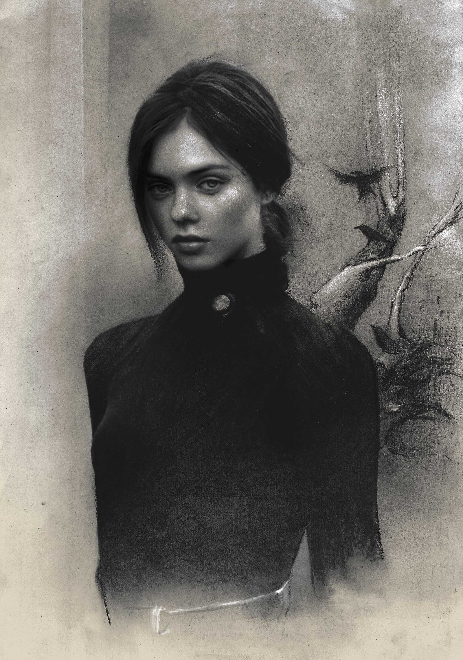
Xenka, charcoal, graphite and chalk on toned gray paper, 12 x 8½" (30 x 21 cm) I had just finished reading a YA book by V. E. Schwab. I was inspired to draw a figure from photo reference and I applied my own elements on the model. My intention was to give it a transcendent fantasy, or a dreamlike vibe about a heroine emerging from the misty woods.
I use erasers to highlight before using any white medium, which I then add for more contrast only if needed. When I’m looking for darker shades, I use compressed charcoal, Cretacolor or Conte pencils. The difference between stick erasers 2.5 and 2.3 is that the first is wider and perfect to create lengthy highlights such as the texture of hair, and the other is round and tiny, suitable more for controlling pressure on the highlights of the eyes, nose and lips. You can’t go wrong with either, and you can experiment on your own and decide which one works best for you. —
My Art in the Making Dan
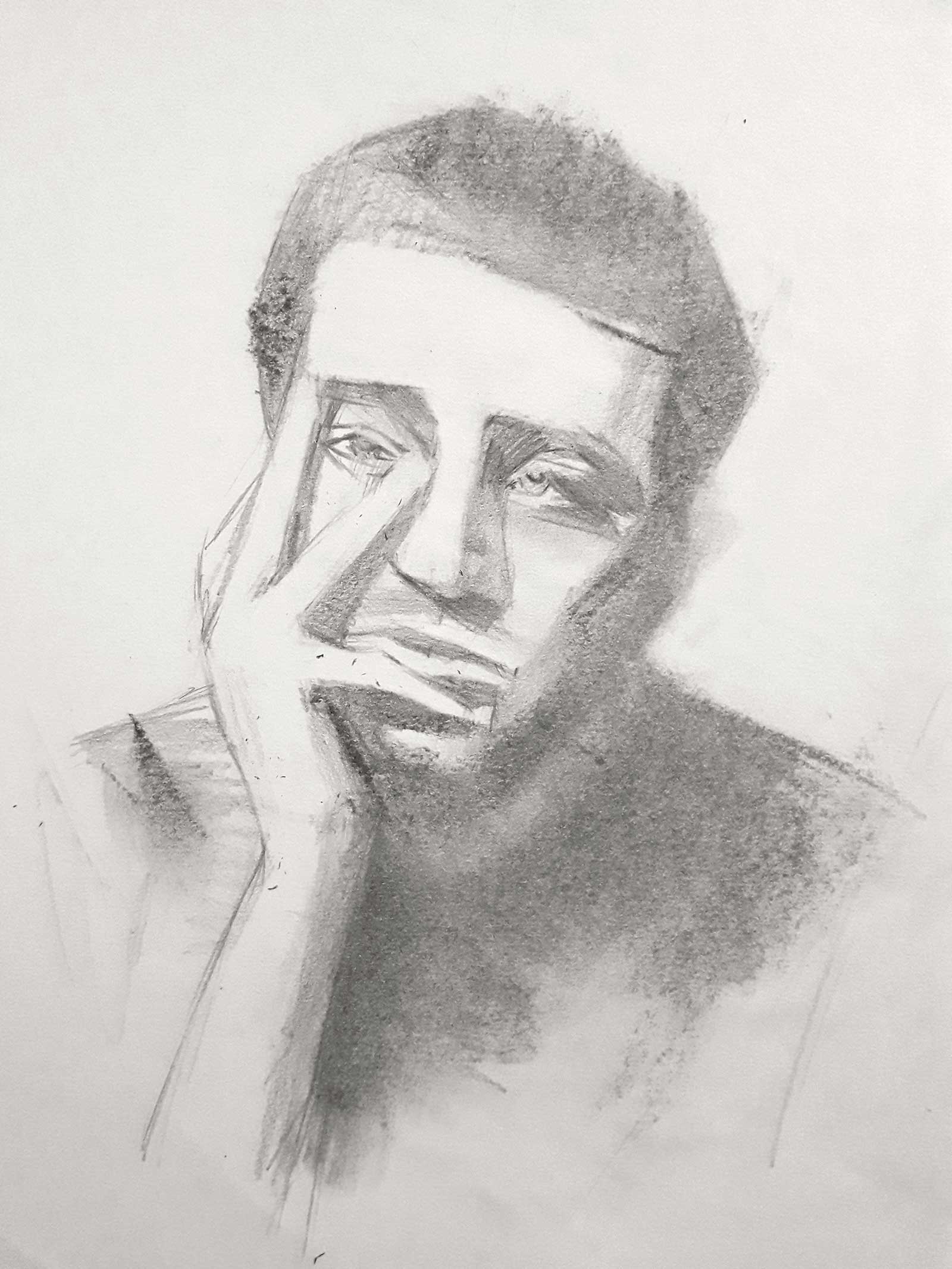
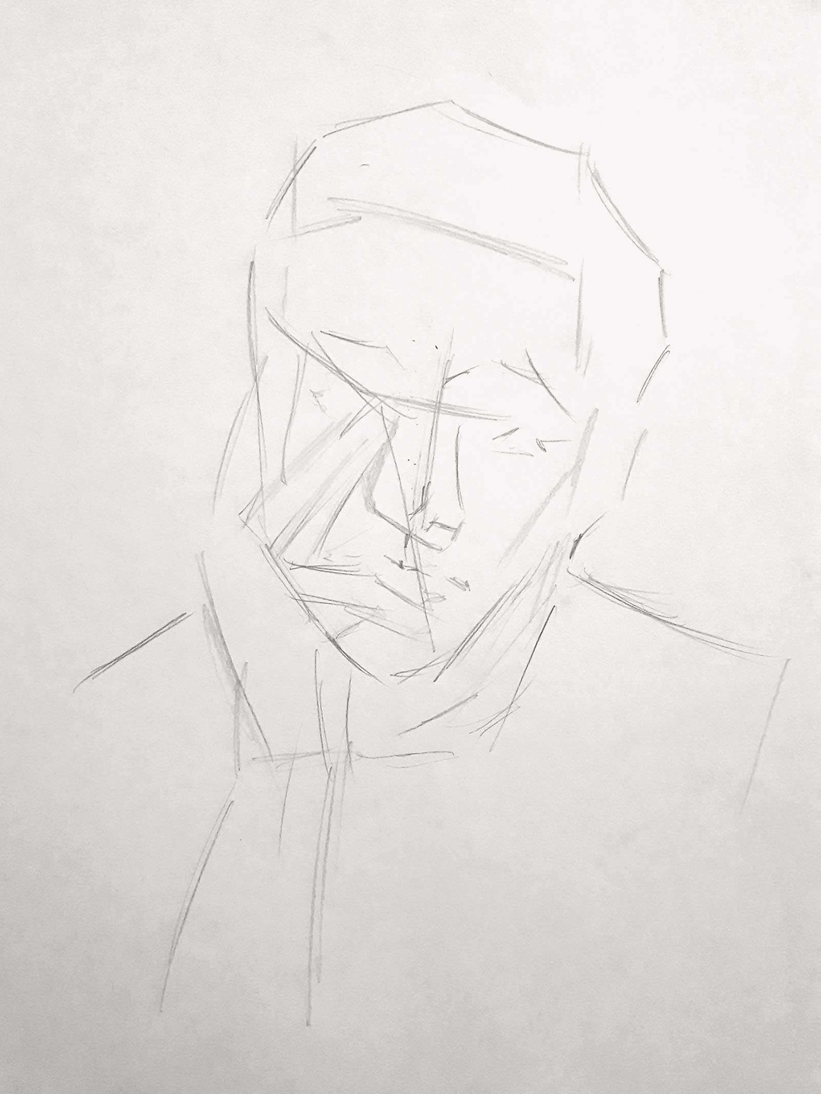 Stage 1
Stage 1 Basic Shapes
I begin with simple, loose but clean marking and shapes and straight lines to establish the form of the face and the hand. I make the markings lightly with graphite B grade.
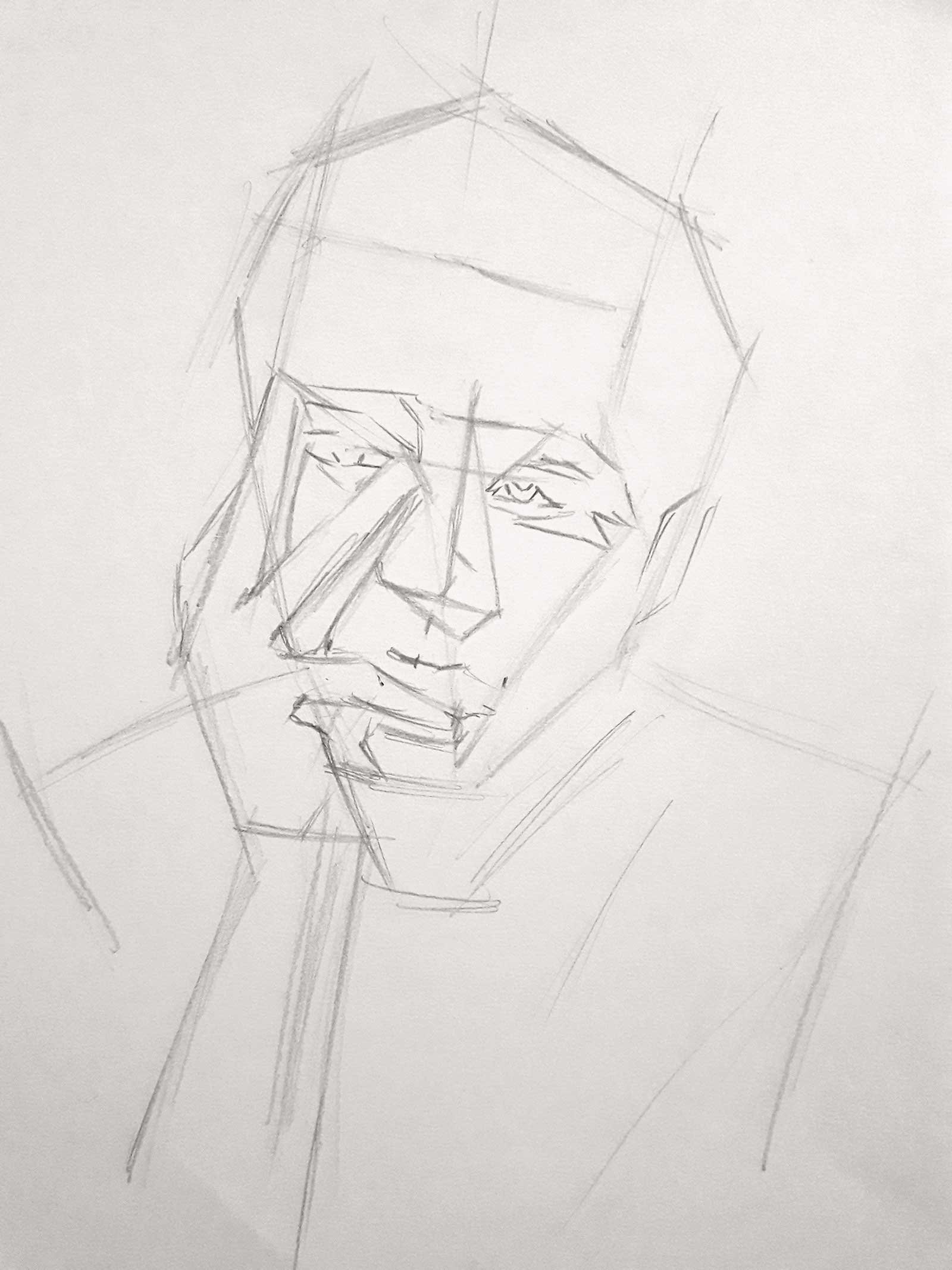 Stage 2
Stage 2 REfining Lines
I refine my lines around the head to make them more clear and simpler before I block in the facial features. Note: I’m using the same pencil and I’m only applying a little pressure.
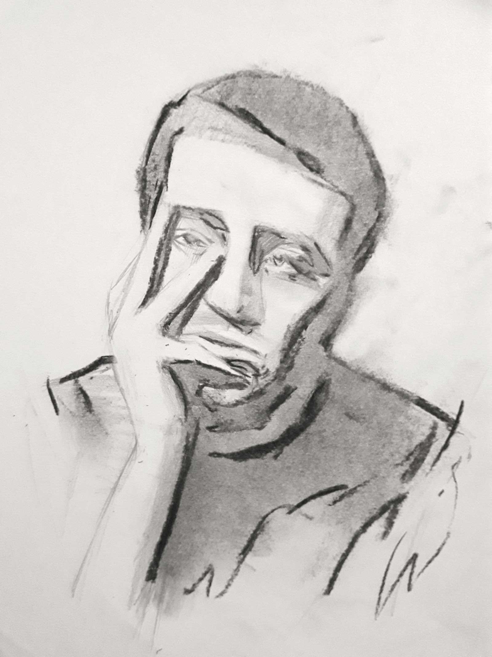
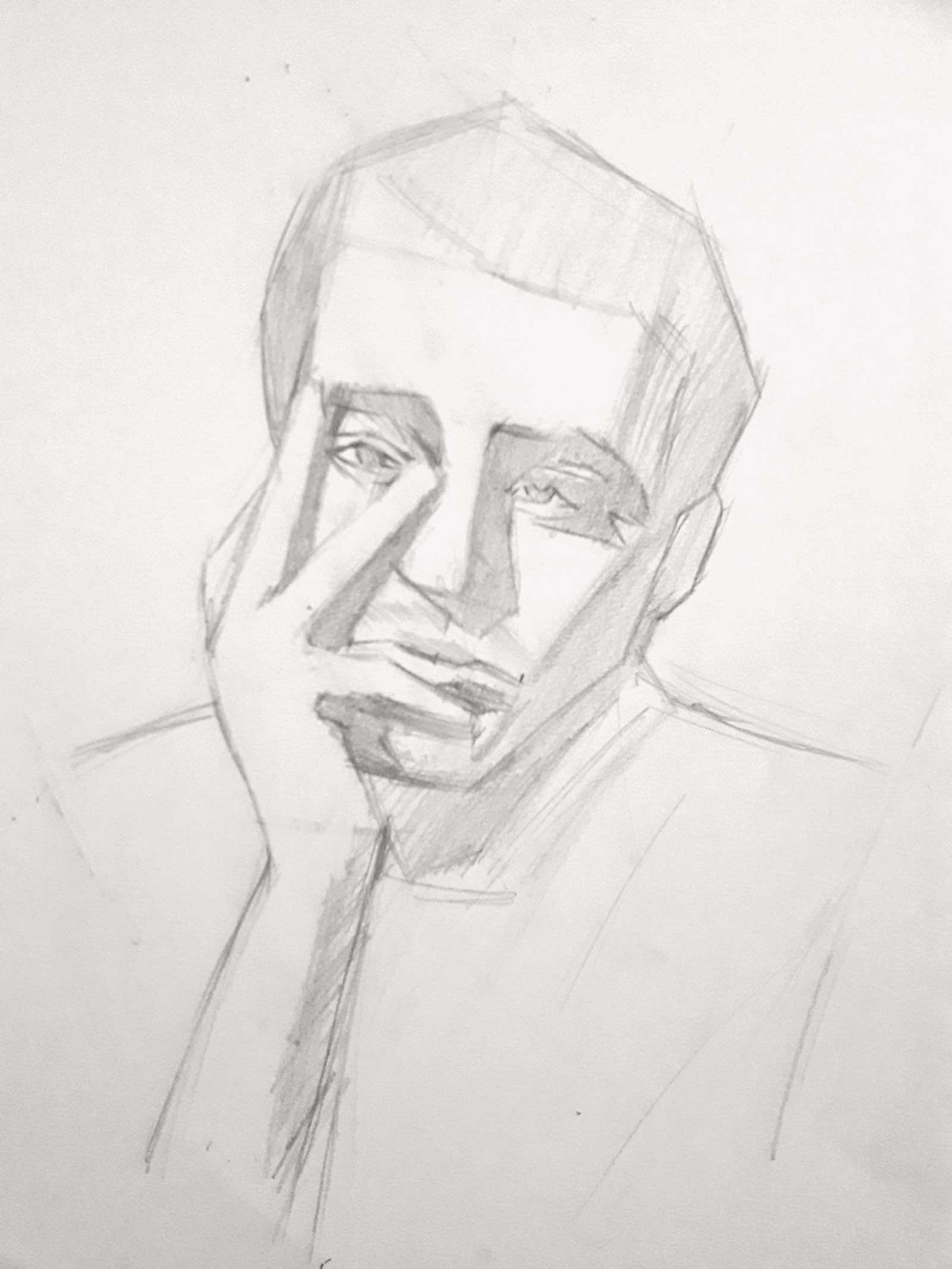 Stage 3
Stage 3 Block-in ANd Shadows
I start the block-in and bring out the shadows to suggest the light direction coming from the left. I also erase out the lines completely and do the shadows with an overhand grip.
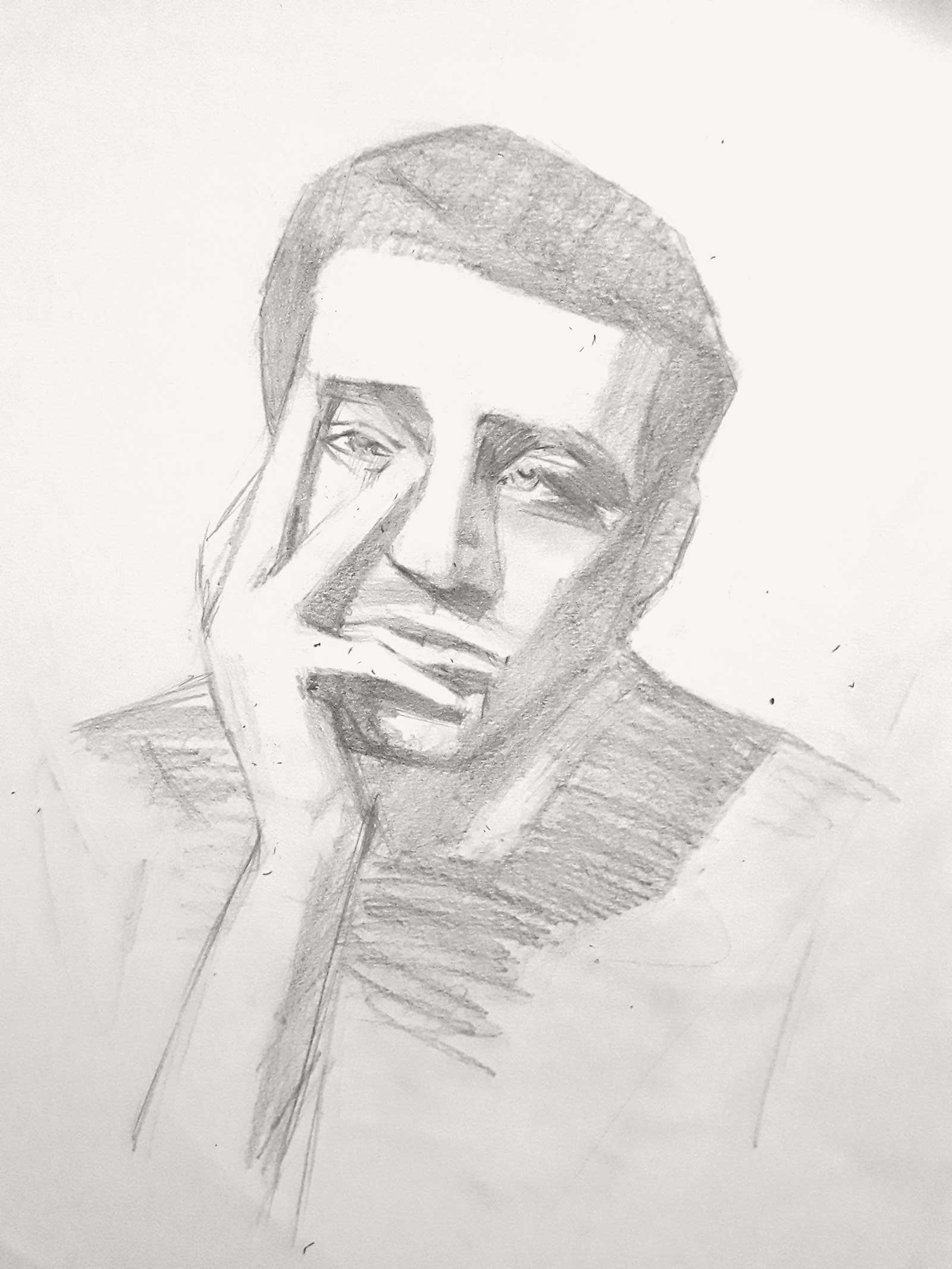 Stage 4
Stage 4 Continuing to add Dimension
I continue the block-in process on the other areas around the body and go slightly darker, but not too dark. The nose, the eyes and the mouth now suggest three-dimensionality.
 Stage 5
Stage 5 adding Charcoal and smoothing
The graphite lines are visible enough for me to wash in vine charcoal around the shadows. I used blending stumps and smooth tissues to cast a smooth shadow without losing details on the face.
 Stage 6
Stage 6 additional vine coat
Now that I have a better idea of how shadows work with vine, I lay one more coat of vine by outlining and marking the shadows again with vine charcoal in free and uniform lines.
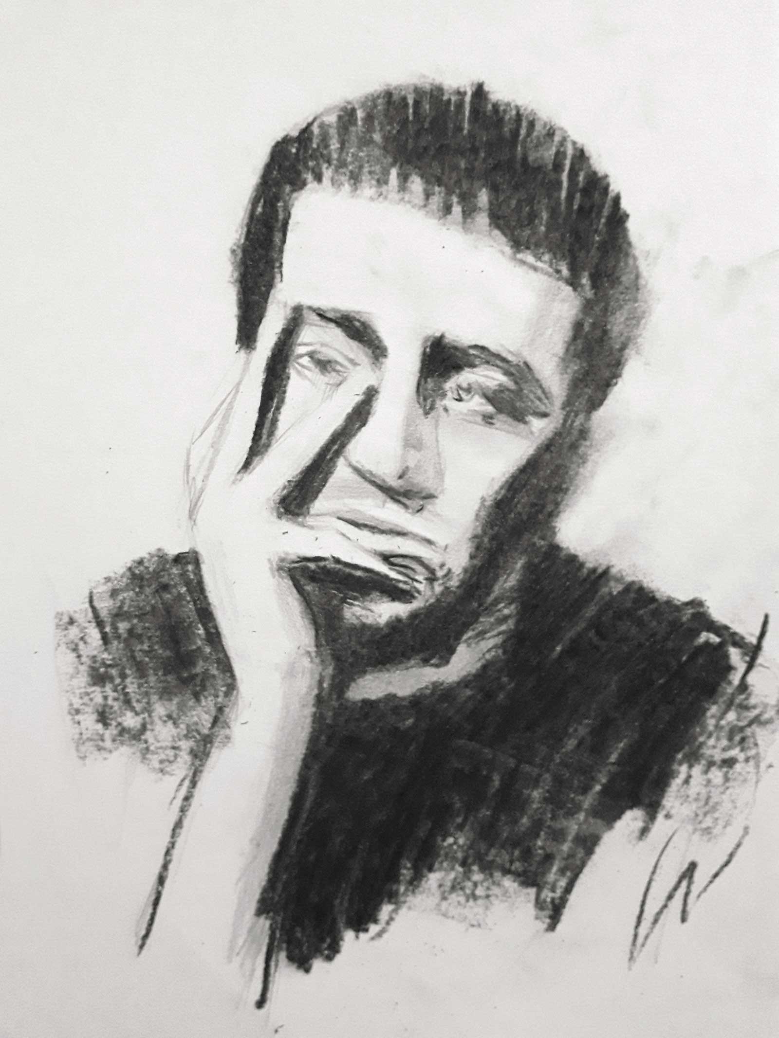 Stage 7
Stage 7 BOdy and Neck
I fill in more vine charcoal where needed to complete the body form and bring out the neck.
 Stage 8
Stage 8 adjustments
Here I’m trying to adjust the vine charcoal with a smooth tissue to suggest delicacy and experiment with texture lines.
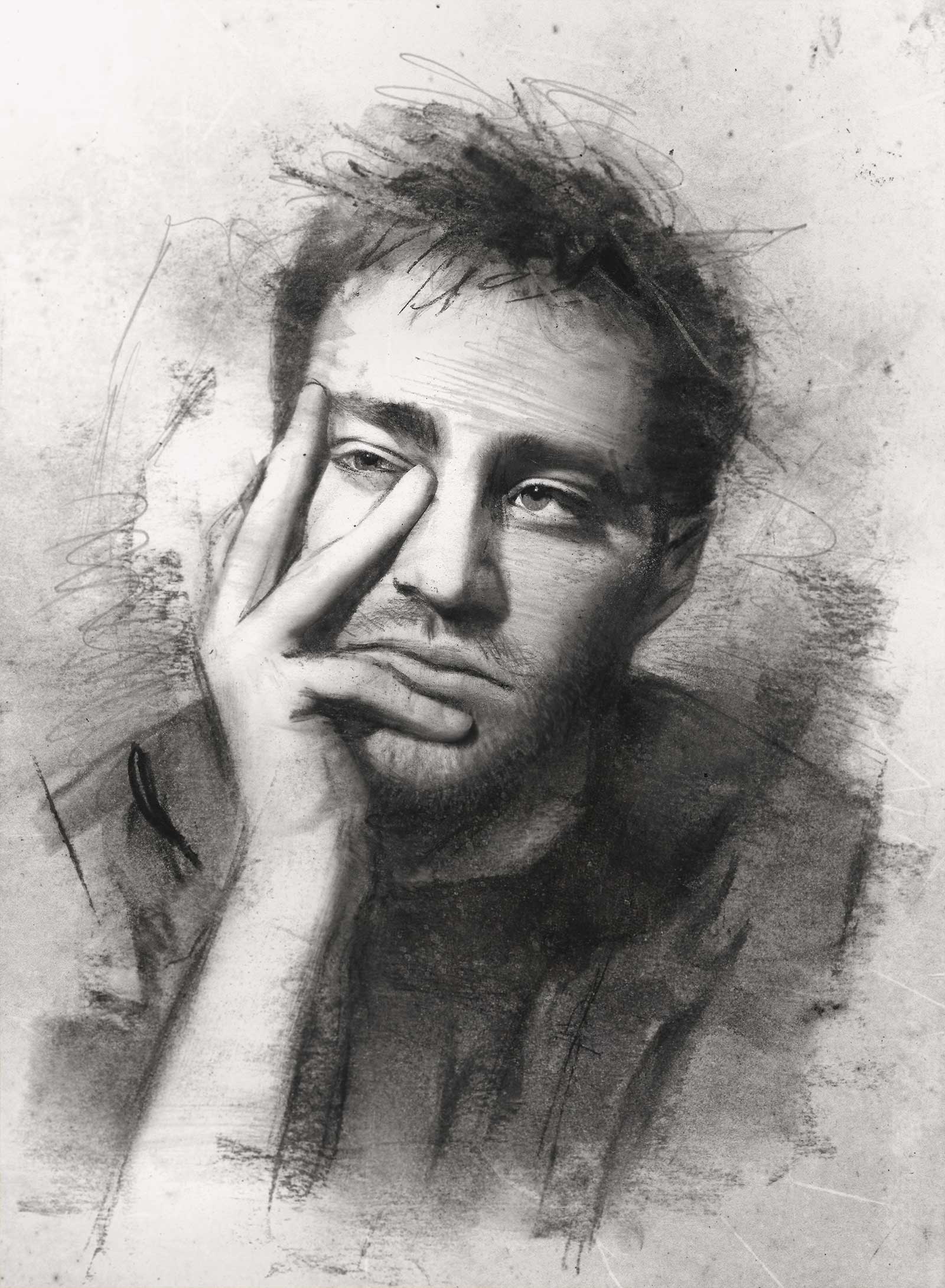
 Stage 9
Stage 9 Beginning Facial Features
I render the first stage of the facial features starting with the eye shapes and nose with soft charcoal and soft Nitram. There are extra landmarks for the hair.
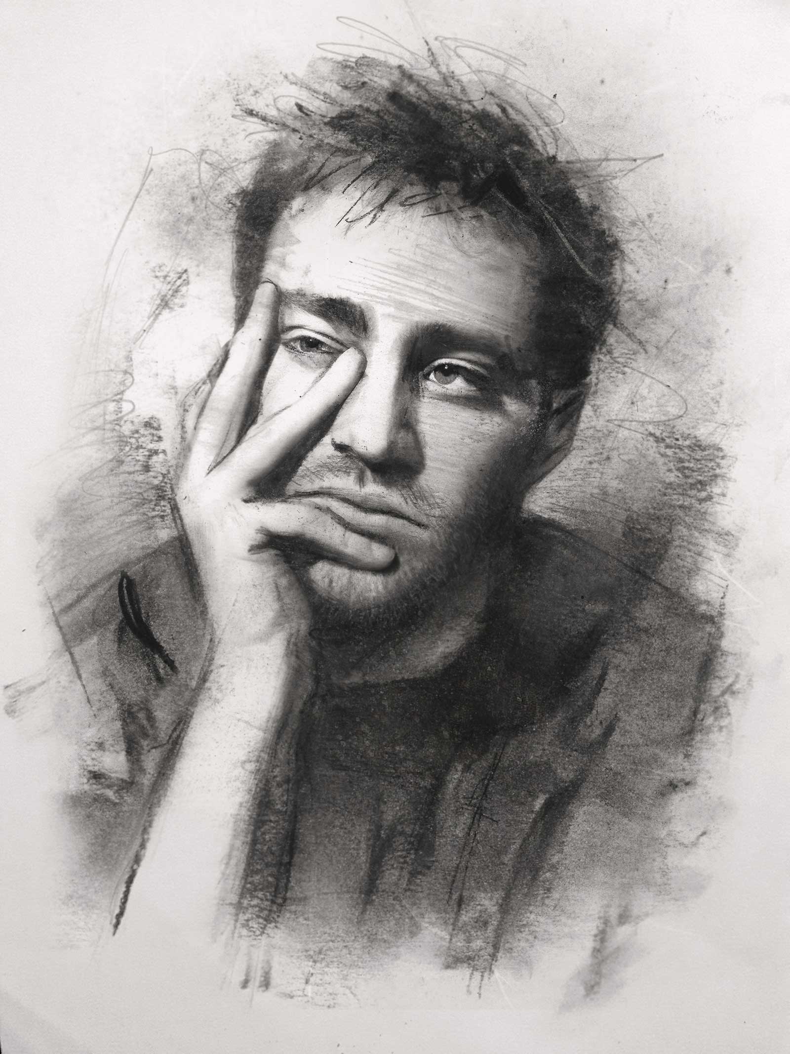
 Stage 10
Stage 10 Smoothing Hard edges
At this stage, I render the face smoothly wherever needed and where there are hard edges with blending stumps. I refine the facial details with a medium charcoal pencil.
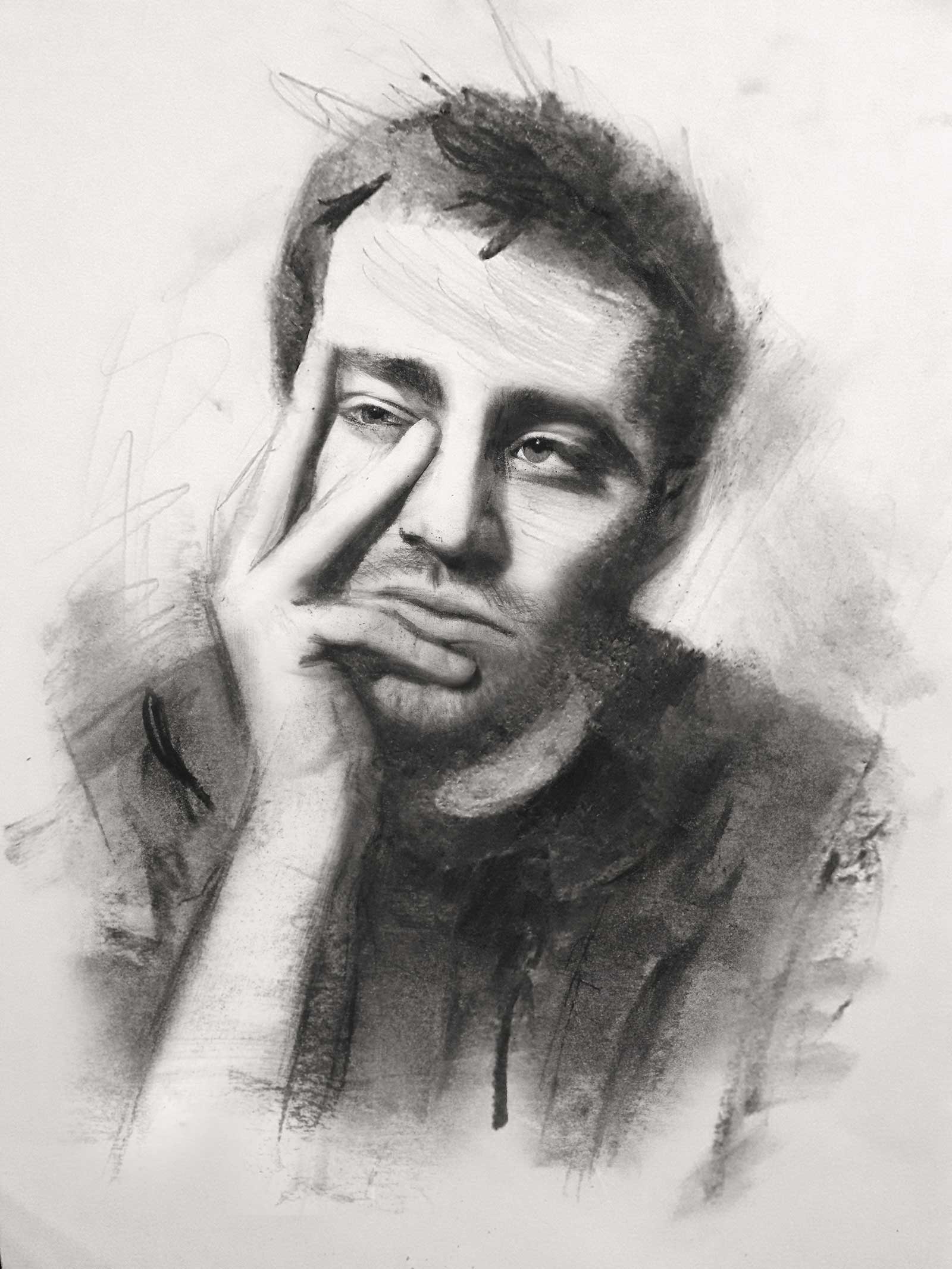
 Stage 11
Stage 11 Graphite Lines
I throw in some directional graphite lines again on the face, on the forehead, hair and right cheek. The shadows are completely formed and the facial hair is visible.
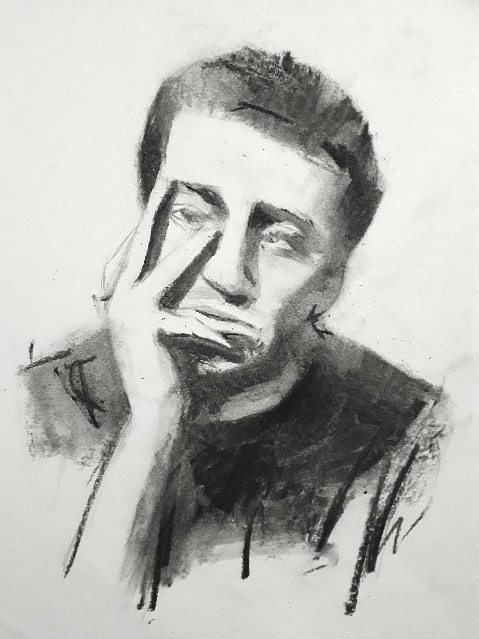
 Stage 12
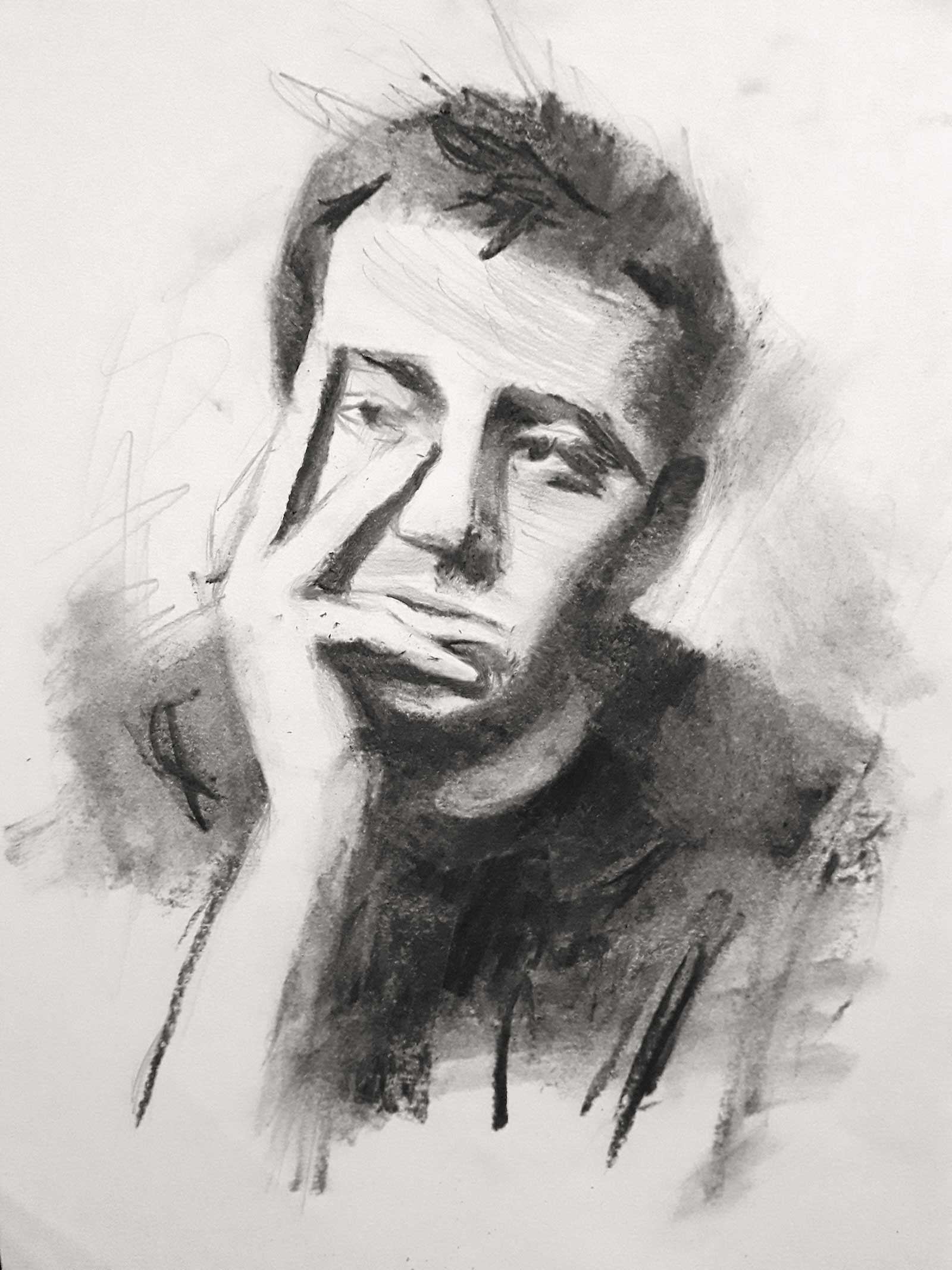
Stage 12 Finished Artwork
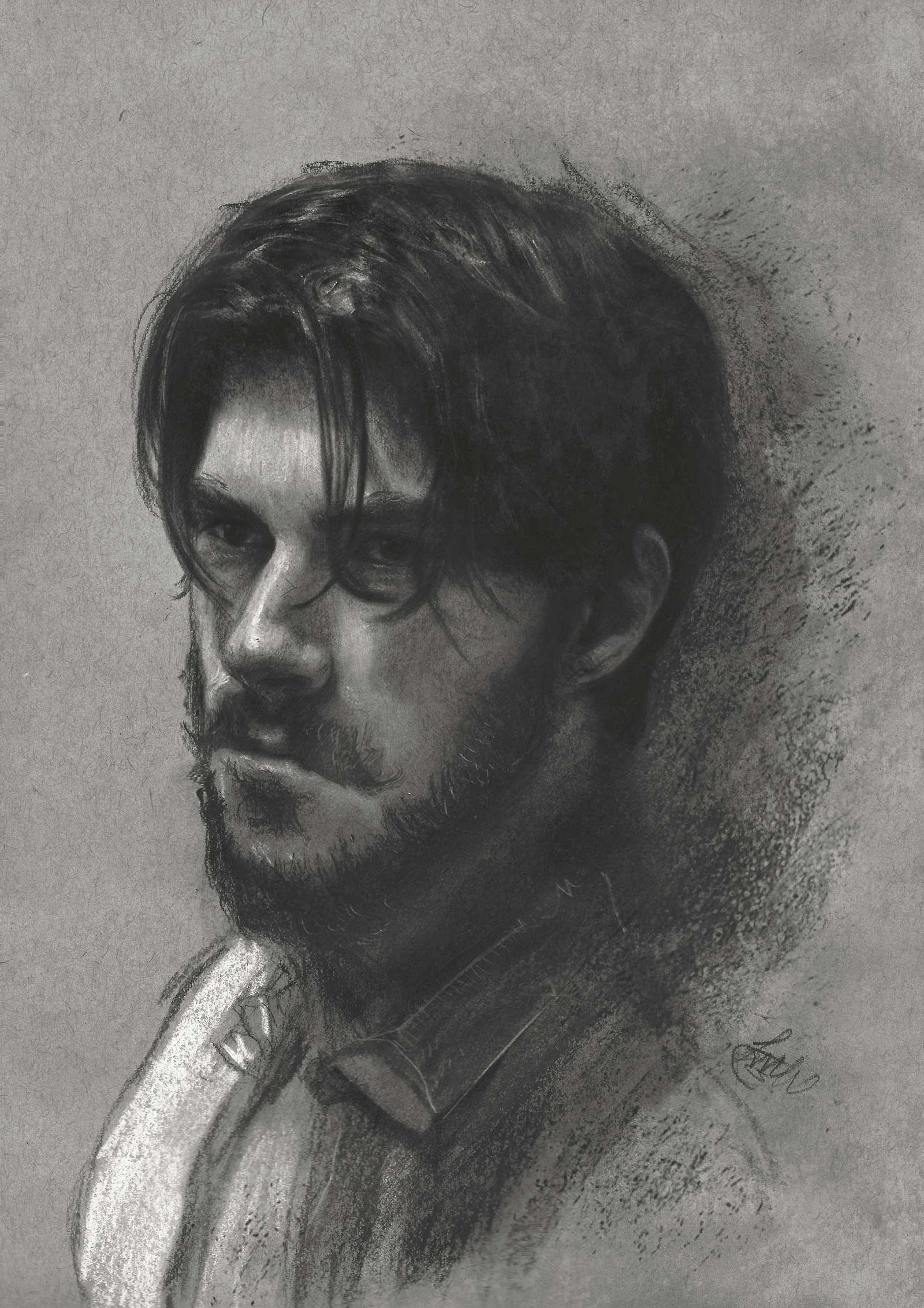
Dan, charcoal and graphite, 12 x 8½" (30 x 21 cm)
I lay down my finishing touches on the face with the sharp end of the charcoal medium pencil. I add more background with a used smooth napkin from earlier and that’s a wrap.
About the Artist
 John Fenerov
John Fenerov is a Greek visual artist, illustrator and designer based in Cyprus with a Caucasian background. His works are mainly focused in portraiture and experimental themes revolving around literature, art and design. Accompanied with a cultural twist, all techniques continue to evolve in a subconscious way.
Contact at
www.johnfenerov.com