


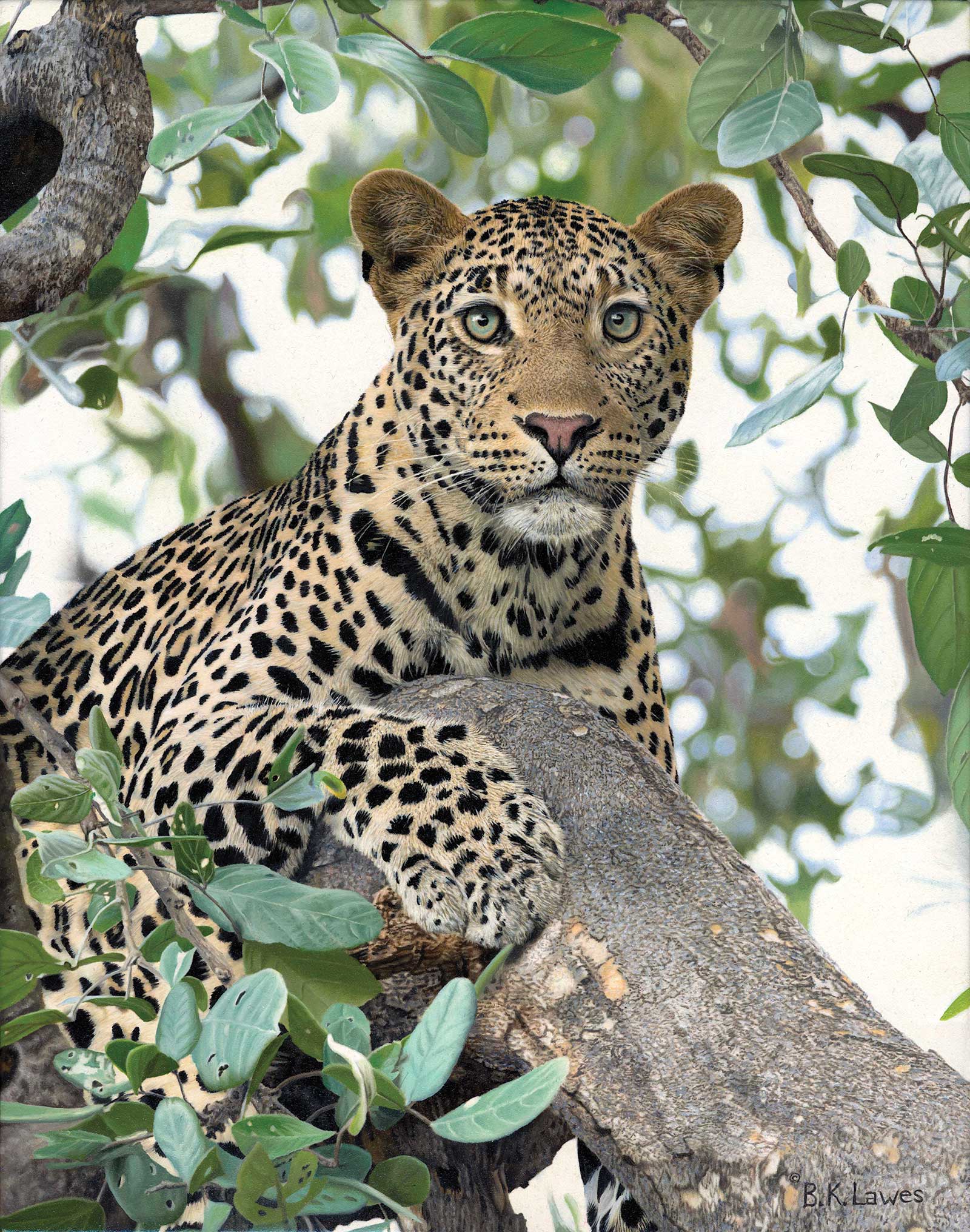
 Locked On, oil, 40 x 30" (101 x 76 cm)Grand Prize is a four-page editorial feature in American Art Collector magazine
Bruce Lawes
Ontario, Canada
Bruce Lawes
Ontario, Canada
True to Nature
Ontario-based artist Bruce Lawes blends realism with elements of impressionism in his paintings of big cats, buffalo, eagles, elephants and other beasts. “I mix in elements of impressionistic techniques to direct the viewer to the areas of sharp focus I want you to see. I use multiple laying techniques to create depth in my work,” says Lawes, whose grand prize-winning piece, Locked On, depicts a leopard in predatory mode, waiting amongst tree leaves to strike. The oil painting is so sharp and precise, at first glance you might think you’re looking at a photo in National Geographic.
“Over time through observation and experimentation, I have become better and more confident in how to achieve my desired end result,” says Lawes. His inspiration, he says, comes directly from life experiences, living with and observing nature. “My work generally has a continuing theme, that being wildlife, but I often like to try to create stories that are associated with each image when possible. I often title works to make a viewer wonder about the title in association to the painting, which often reveals the story I wish to convey.” In Locked On, the title as well as the focus in the cat’s eyes convey a story of cunning, planning and boldness, something that happens every day in the wild in the dance between predator and prey.
Once an idea has come to mind, Lawes often begins a painting using either personal photographs or by getting in touch with a professional photographer, who either ventures into the field to take new photographs or pulls the right photo from their archives. Lawes explains that he also studies taxidermy and falconry to better understand his subjects. “I can also sculpt, so I often will sculpt a subject so that I can see how the light source may cast a shadow accurately. With composition I often look for abstract shapes of negative and positive space that will naturally force a viewer to look where I want them to look,” he says. “I can often go beyond what a camera can capture and manipulate a scene to express what I wish you to see. These are the elements that capture my collectors’ interest.”
My Inspiration
My inspiration for this painting was to create a leopard with that intensity and purpose you often see in their eyes when they first spot an opportunity for prey. The leopard, being one of the big cat five predators in Africa, is an inspirational subject in how graceful it is with deadly finality in its intent. Its fur is not just beautiful to look at, and paint, but for them, it acts as an effective camouflage as it stalks through tall grass or perches in trees. These animals are truly one of the most strikingly inspirational animals in Africa. This work will go to auction in the near future to help support Dr. Jane Goodall’s work in conservation.
My Design Strategy
The way in which I design a composition is often determined on what I am painting. How is it being featured, sitting, standing, flying, running or swimming? I also consider what the painting is being used for, is it going to be on a cover of a magazine or featured in a prominent show. These factors all go into my planning stages before I begin. The size of the canvas is another consideration that needs some thought, as too big reduces the market to sell, but too small may effect the impact you may want to convey with that specific subject. With my painting, Spotted, the composition illustrates a framing of the main subject with surrounding foliage to direct your view to those incredible intense eyes.
My Working Process
The way I work can be very time consuming, but I sometimes like to introduce different techniques for effect. The foreground or main subject is highly detailed while background elements are more impressionistic. I think if I had made it completely sharp it would not have had the same impact and appear too busy. In preparing my canvas, I spray my gesso on my linen in order to get a wonderfully smooth surface before I paint, this allows for finer detail when necessary. I use 0-size brushes when I get to the finer details in the leopard, for example, but will apply color with a broad brush and then use a fan brush to pull color and soften any sharp edges as seen in my background leaves. As I only paint in oils on linen this technique easily allows me to manipulate the paint with the extended drying time.
Contact Details
Email: info@bklawesart.com
Website: www.bklawesart.com
 Afternoon Rendezvous, acrylic, 36 x 30" (91 x 76 cm)
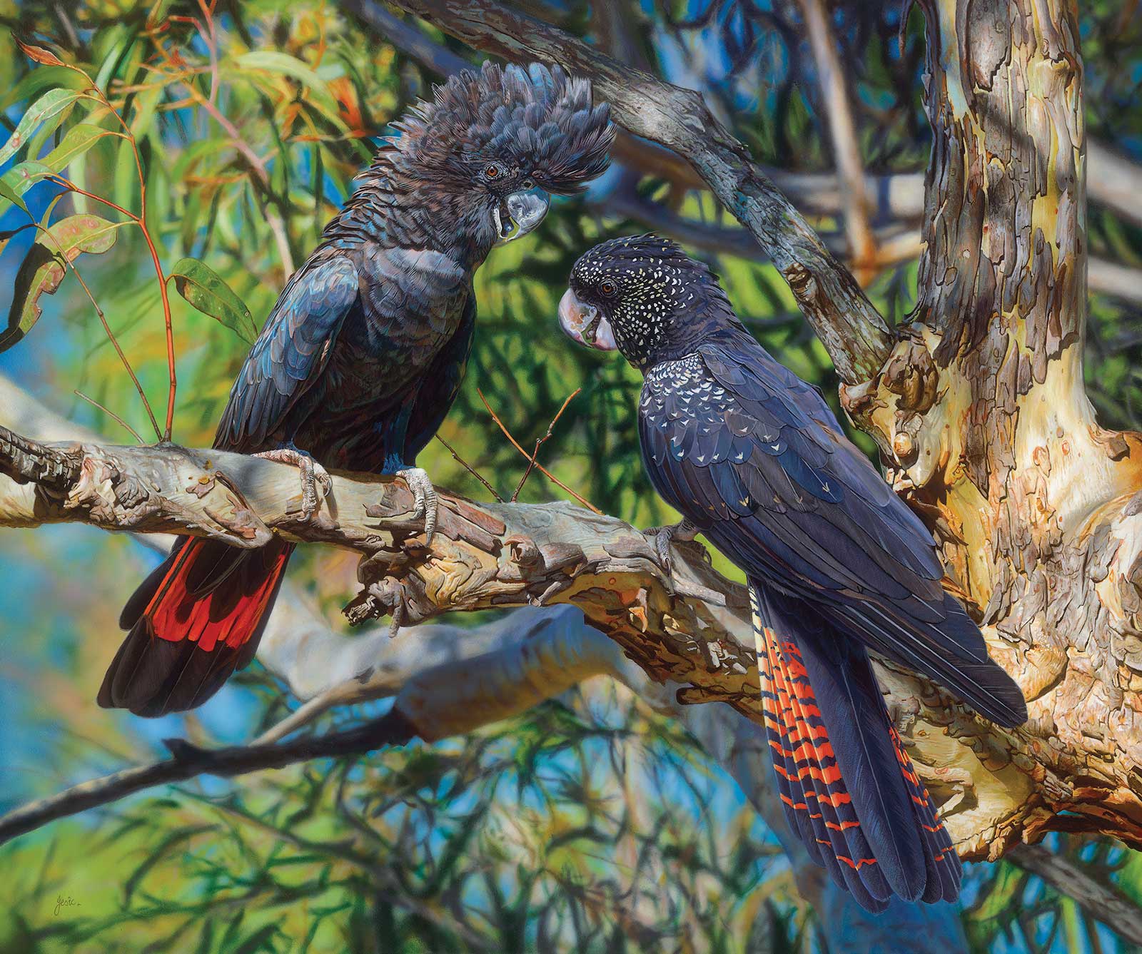
Second Prize is a two-page editorial feature in American Art Collector magazine
Afternoon Rendezvous, acrylic, 36 x 30" (91 x 76 cm)Second Prize is a two-page editorial feature in American Art Collector magazine
Stephen Jesic
Queensland, Australia
My Inspiration
I had previously painted a single red-tailed black cockatoo in a portrait format and was so pleased with the painting and having so many high quality reference photos the groundwork for a larger painting was inevitable. As artists do, after some time passes images start to form in the subconscious, the urge becomes overpowering and various design versions start coming to the foreground. It reaches a compelling stage where you have no choice but to start to review all the reference material. I usually write a brief at this stage to capture the essence of what the final design should incorporate, and so it begins.
My Design Strategy
With the brief in hand, I reviewed all the reference photos and set up a folder to copy all the images required to meet design variations of the brief. As I said I always wanted to do a larger painting of this setting but this time including a male and female red-tailed black cockatoo in a landscape format. I wanted to show the vibrancy and energy of both birds typically interacting, enjoying the afternoon sun in this magnificent sunlit scene incorporating a myriad of textures, lighting, detail of the birds and intricate complex character of the scribby gum tree.
My Working Process
I prepared a 9-millimeter Baltic Birch board conforming to Archival Museum Standards. After drawing out the design on the board I then started blocking in the main colors with structure acrylics diluted to a heavy cream consistency applying the broader areas with some large filbert bristle brushes then rendered the more detailed areas with #2, #5, and #6 round stiff synthetic brushes covering the entire board quickly, loosely, but still accurate. After blocking in the main colors with brushes I thinned the colors further then airbrushed over parts to soften edges, then brush, alternating between the two which introduced more complex layers of color harmony. The complexity of this painting was overwhelming, so I decided to finish the birds then start from the left of the painting fine-tuning and finishing the final detail as I went across using various sized round and script brushes. I lost track of how many interlocking layers of paint I used to create the textures and lighting effects and with each passing layer the painting’s character resolved, finally coming together.
Contact Details
Email: saj@stephenjesic.com
Website: www.stephenjesic.com
 There Be Dragons!, pastel, 14 x 16" (35 x 40 cm)
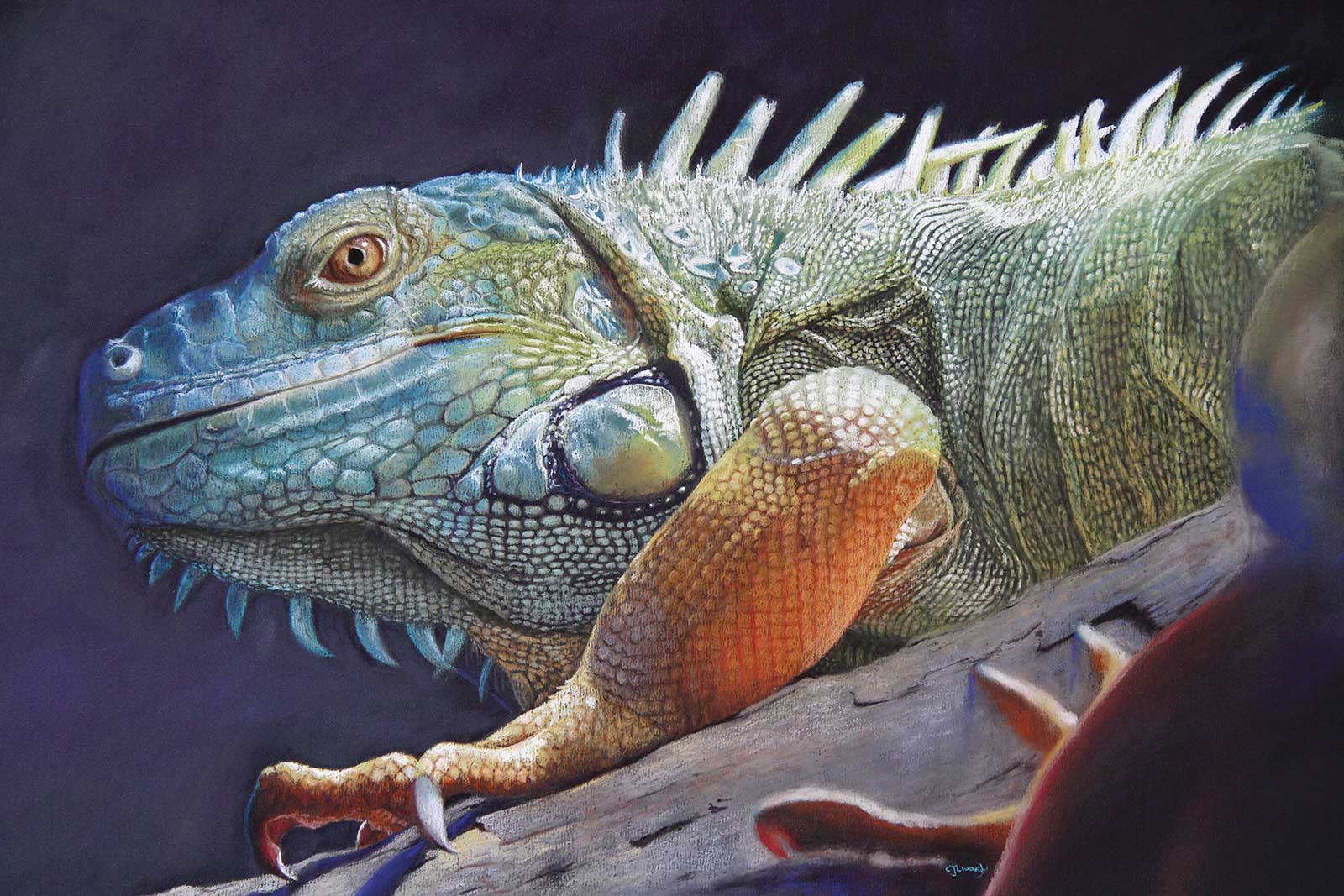
Third Prize is a one-page editorial feature in American Art Collector magazine
There Be Dragons!, pastel, 14 x 16" (35 x 40 cm)Third Prize is a one-page editorial feature in American Art Collector magazine
Catherine Lidden
New South Wales, Australia
My Inspiration
Who could fail to be inspired by these gorgeous creatures? Reptiles are often overlooked as subjects, but they are fascinating to do. The color of the green iguana is highly variable as a matter of course, but my reference photos were taken in a reptile house, which had fabulous lighting that gave the iguana some wonderful color effects. What also got me intrigued was the variety of scales covering different areas of his body including the scales that resemble spikes behind his neck. Isn’t that head pure dragon?
My Design Strategy
My initial design starts with taking the photos. The viewfinder helps me select the areas to focus on. I felt that by looking up at him it would convey a sense of size. I wanted the focus to be on the head and those lovely scales, but I also wanted to include the huge claws. The decision to include the hind leg on the righthand side was to balance the composition. In the end I used two different photos taking aspects from each to build the whole. I knew I wanted a dark background with nothing to take away from the iguana.
My Working Process
As usual, I began with thumbnails to sort out the composition. These are very basic and show only the shapes and values. Once this is established, I draw it on cartridge paper. I don’t draw in all the scales—just the major ones and show which direction the smaller ones take. The reason for this is, once the drawing is transferred to the pastel paper a lot of detail can get lost. I have my reference photos on my computer so I can zoom in on details. My way of working is to do small sections at a time until completion, then move on to the adjoining part. I began with the eye and worked out. At no point was fixative used.
Contact Details
Email: cjlidden@yahoo.com.au
Website: www.catherinelidden.com
Finalists
Each receives an Award Certificate and a one-year subscription to International Artist magazine PLUS having their work seen worldwide by international galleries looking for new talent.
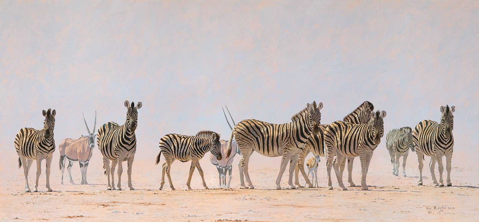
Paul Dixon, Watching the Watcher!, oil, 18 x 38" (45 x 97 cm)
Paul Dixon
Western Cape, South Africa
My Inspiration
Living in Africa for the last 40 years has given me the opportunity to seek out those special moments in nature that end up on a piece of linen as a painting. Namibia is my favorite stamping ground, essentially a desert country with wide open spaces coupled with a unique light and atmosphere which go hand-in-hand with the diverse array of wildlife to be found there. The combination of these features is my inspiration and gives me the perfect recipe for my paintings.
My Design Strategy
My work is usually determined by the animals I paint and their activity or indeed, their inactivity. The final composition is worked out from sketches and photos back in the studio but for the most part my paintings are designed by nature hopefully resulting in a more natural and authentic appearance.
My Working Process
I start by getting rid of the “white” of the Belgian linen by using a very “turpsy wash” of usually an earthy orange over the surface, and then leave it to dry. Working from top to bottom, the background is laid in allowing some of the undertone to show through. Once dry, I draw the main characters with graphite, then do a tonal underpainting of all the shadow areas. When this has dried, I use various glazes in several layers to achieve the correct colors of the animals, finishing with more opaque mixes working up to the lightest lights.
Contact Details
Email: wildart@mweb.co.za
Website: www.facebook.com/paulbdixonstudio
Tanya Achilleos Lock, Never a Dull Moment, oil, 31½ x 35½" (80 x 90 cm)
Tanya Achilleos Lock
Wiltshire, UK
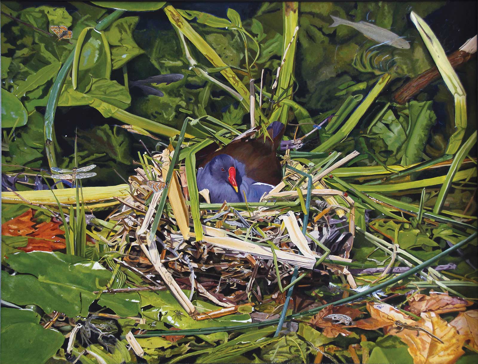
Tanya Achilleos Lock, Never a Dull Moment, oil, 31½ x 35½" (80 x 90 cm)
Tanya Achilleos Lock
Wiltshire, UK
My Inspiration
I saw this Moorhen in its nest by the town bridge a few years ago. I was really interested in all the wildlife that was happening around the nest, and I thought how it must be so busy in the bird’s world. This inspired me to think about all the things going on that we don’t see, spiders catching flies in the nest while a frog goes for the same meal, ladybirds, lizards, butterflies, dragonflies, fish, all the life of a river happening at once—I thought it’s never a dull moment.
My Design Strategy
My design for this was to keep it interesting, to hide as much wildlife as possible and keep it real. I wanted to have a painting that you could look at and find something new or challenge a child to see what they can see. I spent hours working out little stories to put in the painting. This is how the nest really looked; nature has its own design and I worked with that. One thing I love about wildlife is the amazing colors. I wanted these to be intense.
My Working Process
I started taking a series of photos dailywhile the birds were in the nests. I painted one simple painting as is, and decided I wanted to paint this bigger and with more detail, so I drew out the nest from another view, and drew in all the new wildlife. I then painted it inch by inch, starting with the bird’s eye and going around the painting. It felt like I was going on a journey with this little bird. After about six months it was all finished.
Contact Details
Email: tanya.lock@googlemail.com
Website: www.tanyalock.com
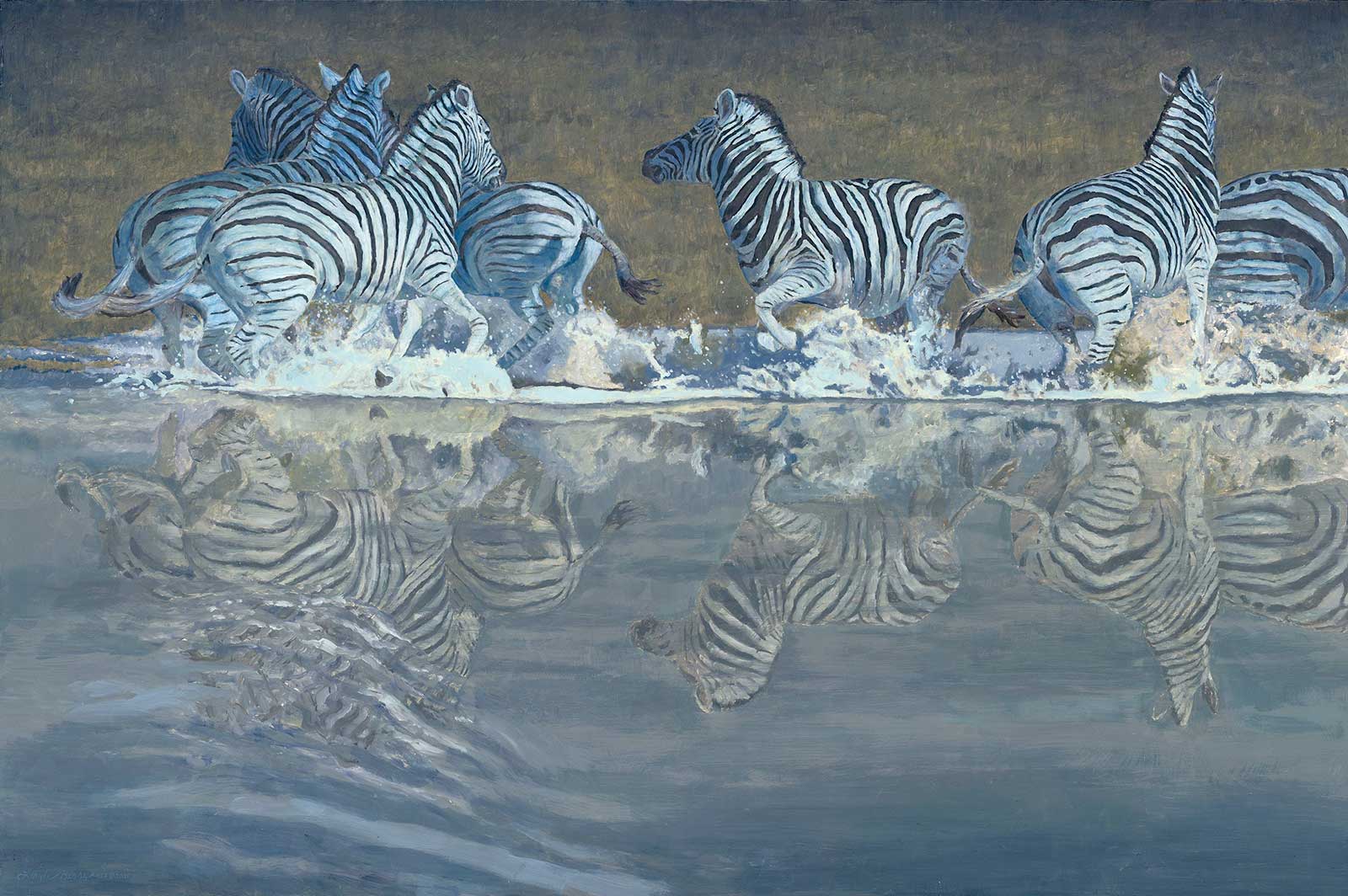
Linda Besse, Spooked, oil, 24 x 36" (60 x 91 cm)
Linda Besse
Washington, USA
Linda Besse, Spooked, oil, 24 x 36" (60 x 91 cm)
Linda Besse
Washington, USA
My Inspiration
Virtually all of my wildlife paintings are inspired by animals I observe in the wild and Spooked is no exception. In Namibia, I was watching a herd of zebra peacefully drinking from a waterhole when all of a sudden they bolted. It was unclear what prompted this disruption, but I knew there was a story (and a painting) from the encounter.
My Design Strategy
The time of day I was at the waterhole was not the best, midday, the most unforgiving of lighting conditions. However, a midday scene does translate well into a nighttime one with a full moon. One needs to decrease the contrast to account for the fewer lumens generated by the moon.
To give the feeling of a chaotic retreat from the water, I placed the zebra moving right, left, and away from the viewer. An added ripple moving through the muddy waterhole toward the zebra finished the story.
My Working Process
Usually I paint completely wet-on-wet without any medium, mixing directly from the tube. For this painting, I used numerous glazes to create a luminous nighttime effect.
Most of the “white” of the zebra was painted with titanium white with a tiny touch of cadmium yellow deep. Once dry, it was time to “make moonlight” and start the glazing process. With each layer of glaze, I would push and pull the color and some zebra would become more vibrant and some would blend more into the background. Each glazed layer would be completely dry before I’d add another one. To cool and dull certain sections I used payne’s gray and ultramarine blue in the glaze.
Contact Details
Email: linda@besseart.com
Website: www.besseart.com
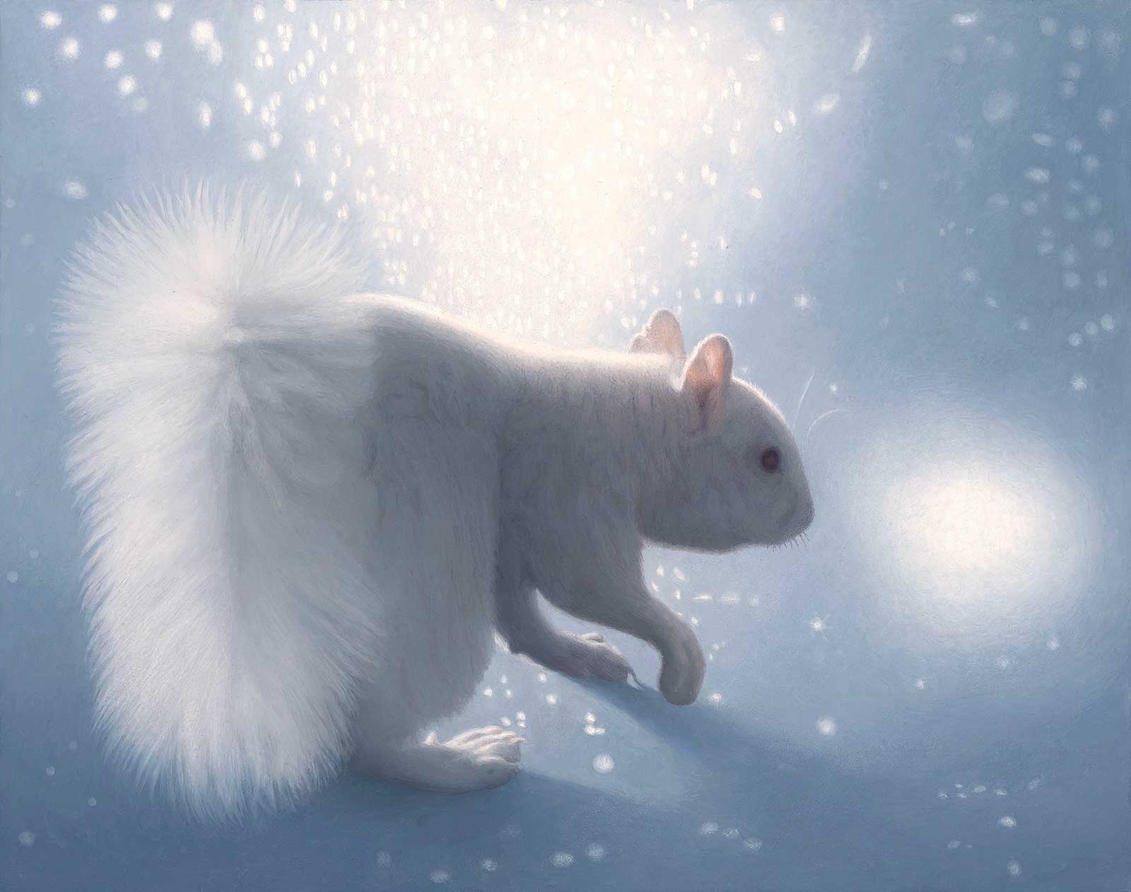
Susan McDonnell, Polar Squirrel, oil, 11 x 14" (27 x 35 cm)
Susan McDonnell
Minnesota, USA
Susan McDonnell, Polar Squirrel, oil, 11 x 14" (27 x 35 cm)
Susan McDonnell
Minnesota, USA
My Inspiration
Many of the inspirations for my paintings come from long walks in nature observing and photographing wildlife. I moved from California to Minnesota last February and within days saw this albino squirrel running along a fence and over a rooftop. The sun was out and the shadows on the snow-covered roof were blue. It was a magical moment that sparked the idea for this painting. There is a type of snow that sparkles like glitter and the play of light on its surface creates its own little world of mystery, a perfect setting for this little polar squirrel.
My Design Strategy
I wanted to come in close on the squirrel and create a winter environment that was mostly abstract, just the elements of light, shadow and texture. The light on the tail and the two background lights fill the space with strong simple shapes much the way winter can transform the world into a wonderland. With that in mind it made sense to keep the palette almost monochrome with minor shifts of blue, highlighting the ears with translucent pink. I really enjoyed drawing the fluid movement of the squirrel in mid-stride. The texture of the snow sparkles were softened, reflecting how snow softens and quiets everything it covers.
My Working Process
Small thumbnail sketches were drawn to establish the general design, then a full-scale line drawing was created and transferred to a gessoed panel. This painting has three main layers of paint with additional finishing layers. The first layer focused on the values and how they read across the painting. The second layer I adjusted the colors and brought out the forms. With the final layers I smoothed out transitions and refined details. When the painting was near completion I took a photo and edited the image to black and white to confirm that the values were working compositionally.
Contact Details
Email: smcdonnell1@mac.com
Website: www.susan-mcdonnell.com
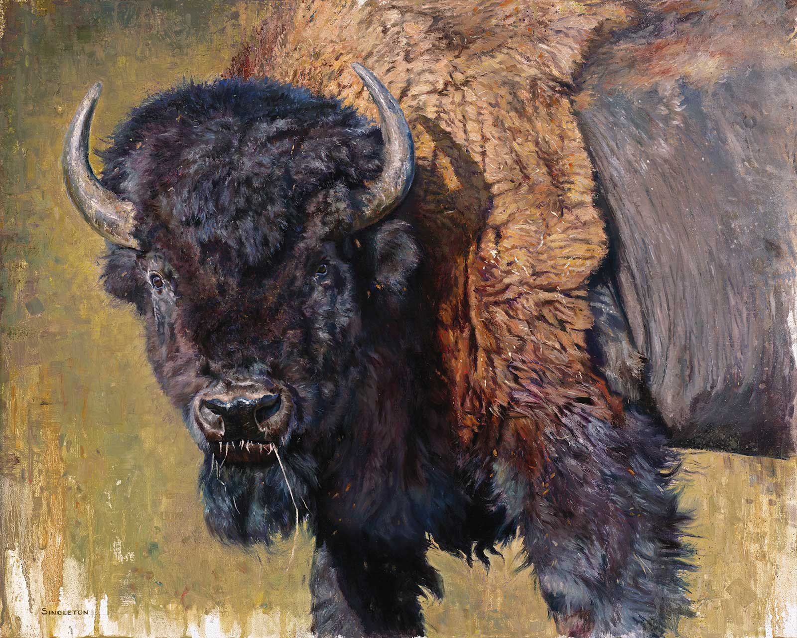
Kelly Singleton, Do Ya’ Feel Lucky, Punk?, oil, 24 x 30" (60 x 76 cm)
Kelly Singleton
Colorado, USA
Kelly Singleton, Do Ya’ Feel Lucky, Punk?, oil, 24 x 30" (60 x 76 cm)
Kelly Singleton
Colorado, USA
My Inspiration
This bull bison caught my attention while visiting Custer State Park in South Dakota. No other bison were around when I stopped to photograph him from a safe distance. Perhaps none wanted to be around him. He was massive and full of attitude with the looks that said, “Don’t mess with me!” He reminded me of Clint Eastwood’s “Dirty Harry” character—he was rough around the edges and had a glare that cut right through you. It was that attitude that I wanted to capture most of all in my painting. I also wanted to delve into all the lovely textures in his hide.
My Design Strategy
I wanted the viewer to feel slightly uncomfortable being so close to this dangerous, unpredictable animal. To achieve this, I cropped in on the bison’s head and the front portion of his body. I kept the tightest details to his head, because that’s where I wanted the focus to be. The treatment on the rest of the bison is looser. The background was also kept loose and abstract so as not to distract from the focal point.
My Working Process
I sketched in the bison with pencil on a linen panel adhered to a rigid display board. I prefer a fine weave linen. Next, I loosely blocked in the colors using oils thinned with mineral spirits. Once the block in was established, I started right in on the eyes; I wanted to get them dialed in right away. From there, I moved outward to the head and the rest of the body. As I paint, I paint the biggest shapes first and then refine them down into smaller, detailed shapes as I go. To create the texture of the bison hide, I used a palette knife, some well-worn brushes and an old toothbrush.
Contact Details
Email: kelly@kellysingleton.com
Website: www.kellysingleton.com
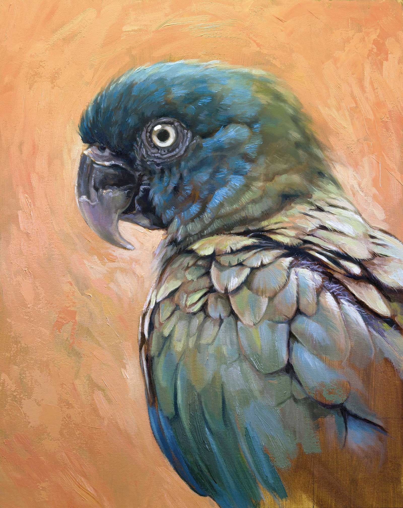
Zoltán Pogonyi, Bluehead, oil, 14 x 11" (35 x 27 cm)
Zoltán Pogonyi
Singapore
Zoltán Pogonyi, Bluehead, oil, 14 x 11" (35 x 27 cm)
Zoltán Pogonyi
Singapore
My Inspiration
I am fascinated by birds. Their flying capability, variety in size, colors, intelligence, and beauty make them truly unique animals. Since I was a kid, I liked to observe birds in nature, and I’m enjoying exploring the different characteristics of different species through drawings and paintings. Parrots are among the most intriguing birds. The small-sized blue-headed macaw lives in Brazil, Bolivia and Peru. I am delighted by its colors: the dominant blue head and the primarily green, olive feathers. Macaws have a unique face, which gives them a somewhat cheeky but intelligent look.
My Design Strategy
To represent the beauty of this animal better, I kept the composition very simple. I wanted to focus on the face, so I went for a traditional portrait approach. Based on the compositional principle of the rule of thirds, I placed the corner of the beak in the upper-left third. I put greater emphasis on the eye—we connect with a character by looking into its eyes. This entry point allowed me to start exploring the image along the diagonally placed body. I chose to add a warm, yellow-orange background to complement the blue head of the parrot and give the painting a lively, vibrant feel. I think it matches these intelligent birds.
My Working Process
I applied three layers of gesso to an illustration board and sanded it to create a smooth surface. I added a loose, burnt umber underpaint to get rid of the pristine white of the illustration board. I wanted to contrast the big, well defined, rustic feathers and the fuzzier feathers on the head. I utilized an impasto medium to give the oil paint more viscosity. With a palette knife, I managed to create some more complex, rough surfaces in the background to achieve contrast in the textures and make those face feathers appeal really soft.
Contact Details
Email: zpogonyi@gmail.com
Website: zoltan.artstation.com
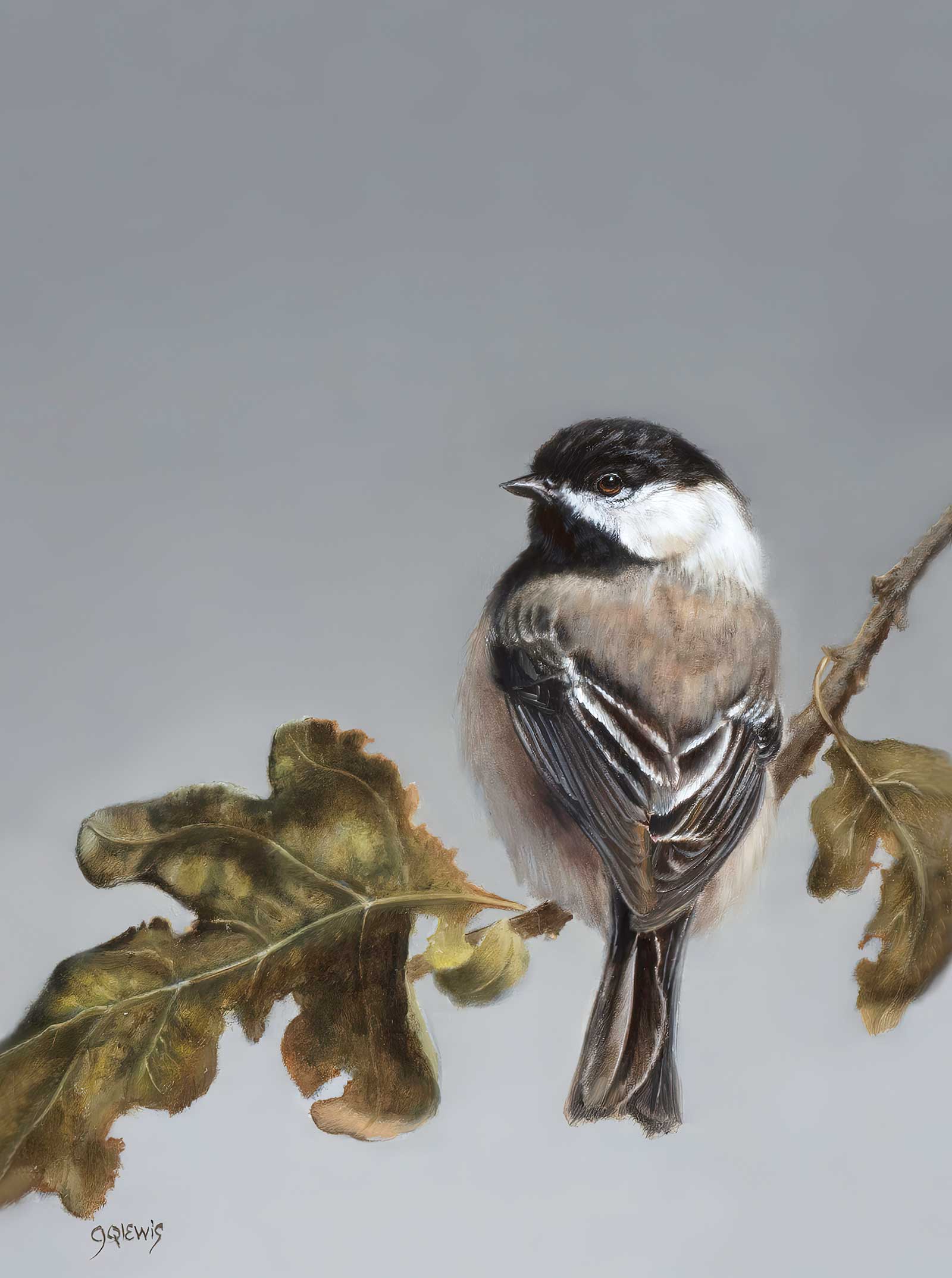
Jhenna Quinn Lewis, Before Autumn Leaves Wither, oil, 8 x 6" (20 x 15 cm)
Jhenna Quinn Lewis
Oregon, USA
Jhenna Quinn Lewis, Before Autumn Leaves Wither, oil, 8 x 6" (20 x 15 cm)
Jhenna Quinn Lewis
Oregon, USA
My Inspiration
My inspiration for this piece came during an Artist in Residence experience at Lassen Volcanic National Park. I am a studio artist and to have the chance to be outdoors gathering reference materials and sketches was—and is always—invaluable. The leaves of particular trees were turning into their fall foliage. The chickadees were a favorite of mine with their muted tones of grays, brown, and a bit of rust. These seemed perfect for depicting the early foggy mornings of fall that were just around the corner. I wanted a tonal palette and this bird was a perfect fit.
My Design Strategy
My typical design concept is one of negative space. There are no unneeded distractions in color, form, or subject matter. I adhere to the “less is more” adage. I also like working in the rule of thirds. This is especially so since my compositions tend to be vertical rather than horizontal. This orientation allows for more negative space in the work. I had a great time picking and choosing the leaves to use.
My Working Process
I work with reference materials in the studio. On walks, I gather many branches, sticks, stones, leaves, acorns, butterfly wings, nests, pieces of eggs, etc. to use in compositions.
I work in oils using a limited palette of ivory black or payne’s gray, red (burnt sienna to transparent red ochre), yellow (yellow ochre to cadmium yellow light) and zinc white.
My painting supports vary. I use portrait linen, gessoed panels, or double primed linen. I start with a sketch of the composition in sienna. Then I use the limited palette saving the cadmium colors for the final touches. I incorporate glazing techniques for the dusky smoke atmospheric backgrounds.
Contact Details
Email: jhennaquinnlewis@gmail.com
Website: www.jhennaquinnlewis.com
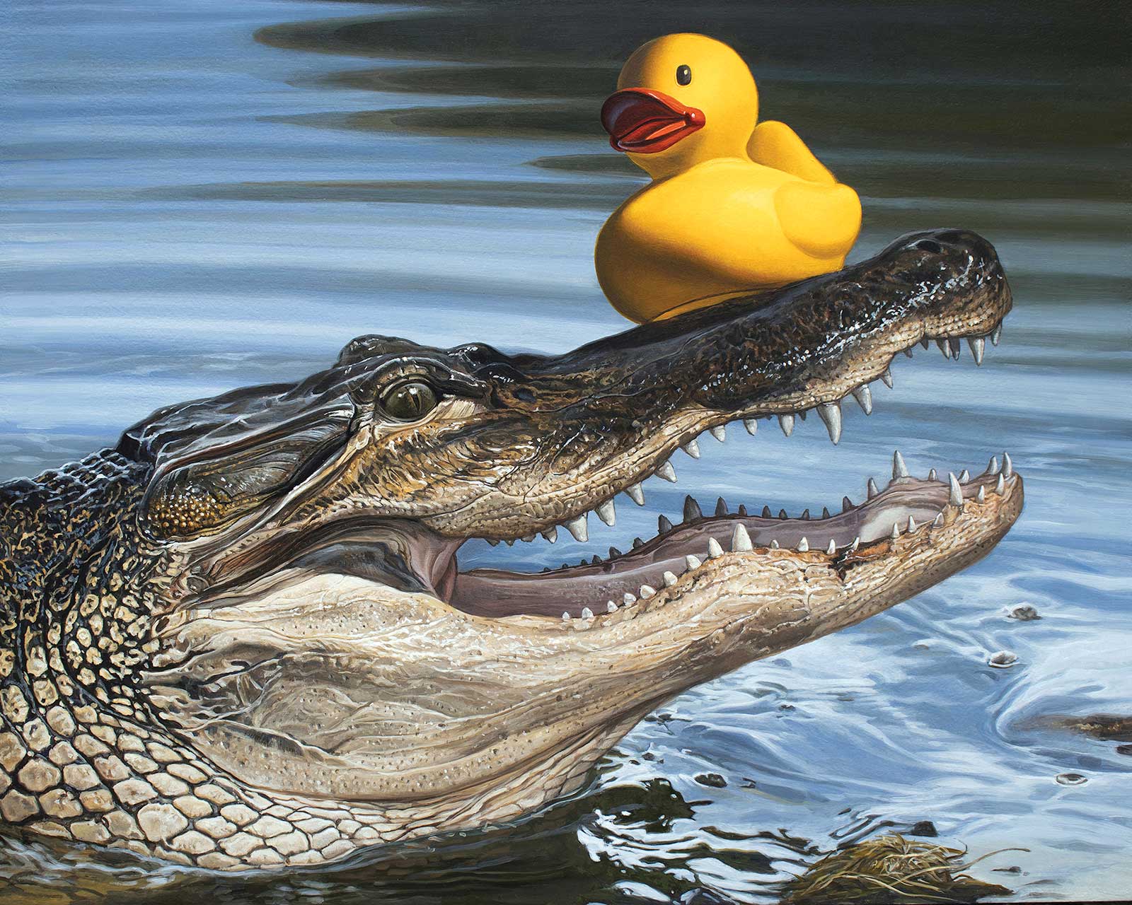
Kevin Grass, Sitting Duck, acrylic, 16 x 20" (40 x 50 cm)
Kevin Grass
Florida, USA
Kevin Grass, Sitting Duck, acrylic, 16 x 20" (40 x 50 cm)
Kevin Grass
Florida, USA
My Inspiration
Sitting Duck is part of a new body of work, called Lame Ducks, which features yellow rubber ducks in a series of narrative images inspired by idioms or phrases that include the word “duck” or words that rhyme with “duck.” These visual puns are often worthy of inciting groans, hence the inclusion of the word “lame” in the title for the series.
The idea for this painting came to me when my wife and I were picnicking at Anderson Park in Tarpon Springs, Florida. Alligators often swim very close to the picnic tables on the shore of Lake Tarpon, and this time a dragonfly landed upon the snout of a particularly still alligator. That, of course, gave me the idea for the painting.
My Design Strategy
I wanted to work from life as much as possible and, since it would be a bad idea to pose a live alligator in my studio, I decided to use a taxidermy alligator head instead. I placed the head in profile and facing to the right. Once the yellow rubber duck was carefully balanced on the snout and lighting was adjusted, I was ready to begin painting.
My Working Process
The subjects were drawn onto a gessoed aluminum panel with yellow ochre lines. This was followed by a careful full-color block-in so that significant corrections would not need to be made in later stages. Subsequent layers were needed to increase the depth and complexity of the color, to improve contrast and to develop more accurate variation in surfaces. The depth and richness of the colors were heightened by increasing the translucency of each successive layer of acrylic paint. A final glossy varnish was added several weeks after the painting was finished.
Contact Details
Email: fineartfan@hotmail.com
Website: www.kevingrass.art
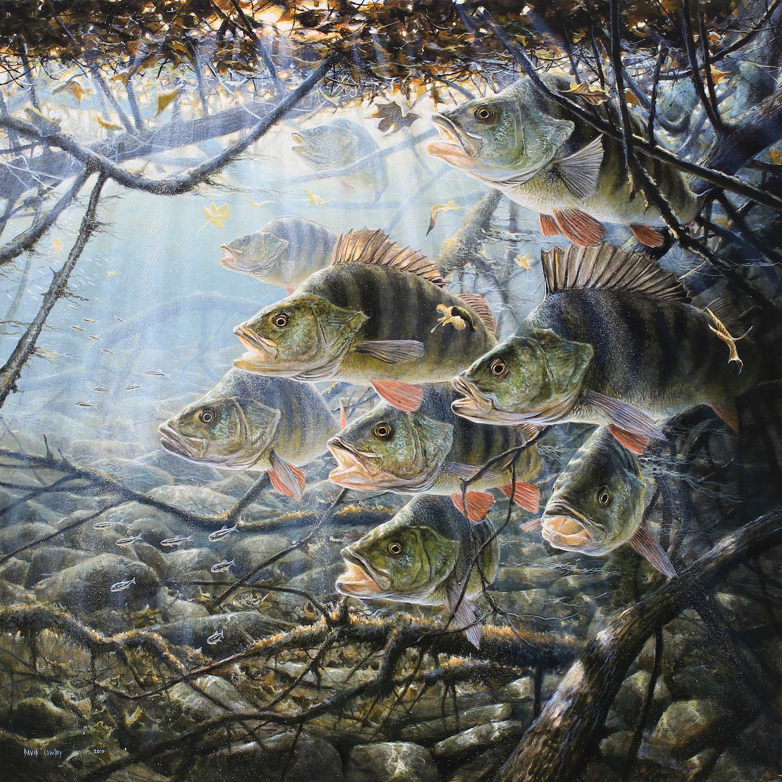
David Cowdry, Autumn Perch, acrylic, 35 x 35" (90 x 90 cm)
David Cowdry
Carmarthenshire, UK
David Cowdry, Autumn Perch, acrylic, 35 x 35" (90 x 90 cm)
David Cowdry
Carmarthenshire, UK
My Inspiration
Perch are my favorite fish, and as an angler, I often let my mind wander down into the depths of a river, wondering what lies beneath those mysterious pools. The season is autumn, a time when the bankside cover is golden in hue and the air damp. The confetti of the season falling upon the cooling waters, creating the dark lair of the perch beneath. This is the underwater scene that I wanted to capture.
My Design Strategy
A sense of atmosphere, space and the fish’s presence in their dark lair was my goal and a feel for the season in which they are depicted. In truth I have an idea rather than a design strategy, and I don’t question how my ideas travel from my head to the canvas. I enjoy the mystery of it and creating the illusion of something solid, something real upon a flat surface.
My Working Process
I paint quickly and instinctively. It took four and a half days to complete, plus a lifetime of experience. Even during the last stages decisions and changes were made. I like a painting to have space to breathe and not have ideas set in stone. My own photos of perch and minnows were the only photographic references used. The rest of the scene was painted from my imagination and a good dose of observation from time spent photographing the subsurface world.
Contact Details
Email: davidcowdry57@gmail.com
Website: www.facebook.com/davidcowdryart
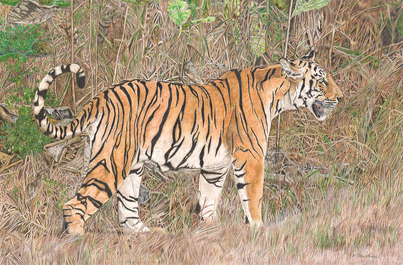
Kathy Christian, Sitara, dry media, 21 x 30" (53 x 77 cm)
Kathy Christian
Victoria, Australia
Kathy Christian, Sitara, dry media, 21 x 30" (53 x 77 cm)
Kathy Christian
Victoria, Australia
My Inspiration
I have been fortunate to have worked with tigers hands-on for several years in a zoo compound in the United States. Zoo cats however do not have the intensity and muscular development of wild cats who hunt for survival. When I saw this magnificent tigress Sitara, who resides in Tadoba Andhari Tiger Reserve, India, I knew I had to attempt to paint her in her natural environment.
My Design Strategy
While Sitara herself would take center stage in my painting I wanted her environment to be just as important, without one overpowering the other. The vibrant colors of the Tigress would assure her place in the composition. The detail I planned on rendering the grass and native foliage would hold the viewer’s interest. The softness of the grasses in the foreground contrasted with the hard musculature of the cat. It was also important to keep the colors of the bush muted.
My Working Process
All my preliminary sketches are done freehand, then I transfer the whole sketch to my drawing surface. Once I completed the sketch of the tigress, I did limited guides to where areas of the grass and brush would be. I completed the cat first, then worked on the rest. The drawing took me over six months to complete.
Contact Details
Email: outlawkelpie@bigpond.com
Website: www.facebook.com/kchristianart